Head-2-Head-X / H2HX: Round Robin - R2M1 - Lonely Hearts Club vs Evergreen Gardeners
-
 12-May 24
-

 Tolsimir
Offline
LHC:
Very pleasent park. The division in two parts was an interesting choice. Landscaping was throughout well done apart from the toblerone like peaks that have been mentioned by my predecessors. As they mentioned too, the total scaling feels a bit off on the whole map. On the land edge I'm neutral, I appreciate trying out something new but I can't say if it is such a success after all mainly due to the 1 dimensionality of the layer cake rocks. It's giving me too much of a blocky unnatural feel.
From the two sides I enjoyed the natural one a lot more. The overall vibe and atmosphere is outstanding. The foliage plays a role here as does the nice composition. I disagree on the choice of the green for the trees, though. I can understand why you want them to be visibly distinct from the low ground foliage but I'm sure there could have been another solution than the super contrasty saturated green. The temple/castle on the mountain side was surely my favourite building on the whole map, nailed it. For the yaks I think it could have been better if you lowered the maximum velocity of them such that they look less like on speed I reckon (very minor issue lol). Overall, I really enjoyed the serenity of this part, big decision to dedicate such a huge portion of the map to something this tranquil.
The second half I found couldn't live up to the standards set from the first one. The archy was somewhat blocky and there were bits that felt like not 100% polished, it's hard to describe, it just couldn't catch me as much as would have liked. Of course there were also stellar highlights like the rock pillar next to the loop of the coaster or the brick building close to the corner. But for example the corner with the tomb (I guess that's what it is?) doesn't feel like it carries the same visual strengths other parts of the map do. For instance the wooden pathways are somewhat clunky and not as slick as the ones in the mountain side.
Please don't get me wrong if I sound overly critical, I think this park is still very beautiful and some of the previously mentioned points also fall under the category nitpicks. My biggest problem, and what probably made me vote for Cirque in the end, is that I kinda felt this park was very beatifully crafted, good fundamentals in landscaping and composition but there was nothing that wowed me or tried me to suck me into the premise of the park (which after Jens' post I surely did not get). Stuff that could have served for that purpose like storytelling scenes felt partially random or distracting to me (the cutouts on the map edge). For a winner map the little twist was probably missing.
Ah regarding the plugin: Imo it didn't add a lot to the park since the revealing effect was not showing something overwhelming probably that made you gaze at it. It moreso was annoying a bit cause it made my game crash twice when I tried to use the scenery picker tool.
-
 Mr.Brightside711
Offline
I really liked this park. Although I didn't voted for it, it had really good vibes and atomosphere. The concept was clear and it sold it well. My issues were mostly with macro. The map felt very unbalanced. But enough negative, this is the stuff I loved:
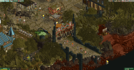
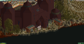
The entrance was really great.
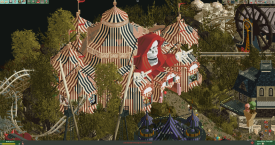
The RMC tent was really nice with the skeleton sculpture.
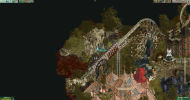
The cannon and skull mountain are both fantastic.
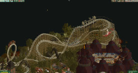
The RMC layout was very strong. Too fast, but still really good. The small helix towards the end and pre-launch weren't my favorite, but what's in this picture is just great.
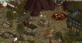
The back of the show tent has great details.
The park is just filled with great little stands and rides.
And here's more.
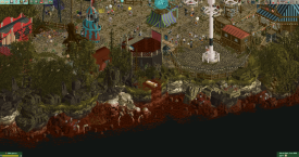
The map edge is consistantly fantastic and one of the best of any h2h park.
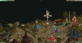
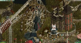
The ferris wheel and small haunted mansion are great. I wish there was more emphasis on this one.
Overall great job. I can see why this park won. It was a hard choice for sure! Good job Gardeners!
-

 Ethan
Offline
Cirque
This theme concept is very up my alley. Easily one of my favourite coasters so far. I like that the layout is unlike any existing hybrid coaster. It’s wacky but it looks like an amazing well designed ride. I also love the sort of rite-of passage esque bit through the crowd in the circus, i imagine this was kind of the pov https://youtu.be/MgsrNoQHDS0?si=QtKgLSUOAeDu3EWG&t=358 . I love the corrupted swan boat ride. The overall grunge and brutal sculptures are so cool and the tents sculpted are so excellent.
Rest
I enjoyed the miniature snow caps. Mountains are massive in real life relative to a person's scale but it just looks lovely for a completely diorama aesthetic. The overall macro vibe has a diorama feel that I really enjoy. And I think the execution is crisp. The central plaza with flat ride interaction and the glorious fully custom RMC is to die for, every little spec of detail is crisp. Just some seriously addicting object usage. I love the bee stuff! This kind of thing makes parks memorable for me is that kind of natural identity. Great touches with all the colorful prayer banners and the yoga scene. Lots of insight to the culture and lifestyle.
-

 Jappy
Offline
Cirque Macabre
Dang it, you stole a park idea I had for outside of H2H! Oh well.... Execution of the theme here has been pushed to the max, and I think you pretty much managed to do as much with it as you can. The cannon launch is so good. My main gripe is the crunch overload, especially on the paths. That could've been toned down and it still would be amazing.
Sambhava's Rest
Okay, I was first very annoyed because I just saw what looked to be a really cool map hidden underneath clouds that blocked my view and I did not know how to remove. The plugin didn't work for me.... Only when opening it a second time did it do what it was supposed to. Very pretty park, and the inspiration is immediately recognisable. The little scenes on the map edge have to be my favorite, they're hilarious. You managed to put a lot of very specific culturaly significant and important details in this park, which is impressive. Shame there can only be one winner!
-

 CedarPoint6
Offline
Reviews are up for both of these parks!
I voted Cirque though it was a very close choice for me.
Sambhava's Rest:
https://youtu.be/S6pGAZy8MCQCirque Macabre:
 Tags
Tags
- No Tags
