Head-2-Head-X / H2HX: Round Robin - R2M1 - Lonely Hearts Club vs Evergreen Gardeners
-
 12-May 24
-

 posix
Offline
People will talk about the aspects that interested them. I think we can let them. I agree words should be given to the park content itself, but if someone doesn't want to then that's that.
-

 GammaZero
Offline
Episode 2, Part 1: gamma is busy
This time, I'm really gonna have to be brief. I'm still getting settled after moving to Belgium, so I apologize to the builders if I don't have as much to say about these (great) parks.
Sambhava's Rest
To once again sidestep the whole plugin discussion, I'm just gonna look at this park in its "post-cloud dissipation" state. That's not to say that the effect isn't cool, but I don't exactly wanna open that can of worms when I'm busier than usual.
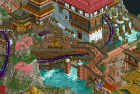
Amazing rockwork. Really convincing as a Himalayan landscape, especially with the clever placement of the clouds that stay behind even after the plugin has done its work. Love the rivers too, and how they flow well (hah) with the map's elevation changes.
The RMC is beautiful, and looks like it'd be a blast to ride. The station is tall and imposing - the architectural highlight of the park to me. The rest of the architecture is, in my eyes, the tried-and-true Himalayan architecture we've seen quite a lot in the past few years, albeit an elegant, well-executed, up-to-date version of it. In any case, it doesn't take away from the map itself, as its highlights - the breathtaking landscape and the flowy coaster - shine very brightly. Can't forget all the cool and funny small scenes either! Overall, a very strong R2 park.
TL;DR: breathtaking (but for real this time), convincing, great coaster.
Cirque Macabre
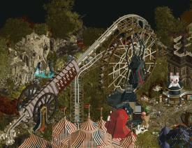
First off, I love how much this park reminds me of (an admittedly much gorier version of) Paradise Pier (RIP). Maybe it wasn't the intention, but the coaster and ferris wheel give me those vibes. Speaking of which, yet another great hybrid layout, and what a coincidence that both of these have that large loop as a focal point!
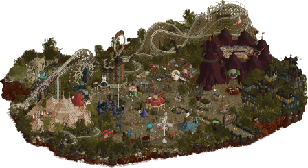
The commitment to the theme is awesome, especially on all the flat rides, and the map edge is one of the coolest I've seen in a while. I also have to greatly praise the circus tents, it's really easy for them to end up looking like formless blobs but you guys nailed it!
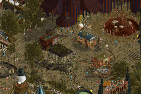
Where this park falls a bit short for me is in its readability. While it might have been intentional, the combination of the palette, foliage choices and crunch makes the map hard to parse in quite a few places. The haunted manor suffers from this the most, unfortunately. Nevertheless, what is there that isn't obscured by foliage is top-notch, and you should all be proud!
TL;DR: gory, thematic, fun.
To me, this is the first matchup where the parks have very different strong suits; regardless, it's still a tough vote for me, especially since I don't exactly have the time to go over each one with a fine-tooth comb. Good luck to both teams!
-

 wheres_walto
Offline
spacek's analysis was significantly more interesting and will be more impactful than most of the reviews we'll get during this entire contest
-

 alex
Offline
Sambhava
High points were the architecture, pathing, peep-level stuff and general small detail work. So many well crafted scenes to be found. On a micro level I think you composed everything really organically, especially all the small paths and bridges and the plaza spaces in the more built-up area.
Fog effect plugin didn’t do much for me but nor did it annoy me particularly.
On a similar note I found the coaster to be fairly forgettable - a little bit meandering and without any particular standout features. Actually the support work was much more inspired than the layout itself - high points being the lift hill, the bit where it’s squished against a cliff face and the loop/bridge combo.
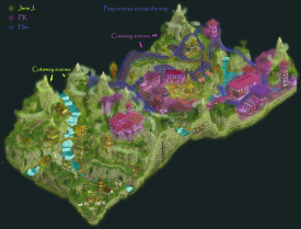
I found the map a bit awkward compositionally - being a rectangle split down the middle into a quiet and busier half, the result was that it felt unbalanced. I guess you were going for something Gladsheim-esq where the viewer starts in a quieter corner and then takes this journey to discover the promised land. But without some narrative to follow inwards it just ended up feeling a bit disconnected. I can imagine something circular with a busy center, circled by mountains and a quieter outer ring might have been more appealing.
Last note, landscaping wasn’t quite there for me - it had this effect of stepped ramps and pyramids where it needed more verticals and possibly some overhangs to give it that extra drama. When I look at images of cliffside monasteries in Nepal they are dwarfed by the landscape and clinging to the side - this feeling didn’t come through.
I feel like this has come across overly neg so I’ll reiterate again just how beautiful some of the buildings and path scenes were - phenomenal work here, best I’ve seen in this theme:Cirque Macabre
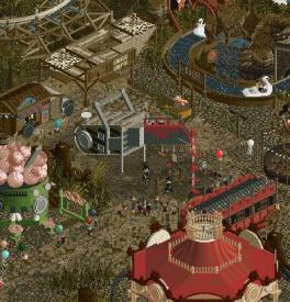
I love a focused and original theme in H2H and here the carnival-horror theme is unique and immediately clear - great job. The sculptures, facades and signage are all great but what I enjoyed most of all were all these carnival wagons dotted around:Great coaster! I liked the simplicity of it and for an RMC it felt quite understated - not twisting and turning everywhere but just a logical sequence of elements. You could argue it’s a bit tucked away in the back but I quite like that aspect here - It serves as a nice backdrop.
I liked the foliage palette a lot - it read as overgrown and sickly without being visually too noisy. That brings me onto what I found to be the weaker parts of the map - the first being that I felt the path texturing detracted more than it added. Even with the the dingy look you’re going for I think you still need to be deliberate with texture placement so that it looks natural: some denser areas, some more sparse - right now it was a solid carpet of tolsimir crunch object and ended up drawing attention away from the much more interesting and high-value detail work.
My other issue was that the main architecture - the 2 big tents and the haunted house - seemed a bit of a mishmash of forms where I think having a clear geometry as a starting point and then letting the overgrowth and general falling-apart-ness offset that would have been stronger.
But that’s all I really have to complain about, I think this park is awesome. -

 chorkiel
Offline
Another M1, this time without a headache for me. But again with two great parks which made me crack my head. Low on time so I'm gonna do a +/- thingy.
Cirque Macabre
+ You absolutely nailed the vibe. Very spooky
+ bonus plus for the spooky landscape with the blood
+ the individual rides were all very fitting to the theme and look great
+ the canon was one of my favorite things
+ the music
- not a big fan of the bare center with all the crunchy path
- felt like the haunted manor was meant to be the flagship ride of this park. For that it fell a bit flat for me. It's a bit blocky and I feel like it could have been more interesting.
Sambhava's Rest
+ the landscaping was pretty much a 10/10
+ as was the architecture, it always impresses me if people can make architecture look normal+good on this kind of landscaping
- didn't care much for the gimmick, but on repeat viewings it annoyed me a bit that I had to wait for the fog to clear out
- the park was a bit boring to me tbh. If I still had a headache that could have scored you points for creating something soothing
In general I think they're both great parks. One is a busy wacky h2h-ey park and the other is a very good grand tour entry.
-

 spacek531
Offline
Sambhava's Rest
+ Cool landscaping and architecture. This really does feel mountainous. The rivers were the best part.
+ Great storytelling. The park felt like a collage of different groups of people making their journeys, woven together to form a general narrative of adventure and discovery.- Landscaping scale felt small. I know this is a H2H park but for all the majesty of the rockwork the fact the peaks were not that much taller than the buildings was readily apparent.
- Park was exported with mist visible. This didn't really affect my opinion of the park but it was unfortunate since the plugin is set up to automatically make it visible when you open. I expect this oversight had to do with the deadline - it's completely understandable and we've all been there.
Summary: Great environmental storytelling set in picturesque valleys.
Cirque Macabre:
+ Great sculptures and themes. Really nails the spooky vibe. Haunted mansion was great.
+ Coaster layout and theme was good. It felt like something you'd see in a Halloween cartoon.
- Coaster was too fast with no reasonable explanation. It was a missed opportunity to not play up mechanical failure or intentional sabotage.
- Midway path layout leaves something to be desired. It felt like most of your tiles were spent on crunch objects instead of cool scenes or stalls. Jam those stalls together!
Summary: Gruesome thrills and most certainly chills
In the last 8 parks we've seen 4 RMC coasters surrounded by Fisch rocks and they all pace extremely fast. Who will break the streak?
This was a difficult vote. In the end the theme and storytelling of Sambhava's Rest won my vote. +1 Lonely Heart's Club. -

 Turtle
Offline
Two more great parks. Round 2 kicking off with a bang. Stream of consciousness reviews:
Cirque Macabre
kickass map edge, and great entrance sign. a lot of dull brown going on which is making it kinda hard to read. lots of movement, lots of things to see. straight away i'm drawn to the big dark tent/stadium - it's a super interesting structure and i know how hard it is to build a circus tent in RCT. the coaster is awesome - definitely my high point of the map. the launch, the loop, the turnaround and big structure with signage etc. great, great stuff.
the big wheel in front is also great, and the sculptures around the map are really special. faves are the skull at the back behind the coaster, the mouse and the cannon.
there's a ton of really cool stuff on this map, and i love the theme idea. overall it just didn't quite come together for me. maybe it's the pallette, but i find it very hard to vibe with the foliage around the map, and the pathing is kinda hard to look at honestly. too much texture overload all over the place with very little negative space makes nothing really stand out from the crowd. which is a real shame as there's a bunch of amazing little bits and the skill level is obvious. i'm sure i'll come back to this map again and find even more great ideas, but it kinda felt like "throw all the ideas onto a flat map" rather than feeling like a real place to me.
Sambhava's Rest
let's get the plugin thing out of the way, as i've seen quite a bit of discussion about it. i'm going to file this under "cool idea, probably not enough of an effect to have necessitated a plugin". i understand some "plugin-fatigue" as posix said, but people counting it against the park when voting is a level of nonsense i disagree with. someone has gone above and beyond to give you guys a cool experience in a very short time-frame, and i feel like some people are using that as enough of a reason to knock the park down. crazy entitlement.
having said all that, this is a lovely park. the landscape is ambitious but works really well. fantastic setting, very well themed with great atmosphere. i feel like the steep rockwork is just stylistic enough to work... it feels slightly artificial but gets the point across pretty well. the coaster is really fun to watch - lovely support work all over (how on earth you guys have the energy to do that i don't know). seeing as both parks have the same type of coaster, i have to give the edge to the cannon clown coaster over this one, but they're both great honestly.
the headliner here is the architecture in relation to the landscape, and it works. great archy all over, tons of more serene grassy areas to let everything breathe. colors are lively and the overall atmosphere is really inviting.
both great parks but for me one was more pleasant to be in and explore, and that takes it for me.
-

 Steve
Offline
- deletes paragraph
- edits LHC plugin joke
- extends apology to admins
Okay, I wanted to hedge a little at the jump for this one because daddy had espresso in his coffee this morning and I'm full speed ahead now, sailors. Hard to port! Step lively! Belay that (I don't know what these mean, but I think they're nautical terms of some kind)! I recently decided to rewatch the Pirates of the Caribbean film series and I'm not done but, phew, what a wild ride. Action! Drama! Romance! Rum! The first one is arguably a solid watch but they get progressively worse, huh? That Keira Knightly, though... Orlando Bloom, even. Can't wait to see where the gang heads next (just kidding, I know where they head because I said I'm rewatching them. Don't ask me why). Alas, I digress, but it's a pirate's life for Steve.
Anyway. Let's run aground and check out Cirque, first (pirate diss!). Dudes, first and foremost: cool theme. If someone said in the group chat to take La Reve and Riverview out for a date and convince them both to fuck only to birth this map then give that nerd a raise. Hopefully RWE is paying you all fair wages. I'm making like, $20/hr with the Jazzcats right now. Regardless of monetary compensation, it does not excuse this absolute dumpster fire of a park. Nah, it's not that bad. Great ideas nearly everywhere. Is the execution of said ideas there? Sometimes! Gotta say, what's up with these tents, guys? What's up with this enormous mansion, guys? What's up with this Target not accepting my Circle Rewards, guys (I need pull-ups for my daughter and I'll be squarely fucked if the Gardners will stop me from potty-training her). The coaster is solid and a cool idea to launch it out of a goddamn cannon, but also, whoever is building your coasters needs to chill or play the game at 0.5x speed because I watch your RMC layouts and feel like I need a nap afterwards. I do like how crunchy everything is though. Good texturing. Who did that skull cave behind the coaster? I want names, because if you tell me names then maybe you'll get DQ'd. Surely someone on your team is either silly or angry enough to do that. hydro said architecture school turns people into assholes so he sounds like my man for the job. All of that to say: the skull cave is good and whoever did it should have sprinkled more of that around, cause like, damn.
Lonely Hearts Club (why did you pick such a long name, J K, and why are you guys lonely. Half of you are married and have children. Is everything okay at home guys? Therapy works!)... where do I begin? A park shrouded not only in controversy but also shrouded in clouds! Or mist? What's the difference? Water density in air? What are the CTR's named again? Let me click on one of th-- and the game crashed. Listen, you lonely yet adorable nimrods: this park is good... GREAT, even. But can you take a page out of your own teammate nin's book and "chillax?" You have some incredible landscaping and architecture in this map with an excellent coaster. Let it speak for itself! Because good RCT fundamentals have much more to say than whatever gimmicks you're tossing out. And I don't say "gimmick" as a negative. H2H incites them and invites them, but it takes more guts to ignore them than to use them. Put that energy into something more worthwhile. Like what? Oh, dudes, I'm so glad you asked! How about some waterfalls that look like they were built after the pandemic. I was scouring this park thinking "this is so good but something just feels off..." and mother of all fucks, I was craving some Tolsimir waterfalls here. With that opening scene of the hanging bridges over the ravine having some more textured waterways would have been Keira Knightly-levels of hot (see, I brought it back!). Take solace in the fact, though, that this is some of the best landscaping I've seen and you should have this player be your floater going forward if only to landscape your parks, cause like, damn.
I ended both park reviews the same way for comedic effect. Did it land? Jokes, ho (that's like when you're up on a crow's nest of a ship and say "land, ho!" but I turned it around for comedy. I wasn't calling you, the reader, a "ho." But I mean, how you spend your sex life is your prerogative, so)!
-

 Milo
Offline
Lonely Hearts Club- the opening scene is very beautiful, the bridges and cascading water and land terraces is very picturesque- didn't have an issue with the plugin and I liked the "parting of the mists" effect, it was a hair slow but it's a tech demo so that is understandable- lots of neat little cutaways on the edge, really cool circular shaping and a very swiss cheese map. One note is that mixing full scenery caves with black void caves can get a little disorienting although it's executed well here- the coaster is neat, doesn't really fit in a specific style but it has fantastic interactions and pairs nicely with the opponents coaster. Nice work on the loop sightlines and I liked the launch idea, but it needed a more defined set piece directly after the launch. Great supports and banners all along the ride for additional interactions with the surroundings- I liked the detailing and infrastructure moments like the boiling water and beehives. It's all very well executed but I had a little trouble connecting the dots in my mind between the more serene parts, the fairground atmosphere with the games, the infrastructure, the mystical elements, etc.Evergreen Gardeners- I like The Carnival of Lost Souls so this theme choice resonated with me and it can be a tough one to pull off, striking the balance between dark and fun. This is executed very well- the RMC was a fun take on a classic woodie layout and the cannon was a wow moment. I would have liked to see a crumbling and rotted side friction choked by vines but that's just my preference- big tents are tough and I think they're well executed here with some interesting use of invisible color and a billowing wavy effect in some spots. The show tent in particular might have benefited from some scaffolding. - the haunted mansion was a little bulky and needed a defined place where it meets the ground imo, but a lot of the effects in the windows were cool. The ride extending into the cave system below could have been interesting- I double checked and I might have missed it, but a use of the peep head CTR in a carnival game context would have been fun. A head being used to ring the bell in a hammer game or being tossed into rings/baskets. Overall the games and attractions were very effective. I liked all of the wagons, tents, and trailers parked in strategic spots.- really great sculptures all around that elevate the structures. The detailing around the edge of the map is very cool. Very effective use of triple color skulls and other spooky objects to create gradient effects. The foliage and swamp goo blend a little too much into a green mass.Two great parks and a tough match to choose. In the end, it was personal preference in theme and the fun factor that tipped my vote.
 -

 Liampie
Offline
Two great parks, possibly my favourite match-up so far. Cirque Macabre is so fun, so well made, and full of good details like the juggler, all the sculptures, and the sculptures. Really good atmosphere. Sambhava looks more familiar, we've seen a bunch of really good Himalayan themes over the years. What stands out to me the most are all the little bridges and walkways, and I like the flags as well. These lines going criss cross through the landscape are a good aesthetic. What made me vote for the Lonely Hearts Club is that I found some of the architecture and path spaces just irresistable. Too good.
Well done both teams.
-

 Ziscor
Offline
I feel a little guilty in voting not null, with so little time spent indulging in both parks at this late of a stage, but honestly, one park just seriously spoke to me a little more with its details, its quality, its spectacle. Both parks were at a very high quality but I have to admit to myself this time that despite which side I wake up on, on any given day, I will just have one clear winner in mind.
I'll give both parks their well-deserved reviews soon. Sincerely apologize to both teams for my laziness with words right now. Congratulations on your efforts, The Evergreen Gardeners and The Lonely Hearts Club! These are parks to be so proud of.
-

 posix
Offline
Match conclusion
 Winner
The poll is now closed. The final voting score was:
29 < 33 34What was the first closer match of the season culminates in a win for the Evergreen Gardeners, who successfully bounce back from their R1 loss. Congratulations Gardeners!
Creators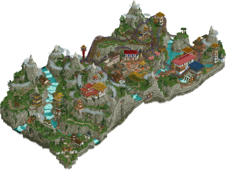
 Sambhava's RestCirque Macabre10 total4.05 weighted9 total1.75 weighted
 Jens J.
Offline
Cirque Macabre
Neatttttttt! This theme is so cool, we have seen creepy parks before, we have seen circus parks before, but this, *this*, is a very original concept. The middle area with all the stalls and rides is very nice, lots to see there. And that chainsaw, I mean c'mon, stunning and so creative!
For me, the money shot has to be the coaster launching out of the cannon with the skull cave in the background. Correct me if I'm wrong, but is this inspired by that one canceled circus-themed Efteling coaster? It fits the vibe really well (the cannon I mean, the gory and scary stuff not so much haha).
Great work Evergreen Gardeners, thank you for the awesome match (and the rollercoaster we went on with the voting poll xD).

 Hex
Offline
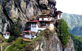
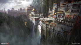
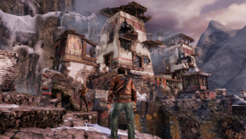
Ahem,SURPRISE! I built another custom-supported RMC in Head2Head! I better see this on the bingo card for H2H11... I'll admit, when JK first told me he was thinking of a large hybrid coaster I was a bit skeptical, partly because of my history with such an artpiece and my fear that it would seem too safe. That said, I had an absolute blast with this thing. Normally, I pride my layouts leaning more towards the realism side, so imagine my surprise when the idea of a vertical loop and a double suspension bridge launch were just some of the ideas thrown my way before I even got started. The layout you see in the final version is probably 95% of my first take on it. The team seemed to enjoy what I had sketched out, so I only really needed to do some tightening/smoothening on certain spots, mainly the diagonal section before the launch, and the swooping turn after the first (double) drop. I think this coaster really comes to life with the addition of all the flags and banners skattered throughout it; the huge pops of color made it so much fun to build. Special shoutout to Iretont for all of his CTRs, but especially those. HOW COOL ARE THOSE?!In the early stages, as we were nearly set on location and setting, I shouted from the rooftops that we needed add the Nepalese Mad Honey scenes as an additional layer of the park's culture. It was fresh in my mind from watching several YouTube documentaries on the subject, and I highly recommend viewing some if it interests you. Funny enough, they were some of the first scenes that Jens tried out as the landscaping was being sculpted. I was over the moon when that initial test screenshot came in, probably exclaiming, "EEEEeeeee!" That in mind, my favorite cutaway scene is the Winnie-the-Pooh & Family Guy double reference with the giant vat of honey. Special thanks to Manticore for the Peep Editor Plugin. I had waaaay too much fun making a lot of these scenes.I believe it's also worth saying that we took inspiration from multiple countries in South Asia - not just Nepal. I remember initially bringing up the Tiger's Nest temple which is located in Bhutan. This spun into various screenshots of the Uncharted franchise for more inspiration. Thus, I believe we constructed plenty of narrative to make Sambhava's Rest its own thing, but that's just my take.---------------------------I want to especially thank my buildmates. FK, Jens, it was a privilege to work with two of the best in the game. I'm elated you entrusted me with the coaster for your map. The way you nestled it throughout all of the tunnels and structures made for such a fun, vibrant park, and I'm glad my name is stamped on it with you two. I'm sorry we didn't come out on top for this map, but that doesn't change the wonderful memories we shared throughout the building process. Wouldn't change it for the world!Deano, while some of the plugin chatter may be discouraging, I am super happy with what you gave us. That effect is really just such a cool scene starter and given your schedule and irl duties, you did a stellar job!Also a shoutout to the Lonely Hearts Club members that joined the Voice Chat, especially during that last week of building.Thanks for reading!-Hex
 Liampie
Offline
Poor FK, can't get a break in H2H. Consistently delivers top quality, but tends to get very unlucky with his matches. Love your work, dude.
Congrats to the Gardeners, glad you guys didn't go 0-2 because so far you I'm a fan of what you guys have been doing. This outcome keeps the playing field somewhat level this early in the contest!

 Jens J.
Offline
Sambhava's Rest
Hi all! You probably guessed it (and if you didn't, shame on you… haha) but I built on this park! I think you all deserve a deep dive into how the park came to be and why we made certain decisions so lets-a-go! (Late edit: long read ahead, so buckle up you beautiful peeps)
The idea all started off with Hex and deanosrs posting some really cool pictures involving Nepalese/Bhutanese architecture and Black Myth: Wukong. Very GT-esque (I'll get back to this in a second don't you worry) but then FK came through with a (in my opinion) really cool idea. And I quote:
"Oh, ooo, what if instead of Tiger's Nest it was Tiger's Gate where that was the primary entrance to a secret hidden city built in the same style? The viewer starts with what appears to be a lonely hike up a natural landscape to a singular temple, but the temple has a sort of hidden entrance that if activated reveals a much later city for which the gate is just the entrance."
Me and Hex were immediately hooked and that's where it all began! I started off with some macro and planning stuff. Eventually we got the conclusion that in order to have a hiking area clearly separated from a "hidden" city, the park would have to be more rectangular. Graphic design is my passion so of course I went wild with the sketching which made nin very jelly (source: trust me).
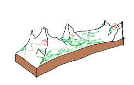
One thing that was immediately clear to me was that the park would need a lot of landscaping. A lot. I've become known for my rockwork in San Avaiki and other maps, so I couldn't just show up with some meh-looking rocks to H2H. Impossible. Not in a million years. As you can imagine, most of my time was put into getting the landscaping right. Meanwhile, FK started working on some very neat buildings and Hex got started with a coaster which would have some insanely good-looking supports in the end product.
I don't remember it exactly, but somewhere near the end of the project I believe, the idea to have the hidden city actually be hidden during the opening scene started brewing. Just as something to set the vibe for the park and which could help the narrative. Many ideas were considered, one of them I have seen mentioned a lot, which is just using the CTRs. More specifically, the mist CTRs we created (thank you Iretont <3). Since I had about a week left to get all the mist in, I didn't want to spend a lot of that time on trying to figure out a shoestring (my arch-nemesis) to get the vehicles to move up and away from the hidden city *and* having to place the mist vehicles down one-by-one across the back area of the park. It would've been like 400-600 vehicles. God bless you if you wanna do that, but I'm trying to stay sane this H2H haha.
Another idea we had was to turn the mist into an object and have a plugin start fading the mist CTRs turned into objects (thank you CHE <3) by using the invisible color. This was time-wise the best solution in our opinion, so deanos got to work on some code. Soon it became clear though that I, a Sport Science student with limited knowledge of the dificult language that is coding, had to put the code into the game since obviously deanos can't build (darn you damn points system /s). Never in my life did I think I would be able to do that, but we got it done and through some iterations the plugin started to function like how we wanted it to. Hooray! Also had an idea to do some sort of treasure hunt in the front area but let's not overwork you guys too much doing RCT lol.
The final days, we really focused on trying to implement as many details as we could before the deadline. Hex and I added a ton of peep/staff scenes where most of the ones in the front area would hint at where the entrance to the hidden city is and how dangerous the trip to the 'promised land' (apologies for the kinda satanic scene where the guest falls into a trap haha). FK killed it with the crunch and all the little details in and around the hidden city. Although I'm very proud of my landscaping on this map, I do wanna give a special shoutout to FK again. Through tons of feedback and lots of reverse-engineering of his contributions to the map, my architectural skills grew a ton and I started to uncover the secret behind the delicious FK crunch™. The area around the Yakousel especially is something I'm really proud of with various games to play there like tug-of-war, the hammer mini-game and archery.
If you have stayed with me this far into the review, congrats! I promised I would get back on one point though: GT and Nepal comments were thrown around left and right during voting which made me wonder: although I don't know if that's seen as a positive or negative in H2H, I do wanna say that we tried to take inspiration from many other different styles of Asian architecture other than Nepal and Bhutan to create our own fitting vibe for this park, think of countries like Vietnam and India. I don't see a problem with using countries as your main inspiration source, the same way I don't see a problem with building in overused themes like Pirates or Underwater. But that's a story for another time my dears lol, gotta wrap this sh*t up!
I wanna say a huge thank you to FK, Hex and the whole Lonely Hearts Club for the feedback, motivation and praise we got behind-the-scenes! I won't lie, there were some long nights in there to get this park done, but looking back now and seeing the finished result, I'm more than happy I put that extra time in! Thank you to all you sexy beasts for leaving some awesome reviews behind, I just love reading 'em. Congrats to the Evergreen Gardeners, such a close vote but y'all smashed it. Kinda jealous as well since the creepy clown/circus stuff would've been a park idea that I would've loved to build on haha. Thank you for coming to my TED talk, over and out, Jens J.! Or more famously known for creating coconut pyramid cakes in OpenRCT haha
 MorganFan
Offline
Sambhava's Rest
In my opinion, the only problem with the plugin is that the park didn't need it to be great. I love the use of layering to achieve a network of narrow paths and bridges. The highlight for me is the side of the map without the coaster; it feels so serene, and then you move the screen you see a peep falling to their death. The river going under the coaster and through the town is great, and the coaster launch over the canyon is cool but makes the bridge feel dangerous. Overall it's impressive how much atmosphere is here.
Favorite screen:

Cirque Macabre
The theme is so thoroughly executed, and yet the sense of place feels realistic. Excellent coaster layout and props/sculptures throughout the park. The map edge is great, and I kept finding new things there. Also kept stumbling into things I hadn't noticed in the park. The theme is something that lends itself to RCT very well, and it's distinct enough from Riverview to feel fresh.
Favorite screen:


 roygbiv
Offline
Ended up voting for cirrque macabre here, was a bit more fresh of a theme and Im a sucker for gaudy horror.
Sambhava rest was pretty good all around. I would've like more features poking out of the clouds in the beginning. Theme is also a little bit of a tired one for me. The little flag ropes were cool.

 Lurker
Offline
Sambhava's Rest:
Amazing mountain landscaping, and the overall map shape makes this park feel way larger than the actual tiles used, and the way the map opens is nice, following the rugged path to the main part of the park. Atmosphere is very pleasant and relaxing, and the main coaster is a lot of fun. Great interaction and cool moments like popping in and out of the caves and the rope bridge launch.
 Tags
Tags
- No Tags
