Head-2-Head-X / H2HX: Round Robin - R1M2 - Hurricanes vs Evergreen Gardeners
-
 30-April 24
-

 Xtreme97
Offline
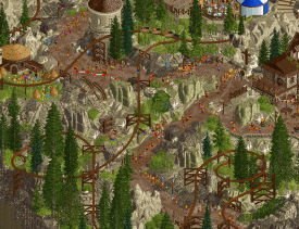
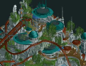
The second matchup of Round 1 sees Kumba's returning Hurricanes face off against RWE's Evergreen Gardeners.

 Lostileth
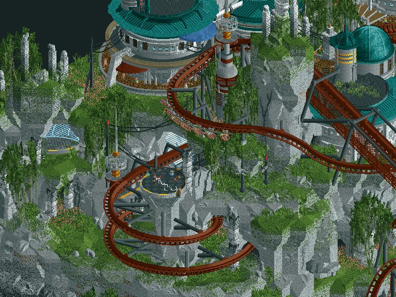
Explore the largest library in the galaxy on the Planet Lostileth in the Outer Rim. Guarded by the Jedi Order, the library is now the target of a secret Sith cult.

 Troubadours et Baladins
-
Voting rules
- The poll will stay open for ~72hrs.
- Do not vote unless you have viewed both parks in-game.
- Everyone may vote except members of either team. Any illegitimate votes will be ignored or removed.
- Anyone with an account that predates the start of H2HX, or who has been drafted onto a team, may vote in this match. Anyone with a newer account must pass the admins' account integrity checks.
- Voting is monitored by the admins to improve fairness.
-

 Sephiroth
Offline
*throws hands up in the air in disbelief*
We're 4 parks in and you people have made enough tiles of content to fill a full-sized map with spotlight-level material, so there's that...
First impression is that the star wars park is a little harder for my eyes to parse the individual shapes/elements/etc, but now I'm laughing to myself because I don't know a lick of whatever language the EG's park is written in so I literally can't read any of the names in that park correctly lol.
Pacing of the hybrid in EG's is a little quick.
Stellar parks, going to have to let these sit, dear lord. Both have a striking amount of verticality and some grandiose set pieces. Both also have the in-game years set to a corresponding calendar year. Both also have a little extra in the zip package. Between all the similarities it's like a "bedroom-park-incident-lite" lol
Again this is ROUND ONE!!!
-

 J K
Offline
Wow what a match, I'm coming back to both parks numerous times to try and make a decision. Both are stacked with content. Great job teams!
-

 Ziscor
Offline
I am so in love with both of these. Currently it is impossible for me to pick one over the other, they're just so polished. You guys have set benchmarks in my eyes for each theme. One might be my favorite representation of a conventional medieval-setting in this game ever, and the other... well I've never seen a Star Wars film and only know a little through internet culture, but I don't need to know jackshit to admire the work gone into this. This is magic and I feel like a kid again. I also really can't appreciate the sound design on both of the maps enough. It's insane to me that this much effort is possible in so little time.
I'll update this post to a proper review as early as I can before my vote. All the best to both parks! What a round.---
Lostileth
Throughout my experience with this map, one thing felt so apparent - there is an insane attention to polish here. As so many have also expressed, the way the rockwork is dealt with, the way the landscape makes way for the architecture to come in, is something I'll be using as reference to learn more often in the future. A little ashamed to say it but I very often mentally process-out any rollercoasters that I see, because it's just something I'm not good with identifying 'good/bad' in. That said, I really admire how well it was integrated into the map. Mad appreciation for how it goes through and around the rockwork, the way it comes through from between that abandoned looking tower-like red structure, and when it dives into that round pit of sorts. That kind of interaction made the environment all around those moments shine and really stay in my mind ever since day 1 of when I say this park.Though it shouldn't have as much emphasis as the rest, I also adore the sound design as I mentioned in my quick impressions. This is the kind of music that can mesmerize someone in the theme, not wanting to leave and to keep exploring. There's individual stuff happening like the whirring spaceship things, the laser shooting sounds here and there, the muffled cantina music (the fact it is a little muffled being what I appreciate most). Although I deeply appreciate the effort that went into the eye-candy, the... ear-candy(?) really deserves appreciation too. <3
The most visually spare area of the map is also not full of stuff to look at either - the center. I have no clue what's going on and why posix needs to examine a rift with some R2D2 clone, but it looks ethereal with the pulsing wave of light moving through that blue gap in the land. Something which adds yet another layer to the map and keeping interest.
Past this (and also before this) I'd only be repeating the same words of appreciation that everyone else has said in much better words. I read through other reviews to read of any small details people mentioned that I possibly missed, so that I could find everything and every reference there might have been. I love the heist angle going on with the library. The way the map is shaped, you naturally end up at the library very soon, and that was a really fun narrative to explore! That said, this is just a map that, even without the Star Wars tag, shines so bright.
It feels unfair to ask for more from a park made in 28 days. This is one of my absolute favourite maps out of H2HX, and the contest has barely even started.
Troubadours et Baladins
I had so much to say about the sound design for Lostileth, but here's the park up against it, doing just as much, and perhaps more, I honestly think, to make this place feel real through music. There's so much individual stuff happening, that with the quality on display, this really comes close to giving off level-from-a-medieval-setting-based-isometric-2D-game-strategy-management-sim-from-the-90s energy. What a terrible phrase, I apologize. But you can hear the ballista going off I think, you hear chains and gears pulling the stuff powering each ride here, you can hear horse carriages individually in each ear, with horse neighs, there's the sounds of chickens, there's little music made by the band near the stairs that lead all the way up to the bridge. There is fanfair from trumpets as something or the other happens (either the jousting, or the parade leading up to the castle? I get so excited every time is goes off again! It's like a victory chime from a game). I just love that aspect, and maybe I'm overreacting but I find both of the parks this round have had a greater impact on me through music than in R1.
When I think of all the things this park could have possibly done to do a medieval theme any better, I draw a blank. What is there is as good as I can currently imagine this type of theme to get. There are nitpicks with everything and so there's always a way to go higher, but the setting is so beautifully realised. Some nuance to the typical medieval theme is always nice to have, so that there's something novel to look at, but Troubadours doesn't bother with it much. It's a park I find to be quite confident in doing this stereotypical theme so well through the level of polish, the hidden details, the cheeky fun stuff, the great answer to "what if this was actually meant to be feasible?" And of course the architecture. I mentioned the animated peeps by MK on Discord but thank you for making them haha, I can not wait to see them add life to so many more parks in the future.So much unique stuff stands out. There's the quarry, there's the burned and blackened house, there's the military camp with the tents, the quest giving tavern area... the little cart that met an accident, the ballista or whatever those are - aiming at the target made above the RMC's track. The bee house with the Nic Cage nod haha. There's the great jousting arena, too, which adds so much to the macro. Why was Kumba sitting underneath a suspiciously extended part of the castl--oh... oh no haha.
If there's one thing I've noticed through each repeated viewing, I think the ambition on this, with the 28 day limit, may have made one angle of the map hurt a little. That one view that's from the castle towards the town. In this angle a few things seem less detailed or touched up, but not at all by a lot. Worth a mention however, because I can only imagine how much you guys must have wished for there to have been more time to touch up more stuff.
---
Despite sitting on my vote for so long, it is still quite difficult to justify one over the other. In the end, I found Troubadours won me over just a little more than Lostileth, and it's a painful decision to have made. Both teams should be so proud of these maps. I hope they are both strongly remembered and brought up in discussion in the future.
-

 Casimir
Offline
This is just a ridiculous amount of polish for a H2H park, on both of them - let alone for Round 1 parks.
In the end, Troubadours was a smidge more captivating for me.
-

 deanosrs
Offline
I actually thought one park was a little better polished (I'll get to that), but both are super impressive for round 1.
28 days is very little time to put together a 60x60 map. I'm super impressed by the 4 maps so far and how much content and polish there is on all of them.
LOSTILETH - THE HURRICANES
Idea/Concept
I've watched the original movies and the prequels, but none of the more recent stuff. I googled "Lostileth star wars" and drew a blank, so when I saw the description on this thread, just below the screenshot, that was incredibly important for me to get the context of the map! I'd have perhaps liked to have known exactly where in the cannon it's set, I'm guessing around the start of Episode 4? The twist of the siths being the ones trying to be sneaky and hidden is a cool idea that we don't see a ton in the films (I think?!)
Execution
The rockwork around the map is beautiful. I have a super sensitive eye on this and I think you guys nailed the balance of how much there is, and the objects and colours you're using. The circular buildings are on-theme and a great concept for round 1 to probably get really nice effects quicker than more complex 1/4 tile shaped efforts.
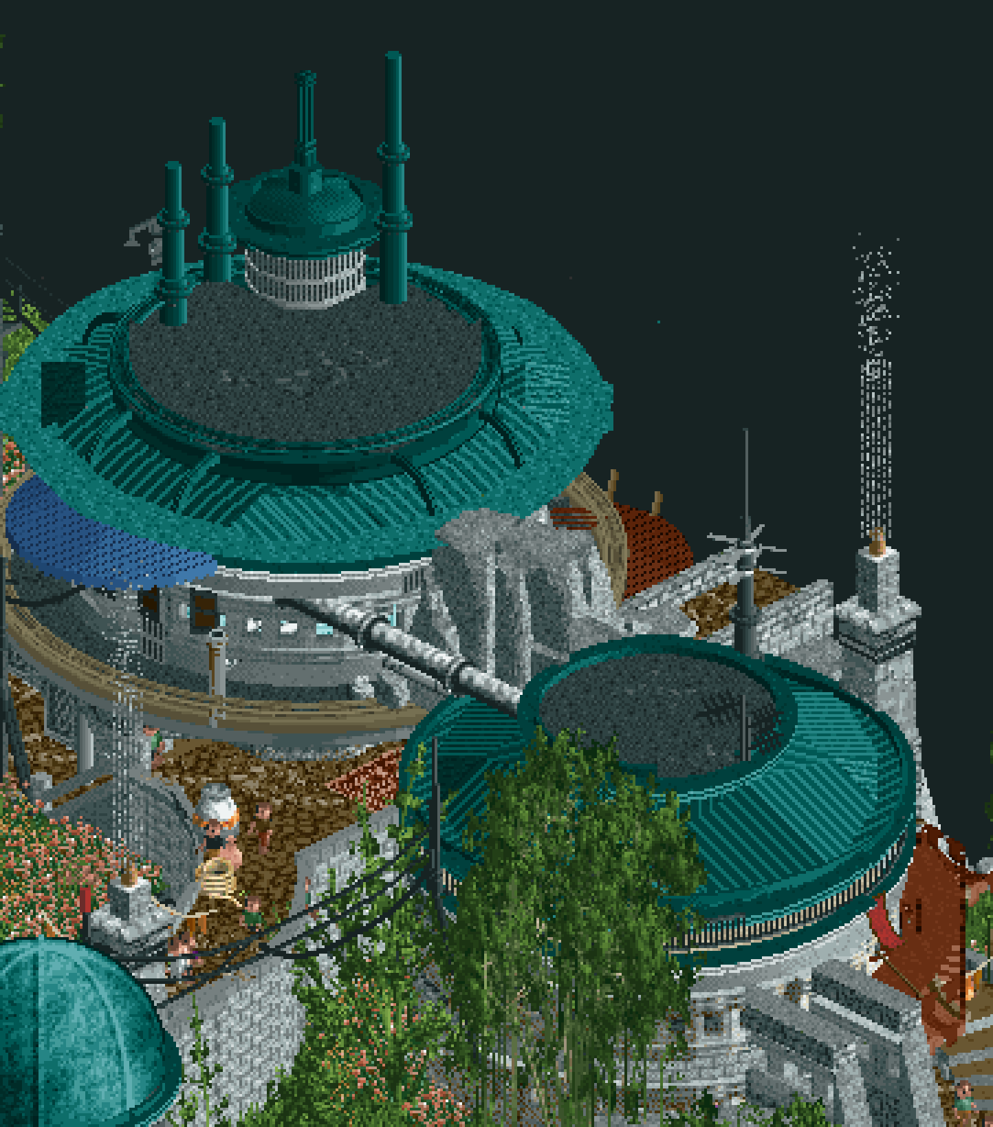
I won't list them all but the map is littered with little scenes and details. This was one of my favourites:
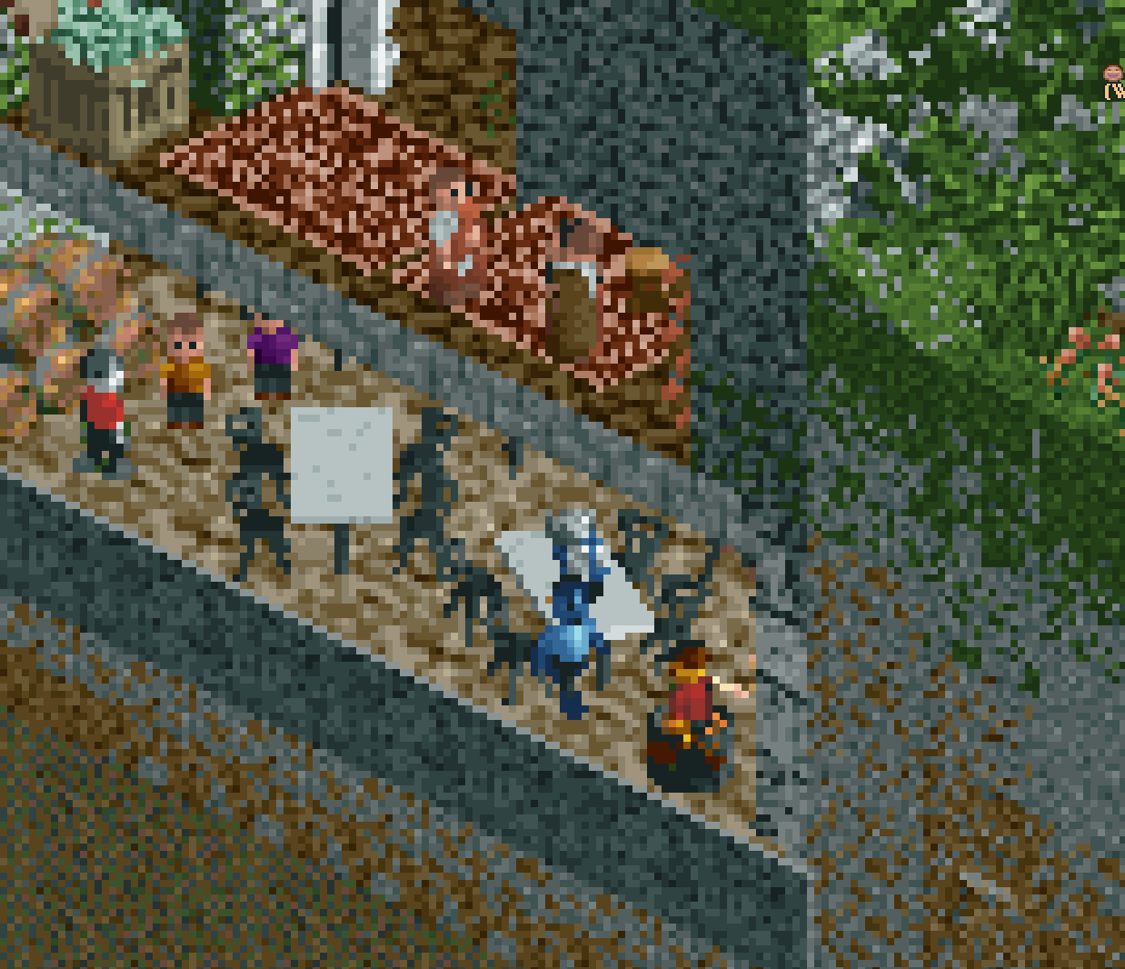
I'm sure this is due to time limitations, but I'd have loved to see a different effect on the map edge other than the standard RCT tile edge. The cutaways (as above) are lovely and help a ton here.
I'm not usually a fan of birds and stuff flying around the map because the isometric view makes it difficult to get a gauge on their height. That said, the West Reach Squadron flying around doing barrel rolls won me over, as did the speedbike chase.
Minideanos comments
"my friend loves star wars. this would be like his favorite park ever"
"wow that ride changes track types, i love the hack!" (Ransack)
"don't they have computers for all those books?"
TROUBADOURS ET BALADINS - EVERGREEN GARDENERS
Idea/Concept
It's a good H2H idea. Medieval stuff is can translate really well into the game, just as it does here. I wonder if it's one idea or twist short of being the kind of idea that can win a match versus the kind of idea that "holds serve" solidly. I don't mind at all the park being in french, but having visited Carcassonne, I can't help but wonder if there was an opportunity to specifically set the park in a beautiful French walled stone city, and take advantage of that theme and the beautiful foliage that could come with it.
Execution
The macro here is really lovely with the castle looking down on the rest of the map. There's some blue around but I'd have liked to have seen more colour maybe.
The micro and specifically the detailed architecture is this park's strength to me:
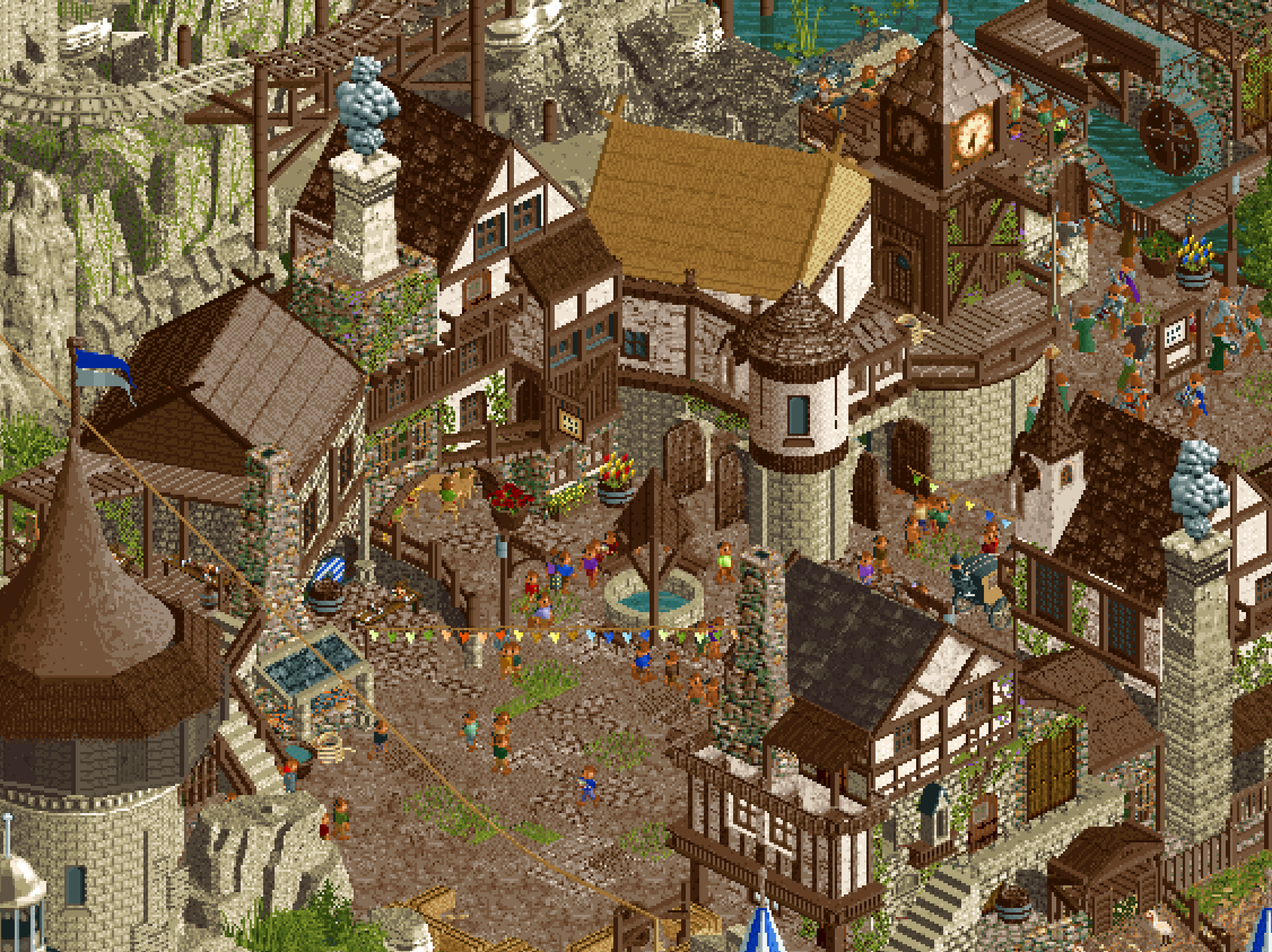
That's beautiful.
The verticality of these arches with the water running below too, wonderful:
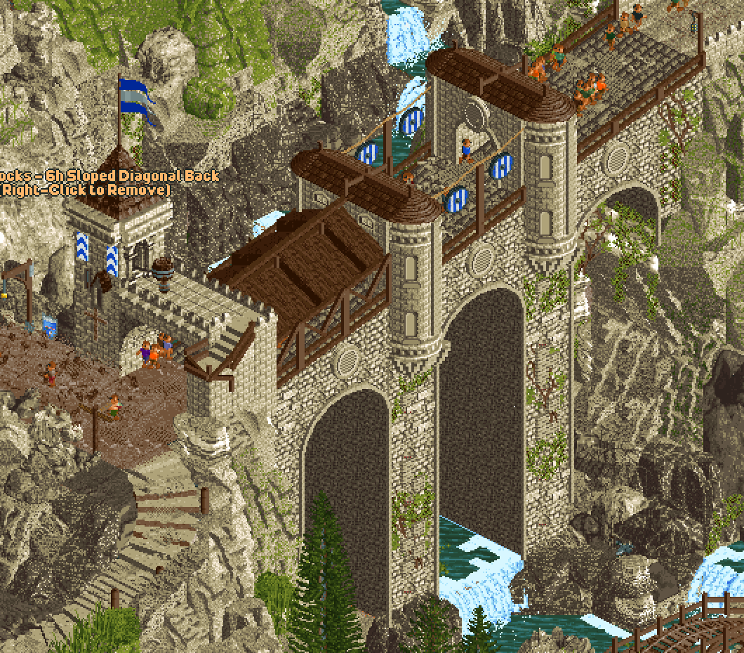
The primary builder does a great job of using crunch around the map too to make every scene look so interesting and detailed. I was really impressed by how many rides you guys were able to fit in.
There were a couple drawbacks to me, and this seems so harsh given it is round 1. But I really want to cast a vote one way or the other, so unavoidably I have to say what feels a touch short too, as ridiculous as it feels doing that with such a huge amount of content in a tiny space of time. The two things for me were the coaster (Montjoie) had some sections that I felt were just too fast for the elements, specifically the angled drop to turn the trains back around over the launch. The rockwork was a little messy in places, specifically in front of the joust.
Minideanos comments
"wow I love that mine train ride"
"that maze is easy i would finish it in like 2 seconds"
"wow that castle is OFF THE CHARTS"
Vote: I went with the Hurricanes. I feel like the extra layer of polish and so many attention grabbing little scenes pushed it over the edge.
-

 Cocoa
Offline
I really loved both parks, quite an excellent and high-atmosphere matchup.
Troubadors felt to me like the original idea was essentially 'renaissance faire' kitsch medieval romanticism, but then got transposed to a pseudo-historical setting. A fun idea for sure and there's some really lovely work here. Buildings scale is a bit inconsistent, and the mountain is a bit of a blob for me. But I love that rising bridge to the castle, and the jousting tournament is awesome. The coaster layout I wanted to like but i couldn't even figure out where it went after the first drop without setting everything invisible and lagging the game to smithereens.
Stars war is to me another tier up in execution. Really some groundbreaking landscaping work, and the architectural forms are really amazing. Is there concept art, or did you dream this up on your own? I truly have not seen architecture integrated into the landscape in this way before, its astounding. The layout is quality, all the spaceships are fun (love the galaxy express xwing idea!), and the rides add motion but don't clutter the park. I really like that you don't have to know the lore at all to like it (I don't know it). The elevated paths with see through awnings over the magical space glowing shit is an awesome piece of composition (getting close to crystals though... I'll allow it!) . For me, I knew immediately. Troubador is certainly an awesome park but this one is truly of the next generation in forms, execution, and overall composition. Hard to overstate how much I enjoyed it, and I hope people will really spend the time understanding how ridiculously hard it is to landscape a park like it was here.
-

 GammaZero
Offline
Part 2: gamma regrets everything
Well great, we're halfway into Round 1 and we already have our first impossible matchup of the contest. I've also realized that there's basically no way I can write that much about every single park and still have time to play RCT and do other things necessary for survival. So, I guess I apologize to the builders that you won't get the absolute walls of text I wrote for R1M1. Anyway, on with the show:
Lostileth
I have to preface this by saying I'm basically a Star Wars noob, so a lot of the lore and references were lost on me. It doesn't matter though, because this map is breathtaking and stands tall on its own right, IP or not! The architecture is slick and does a good job of setting a regional motif, the flyer looks gorgeous and has sublime interaction, and the rockwork is simply stunning.
Of course, the thematic setpieces are that extra layer that ties it all together. The library and archives, the Jedi vs. Sith narrative... One of the highlights for me has to be the the walkways over the rift. Very clever use of "empty" space. If we're still talking about layers, all the neat and funny details all over the park are the cherry on top. Again, I wish I were enough of a Star Wars nerd to understand all of them, but most are simply really cool additions (especially the ships and other vehicles - your CTR Sith lord is putting in the work!).
Finally, I really appreciate how the map composition has all the positives of good traditional(-ish) theme park planning, while still feeling plenty organic and interesting. Phenomenal job!
TL;DR: breathtaking, thematic, stunning landscaping.
Troubadours et Baladins
Putain de merde... This park is simply grandiose. Love the more lighthearted and playful angle on the usual Medieval park. Every ride type was carefully chosen to evoke that "somehow we managed to build a theme park in the Middle Ages" vibe, and I think it works wonders!
I seriously don't know how you guys do it, but this park looks WAY bigger than it actually is. Of course, a big part of it is the elevation (which I'm a sucker for, as mentioned in my last round of reviews). Here, it somehow manages to be even bolder than in Radio Park, and it frames the castle so well.
Despite being mostly geometrical and rectangular in nature, the architecture is still crafted in a way that breaks the grid entirely, leading to a very organic (I know, I love that word) village. The winding path(s) up the mountain also contributes to that. But just going back to the architecture for a second, wow. The detailing and texture work everywhere is insane. Rockwork is also stunning, despite being a little sloppy here and there.
Hey, if the Jazzcats park had no coasters, this one is filled to the brim with them! And they all work really well, in part due to the aforementioned scale of the park. Of course, the eye-catcher has to be the launched RMC (and that cool ballista hack!). Awesome layout, I just wish the pacing was a tiny bit more natural. But, hey, maybe that fits with the narrative; they probably didn't have the coaster design expertise we have now in the 1300s.
In any case, this park is also spectacular! Oh, and bonus points for including the opposing captain literally knee-deep in the mud.
TL;DR: grandiose, humorous, detailed.
Actually, it looks like I wrote just about as much as I did last time. Sigh. Doubly frustrating, though, is that I still can't decide who to vote for! I wasn't kidding when I said this was an impossible matchup. No matter who I go for in the end, though, I still think both teams deserve the utmost appreciation, and I hope this match is a nail-biter until the end. Next time, we're crashing into the scene, stay tuned!
-

 trav
Offline
First of all, 2 brilliant parks. Both are absolutely full of content, both are very meta inline with 2024 objects and vibes, and whilst they are very obviously very different in terms of their theme, they're both actually quite similar parks if you strip it back - a town/village set in some alternative universe/time period that then has rides integrated into it.
Hurricanes
I'll start off by saying I'm not a Star Wars fan. I've only watched the 1st film and a small part of the 2nd film, so a lot of the little references will pass me by. However, Star Wars is so ingrained into pop-culture that I do still recognise an X-Wing when I see one. I also absolutely love Galaxy's Edge and immediately recognised the soundtrack when I opened the park. The theme of little details continues through the map and I definitely missed most of them, but appreciated the reference to blue milk, all the droids walking around and jedi/sith fights across the map.
Landscaping was top tier here, especially in the part of the map that overlooks the water. That's genuinely some of my favourite landscaping I've seen in a long while, I loved the gradual colour change as you go up the cliff and then the green grass on top was done beautifully. It felt realistic, it felt South East Asia, but at the same time it felt alien and abnormal. The coaster interacting with the landscape here is also great, I'm not a massive layout person but this felt well done.
Architecture throughout was great, nothing meta-defining or anything, but the use of curves throughout was good to see. My main issue with the architecture was the overuse of the Roman Balustrade texture. I know it's one of the only curved pieces with actual texture, but I think a few buildings felt weirdly hollow because of this.
I loved how this was basically a modern day equivalent of a 'centre lake' park, but the lake was instead some weird gassy landscape, but it really gave the map room to breathe with nice negative space that was still interesting enough to look at.
The back edge of the map where the library was did feel a little out of place. I like the idea and that it adds a story element to the map, but why was this such a dramatic shift in colour tones? I get that it's trying to portray that it's underground and that the landscape shifts from grey to brown, but I'm not sure that really works in the way it was intended. Instead, to me it just makes it look like a different map. I'm looking through these parks with my girlfriend, and even she made a comment that this section looked more Lord Of The Rings than it did Star Wars. It's a nitpick on what is otherwise a fantastic map though.
My least favourite thing about the map was all of the cutaway scenes on the side of the map. I'm not a big fan of these at the best of times as it makes the map feel cut off and not complete in a way, but there were just too many of them here. It feels weird that so many buildings/scenes would extend to just another tile or 2 away from the current map edge and makes it feel very...theatrical.
My favourite part of the map was definitely the elevated street around the main coaster. Gives major Galaxy's Edge vibes, but the use of elevation here was fantastic, the architecture was clean but rough enough to be believable and I have no idea who Glup Shitto is, but he definitely has a following.
Really solid work and I think this park does get my vote after viewing them both a few times. I'd rate this somewhere between 80% - 85%.
Evergreen Gardeners
This idea is instantly more accessible than Star Wars for me - I understand what a medieval French village should like like, and it's basically just that Roman park from a few H2H's ago but in French. The amount of small details on this map is incredible, and makes it relatively clear who built on this map because it's a major part of their building style. I will say that I think sometimes less is more, and this definitely felt like one of those times. I spent a fair amount of time zoomed in literally as far as I could with 5 pixels on my screen because the amount of content on the screen made it difficult to focus on any one thing. That said, the quality of the details that are there are incredible; the crossbow on top of the coaster, the cup building thing, the details on all of the rides to make them medieval-friendly, all top tier stuff.
The main coaster feels way too fast. The layout could be cool if taken slower, but it crests that 2nd hill at 50mph. The other coaster next to it has a cool adventure vibe, I can imagine having a nicer, calming ride on that.
The landscaping is possibly the weakest area of the park for me; it doesn't hit quite right and I'm not entirely sure why. It feels chaotic and distracting, it's too bright and ends up blending in too much with the castle. This is also the first park I've looked at in a while that has scenery-popping issues. I play on OpenGL so I thought these had all been fixed, but I get quite a lot in the back half of the park on here. I think if the landscape had either been smoother or a darker colour, it would have instantly elevated it for me. It would have been less distracting, acting as the negative space needed to give all the little details room to breathe.
Architecture was great for the most part, especially in the town. The timber framed houses are fantastic and have enough variation in them to give each one of them character and identity. I loved the festival vibes with market stalls and bunting around to add colour to what would otherwise be a very brown village, the splashes of colour really worked well here. The architecture on the castle and the back half of the map maybe wasn't as strong, but I also feel like it wouldn't have ever had as much space to be as strong purely due to how overpowering the landscaping is back here.
My favourite part of the map is definitely the jousting arena and the architecture opposite it. The scale suffers a little here, with some of the buildings feeling quite squat, but overall the details, the colours and the atmosphere is top tier.
It feels a shame to not vote for this, but I think it was just a little too much for me. I'd have appreciated a little less so I could fully take it in. I don't want this to sound negative, as I still think this is a fantastic piece of RCT and to pull it together so quickly is incredible. I think I'd vote this somewhere between 75% - 80%.
-

 MrTycoonCoaster
Offline
Gezz!!! I had to see two impressive works over and over again. I also searched the Internet to understand the themes and I wonder where you get these incredible ideas from.There's no need to talk about atmosphere, colors, buildings, details, because both parks are perfect for me.I'm not an expert, I mean, yes I saw some things maybe a little out of place, but the detailed work is so incredible, it covers the small flaws. (I speak in a humble way, I can't even do it)It was difficult to choose 1 map to vote, both magnificent.Congratulations guys
-
 Ulvenwood
Offline
LOSTILETH
The towers, the pathways, the circular archi (although some unpolished roofs), the coaster, but above all, the landscaping, everything looks sick in this park. The rockwork gradients work really well, and I like how the coaster interacts with them and interacts with the red tower in the middle. The Banshee station is my favourite piece of architecture on the map. Some very nice keyholes on this coaster as well. On two of the four available angles it can sometimes be hard to get a grasp of the verticality and layers in the park. Sometimes there are a few glitches happening as well, and I don't really like the map edge, but these minor drawbacks are understandable for a R1 park.
I think the park is great, plenty of details and a cool ride line-up. The cut-aways and other micro details add a lot for me as well, as I am not too familiar with the subject matter. It is quite insane how, presumably, many hours of detailing have gone into this piece. Would definitely visit again!
TROUBADOURS ET BALADINS
Le Roy est mort! Est-il vraiment mort ? J'espère que non. La compagnie de mandrin est une balade tellement mignonne que j'aimerais l'embrasser. Le trajet en trébuchet est également très cool et bien réalisé, même si, comme certains l'ont souligné, il peut parfois être difficile à suivre. Il y a beaucoup de beaux bâtiments de village à admirer ici, et vous pouvez voir que beaucoup de réflexion a été menée pour détailler les bâtiments et donner à chacun d'entre eux une certaine fonction.C'est peut-être un peu dommage que la majeure partie du parc soit grise ou brune. Un autre problème est que les objets de la tente semblent un peu trop plastiques, si cela a du sens.
Two great parks! I will sit on it for a while. Je n'ai pas encore pris ma décision. Good luck! Bonne chance! -

 dr dirt
Offline
Lostileth:
Star Wars... love Star Wars. Adventurous landscape; love the Jedi enclave - great and accurate library. Cool Sith cutscenes.. nice little scenes sprinkled in. Curved architecture is working... cohesive colors/textures... good. Flyer is fun - love the raven turn over the water & pacing there. The lower layer is cool. Lots of movement. Lots of movement throughout - ceiling fans are working. Spaceships are great - love the almost repair/garage feel in some spots. Like the little spots of grass in the cliffs... maybe the landscape could be a little less greebled, a little more clear. Strong all around. Only a few spots of awkwardness not worth mentioning. I'll have to read up on what Lostileth is...
Troubadours et Baladins:
Medieval, French? Distinct architecture. Lots of people, lots of life. Bridge, like the bridge. Beautiful bridge. Giant windmill with swings: how the hell is that held up on that little foundation? A bit disproportioned. Beer mug is so cool, but breaks the illusion of a real environment due to proportion. Love the rides. RMC is wild. Trebuchet-inspired? Mine carts sort of go through land randomly at one spot... I think. Landscape also greebly here.. Some coloring and forms of them less-than-ideal, IMO. Love the maze; great outskirts feature there. A bit heavy-handed on trims for my taste, but still good. Grey in palette looks a little... shiny? (almost). Love buildings inside the castle, castle's great. Atmosphere a mix of fun and feeling real. Overall, enjoyed it. Fun.
-

 wheres_walto
Offline
Lostileth - I'm not a big Game of Thrones guy but a google search suggests that this is an original creation within an existing IP universe. I'm most struck by the architectural forms and themed dark rides. Really nice stuff
Troubadours - this is easily the best depiction of a medieval village I can recall seeing in rct. Please get someone else to do the windmill for you next time because it's distracting. That's the only negative, I love the architecture and setting, the castle atop the mountain is just so good
Very interesting that these two parks fall under high fantasy: one in the future, one in the past. It took two viewings, but I went with the medieval one
-

 Luketh
Offline
A bang-up, knock-down matchup in R1M2. Both teams throwing heaters with well-beloved themes - Star Wars sci-fi versus medieval revelry.
It's a tough vote. In common between these parks is use of sound, atmosphere and rocky cliffs. Grey rocks versus beige rocks.
Jousting knights versus jedi knights.
How am I supposed to vote? I'll have to sleep on it and decide tomorrow.
-

 Scoop
Offline
Match 2 Here we go!
Troubadours et Baladins:
First off The macro of this park is wild. I love how imposing the castle is on top of the built out cliff. the path leading up is really nice too doesn't feel like a means to get to the castle since there is so much context. It feels so alive as well, the music really captures the vibe you were going for and all the kinetic motion really helps the atmosphere shine. While we have seen this style of building I don't think I can remember the last time we've seen it on this scale or execution. So many awesome details to find. My favorite of which being the synchronized launch on the RMC with the arrow. Speaking of the RMC it's definitely a bit too fast paced in spots, but I think for the most part the interaction make up for it. A couple of the rides didn't make too much sense too me as well, namely the swing ride in front of the cathedral. It feels very forced to me and would have worked better maybe integrated into the church rather than an attachment to the church if that makes sense. The other ride(s) I was thinking of is the small drop tower and frog hopper. I would've stuck with the drop tower just because it looks like a larger version of the frog hopper, which in turn makes it feel a little redundant. The landscaping is also pretty immaculate for the most part. There are some stand out lotr rocks here and there, but it mostly gets the job done I think. Fantastic job Gardeners. If this is what you're offering for round one I can't wait to see what else is in store for later rounds!
Now for some fun little bits.
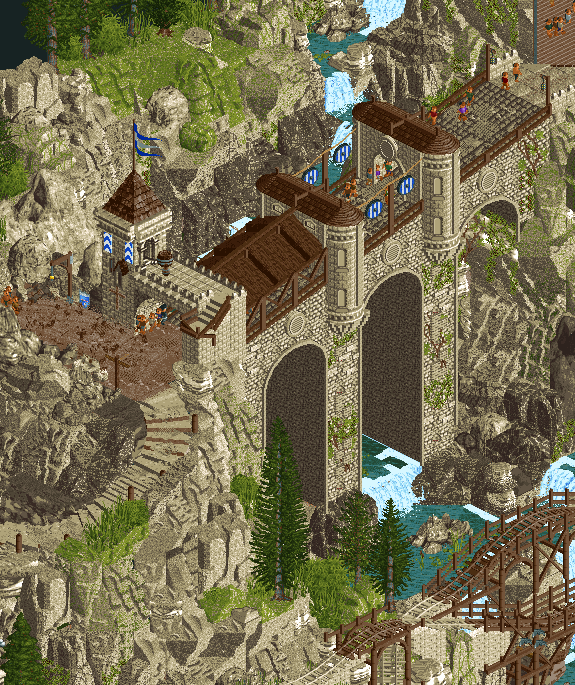
I love this bridge. So Imposing and the gradual slop is a great touch.
This interaction is so good. Nice little sculpture too.
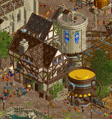
I love all of these small scenes
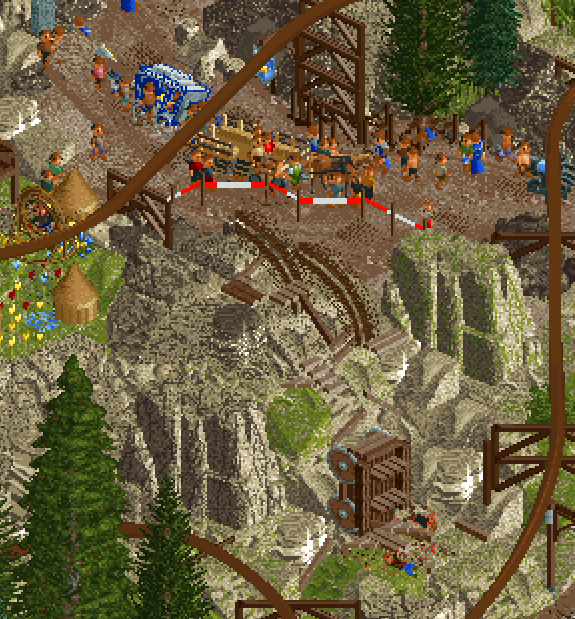
Uh Oh... Stinky.
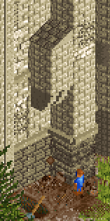
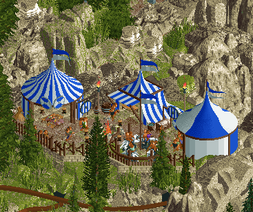
I love this tent grouping as well.
Lostileth:
Okay... I don't care for Star Wars
That being said it doesn't matter, because you don't have to like or understand it to enjoy this map. The colors and setting is so cool. Another map that has plenty to look at and keeps you sucked in for plenty of time. The Architecture is stunning and I like how it's clean but feels lived in at the same time. The fissures in the central area of the map is super well done and feels fresh. The flying coaster layout is probably the best one we've seen so far this contest (still so much to go lol) It's a pretty standard flyer but what it does it does well. Not to mention the interaction with it is amazing also. Hugs the terrain in all the right ways. The dive out of the beige tower down to the water is one of the highlights for me. Also What a great way to do waves crashing. There are a few points of contention for me. The forms of the rock work are great, but it does feel very repetitive at times. I understand that it's supposed to feel carved to some degree but I think some of the rock work could have been mixed up a bit better while still maintaining the clean aesthetic. The library is also really cool, but it kind of leaves me wanting a bit more perhaps? The spinning coaster feels a bit like an after thought and probably isn't needed. I think if the park were more of a 50/50 split of the lostileth architecture and library then it would feel a bit more balanced. I do also see that the library is about the same amount of tiles as the waterfront so maybe that's not true. (I'm shrugging on my end) Either way. This is still a fantastic map and the builders should be proud no matter the outcome.
Here are some more tidbits that I found cool.
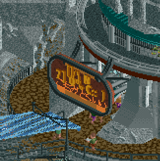
This sign is wonderfull! such a wild style.
As mentioned earlier this tower is one of the highlights for me.
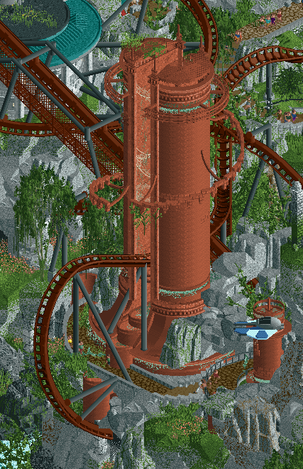
Such a vibe.
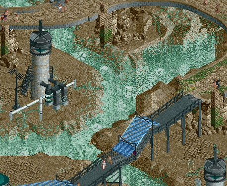
The layering of this architecture with the landscaping and coaster is just inspiring!
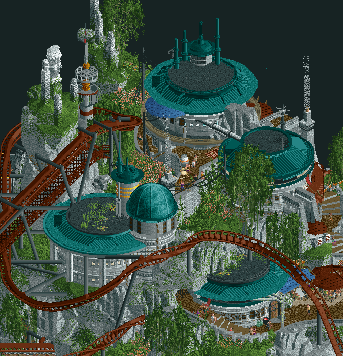
All in all another fantastic match. And while I have warmed up to lostileth after the initial shock of it being a Star Wars Park (shouldn't be a factor in anyone's voting process) I am going with the evergreen gardeners one this one. I preferred the overall atmosphere and macro of this park just a little more.
-

 alex
Offline
Troubadour
I’m always a fan of these simple and unpretentious themes: an amusement park but it’s in medieval France. It reminds me a lot of Forum Celeste for that reason, in a good way. A concept like this invites you to look for details in a kind of “I wonder how this works with the technology of the day” way, and then you find cool stuff like a horse-drawn cart bringing the ride cars of “la Complainte de Mandrin” back up to the top. This was probably my favourite area actually - the landscaping underneath is spectacular:The main drawback for me was that it had a very definite ‘front’ and ‘back’ view, and I think it could have been more beautiful if you composed it with the castle on a hill in the centre of the park with the path spiralling downwards and gradually becoming town. I also think more dynamics in terms of building size in the town itself might have helped. Except for the Jousting arena, all the buildings were more or less the same size and I found it lacked some focal points.
Still, fantastic job.
Lostileth
The theme is less to my personal taste but that doesn’t stop me enjoying this on a purely aesthetic level - it’s beautiful and quite cutting edge in terms of landscaping and architecture work. The monumental (ancient?) structures in particular were quite spectacular and merged with the landscape in a novel way. Though my favourite archy/landscape combo was this corner with all the different tiers:The only weak point for me was the main coaster - I just think it looked quite stretched out in places (after the cobra roll and before the final dive loop for example).
-
It was a tough call but I'm going with Lostileth because I think it had the edge over Troubadour in terms of map composition, how vertical space was used and the different viewpoints considered. It also felt like there was more to explore, not because there was necessarily, but because the landscape invited it more successfully with all the different levels and nooks and crannies.
-

 In:Cities
Offline
I should probably start reviewing parks.
Another incredibly tough matchup between two spectacular maps. You guys certainly are not making this easy for us as voters!
Lost Lilith
There is so much to explore here, it's almost deceiving at first glance. Rockwork and overall landscaping is so well done throughout. Probably the highlight of the map for me. I particularly like the gradient treatment on the rock caves along the shoreline. The waves add a ton of dynamics here, along with the speedbike chase. I really love the landing pads with spaceships on them - helps to set the scene of the entire map! From an overall perspective, the center of the map is one of my favorite spots. The relatively empty space does wonders for the map composition and really allows the landscaping to feel that much more effective. Without trying to be too nitpicky, because I know this is a finished product and the builders are not looking for feedback; I would personally have changed the ground color that lies underneath the elevated paths. When looking at the map as a whole, they tend to blend together slightly. I think something as simple as lightening the sand, but darkening specific sections that fall beneath the elevated paths to represent shadows would have gone a long way in providing that contrast. But again, that's not something that affects how I think about this map haha. The architecture is fantastic, and really feels appropriate for this theme. Favorite structure is the tall red thing that the coaster goes through, and that massive gate thing at the back of the map that leads to the archives. Sound design is also something that really helps to elevate this map.
Great work team - this is a spectacular round 1 map.
Medieval Action Park
You guys are making this vote extraordinarily tough, because for as much as I love the Star Wars park for specific reasons, I also love this park for wholly different reasons haha. You bastards built an action park without me, and it's so much better than what I could do with this theme. This map is absolutely packed full of content, and there's new things to discover at every turn. I literally opened the map and just stared at it in one view for quite some time - so much to take in. The audio design is superb here. (waterfall noise as you get near the falls, etc) There's an incredible amount of rides and movement. Overall, this map feels extraordinarily refine and polished at a ground level - the ride design and architecture is super unique, varied, but yet cohesive. Without nitpicking too much, the only thing I would have loved to see differently is a slightly better macro plan. I like the village at the lower level with a winding road leading up to the castle - thematically it's spot on. But the landscaping feels a little to over-reliant on the fisch rocks in some spots to the point where it feels a little harder to decipher in bits. That said, it's not a dealbreaker for me by any means. For a round 1 park, there's absolutely no denying the insane quality you guys have managed to achieve. The mining/quarry ride is so unique - I love the bridge over the falls. The spinny ride thing next to the wheat fields is probably my favorite of the flat rides. And of course the bees. That little slide from the restaurant patio down to the path below is so good haha. One thing that really stands out as well crafted to me is the path of water in this map. Following it from the top of the mountain down the falls, through the water wheels and into the city canal and into rapids is brilliant and a testament to your skill as planners. I'll be coming back to visit this one a lot!
In the end, I had to vote with the park that appealed to me the most. Which is hard, because both of these maps are successful in that regard. Vote went to the medieval garden boys by a slight margin. Incredible work, truly.
-

 FredD
Offline
Lostileth
As a sucker for Star Wars, immediately delighted by being welcomed by the Cantina music. Holy shit, this park is so good! Absolutely love the SW vibe you guys portrayed so well. This whole map is full of interesting shapes, in the forms of flowy mulitleveled paths, buildings and architecture. The landscaping & foliaging is amazing... I'd even say it comes near perfection.
Love Banshee. Implemented so well in its environment, such great interaction and the lay-out is ace! Also love the addition of the darkride. Overall there's so much to love in this park, so much content, so much details. My favorites: Veritas Tower, the Rocks opening up to the library, the cracked earth paths with glowy fog coming out, all the cut-outs with details, the cool ships like the X Wing and broken Tie Fighter...
Amazing work, simply amazing. Wow!
Troubadours et Baladins
As much as a sucker for Star Wars, I'm also a sucker for history and historical parks. And wow, can't believe this... This must be the very best portrayal of the Middle Ages into RCT ever. Period. It is so immersive, so full of stuff and details. Let me say the added custom music is fantastic and together with all the added noises, it makes this map come alive and letting me feel like I'm truely in a medieval village.
The placement of that castle is so good, up that amazing hill. Great way also to show how the ruling class put them above the common people. Also great landscaping here. The star of the castle is without a doubt that magnificent bridge. And there's just so much to see, I can keep looking at the park and it feels like I keep discovering new stuff. All those details and custom rides are so great.
One point of critique: the pace of the RMC is way too high haha, even for me who likes pacy coasters. Lay-out however, fantastic. I assume it was alright without the added weight of peeps?! Could've played a bit with the train mass or add some hidden trim brakes
 I also loved the mine train coaster and how it is placed on that mountain hill, just so clever use of that space.
 I can keep going but yeah... just absolutely love it.
Both parks amazed me, both hugely impressive and I really doubted to null vote because both these parks deserve to win. It's a shame only one can win... After a night of sleep I did come to chose who to vote for. I can not imagine this won't be a close match-up. One team might lose this but both are winners and both parks are to be immensively proud off by those who built it!
-

 Steve
Offline
Now that I've been absolutely obliterated by alex in a contest for what feels like the seventh time, you guys luck out: any and all motivation has been shifted from building to more reviews (just kidding, I am now out for blood and I have receipts of all fifty-fucking-something of you that wronged me)! It's all good though; this is what you nerds want anyway. I think? Am I already losing my touch with only two reviews into the contest? Wait. No, Steve. No rhetorical questions. You're better than that! Wait, have I gone from asking questions to myself to just outright talking to myself, now? Oh, I'm doing both. Well, someone has to read these things so it might as well be me.
It's been about, what, since Kumba went on the meds that he last captained, right? Man. I've be waiting for this moment: to rip his team a new one in one of my reviews (I'm not saying he built on this, so this isn't speculation all right, Liam?). I mean I'm sure I ripped him a new one on one of his parks that he did in H2H9 or something. What did Kumba build last time again (burn!)? Doesn't matter, let's talk about this Star Wars map because sweet tapdancing Christ this is so rad. Shane is right: the rockwork here is absolutely bananas. Instant nut. The gradient from grass to stone is just so good I'm going to straight-up skip the euphemism and kiss the chef myself directly on the mouth. I hope it's Xtreme. I mean, what. Anyway. It's just an incredible piece of world building - entirely convincing to where you can believe it's rooted in the Star Wars canon without needing much context like Galaxy's Edge in the Disney Parks. It's incredibly accessible, which I think was the right move as to not alienate (good one, Steve!) the viewers. Basically, I want to play this level as Cal in Fallen Order and force push a bunch of dudes off a cliff.
RWE's first swing as a captain with his Evergreen Gardeners from H2HBenign (that's a joke about H2H Classic being lesser than H2H9, try and keep up, gang). I can't begrudge RWE as a captain too much here; he's picked the dynamic duo of Xtreve in mock drafts far too often for me to dunk on him like my toddler dunks an Oreo in her milk, and she goes hard on the dunking. Milk on the fingies and everything. It's a mess. Am I alluding to RWE being a mess of a captain? It seems like it. The analogy kind of got away from me a little. My usual pithy indifference to not landing jokes usually makes up for it. Does it make up for this park from Team RWE? Eh, I mean, maybe! There's some things to like here: the overall atmosphere, some of the architecture, the kinetics of all the little scenes moving around, the jousting, etc. The music though! Such ambiance! It's like I'm at fucking King Richard's Faire and I'm here for it. What's up with the coaster, though, dudes? Is Fred on this team? Did Fred build on this? Genuinely asking because I can't remember. The little mine train cart ride was fucking cute though. And the royal cavalcade coming down from the castle was a nice touch, too. It feels like a great bit of world building in the same sense as your opponents, basically, it's just a shame it had to go up against some of the best landscaping we've seen in a fucking while. Also, speaking of landscaping: can people start using the right shade of aqua for waterfalls before I have a goddamn aneurism because I'd like to live to see the next round, please. OK? OK, fabulous.
-

 chorkiel
Offline
Hurricanes, you've come far since the last time you did a Star Wars park in H2H. And so did I, because this time I've seen and like Star Wars! Didn't read every reviews but I don't think I have many new things to add. The park itself is outright gorgeous. The landscaping and architecture are just great. The spaceships add a lot of liveliness to the map. But what I'm most impressed with is that it's a believable addition to the Star Wars Canon. Well done!
Troubadours et Baladins was a charming little medieval town. It was so hectic and messy but also very legible. Well done! Reminded me of Forum Caeleste in the best way. I agree with Walt that the windmill was distracting in a bad way, which is one of the few negative things I could say about this park. Maybe it would've been better to stand still as the map wouldn't have been the same without a windmill either.
Both great parks and a very tough matchup. Thank you both!

 Tags
Tags
- No Tags
