Head-2-Head-X / H2HX: Round Robin - R1M1 - Dambusters vs Jazzcats
-
 28-April 24
-

 spacek531
Offline
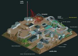
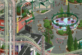
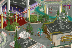
Radio Park Tbilisi:
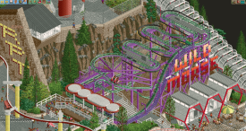
+ Cool brutalist architecture and rides. This does feel like a soviet/ex-soviet park
+ The height differences are extreme and good.
- Not really a fan of the alex H2H palettes. It was one of the reasons I liked Fiera Del Flamengo so much.
- It felt like it didn't have enough room.
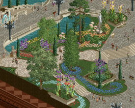
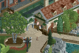
The Royal Institute of Extraordinary Biota:
+ It was awesome seeing the hedge maze come together under Steve's hands.
+ Tolsimir's buildings are top-notch, and Monsterbux did a fantastic job on the wooden frame.
- There weren't enough tranquil gardens.
- Ride control system for the swan boats is anachronistic. Very post-1960 for a 1920s park. -

 Turtle
Offline
i'd be very interested to see how this score stacks up related to other parks. 74% feels really low for the skill level on show in this park. but i guess you kinda have to score it within the frame of being an H2H park. still, i loved this park and theme a lot and it's one i'll keep coming back to. (Biota)
-
 Maverix
Offline
Well I'm late to the review party, but better late than never!
Radio Park Tbilisi
- It shouldn't be a surprise that this is right up my alley. A realistic park set in an unusual setting based on a real place? Yes please.
- Racing coasters had a great layout, definitely Japanese Jet Coaster inspired, which makes sense given the location, and works really well.
- Flat rides are done very well all around
- Log flume I see some Tokyo Dome insperation on the first big drop with the path

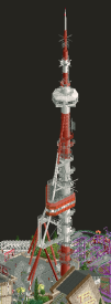
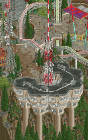
- Unique but clean architecture, and the radio building and tower themselves are fantastic.
Overall really love how this looks as a whole and lots of fun details to explore.
The Royal Institute of Extraordinary Biota
- I feel like a non ride centered park going up against a ride centered park is almost always at a disadvantage and sadly that looks like what happened here looking at the votes, but that doesn't take away from this being a beautiful peice of RCT.
- This may be the most lovely quant RCT I can remember seeing. I think that's because it feels like there are no sharp edges. The park isn't necessarily off-grid everywhere, but it flows with it.
- The double decker carousel is fantastic, and is the swan boats. They feel perfectly at home.
- The greenhouse has beautiful glass work.
- The side edging is great and super well done, but I think would have worked even better if you didn't do the typical RCT "path ends to imply more off map" thing. It feels so desperately like it wants to be a stand alone diorama, but the harsh edges at the map edge contrast with the flowing nature of the park itself.
Overall my vote went to the amusement park (shocker), but these are both fantasic peices of RCT! Great job to both teams!
-
 Mr.Brightside711
Offline
I'll get right to it. As of round 2, Radio Park is my favorite park of H2HX so far (besides my park haha). I'm a slut for realism and just straight up theme parks in general so this park almost feels like it was made for my vote. Thankfully I couldn't because I would have. Heres stuff I loved:
Wild Morse. Great pun.
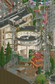
The big tower. So clean and visually stunning.
AM/FM. These are my favorite coasters of round 1. Pacing over some hills are a bit fast and I wish the race was closer more often but still, such a fantastic ride to have in a great park.
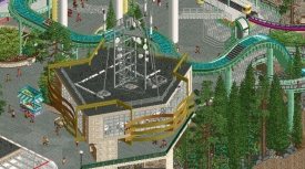
This building... Obviously
Love the sides on this one:
This whole area, and the flag mural. (see attachment)
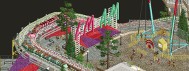
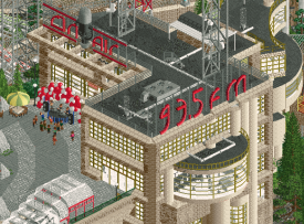
The roof signs are amazing
This slingshot ride.
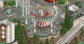
And finally the support intergration into the merry go round.
Overall, such a great park. Great job busting that dam.
-

 alex
Offline
Thanks for the comments and reviews everyone. I'm very grateful to you all for you taking the time to write <3
---
Jazzcats - loved your park and the bold direction you took. These were the main highlights for me:
This little off-map bleed is a very cool touch, and the general path composition around this water feature is great:
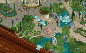
It's already got a lot of attention but deservedly so, amazing curves in the swan ride area:
I love this understated train station design. Best architecture on the map possibly:
Beautiful work guys.
---
a little background info on our park -
The concept came out of my desire to make a relatively straightforward amusement park in H2H, but make it less straightforward through the execution. I was keen to do something that had dramatic elevation changes that would give a multi-layered quality to the architecture and ride design. On top of that I wanted to capture a feeling of classic Rollercoaster Tycoon ride spaghetti, but in a realistic and aesthetically pleasing way.
The 'radio' theme and setting were secondary to all this, but served my intentions well since: it works with elevation since radio towers are typically on a hill; it gives an opportunity for some infrastructural set-pieces like the main tower and antennae farm; it gives plenty of scope for the ride theming and narrative details. Tbilisi as a setting is also incidental but works: it has a cool looking radio tower on a mountain with an amusement park next to it.
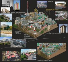
Some reference images:
Daidasaurus at Expoland - I've always had an itch to make something similar looking with how expansive and on-top of everything it looks:

I was also inspired by the look of this ride spaghetti at another (former) Japanese park - TamaTech:
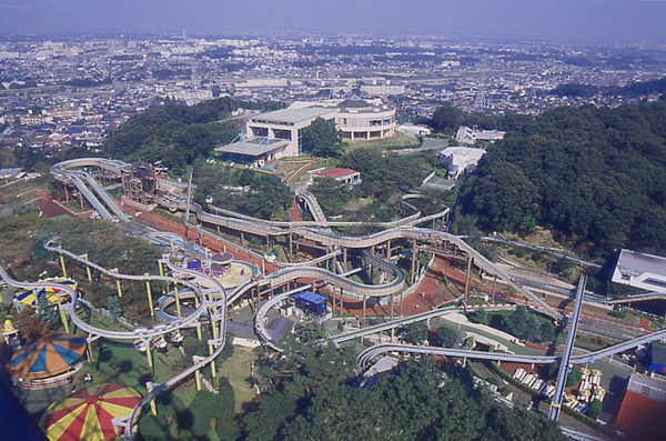
Via Liam - long escalators and elevation at Ocean Park:

Tibidabo in Barcelona - hill-top park which making use of stacked terraces/multi-layers:

Antenna farms:

Here is an early plan - Liam correctly pointed out that it's much too flat:
Later plan:
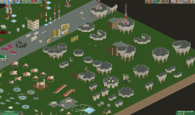
Here is a window into my process (with main feature architecture at least) - I do a lot of off-map copy and paste iterations like this:
Oftentimes I will make a module without actually knowing how the final form will come together, then I rotate it and paste and go from there. It's quite a fun, low-stakes way to work. Just messing around and seeing what happens.
Now i'll point out some highlights of Ulvenwood and Roygbiv's work - a lot of it is general detail and polishing stuff mixed across the map which is hard to do justice with a dot-map.
RGB made this great building next to the tower - Ulv came up with the 'On Air' mic sign and made the DJ booth:
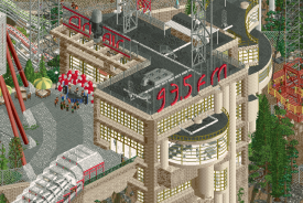
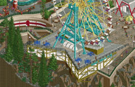
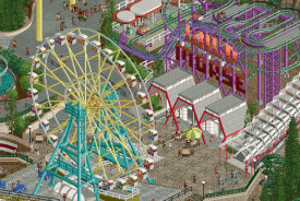
RGB made this ferris wheel & supports, the cool honeycomb building and the Georgia flag mural (just off to the left). Ulvenwood did the Wild Mouse, supports, sign (and of course brilliantly named it Wild Morse):
Great final detail ideas to elevate the park, from Ulv (macaroni sign) and RGB (Heart photo-op):
RGB did a tonne of rooftop detail and texture across the map, the buildings here are a good example of it. Ulv made a cool space backdrop for the playground
Ulv made this Fryquency truck and 5G Protestors scene:
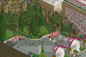
They were both great collaborators for me because I'm not the best at small scenes and narrative details and this is where they both excel. I'm aware that I'm also not the easiest to work with because I will have a strong vision in my mind, work quite free-flow without communicating or delegating particularly well, and on top of that I have quite high standards XD. So thanks a lot to them for their work and to the rest of the team for their input along the way.
-

 Hex
Offline
The Royal Institute of Extraordinary Biota:This polished of an execution? In R1M1? What?! And those hedges? Get out of here... What an absolutely beautiful set of new pieces to work with.I really love the NCSO inspiration of Ferris Wheel architecture. I saw that they were scenery pieces, but still, this gives me plenty of ideas...The foliage and the pathing are the highest strengths in here in my opinion. I love all the little step-downs and slants; it would be super fun to explore this place irl.Not every park needs a coaster, and Biota definitely has good moments of movement, but I feel like this style lends itself to need so much space. Thus, my biggest problem with the park is that I wanted more. To me, it didn't feel like an H2H contender, but I'd kill to see a full-fledged map in this style.-----Radio Park TbilisiWhat a fun take on brutalism. I had to look up if this place was legit and to no surprise, it's in the Caucasus. I knew from the start that Alex had something to do with this, given his run through the previous Grand Tour.If you know me, you know that interaction is my most favorite thing to see in this game; this park has no shortage of it. Soooo many nooks and crannies, plenty of legible overlap - that's what I love.I think the biggest downside to me was while the radio towers were excellent, they blocked a lot of viewpoints from certain angles.It's so fun to see what I think is incredibly ugly architecture (in the best way, the way that we find Pugs and Bulldogs adorable) in such a fun, colorful, and inventive execution.-----My vote goes to The Dambusters.
 -

 WhosLeon
Offline
Radio Park Tbilisi
instantly saw it was an alex park upon clicking the preview screenshot. a scary sight being the opponent...
+ the architecture is fantastic, it feels like a level above the previous soviet stuff you did a couple of years ago now? highlight is definitely the honeycomb-ish building with the radio tower on the roof. impeccable
+ The vertical layering is also really well done, sometimes bordering mega park vibes but just staying in the green zone. the entire composition feels extremely intentional and precise as we are used to from you and its perfectly fit for a concept like this
+ great rides, arguably the most memorable headlining coaster of H2H thus far
+ the soviet mosaics
+ fun ride design as well as good naming
- i find it hard to think of any real negatives on this map. for what it aims to be its executed close to flawlessly. if i had to name something i'd say that i would've liked to see a bit more national identity on the map, as georgia has a lot of other styles and flavors to offer that would've been interesting to throw into the mix, i think
again, congrats on the win and great job to all builders involved
-

 Ethan
Offline
Radio park
From the overview, the radio towers and rides have this intricate skeletal-ness. The ride design leaves an exciting first impression. The bulky duelling coaster knits the patchwork excellently. The support and structural connectivity are highly commendable, especially under contest pressure and trials of team coordination. The architecture is inspiring because the brutalism here feels futuristic, rather than dystopian. It’s a unique take on that style, where drabness is often central. This park has a surplus of colours and lush greens and the reds and purples are lovely. The rudimentary theme concept translated to a park is brilliant and effective. The theme concept has provided a wide variety of excellent content as well.
Botanical
Another round-one park that makes a great first impression with a striking overview. The Jazzcats provide a more fantastical light yet within the realm of plausible realism. That's the beauty of the contest. The whimsical map-edge and flower arrangements create a magic aura. The set pieces throughout the institute are considerate of the relative impact they have on one another. The paths and swirling hedges connect the motifs nicely. The composition is very musical. -

 Turtle
Offline
i'd like to point out some of the little things in a park that i think i loved a bit more than consensus... i was very close to voting Biota here, and think this park (while perhaps comparatively light on content) is skill-level up there with any park this season so far.
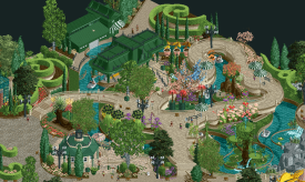
i don't think people realize how hard it is to combine all these colors together in a tight area and not have it look completely shit
this little corner of the building is so believable for me - wall colors, door, cracked wall, the sign... everything perfectly placed
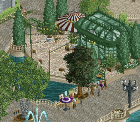
i mentioned this area before but goddamn... this is exactly right. the lights over the path spreading out, the painters on the bridge, the color of the greenhouse, the awning, the fans inside the greenhouse... it screams Little Parisian Cafe in a Park to me
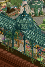
again, the colors... the dark green is spot on for the structure (and throughout the park) - it's a color i don't use much, and i want to, so badly. in fact the dome is absolutely magnificent, again, very understated but the effect is perfect. easy to view, hard to master
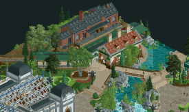
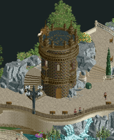
it would be easy for this building to stand out in a bad way, it's so different from the rest of the park in terms of materials.. but it feels exactly like something you'd find as a historical marker in a forgotten corner of a park
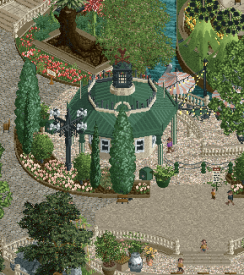
while we're talking understated, the skill level to make something this small and intricate with this many angles and have it feel realistic... goddamn.
overall this whole park felt like it popped into being fully formed, nothing felt out of place or strange or sloppy. a real achievement.
-
 Jappy
Offline
Alrighty, time for Jappy's bitz reviews to commence and finally leave some thoughts here.
Botanical Gardens:
Vibes everywhere! Love it so much. Archy is on point, foliage and pathig are next level here. And that park edge..... Wow. Only wished there was maybe just that little bit more movement? Especially around the main big Darwin building. Absolutely gorgeous nonetheless.
Tblisi
Strange idea, but those work wonders in H2H and this is no exeption! You managed to make a very ugly style or archy look appealing and that's an impressive feat. While it may be cramped, it does force the viewer to take its time looking around. Overall a great park.
-

 CedarPoint6
Offline
Here are video reviews of both parks:
Extraordinary Biota:
Radio Park:
It's no secret that I love the premise and style of Radio Park-- it may be my favorite park of the contest still at the time of this writing (after R3). Wonderful job.
-

 Gustav Goblin
Offline
I'm not surprised. I remember one of my first impressions of Radio Park was Alex does CP6.
 Tags
Tags
- No Tags
