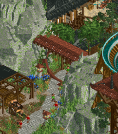
The Grand Tour '23 / The Grand Tour '23 - Grand Final Voting
-
 21-December 23
-
 Xtreme97
Online
Grand Final
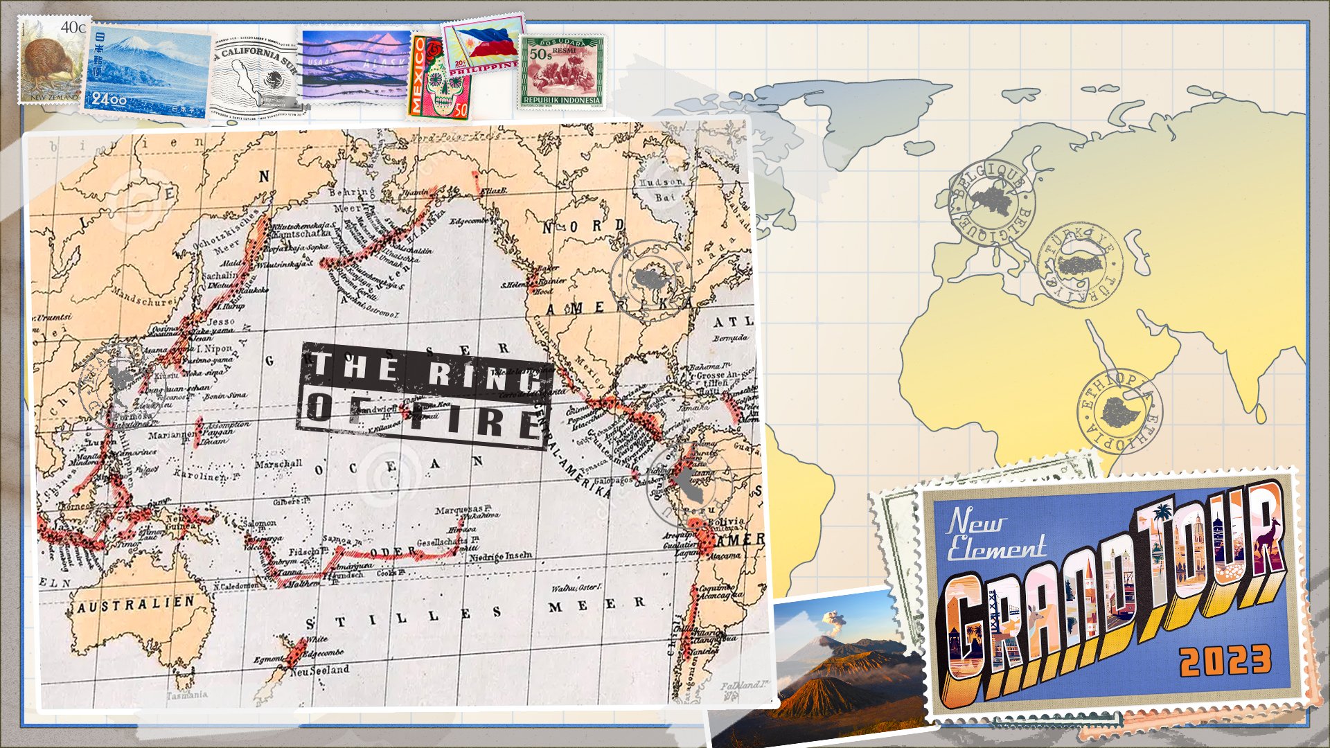
The Ring of Fire
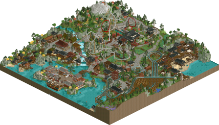
The Grand Final is upon us - we now see 6 entries spanning the width of the pacific region, with one location in particular being quite popular! These parks match their tumultuous tectonic inspirations, with strong eye-catching visual motifs and gorgeously composed scenes. After such strong preceding rounds that pushed the bar ever higher, this final matchup is a fitting close to the contest - good luck all!
To help you vote in this match, please see the round objectives below:
1. Your park must be set in or themed to a region that is part of the Ring of Fire.
2. Your park must include or reference a volcano (active or dormant) or an earthquake - or another type of tectonic activity found in the Ring of Fire.
3. A national flag (or elements thereof) of your chosen region must be used as a visual motif on your map.How to vote
Before you vote, you have to make sure you've viewed all parks with thought and care. Voting happens through the polls above. The submissions will be judged on two criteria. First, you are asked to vote for the parks that you think completed the three objectives for this round the best. Second, you are asked to judge the parks on their overall quality - separate from the round objectives. After 72 hours, the polls will close and we will add up the votes from each poll. The submission with the most votes in total will earn the creator(s) a ticket to the final round!download All parks batch download download
-

 Lurker
Offline
Tectonic Clouds in Harmony:
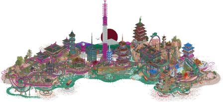
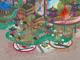
I love the presentation of this, the intricate, surreal map edges (That dripping water effect is so cool), the overall shape, and the background. The architecture is great and I like how the rides are wound through everything, like they're holding the whole thing together.
Akuma No Uta:
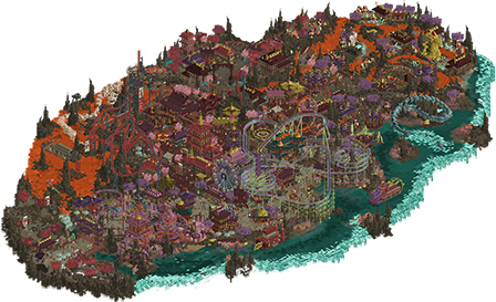
This has such great dark and unsettling atmosphere (The music really helps). Tons of great setpieces, architecture and ride design all through, and the technical tricks are really impressive (The beyond vertical drop, wow). It's amazing how this is so chaotic and yet pretty easy to read at the same time.
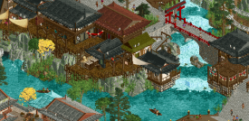
Dejima: Gateway to Japan
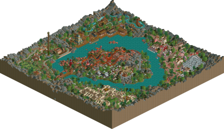
This has such a pleasant and peaceful atmosphere. The foliage and rockwork are so well put together and the overall shape and composition feel like the best of the pro tour days with modern objects and methods. I also really like the ride layouts, very "Flowy" and great interaction with the surroundings, and the red loops were a good way of doing the flag motif.
Aztec Action Park:
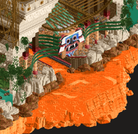
The ride design is just awesome, they're creative, fun to watch and the structures are amazingly designed. The architecture is great and the elevation change makes this map feel absolutely huge compared to the actual map's size. The landscaping is good and wow, that map edge, absolutely stunning.
Yatagarasu:
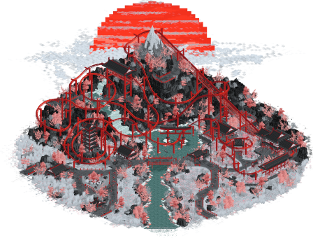
I really like the artstyle, the contrast between the rockwork and foliage and how the monochrome coaster pops against the surroundings. All that red and white is tough to do but it's pulled off amazingly here, really like the coaster's layout too, very graceful winding around the cliffs. Really nice presentation too, a great background setpiece, and a nice map shape. -

 Six Frags
Offline
Just wanting to highlight my favourite bits from all the parks.
Taman Kaldera by Lurker
Love the atmosphere here. The red path pops and the the subtle height variations give it depth.
Aztec Action Park by J K and In:Cities
Love this capybara ctr, also translates well to the 'action park' theme/meme, and put a smile on my face

Also like the canvas tent bits you used to create this aztec texture on buildings (like in the top right on the roof) and those glass bits to create the square/aztec decorations throughout on walls.
nice boat, love the spades and the custom supporting on the coaster is intricate, borderline overdoing it, but just on the right side of the line imo.
Love the lava gradients on the side of the land/map. Gives some nice atmosphere and depth. That aztec mask was also nicely done and the vertical construction throughout the park was great.
Tectonic Clouds in Harmony by hydroportal and FK+Coastermind
Just WOW! Love the depth here with all these different dimensions, to create this almost 3d view.
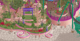
Love the way you guys did the sushi underneath, and the curvy water. Also the foliage selection and coloring is great and those new tulips really make it pop

I love curves, so the way you used those curved trims and fences was fantastic for me. Again great foliage as well on all the different levels.
Yatagarasu by RWE & Gustav Goblin
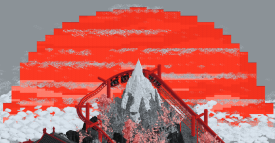
Love how you did the giant sunset. Overall, it felt a bit bare in places, but maybe that's what you were going for? Risky going for this color scheme, still a bit on the fence, borderline too gimmicky, but overall I think I like it for this relatively small set-piece.
Akuma No Uta by Ethan
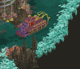
This was so chaotic overall, usually there's a bit more organization in your work, but this felt a bit too disorganized imo. I did love all the structures throughout the park though, like the boat in the image. Also love the waterfall edges of the map, although I didn't really like the color scheme. Maybe a more normal color scheme would calm down the park a bit.
Dejima: Gateway to Japan by Turtle and Liampie
First of all, nice to see an 80% Turtle park! Always loved your style and this is no exception.
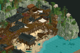
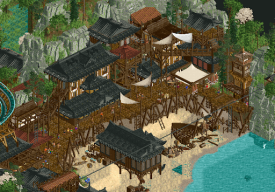
This was probably my favourite area of the park, nice height variations, subtle detailing, great color scheme, love those new wooden slats paths, great architecture and nice structures like the shipwreck. The subtle wet sand on the beach edge to the water is also simple yet effective and the rock work is just awesome.
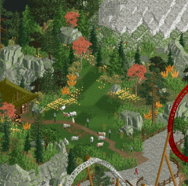
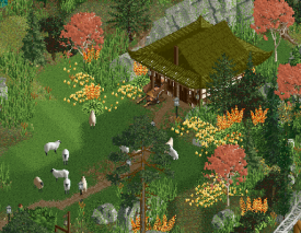
Just a lovely scene, great use of the sheep ctr, subtle flower crunch and effective bits of rock throughout. Nice colors and the paths also swirl nicely through and around it.
Another lovely scene. Love the use of the shire flags/decoration on the right and those haunted mansion walls. Nice waterfall section and again the architecture and subtle details are immaculate. Great to see you build again Turtle and you've adapted well to all this new cso!
Great job on all the parks guys, will be hard deciding who is 'the best'
-

 deanosrs
Offline
I can see this is going to be a super close vote. Lots of you deserve to win.
Aztec Action Park:
The mask next to the Father's track-drop - wow. Super cool. Harsh on the guests lowering them into the lava, but I'm sure they deserved it based on what's going on in the rest of the map! I spotted a spilled barrel of wine next to some degenerates on a temple no less elsewhere! The double-layered song of flowers ride was a high point for me. This map, like a lot of contest entries, is super busy and this was a really nice calm corner. Second the rock work being amazing, specifically the way the lava flowed off the top level and then down off the map edge - super cool. I wasn't a fan of the track on the Father, personally. I just think RCT is a little weird with how it blends the colors of the railings with the track. It's so close to working really well. The volcano area and the side friction worked better to me. Shout out also to the little row of temples next to the reverse freefalls. I loved the density and detail of the buildings and plants in this lower half of the map, all the way round to the voladores.
Teman Kaldera: honestly, LL has never been my thing so I'm not sure I'm best placed to comment on the skill of this entry. I get the whole thing is a caldera, but I couldn't really see any incorporation of a national flag to the map. The map was a little underwhelming to me, but it's a pretty tough draw to be looking at this in the context of the hyper-detail of the other entries. Keep building, been loving some of your work in the building challenges and look forward to seeing more!
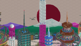
Tectonic Clouds: so immediately get the japanese flag element here. Really sweet backdrop to the park. I'm going to hold my hands up and say I have no idea what the plates of sushi are doing underneath the park, but they are absolutely awesome. I also have no idea why water is dripping off the edge but it too looks fantastic, and I guess if there's a ton of stuff that looks really cool but I have no idea what it means, then that's kind of nailing the vibe of how I interact with Japanese culture! The half diagonal work across the map is insane, and especially the tunnel entrance on sumida kawa, the half-diagonal skyscraper, and also the mostly trackitecture Tokyo tower next to it. Jishin dominates the park and is really well done. The super-love heart sits inside its element so nicely. I'm not the brightest sometimes and I'm not saying it's not there, but I just don't personally see the tectonic feature like a volcano or earthquake here. It's a beautiful map built with far more skill than I could ever dream of having in RCT.
Yatagarusu: my favourite flag interpretation of the contest, not only for the rising sun but also how it lends its colors to the whole map. I guess that's volcanic mountain in front of it (mt fuji?) which kind of checks the tectonic box but doesn't knock it out the park the way AAP does. There isn't as much on the map as some other entries, but in a way, I kind of like that. It emphasizes the coaster which to me is my favourite ride of the finals. I really like the entry, if it just had one more featured ride and another big wow moment in it, this could easily have been my favourite.
Akuma No Uta: in terms of the brief definitely checks tectonic, I'm struggling more to see the flag although I'll keep looking. Some of the details here are ridiculous. Wonderful maneki-neko for instance. There's a japanese devil face thing next to Oni which marks its entrance which is probably the neatest and best integrated sculpture I've ever seen in the game. The rides are all wonderful and add to the vibes of the park so well. This is probably the entry I feel most overwhelmed by, in that I don't really get it yet, and want to revisit and dig into some more. The skill level is crazy and to do this solo in the time that was available is absolutely ridiculous.
Dejima: I don't know if I can describe the stuff that Turtle and Liampie put out any better than to say, my brain just really enjoys looking at it. Let me put it this way. If other entries are the Mars Volta, this one is Sigur Ros. I can't say it's particularly technical to think to place some low grass on top of water, but I can say that the end result is so pleasing on the eyes with Hinoyama's turnaround above it. I can see you guys were pushed by the deadline in places and that coaster could have used a touch more support work, but that said it's a great way to incorporate the flag into the park. The cool zen area with the sensei above Tsunami and the curved steps over the half diagonal bridge with the wooden track below is such a calm scene until the coaster comes hurtling through and around. Exactly what a Tsunami represents. I almost rudely expect a Turtle/Liam park to have flawless foliage placement and there's certainly no disappointment here. I loved also the boardwalk area down by the beach. I think what this park gets really right is the density for an entry like this, at least for me. There's a lot here, but there isn't so much that it's overwhelming.
-

 Gustav Goblin
Offline
Oh it is ON.
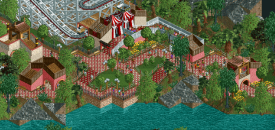
Taman Kaldera: The Lurker streak concludes with yet another great litLLe park. For some reason I was under the impression you'd go big with an IOA-style center lake park based around the entire Ring of Fire, but Indonesia is a very unique choice for this round. In a sense it does feel like a condensed version of a classic LL spotlight with the four corners and the central lake and island. Themes are done well with the obvious volcanic caldera and the red and white fairground area. Unfortunately I think it feels a little same-y compared to what you've done prior, and I was hoping we'd see you go a little bigger for finals. As always though, it's hard not to love this scenario style, and all five areas are clear and recognizable with your style just as visible. Also love the nod to the wooden wild mouse.
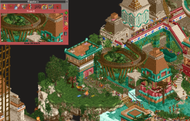
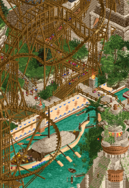
Aztec Action Park: And talk about going big! This is the best example of J K's grandiose sense of scale in a long time; this whole park is just so huge and overwhelming to take in. It's frankly hard to find where to begin so I'll just go for objectives. The volcano is a great centerpiece with a wonderful reverser coaster around it. I see those heartline transfers; shoutout to Kumba. The flag motif is a little more subtle but it's sprinkled throughout just enough that it'll pop out. In general the ride design in this map is super unique, from The Father's unique layered track effect to the dueling reverse freefall coasters and the absolutely gorgeous Dance of Flowers. All of this is augmented by some world-class landscaping, architecture, sculptures, sound design, and named staff which could only be the work of Josh. And of course that lava map edge is just ridiculous and stuff I dream about doing. Genuinely incredible work you two.
Tectonic Clouds in Harmony: This might be my favorite park of the contest. Maybe it's recency bias, maybe Diamonds of Antwerp and Wrigley Field clear this, but what this has over them is the artistic vision which I gravitate towards without fail. Incredible blend of realism and surrealism with some classic FK artistic goodness and Hydro hyper-detail. Let's talk about that macro first. Love the swooping shape with the dripping water and the literal tectonic plates. (Hope Hydro explains the reason for this artistic choice, it's so funny.) Plates of food, ramen-powered propellors, a cloudy border on an off-white backdrop; all these unrelated elements combine seamlessly into an artistic masterpiece. It's not hard to find FK in the single-view diorama with the sun rising over Mount Fuji; couldn't let RWE and I have all the glory I see. Just as impressive is the attention to detail in the micro which the OpenGL 4x zoom brings out. Obviously Hydro and FK on the same park is going to mean some of the most unbelievable architecture you'll ever see. Ride design is stellar between Jishin tying the map together and Sumida Kawa providing some great contrast and even better half diagonal effects. Y'all make half diags look like they were always part of the game. All this and city pop jams on top of it? I can't not love this. Admittedly the tectonic theme falls flat for me outside of name, but I guess circles are Japanese enough and there's a lot of 'em in this map so it does well there. Even then though, I think FK might get another win and Hydro may avenge himself for last year.
Akuma no Uta: First thing I notice is Boris blasting in my ears; it's an Ethan park alright. This feels like a nightmarish Hoshi En parallel or if you turned Babylopolis on its side and spread it out into a more conventional park. Just absolutely messed up in the best way. If Aztec Action Park was incomprehensible to look at, this is even more so. Love the ride design throught; the spinner is adorable, the Togo stand-up is an Ethan classic, and holy bananas the beyond-vertical drop and custom inversion on Oni! The meta-pushing inventiveness that defines your style. All the boats throughout are really cool, especially the one with the frog legs. Absolutely crazy sculptures as well; so messed up yet so understandable. Going back to Boris, the remixed versions of the song for each area is such a cool trick and really adds a new level of immersion. It's hard for me to make out any sort of flag reference, but I guess the lava rapids represents the volcanic activity. Either way this is such a fresh and unique style that I think we as a community gotta embrace and respect instead of pissing ourselves in fear and running away to our cozy 2005 roleplay hidey-holes. Not all art is Monet; you're gonna get a Bosch every once in a while and that level of stylistic diversity is what makes art what it is. If this doesn't get at least 80% I am actually going to go on a rampage. Ethan, you are the future. Never stop what you're doing.
Dejima: Man, y'all love Japan. Weren't you all clamoring for Australia this contest? Could've done like Korea or Peru again or Los Angeles or something. Either way, it's still as awesome as ever to see Turtle kicking ass in the '20s, this time taking the spotlight. (Liam you're cool too I promise) What results is a seamless blend of fast meta adaptation and a weathered and unique sense of park design. This is definitely the most grounded and earthy of the finals entries along with Lurker's; in no way a bad thing. It hits a near perfect balance between modern detail utilizing new objects and clean simplicity. Hinoyama doubles as a subtle execution of both themes and a great layout in its own right making use of nearly every new element. Tsunami is hit or miss for me honestly. Landscaping is wonderful with the Fisch rocks with just a hint of green in them, and the architecture is absolutely spectacular. The fishing villages with the raised paths are the highlights for me, just unbelievably immersive. It's such a pleasure seeing Heaven's Kitchen back at it, even against a fantasy H2H6 Hurricanes pairing at that. Pure Turtley goodness.
Yatagarasu: You ever hear about the remora? It's this weird fish that lives in the ocean and has a big suction cup where its dorsal fin is. It latches on to big graceful manta rays and sails the seven seas just by sucking and sucking and sucking and the point is I'm just happy to be here. Very proud that RWE and I could make something that can turn heads among this ferocious competition in the time we had. RWE and I both agree this is some of his best work ever and I really think y'all need to show him some more love for directing an artistic vision like this. Will obviously say a little more once voting concludes, but it's a big honor to be here with you all for the climax of this Grand Tour.
Voted Tectonic Clouds in Harmony for my overall favorite, Taman Kaldera for best objectives, and Aztec Action Park for both. Thanks for a great contest!
-

 Jene
Offline
Akuma no Uta – Ethan
This is huge. I love the colorscheme; so bright and so dark. The devil’s head for Oni’s entrance is brilliant. The dragons are beautiful. Are those croaked frogs you’re using? I love the layout of Oni. Great use of the new track elements. The boats and statues are also amazing. This is brilliantly done. It looks stunning from a macro-perspective as well as from a micro perspective. What’s that crackling sound I keep hearing? Ow that’s my laptops CPU . . .
Aztec Action Park – JK and In:Cities
Wow you guys really did your research. How do I pronounce these names? I love that you used coasters that we don’t see a lot. Fire ceremony is brilliantly done. That volcano is beautiful. Also love how you guys show the lava underneath. That drop-track is fun. But a shame you couldn’t get the lift back up hidden.
Taman Kaldera – Lurker
Always nice to have an old school park amidst all the parks filled with new custom scenery and track elements. A fun idea to have the coaster represent the eruption. Great macro too. I’m not a big fan of the random geometrical shapes though.
Tectonic Clouds in Harmony - hydroportal and FK+Coastermind
Wow, this is art. So flowy. Beautiful backdrop with the sun, mountains and skyscrapers. The drips. The sushi. Such a shame this will only look good from one side . . . hold up . . . it’s gorgeous from every angle! And thank god we finally have a Wagyu CTR.
Dejima: Gateway to Japan - Turtle (80%) and Liampie (20%)
Great composition. I love the ship. Not a big fan of the paths you guys used. I don’t get the ‘Ring of fire’ vibe as strong in this one.
Yatagarasu - RWE and Gustav Goblin
Glad to see you building in the finals Gustav! The park looks beautiful. I love the a-chromatic colorscheme combined with the deep red. The coasterlayout is very good and the composition really brings it out perfectly. I love the big sun behind the mountain top. Such a statement. I think it would have been even better if there was no path half-way up the mountain. That area looks a little forced and squarish, while the rest looks so flowy and natural.
Final decision
I think Ethan represented the goals the best and Tectonic Clouds has the highest overall quality. The fact that you guys made something so complex in shape look so good from every angle is mind-blowing.
-
 Bluetiful_Monday
Offline
Yatagarasu, by RWE and Gustav: My favorite park of the round. When I close my eyes and think of Japan, this is what comes to mind. Absolute perfection across the board: framework, micro details, masterful terrain, and a phenomenal suspended swinging coaster. The foot of the mountain almost reminds me of snow gardens. If I could summarize this park in one sentence, I hope this gets RWE a green name. 100%
Aztec Action Park, by J K and In:Cities: So much content to explore.You just move your screen over a few tiles, and there is a whole world of theming to discover. The vertical drop coaster layout is epic, and that ruination given to the track looks insane. I think my favorite part of the map is the bottom corner, with the garden ride and the bridge spanning across the lava. The soil layering is incredibly put together. 95%
Akuma No Uta, by Ethan: Not sure if you listen to much of The Cure’s music, but this kinda reminds me of something straight out of their renowned album Disintegration. It’s like stepping inside of someone’s dream. You have quite a mind, Ethan. This is a map that changes your perception of the game unlike anything I’ve ever viewed. To top things off, what a layout. I have no idea how to use the advanced track plug in, but I think it was put to brilliant use. 100%
Tectonic Clouds in Harmony, by hydro and FK: You both are artists, and it shows in spades with this. My personal favorite architecture of the round, just incredible details. I love some diagonals with a layout. The small city skyline backdrop is such a subtle, but cleverly integrated detail. As Posix mentioned, those sushi rolls are chef’s kiss. A map that brilliantly combines architecture, landscaping, and a little something more that I can’t quite describe. 95%
Dejima: Gateway to Japan, by Turtle and Liampie: Compositionally, the cleanest park of the contest. Everything is exactly where it needs to be without being overwhelming. A park that shows scale, while also being easy to read and perfectly organized. Incredible architecture, and a lovely layout for your wooden coaster. Perhaps it doesn’t have the same visual centerpiece or framework highlight that the previously mentioned maps do, but it makes up for this with the individual areas. 90%
Taman Kaldera, by Lurker: I admire your consistency and dedication to an LL park every single round. On a personal note, I like how you play LL - without trainers. So everything you do would be possible in a high quality scenario play. I certainly get the ring of fire atmosphere with this build. As mentioned, the amount of detail just isn’t really comparable to some of the maximalist cso builds of this round. I think one area of improvement could be architecture. Even without cheats, I think there are some more complex buildings well within your wheelhouse. 65%
Final thoughts: This is tough. My pick for the 3 round objective slot goes to Yatagarasu, by RWE and Gustav. My pick for the highest overall quality goes to Akuma No Uta by Ethan. I think there is a strong case to be made for a 100% to any one of these parks. This is some of the best RCT content I’ve ever witnessed. There are few times I’ve had quite this much fun exploring a park. -

 SSSammy
Offline
https://www.youtube....h?v=e7t7CfMaFV4
The VOD from yesterday's live stream. We were joined by at least one person from every park, so check it out to hear the process of how these amazing parks were built!
-

 Kumba
Offline
Ethan - This is one crazy map. You build with amazing micro detail... maybe a little too micro? Good thing for the extra zoom capacity of Open, lol. I got lost in everything at first view, but enjoying it more each time I take another look. Love Oni, got to say that's the best hacked coaster I have seen in the game. Flowing lava river with rapids? Amazing! Monsters all around, great too... could have used a big, more central one tho, they all seem a bit spread out. Love the one on the entry to Oni. Overall, an entry with some next level work. My only small issue is that you build with a ton of texture and it's almost sloppy in some places. Also was not sold on the objects to represent the national flag motif. Congrats on an outstanding entry that could earn you an NE Parkmaker spot!Hydro and FK - Wow, that motif is epic. The flag element with the sun, the subtly detailed mountains and the buildings lining the base of them. Plus the Tokyo Tower. Outstanding work there. I love how the map is something of a tour of the island of Japan told by a coaster and a water ride. It's all so well done as both you and Hydro are outstanding at clean/readable micro details. The "tectonic" sushi plates are awesome and a great use of humor. Congrats on an amazing entry that might win this contest and make FK two for two on GT finals entries!J K and Josh - My favorite entry in this round. I just love the feel of the elements and height this is built with. Great hacked rides too with creative inversions. Happy to see the use of reverser track and a heartline transfer, lol. The masks and lava-scaping were amazing details to add. Also great use of the map with clickable details all over. I really like the motif with the snake and eagle of the flag seal, just the trains were a bit dull and lacked detail as a centerpiece. Overall, my only minor issues were that some of the function seemed to have errors, like peeps walking on water and the coaster train floating on nothing after it goes off the advanced track. Also, is this really an "action park"? All others by Josh are in a quite realistic setting and this is not. There is some humor, but not as much as in others, tho yeah that capybara water slide jump was worth an lol. Wonderful entry and even more of this epic return to RCT2 greatness by J K.Lurker - I like that you had the most unique country choice with Indonesia. While I don't know much about Indonesia, it seems you put some time in and where able to add elements of it to each small area of the park. I did hope we might see you do some RCT2 here like you have in building challenges, but still, it's very nice to see LL Living Long!Turtle and Liam - Great entry and one that really felt like a throwback or top H2HC entry. Still had the modern touches like the Fisch rocks and new track elements. lol at the animal noises, great use of animals on the map. Overall, just such a clean and smooth entry when so many others were kinda messy and hard to read. My only issue was that most of the wooden coaster looked pretty dated in a park that otherwise was a great meeting of past and present. Trim was too bright and the lift was very default. Thank you for a great entry and yet another classic Turtle/Liam park!RWE and Gustav - Amazing coaster design on Yatagaraus. Great flow and elements, the best suspended coaster I can recall seeing. Love the MCBR too. Your motif is massive and very well done with great detail. My only issue on the map was that it lacked a supporting cast. It opens and you get the feel of the coaster and motif instantly. After that, I just didn't find much that added to the map. Seems clear you went for more of a design than a small park and I was more expecting small parks in this contest. Hope this can score 80+ and grab RWE an NE Parkmaker spot! Would be great if the GT2 final produced two new parkmakers and I think they would be earned spots with this level of work.Also another shoutout to Six Frags on his awesome workbench, tabs and objects which must have been a huge help on some of these maps.
 -

 ottersalad
Offline
Congrats everyone - amazing final round and overall such a wonderful contest. Enjoyed looking thru all these entries.
Lurker: nice and pleasant entry. I think it's tough to compare with some hyper detailed rct2, but the contrast was refreshing. Lot of detail and a well themed entry. The coaster/volcano in the center was quite hectic with all the inversions. Lot of work to be proud of this Grand Tour.
RWE + Gustav: Very cool scene to open the map upon. The coaster layout is quite awesome. Hauls ass, lot of turns and drops, good interaction with terrain and archy, really well done. Agree with FK that beyond the coaster though there wasn't much to hold my attention, but what was there is stellar!
Liam and Turtle: wow, this oozes with atmosphere! Everything along the watersedge is so tranquil, detailed, and immersive. The cliffside village outside of the Tsunami station is amazing. So well integrated into the hillside and full of details. Very clean and pretty entry.
Josh and JK: Don't understand how you can put so much detail into a park within a month.. mad lads. So vibrant, colorful, detailed, quite impressive and there's just so much to take in. So much so that I keep getting lost in terms of all the layers to this! All the giant masks and stuff were very cool.
Ethan: Wow.. same thought as Josh and JK: how did you do this in a month? I'm flabbergasted at the detail. So moody, intense, and immersive. The flowy rapids ride is really neat. The togo is a nice splash of color to contrast all the dark/gloomy archy and landscaping. Readability is a struggle some times here.. the density is a lot to take in!
FK and Hydro: It's like a painting, but in RCT. Very strong aesthetic and style. So unique in comparison to the other entries and feels fresh. Perhaps it's because I went from AAP will human sacrifices to Ethan's park to this!! But the coaster layout is a lot of fun, as is the flume. Love the sushi, love the archy, love the colors. Amazing stuff guys.
-

 alex
Offline
Wonderful parks all round - great work everyone!
Yatagarasu (RWE/Gustav)
Great opening scene. The graphic look with the limited colour palette has a wonderful impact on first impression, but then the downside for me was that it didn’t keep my interest very long - things started to look a touch samey across the map. It’s always a difficult balance to get right. Maybe I was also missing a bit more architecture, but what was there was lovely, very tastefully made!
Aztec Action park (Josh/JK)
I’m in love with the colours here and all the surface patterns and texture in the architecture. Gives it such a lively atmosphere. Out of all the ‘Action Parks’ so far this one felt the most like a H2H map for some reason (and in a good way). There is the map size and density but I think it’s mostly the way the coasters are designed: they have a very integrated look where it’s less about the presence of the coaster and it’s overall flow but more about how it interacts as a theming and storytelling feature. Anyway, I liked the choice of keeping them all brown and going for the rickety wood scaffold look across the supports.
In general I’m super impressed with how you’ve managed to fit all these massive structures and landscaping features together in a fairly natural looking way. Especially when there is no ‘normal’ landscaping lets say, or a visible base to work from. I wouldn’t have a clue where to start with something like this!
Dejima (Turtle/Liam)
The calm, rural atmosphere of this is like a breath of fresh air. Because of the dynamics in the detail level (some areas sparser, some more dense), it was really easy and enjoyable to explore, and it made the interest of the more heavily detailed areas have a bigger impact. It’s really impressive that on a map of this size you’ve crafted a few different areas with their own identity. The station of Hinoyama was an architectural highlight and in generally I liked all the small wabi-sabi irregularities in the buildings and pathing. For me the only drawback was the wooden coaster which I think could have been a bit more flow in places.
Akama no Uta (Ethan)
This was like nothing I’ve ever seen - such an unusual colour palette and mix of shapes and texture. Loved the overall mood - dark but also whimsical and dreamlike. And totally unique.
Sometimes I struggled with legibility, because of the extreme density, amount of texture and similarity in tones used across path, landscape, foliage and architecture. Idk how I feel about it - it’s challenging to explore and find details but not necessarily in a bad way. It’s noisy but noise can be expressive and interesting.
Tectonic Clouds (Hydro/FK)
Nice city-pop vibe going on here. It’s clever how you played with 2d/single-angle elements as a backdrop, the mini-skyline is especially cool. There’s so much to love in the architecture here and in general it feels like the most complete and succinct vision out of all the parks.
I also enjoyed the tectonic sushi plates and floating support footers haha
Taman Kaldera (Lurker)
Cool stuff as usual and I love that you’re just doing completely your own thing in this contest. Amazing that you’ve competed every round too. With this specific park I particularly liked the look of the ruin site and the flume area with the wooden buildings. I think making the volcano island a bit more prominent and mountain-like would have made it a stronger centrepiece. -

 FredD
Offline
Yatagarasu
What a unique piece of rct. Color management is spot on, the grey/white landscape with the red touches work so well. The raising sun as a background is really cool, a bit of a shame it is Julow'd but I wouldn't know to make it work in more than 1 angle either. The coaster is massive yet very flowy. Very good. Also loved the extra music and the pink trees, pink trees are the shit. Memorable piece of RCT.
Dejima
This is some prime Liam (and Turtle) work. Full of atmosphere and fully immersive. Full of details too, and yet very clean. A lot of cool buildings and structures here, the Sensei Yamamoto building was one of my favorites here just as the Buta Noru ride. Also great boat in the harbor. The launch coaster is pretty neat, with that zero-cobra roll combo as a highlight. You know I do love unique elements in a coaster
 Also great subtle inclusion of the Japanese flag in the coaster colors! Woodie is ok, don't really like the blue color.
 Akuma No Uta
Well... wow... definitely unique atmosphere here. This seems like it must've been a bitch to build. Overall I find it a bit too busy for my likings. Your micro is incredible, it's just a bit too much for me. I'm not into the artistic part of the game, so to each their own. I do like the Togo and Eurofighter a lot. The lava rapid river is also pretty cool.
Tectonic Clouds in Harmony
While this is also an artistic entry, to call it that, much more readable and less busy for the eye. Great archy with a flowing coaster and flume around it. The layout of the coaster is cool, not so fan of those funky colours though. Interestingly also went with the raising sun as a 2D background, and more angle-friendly. Those 2D manga-esque clouds are such a neat touch and the water dripping down is really great. Also love the big tower in the middle.
Taman Kaldera
It's not easy to hold this against the other, super detailed RCT2 entries but in itself is a really nice looking park with atmosphere. A nice final park for your Grand Tour. Also like you didn't went with Japan, that was refreshing when viewing all these parks.
Aztec Action Park
I opened this as last and it seems like I saved the best for last. Wow! The landscaping on this is just insane... There is so much to look at, this is so packed with so much content... Many unique rides, great archy, insane and unique coaster structures, awesome sculptings, pretty foliage and so many little details. It feels like I can watch this for days and still discover new stuff. Yeah absolutely love it! Also hehe on making Posix clapping his cheeks. Hehe.
First of all, fuck you guys for pushing the meta even further. I feel old and like I can't compete to you young medlings anymore. Second, what a final. All of you delivered parks of such insane quality it is hard to chose one winner. There will be 1 winner, but you are all winners. And we are winners too, by getting to see these beautiful parks.
-

 Xtreme97
Online

Grand Final - Results
Voting for the Grand Final has now closed and we can reveal that after a very tight race the winner with 50 total votes, and champion of The Grand Tour 2023, is...
Aztec Action Park
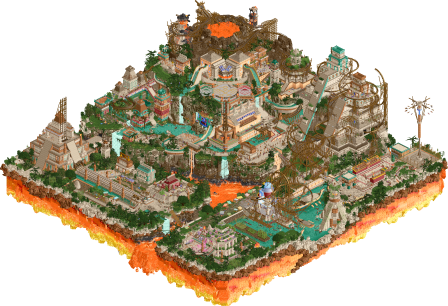
Congratulations on this stunning win, and a worthy championship after a fantastic contest performance by both! Find the full results table below for all entries. The total score for each entry has been calculated from the following formula.
Score = Objectives votes + Quality votes
Entry Objective Quality Total 
Aztec Action Park
by J K and In:Cities
25
25 50 
Tectonic Clouds in Harmony
by hydroportal & FK+Coastermind
18
22 40 
Akuma No Uta
by Ethan
9
19 28 
Dejima: Gateway to Japan
by Turtle & Liampie
14
14 28 #5 Yatagarasu
by RWE & Gustav Goblin
18
8 26 #6 Taman Kaldera
by Lurker
8
1 9 And for those who may have missed it, SSSammy hosted a fantastic review stream of the Grand Final on Friday evening in the NE Discord, complete with insights from the park creators, which you can now watch back on Youtube below.
Congratulations to the winners, and thanks to all who participated in the form of submissions or votes. See you in 2024!
-

 Gustav Goblin
Offline
Congratulations to J K and Josh for the huge win! I knew J K would crush the Grand Tour as a world traveler himself, and Josh winning as a wild card is a hell of a statement. Two of the most creative and skilled parkmakers in the game and deserving of the win. I'm shocked RWE and I came as close to breaking into 3rd place as we did; makes me wish we pushed just a bit more but I'm still amazed we managed to make such a strong impression in the time we had.
-

 Turtle
Offline
Happy Christmas everyone!
Post-GT wall of text incoming. Thanks to everyone who made GT possible, it was one of the best and highest-quality contests I can remember. It was also very positive and drama-free, which motivated me to finish it with a completed entry, so thanks for that.
I’ll do a proper review of all the parks at some point soon, this post is some background on ours. I would have ranked the parks pretty much exactly the same as the final standings, so well done voters I guess!
Our original concept was 3 areas, based on a different tectonic disaster - tsunami for Japan, earthquake for New Zealand and volcano for Indonesia. I did some initial test stuff for all 3 countries - Indonesia was looking cool, but was VERY intricate and time-consuming. New Zealand is one of my favorite places in the world, but I just couldn’t quite pinpoint what we would actually put on a map in RCT. Japan was a theme I knew I would love, but was probably the one I was least excited about.
The first thing I built that made it onto the map was the volcano coaster - originally meant to be Indonesian. Coaster design has never been my strong suit, but I wanted to try one using the new elements, which are AWESOME. Ended up with a layout I liked, tweaked it a bit during the build but it mostly stayed the same.
We’d decided on a traditional Japanese theme by this point, mostly I think due to time-constraints that we could already see coming, and the fact that we were vibing with Japanese architecture in a good way. The volcano thing still fit nicely, and we wanted to incorporate the tsunami idea also. I’d read a book years ago called “The Thousand Autumns of Jacob de Zoet” that had stuck with me - set in Dejima/Nagasaki in 1799 and told from the perspective of a Dutch clerk, it was such an interesting setting that I loved the idea of anchoring our park in that specific place and time (roughly). Once that was settled, we pretty much just kept building.
We had a quite a few ideas that didn’t make it due to time - wanted to have a proper shipwreck up on a rock spire to tell of a previous tsunami, and in general have more wrecked architecture - this just ended up taking longer than we had. I think if we’d had one more week, we would have used it to add a layer of “life” to the park - little stories, personal scenes to tell the story a little better, named staff/rides etc. Unfortunately we just had to prioritize getting a park that at least looked complete. I’m happy with what we managed to do, and I don’t think an extra week would have changed the contest outcome at all (Leon/Xtreme probably would have finished actually, so would have moved us down
 ).
).
I love building with Liam - we’ve done it a few times now, and it’s been a chilled out pleasure each time. We’re both good at picking up slack when the other needs us to I think, and there’s total trust to change/add to each other’s work and make it better. We’re also both experienced enough with contests/deadlines that we know what it takes to complete - this is an underrated skill in my opinion. Cutting things early enough in the build, prioritizing important things and honestly putting in the hours to get it done. We’re all adults now with lives and families, playing a game and entering a contest with no real world prize - the time the entrants put in to submit awesome parks shouldn’t be underestimated.
A few of my very favorite parts:
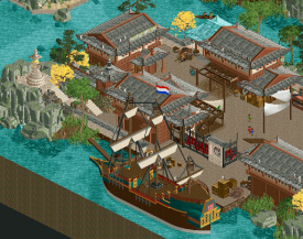
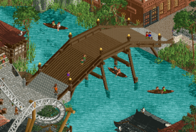
I have a soft spot for the entrance island of Dejima - one of the first parts we finished, an incredible ship (Liam), I just really like the vibe here.I’m a sucker for open space on a busy map.
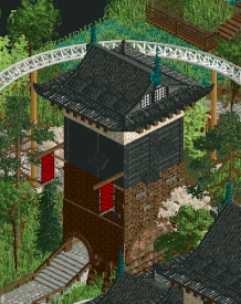
This castle was the first landmark building completed that I loved - this was the point where I was confident we were going in the right direction with Japan.
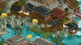
I wish we’d had more time to develop this area - it’s meant to be a hidden kinda ninja-fishing village build with scraps of boat and stuff. Inspiration was Umugi Cove from Ghost of Tsushima, if anyone has played that.
This little circular entrance to the hidden cove is something I was very happy with.
Thanks for reading if you made it this far, reviews of the other great parks to come -

 Turtle
Offline
Time for some reviews!
First of all, outstanding work from everyone to do these in a month. A really good amount of entries after a long contest, with a lot of people entering multiple rounds. Hard to stay motivated and come up with new ideas time after time, so well done.
Taman Kaldera by Lurker:Major props on entering so often, this style of old-school RCT is a really nice throwback to the way we all used to play. It feels nostalgic, easy to look at and there are some really cool ideas. If i'm being honest it's probably hard to vote for when stacked up against these other more intricate parks. But i'm glad you were a part of the final, you deserve it and it should be celebrated.Aztec Action Park by J K & In:Cities:This was the winner for me (and for everyone else, so that's good). It's fitting that an Action Park won this contest, as they've been one of my favorite recurring entries (along with Alex). This was definitely the best one, for me, and worthy of winning a final. There is SO much going on everywhere, tons of movement, tons of color (but cohesive), and interesting things everywhere. It just feels "fun". There are a ton of really cool theming ideas - all the rides being made of wood, innovative use of theming objects all over the place, the edge of the map is AMAZING, the capybaras and pulleys to mimic old-style machinery, and so much more. Both of you guys are so great at using texture to make things feel more "real" - the edges of paths and walls are gradiented into each other, the landscape is gradiented, it's something that not a lot of people are doing successfully and you're nailing it. I've looked at this park a few times already and each time I find more cool stuff to like, which is definitely key in winning a contest. If I had to pick a negative i'm not crazy about the foliage, but it fits the theme well so i'm not that bothered honestly. Well done both, glad to see you win.Tectonic Clouds in Harmony by hydroportal & FK+Coastermind:This entry makes me SO happy and i'm glad it got second place, I think that was deserved. The overview made me think "this might win", and the first time I opened the park I thought "actually i'm not sure I like this park as much", but the more I looked at it the more I appreciated what you've tried to do (and succeeded). Historically this hasn't been my "style" of RCT, but I think as I get older I appreciate using RCT for weirder art stuff a lot more. A lot of color choices that I personally wouldn't make, but they all work and feel cohesive and planned out. It's hard to layer all these ideas and separate things and make it feel like it all fits together, and you two have absolutely nailed it. Please do more things like this.Yatagarasu by RWE & Gustav Goblin:Another STRONG concept that you've leant hard into, and the end product is really striking. Overview-wise this was the strongest imo, but when I opened it and dove into it it feels sliiiightly emptier than some of the other entries. My initial reaction was "ah fuck, they've done what we did but with a stronger concept". Everything that is there is great, but I wish there were more points of difference around the place to make me want to explore. I think the strong palette and concept kinda overshadows the coaster, which is a great layout. Congrats on a really strong entry in the final, really glad to see both of you build more.Akuma No Uta by Ethan:This park is vast, intricate, lively, overwhelming, crazy, and hard to understand. Probably quite polarizing, I would imagine. I would LOVE to see this park with a more traditional, easier-to-read color scheme. It might be worse, I just wonder. It reminds me of the best parts of geewhzz and kong back in the day - builders who were more interested in concept and executing it exactly as it "should" be. Philosophically this is a little different to how I build things - often i'll try something that makes sense, but if it looks bad, i'll change it. I feel like quite often in this park you've built something that doesn't look great, but you've got total commitment to the concept you have in your head, so you go with it anyway. The final product can be hard to look at, honestly, but I can't help but appreciate what you've made. You're doing things no one else has even thought of doing, and if you can improve your ability to make things readable and easy to understand, you'll be one of the best. But you might not care at all about that, and I applaud you either way.My read on the placings are that they're pretty much spot on. I honestly think our park could have placed anywhere from 2nd to 5th depending on personal preference, and i'm happy with what we ended up with. Cheers all! -

 Xtreme97
Online
I owe some reviews on this. What a fantastic final round, well done everyone and I'm sad that me and Leon couldn't finish up our map in time.
Taman Kaldera:
Charming piece of work and a consistent bookend to your work in this contest. I liked how you incorporated the flag elements in the central island - it's not in-your-face obvious but the colour delineation is there and from afar it becomes more noticeable. The rest of the map is decent, quite a variation in how you approached the theme with a four-corners approach. Liked the stone structures the best. All in all, I'm really happy that you created something for each round and kept the LL spark alive Lurker!
Akuma No Uta:
This is pure Ethan all the way through - busy, chaotic, pure maximalism and instantly Japanese. I think yours is the most unique approach to Japan out of the entries, eschewing some of the more traditional inspirations and images that one conjures in favour of something that draws from the weirdest elements of the culture. This of course suits your style perfectly and the map feels like a continuation of the design and colour choices found in your Babylopolis micro. It does suffer in places from this, with the hyper-detailed maximal crunchiness creating a sort of static noise effect when viewed from afar. But focusing in on a particular area or building reveals a stunning level of detail and thought. Sorry that I couldn't vote this higher, and I didn't feel it met the flag criteria strongly enough (the flags are there as objects but it just feels a bit of an afterthought compared to how creatively the flag motif has been incorporated in other maps). One last thing is that the dragons and the Oni mask are brilliant.
Tectonic Clouds:
An absolutely tremendous map, loved it from end to end. To start off with the mountain-flag backdrop is so good, fantastic layering and positioning with the flat building mural sitting just in front. Then you have this great big pink and white tower anchoring the rest of the map in place and serving to split it down the middle. The colour choices are also fantastic - the magenta and green used as complementary colours with touches of gold and purple giving the park a very distinct immediate impression. All of the design choices and details feel very stylish and deliberate, and it feels like peering into the near-future of NE style. Takes the floating islands in the clouds motif and makes it look fashionable, but I suppose that can be attributed to your two styles and abilities to combine objects in such unique ways. Loved the coaster and the way it elongates and shapes the map with its two peaks at either end in the top-hat and batwing. A few other things I loved: pancake stacks made out of graveyard dome, japan flag ice-rink(thing), all of the sushi plates which are just marvelous, the rounded garden terraces in the back, and the sheared earthquake buildings. There's probably much more I could comment on so I'll stop here but as you can see I really loved this map!
Aztec Action Park:
Well first off, congrats on the win! I think this is definitely a deserving champion - captures the country perfectly while hitting all the objectives and providing a map that's packed with detail, ideas and content. Love how you've incorporated the flag on the plaza up top, excellent mural design. The map itself is really quite impressive in terms of how much verticality and depth you guys have achieved without hindering the views. The big steep cliffs and lava rivers juxtapose nicely with pools, canals and tropical foliage. That huge wooden coaster is really neat - feels unique and reminds me of old-school fantasy/semi-realism coasters in how it navigates the space and includes the huge wooden support structures. Also really like how much is hidden beneath the mountain. The rockworks is a little rough where it's just the multi-tile fisch rocks stacked up but the focus is on the content which is superb. A few highlights include the face/mask murals of the gods, great use of an undervalued coaster type with the launched freefall, and the subtle waterfall and pond area up by the capybara ride.
Yatagarasu:
Definitely one of the most eye-catching and distinctive works of the contest. The pure tri-colour focused palette of red-white-black is at first a bit blinding but looks fantastic. I think this might be the most stylistically bold park you've made RWE and the choice to go this route absolutely seals the thematic objectives and use of the flag. The coaster is wonderful and flows nicely down the mountainous regions toward the pool at the bottom. I also really like how you've designed the map around the Yin-Yang symbol, and tying that into the theme with the black side being volcanic soil/rock. I think the thing holding the park back a bit are the smaller scope and the difficulty viewing in the other rotations. But overall I hope you're proud of the map, it marks a stylistic evolution for you in my eyes and is a step in making your RCT more distinct and recognizable.
Dejima:
This runs quite close to what I was intending to build with Leon at the start of this round before we went in a different direction (and then didn't finish.. lol). I think the settings is what sells this the most - being so specific about the time and place of Edo-era Japan on the island of Dejima makes this a lot more successful in how it broaches what can be considered a "cliche" theme and gives the map that extra grounding and realism that I love. The content is fantastic and feels like you've taken to the newer "meta" quite naturally. It still retains a classic feel in some of the object choices but areas are noticably modern (the clusters of flowers for example). The coasters are cool, I think the launched is superbly integrated and flows very well without meandering. Also really like how varied the buildings are, standouts being the coaster station castle with the black wooden walls motif, and the island with those distinctive sepia and silver colours. In the end I was really impressed by the park and hope we'll see some more Turtle work in 2024.
 Tags
Tags
- No Tags
