Micro Madness 2023 / MM4 Grand Final
-
 26-March 23
-

 Gustav Goblin
Offline
Damn, right as I voted! Confident in my vote though. Will elaborate after today but TL;DR Leon got my vote followed by AVC. Insane stuff by all of you.
-
 RCT2day
Offline
This is really difficult, but after looking at everything for a while and really thinking, here's my best attempt at reviewing and placing everyone. Congratulations to all finalists, really well deserved. And thank you to the admins, this was a phenomenal competition.
1.) whosleon - what separated this one was the sheer size of it. I can't believe that there are <400 tiles. It really feels like a dynamic city at street level with life and atmosphere, but then evokes such a strange feeling of gilded progression as you climb vertically. Colors are beautifully done, architecture is gorgeous, there's just so much going on that I could spend an hour in this little park. Amazing work. The clear winner to me.
2.) nin - first thing to congratulate you on is having fun throughout the contest! This looks like another entry that was a blast to make. You've always been good at making the western style ooze atmosphere and life, and this is no exception. I really love the train wreck going right through time, creating an awesome atmosphere and telling a story without shoving into the audience's face. I do wish that the coaster did more than just rise and fall. Maybe a layout underground through caverns would've helped push this one to the top for me? But just an idea, what is there is beautiful. I flipflopped between 2nd and 3rd for this, but I ultimately settled with 2nd here because of that atmosphere over...
3.) AvanineCommuter - amazing! I love the hologram, I think that is done really really well, especially with the colors and that mesh. The disorganized and aged structures that the coaster weaves through are a perfect contrast to the coaster's sleek design and aesthetic. Perhaps the only weak thing to me is the rockwork and the sandstorm, both of which had a texture that stick out in a bad way. Otherwise, it's your usual amazing work. Congrats on making it this far and consistently producing some amazing micros!
4.) wheres_walto - geez, that writeup was a rollercoaster of emotions for what turned out to be one of the funniest entries of the contest. Solid entry, but not as good as the others unfortunately. Adding Micro Madness finalist to your impressive resume from the last 18 months is no small feat. You should be proud of putting out some of the best entries of this whole competition. For what its worth, I've had a lot of fun exploring and experiencing your work, especially your micros. Congratulations
-
 Camcorder22
Offline
in a contest full of "no idea who to vote for" might as well have one last impossible match!
walto - I think I agree with fk's assessment on this one. by far the most evocative and feels like "a statement" but not my favorite RCT aesthetic of the round. i think this was the perfect time and place for this concept, it would've been stretched way too thin on an H2H map, but needed the extra room to breath from the 15x15 maps. absolutely packed with references as a map like this needs to be, though a lot of them just make me sigh to have to be living through this reality lol. a strong entry to finish this competition that you've shown a ton of range, i've really enjoyed seeing your entiries.
nin - feels very conceptually traditional and almost scenario-like, but with a fresh modern aesthetic. more proof that perhaps drip is the new crunch. the way the oil was done looks super visceral, and all the archy is very creatively done for this theme. the big coaster layout is very imposing and well composed, though on a larger map i would've liked to see a more full layout. i think that may be what's holding this back from being my clear favorite this round.
leon - an absolutely packed map, in a way this reminds me of your building style on aqua alta. i think this might be the most challenging of your entries to dive into. in the others, things were composed in such a seamless way that the map kind of presented itself in its entirety. with the amount of textures and colors, its harder to take in, but it is rewarding to dive into this one. the more time i spend the more really impressive bits i find. i also really like the double decked coaster.
AVC - i like how clearly composed this one is and the hologram aspect is really well done. dust storm is cool and i like how it slowly clears and reveals more of the park, though perhaps i'm conditioned to expect something more dramatic underneath the sand than more sand. you managed to fit in a really nice layout and interaction here too. very quality entry, maybe missing that extra bit of finesse to be in the top tier, but very good showing nonetheless.
not going to bother ranking all these, it was very close and each park had such different strengths. choosing who to vote on though, i think its gonna be leon by a hair.
-

 In:Cities
Offline
Quick reviews before I forget.
Calamity Ca-nin - This map is excellent and likely would have won any other round. Colors and composition are on point, the structures and supports are easy to read, the storytelling element is brilliant, the verticality is great. It's a beautiful western layer cake and I'm all for it. The oil overlay is just a bonus for me. Tons of motion, lots of fun little details, and 1000% kyle style. I love it.
Xerakkis - Probably the best overview I've seen in a long time. It's immediately apparent what you're going for here and thats a huge success. The hologram effect is awesome and easy to read. I love that you have it on different planes. Music is great and the little pops of red color for the canvas awnings is a smart choice. The sandstorm is a great bit of storytelling and is done so well. Amazing work all around.
trump city - Jesus christ man haha. This map is absolutely hilarious and terrifying. But mostly hilarious. Definitely my style of RCT in terms of dumb jokes and fun details. It's like if FAP was even more Florida, but with more piss and ketchup. I lost it at "OBAMNA" and Infowars Live. Detailing here is top notch, and the cutaway content made me laugh quite a bit. Capital storm ride was a fun detail. Missed opportunity to do more for the Trump tower. Could have put a 7ft tall Baron Trump in there playing fortnight in his bedroom. Or Matt Gaetz with a bunch of 14 year olds or whatever he's into. Some gay frogs could have made an appearance. Also Q anon shaman should have been a pirate or gorilla entertainer or something. I'll work as your creative consultant next time for general lewd bad-taste humor so that we can aggravate the europeans even further. Seriously though man, I'm glad that you're back and are making bold choices in the game. Love seeing your creativity shine consistently, and this is no exception.
bangcock - Man this might just be one of my favorite pieces of RCT ever. It's messy, its cluttered, and it's brilliant. The concept and theme is executed to perfection. Immediately recognizable as to what its supposed to be and where its set. The overall moodiness of this map is what won me over. It really does feel like a city on the cusp of nighttime. The sun is setting, but things are still bustling. A big takeaway from this map, and most of your other maps is that it's very apparent that you are somebody who is well traveled. To me it feels like you aren't just looking up images online and recreating, you're creating based on lived experiences. Taking creative liberties and exploring new dynamics that are influenced by the world around you seems to be a common theme in your content and its what makes it feel so authentic to me. The music in this park truly won me over. It fits the vibe perfectly. And when I noticed the dark shadows silhouetted up top, it further cemented my vote. Congrats man - this is beautiful.
-
 Xtreme97
Offline
What a great end to the contest, four truly distinct parks each showcasing the best qualities of each player imo. Great work guys, and what a very difficult vote this has been.
Walto:
Was excited to find out where you would go in the final. You've definitely shown a wide array of styles and ideas throughout the contest and this is no exception, being more grounded but packed with detail and making full use of the increased tile limit to give the main building a good scale. Perhaps as a non-American I don't have as strong an emotional reaction to the micro beyond the comedy of it, and it was quite fun noticing more and more details as I explored more, especially in the full interior, which was great.
nin:
Really strong piece of work, if a little small compared to the others. The composition and focus on the immediate impression is again a standout feature that you've excelled at in every round. The colour use, size/scale and positioning of the major elements makes the macro instantly accessible before you even zoom in. I'm not sure what the intention for the coaster/mine shaft is beyond the aesthetic of the structure (which is superb in how it dominated the focus of the map), could have used a shoestring of some sort maybe? There's a good level of detail elsewhere in the map, achieves a lot on its small plot of land.
Leon:
This is quintessential Leon - dense urbanism with a slight fantasy flair and a strong aesthetic. A fitting conclusion to your progress in this contest, this one is right up my alley with the almost grungy cyberpunk feel. The setting is so good, love the traffic dynamo idea and the way the roads sits above the street level without completely blocking it out, giving you a pretty good look through the gaps. Also love the flyer and the double-use of the coaster track to fit even more in. The dark yellow backdrop seemed a bit weird at first to me but began to make sense with the moon out and the hazy sunset vibe you were going for.
AVC:
Another AVC banger! I think you've shown a pretty nice diversity of styles while still being very recognizable, with a strong vision in each of your micros. I really love the sort of rough, disused style of the architecture, feels like the junk style of the early Star Wars films and the "used future" design philosophy of that universe, which is one of my favourites. The concept is really cool here, clashing the neon hologram effect with the rusty structures and sand storm which added another layer to the concept. The music is also among my favourite in the contest, that Dune track is just so good.
Very tough choice for me in the end, and I think every micro here is worthy of its place in the final. Very happy to see four finished entries as well, as I know the fatigue after building 3 full concepts must be draining, so well done to all four of you as I'm not sure that I could have done the same. -

 Six Frags
Offline
1) Bangkok Dynamo by WhosLeon
-Concept:++
-Content:+++
-Quality:+++
Overall; It took some time to get into this micro, and although it's not my favourite of your entries, I appreciate that you tried something different for the final round, although some core meta concepts you've used throughout the contest are still in, like how you did the bottom of the map polish with the pipes and brick objects. The colour scheme/palette and sunset orange background create a nice unique atmosphere. Great architecture, with nice use of diagonals and especially the half diagonals. Lots of deco to give it all a nice polish and the ways you've used colour to give the impression of light is really clever! Love how the coaster flows through it all, what really seems to be your forte. The concept was a bit vague, but I guess the road treadmills are powering up the dynamo to give power to the city? Or is it the other way around, that the dynamo is powering the cars, so they can be fully emission-free? Probably the former, but I just found your other concepts to be stronger and more captivating. Nonetheless, very impressive how you've kept up the quality with all your micros and a very deserved winner imo! Oh, and great music once again
2) The Storm is Coming by wheres_walto
-Concept:+++
-Content:++
-Quality:++
Overall; Another strong concept park from you. Glad that I checked the comments first to point me to the interiors as that really elevated this a few tiers for me. Love how you executed all the mockeries, and the music tops it off. The architecture, although not the most important aspect in a park like this, was also done really well. Especially like the deco use and colour scheme. The Trump Tower felt a bit bland tho, could've done a bit more with it I feel. The coaster on top gave it some nice movement action, and all the naming was really funny to explore as well. People underestimate how important naming can be, but it really adds a lot here. Especially the 'crashed' rides cracks me up quite a bit Let's just hope all this doesn't become a reality though
  Oh, and great readme btw, love how you went in depth with the creation process and how hard it can be to get something like this produced.
3) Xerakkis Outpost by AvanineCommuter
-Concept:++
-Content:++
-Quality:++
Overall; At first I thought I was looking at nin's entry with this sandstorm in the middle of the map and the kind of rough-around-the-edges style he had in the Virmintide, but then I realized it was yours. Also reminded me quite a bit of Westworld, where it combines this western/desert atmosphere with futuristic aspects, in this case the hologram idea. I like how you executed it, although it's a bit getting used to the bright blues representing the hologram beams. It's risky going so bold on the bright blues, but I think it kinda works and sells the idea well in the end. Also risky were the kinda weirdly textured Ethan objects (especially the pipes), and I'm still not sure about them. Are there really no better textured (more RCT like) objects you could've used? Apart from that, what got me most about your entry is the atmosphere as I'm always a sucker for a mad-max like vibe, and it almost made me wonder if it was further fleshed out without the hologram idea if it wouldn't be even better.. Love the coaster going through all sorts of towers and caves, nice flow, and a great support job with clever use of different objects to attach the rails to a structure. Nice cable management btw Great entry overall though, not sure this is my favourite of yours, but still very enjoyable.
4) Incident at Calamity Canyon by nin
-Concept:+
-Content:+
-Quality:+++
Overall; I must admit I was expecting a bit more from you, as your other entries were so strong and I thought you and Leon would battle it out for the win. What is there is really nice though, and top notch nin quality work, it just misses that bit of extra power your other micros did have. Like others said, it wasn't really clear what the huge mineshaft/tower was about over the town buildings and why the minetrain plunged into the ground/oil like that; was that the calamity or something? Or did the drilling go wrong and therefore the whole train rails are collapsed? There's a lot of TNT all over the place, is that having to do something with it? There's oil dripping from the upper path bit (cool effect btw), is that having to do something with it? I'm probably reading a bit too much into what the concept was about though, and should just take it as-is Best thing for me were the town buildings; Just love the composition there and all the different little intricacies you added to them. Also nice billboards and inside cutaway from the theatre. Great Fisch rock work and pole-job to get everything on top of those rocks. Still a solid entry from you nin, very enjoyable, although my expectations were a bit too high I think..
 -

 RWE
Offline
Damn these all could have been winners. Went for Leons with the first vote in the end. Incredible how much content it has cramped on such a small island. The colors, the atmosphere, the overall aesthetics, all pretty amazing. Viewed it for like 20 minutes without doing anything. Just watching. Second vote went to walto. I think rct-wise the other two entries might be better, but probs for choosing such a theme. Definitely made it stand out and unique. You all know this stuff is exactly my cup of tea.
AVC and nin havent recieved a vote from me, although i really would have wanted to vote for them too haha. Really incredible to see especially what nin is doing with his style this MM. This again is a creative and well planned micro. Loving all the little details to find here. AVC with some amazing stuff again too. The blue holographic stuff is awesome. Im really wondering why nobody has ever done something like this. The coaster was pretty nice too.
All in all a worthy final for a great contest. You all can be very proud.
-

 Liampie
Offline
Bangkok Dynamo
This is so brilliant, how do you come up with it? The coasters are amazing. The treadmills… Crazy. I love how the Outage coasters backs along a signpost. Also nice to see 3D signs used for another alphabet other than the usual Chinese/Japanese symbols. All the rods and wires above… Awesome. It reminds me of that famous picture of an old telephone tower in Stockholm. Lastly I want to emphasize that it’s really nice to see an urban sci-fi concept that is not cyberpunk (boring at this point) or steampunk (definitely boring).
Xerakkis Outpost
The hologram base is a nice successor to how you did your China Blue micro! Nicely done. The theming here is great. You nailed the rusty dusty setting, and the coaster is integrated amazingly. Again, rods and wires are an important element in the aesthetic. Are wires the detail of the future? I’m kind of sad this thing isn’t part of a larger map though. I would kill for a full park from you.
Calamity Canyon
This isn’t as dense as the previous two at first sight, but I take that back. Exploration is rewarding here. Details like the outhouse, the public hanging (and the crow!), what I assume is a prostitute hanging from a window, and the theatre are just lovely. The stagecoach sale is also a nicely diegetic flat ride idea. Stylistically, this map is also great. I can tell that you’re in the video game business, it suits you. The oil must be mentioned, but I’m mostly interested in the row of facades you did. Something about it is just great, maybe how monochrome it is. The cracks in the middle building significantly contributes to the scene as well, though. Just the right level of detail to sell the crustiness of the town without going full crunch.
The Storm is Coming
What a crazy idea for a concept. Not far fetched, just crazy that you thought it’d be suitable. You made it work. Great archy, great vibe (strongest atmosphere of the round ) (it scares me), great object usage (the full bladder peeps are a nice choice) and also just lovely detail in general. The staff. The rides. It’s so entertaining, though I’m sure some people are offended by this. Either the depiction of the celebration of violence and discrimination, or the ridiculing of the Trump movement. Whatever.
 -

 Narc
Offline
The Storm is Coming
Outrageous, hilarious and filled with more references than I, with only a shallow grasp on USA politics, could ever catch. A surprisingly strong and (of course, this is the finals after all) well executed concept.
Incident at Calamity Canyon (second favourite)
Beautiful theme (I love huge wooden support structures) and interesting use of the coaster. Unlike some others I really don't mind that it's not a full layout, the abrupt drop stir your imagination and adds a slightly surreal feeling to the micro. The oil coated wood looks surprisingly good. Great amount of detail and things happening at ground level but I would have liked more things to look at below ground.Bangkok Dynamo (favourite)
An imaginative concept and incredible level of detail just like your earlier submissions. Could spend hours just looking at things move around and interact. I can't comprehend how you manage to cram so many things into such a small space without it feeling overcrowded or incoherent.
Xerakkis OutpostOnce again, incredible idea. The bright colour of the outline of the hologram is such a simple yet effective trick. The storm actually ending after a while is a neat detail.
-

 Tolsimir
Offline
I have been a lazy commenter this contest but I guess for the finals I do another effort.
Overall a finals outcome that this contest deserved. Four very strong entries and choosing preference was very hard, in hindisight I am maybe not as convinced in my final vote but what can you do lol.
Leon: You crowned your mad run this contest with a spectacular final entry. It is pretty much perfect. You have found the winning formula for micros it seems and that may be my only critique that somehow all entries feel very similar or as said 'formulaic'. On a perfect level that is of course. Theme is unique, as Liam said, some kind of dynamo punk
 I really enjoy the messiness with all the wires, structural layers, antennas etc. You have mastered how the composition leads the eye, carefully pouring details at the right places and just making indications elsewhere (e.g. the silhouette effect). Also the two coaster on top of each other was a fresh idea. Maybe I disagree a bit with having them be solely tucked away in the ground layer, some inversions peaking up to the top would have made a bigger impression? I don't know. The grey tower with the half diagonal portion is my favourite thing on the map, so masterful. One final complaint.. the black (ocher?) tiling was a bit disturbing with peeps and rides peaking through in the void of course no biggie.
Walto: My second vote went to this park. As you have said, it feels almost like a H2H entry, although I didn't have the same sentiment to the other three micros. Yours is completely packed, what fits with the theme of course and honestly I could envision the same thing also on 40x40 with a bit more space. Nonetheless, also the smaller version works and maybe the condensation makes it even better. I agree with Josh that the Trump tower is just there, however as you described yourself I can let it go through as just some hollow facade and then it works again. Not being a US citizen I still get most of the jokes and there are so many to find. Especially loved the swamp being in one of the corners. The archy is well done as it is immediately recognizable (lol at pothics statue showing its best part to the people). In the end what made me vote this over the other two entries in spite of being maybe not as artistic was the good humor, the density of details, and the bold concept. Congrats on the great run this contest, walt.
Nin: It really sucks to not give this entry one of my votes. One can clearly tell that your profession is art. This map is very well thought out, every detail has its meaning and is thoughtfully placed. I think this counts for all of your entries this contest - they just seem very well-thought-out and put together. Love the giant set piece of the milling tower and then its miniature version on the welcoming sign (if I'm interpreting that correctly). All the scaffolding look fresh by being made out of single rail track. And the map edge made out of oily goo is a great choice. Also all the wild west details are great, other reviewers mentioned them already. My only two issues with the entry are these: 1st the coaster is a bit dumb, the fact that it simply just sinks into the oil and that's it. I know that we a probably supposed to imagine the submerged part ourselves but imo that the track ingame then just returns to the station is a bit lacking. I guess a more conservative approach with a minetrain going around the (very decent) rockwork would have been the better option -- maybe with still having the final drop as the climatic catastrophy of the ride? The second issue with the entry is that I don't quite get its story. What exactly is the incident? The train crash (then what caused it)? The minetrain falling into oil? The hanging? I'm not quite sure. So while the atmosphere is very strong the conceptual story leaves me a bit wondering.
AVC: First of all, the hologram feature is a great twist and move. It is an awesome in park explanation why we are seeing a micro in the first place (same counts for the china blue in your first entry). The portions sticking out being holograms works very well, too. Also the sand storm is great, especially the reveal afterwards (would have loved to see the effect on a bigger map ;P). Indeed, the Dune music is a great choice, overall the micro reminds me a lot of the movie. The rusty archy looks good getting a lot of mileage of those boiler room objects, but a lot of the buildings is just steel boxes in the end? Fits the sandy theme I guess (although I wouldn't want to spend a summer day inside lol) but also maybe a bit too feature less. Still you manage to create great interaction moments with those boxes and the coaster. I think the coaster is the best one of the four entries, too. The landscaping is too mixed in my opinion, still not convined of Krypton + Fisch rocks. But most of all I disagree with the use of monorail on that overarching part. It sticks out and doesn't fit into the style of the rest of the micro. In fact I'm unsure in how to interpret it. Is it a part of the rock (then why so clean and round?) or is it some artificial structure belonging to the base (then why is it not as worn as the rest?)? Being it at such a prominent spot of the map is really putting me off a bit. I think I might sound a bit harsh here, don't take it too seriously I'm just trying to point out what made me not vote for this entry because in the end I still think this is a very good one that I really enjoyed viewing.
-

 Xtreme97
Offline
Document  Champion
With each successive park this contest, WhosLeon has pushed the micro genre forward and crafted beautiful scenes, perfectly balanced in scope and scale and filled with innovative ideas. Each park is archetypal of his style, blending superb concepts with stunning scenery, each piece adding up to a body of work that is a very deserving winner of the Micro Madness crown. Congratulations on this well-earned victory!
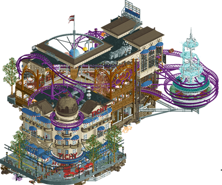
Salon Tichy
Round 1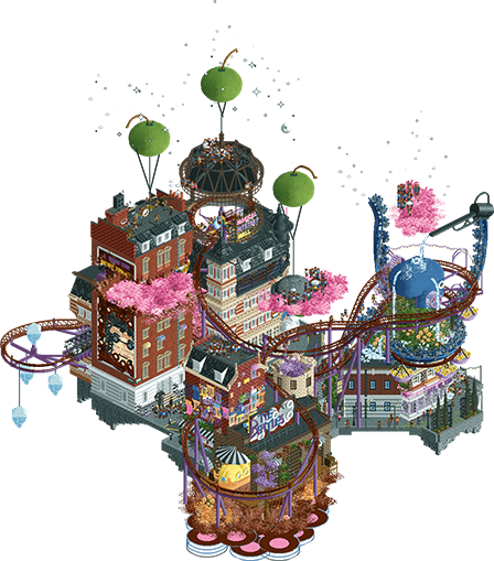
Last Hurrah
Round 2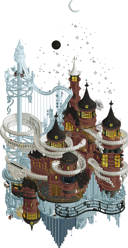
The Melting Orchestra
Round 3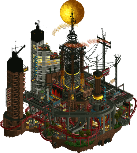
Bangkok Dynamo
Round 4 -

 Xtreme97
Offline
Document 
Match
ConclusionThe poll is now closed. The formula to derive the results is:
1st choice votes + ½ × 2nd choice votesPlayer Calculation Score Outcome WhosLeon46 + ½ × 17=54.5 (53%)CHAMPION AvanineCommuter13 + ½ × 24=25 (25%)2nd Place wheres_walto6 + ½ × 16=14 (14%)3rd Place nin3 + ½ × 11=8.5 (8%)4th Place -

 Liampie
Offline
Congratulations Leon! Not surprised that you got this far and won the whole damn thing. I doubt many people can argue with this outcome, though I would've said the same if someone else won. There are several worthy champions in here. What a contest it has been... Amazing
-

 Jens J.
Offline
Congrats to all four finalists! What a wonderful way to cap off this Micro Madness with such a high-quality final
-

 wheres_walto
Offline
Congrats Leon, you were the clear best player of the entire contest. I'm happy to take the bronze behind two studs
-
 WhosLeon
Offline
*corny speech alert*
Woah this is so cool….
I went into MM with a “I’m just happy to be here” mindset, seeing it as a perfect opportunity to execute some concepts that I otherwise wouldn’t have gotten the chance or motivation to build.
My first idea was to do a series of micro’s that were all based on places I’ve been as I have been traveling a lot as part of my studies, which I actually started doing with Salon Tichy. But as you know, RCT and creative processes in general never really go according to plan — my usual way of working does not really involve too much of a plan, anyways.
I don’t want to sound dramatic by any means, but living somewhere else every couple of months for a period of three years can be challenging (but also incredible) at times, especially when you do it alone. Being involved in the NE community throughout all of this has been such a great constant factor that gave me comforting continuity through all the changes that were happening for me in terms of location and social circles. Having this group of friends that all share the same passion for worldbuilding and RCT at my fingertips has truly been a blessing that has kept me from feeling lonely or losing my mind many times, so a big thank you to every single one of you for that.
After round one of MM I moved to Bangkok (which probably will be my last big move/journey for a while), which forced me to do most of my building in Airbnb’s, airplanes and in between grading essay’s fueled by watered-down iced coffee’s in a local cafe. On the surface that might not sound like ideal building conditions, but it has actually been a great way to escape the chaos of the city and the stress and insecurities that come with interning in a foreign country.
The concept for Dynamo hit me on my way to work, when I was stuck in traffic in the minivan that picks me up every morning. Staring out of the van window looking at the absurd amount of power/telephone lines that strangle the city against the morning light made me wonder and fantasize about where they all come from, a ‘central’ point if you will. From there it went really quickly by tying some other characteristics of the city into the concept like its layered nature and the insane traffic.
Building on this park especially — while certainly stressful at times — has been strangely therapeutic. Deconstructing and studying the city’s layers and components helped me to make sense of everything around me and my place within it, I guess. This was the first time really that I was fully endulged in the environment I was building which also helped a lot — I’d come back home with fresh inspiration after something as simple as a short walk or seeing the city’s tallest buildings slowly turn into blinking silhouettes from the terrace of a rooftop bar.
I want to thank you all so much for the encouraging words you’ve given me throughout the contest, I’m still in disbelief that my work has been received so well and I’m really grateful for it. I think in a solo contest that type of stuff just hits different. It didn’t only give me more faith in my own judgement regarding RCT, but it also hugely increased my confidence in terms of creative decision-making in general, which I feel like will be something I’m going to take with me and benefit from in several parts of my life for a long time.
One takeaway from my building experiences this contest is that you don’t have to (and shouldn’t expect to) feel inspired every minute of working on something. It’s all about trusting that initial vision and spark that made you start the project (even if that already got boring to you because you’ve been staring at it for 20+ hours) and putting in the hard work that helps translate that idea to the viewer as well as possible. If you do that, the excitement you felt when starting off will translate to your audience even if it’s already lost to you.
A thing that I think is unique to MM (and maybe also H2H but less so because you have a team around you, i’d say) is how it forces you to just ‘go’ with certain things simply because you have to. When you build solo outside of contests you can spend days to weeks pondering between two concepts or even two different railing styles; However, in MM you just have to choose — on your own — right away. If you don’t, you won’t make it. That together with the feeling people are expecting you to deliver make it just so much easier for me to finish projects. I wish I could transfer that type of energy into my deadline-less solo work (and other creative endeavours) so I could actually finish stuff, but I haven’t really found a way to do that just yet.
I was talking to nin the other day about how RCT is sort of a ‘miniature’ version of an artistic venture, which makes it such a strong tool to get an insight into what it takes to realize your vision through an artistic medium. There’s so many transferable skills that you learn while playing this game, no wonder so many members of our community are succesful artists and designers.
I’m probably going to take time off RCT for at least a month or two. As rewarding as MM was, the burn-out definitely started kicking in during the final round — I think all finalists/participants can relate to that, as was also appearant from Walto’s lovely building diary.
Anyways, I’ve been going on for way too long, and I’m not sure anybody is even interested in my rambling lol. Thanks again to all the participants, voters, and commenters. Finally, thanks to the lovely Mulder, Spacek and Tolsimir for providing me some incredible assets to support my silly ideas. It truly means a lot
-

 Lurker
Offline
Congratulations Léon on a dominant MM win! What a run. Also great work by all 4 finalists, it was a fun match to looks through and tough to vote on.
-

 G Force
Offline
Congrats Leon, well deserved, fantastic run all the way though. Kudos to the other finalists as well, really a good showing all around. Was not an easy vote.
 Tags
Tags
- No Tags

