RCT Discussion / RCT Hot Takes
-
 28-October 22
-

 nin
Offline
What are your RCT hot takes? Defined as a "piece of deliberately provocative commentary that is based almost entirely on shallow moralizing", hot takes spur reaction and discussion. In our own community, that could mean an opinion of a particular building style, a ride type, trend, etc. This can span any era of NE or RCT, so feel free to reach as far as you can if your take needs to.
I'll go first:
Half-diagonal building is unnecessary, and oftentimes doesn't add much to the game's aesthetic.
---
Also, while hot takes can be taken as negative or controversial, refrain personal attacks on players, past or present, and remain civil if you disagree with someone's take. If healthy discussion emerges, you may even change their mind.
-

 Tolsimir
Offline
As 'inventor' of the half-diagonal I think I need to disagree with you (it's a hot take after all
 ), mostly on the second statement, though. I mean it of course depends on what you want to achieve in the game. If you want to go for the way we have built in RCT ever since, evidently they are not necessary. You can achieve all cool stuff completely without them. However, if you are to recreate something and try to make it as accurate as possible (the reason I came up with them in the first place), I guess they are a valid tool to use. Moreover, -- coming to the second statement -- recent releases and screens have shown that the delicate use of half-diagonals indeed are able to create very fresh look, I'm refering to the movement of breaking the grid as much as possible, i.e. something is added to the aesthetics. Especially in my opinion the use of half-diagonals can create a sense of depth, which you couldn't achieve before. Of course I'll give to you that you personally can just favor 90 and 45 degree angles, but denying that there is a new look by using them seems rather not appropriate. That being said, I'm certainly not arguing they should be used everywhere by everyone but automatically dismissing work just because there is some half-diagonals used should also not be done. In the end, as with everything else in RCT, it is about the execution.
Nice topic idea!
-

 nin
Offline
I felt bad as soon as saw you browsing the topic-- nothing personal!
For me, I think I haven't been totally convinced by their use, though I can see myself changing that stance as it transcends from feeling gimmicky and becomes an ongoing part of the meta, as all innovations tend to do here. -

 alex
Offline
I think the fundamentals have to be good first. If a path layout or cluster of architecture is poorly composed, then using half-diagonals or curves is like polishing a turd.
That's why I'd advocate learning to build with full tile architecture, pathing and landscaping. If you can make something look organic and well composed with basic tools, then things like 1/4 tiles, half diagonals, curves, new landscaping techniques are the cherry on the cake.
My own hot take:
English Palette II is not very good. It was suitable for the use Liam made it for, but otherwise I think the colours are not very well balanced.
I think people use beige too much because the default greys are too blue and the default browns/tans are too yellow - if these are balanced out you need 1 beige colour at most.
I'd love to see people embracing whites/greys and browns again instead of so much beige.
-

 Tolsimir
Offline
I felt bad as soon as saw you browsing the topic-- nothing personal!
Don't worry man. I myself am sometimes still thrown off when seeing them and also when using.
@alex: I don't like that palette either, but mainly because the dark beige there causes awful saturation (I think it's because of its position on the palette). However, I do like a variety of beiges (of course depending on the theme). For Valencia for example I am totally happy to be able to have a full spectrum to capture different tones. There I changed the beige from english with the one from mekong I think though, it's a lot superior imo.
-

 Scoop
Offline
Hot take: I think H2H is not ALWAYS a good indicator of individual skill in the game. This is mostly predicated on the fact that the contests nature is collaborative. So while parks can still be outstanding, It is still a team effort. This can also go the opposite way (Fantastic builders on average parks).
-

 wheres_walto
Offline
Hot take: Gold has become a de facto certificate of completion and doesn't feel special anymore. The tools we have now are so powerful that high accolades are more accessible and less impactful than ever. As a result, we've become hyper-fixated on parkmaker tiers to the point that excellent parks are being considered disappointments for the builders and creating further distaste for panelists
I think it would be cool to create curated lists of personal favorite parks, things we've found inspiring or influential or otherwise enjoy revisiting. Holding a spot on another player's list, especially one who's work I also admire, would mean more to me than any accolade -

 Sephiroth
Offline
Hot Take: If your semi-realism (or realism) project is going to include realistic details like transfer tables, storage sheds, and other maintenance items, you should make sure they actually make sense or just scrap them entirely and let your stronger aspects shine without hinderance from garbage, non-functional details. Same goes for dispatch times for coaster trains and trains sitting stopped by block breaks at the tops of lift hills and mid-course brake runs.
-

 Ethan
Offline
hot take: this pole object
 has the line right there in the middle. I say remove that! at least when using it for not wooden pillars. See it used for some nice archi but looks like it is being supported by bamboo shoots.
you're welcome ETHKNPL2.DAT (1.06KB)
downloads: 393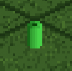
-

 inthemanual
Offline
Hot take: I think H2H is not ALWAYS a good indicator of individual skill in the game. This is mostly predicated on the fact that the contests nature is collaborative. So while parks can still be outstanding, It is still a team effort. This can also go the opposite way (Fantastic builders on average parks).
Never seen a harsher self own -

 Ge-Ride
Offline
It'll take me a while to come up with something that's really controversial, but in the meantime I have this to say. I miss the time of less detailed parks because you had to be a little bit abstract. I don't mean the LL days before RCT2 came into its own, though those parks were creative in their own way. I just miss the time when you used some new custom objects but not from a ridiculous sea of them to cater to your every whim. It used to be that if you wanted an effect, you'd find an object or two that gives you that effect. Now it feels like you have to engineer every nick and corner and sometimes, not always, but sometimes feels to me like you're putting in more effort for a less effective result because you can't micro-manipulate the scenery quite to the point where it feels natural. At some point they'll find a better way to do micro-details with some sort of new feature or plugin, but once we do that, we've effectively reengineered the game quite fully to the point where there's little of the original game left, for better or worse.
-

 Scoop
Offline
I'd say that it really comes down to knowing the fundamentals of design. You can build in any style that you want, but if the basics aren't there then almost always it won't turn out great no matter how much detail is or isn't there. It also depends on what you're playing the game for. If you are trying to create the most realistic parks possible, then having as many details as you can fit feels pretty acceptable. As where a more semi-realistic approach may not need all of that and even further for something completely detached from reality. But even then you can have minimalistic styles for each of those examples.It'll take me a while to come up with something that's really controversial, but in the meantime I have this to say. I miss the time of less detailed parks because you had to be a little bit abstract. I don't mean the LL days before RCT2 came into its own, though those parks were creative in their own way. I just miss the time when you used some new custom objects but not from a ridiculous sea of them to cater to your every whim. It used to be that if you wanted an effect, you'd find an object or two that gives you that effect. Now it feels like you have to engineer every nick and corner and sometimes, not always, but sometimes feels to me like you're putting in more effort for a less effective result because you can't micro-manipulate the scenery quite to the point where it feels natural. At some point they'll find a better way to do micro-details with some sort of new feature or plugin, but once we do that, we've effectively reengineered the game quite fully to the point where there's little of the original game left, for better or worse.
-

OddmentsAlchemyLab Offline
I'd say that it really comes down to knowing the fundamentals of design.
I could not agree more. I collect objects and having 25k+ objects has done nothing to improve my eye for design. In fact, I STILL find myself looking for - or now learning to make - objects to fit a specific vision in my head. This is not because the materials are not there, its because I am overwhelmed and do not know how to use what I have well.
An example would be asking the builder of a park where he found his vertical i-beams (I assumed he had some custom stuff) and it turned out, he was using single rail track. BRILLIANT!
As new players are attracted to RCT through the new features in ORCT I think this may become worse. I am one of those players and I have no sense of the creativity it took to make parks with limited options; and yet they will be lost in the sea of objects without a sense of "custom/NCSO" distinctions. I think more visible NCSO tutorials would be helpful for that. But also considering "official" extended sets of objects that match a base aesthetic could help create a building standard and establish aesthetic genres specific to the game.
It sounds like a lot to do, but my rant would be that object organization should have been foundational and not an afterthought.
-

 posix
Offline
Hot take: Gold has become a de facto certificate of completion and doesn't feel special anymore. The tools we have now are so powerful that high accolades are more accessible and less impactful than ever. As a result, we've become hyper-fixated on parkmaker tiers to the point that excellent parks are being considered disappointments for the builders and creating further distaste for panelists
I think it would be cool to create curated lists of personal favorite parks, things we've found inspiring or influential or otherwise enjoy revisiting. Holding a spot on another player's list, especially one who's work I also admire, would mean more to me than any accoladeThe list thing is enough for you to repair incentive though?
-

 Ge-Ride
Offline
I'd say that it really comes down to knowing the fundamentals of design. You can build in any style that you want, but if the basics aren't there then almost always it won't turn out great no matter how much detail is or isn't there. It also depends on what you're playing the game for. If you are trying to create the most realistic parks possible, then having as many details as you can fit feels pretty acceptable. As where a more semi-realistic approach may not need all of that and even further for something completely detached from reality. But even then you can have minimalistic styles for each of those examples.
To explain what I mean a bit more in depth, I'll give three points. When you use certain premade objects they're more detailed than what you can easily make by recreating something with smaller objects. Not only are they more detailed, they may have colors that you can't easily recreate with RCT's limited painting palette though you can be more choosy nowadays with custom palettes. And lastly, the smaller objects have a sort of micro-conformity to a grid, which you don't quite see with say, LOTR rocks or canyon pieces, which conform to a large grid but don't have details that conform on a smaller scale like those small stones people are using nowadays. Obviously many large scenery pieces don't have this sort of nuance that evades smaller pieces of scenery so I can't generalize too much. But that's where I'm going with this. There was a screen posted of an inverted coaster that was sort of Nemesis-like but it was done in a more modern style that used those small stones and it felt like they were trying to micro-manipulate my impression and not quite succeeding because the details weren't quite small enough yet.
-

 wheres_walto
Offline
The list thing is enough for you to repair incentive though?
In theory, yes, though as far as incentive it doesn't seem much different than reviews and in the most reductionist sense it's no different than Instagram likes from verified profiles
-

 Jaguar
Offline
1. Playing the game experimentally or using gimmicks is generally frowned upon and unfairly viewed in a negative light. That is, until a 'good' player starts using the gimmicks or it gets accepted by the general community. Biggest example of this would be the WW/TT objects... people hated them for years and using them on a screen caused the scores to tank. After this, once a bunch of people got ahold of the disaster bench and the DKMP server at large started using them, people started accepting them.
2. I think the excessive focus on 'composition' in an isometric game is kind of silly as there's no perspective... you could have good composition with a still screenshot but as soon as you move the screen in-game, it suddenly looks 'bad.' In addition, this site has a strange obsession with making everything look 'sparse' and 'clean' when most artistic depictions of isometric and similar projections, like a wimmelbilder or a bosch painting take advantage of the lack of perspective to fill the picture with detail.
3. "Have you thought of deleting and restarting that building you spent 3 hours on because it's the wrong color." No.4. There are so many unnecessary objects that exist just to make the game slightly more convenient... there's a million different quarter-tile cliff blocks, redundant, slightly different foliage objects because why not?, and one-time use objects like park-specific signs or peeps doing dumb shit. I'm the last person that should be complaining about this but "we need new deco blocks that are slightly thicker than the toon deco blocks" or "this park should have a different palette with a slightly different shade of brown and purple" is a little unnecessary.
5. Don't get me wrong, I love the style but I think LL parks are hugely overrated, at least as far as reception is concerned. A RCT2 park with LL detail would receive much lower scores. And as far as detailed LL goes, it looks like a mess of random objects to someone that doesn't play RCT. The appeal is entirely due to nostalgia and the artificial difficulty but strangely, this doesn't seem to extend to NCSO parks, which seem to be judged pretty harshly, even though they also have an artificial difficulty.
-

 ottersalad
Offline
Those are some good hot takes Jag. I’d agree with you on a lot of it. Except maybe the LL part. I will say that NCSO parks are some times scored a tad low.
 -

 Scoop
Offline
This is in response to Jags post (didn't want to repeat the same wall of text
 )
)I'll just respond to these in order.
1. I think gimmicks and experimental building are a great thing. I think the issue with gimmicks are that they tend to be a crutch. I'm not saying they shouldn't be a focus, but when you can take a gimmick out of a map and there's nothing left to support it in a competitive map, then it becomes an issue. Basically it comes down to the bigger picture.
2. Composition isn't intrinsically linked to perspective. Also, composition isn't relegated to the micro level either. A map shape or the way certain areas fit into a map help with the overall composition. Again, the bigger picture. As for clean, I don't know if I agree with that given the nature of most H2H parks and high scoring parks. There certainly are maps that have a clean aesthetic, but that doesn't mean that the community as a whole subscribes to that philosophy.
3. More of a personal preference rather than a hot take about the community, but that's okay! You should build however you want.
4. If it makes it look better than what could've been built previously then I don't see an issue. For the longest time we as a community were looking for a better way to portray cliffs. I'd say that until the Fisch rocks came out the best we had were krypton rocks and those still saw flak from the community from time to time. A lot of objects you mentioned sound like they were made as replacements for previous objects or additions to existing texture sets that we didn't have like curves or diagonals. I can agree about palettes, but realistically we don't see new palettes with extremely small changes in color. One or two color swaps yes, but I believe they are pretty drastic changes.
5. The problem with LL and RCT2 is that they are two separate games. I'd even argue that LL, NCSO, and CSO are all separate types of building and shouldn't be compared against one another. If you took the highest rated "modern" parks from each "game" and asked the community to vote on which is the best it would most likely end up being the CSO park.
 Tags
Tags
- No Tags