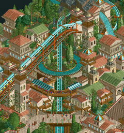
Head-2-Head Classic / Round 3 | Match 2
-
 19-August 22
-

 Liampie
Offline
Retracing our collective footsteps
Round 3 | Match 2
VS Viori Cove
Cartoon Networld
AvanineCommuter (85%)
Xtreme97 (10%)
SSSammy (5%)
 Please note that Viori Cove uses some game features only included in an updated OpenRCT2 version
Ulvenwood (90%)
Scoop (9%)
Mulpje (1%)
Voting Rules
- You should only vote if you have viewed both parks in game.
- Take your time to reflect on each park. The poll stays open for three days, not three minutes.
- Everyone but players belonging to either team in the match may vote. -

 Gustav Goblin
Online
Not gonna have a ton of time to look at these today but GOOOODDDDD Barnacle Heads. How many times can my favorite park of the contest keep coming out? Absolutely masterful composition and ride interaction and aesthetics and just JEEEEEESUUUUS. Was hyped to see what AVC would put out and dude absolutely delivered. So so so so so so damn good, will most likely get my vote.
-

 Turtle
Offline
Easy pick for me, I liked Cartoon Networld but it felt like it was emulating builders that I didn't love back in the day either. The texture-less quarter tile buildings/sculptures just never really vibed with me. Really nice triple dueler though, and was fun seeing the cartoon network tie ins that I grew up with.
Viori Cove is outstanding. Very much along the lines of what I like, an amazing coaster, interaction with the queue, water ride, huge waterfall, ticks all my boxes. Everything was so well done, felt nostalgic in a refreshing way - something new and atmospheric that didn't feel massively different to some parks from way back.
-

 Astroturd
Offline
Viori Cove: The first drop is framed so beautifully. The pretzel loop placement is also primo. Ritual is a cool addition hiding behind the mountain. Very period-appropriate to include a non-functioning custom flat. Nice and polished entry.
Cartoon Networld: Such a fun park. The power puff coasters are short but done really well. Big statement duelers are something we need more of today. Johnny's Wild Adventure is just hilarious. Prominent sculptures and theming throughout the park. One downside is that the individual themes were all very separate from one other - visually and physically.. The park comes across a bit disjointed.
-

 Mulder
Offline
Love to see Ulvenwood growing as a cso builder, really great stuff even though sculpture-heavy parks aren't really my thing. The cityscape with the powerpuff coaster has amazing interactions and interesting architecture. The Johnnywood area is so fun, loved to watch Johnny growing up.
Barnacle Heads, AVC, I just love this. So amazing and beautiful. I want to live there.
-

 CoasterCreator9
Offline
Cartoon Networld: This is really charming. It's certainly got nostalgic flair, and I grew up watching Ed, Edd, n' Eddy - so that was a fun little section to see. The triple dueler is a lovely inclusion, and possibly the highlight of the park. Johnnywood was certainly amusing. This certainly brings the classic atmosphere to the table, though parts felt a little bit undercooked. Overall, very solid work.
Viori: This is exceptional. Brings me right back to the kinds of parks I was exploring when I first stumbled upon NE. This truly has an elevated classic atmosphere, not only in object selection but compositionally and macro-wise.
The scene above is very well framed; the park as a whole is stunning setpiece after stunning setpiece in a wonderfully arranged landscape - my two favorite things. Coaster layout is fantastic, the theming as a whole really evokes a classic feel - all around just incredible work here.
-

 Cocoa
Offline
viori: really excellent and smooth parkmaking. the layout is flowy and integrated to the park really well, and the archy is so atmospheric. Really reminds me of old turtle work. the stuff beyond the cliffs is really pretty too, especially the elevated houses, although I'm not so sure how the peeps get there. all up a really stunning park, definitely a highlight so far
cartoon: hah, this park is also hilarious. such a throwback to internet city esque parks. Add another ridiculous porn sculpture to the collection! My favorite part was either the entrance, which was simultaneously simple and elegant, or the city of townsville area, which gave me such archangel vibes. really fun stuff folks
-

 ottersalad
Offline
Holy cow, Viori is like our park but on steroids! This style of architecture is what I had in mind honestly, but you did it 100x better. I'm quite honestly jealous! The layout of Viori is superb, and the queue is done so well too. I love a good sprawling queue. What's also impressive here is the elevation changes are massive, but so well hidden with how everything is framed and how well the archy is nestled into the terrain. Top notch park making and planning. Definitely will come back to this over and over. Pretty inspirational work.
Cartoon Network: Loved the ideas here, sculpture work is wonderful. Shame you had to go up against Viori! I think the triple racing coaster was ambitious and really well done. Just the blue train ends so much earlier! But the interaction was great. The merry-go-round theming was amazing. Just super creative and little bits like that really make a park. Definitely can tell you had a lot of fun making this.
-

 Ling
Offline
Cartoon Networld: Truly wonderful application of the style of objects at the time. The nostalgia factor and sheer affection for the time period is strongly on display and works wonderfully. Johnnywood is kind of gross but also hilarious. This isn't technically flashy like some other parks have done in revisiting the earlier object sets, but is a wholly different interpretation of the stated purpose of the contest, and I adore it for that. Maybe Toonami could have been mixed in here somewhere? I think that would have been period appropriate...
Viori Cove: Ah, I wonder what we would have said if people tried to use pizza huts as roofs back in 2005. I think this may be the best single coaster of the contest so far, and I am a huge sucker for these classic style pole supports. I'm also a sucker for big sprawling station buildings like this. Truthfully I just don't have much to criticize, this is wonderful.
-
 Levis
Offline
A very nice round again. Kudo's to both teams to deliver this kind of quality. I must say it was very hard to come up with some points of improvement for both parks.== Viori Cove ==Pro's:- The atmosphere is very good!- The landscaping is done very nicely!- Ritual was done very nice, I loved how it was a bit hidden and had it's own distinctive style while still feeling in the same overall theme as the rest of the park. I also like the detail that the quests will walk past the exit of the ride when exiting the hidden substitude ride.- I liked the layout of the flyer, it felt a bit long but I don't mind.- I like how you set up some views like the one from the lifthill.Con's:- I'm missing a big architectural thing. All buildings are done very nicely but looking at it for a while it all starts to look the same, I wish there was one bigger building which would really draw my attention to all the nice details in the architecture- In the lower part I felt that the foiliage was a bit to much, mostly on the side of the enterprise ride. The foiliage became a bit to distracting and took away from the overall experience I think- I would have loved to see peeps actually going in ritual and looking like they get out instead of going behind it, if you are using a substitude ride already you could just place the entrances and exits there already.- The splash run area for the viorifalls ride felt to shorts, the car wasn't slowed down completly before entering the corner.- Would have loved to see the handyman als named to see what other fun things you could come up with, but I understand it can become tedious to name them all.== Cartoon Network ==Pro's:- The quaterblock sculptures where nice- The shoppingcar ride was funny, did you make it specifically for this park?- The park was set up nice and open and felt nicely layed out- The tripple coaster had a nice layout (but I really wouldn't want to work on the station of that ride trying to load/unload the peeps that fast to make the sync work properly XD )- The entrance carousel with the camera etc looked very nice!Con's:- No welcome message, I do like the fact that you set a custom date, if I remember right that is the date cartoon network stopped right?- I felt that the archy in the PPG area was a bit to monotome. Could have used a bit more texture- I don't really like the use of the car objects, I never really liked them. Personally I always wondered why people use them as we also have car rides, so why not just use the cars from that ride, you can also position them however you want (diagonal or not) instead of needing different objects for that. And especially because you did use rides for the crashing car I don't understand why not use it on the other spots too.- I felt that the PPG area was a bit to big compared to the other area's, but I also understand you needed that room for the big coaster(s).- It's a shame some of the bridges are just default path with default support, it felt a bit unfinnished/rushed in that way.Overall like I said before two awesome parks. I think cartoon network would have won many matches because the nostalgia for the cartoons allows me to overlook a lot of small things. But in the end it's really missing some polish. So my vote goes to viori cove.
 -

 chorkiel
Offline
This is such a great matchup. The best one so far. It also shows two completely different approaches to h2h which makes it a really difficult vote.
Viori is all aesthetic and vibe. Looks great. Celladoria was one of my favorites from the NEFC, so I shouldn't be surprised this is coming from you. This park seems like it could have made someone a parkmaker in any year from like 2005 till now. Which is quite a feat.
Cartoon Networld is one of those fun idea driven parks. People always discourage IP parks, but I think with CN you didn't pick a really risky property. I didn't grow up with it and I still got all the themes and plenty of references. You did a great job of coming up with rides and execution that really fit the show and their characters. Very good job!
Leaning towards Viori but gonna contemplate my vote a bit more.
-

 Recurious
Offline
Two cool parks.
Viori:
Love the composition of everything. Everything just seems to work so well together, the archy is beautiful and the landscaping is exciting and well done. Also gives me great PT2 vibes. Overall just masterfully composed and excellent.
Cartoon Network:
Really fun park. Love many of the ideas and sculptures, really fun to explore. This park also really gave me old school vibes and reminded me a bit of Dreamport / Levis style. Overall just good work although it definitely feels less amibitous than Viori. That is IMO more than fine for this contest, just bad luck with the park you faced in this match up.
In the end I voted for Viori as I thought it was more ambitious and overall more exciting/higher technical quality. But I thought both parks were well done.
-

 Gustav Goblin
Online
Cartoon Networld: This really hit the 2005 niche in a special way for me; I definitely remember watching a ton of these shows way back when and Sundae's Best gave them a great home here. Right off the bat, the sculpture work is surprisingly clear considering the PT2 limitations, not surprising for Ulvenwood. There's a great selection of family-oriented rides, although the triple-dueling PPG mobius really stands out. The archi around it screams PT2 and reminds me of Metropolis and Arch Angel. Genius move using the double deck observation tower as Mojo Jojo's hat as well. I also love the little interior cutaways in the Dexter's Lab ride. The Johnny Bravo area is... distinctly Ulvenwood, to say the least. Not exactly sure if the name Wet Dream would fly in a park like this in real life. With that said, the Johnny Bravo sculpture here is the best in the park. While I understand the area around Johnny's Bad Hair Day is a continuation of the waterpark nearby, something about it doesn't really fit the Johnny Bravo theme.
There are two minor nitpicks I have about this park. First off, there are no mechanics. Leave the game open during work and the whole park is inoperable. Second, there's a waterfront seating area near the PPG coaster which seems to be right at water level and separated by a wall. I feel like this should have been 5 feet up overlooking the water. Nonetheless, this is a park H2HC really needed; feels classic all around and nails a part of 2005 that zoomers like myself have fond memories of.
Unfortunately...
Viori Cove: Hear me out, captain.

I made an early decision. I held my vote. I waited to do a deep dive of both parks before making a decision. Nothing has changed. This is clearly on a level above anything else presented in this contest so far. It's the perfect child of the last match, combining the subtle beauty of Otter's park and the over-the-top detailing of Ethan's. It is genuinely something to behold and a classic example of masterful parkmaking.
First off, this map feels massive. It looks to be about 3600 tiles when I pull up the land tool, but how it's laid out and given separate themes makes it feel finals size. The verticality also contributes to how massive this park feels. The landscaping is top notch; the entire park feels lush and the meadow near the cove deserves special mention. The vines creeping up most of the buildings almost make it feel crunchy.
The main village is gorgeous, and its architecture is subdued but intricate with unique motifs such as the blue and gold domes throughout. The foliage does wonders to break it up, and frankly I kinda wanna live here. Conversely, the cove village is straight out of Agencia and also has a unique yet consistent look. Absolutely love the houses cascading down the cliffs.
The ride design is through the roof and Viori is easily the best coaster of the contest. The first diagonal drop through Viori Falls, the queue, and the main path is just stunning, as is the pretzel loop next to the waterfall. Viori Falls is a great supporting ride; splash boats and PT2 go hand in hand. The interaction with both the village and the mountain makes this ride an experience. There's a nice offering of flat rides throughout as well to break up the paths, and Ritual is a crazy hidden gem. The only miss I would say is Hall of Mirrors; something that could potentially have some insane theming doesn't feel right hidden inside a mountain.
Honestly, this is a park I would call... perfect?! Nothing sticks out in a bad way and everything about it is spectacular. Far and away my favorite park of the contest, and it's gonna take something out of this world to top this. Fantastic park Barnacle Heads!
-
 G Force
Offline
Really liking both of these parks, so great job to all builders.
Cartoon Networld has really grown on me the more I look at it. This park totally feels straight out of H2H5, like in an uncanny way. So maybe not quite the classic era as defined by the contest but to me its really cool to see a park like this since we really don't seem to tribute many of the parks from this era that weren't in the top tier or on the cutting edge. Even down to the concept which again feels so H2H5 its funny. Probably will end up being one of my favorite parks of the contest.
Viori, well yeah, AVC you nailed this. Almost feels too good for this sort of contest but I don't have a problem with that at all haha. Coaster is fantastic, landscaping is expertly done, the archy is wonderful. Just all around fantastic work, maybe even spotlight quality stuff, even in todays standard. Hope building in this style opened up some possibility for future productivity from you, definitely would enjoy seeing more stuff like this.
-

 In:Cities
Offline
Viori outclasses everything in this contest. It's the perfect balance of classic aesthetic and modern sensibilities. Excellent interactions, appropriate amount of detail, gorgeous atmosphere. Just a well crafted map all in all. I love that you used the new flyer elements. Yes, it's a "classic" contest, but i think this park feels the most classic out of all of the maps I've seen so far. You understood the assignment and nailed it. Great work boys.
Cartoon Networld is sick. I love the vibe of this map. Triple launchers are nasty. That corner of the map is probably my favorite. I really like the little area down by the water. Johnny Bravo area was fun. Nice butts. I do think there's a bit of missed opportunity in including more shows from Cartoon Network. Though it seems you selected the shows specifically from the early 2000's - which is appropriate of course. i really like the entrance area with the camera. Tons of great ideas and well executed sculptures. You guys also nailed the classic aesthetic, so well done on that!
My vote went to AVC/Xtreme/SSSammy. That map is just undeniably great. If it were released in 2005, it would be referred to as one of the greats and would influence parks and designs to this day I think.
Well done
-

 wheres_walto
Offline
Lots of love given to Viori, and rightfully so. Truly great work from one of the truly great players. I don't think I have much more to say about it so I wanted to give some attention and appreciation to Cartoon Networld.
This contest is about remembering the past, and I think Networld does a great job to strip away the nostalgia goggles and remember lots of parks back then were stupid and served purely as a laugh for the builders. Not everything from the era was a masterpiece, the player base was younger and arguably less thoughtful than the remaining hardcores who still play these days, and as a result we got a lot of silly parks. True humor parks are nearly extinct these days, now humor manifests itself in different, more subtle ways. Take these classic examples:
https://www.nedesign.../internet-city/
https://www.nedesign...h-park-studios/
https://www.nedesign...932/parkmakerz/
https://www.nedesign...0/playboy-park/
https://www.nedesign...spiration-well/
So far in the contest the vast majority of entries have to some degree just applied modern techniques to classic styles, taking recognizable inspiration from the same collection of parks from the same collection of builders. This is the first park I've seen that goes the opposite direction, focusing on parks built by horny teenage boys who just wanted to make their friends laugh. So many of us (and I'm 100% guilty of this) are so pre-occupied with winning or creating the best thing or scoring high accolades that we forget how silly all of this is. Thank you guys for not taking it so seriously and building something to be proud of
-

 alex
Offline
Cartoon Networld:
Such a great idea to not only do a park which is nostalgic in style but also in choice of theme. Sculptures were all super fun, albeit a bit crass on Johnny Wood island - though appropriate to what a teenage-boy RCT player might build. I enjoyed watching the powerpuf duellers zip through the cityscape. In general this is a charming park and the poll doesn't reflect the quality - it may well have won in a different match

Viori:
Not much to say here that hasn't already been said - it's a phenomenally beautiful park and to be honest would hold up in a regular H2H matchup. Well done guys.
-

 FK+Coastermind
Offline
Both maps were a lot of run to explore for very different reasons. Viori captured the aesthetic and feel of classic rct2 parks from back in the day, and with a surprising amount of content. At times the forms felt a little repetitive, but that also played into the nostalgia for me of an era when an entire area of a park was just a single 'style' with appropriate variations and rides. While I do see some modern tendencies, on the whole this park feels like a missing masterpiece from the PT2 days rather than a modern park pulled into an older style.
I echo walto's appreciation for how Cartoon Networld captured a very specific style of park from back then. Focusing on a single source media like Cartoon Network and finding fun and unique ways to bring it into rct was very much a bread and butter for rct2 at one time, though I associate that more with H2H's then PT2 specifically. Where I'm torn on this park is that I was never really a fan of those parks back then, and it's a weird bit of bittersweet nostalgia to look at some of the conceptual quirks of this park and see them as a lovely throwback to how odd those parks were even then. Ultimately, while I appreciate more the risk to make a park like this and reference a very specific part of NE's history, the timeless aesthetic of Viori won me over.
Big congrats to everyone involved, another really run matchup to explore.
 Tags
Tags
- No Tags

