NE 20th Anniversary / Portfoliesta - reminisce and enjoy
-
 10-May 22
-

 Cocoa
Offline
Going back through the strangelove parks, I think that team may be one of the best 'underrated' teams in h2h history. Almost every park holds up incredibly well, and the six parks we finished were all great. somehow the weakest park might be... port disney? which was still an excellent, exquisitely designed piece of realism where I first realized that Josh was not to be fucked with!
Otter and I have quite a few pieces together, both officially and unofficially... lol. I want to be naughty and post two:
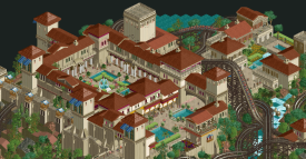
from malaga. I really love this park still. I remember spamming alhambra pics on discord with the hope that it could work perfectly with the pt2 bench, and I think you guys nailed it. I also may have contributed the skeleton of that coaster layout... sorry admins lol. In the end, I was amazed with how quickly you pieced together a really coherent and atmospheric landscape, although I must confess I do not recall who did what from this screen! I think the ability to quickly make a flowing, natural scene with more minimal scenery choices or detailing is the most important step to elite parkmakerhood. Not that I don't think you're good at detailing too, but a lot of people skip the big picture, whereas I think you've intentionally grown that element of your game.
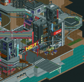
this is where I realized you were going somewhere. This is like >90% you IIRC. the unfinishedness makes it slightly hard to read but I promise there is some excellent micro detailing in here. This park's demise is at least 80% my fault for floundering around in uncertainty and losing my mojo, but I think we were slightly ahead of the game perhaps! would have been epic...
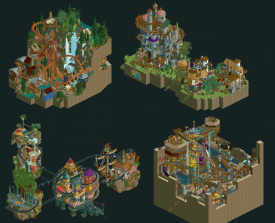
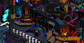
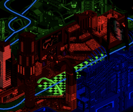
I have a lot of stuff I'd like to brag about. For example, I kinda want to elaborate a bit on the temple design in Mekong, which is probably my best park. But maybe my proudest 'work' is my run from MM19---I had a deliberate design philosophy throughout that I think made that collection of 4 parks something special. So I may cheat a little and do this. (may have to right click and open image in new tab if its too big). The goal of each park was 1. introduce some new hack/dynamic feature/gimmick and 2. reinterpret classic RCT atmosphere and themeing. I wanted each park to have spectacle and narrative that kept you watching for more than the few seconds it takes to rotate the map four times.
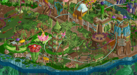
1. forest frontiers was my least ambitious idea but ended up with the highest community vote...I concede it is very pretty. I fucking love the layout though, the flyer drop is just so cool. the setpiece here was the log waterfall into the sawmill. I've always been obsessed with the real 'log flumes' of old in the pacific northwest.
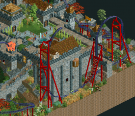
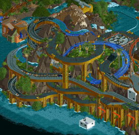
2. probably the most complete ride in all of them, and easily the best narrative ride I've ever made. I think the story is both sufficiently simple but really fun. The idea of peasants sneaking into the castle in barrels is just plain fun. the original gimmick of the park was to take the green goo objects to their natural conclusion (something I'd played with a bit in that collab LL villain park). the plague idea grew from there. I wanted to teach myself how to shoestring the barrels so they would each go different ways, but it turns our rapids boats don't go backwards happily (or at least, I'm too dumb to figure out how). But in the end, I managed to fit all the narrative features into one quite long story ride. very proud of this one.
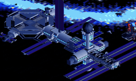
3. maybe the worst of the four? not sure. An idea I had from the beginning, using the conveyor belts as old school magnetic tape that played songs. I put a lot of tiny details into here that I'm not sure people caught, like the brontosaurus playing the electric fence bass instrument, and the dead human groaning into a mic. The central island is also dense af and I love how it turned out.
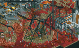
4. the reactions I woke up to on discord were all I ever needed from this park. very proud of that, even if it looks a bit clunky...I had made the vehicles early into MM, but I ended up needing to build the park itself quite quickly. I spent maybe 6 hours on a flight to dubai placing each of the rides very very carefully. what a hunched over nightmare. Still, I think the actual park may have been slightly overlooked. its messy, but I love dynamite blaster's layout, the emerging alien, and the warm, scifi density of the base. what it sacrifices in readability I think it makes up for slightly in atmosphere.
ok that was too much lol sorry everyone
-

 Liampie
Offline
Funny how you've had the status of a top tier player for a long time now, but without many standout releases to show for it. Your reputation seems mostly based around screenshots of unfinished parks and snippets of finished parks. Howl's Moving Castle is still quite nice, but your composition has gotten a lot better since.
Not a crowd favourite, but I still quite like the Cedar Flags park I've done. Half of it built around 2008, and then I finished and redid some stuff about five years later, that is clearly much better. I'm quite happy with this architecture!
-

 FK+Coastermind
Offline
Liam - Looking back thru the absolute ocean of stuff you've made, even in just the past 10 years, the variety is pretty wild. Though there may be some distant realms of rct that haven't ventured, you've certainly proven yourself as a jack of all trades when it comes to rct. You've completed well-received projects in both LL and RCT2, realism and non-realism, multi-park collabs, artsy and fartsy concepts, serious and funny, parks inspired by real places, ultra-detailed and low-detailed aesthetics; it's just really impressive the amount of ground you've covered. You can definitely see certain comfort zones and stylistic choices that thread thru your work, but you are willing to go further afield from what others expect, which is refreshing. As controversial as it was, I can't help but smile when thinking of Table with Umbrella. While some seemed to think this was a slap in the face, I love the spirit of experimentation, seeing how far you could truly go with just one object, and the ability to not take things so seriously. As rct continues to evolve, I think now more than ever NE has the chance to step outside the expected.
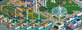
For me, I nabbed a picture of my mirror concept, first used in Monstrocity and later repeated in Micro Madness. I've always loved this concept and hope to do more with it some day.
-

 AvanineCommuter
Offline
FK has a very long history here on NE, but the most incredible thing is his latest breakout into full blown architectural realism that has taken NE by storm. The diversity of his parks are incredible, going from full blown abstract surrealist fantasy queen to atmosphere semi-realism / fantasy world builder all the way to now the queen of crunchy recreationalism / realism! The crunchiness that was associated with his mowed grass and 1k netting found throughout his fantasy works translates perfectly to today's crunchy realism meta, and I'm super excited to see how his work continues to evolve. I think the best words to describe FK's work would be Textured, Ambitious, Creative, and Artistic.
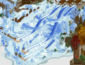
I've chosen to highlight one of my favorite parts of Seasons, a park we briefly worked on together during H2H8. What a beautiful thing to see FK finish this, and take it beyond what we've envisioned during our time on the team together. This slide area is so beautifully composed and flowing, and perfectly fitting within the concept too.
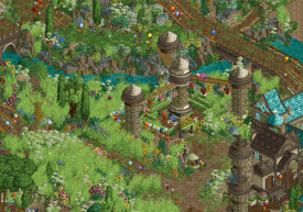
As for something of mine, I really enjoyed working on the foliage in Papilio Valley. I basically stepped in mid-way through the park as a third builder to help recompose the areas and bring the foliage to life (and to delete all of Kumba's jungle flowers ). The majority of the park was already completed with great work by BSG and Kumba, so it was a very fun experience to jump in with those elements in place already and simply create these wide swaths of grass and flowers. I felt like a gardener and I'm very happy with how it turned out.
-

 saxman1089
Offline
FK - It was absolutely fantastic being on a team with you for this past H2H, I absolutely adore how you can take a simple idea and produce gold with it. I don't know if anyone has shared this around anywhere yet, but I love this idea you were working with in H2H near the end. Just such depth and micro ability here that it blows me away how much detail is packed into such a small scene that's basically a tile or two wide.
[Edit: I just saw AVC's post, oh well, you get two FK.]
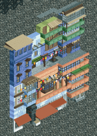
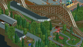
As for me, I'm still really proud of the area around the Phoenix in Knoebels. I felt like I nailed the feel of the real park here, more so than in the rest of the park.
-

 Gustav Goblin
Offline
AVC: The dude that changed how I look at this game. That one-two punch of seeing Le Reve and Arcanis Mineralis for the first time made me realize just how this game could be used as an art form instead of making sure your guests can buy $20 umbrellas. Ask me who my favorite parkmaker is and you are guaranteed to be at least one of the first three names I bring up.
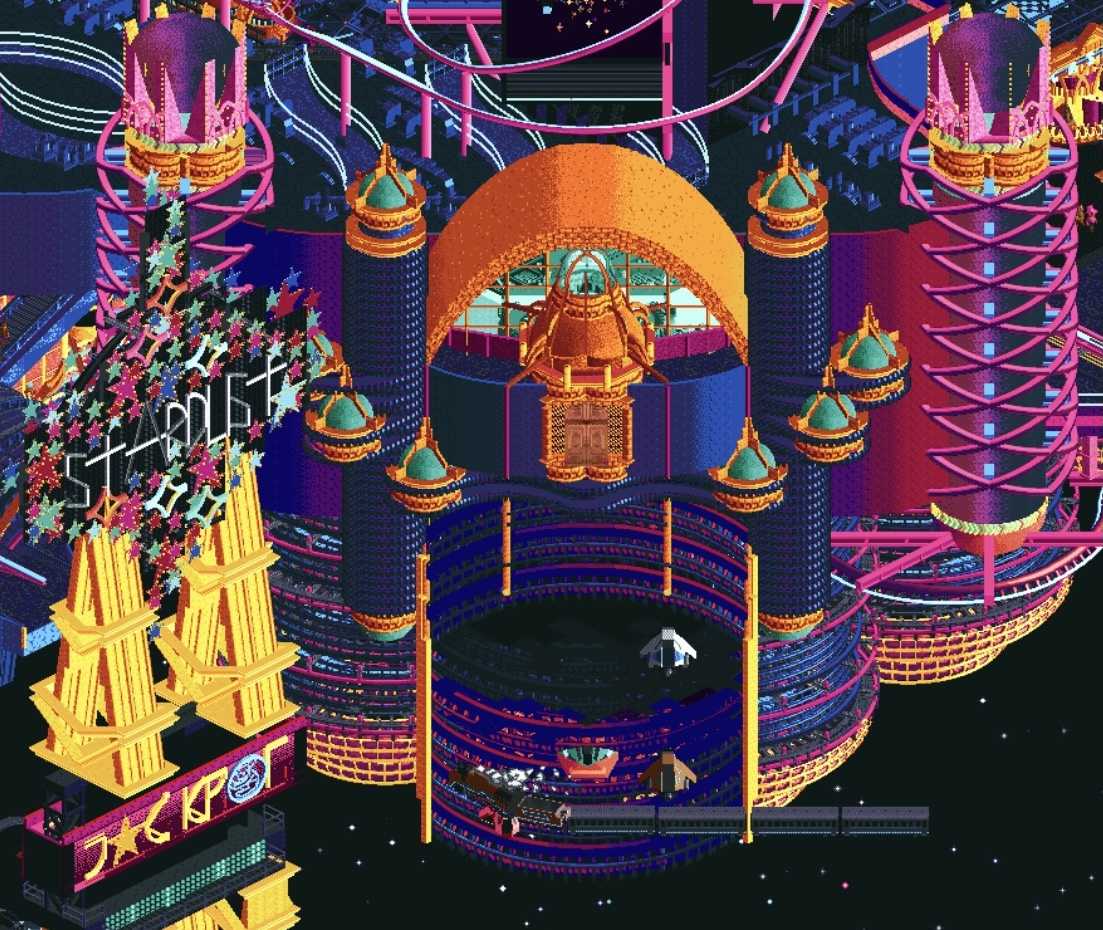
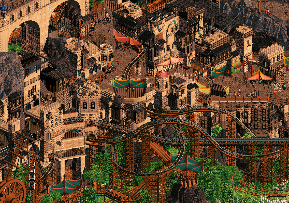
As much as I want to post a Le Reve shot because that set me down the fantasy route from the get go, your work in H2H9 was just insane. Like I still can't fathom how both Stardust Jubilee and Madinat Al-Hareer were even conceptualized, let alone done. Jubilee is just wtf; I don't even know where to begin with any of it but all I know is it's completely freakish and I love it. The little houses built into the cliffs in the Madinat shot really stuck out to me, and the foliage and awnings are perfect for an otherwise monotone area.
Saxman: Complete opposite end of the spectrum but in no means bad. Whereas AVC excels in big maximalist fantasy and worldbuilding and overal wwhooooaaaa, you excel in authentic, homey realism vignettes you feel like you can be a part of. The Bruce Springsteen of RCT. Also the best floater in H2H history, like hello. It's like Spacecrab had a twelfth regular builder with how much work you put in. And as a relatively new dad too? WTF man.
I could easily highlight your huge floater workload on Mount Haystack or Romon U-Park, but why do that when you've recreated a park I've been to when I was young? Seeing Knoebels recreated in RCT2 was surreal; little me would have been absolutely blown away. While I was never around for the Flying Turns or Impulse, I'm going to have to second your Phoenix screen because I did manage to sneak on that one as a young lad. My only other Knoebels memory was falling off one of the handcars. Silly little Gustav.
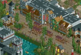
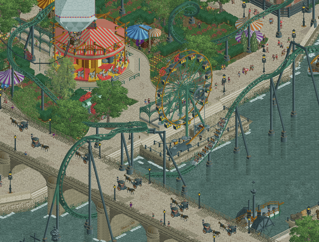
Yours truly: Two portfoliesta posts and I'm already running out of releases. Awesome. I can't not highlight The Big Smoke though; this was the first release under my name that looked genuinely good (65% thanks to a very fast and very nice German). A lot of the "whoa that's awesome" stuff like the hot air balloons, most of the boats, and the bridge was RWE's work, but this screen has pretty much all my favorite things I put on the map. While the second half of Revolution is pretty meh IMO and was built after pretty much everything on the map (big mistake), I really wanted to pull off that immelmann under the bridge and I'm happy I got to do it. The steam-powered ferris wheel was the big revelation that made this map more than just Industrial Revolution-era London, and the huge carousel meant I got to put details I don't think anyone had done before inside like the steam engine and the organ. I'm also very proud of how I used the Liam rock walls to create so much variation and texture; super super fun objects to work with. A bit of a downer park to work on at times as I second guessed my choices and my horrendous pace a ton, but RWE was an awesome partner and helped me keep my head up while tearing through the map and bouncing ideas off me all the way. We made something truly awesome and it helped me achieve my first NE accolade. Nice.
I almost want to do the Ethan thing and pop off on everyone's work. Can I do that?
-

 Liampie
Offline
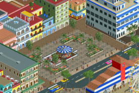
Gustavo: you've already come a long way from your first appearance in Micro Madness a few years ago. It's your Cuban Grand Tour entry that made me notice you as a talent, I remember you building it with a lot of discord feedback, and it paid off in a map that was significantly better than everything you made before it. I like that you're often trying to incorporate some more creative ideas. In this case the map is fairly straightforward, but still, the way you used the flag of Cuba as a colour scheme for the park entrance is quite well done - just taking flag colours can easily come off as cheap and uninspired when done poorly. Interested in seeing another map like it from you sometime.
What Lurks was quite fun to build, during 2016's NE Olympics. Disaster bench was equal parts inspiring and frustrating. I think Tolsimir and I made a quite charming little fantasy world with a little narrative of an unnamed swamp monster attempting to break into the castle. I focused on the castle. This tall asymmetrical wall is one of my favourite spots, and I'm quite satisfied with the animated wall object used for waving flags in the army camp.
-

 FredD
Offline
Liam: I once called you the Zinedine Zidane of rct, because almost everything you build seems easy to do but actually it's genius and hard to mimick. Liam's rct is full of atmosphere, creativity and you're always spot on with textures. There's so much work from you - from the early Dutch parkmaking days when we were all heavily influenced by the great Dutch master Paul, to Legacies to your H2H work that delivered multiple victories.
I can't pick one so I'll pick 3 parks from you that I love.

Tenochtitlan... still one of my favorite pieces of rct ever! A really lovely, full of atmospheric piece of rct. You nailed the right vibe here with perfect texture use and great foliage choice. Also see how that coaster perfectly fits the village?! The all black color works perfectly. For sure one of your best works.
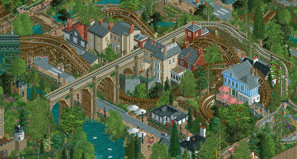
DKS is also a great piece of work. Once again you hit the nail on the atmosphere, vibe. It really feels so English I can imagine walking there. The bridge here is great and shows how you geniusly used elevation change to your advantage.
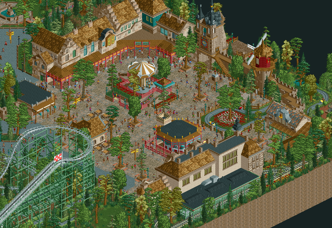
And I also want to shout-out your DVH/Python 'recreation'. Because it feels so damn real, if you wouldn't know better it would look like Efteling took your work as inspiration. This whole square is damn amazing and maybe my favorite thing from you. It shows how you detail everything just enough, not too much, not too little.
As for the rct from myself I'm most proud of... it's easily the latest work I did on my last big solo park Ochsenbach. I had such fun on the whole park and I was motivated and inspired during the whole process, which made me finish the park quit fast for my likings. It brought all the fun memories I have from visiting real German theme parks and their unique vibe together.
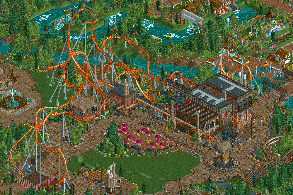
I think I'm the most proud of the Karacho coaster. I'm kinda known for sketchy lay-outs with weird inversions because I made like... 2 or 3 wacky coasters once. It's a stupid reputation because I tried to be innovative and out-of-the-box. And look at RMC now with their zero g stalls, sideways airtime hills etc.
 But this big orange coaster, is for me the best coaster I've made in the game. I think it really flows so well with a bit out & back but also twister section.
 I also had so much fun with the station building that also houses queue, a toilet block, the spare track work room and a restaurant. With the launch starting right above the restaurants entrance and next to the restaurants second floor so peeps eating there will have a blast of a view.
-
 Jaguar
Offline
FredD - Croaked!, despite being unfinished, is a very commendable park, easily one of the most memorable creations of H2H9. The layering and scale of this park is impressive, the buildings have a unique organic geometry to them that breaks the grid, and there's a whimsical sense of fun that was a wonderful surprise coming from someone known for a more traditional, 'safe' style of realism.
It's a shame this park suffered from one of the biggest park killers out there: the object limit, because it is immensely underrated imo. Its creativity and color use is very reminiscent of those old H2H4 and RCTspace parks by players like Emergo and Jkay and I can really appreciate it.
As for me... Via Lactea. It admittedly has aged pretty poorly as OpenRCT2 and object choices have evolved. However, it brings back a sense of nostalgia for a more 'optimistic' time and was sort of my breakthrough park. When OpenRCT2 came out and made building much less tedious, it seemed as though the game was no longer about just building coasters. It was also a source of expression for whatever came to mind, and at that moment it was a renewed interest in astronomy.
-

 In:Cities
Offline
well this topic died quickly haha
time to bring it back. Jag - been a huge fan of yours in recent years. Always flying under the radar a bit, but a mad dangerous player.
I was a very big fan of your h2h park. A bit sad that it got lost in the shuffle a bit. Stupid riverview. But man, Cosmic Infection was a blast to explore. Especially revisiting it now after some time has passed. You have such a distinct style, and I love it.The aesthetic of the black track against the blood red with all the bones and surface movement was just too cool.
gonna go basic white girl and highlight Stardust Circuit again. While without a doubt one of the most stressful build processes of any project I've ever been involved in - rct or not - this map was undoubtably a ton of fun to build on. If we had no deadline, I would have wanted to continue expanding this map. However, it likely wouldn't have gotten finished if there were no deadline haha.
Almost everything I built in this section was built on the literal last day right up until the submission deadline. The music note building, the sushi restaurant, all of the stadium seating on the backside of the Daft Punk stage, the video board with the race track display, the shogun helmet building, the holographic girl face in the sky - they were all built in the mad-dash to the end. What's funny is that the animated peep stadium/crowd objects were created specifically for this park. But with the shift of Lost World going in r1 instead of Stardust, they ended up getting released early haha. Ultimately I think my contributions to this map ended up meshing with hoobaroo's vision in the end and I'm mad proud of how it all came out in the end. love those boys
-

 alex
Offline
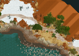
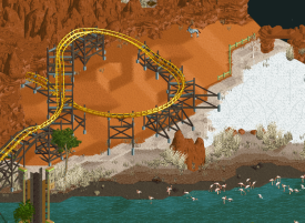
Josh - i'm always impressed with your commitment to aesthetic innovation in RCT. Imo the best example of this, and my favourite work of yours (and CC9's) is Ombezi:
The landscaping is amazing - love all the textural detail and gradiation on the waters edge, and the salt flats, but what I like most of all is how you worked in the games default pyramid 'mountains' to look like dunes and made it look completely natural. On top of that it's a very effective negative space to give some balance to the park.
-

 SSSammy
Offline
Alex - one of my all time fave builders. Take a look at this screenshot.
For another park by a different builder, this might be an unflattering angle. Somehow instead there is a harmony. I'm finding it difficult to describe - perhaps the best way to describe it is that you make it look so easy. There isn't much that is inherently challenging in terms of content on this screen. But it is composed so harmoniously that it can't be conscious. alex do just be built different. I would also describe alex's NCSO as peaceful. I always feel rct-soothed after looking through an alex NCSO park.
-

 Faas
Offline
SSSammy, your love for the classic vibes this game offers shows through in your work and also i how you talk about the game.
You stay true to the original game dynamics and make the best of the awkwardness the game sometimes offers. You rightly see it as an asset rather than a hindrance.
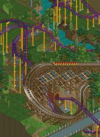
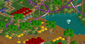
This screen shows that best. No object is too much, and every part of the atmosphere is simply created by landscaping, foliage and coaster interaction. I wish you released more of these parks where less is definitely more.
Edit: I just read that I have to post something of myself that I am proud of. It is my recreation of Bob in the Efteling:
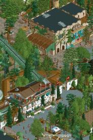
Not only am I proud of how well recreated I think this is, but I am also glad that RCT can work as some sort of album of memories. Funnily but mostly sadly enough, not only the Bob had been demolished, but the Spookslot at the top of this screenshot will also be removed. I am proud both rides live on through my RCT work. -

 Turtle
Offline
Faas, I've always loved the way your work is so believable, without losing that sense of fun. It's tough to know when to stop on the spectrum between under and over-detailed, and you always seem to sit right in that sweet spot. You use bright colors in a way that's always charming, and never tacky.
This is a great example of it - how on earth you managed to make red, yellow, orange, purple, blue and magenta look good, all on a background of peach and green, i'll never know. It's always exactly enough - such a good sense of what looks good.
-

 Terry Inferno
Online
Turtle
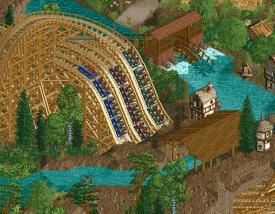
Even though your blue status originates from an older Spotlight, it is your more recent works that I've found to be the most remarkable. I consider Les Trois Mousquetaires to be one of the greatest layouts ever built, and I can only imagine how much fine-tuning went into perfecting it. A triple-dueling woodie that looks perfect from each angle and syncs up beautifully at each transition is a feat that even RCT's finest ride designers struggle to accomplish, and you've turned it into an art with how powerfully it stands while moving so gracefully. Watching the three trains duel is absolutely mesmerizing even to someone who has spent the past two decades watching animated coaster trains move around their tracks. If I had to pick one favorite moment, it would be all three musketeers diving under the creek that hosts the Fleur de Lys boat ride, a truly inspiring interaction scene.
Self
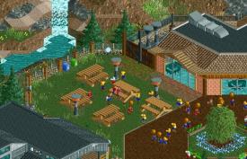
Though it is not particularly complex and noticeably dated, I am still quite pleased with my work successfully conveying this ordinary picnic area. I believe this was the first piece of RCT to incorporate heat lamps (dubious claim; source needed), so I am optimistic about my future in gritty American hyperrealism even if this particular Design is not among my best work.
-

 Cocoa
Offline
Agreed about les trois mousquetaires. I wouldnt say its underrated, but it is understated. Still, i have returned to it more than most designs over the years to study the landscape and the subtlety of atmosphere building. That kind of parkmaking to me feels like the literary fiction of rct---an expert so confident in their skills that an understated but thoughtful piece of work outshines more audacious projects (i have kazuo ishiguros remains of the day in mind, which i just finished...)
 -

 Fisch
Offline
Terry, I found your sense for composition, colors and vibrancy that you showed with Yerka Daylight Time to be absolutely fantastic. On this famous and not at all simple set piece of yours you picked specific colors for each major element. The colors are bright and contrasting but it never seems messy despite the incredible structural complexity. You chose to have all these tracks, curves, and lines interact with each other continuously. You kept moving them on the x, y, and z axis but due to the strict adherence to the color choices you had made for the elements, it all stays very much readable. Then on top of that you managed to let each of the curves that define the composition be home to ride track to add movement and intrigue with all the tunnels and crossovers. And all of it sits in front of the vast open waters so that it’s clear, that this aforementioned set piece is in fact the focus of the composition. The water really amplifies that. The set piece draws one’s attention in and it is in fact one of the few set pieces across parks that stay in memory and are not to be overlooked or forgotten. Not at all an unpopular opinion, but it is my favorite work of yours.
-

 Turtle
Offline
Fisch, let's talk about Gladsheim. You have a long list of great parks, not least in H2H, and this one came at the end of a long and impressive contest. So many great parks, so many new ideas, so many people operating at such a high level, pushing the boundaries of RCT.
Personally i'd been following closely, and commenting on as many parks as I could, spending time in all of them in an effort to pay back the creators for their time and commitment. Sometimes honestly I was struggling to find the words... the parks kinda blended in with one another after a while.
Gladheim is the only park that I just... sort of... sat in, for at least 20 minutes, before even thinking about what I could write about. I don't know how much of it you were responsible for (I hope a lot, based on this post...), but it was one of only a handful of parks that has stuck with me. I have a really strong memory of opening this park, and following the people through the icy wind and snow until they reached the end of the map. I didn't cheat, I didn't look at the end of the map until I had been led there, slowly, by the people... I was just mesmerized, transfixed by the atmosphere. So many theming choices that prioritized atmosphere over aesthetics, and the aesthetics were incredible even so. Thanks to you and whoever else worked on this, i'm afraid I forget.
-

 In:Cities
Offline
Alright turtleman, your turn.
Sad that you don't play the game anymore, but it's always nice to see you pop in and see what we're up to every now and again. I swear I see you pop up on Steam almost every day to play football manager though! lol Maybe one of these days you'll fire up the old rct game again and return to glory.
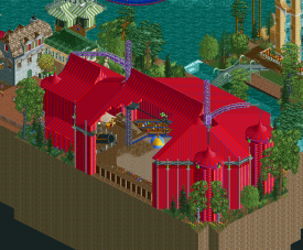
Anyways - I wanted to post le reve just because it's one of my favorite maps ever. wicksteed is probably my favorite builder of all time, and avc is beautiful. The 3 of you together is a dream team, and this map conveys excellence.
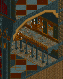
I remember having my mind blown when I saw this circus tent and the interior. It still holds up so well
i'm still proud of bitmap. this is the map that somehow convinced you guys to make me a parkmaker. Despite me not ever building my own coasters. So fittingly enough, it happens in a contest where I don't have to worry about making a coaster. suckers.
 Tags
Tags
- No Tags
