NE 20th Anniversary / Portfoliesta - reminisce and enjoy
-
 10-May 22
-

 In:Cities
Offline
scop,
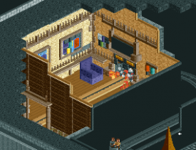
You've become a legitimately good friend over these past few years. You're hardheaded af and usually wrong, but have a heart of gold and a true talent for design. You're biggest asset lately has been your receptiveness to feedback and the consideration of becoming more open-minded. Yes, there will always be someone out there who's better - no matter what skill level we're at. But that just means there's room to stoke that motivational fire and continue to make yourself the biggest, baddest of them all. I love seeing your artwork evolve - both the digital and hand-drawn, and am fortunate to be a part of that process on occasion.
Having you on my h2h team was exhausting, I'm not going to lie haha. But not necessarily in a bad way. You were reliable and considerate of your teammates. Yes we argued, yes I told you to chill many, many times. But in the end, you were the heart and soul of the AC boys and I'm glad I had the chance to get to know you as well as I have.
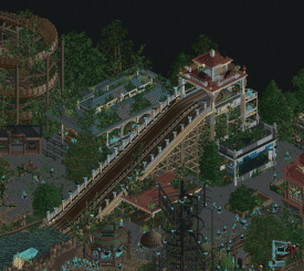
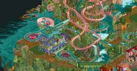
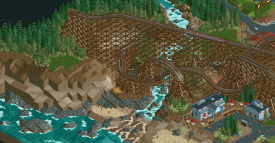
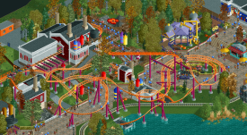
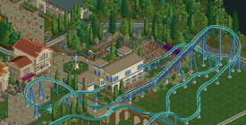
Riverview was surprisingly one of our "less" stressful parks all things considered. It was still a nightmare to put together no doubt. You and Hydro and Brandong put in SO many hours, but it really showed in the end. As incredible as hydro was on this map, I also want to highlight how much you added to it as well. You boys worked so well on this together and your contributions blended together so seamlessly. I remember being super impressed by all three of you throughout the entire process.
Keep at it big boy.
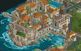
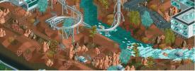
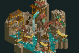
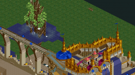
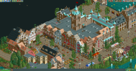
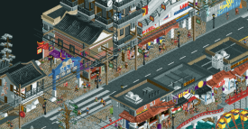
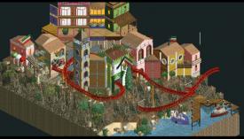
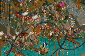
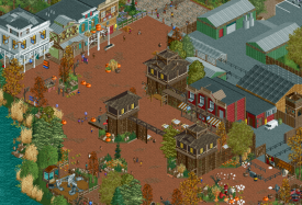
For mine, I wanted to highlight a bit of the Croatia map I did with ][ntamin. While a little stressful, the overall build process for this map was a ton of fun and was really a departure of style for me in a lot of ways. This little harbor area was one of my favorite things on the map. The cathedral and buildings are a bit clunky - might have been good to try some diagonal/half-diagonal buildings here and there but oh well. Still proud of how it came together in the end, and glad I got to get to know Matt better during the process. Also the debut of my colorable animated water objects, which we put to great use when creating the Baja Blast beaches of Croatia.
-

 Splitvision
Offline
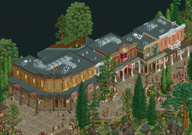
Probably have to scramble to be the first to get the privilege to highlight some of Josh's work. The design guru of NE has long been one of the top players of the game, with an amazing feel for textures, colors, and shapes, put on display over and over again. The Domovina screen above certainly is one of those examples, but there are many more to pick from - I'll go with another showstopper from the GT, Ombezi River Basin. This really shows Josh's next level skill in layering textures to create incredibly credible scenes, and in particular landscapes - I think you are unrivalled in this aspect, and have invented many of the modern "tricks" which players try to mimick when aiming to create natural scenes that really draw you in. On top of that, you obviously have a great eye for architecture, the building here showcasing your skill in creating very convincing and attractive buildings, always with a clear purpose in mind and on display for everyone to see. I think you might be the player who most consistently puts out warm, inviting and great RCT, and for that I'm really one of your biggest fans! And I don't think I have to (but I will) mention how central you are to the good atmosphere of this community - always welcoming new members with open arms, be they skilled or not, always finding something to praise in other's work, and always on hand with an infectiously relaxed attitude while also clearly being hyper-ambitious in your parkmaking.
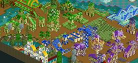
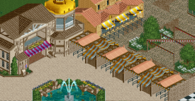
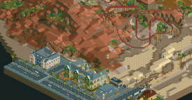
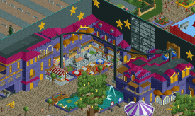
As for myself, it's funny to see that after a 10-year break from RCT, I'm finding myself more and more drawn into it again. I really don't see it as anything less than my main creative outlet right now. H2H9 was my first big contest and it really helped me get a lot more engaged in the community side of RCT again. I have an unscratchable itch when it comes to trying to make RCT more interactive by exploiting the mechanisms of the game - I think that comes from my background having studied design, engineering and human factors. Despite that, I think I will choose a small snippet of Gangland architecture which I was responsible for as my screen, the hotel and the adjacent cafe. The fact that I dare showcase this in the presence of SRF's surrounding archy tells me I have gained some confidence in building more realistic buildings. A lot more of that will be showcased in my solo, to be released on NE's 50th anniversary.
As for the aforementioned interactive side of RCT, there's something of that sort in the works too which will make Gangland feel like tic tac toe...
-

 Ge-Ride
Offline
Splitvision has done so many creative works that I could highlight any number of them. One that I really like is his vision of a foreign planet theme in a futuristic theme park in Journey to Eos. I don't know why, but I really like his custom scenery vehicles that only drive at flat and 90 degree angles. That and the interaction with the main roller coaster which is very good in its own way. But this is only one of many Splitvision's works that I admire.
For myself, I think that the quaint architecture from the USNW Entrance is some of my better work. It doesn't go overboard on blockiness and neglect the basics like much of my later work.
-

 bigshootergill
Offline
Fun forum idea, it’s been a great read so far, perfect way to spread the love around the community. Can't get enough love!!!
I have to say that I’m really glad I get to post for Ge-Ride because I think you represent a key component of NE that no one should underestimate. Your post prompted me to check out your profile page… no screenshots, no projects, and a small handful of parks from nearly 15 years ago… and yet, I’m very familiar with your name showing up with posts and messages on other player’s parks and screenshots. There are so many players like yourself that have simply stuck with the community for so many years, contributing in your own way to where NE is today. It’s important to remember that there are more than just players posting their work on our site, there’s a large group that simply enjoy the work of others. So I feel it’s a perfect time to say thank you to yourself, Ge-Ride, and all the other loyal fans of RCT and NE for your constant support.
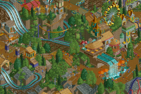
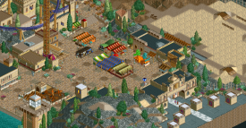
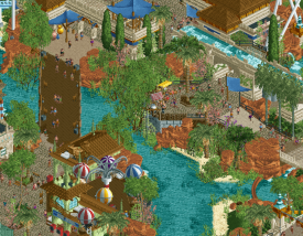
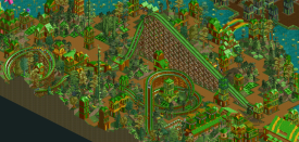
The image I picked from your parks page is from your “Universal Studios New World” park you posted in February 2020, but it was something you built back in 2005, and I choose it for a couple reasons. First, I feel this park represents the dedication we have to preserve the history of RCT in the community, which of course is a key cornerstone to where RCT is today. The fact that you got this park from 5dave and decided to load the park is greatly appreciated! Second, I absolutely love an immersive jungle theme, one of my favorite styles to examine. Thank you Ge-Ride for your community commitment over the decades.
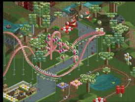
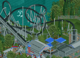
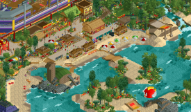
As for myself, I had a few choices in mind, but I went with this beautiful go-kart track from Mario Kart, Koopa Beach. When I started building parks, I was so concerned about the community’s approval, so I tried to stick to what would be considered acceptable by the majority of NE members. I kind of felt I was being pulled in too many directions and wasn't fully enjoying the game. My Mario Kart park is kind of where I turned a huge corner in my mindset, where I started building what I loved, and what I thought would be a cool project, with less emphasis on trying to please everyone. (To be fair, Asteroid Fields, and my H2H7 team, definitely nudged me in this direction). Don’t get me wrong, I still value the input of others, but I don’t put as much weight in it either as the opinions and suggestions cover too wide of a scope to please everyone. Building for myself has helped keep my joy for building RCT, and while it’s not everyone’s cup of tea, it’s at least someone’s cup of tea. And Mario Kart led to a lot of fun projects later on in my career, so it was truly a valuable turning point for me, plus I just had a ton of motivation and excitement just building it, and bonus surprise of getting voted as a spotlight.
-

 hoobaroo
Offline
So for BSG, you along with AVC were definitely my biggest inspirations when I first started making stuff on NE. Your screens teasing Quinlan Quinto ignited my fervor to build fantasy, and I think you can definitely see the inspiration in my first two Magical Town screens.
you can see how inspired I was by your style
Your use of verticality, scale, eye movement, and focal points in your compositions, like in this first screen up there, lends itself towards a sense of grandiosity that also really breathes life into your fantasy, which is also something that I think I definitely was inspired by. Your eye for whimsical and dynamic compositions aids towards creating this atmosphere in your worlds that make them really feel alive. I still remember seeing your screens and really being excited imagining what kind of world these scenes belonged to. That's what really makes fantasy magical to me; the ability to make the unreal feel real. And your work excels at that.
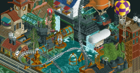
I also wanted to throw in your round 3 micro from MM, because I think it was overshadowed and it deserves the attention. Your homogeneous color use combined with strong composition even in a small setting creates a world that really does feel real. I'd love to see this theme explored on a larger scale.
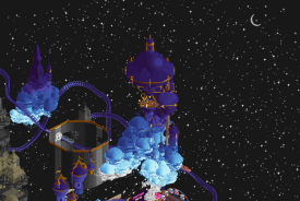
As for me, I thought I'd include an (unfinished) screen from House by the Sea.
So, after we submitted House by the Sea in it's unfinished state, I was very unsatisfied to say the least and abandoned the competition and RCT in general. Partially from burnout, but... truthfully, because House by the Sea meant a lot to me, and it was very painful to not actualize it in the way that I wanted. For that reason, I've almost completely avoided looking back on it, and maybe RCT in general, since then. But it's almost been a year now, and this thread made me want to take another look at it.
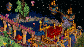
Although the screen is unfinished, I can still now look at it and see everything that it was supposed to be. Which hurts... but is also kind of sweet, in a way. Bittersweet. The entirety of House by the Sea started off as a vague conception of phantasmagoria, dreams and memory. It wasn't until during the middle of the process that I had fully realized that House by the Sea was, in some form, a swan song to my youth. In that sense, the building process of House definitely only added to the irony of it. I look at the work and think back on what could've been, if only things had went a little differently, if only all of my dreams would've been fulfilled. Just like the story it was based on. Definitely a bit melodramatic haha, but it's true.
Now, I look back on it and it's really just sweet to me. It was definitely my folly to attempt something so ambitious mostly on my own on such a short deadline. Like there was just no shot. I was definitely hotheaded and eager to use the high stakes of the competition to display House to everyone. It blew up in my (and AC's, sorry
 ) face. But I still look back on H2H as an amazing experience. I still describe it to people as strangely the first time I really learned just how important creating art was to me, the whole collaboration process and experience of actualizing a huge amount of effort into a finished work. So yeah. House by the Sea. An unfinished, bittersweet dream, created as a monument to the very same thing. With time now, I can look back and it's not as bitter; mostly just sweet :*).
 And while House was dedicated as an ending to something, it actually came to be a new beginning for me.
Ok sorry for all the egocentric rambling, I got a little carried away. I'd love to explore all of this in some way again, someway somehow. Whether it's writing about it or just making something new. There's still so much to unpack here I think. And to NE, thank you. You've all been so much more important to me then words could say. All the people met and the opportunities to create and enjoy other's works. My life wouldn't be the same if I hadn't came across NE as an outlet for creating and expressing. So really, thanks.
-

 posix
Offline
Such a sweet post hoob. I've always considered your input to the community valuable. Whether it's actual RCT or not.
Now everyone please carry on with this golden topic. Love it.
-

 wheres_walto
Offline
@hoob that sure does sound familiar.. when you're ready to pick it back up again you might find that finishing the build is a lot less stressful without the external pressure of deadlines/competition and lessened internal pressure to amaze people (remember that you already have)
You're one of my favorite builders ever, you have a completely fresh and unmatched ability to use RCT to transport viewers to completely different worlds. Your stuff is just so different, so artistic, so stylish, I have House by the Sea and Stardust Circuit saved for immediate reference whenever I need inspiration
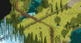
I think both of these screens highlight your ability to express mood through your work. The meadow scene is quiet, melancholic, and nostalgic. The train and seasons invoke feelings of change and transition. The water forces reflection. The ability to convey those feelings is special.
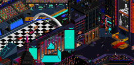
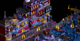
The second scene is still unlike anything I've scene in RCT before, there's so much going on at once but it all comes together to transport me directly into the event. You and your friends managed to capture a dingy alleyway, an EDM concert, F1 race, all against the backdrop of a futuristic cyberpunk Tokyo-esque city center. It's nuts, I love it. One of my dream builds is the Las Vegas Grand Prix, but I worry that any attempt will be purely derivative of Stardust Circuit.
Sincerely, thank you for pushing the aesthetic limits of the game, you are the most inspiring builder to me on the site today and I hope you'll come back to the game when you're ready.
As for me, consider a before/after. I know what it's like to have the weight of competition be too much to bear. I gave up on the park and quit RCT for 6 years after the experience. When I rejoined, I found it much easier to build what I liked because I saw more people doing that than ever and the community is more welcoming and encouraging than it's ever been.
-

 Scoop
Offline
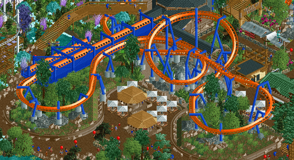
I've always loved Avatar as a movie, so when I found out that there was a h2h park after rejoining as scoop I was beyond excited. There's too much to pick from on this map, but I really love the curvature in this little coaster scene!
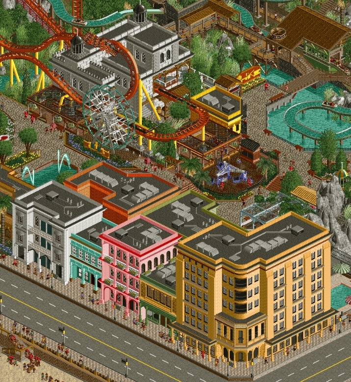
As for me I really enjoy how this entire area turned out in Cuba Libre Gardens. I think this really marked the point where I had the confidence to know that I could build at the level of El Dorado and it was such a blast to build with Geoff on it!
-

 Liampie
Offline
I claim Scoop
edit: 24 hours later and now Scoop finally edited his post, guess i need to get to work.
-

 Ethan
Offline
Today’s my birthday. I claim everyone above me in the thread!
I dont got much to reminisce on, but I want to go ahead and gas all y’all up cause y’all are great
Cocoa
Thanks for starting this thread! You got a great catalogue, a really clean and endearing look. kind of like a real, super immersive themed park like your dosney or universal. Just so magcial. This micro is so enchanting. If there is some kind of Disney revival I would love to see you follow up DisneySea!
Walto
Your range is huge and your way around objects is mindblowing. Yea this is your most recent solo but this is just so overwhelming. Hope to see you get around to a full sized park your creativity is so impressive. Definitey one of my favorite builders to see right now.
Lurker
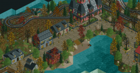
You build such adorable maps, and I think your ride design is also really great. Love the classic style and wholesomeness. Your cso is pretty great, This little halloween themed map is so sweet, love this wooden coaster. Would love to see more!
Liam
You are one of the most prolific RCT2 builders of all time IMO. Two spotlights, several golds and H2H captain multiple seasons always performing extremely well if not winning it all. Your experience shows you give very helpful and observant advice. I like your way around objects and colors, always doing something different but playing by some strong rules that push your creativity. I enjoy using a lot of your landscaping and block objects too. I really like this park, so much soul into it. This corner is enchanting.
Scoop
You are a wicked good builder and ride designer. I really hope you get a full release one day cause you make some incredible setpieces/themed areas. This is small but this Busch Gardens entrance looks so good. You have a lot of great work on your resume and are a hell of a creative dude in general.
Xtreme
Probably the biggest come up of all time. You have such a clean style that’s also pretty forward thinking and inventive. Your work in benches and objects is greatly appreciated as wel, and now an Admin. Huge icon in the community. This micro is incredibal, ascension too obviously but wanted to dust off this one. I would love to see a fullsize from you in the near future because I know it will be a show stopper.
Jappy
You got a pretty huge portfolio in the last decade and you are still going . Your ability to complete hogh quality projects so efficiently is inspiring. Always build such fun and inspired theming. This micro is so magical, such great detail and cool colors.
Whosleon
You are a freak at this game broer. Your ncso is scary and you are among the best of the best at most aspects of the game. Hope to see legoland done or something, you have the skillset to snag a 90+ spot on something. We all know it. You know it. You porbably have figured that I am a huge fan of this design. In terms of micro and this overall blank canvas of grey and white with the main figure being the ride shining that deep Blue is just so in spirit of Wabi-sabi aesthetic and Japanese minimalism. Love it.
Fk
I love your styles, it’s always so inspired for even the most drab of sources. Always doing something so fresh. Your shapes and colors standout and are super inspiring, always giving every set piece identity and pushing the meta on your own way. I have absolutely no idea what you got coming next but it’s probably going to be something difficult for me to imagine/predict. This park is such a great conceptual piece, Spring is my favorite season of the year. This Spring area is so gorgeous. The colors and inventive architecture, ride design. So fresh so inspired.
Gustav
Your love for this game is infectious. It means a lot how much positivity you exude and uour support for myself and others. You are so inspired and it shows in uour work as you develop. Great ideas and always such a fun execution. This is kind of a small bit but this Plantasia screen is so charming. Love the album as inspiration, a great example of your super inspired and soulful builds.I really hope you get around to a full project because you have such great ideas and passuon I know you will absolutely kill it.
Terry
You’re a hell of a ncso player, your trackitecture work in general is mesmerizing. Your CSO as well is so so nice This screen is such a stunning landscape. There are many other vignettes I could pull from with such great flow of shapes and stuff. Oh you are also a grwat reviewer! Can’t wait for the full size NCSO hopfully!
Otter
You’re a hustler man! You churn out such high quality parks so fast for the last few years. Your builds are so wholesome. I really appreciate your reviews too, always thoughtful. This is a big screen but wanted to include both the coaster and the town area. I love how spacious it is and this coaster is just beautiful. Great landscaping and architecture. Can’t wait for whatever you are working on next snd that pirate park.
Dirt
You are to me an MVP of this community. Your guides and the building challenge are great and you always give such good advice. You have such a cool style and object usage. Also responsible for a lot of great pieces. This micro and that south wind, clear sky with the single angle view aspects is incredibly inspiring. So iconic. Love the dark theme in this micro.
Ulven
You helped me quite a bit when I was starting around DKMP. One of the most prolific guys there and seeing your stuff on youtube was always sick. You have such good comp and creativity. You can cover a huge range of styles within ncso, and tour cso stuff has also been awesome. This screenshot is stunning, such great colors and shapes. Feels so alive.
Mulpje
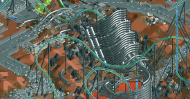
you are a hell of a world builder. You make a lot of underused wwtt objects look so well integrated and alive with your theming. Got this from your huge collection of maps you released. It’s amazing how much you hav built. Love the harsh red against white of this map it is so ominous. This slide interaction is stunning. I can’t wait to see what you keep coming up with.
Josh
You’re a legend man. You’ve been pushing the meta for a hot minute. Your work is so creative and detail rich. You write great reviews and are always so supportive. Your designs, logos and additional contents are also always so incredibal. I love this micro and I like how it looks sort of like the predecessor to Adventure Club. The shapes and comp of this micro is absolutely nuts.
Splitvision
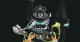
There is outside the box and you are outside outside the box player. Your CTRs, objects, concept work also so out there and brilliant. Seriously one of the most brilliant and creative players of all time, everything you make is jaw dropping and full of so much consideration for every aspect. This design is really awesome to me, this toppling nuclear silo is so foreboading and looks so cool with all the nasty rubble everywhere.
Ge ride
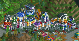
You have been around for a hot minute and I really like your philosophy towards the game. Your work is always so unique and intriguing and as an asdie from rct I think your music is really cool and interesting. This area of the park is so intriguing to me. I love the shape and harsh color blocking, it
Bsg
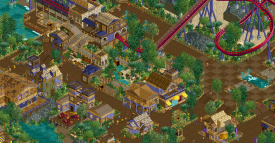
Your work is so magical. Such a great world builder with a huge range of imaginative ideas. Everything you have released is such soulful treat to look theough. I love this area of the park, such amazing colors and the foliage is lovely.
Hoobaroo
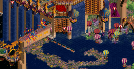
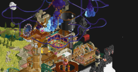
I love your approach to the game almost like a painting. This is kind of the most unconventional viewpoint of the House yet I live this so much. This discordant nature of it really adds to it I feel, feels like a sort of lapse i. memory. The first fime I opened this park and heard the motif from promises with the harsh compression of the wav file to fit the game gave me goosebumps. Loved that album, just got a 180 gram of it. It was so enchanting to hear it in the game represented like this. Seriously inspiring.
Posix
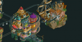
I like to think of you as like the professor x of rct lol. You always give great feedback on composition and style. So wise. I loved the landscaping on this design. I do hope one day to see you return but it’s nice to have you around and still find so much enjoyment in yhe stuff others put out. Thanks for all you do for the site!



-

 Xtreme97
Offline
Reserving my spot for Ethan. I've probably done too many of these by now.
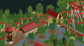
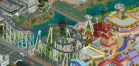
Ethan: you kind of came out of nowhere with the building challenges on the discord, and picked up steam really quickly. You also took to cso very naturally I think, and Hoshi En is a testament to that. This is one of my favourite parts - much of the park is quite grey (not without its pops of colour) but here it makes way for the bright and playful nature of the park with lots of schemes that grab your attention, best of all being the coaster colours. Also really like the curvature present in the screen with the paths, and the way the pirate ship is nestled in nicely.
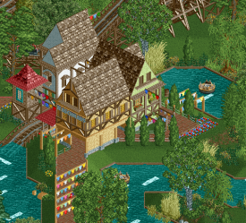
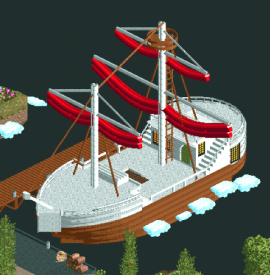
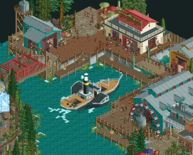
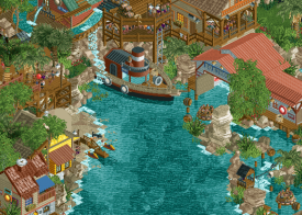
Myself: Anchor Bay was my first collabo with Steve (and I think my first real collab in general) and we clicked really well which made for a great building experience, definitely made me more confident to work with people. Despite being a micro map I think there's a lot of stuff packed in, and I particularly like the boat and boathouse here.
-

 G Force
Offline
So Lemuria, wow, just incredible. This is when you really cemented yourself as an upcoming elite builder in my eyes, obviously you had done great things in micro madness and in Grand Tour, but this was just next level. You really nailed the micro here and also didn't get lost in it the way some of us do, basically everything about this I adore (except for it being submitted as a Design). Currently one of my favorite builders and I hope we can start to see some work from you outside of contests!
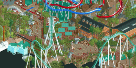
As of now I think that Southwinds is still probably my best work to date, I was really trying to make the coasters special/memorable in this park and I hope I achieved that. While the invert probably isn't everyone's cup of tea due to the colors or the lack of theming, it ended up being one of my favorite rides to build. Was a fun experience trying to force the layout into an awkward plot and then build around it. Plus I think Afterburn is just a sweet name haha.
-

 Liampie
Offline
Scoop: opened up an old park of yours (Real Drachen Fire) that was quite nice. The dark ride interiors hold up well enough, scenes like these are very well done. I like the collection of musical instruments in another scene too!
Xtreme: thought you rose above yourself with this piece, but turns out you were actually getting this good.
G Force: Frontierland is underrated in a way. I think this architecture, for what it is, is pretty flawless and beautiful. Warm and crunchy, but also very functional. No fluff, only good shit.
I like to go for deeper cuts, so for myself I went with the buffet restaurant from Dream World Indoor. Sadly there's a peep jam here that I wasn't able to fix due to deadline rushing, but you can see all the detail here. I was learning so much around this time, and it was starting to show with ideas like these, in my opinion.
-

 Version1
Offline
Jappy
I know that Canary Mines was the park that finally got you parkmaker, but I still think EDK was your best work. The park is fun, atmospheric, well layed out and overall awesome. I chose my favourite section, the fireworks themed family coaster, but I could have gone for a dozen of screens.
Myself
While not really technically strong, I always liked this setup.
-
 CHE
Offline
V1
I absolutely love the rapids station in Erlebnispark Haslach. Great structure and details and the theming with the T-shirts is very charming.
CHE
It's a b o a t. This fantasy micro was a nice change from my usually realistic approach for me. The blacktiles were azure at one point, in the end I decided black would give a better contrast with the clouds. It got me into round 2 of MM2019 as a replacement.
-

 Jappy
Offline
Liam, you're one of those members I was most intimidated by when first joining NE, mostly because I knew you came from RCT-Guide and I was already awed by your work there. But it turned out that apart from being a great builder you're also a nice guy as well!
For this, I've chosen something that isn't necessarily the best work you ever put ought, but that is the most quintessantially 'Liam'. Something that you would instantly recognise and would link with you. And that is your micro entry 'Writer's Block'. It's hard to put my finger on, but somehow this is so you. Perhaps it's the mix of the classical style with the modern touch? Hard to say. I just enjoyed it massively!

For myself, I've chosen the entry plaza from Bumbly Beach. This area marked IMO a step-up in building quality and beautifully captured that British seaside resort vibe I wa going for.

-

 G Force
Offline
Jappy, for the most part I've really enjoyed your work and approach to full sized parkmaking. To me, EDK is still your best, the theming and realistic feel of the area here (and in most of the park) is top notch. I've always wanted to do a realistic park set in halloween and you truly nailed it here. Ultimately it was hard to just chose one screen for this park because there are so many great areas. Perhaps there are a few things that let the park down as a whole but for the most part I think it was 80% work and I'm happy I could contribute to it!
Here's actually a screen with both our work in it, haha. Man was this park a fun one to build, but such a rush as well. Basically marathon'd the game for 3 straight weeks to get it done. Probably was a bit of an asshole at the time and not too fun to work with by this point, but hopefully it was a fun experience for you as well. I do think your work added some needed balance and iconography to the park. Ultimately it was a success, winning its match and to me something to be happy about in hindsight.
-

 ottersalad
Offline
G Force
Always been a huge fan of your work. I think you drafting me in H2H8 led to you being an influence on my building style for awhile. Your attention to detail and the research you put in to your ride design and parks is quite admirable. I also would say being a part of Frontierland was a grind! I tried to contribute but your standard was quite high, and the product was great as well.
I think while all of your parks have been increasingly better examples of realism, the process of watching you make ACGTH in Discord was eye-opening. The creative process and then the building of the park. It made me want to raise my game! The "larger than life" and fantastical spin on your realism style was great. This park has aged well IMO. While there are a lot of great moments, the atmosphere around Drachen Fire was wonderful, and it was so obvious it was you on this park.
Myself
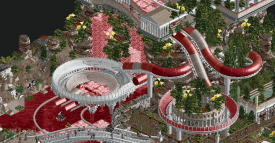
So, I guess to highlight another thing I'm proud of.. it's project that'll probably go unfinished, but this is a small Roman themed area of a park I was working on. I thought it was worth sharing because A) It's cozy and atmospheric.. B) It's a G Force ripoff lol
 Tags
Tags
- No Tags
