NE 20th Anniversary / Portfoliesta - reminisce and enjoy
-
 10-May 22
-

 Cocoa
Offline
This is an idea we had in discord to celebrate the good feelings of nostalgia around this anniversary. its nice to celebrate your own body of work, enjoy others, and reminisce about this crazy game.
Here is how to participate:
first, show a screen of something that the poster above you has done that you admire
second, show a screen of something you've done in your rct career that you are proud of. feel free to add some details explaining the creation process, bit of history, whatever you want to include.
two screens, and hopefully a lovely tour around the rct community. feel free to participate multiple times, but give it a bit of time so people can join
from fk: bonus points if its from NE's latest decade!
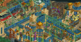
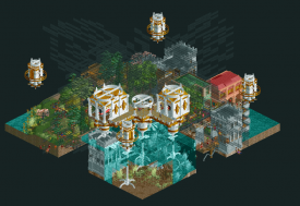
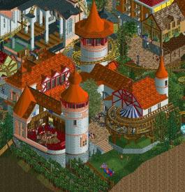
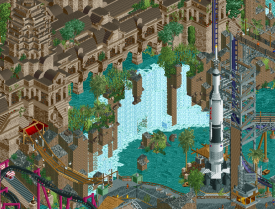
I'll start, with something very recent-our Underground h2h park that I am now particularly fond of. at the time, dealing with a stressful PhD and average mental health, I wasn't so hot on it. but looking back, I think we killed it. the density is ridiculous, but if you look carefully its planned out very finely so that a hypothetical peep would be totally immersed and able to explore. i'm really proud of the interactions, layouts, and flow here, even if its hard to read. its a pretty nuts idea but something I would kill to exist in real life.
-

 wheres_walto
Offline
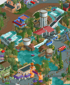
@Cocoa - I always liked Worlds of Fun (https://www.nedesign...-worlds-of-fun/), it feels very classically your style. I identify your work by bold use of rich blues, reds, golds, and especially purples, often with overgrown foliage. Where many builders lean on earthy tones, you zig and lean on primary colors. I think the busy-ness of this park holds up well, it really is a great example of H2H as a genre. If I remember right, you took inspiration from Worlds of Fun in Kansas, a place you were familiar with in real life. Building places that have meaning always hits the mark for me
As for something from my own portfolio...
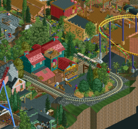
This was probably my favorite section from Avatar, my first H2H park built with Josh and Levis in 2012. I was the lead builder and did most of my work on the coaster, landscaping, supporting rides, and details but it was really my two partners who pushed it to the finish line. I would not have finished the park without their help. At the time, I was a depressed college freshman building alone in my dorm room during bouts of insomnia or when I decided to skip class (which was most days that semester). I remember feeling so excited to be competing in the contest after watching H2H5, it was the first time I collaborated with other builders. I was an immature twat at the time and remember lashing out at Levis at least once during the process, but I'm still proud of the park we put together and happy that we got it done
-

 Lurker
Offline
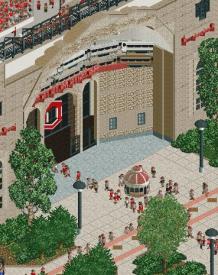
Ohio Stadium, such a great recreation of the real thing, Especially how it captures the "Game day" atmosphere. I'm picking this for a screen because the use of ride vehicles for the stadium was brilliant.
Overall I've been so impressed by your ability to change styles, going to from a recreation, to an abstract artistic park, then back to realism in your recent screens.
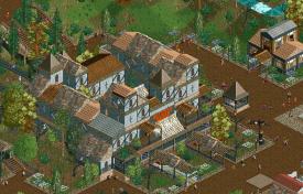
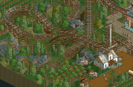
As for my stuff, I feel like I've done better since (And I cringe at some of the obvious mistakes I left in it with my rush to finish), but Terror Bay got me my first accolade on NE.
I wanted to have a larger park the the small contest maps I'd been doing, and decided to speedbuild a 100x100 map with no cheats of any kind. Most of the park was done in a week, with some small things later. -

 Liampie
Offline
I identify your work by bold use of rich blues, reds, golds, and especially purples, often with overgrown foliage. Where many builders lean on earthy tones, you zig and lean on primary colors.
I think you're missing one aspect of typical Cocoa work, though it's less apparent in WoF: elevated paths, such as boardwalks, or other multi level compositions.
Lurker: did you do the coaster and it's landscaping here? Your style is quite minimal and small scaled, and that really helps the theme: you've got a nice pastoral feel here.
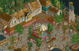
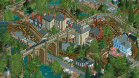
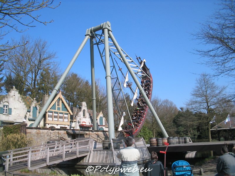
My own: really happy with this row of buildings in Python/Vliegende Hollander. I think I got the Anton Pieck style down, and got some good subtle asymmetry in there. Perfect imperfection is hard to get right, and this one of my most successful attempts. It's the things like the green door on the leftmost stepped gable, and the crooked trim on the building in the corner.
For reference:
-

 Scoop
Offline
I'll go next. Liam I wanted to go to legacies because there is so much that I could pull from that park, that has stuck with me for all these years, but since I get extra points for the past decade (
 ) I'll go to DKS because that elevated train bridge over the creek gets me every time. Easily some of the best verticality in a park and the composition of everything is spot on too.
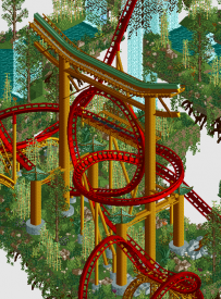
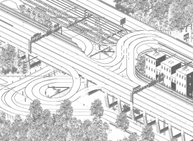
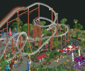
As for me, I could cop out and show a certain log flume, but where is the fun in that. I went back to where I really started finding my own voice. This loop from Ukiyo has been something that I've been proud of since it's release. I never tackled anything as large as this and now that I'm looking at it, makes me want to do more large set pieces in the future.
As brash as I can be sometime, I really do love this community, and everyone in it. It's crazy how much the community has helped me in real life too. Being a graphic designer a lot of the skills from rct are easily translatable to not only what I do, but many other professions of other members. It's also crazy how many great friends (hopefully lifelong) have come from it too! Here's to another decade NE!
-

 Xtreme97
Offline
Cool thread idea, Cocoa. Nice to have a retrospective of eachothers work over the past decade+. Crazy how much RCT must have been collectively made by now.
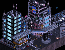
My go - for Scoop, I think your micro madness output went under the radar somewhat but it feels like one of your earliest attempts at branching out aesthetically and it turned out super well. The CyberNoir micro especially caught my attention, love the vibe of this work and the way you composed the space.
As for my own work, I gotta go for the meme and say Lemuria. Specifically, the station complex which I was initially reluctant to figure out due to wanting it to look both super fantastical but also realistic. I think the end result is super nice however, and I love the launch lift I did too.
-

 Jappy
Offline
I found your write-up to actually be quite difficult Xtreme. You've been a part of NE for quite a while now, known of course for being 'the guy that makes the benches'. But you actually have quite the impressive portfolio!
Your standout in the last years is without a doubt your micro IMO. Not because it's the best or most impressive, but because that's where for me personally you showed that you were so much more than the 'benches'-guy and know your way around objects. And seeing your latest creations only makes me more excited for what is to come.

As for lil' old me, well... My favorite thing I made recently (that has been released, prepare ur asses for my next solo...) must be the entrance to Canary Mines. The style of that and the composition was such a natural fit and add to that it looks exactly how I imagined it in my head. A little gem.

-

 WhosLeon
Offline
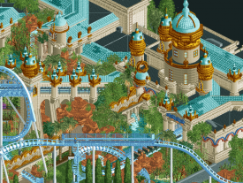
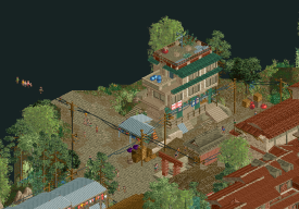
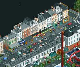
Jappy, apart from very likely being the single nicest person on NE, you've also proven yourself as one of the most consistent parkmakers on here, releasing quality full scale parks year after year. I think your positive spirit and work ethic is something we can all look up to, I know I do, at least. I can't say I am always completely in love with your work, but I can say that every park you've made contains things that I love. The first thing that comes to mind is this rugged, semi-inviting shopping street in the outskirts of bumbly beach:
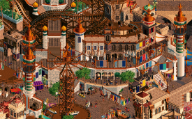
For me personally, I think the area im most proud of is this layered bazaar in Madinat. I remember getting the idea for this plaza in my head was really a breakthrough for the composition of the rest of the map, one of those epiphany moments that I'm sure you can all relate to. Making the different layers work in a readable way was quite a challenge, as was detailing every little shop without it becoming repetitive. I must also mention there is some AVC work in this screen aswell!
As for New Element, I want to congratulate everybody who has put their valuable free time into running this website, hosting contests, and putting up with our bullshit for such an impressive amount of time with the 20th anniversary. For me it has always been a true pleasure being a member here. This place has been part of my daily routine for so long now that I can't even imagine it not existing. Thank you for giving me one of my main creative outlets, and for all the good memories. Long live NE
-

 FK+Coastermind
Offline
Leon: Pretty excited I got the Leon spot! I'm reversing my own tendency to dig deep into the past and going pretty recent with one of your screens from Dirt's Building Challenges. We all know that Leon is an excellent builder, you've proven that time and again, but I think your work in the building challenges has shown a new side that I had never considered before. I feel that most of your past work was much more grounded, often realism or tilted toward realism in some way. But the building challenges have been an entire different world of Leon. Artsy, conceptual, creative, taking advantage of the perspective, and really exploring new ways to build with an age old game, all while retaining the details and charm that you've built your name on. It felt like such a surprise to see this kind of work coming from you, and yet not as a surprise at all in the same way. I think your output as of late already shows how your foray in the Building Challenges is morphing into larger projects, but I"m so excited to see more of it. The screen I chose is a favorite, graphic and clean but also pulling back the layers to show your skills in macro design as well. Hopefully we get the chance to build something kooky and mindbending together in the future! Cheers
For me, I went with a deeper cut in The Time Traveler, my entry for the 2014 Micro Madness Finals. I really loved putting this together, it was very conceptual and heady at a point where that was what I wanted most out of my rct. I think it suffered from being so conceptual as to be a bit overblown at a time where people didn't want anything to do with readme's or artsy rct. That being said, I love this little park. It's a great indication of where my rct would go in the years that followed, and I really loved the idea that obscuring parts of the park forced the viewer to interact with the park more than on the surface level.
-

 Gustav Goblin
Offline
FK, it is by no means a stretch to say you're one of my greatest inspirations as a parkmaker. Jack of all trades, master of all trades. The Walto effect. While a bit controversial in its round, I don't think anything you've made got a double take out of me like Sistini. Imagine me scrolling through the microstates round looking at all the entries. Big skyscrapers, Monaco raceway, tropical island, Monaco raceway, BOOM CREATION OF ADAM PIXEL ART. Actually got a double take out of me, and looking at it in full scale was just spellbinding. Hell with not an exact recreation of the microstate; this was such an inventive take on the round.
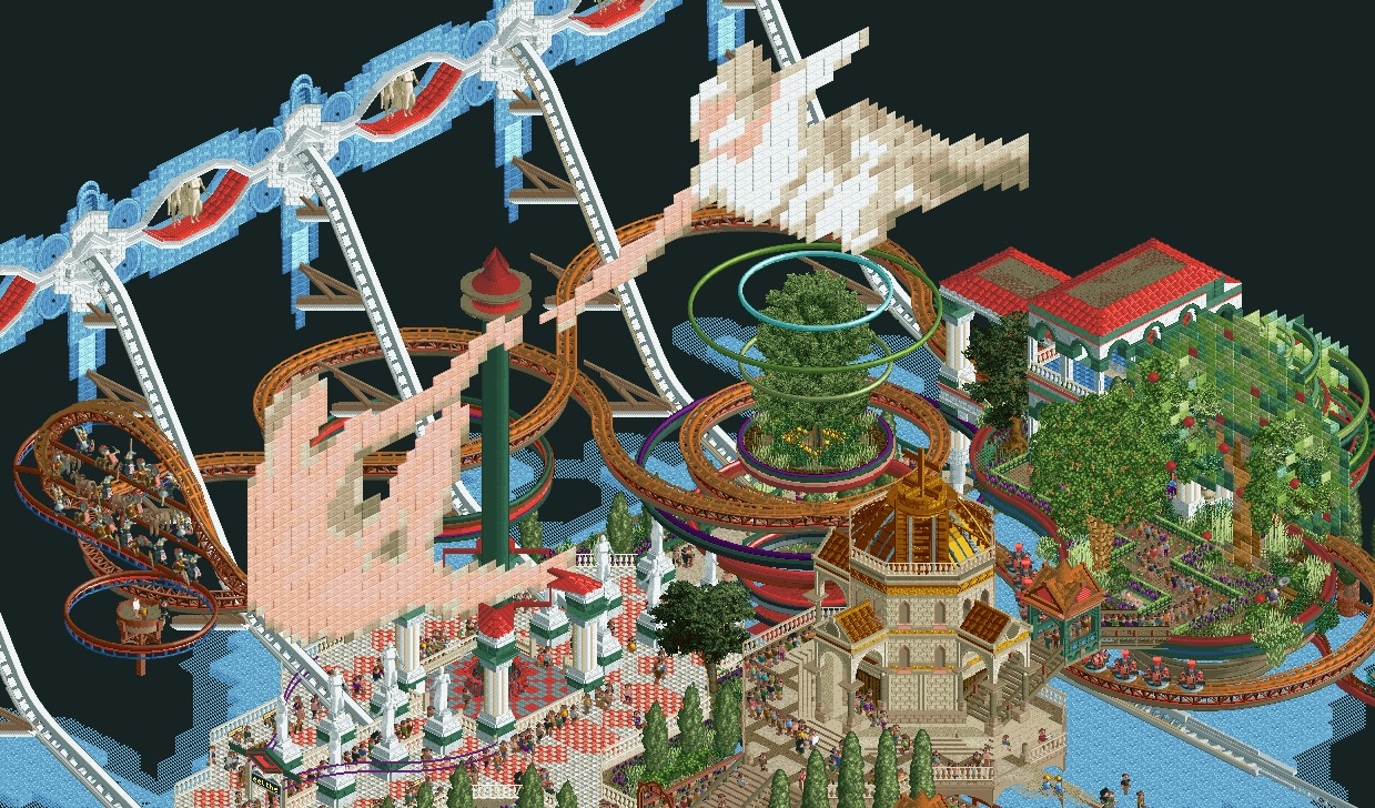
And speaking of FK, Om Mani Padme Hum. I know, most recent release and stuff. Up until that release though, I've never really had any releases I could be proud of that were fully mine. All of my work prior to The Big Smoke was honestly pretty bad except Terra Della Torre (which got its ass whooped by Sistini above), which even then wasn't amazing in my eyes. The Big Smoke was cool and all, but RWE pulled most of the weight in making it look beautiful and I could not have even attempted to match that on my own, let alone finish. With this bad boy, I finally had a release which encapsulates what I want to make and what I'm capable of without any outsider influence. Like this is Gustav Goblin. This is what I want to do. (See me in Micro Madness 4 by the way.)
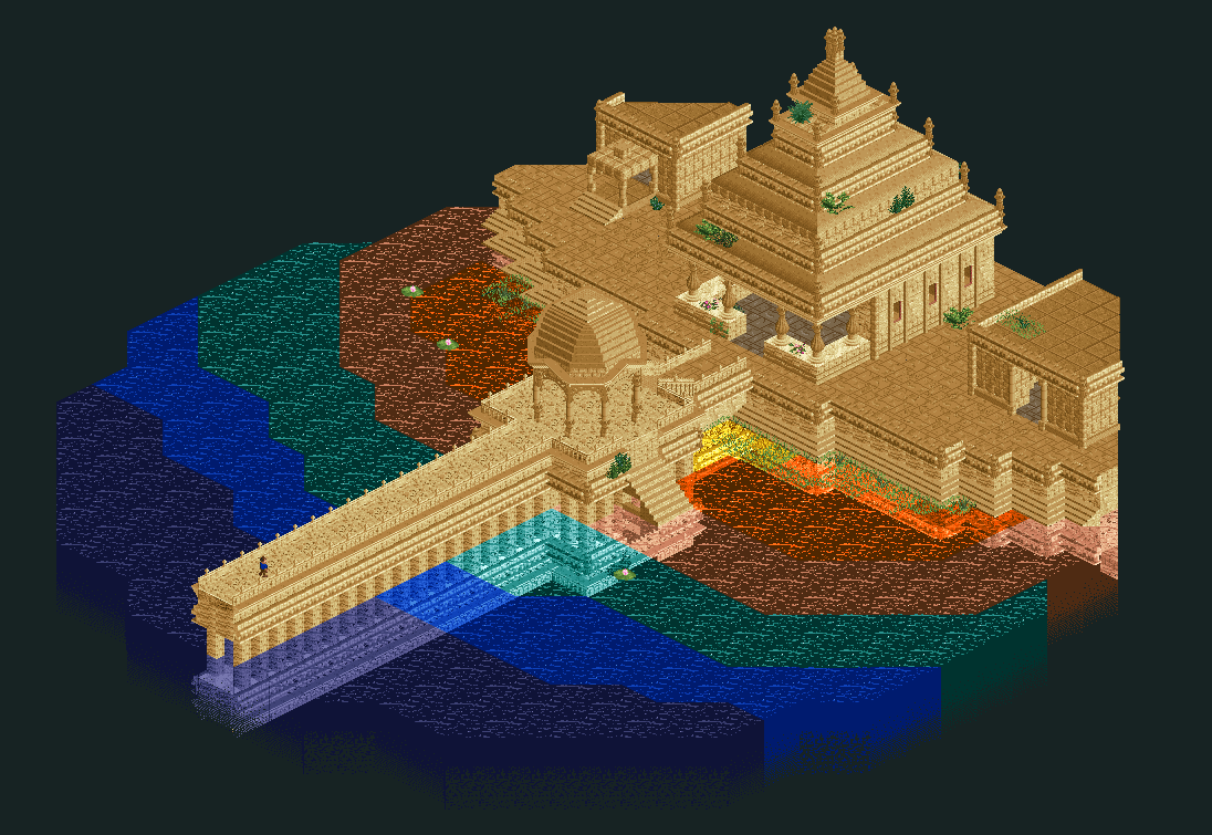
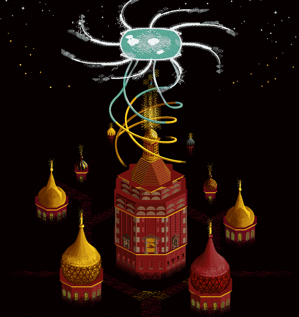
Honorable mention to a building challenge entry since I think those really let me evolve my style and get creative. Out of all of them, I think The Czar is my favorite since it was the first time I could really go crazy with the fantasy stuff. I always wanted to do something like this but every time I would just end up make something realistic with a slight twist. Considering how much I look up to parkmakers like AVC and FK and Hoobaroo, I'm glad the gears in my head shifted into trippy fantasy mode for that moment.
EDIT- Was typing for so long I didn't notice chief Tile Inspector Tolsimir was writing his own post on FK. I'll fanboy over your stuff as compensation. You're already a great builder as is but you are a freak with the working mechanisms. Absolutely nominating the loom mechanism in Madinat Al-Hareer which was already an absolutely insane park as is. Trust me, it was so damn hard to decide what to nominate and I feel bad not nominating a park you had more input in (Zuphiro is still an absolutely insane micro).
-

 Tolsimir
Offline
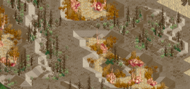
FK, even though you have been active probably as long as me on NE you really skyrocketed the last two years or so. As you said more or less with covid situation. So it would be easy to take one of these parks to praise you. But I don't. I take this pic from your unfinished version (not anymore thanks to walto) of fantasy park with strong narrative. What do I want to show with it? I think everybody agrees that it kind of is not the best looking landscaping ever -- strange choice of rock color for example. But what I find most notable here is how you were kind of 5 years ahead of time. Nowadays you are the king (queen?) of crunch and here it already shows your techniques. Layering different textures, abundant use of the 1K net for another texture variant. What you did here in 2015 has become a staple in parkmaking way later and really became meta with GT (also under your influence again, among others). To me the 'crunch movement' added another layer (literally) to RCT by allowing us to get closer to real life which is much more than plain surfaces.
Just saw that Gustav posted, too. So I'll keep it here and the line continues with him.
-

 Terry Inferno
Offline
I'll do a double portfolio review.
Gustav
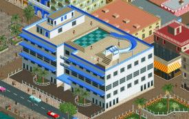
Even though your building style is still blossoming, I believe the turning point was in your GT entry. While it may not have crossed the Bronze threshold, the architecture here is certainly something of which to be proud. This building for me is the high point of the map (and not just because it is also literally the highest point on the map), but plenty of these Cuban edifices reflect a keen eye for architectural design. Now you're branching out and embracing more abstract styles as well, so I can envision a (not-so-distant) future where we see from you spectacular structures in both realistic and dreamlike settings. With your enthusiasm and pure love for RCT and this community, you should know if you do not already that we are all rooting for you! Keep on building and keep being Gustav.Tolsimir
Between being one of the most architecturally-gifted RCT builders ever and crafting innovative new objects that change the way the entire community builds, I can understand why it would take considerably longer to finish a large-scale solo project. We all anxiously await the day we can explore the Spanish cityscape and be blown away by every brilliant artistic choice, but in the meantime, your smaller contest entries still manage to amaze us. Your patience and attention to detail are two traits of yours that I wish I could possess to the extent that you do, and I believe Winkelheim exemplifies both poetically, as to essentially create the same map four times with subtle variations in a pre-scenery-manager era could not be done without these characteristics. I know you will continue to amaze us in ways we never expect to be amazed.
Myself
I've not yet reached a point in my own building career where I am able to build and finish the projects I envision, but I do believe the H2H park I led this past season is the first step in the direction of building non-NCSO parks and maps with high quality landscaping, architecture and ride design. I greatly enjoy building scenes depicting mountains, buildings and rides all interacting with one another, and I hope I can finish more projects like this in the near future. One might even score higher than 79.50.
-

 ottersalad
Offline
Terry
Your Raspberry Acres was a huge inspiration for me post-H2H8 and kept me interested in the community. My engagement in the community waned after burning out and seeing our Cyberpunk park (RIP) go unfinished. My RCT career up to that point was getting drafted in the last round of H2H twice and then disappearing. Raspberry Acres and also Obeah and the Cursed River were influential in my NSCO style.
This log flume from RA and the entire park in general inspired me to make Karlkurla Canyon. Love the rockwork here and just the overall aesthetic.
And I want to point out you're a great scholar of the community and know parks extremely well, so you most likely see a lot of Obeah in my Antiquita park as well! Those monorail walls, the curves, the forest vibes? Oh man.
I'm with you in that Yerka was a step forward. I think you have shown in recent screens some impressive stuff and excited to see what you have in store for us.
Cocoa
Figured this is my chance to give a shout out to someone who I've had the honor to build with twice in H2H. You've been a great supporter of my RCT and I'm very thankful for that. Will never forget you calling me a mensch for always asking to help on Mekong even though I was not up to the same level as you and Ziscor lol. I think the way you make RCT look so easy always impresses me. You can go into these intense building sessions and come out the other side with mind boggling atmosphere. Like, come on.. really??
Thanks for inspiring me and pushing me to get better!
Myself
Well, it's hard for me to pick something out that I'm really proud of because a lot of my work in H2H gets a little sprucing up last second before submission! Since H2H8 I've grown a lot as a builder and really taken myself out of my comfort zone. I think Gauntlegrym with all of its flaws is up there for me. The wow moment of opening the park is something I'll hang my hat on. The amount of time I spent on that area before we got a good finished product was insane! I think I spent like 3 weeks just working on architecture around the entrance... 90% of which was nuked. But damn, what a start to H2H9.
Lastly, I think this corner of Diegetic Underground was a highlight. The weird mechs in an alien jungle was a challenge, but the density and the lush forest vibes, the waterfalls, everything about this was so much fun. This entire park really was something I'll always be happy I was a part of. Contributing to probably the best Bioshock area in RCT was a trip too. That Myst inspired entrance was fun as well. Shoutout to Leon for the monorail cars as windows at the entrance lol
-

 dr dirt
Offline
Quite the lovely topic!
Otter
Went back through your catalogue of work, which is quite deep. Some of my favorite parts are the things that showcase an eye for some classical strong building techniques. There's bits of some adventurousness sprinkled in there, like your Micro Madness entries, but what's nice to see is someone who can also excel at the fundamentals of NE-style building. The NCSO work definitely necessitates it, so I hope to also see these techniques translated into more CSO work as well! I considered Marblehead as the park to show a screen of, but I think Caer Hywel showcases the effectiveness of the basics just as well if not better.
Here, it's great to see someone choose some limited palette of objects and paths and make something quite effective here. The rusted rooves are a great choice, and the small section of wooden dock/boardwalk sells the mini-waterfront look while only being on a small bit of water.
Me
I wanted to choose the Grand Tour entry Cam & I produced. I felt that this was a strong park, and there's a lot of considerations thrown in on this one that takes some time to appreciate. One thing that we tried to capture is multiple eras of Cuba, from some of the infrastructure being from multiple periods as well as more clear signage and coloring, etc. I also liked how it is nestled in a somewhat touristy and commercialized area on one side but it quickly transitions to residential on the other sides.
This one captures a spot I really liked, the rapids that are sitting above the land but also has some sections that spill into the natural environment. I also liked the understated entry area that only has a bridge and a picnic section that's on water. There's intended to be a distinction of a newer ride like this and the center, older areas of the park, which I think came across fairly well.
-
 Ulvenwood
Offline
Love this concept, now it is time to add my thoughts on Dr Dirt.
Not being around NE for too long, I decided to go with the things you shared during my time as a newer member. I looked at your entries for the building challenges and went with a couple of screens from there.
First of all, I have really learned from the way you use jagged rocks for landscaping. Using raised land blocks works very well to outline the general shape of the landscape, and it is actually a very effective and pleasant way of doing rock formations. I have seen you doing this multiple times now and it has really helped me with my landscaping, as did your foliage tutorial on YouTube.
Here's two examples:
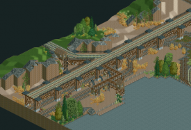
I especially like here how the jagged rocks give the railway more emphasis. Also, the supports for that train are very well done.
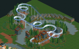
What I like here is how the rocks follow the pathway and how the MCBR is situated above the pathway.
That's not the only thing I like about Dirt's style. Your architecture varies some simplistic to intricate, from old school to modern and futuristic, and everyhing in between. My favourite building of your building challenges entries is this one:
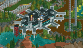
The verticality, the path crossovers, the details on the roof, the functionality of different parts, everything works together. Making dull grey look good achievement checked off. I wonder what is inside.
As a member, I think you are one of the best providers of feedback on NE. Constructive criticism while not dwelling on negative things is something some members on here can learn from. Your Building Challenges have inspired many members on NE to go outside of their comfort zone, each challenge opening new possibilities and changes in perspective on the game. I have really enjoyed them so far and it got me experimenting with CSO and got me thinking about the game in ways I wouldn't have thought about before. Keep on doing what you do!
As for myself, I consider myself a mid-tier player on NE. I may be one of the more experienced builders on DKMP, there is a lot of stuff for me to learn when it comes to macro and usage of custom scenery. I have been lucky enough to have built with one or two legends on this website. My favourite CSO build is probably the lighthouse I made for Dirt's challenge. I think I captured the vibe I wanted to create here quite well.
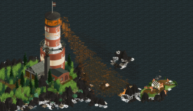
Looking forward to meeting new people and learning more stuff through New Element!
-

 Mulpje
Offline
Ulvenwood
Having competed with you in a lot of DKMP contests and even worked with you in one of these, its safe to say that im very familiar with your work.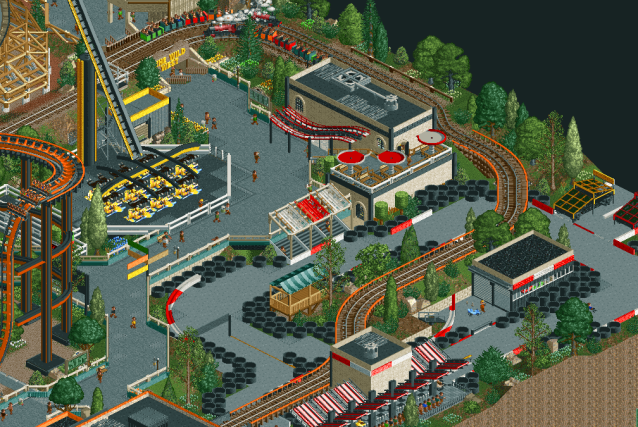
What I admire about you the most is the skill you have too constantly keep improving yourself. From the first day you joinend DKMP till the last contest you have entered, all of your work has been better then the last thing you made. With this park seen above here being a prime example. Teamed up with Iretont i think you made a little realism masterpiece with NCSO here. So much attention to detail and planning that went into ths park its just eyecandy for any NSCO player
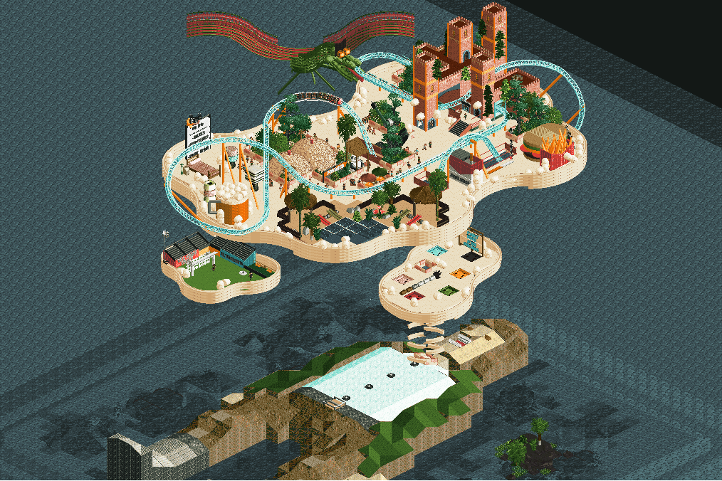
And then ofcourse we have your crazy and wacky ideas like you made for this mini contest. Such a great idea to recreate something that I believe everyone had at least once who is here on this site. I believe the story was that you lay in bed at night and you dream of RCT (correct me if im wrong) really cool man! Other crazy ideas like the toy story made with Rhythm and the Pokemon park made with Mamarillas are also very good examples of the versitilaty you have in making different themes.
Lastly I want to say to you is, while having mastered the NSCO side of this game I think its a good descision to branch out to the CSO side of RCT. Who knows, one day we may be face to face in H2HX
P.S. Ulvenwood is an english teacher if im not mistaken so he probably will hate all of the grammatical errors I have made in this post so cheers to you Ulvenwood Love ya!
As for myself what im most proud of is the transision I finally have made to explore the world of CSO, although its pretty overwhelming and vast to get used to. I think with enough time and with the project im working on I will be of to a good start
its cool to see that while working on the project I am improving my own CSO builds already.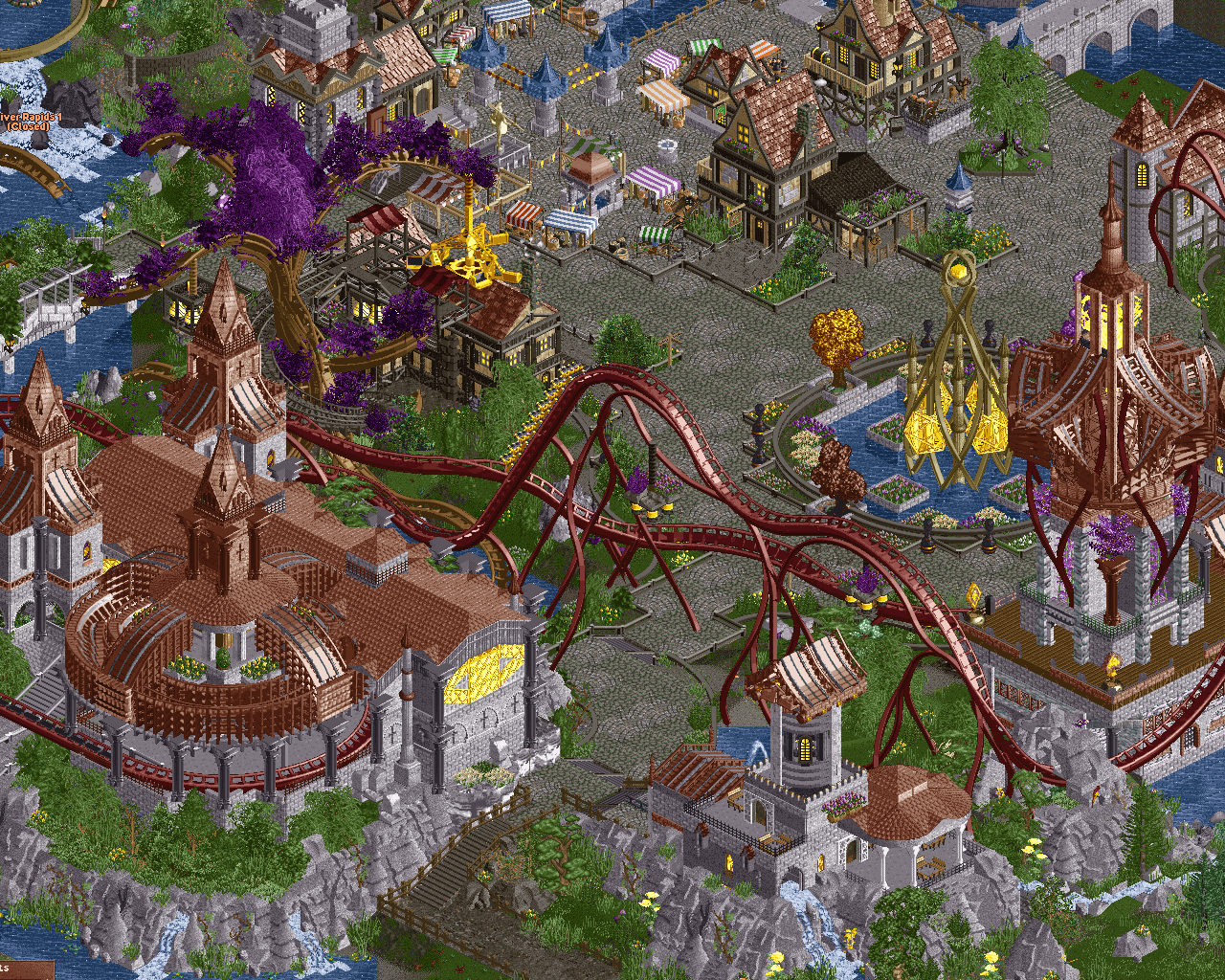
I dont consider myself someone who has a lot of knowledge about coasters or park layouts but looking at a lot of parks you guys made as a community really has been helpfull. This has also helped me to learn CSO. So GG to that. -

 FK+Coastermind
Offline
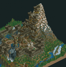
Mulpje - As a newer member and someone more involved at the DKMP server I feel like I've had less access to your work in general, but as I looked at your profile you've already amassed just shy of a dozen projects in two years. That's pretty impressive, particularly given that these aren't small builds by any means. The one project that stood out to me was Dwarven Kingdom, I remember downloading the park after being wowed by the overview. While it doesn't have the micro details that NE values most, it really excels at the macro. The structures are huge, the scale of everything is shockingly massive and creates such a sense of drama and fantasy. I think you can see in this park a vision for the kind of content you would continue to make; huge sculptures, dramatic structures, fantastical landscapes; all things dear to my heart. I think I've said it elsewhere, that if you can harness that raw skill for really impactful landscapes and set pieces and bring it to CSO or a contest like H2H in the future, I think you could make some mind shattering parks.
This time I nabbed a screen from Linga, one of my favorite buildings and one of the last I built in the park. I found the reference for it weeks earlier but was running short on time to execute. I got a few hours before the deadline and it just seemed to flow out of me. This park was without a doubt that happiest I've ever built, so I cherish it greatly.
-

 Xtreme97
Offline
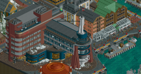
FK - ever since you broke through in 2020 I've adored your work and the way you're able to make so many unique textural combinations seemingly effortlessly. Any piece of your work almost always has me scurrying to Tile Inspector to work out how you layered certain objects to create a textural or geometric effect, and it's a trait I've tried to emulate in my own work. Your best examples of this I feel were during the Grand Tour, and you've already showcased one of my favourite entries with Linga, so I'll pick your winning Final entry to highlight. This building in particular caught my breath. Not only the gorgeous use of that faded red and dark blue, but the structure and shape of the building with that curved end piece really made this one of the most memorable parts of the map for me. Superb.
As for my own work, I'm gonna pick another Grand Tour entry with mine and ITM's Chile entry. Had a blast making this, even with the time crunch at the end (and looking back the cliffs were an interesting choice haha), and the big spiralling drop into the huge loop is an area I'm super proud of. The layout is I think one of my best efforts (with great improvements by ITM), making it long enough to fit the requirement but also something that feels realistic in its scale. Marrying the supports with the go karts underneath was a fun challenge as well.
-

 Scoop
Offline
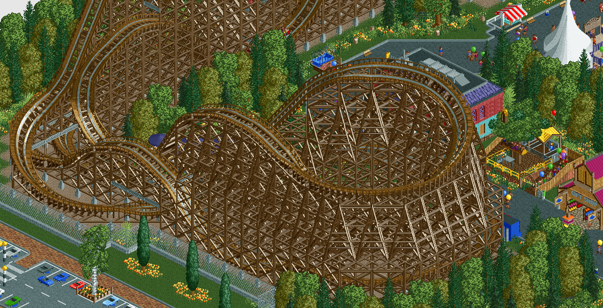
Man you've already come a long way from this (which was only in 2018 mind you, but this little bit of layout work really show's some really nice developing compositional skill. I'm always a fan of these cci esque woodies.
As for myself (again)
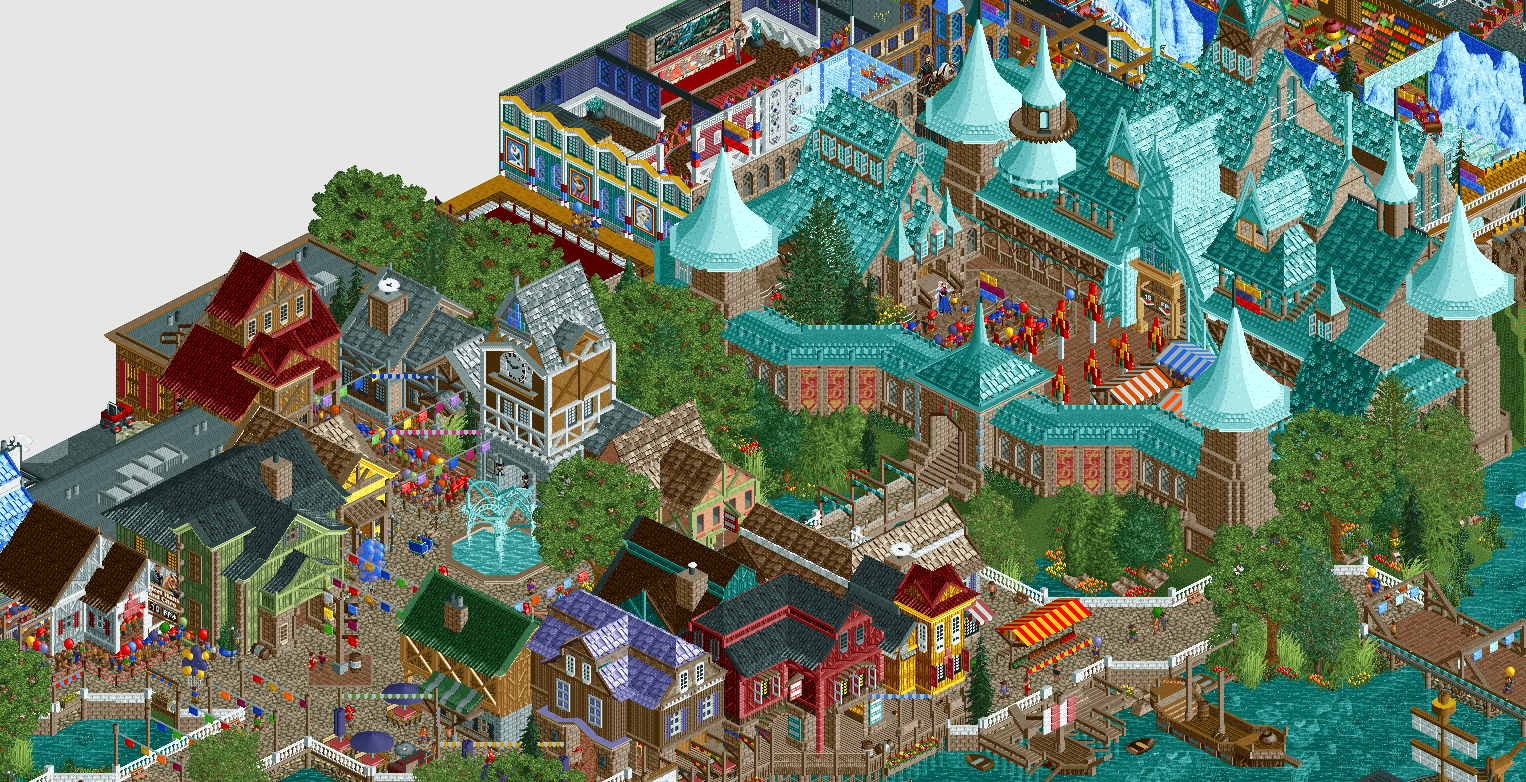
Even though everyone HATES Arendelle I am still suuuuuuper proud of this area of the park. I hate frozen by the way. I never wanted to build on the park, but it was needed, so I did.
 Tags
Tags
- No Tags
