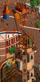
H2H9 / H2H9: Semi-finals - SFM1 - Tile Inspectors vs Logan's Run
-
 29-August 21
-

 wheres_walto
Offline
Logan's Run-
Thanks guys for a great season, you were one of my favorite teams and I'm really impressed with how you managed to put out quality parks every single round. Nippon and Brewery were highlights of the contest for me, I looked forward every week to what you guys would do next, and I hope you'll submit something for the third place match. You seemed to strike a good balance between modern layering and classic park design, and it worked really well.
I know at this point in the contest lots of people have already checked out, but I really hope others continue (or start) to comment and leave reviews. Everyone loves their work getting attention, but it's not a one way street. Here's one last review for y'all
Siege of Frostgard
+ really cool opening sequence with the spinning drill and falling ice wall, very dramatic
+ love those armored elephants, big upgrade over the current elephant object, we 100% would have used them all over Madinat had they been available
+ super cool architecture throughout, the generators were sick. While reminiscent of a lot of other parks, the bold primary color choices and snowy setting made it feel unique
+ the heart of the factory area is stellar, full and detailed without being too busy or dense, really enjoyed that section
- the main negatives are clearly time crunch issues, landscaping was effective but a bit plain, others have mentioned that beyond the initial sequence there wasn't much to sell a siege happening. I'm honestly impressed that one person cranked out 80% of a semis park to a respectable level of finish, that shit is hard to do
-

 hoobaroo
Offline
This was my favorite match of the whole contest. This kind of grandiose worldbuilding vision is so spectacular and is so inspiring to see. It's that magic that attracted me to NE originally, and it's crazy to see two of these visions, so bold in their novelty, scale, and style, go up against eachother in the same match.
Siege
We open with a magnificent setpiece that instantly ignites the viewing experience. Perhaps more could've been done to integrate it with the main city, as in having the siege be a bit more merged with the visuals of the city, rather than it feeling almost completely separate macro-wise. In terms of the city, you did a great job with the contrasts of verticality in the larger structures by the wall, and lower buildings by the sea. It really makes the city feel bold and towering. I personally had no problem with the asian architecture pieces. The city's structures do not have to be entirely homogenous, and a novel touch of a different style or color can indicate importance/luxury and give more personality to the world than if everything was the same. In particular, I really thought that green/yellow asian wall/gate with the clocks was really tasteful and had a lot of character. The macro composition of the city gets a little mushy in the center. I think this would be less of a problem if there were a space or two left more open for some breathing room and to create contrast between cluttered cityspace and an open area. The waterfront is pretty masterful with that rounded imposing red building and naval ship. I'm also skipping over a lot of the micro, but it's exceptional. The landscaping is a little uninteresting, and maybe could've used a little something to feel less barren, despite their primary purpose being negative space to frame the city. On zooming in, the attentive details to the buildings, paths, and snow really bring this together and sell the idea that this is a real city that people live in and walk around. In particular, the detailing of the snow in the river is very aesthetically appealing. It goes without saying that all of the buildings are expertly crafted. I'm a fan of the use of the brick/metallic texture combination usage that is prominent throughout the map. The incorporations of the river through the city are just very cool and look awesome going through and around the city. War Machine was a little spaghetti but still cool and works for its narrative position. Mine Patrol had a cool lift and a nice flow but I felt the dark brown/black stuck out a little too harshly against the bright white snow. The color choices for the whole thing overall are interesting. The uniform use of many varying desaturated colors creates a feeling of grounded fantasy that feels disarming. I'd be interested to see how a less uniform application of color here could create a different feeling and maybe elevate the stakes and intensify the feeling of the siege. Overall a spectacular vision with bold choices, clear passion, imaginative worldbuilding, and clear expert talent in detail. I'd say that the most important takeaway is to think about how the narrative ended up coming together with the visual execution, and in what ways you could add and change visually, to make this thing an even more cohesive and awe-inspiring moment of storytelling. Because it already really is so ambitious and fresh of a concept.
Madinat
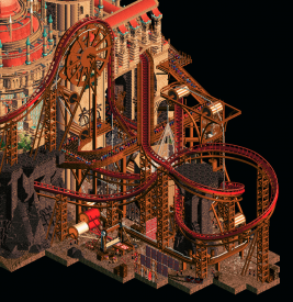
Goddamn. Ok. First of all, Leon AVC Tols is a total dreamteam so I'm happy that we got to see the result of this combination. But this thing is crazy high level. The Macro composition is instantly clear and distinct with the giant arches of the bridge, the green grass at the front, the giant dome buildings each taking up their own space on the map; the whole thing is really striking. I think the palette has stronger spots and weaker spots, but definitely a success on the whole, for how well it sets the mood of a middle eastern sunset with the stark contrast of dark shadows and sunkissed stone. It is definitely most successful on the bridge, with the arches beneath, which is important because of how integral it is to the macro. A weaker spot would be on the slummier architecture to the side of the bridge, where the use of the darker browns/blacks and varying textures risk becoming visual soup. The overall architecture on the map is so good. Every building is a strong point in terms of textures, details and form across the board. The coasters are great and have great integration with the map, whether it's Beggar flowing and weaving through hills through the grass besides the cliffside homes, Sacred Loom perfectly situated over the giant threading wheel, or Resurrection going in, out, over and under arches and buildings in the main city; the whole thing's sexy as hell. I think my only real negative note is that the back half/corners of the map feel a bit too sparse and lifeless for how much buildup there is leading to it. The stagnant peep scenery doesn't sell the feeling of a massive crowd as much as desired when they're just standing still motionless. But on the whole, this map is clearly an exercise in elite level aesthetic sense, shapes, color, and worldbuilding.
Congrats to both teams on two genuinely awe-inspiring maps. These are the creations that stoke my imagination and are so admirable in their ambition, scale and immersion. Really just inspirational.
-
 Xtreme97
Offline
Thanks for the kind words and reviews everyone! It's very much appreciated to hear all your thoughts
 As josh says, there is a more finished version of the park called (Final) in the download now if you want to check that out.
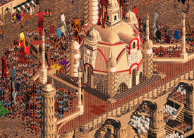
Will start off with a review of Madinat because this park was absolutely wild. I knew when I opened it that victory was a very slim hope because you guys poured everything into this. Been anticipating a tols/leon/avc park since grand tour and it delivered in so many ways! The scale of everything and the overall vision is stunning, absolutely love the concept of this silk city come to life. The giant loom is easily one of my favourite set pieces of the contest, and it feels like every portion of the map is laden with details, with every single one of them contributing to the story and the world building. The palette took a bit of time to adjust to but once you get into the setting more and really embrace it, the sunset vibes enhance the park so well. Certainly a risky choice but I like it, and switching to a standard English palette to me kind of washes out some of the colour and boldness, so I think it works better this way. The coasters are all very strong and surprisingly well spread for how dense the map appears. Loved the beggar and the sacred loom, the woody was a bit hard to follow and didn't feel as well integrated with the theme as the others, but it's a superb layout even then and I think it's just the comparison with two standouts that make me think that. There are so many more details, techniques, and ideas I could list off as superb, so I'll try and limit it to my favourites to keep things a bit brief:
- The loom structure is so cool, and I love how you integrated the top spin and the ghost train elements.- This whole ritual building with the crowd is lovely and really packs in the peeps to create the crowd. Only wish there were more movement perhaps.
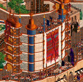
- Love this custom rug and the way the sign letters are used here.
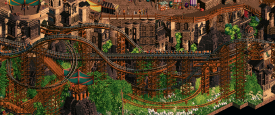
- The way you packed in so many layers of track here is beautiful.
- The crane towers are sometimes hard to distinguish but they're very cool.
Now for a bit of behind the scenes of Frostgard. This was conceived in basically the first week of the contest, me and Bubbs both jumped at the concept of icy steampunk based on a couple of concept art pics I found and we thought it best for a playoffs park to give it the best chance. Sadly due to real life getting in the way, Bubbs didn't have as much time as he'd hoped to build on this so I had a bigger job than I was anticipating, leading to it being fairly hectic in the final week. I was worried it would end up being a rush job but I think we got it looking very respectable in the end, with Sammy jumping on in the last couple of days to lend a good deal of help. Zara was also instrumental in the building process, he conceived the main coaster, mine train and power splash, as well as plenty of the hacks and ideas to bring the park to life. The starflyer hack is still baffling to me, amazing stuff. Also want to shout out myself for learning buggys ride maker 1 week before the deadline and making the ice blocks and mine track vehicles God knows why I didn't bother to learn this sooner.
I'll try and get a gif of the building timeline together at some point. Definitely a stressful experience in the final week but I couldn't be prouder of myself and my teammates in completing the park, as well as the rest of the team for the encouragement and advice. Been a brilliant H2H experience, especially for a first go around! (but don't tell Steve I said that, he'll get all emotional. Did you know he's having a kid? Wild)
Obviously I'm disappointed in the loss but I can't say I wouldn't have voted for Madinat if I were a voter. Congrats inspectors, hope to see that finals spot pay off! You've easily been the strongest and most consistent team of the contest thus far in my eyes, so it's a well deserved win and I can't wait to see what you cook up. -

 Cocoa
Offline
madinat: damn. this park is amazing. crunchy and lush. there's an absurd amount of content here, and it's all overwhelmingly beautiful. i'm not sure I've been able to take it all in yet. there's so much action, beautiful windy layouts, sprawling gigantic architecture, just really astounding work. The giant setpiece at the back with all the peeps is not really something I'd seen before ingame, and it looks awesome and epic. Just really an incredible and innovative piece of rct, I don't have much more words for it than that. this competition has been nuts...
siege: holy hell this was a matchup. damn. this park is also stunning... I really adore the snowy steampunk atmosphere here. Probably the best snow park I've ever seen. All the waterfront archy is just so smooth and complicated but not overwhelming... just extremely skillful construction. the landscaping was amazing, and I love the way the map opened up with the wall falling down. the coaster was super fun to watch too. I'm still very impressed by how effortless and clean all the detailing is, when its so easy to get carried away and sculpt a mess. This park is excellent. I have no idea how you do it. It may have even stolen my vote, its hard to say.
incredible congrats to both teams on one of the best matchups in h2h history, maybe my personal favorite.
-

 Recurious
Offline
Madinat Al-Hareer
Imo this was the best park of the contest. I absolutely love this park besides maybe the palette. The fact that this park only got a 84% score is a crime against the humanities imo. I feel like this park would have scored much higher had it been released earlier on in the contest. The layeredness in this park is just impeccable. My favourite bit is the green lower level with the mine train coaster running through. It reminded me a lot of Eye of Namibia which was also a AVC and Tols park.This park is just so well composed imo and has so much stuff going on, I just wanted to keep looking. Great park overall and I will for sure be coming back to this for many more times to come.
The Siege of Frostgard
This is also a great park, although for me on a bit lower level than Madinat. My favourite bit of this park was definitely the archy which was super cool. Especially the bit near the waterfront was great. Besides the archy the hacked rollercoasters were also pretty cool and I loved the opening scene with the falling wall. That was a very cool effect. I did however feel like some parks of the map felt a little bit empty. I guess this fits the theme, but still I would have liked to see some more features in the snow parts of the map. In hindsight I feel like this is something Gladsheim did very well, this park also has large sections of snow and yet it feels like there is always something going on, that was missing for me a bit in this park. Overall though this is still a fantastic park and even though it did not win, you guys can be proud of what you produced!
-

 CedarPoint6
Offline
These were great parks!
Here's my review of Madinat Al Hareer: https://youtu.be/NIwhkNQppfs
And here's my review of Frostgard with special guest Xtreme: https://youtu.be/YOlVJxklBsw
-

 AvanineCommuter
Offline
It has been a while since the contest but we never got around to making a post about Madinat, so better late than never.
Thanks to everyone who posted reviews and your comments in discord and in this thread; as always, it's a joy to hear the community's thoughts on the parks!
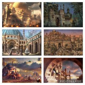
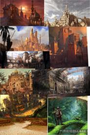
Leon spearheaded this park as one of many potential semi's park concepts, and after the first macro planning, this became something exciting that had the most momentum out of all our test concepts. It was under the working title "Caldeum" up until the end, which is referencing the Act 2 land in Diablo 3 that was a heavy inspiration behind the atmosphere and architecture we were going for.
We added the layer of silk manufacturing / trading post to give it a unique spin, which gave us a lot to work with to include the ravine where magic silk cocoons were harvested, and magic carpet production facilities, etc. We wanted to include a sunset palette to give the park a warm, desert feeling like we saw in a lot of the concept art images, without realizing just how controversial the palette would be.
Inspiration Mood board, including images from Arabian Nights, Caldeum, and general Arabian fantasy concept art:
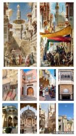
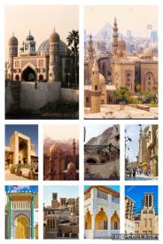
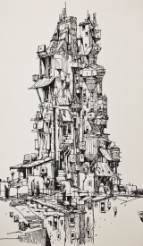
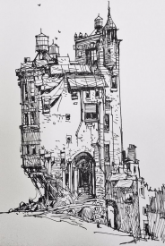
Inspiration concept art for the slum areas:
Early macro planning:
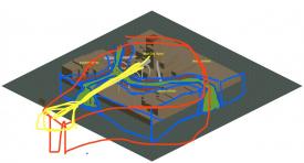
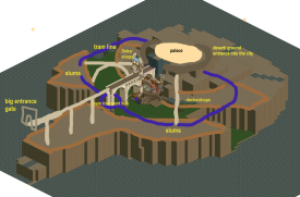
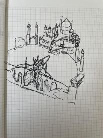
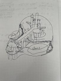
Early sketches:
Some early tests by Leon and Tolsimir for clouds surrounding the palace, and a prototype working loom: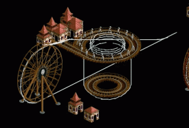
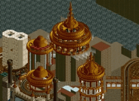
Some outtakes:
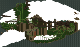
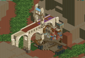
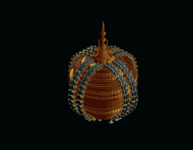
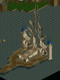
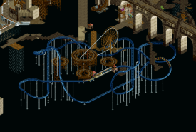
1 week before deadline:
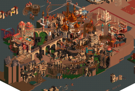
Overall breakdown of split:
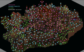
Leon - spearheaded the map macro, the entire central palace and surrounding areas, the silk festival crowds at the silk temple, 1st half of Beggar's layout and parts of the slum buildings, landscape + transportation ride stations in the ravine, Resurrection layout, flying eagle and whirling dervishes, caravans, cranes throughout
AVC - Sacred Loom layout and station area, underground portion of Silk temple and nearby caravans, buildings in the surrounding area, majority of slums + 2nd half of Beggar's layout, landscaping and details throughout
Tolsimir - Sacred Loom factory area + loom hacks, majority of ravine landscaping, rockwork throughout, elevator lifts + hacks and detailing throughout, buildings in the surrounding area, magic carpet rides + fly-in movie theater, Silk temple, bridges throughout
Rob provided hacks, as did SpaceK and other team members to create custom carpets, tent rides, the Falcon ride and magic carpet rides. Mulder created the sunset palette and BSG did another great evidence board for us and also the logo.
As with all Tile Inspector parks, this was another full team effort with hugely helpful feedback and object creation / brainstorming from everyone. Thanks again to everyone's hard work and to the community who voted for this park as Top 3 parks of H2H, we're all very proud of what we were able to create here and am happy to see the positive reception from the community. -

 Gustav Goblin
Offline
Awesome to finally see this. Madinat was my #1 H2H9 park for a while and is still easily in my top 3. This is the kind of park I describe as freakish; something so utterly mind-blowing in its concept, execution, and detail that I struggle to even comprehend what I'm looking at. (Only other H2H9 parks to hit this level for me are Stardust Jubilee and Riverview.) Was the inspiration concept art drawn by anyone on the team or just found online?
-

 Tolsimir
Offline
Add to your list that I also made remix version of the LOTR building blocks where I fixed the colors of the shadow side. In my opinion it was a crucial addition to the park because the default blocks tend to make the park inconsistent in the colouring. Maybe the added contrast was also one reason for the not well recievedness of the palette (even if it wasn't due to the palette itself).
It was the first time I used (half-)automated sprite generation .. and it won't be the last time.
-

 AvanineCommuter
Offline
Awesome to finally see this. Madinat was my #1 H2H9 park for a while and is still easily in my top 3. This is the kind of park I describe as freakish; something so utterly mind-blowing in its concept, execution, and detail that I struggle to even comprehend what I'm looking at. (Only other H2H9 parks to hit this level for me are Stardust Jubilee and Riverview.) Was the inspiration concept art drawn by anyone on the team or just found online?
Thanks Gustav! The concept art sketches were found online, I think Leon found them during brainstorming the slum areas.
 Tags
Tags
- No Tags

