H2H9 / H2H9: Round Robin - R7M3 - Logan's Run vs Adventurers Club
-
 12-August 21
-

 Liampie
Offline

Round Robin

 Highlands
VS

 House by the SeaVoting Rules
- The poll will stay open for ~72hrs.
- Do not vote unless you have viewed both parks in-game.
- Everyone may vote except members of either team. Any illegitimate votes will be ignored.
- Voting is monitored by the admins, who can see names behind all the votes. This is to improve fairness.
-

 Zarathustra
Offline
For Highlands, please install the custom music file before opening the park and listen to the audio in game. There is both custom and default music in the map in various places, so you can't get the full experience by just playing the file in the background.
-

 Liampie
Offline
I want to hate LR's park, but I can't, and the music made me laugh out loud. A lot to like. Same with AC, a lot to like. I'm already working on reviews for both, as I got to see them a little earlier than most.
No idea how this match will go. Really excited to see it unfold!
-

 wheres_walto
Offline
It's late, I've worked 22 of the last 23 days, and I'm tired but I wanted to get a few thoughts out there before I come back for full reviews. I haven't decided who I'm gonna vote for yet
Highlands
+ legitimately funny. Music choice, so many jokes on the signs, bong water plunge, hemp garden, fucking blaze pizza (can't tell you how many times I walked to blaze pizza in college), slow karts. Mrs Walto and I were cracking up while exploring the park, so thank you for that
+ beyond the hook, the park itself is well made. Finally another team is using tolsimir rocks
+ hope this park was as much fun to build as it was to open
House by the Sea
+ completely different vibes from this one. Pensive, atmospheric, melancholy
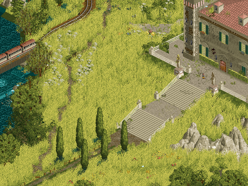
+ the meadow, reflection, music.. untouchable. This is something I've always wanted but never been able to create
? not sure what's going on in the back half of the map. The black rocks, white beach, red water is gorgeous. The chained heart, the dance hall, play room, bedroom... wow
- I think it's unfinished but man those high notes are fucking sublime
Haven't decided yet, this matchup feels like being served a perfectly seared 2oz filet on too small a plate against a double cheeseburger with a large oreo milkshake. Both sound pretty good right now to me
-

 spacek531
Offline
I really liked the melancholy, nihilistic, or possibly fatalistic atmosphere that House by the Sea presents with its emptiness, verticality, and abstract style. I'm also a sucker for big fields of grass and nature in general. Also Myazaki vibes with the train, train station, woods behind the train station, brook, and trees. Even though the back half was unfinished, I really like it as it is submitted already.
Highlands was certainly interesting. There were a lot of good ideas here; the couch-go-round, the slow karts, the switchback hack, the water coaster, the bong water color. There was also a lot of good archy and texturing. Christchurch, Colorado, if you will. Despite all these great technical qualities, I didn't like it as much as House by the Sea.
-

 Faas
Offline
Highlands was a bit annoying to me personally because I hate the whole trope of "smoking weed or using drugs is a subculture". However, although some of the architecture showed that perhaps the lesser skilled players also had a role in this, it came together as a nice park with some fun ideas.
I didn't care for House by the Sea. It looked unfinished to me and I dont really understand it I think. I did like the water coaster drop being framed by its own helix, I wanted more of those moments.
I voted for Highlands. -

 RobDedede
Offline
I have not left reviews in a while, so I want to leave some quick thoughts for this match:
Highlands:
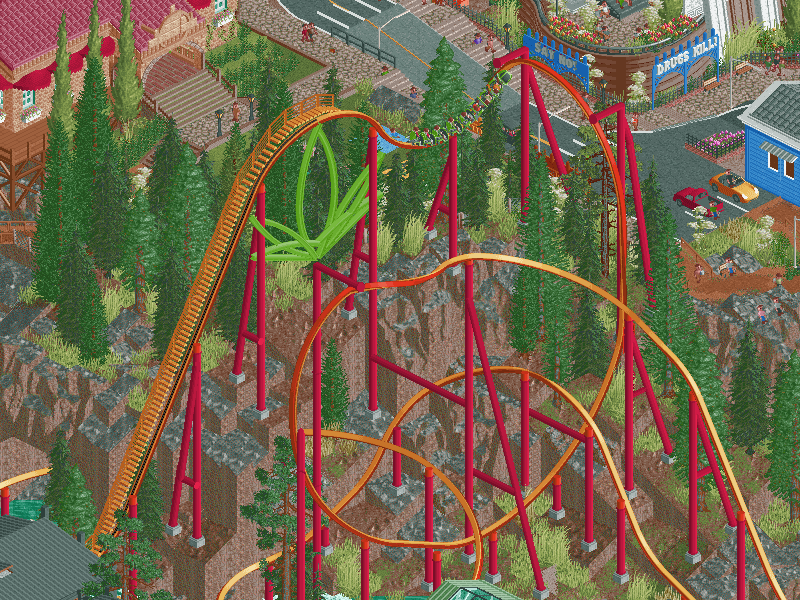
This park is downright hilarious. All of the funny scenes, signs, and themes had me laughing out loud at some points. I really loved both the church and the weed garden with those new custom vehicles that are like a roller soaker. So nice! All of the hacks throughout the park were really nice, too, especially the ZDTs style switchback coaster.
House by the Sea:
I really wanted to like this park, I really did. The abstract, dreamlike themes are right up my alley. Unfortunately, I simply could not look past this park’s unfinished state. I think with some more effort put into refining this map it could have possibly been my favorite park of this season, but sadly it did not come close to that in this version. Perhaps it can get finished after the contest is over? Either way, there are some really cool moments in the park such as the huge fields of grass and the front half of the building. What’s there in the back half of the map is nice but obviously it needs a lot of refinement.
In the end I voted for Highlands. -

 chorkiel
Offline
Highlands:
After the beer park there's a weed park. Your teams discord must be fun
 . This park kind of lives on the border between tasteless and funny to me. I'm not necessarily a fan of acting like doing drugs is a personality trait (or way of life) instead of just a fun pasttime. Having said that I chuckled when I saw the slow go karts. Without the theme and jokes I didn't think this was a particularly good park, but at least a solid one.
House by the sea:
Looks unfinished indeed. Or maybe that's intentional to a certain extent. Parks based on dreams are cool and I always appreciate expressionism. That helps look past the unfinishedness. I had quite some fun exploring this park. The boat shaped map was also cool. Looking forward to a write-up further explaing your ideas and process.
-

 FK+Coastermind
Offline
This is certainly a very interesting matchup. Some thoughts:
Highlands: This is definitely giving me H2H6 or 7 vibes, very much the style of finding a theme and filling it to the brim with ideas based around that. I don't say that purely as a criticism though, there is a reason it was so successful, because it makes the park a canvas for interesting ideas and there are SO many here. In a way, it almost felt like the Family Guy marijuana legalization episode, clearly over the top weed. I think the one drawback to the content-heavy style is always macro, and that is evident here. The micro detailing is excellent and leaves so much to explore in the best way, but how the park comes together as a whole does feel more like a bowl of ideas then a singular vision. And hey, maybe that is intentional to capture the true essence of building baked. The coasters didn't blow my mind, but they were fun to watch. The hacks throughout, both small and large, are stellar and I could see how these might have other applications in rct. This park certainly didn't leave me gasping for air like some of the huge ones from this season, but I still think it's a great piece of rct and a great way to close out RR.
House by the Sea: From what I can see, the concept and the vision for this park are almost untouched. Maybe even beyond non-realism greats like La Reve, the visuals that are there or are hinted at are just so incredible. Not just amazing visuals, but an incredible approach to storytelling and symbolism through rct as a medium for art, and that gets me excited as someone who has always veered more toward the 'fantasy' side of rct. The blue clouds gradient turning into towers with the starry background in particular is one of the most beautiful visuals I've ever seen in rct. Alas, it just isn't a complete vision (or if you want to tell me it is, then it isn't as good as I'm claiming, heh). It's hard to critique in that way, because I'd be guessing at what it might have ended up. Like the main structure was pretty boxy in places, but it's hard to say if that is because it was the initial sketch or if with more time it might have gotten further defined. I really hope the builders will consider finishing this after H2H, because the moments of clarity are pure magic.
Ultimately, I voted Highlands. While I think House by the Sea had moments of better work (maybe some of my favorite from the season) it just doesn't deliver throughout. While I'm not against voting for a partially finished park, it comes down to vision for me, and Highlands was able to fully realize and deliver on a concept in a high quality way that was just missing from House by the Sea. But I hope to see House by the Sea finished some day, I think the potential is incredible (heck, I'll do it if y'all wont).
Congrats to all the builders and both teams for wrapping up RR.
-

 saxman1089
Offline
Nice way to end RR with these two parks.
House by the Sea: I opened this one first, and was disappointed to see it was unfinished. I can really see the potential here, and thought the scenes that were fully there were great. Thankfully I figured out the music situation (that it isn't turned on anywhere in the park) and was able to play it as I viewed the map. Some beautiful symbolism and scenes, all somehow making sense together. I'm not sure if the unfinished-ness is intentional or not....as I could see a "finish it off in your imagination"-type thing a totally valid way to draw people into this park. But given the sloppiness (like supports showing, none of the rides opened, etc.), I'm assuming it was truly unfinished and would've loved to see what the builders had in mind.
Highlands: This kind of park needs you to really lean into the theme and make it over the top imo, and you guys definitely achieved that. As others have said, the music was hilarious and got me laughing right off the bat, with more giggles as I explored. My one drawback is the church and the area surrounding it...I think I get what you were going for here, but it just seems discordant and weird with the rest of the map.
Overall, this was tougher choice for me, in that I could somewhat imagine what House by the Sea would've looked like finished. However, I can't really vote for what I imagine the park would look like when it's finished, and have to go with what's actually on the maps. Voted Highlands. -

 Turtle
Offline
This is a rare situation where I vote for the park I like less.
Highlands was a really nice park, nicely put together and a high skill level. Lots of little things to find and like, some nice rides and scenery. Weed always kinda feels like an immature theme choice, can't put my finger on why, and I got past it pretty quickly. Some choices I would have made differently, the meh green throughout was kinda overpowering. Overall a good park that will probably deservedly win this matchup.
House by the Sea, on the other hand, I loved. It just isn't finished. At all. The really crazy thing is that upon first glance I didn't really even notice how unfinished it was. The unfinishedness kinda fit the setting, somehow. Just slices of abstract thought, represented so beautifully. The opening scene was just perfect, an atmosphere that I haven't seen in RCT before, I don't think. But ultimately this being a competition, I felt it would be really unfair to vote for it over a high-quality finished park.
Great work to all builders, congrats on your seasons.
-

 Lurker
Offline
Highlands:
Although I'm not into the subject matter (Not bothered by it either, just indifferent) at all I still enjoyed the park and even laughed at some of the references (Like the slow karts). I also enjoyed the variety of coasters and other rides here, and how they were fit into the theme and landscape. Also some good use of map edge cutouts.
House by the Sea:
Definitely looks unfinished in places, with default supports sticking through, but a lot of great areas as well. The way he coaster at the top is timed on the multi-launch, the reflections in the water, the helix/drop on the water coaster, the night sky and the clouds at the top. -

 posix
Offline
I found both parks to be quite enjoyable. Not super happy on the palette in Highlands, and honestly didn't care for the whole weed mantra. But the park's substance
 itself was good, in parts very good. Nice full content everywhere, well articulated, with a lot of care given to pretty much everything.
I thought the AC's opening moment was totally beautiful. The whole naturalistic setting in the beginning was so good to look at. Some real aesthetic potential here you realised. A very good palette use here, by contrast. The huge building and all the deep meta effects didn't come together for me at all. I know it was probably unfinished, but this kind of H2H conceptual overshooting is still reliably biting people's back. Don't do it. Just make a nice park and be done with it. Much more effective, and enjoyable to build and later see.
-

 AJ-
Offline
~House by the Sea~What's here is haunting and beautiful. Disappointing its not finished by why beat a dead horse. I dont think the building is shaped very well but the entire macro looks good. I the building is blocky at the bottom and the doorway area is a bit clunky. I love the field and train, the reflection is cool. The clouds look real nice too. The red and black rocks could have been so cool. Good job on the start of a really imaginative park. Hope to see it finished!
 -

 Liampie
Offline
Highlands
I want to hate this park, as I hate weed culture just like how I hate beer culture and car culture and anything that glorifies and romanticises drug use or other harmful stuff. Weed is just a plant that you can smoke and it does funny things to your mind and maybe brain damage. Weed culture, weed consumption and weed consumers can’t be generalized into a monolithic single group, there’s all sides to it and it’s not all as obnoxious to me. The ‘420 blaze it’ type, that also ruined half the city of Amsterdam by catering to American tourists with crappy coffee shops and souvenir shops that sell lighters, socks, keychains and dildos with weed logos, as well as obnoxious loud adolescents smoking in public definitely thinking they’re being cool as shit, while actually significantly harming the livability of the city, this type of weed culture just rubs me the wrong way. I roll my eyes again and again. Should hook them up to a dynamo to solve the global energy crisis.
Anyway, I should hate this park for its emphasis on this facet of ‘weed’. Within seconds after opening the park, I was laughing out loud, as the music kicked in. I can’t believe you got the n-word into a H2H9 park, multiple times. This is a theme I personally can’t stand, but it’s so well suited to a H2H park, and I love how you explored it in various ways. It’s goofy, lighthearted and fun, and unashamed.
One thing I like about the park is the density. It’s not too dense, everything can breath and it’s easy to read, yet there is still plenty of exploring and discovering to do. And nearly everything on the map was intentional and had a purpose, either clever (the couches) of superficial (smoke ring, grinder). The maze looked very good, as do the coasters. Some favourite details: Free Britney (using the greek font is smart!), the underground weed lab (maybe should’ve been entirely hidden?), the glassblower (damn!), the anarchy sign, the california mural… Is that a dog petting garden? Brilliant. The execution was good in most places, but with some weaker links as well. The red wooden cottages down by the river are great. The Golden Kush Hotel I thought was rather weak. Is the large amount of aircos on all the buildings intentional? If so, good detail. There’s a lot of good details. I’m a fan.
All in all, this park supports my theory that you can turn any topic into an engaging likable park, regardless of personal affinity with the theme. It just takes skill. Well done, Logan’s Run!
House by the Sea
Map starts of promising, although there was confusing stuff, but I quickly figured out that this map was unfinished. Case of being overly ambitious? It’s certainly ambitious. There’s a lot of floating stuff and it’s hard to figure out how it all would’ve worked together. I reckon that if this were finished it could be more than the sum of its parts, way more, but in this state it makes more sense to judge each part on its own, so I will (try to) no further mention the unfinishedness. And maybe, like the park, I’ll make it a fragmented review, summing up some of the elements that stood out to me.
- The meadow is beautiful. The train quietly passing by and the car driving into the snowy forest set the tone - hauntingly beautiful. The river was alright, but I really liked the lake, with the muddy ‘beaches’ and the two boys meeting. Great detail, I love ambiguous scenes like that.
- The castle structure has some nice portions (stony texture on the 1x1 tower), but as a whole the scale was off and I didn’t understand what to make of it.
- Sweet Dreams, the main coaster, was hard to follow due to its altitude, but the loop/clock interaction was fantastic. Question: was the coaster supposed to be invisible in the end? I made all the tracks invisible and I found it to be much nicer looking. Trains didn’t make the circuit though.
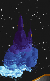
- Now we’re getting to the upper level. Some great stuff here. The black/brown tower is intriguing, curious to see what your plans were for that. The bird cage thingy. I don’t know why there was a giant black cylinder. What was strong enough to almost win the match single handedly, were the castles in the sky. You could’ve cut the rest of the map and just had floaty blue rock/cloud (looks ambiguous, love it) thingies morphing into mysterious looking castles. 10/10 stuff. Leaves me wanting for more.
- The red beach was another mysterious, haunting scene, but the execution let it down a bit. Ugly rocks, messy backdrop.
- The floating rooms inside the castle… Some of them are spectacular, namely the playing room, the 2001-esque bedroom, the submerged hallway, the room with the plants, the party… Alright, that’s nearly all of them. Just imagine I said all of them, because actually I don’t see anything wrong with any of them. I love them all.
- A giant heart that appears to be beating, chained to all these… memories? Well done.
I fear it’s not developed far enough for the overall concept to come alive, but this type of park is right up my alley. Personal, original, and surreal, without being absurd. I wish you were a little more restainted in how much stuff you crammed in. The natural landscapes, the interiors and the sky castles are all great, but together… I think you should’ve applied some ‘kill your darlings’ here, or maybe opted to pursue this concept outside H2H, without restrictions.
Anyway, there’s plenty to love. I’ll end with my favourite bits as screenshots:
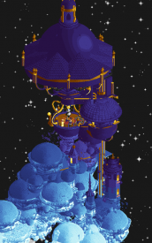
You used a ROCKET! Brilliant.
I’m confident in voting for Logan’s Run, but I applaud the Adventurers Club for their vision. -

 posix
Offline
Match Conclusion

The poll is now closed.
Logan's Run have won this match with a score of 34–6.
Creators
Logan's Run"Highlands"
Zarathustra
AJ-
Maverix
Adventurer's Club"House by the Sea"
hoobaroo
Otsdarva
SensualEthiopianPolice (F)
-

 ottersalad
Offline
Congrats to Zara, AJ, and Mav for winning! This park was full of great rides and all the archy was pretty well done. I think the village across from a park with some level of tension between the two halves is a H2H trope that is a bit played out, but when comparing these two parks I think that is okay. I think Liam's review hit all my thoughts pretty much. Density was spot on.. let various rides and areas breathe. The ZDT Switchback was very very familiar, I wonder who built that lol. Another highlight to me was the Carousel of Progress -esque ride. Was really neat to see that sort of attraction. Made me think, is there a good way to make omni-movers? Besides Arandelle?
House by the Sea was such a tease of an entry. I want to see this vision completed, I really do. Knowing some of the issues and struggles to get this park near completion, I sympathize with you guys. I would know firsthand the crunch of finishing a park on time! There's some terrific layering and object usage here that I just enjoy... the little courtyard beneath the splash drop for example. I'd be curious Hoobs to see you do something that is less vertical perhaps. As much as I enjoy your work, I think building out in all directions as opposed to just up and up will help immensely. Maybe it's just me, but building so high up on the map becomes quite a challenge. But again, I'm on board with Liam, I want more of this style.. "personal, original, and surreal, without being absurd". Please keep building guys, I look forward to whats next from all three of you.
-

 Camcorder22
Offline
Wanted to wait until after the match was over but goddamn House by the Sea was something special which made it all the more heartbreaking that it wasn't finished. Please finish this hoob & friends you will have at least one fangirl and I suspect many more. I'm not one for "getting" parks (reminder I'm a dumb bitch), and I don't really care that much either, but it just had that surreal, dreamlike magic that you started to capture in some of your MM entries (particularly Dreamcatcher) that has made you perhaps my favorite builder to emerge in the last couple years. If I start something new after this, I'll surely be coming back to this for inspiration.
Not sure I get the stink with a weed theme, like it or not there is a huge amount of culture and references around weed, and its not like building a park about something is an endorsement of it. Especially after nobody seemed to care regarding an alcohol theme earlier in the competition (much more harmful of a substance, not that I mind that theme either). It was certainly a solid park, rating seems a bit low because it seems like an easy gold in my eyes? Plenty of clever details and subplots. Maybe the biggest thing for me is I'd have wanted to have seen a weed park done a bit differently than just a realistic park themed to weed? A bit more lush, overtly psychedelic, and perhaps with a bit more natural space. Nonetheless, solid execution on a theme that we were bound to see eventually.
With how much House by the Sea struck a chord with me, I perhaps would've voted for it in a different situation, but given the importance of the outcome of this match to SQ, it didn't feel right. Best of luck to both these teams in the semis!
-

 Ling
Offline
I'm getting to this a few days late. The single rail in Highlands is so good. Almost a little too extra for the map it's on, but what a layout. If anything I find the atmosphere a little confused. These city/theme park hybrids have never quite been my thing. The parts that feel just like a city are nice, very PNW or northern CA feeling. The underground sections seemed like they might have been better as building interiors on smaller scales. This is also a case where I think the custom color palette was more annoying than it's worth. I suspect you were going for a "hazy" look but honestly the base scheme makes the greens look so much more rich and lush. Semitransparent objects could have been used in a few key places to drive the same point home I think.
For House by the Sea, I think I kind of see where this was going, but... probably a little too ambitious. I can't tell what I would be getting out of a lot of these rooms, if they were done. The celestial area at the top though, is just... gorgeous. I hope that gets repurposed in to a smaller scale design or themed area in the future.
 Tags
Tags
- No Tags


