H2H9 / H2H9: Round Robin - R7M2 - Scream Queens vs Cereal Killers
-
 10-August 21
-

 Liampie
Offline

Round Robin

 Atama Yama
VS

 RajasthanVoting Rules
- The poll will stay open for ~72hrs.
- Do not vote unless you have viewed both parks in-game.
- Everyone may vote except members of either team. Any illegitimate votes will be ignored.
- Anyone with an account that predates the start of H2H9, or who has been drafted onto a team, may vote in this match. Anyone with a newer account must pass the admins' account integrity checks.
- Voting is monitored by the admins to improve fairness.
-

 Turtle
Offline
Two great parks, but one is pretty clearly ahead of the other in terms of skill-level, composition, etc. which made it a bit more enjoyable for me.
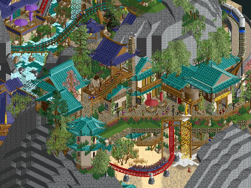
Atama Yama was a really interesting concept that juuuust missed the mark for me. I'm a really big fan of huge imposing landscapes, and wanted to like this one more than I did. I think the object choices for the rockwork threw me off, they just drew the eye rather than leading me around the map to the different islands. Whenever I was trying to look at the architecture (which was great) or trying to follow a ride, I was getting distracted by the rocks. Perhaps they're too geometric and not natural enough? Not sure exactly how you could have softened it a bit, but I think that would have helped.
Some things I loved:
- the verticality, especially between islands
- architecture throughout was really strong
- the high wooden bridges were great, loved the wooden coaster spirals
- the mix between the lush foliage and the desert was really nice
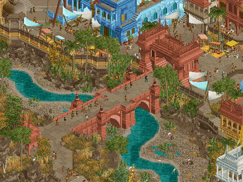
Rajasthan was incredible, definitely up there with my favorite parks this season. Probably top 3. The foliage and landscaping were top notch, super natural feeling (especially compared to the geometric rocks in the other park). I especially loved the riverbank section, just so natural. I didn't even mind that it was so brown over there, partly because it fit the theme perfectly, but also the little pops of orange/yellow in the foliage made it. In fact, the colors throughout were incredible. The dark red color was so great, really glad there was such a huge building out of it as it felt so warm. Also the blues were a bold choice but they saved the whole park from feeling too brown, I think. Feel like I spent a lot of time looking at every single building - they all had their own charm and personality which is rare to see. Nothing felt like filler.
Things I loved:
- the little red bridge over the river
- the waterfall coming out of the castle side through the trellis
- the opposite river bank was lovely
- the white domed temple in the middle of the park
- the yellow canvas covers contrasted really well with the dark red
Overall just such a great park, right up my street in terms of feeling super atmospheric. I believe that this was a genuine chunk of a place that exists. Really well done.
-

 MK98
Offline
Ugh great match. Atama Yama was a nice idea. The themepark sections looked fun and the shapes of the human heads seem realistic. I like the references to the other teams here and there (the kraken-bar OMG). Made it fun to watch. The park seems kind of small overall but I think thats just my imagination.
I think the SQ's are in very bad luck to go against Rajasthan because oh my god. Easily one of the best parks this contest. The level of detail and crunch is fantastic. Zamanidar has great interactions with the paths and archy. Must've taken tons of hours to build.
-

 Xtreme97
Offline
Rajasthan:
Right from the opening screen I was immediately impressed by this. The composition of the entrance bridge over the river is great, and I love how the shape of the river is carved out with the curved pieces, makes it great from an aerial perspective as well. The star of the map is the fortress atop the hill, one of the top pieces of archi we've seen this season I think, so varied and interesting in its form despite being mostly singular in colour, and nicely broken up by the various garden scenes and interaction with the coaster. Speaking of which, solid layout, loved the unorthodox sort of offset pretzel loop and how it used the landscape. The white temple structure was also impressive, I think more of the detail got lost here but it's very grand and set apart from the rest. The city/town area is superbly made, every building feels unique but they fit together nicely. The dominance of the red and blue is a cool choice as well, I think my only concern was the relative scale of them compared to the fort. The map reminded me more of a Grand Tour park than a H2H park (similar to Villerouge in that regard), I think the concept of theme park elements embedded in a location setting can be a risk with how much it's been done recently but you pulled it off very well here by choosing a theme/culture that's rarely been done in RCT and nailing it. Well done guys, seems you saved the best for last between this and Gangland.
Atama Yama:
At first I didn't quite get the full concept of this beyond the head sculptures but when it clicked that the heads represented the teams (credit to Steve sadly) I found myself really enjoying the park and diving into it more. The heads themselves are fairly blocky in their construction but also look stylized in this respect, and I love the integration of the archi and foliage on top. The music is perfect for the atmosphere and vibe as well, love that it's an original piece. I think the building style becomes a bit repetitive after a while, you could have differentiated the styles some more beyond just a change in colour, though I do see some distinct features/motifs in some of them. The coaster was pretty neat and I liked the norwegian loop and turnaround scenes. Beyond those parts however, I found it was sort of sidelined from the action and too easy to just ignore in favour of more interesting areas. I definitely enjoyed a lot of the nods to the various teams, makes me more interested in exploring the map and taking in everything it has to offer.
Overall I think Rajasthan is the stronger park, and the one that gets my vote. Great job by both teams. -

 Ling
Offline
The atmosphere of Atama Yama is just... impossible to describe. Fantastical, charming, serene, somehow creepy. Unfortunately the landscaping style, while extremely original, makes things a little hard to track/process. Sukurimukuinzu is a solid, insane hyper layout but it doesn't feel as much a part of the map as other entries. There is one REALLY COOL angle on the log flume rock/island but it's really hard to get a sense of what's going on in there from any other angle. The heads are super cool, would love the see the concept used for something with a bit more of an overt story/history.
Rajasthan... I just don't even know what to say. I will be trying to process details in this park for weeks. The macro is crazy. The micro is crazier. Zamindar is fucking incredible. The queue for the corkscrew coaster alone is just spellbinding. The colors are crazy. What a masterpiece.
-

 Zarathustra
Offline
Atama Yama - This park really grew on me the longer I looked at it. It only took me a few seconds to realize those were giant heads, but it was still a cool realization. I like the atmosphere fo this park, particularly with the music. The track sounds exactly like something that would be rct2 music if rct2 was made in 2021. So cool that you made your own score- something I've always wanted to do. I think this park does great on the macro, but left a little to be desired on the micro level. The heads were amazing! the coaster worked less well for me. I wish it was integrated with the heads more, popping in and out of eyes and mouths. Instead it mostly just twists around in front of the heads, dwarfed by their majestic magnificence. I think it would have worked better to make the coaster a bit larger and the heads a bit smaller. as it is they feel a bit out of scale. The head2head references were cool to discover, but ultimately felt a bit gimmickey to me. I kind of wish you'd committed to the weird Asian vibe instead of layering on all the park references as well. Felt like they broke my immersion some. That said, some were really amazing, particularly the eiffel tower. Overall again, I really liked the atmosphere and macro of this park- definitely had a great artistic vibe to it like Yerka did as well. Just wish it had committed a little more and integrated its various ideas.
Rajasthan - This park wowed me from when I first opened it, but while I do like it, I think I maybe like it a bit less than some. Definitely had a lot of highlights though. First one is definitely the archi. I love the commitment to monochromatic buildings. The huge red fortress was a favorite- so glad you didn't add an accent color. really allows the viewer to focus on the forms and makes it feel more unique. Same for the white arrow station. I love the way the red is used across the park from the big fortress down to the bridge across the river. Honestly the use of color in this park is top-notch. The river is also great- definitely going to steal that curvy strategy. Archi was great overall, although it felt a little blocky sometimes. Wish we'd gotten more ornate/textured domes. One part of the park I liked a bit less was the ride design. The yellow arrow felt a little underwhelming to me. wish it had more exciting moments- as it is it kind of all blends together. The pre-lift section is an exception though- very creative! The supports also need work. As it it is most are just straight- doesn't add much beyond the default supports. more slanted pieces would have improved the look of the coaster so much. The flyer I enjoyed more- very dramatic how it sprawls and swoops across the map. Still a couple suggestions- for the big inversions I dislike that you merged into multi-dim track like that. I'd suggest the more modern method of using the "arbitrary ride type changes" cheat. Then you can build any invisible parts with display track using the Twister track which blends much better Flyer. It also has the option of the large steep to flat pieces and vertical twist which would have helped the flow and shaping. (even if it meant making the inversion slightly taller.) That vertical twist could have been one of the highlights of the entire layout, but instead you used a vertical track merge and then hid it from view with supports. The cobra roll also doesn't work for me- cobra rolls in this game look better when they are tall and sleek- and this one is very squat and blocky- again a consequence of using the multi-dims limited track pieces and having the train flying on the outside rather than the traditional inside of the cobra roll. but anyway these are just nitpicks/suggestions. I did really like the car ride that gets lowered. vertically- very creative. Overall a solid map- easily above average and something to be proud of.
-

 Jene
Offline
Scream Queens – Atama Yama
Loving the big heads and how you guys sculpted it. Great stuff. It was fun to find all these references to the different H2H parks. +1 because I saw myself. -2 for making a smart-ass statement about our skeleton missing legs. +1 because I love the use of the cotton candy shop head. I just really like this strange setting and the use of height variance. Just tough luck going up against:
Cereal Killers – Rajasthan
Damn that’s a nice bridge. And Damn that’s a nice river. And Damn those are so many amazing single colour palaces and houses that just look phenomenal. And Damn just for the whole park. Steve I really hope you’re not going to kick me out of Logan’s Run for saying this but: I love the use of half diagonals in this park. All half diagonals are so well placed and add something to the area. Just . . . Damn. Man, now I’m craving some Indian food. This park has my vote.
-

 Dr_Dude
Offline
oh phew, I was worried I wouldn't have a wildly against-the grain vote this season.
I don't completely understand the widespread appeal of Rajasthan, but I don't have much to criticize, just a me problem I suppose. I will say I don't like that so many buildings are monochromatic, it makes it much harder for me to appreciate the obviously impressive crunch. Makes the park feel a little blocky and pre-fab to me, despite all the flowing shapes here that were unimaginable last season. Seeing the praise it's getting makes me second guess myself, and probably rightfully so, because I basically do not play this game. Glad I voted before reading reviews, for variety's sake.
Also thought Atama Yama was incredible, obviously. Love the music, love how weird the atmosphere is, love the easter egg hunt for park references, love the coaster swimming in the negative space. The way Diablo was reminiscent of an early h2h park, this felt to me like a finals park from a more recent season. Throwback-adjacent, but refined. I guess that's how to get my vote. Keep that in mind for finals if you want 1 guaranteed vote, teams.
-

 Lurker
Offline
Atama Yama:
Love the concept, great atmosphere. I enjoyed looking around and spotting the references to other parks, and I liked how the area/parks fit into the giant stone heads. Architecture was great as well, I like the multi-level areas especially.
Rajasthan:
Fantastic architecture, terrain, and foliage. Great composition/layout, and coasters with good interaction with the park. I also like the river, love how the landscaping was done to show the low water level, just some amazing terrain work through there. -
 Mr.Brightside711
Offline
Yama: I gotta say, at first I was not a fan. The huge rocks are very overpowering and I'm not a huge fan of having different villages on each of them. Then... wait? Is that a face? Ohhhhhh. Then I start discovering the references to the parks. The first staff member I clicked on happened to be me. Of course at the brewery. I thought that was funny. Then the good death. Then the kraken bar. Then the cereal. Man there are so many fun references. It feels like a good summery to the RR. It really is a great park with a super cool theme and lots to discover. Of course, I'm not the biggest fan of fantasy but besides the giant floating heads, its actually somewhat "grounded". This park grew on me. Alot. And what I thought was gonna be an instant vote became more of a debate within. Its fun. Its unique. I love the Asian villages. I will say that the park is hard to view rotating like many other parks this H2H. And that kind of goes into the coaster as well. It's very hard to follow. Also the pacing is way too fast. But the layout itself is really good.
Raja: Wow, this is really a great piece of art. It gives me such Animal Kingdom vibes and that's one of my favorite parks IRL. The coasters are super weird and unique but very fun. The landscape is beautiful. The buildings are gritty and also elegant. It is so well put together. There really isn't much to say about it because of how good it is. Insane work.
For me, I'd say these are the best parks of the contest from each team in this match. I wish I could both but CK just wow'ed me more with the insane micro and macro.
-

 Cocoa
Offline
rajasthan: a really great park. the architecture is the standout here- its detailed and vibrant throughout and really such an impressive study. I love the giant palace that forms the centerpiece in particular. and of course, the muddy landscaping is executed well and gives the whole piece an interesting and unique atmosphere. I find myself questioning a bit the composition and the overall flow. maybe the building colors are accurate but I do find that the block use of color feels strange and the use of those dark brown rocks gives everything a bit of a muddy feel. I probably would have loved a bit more greens and natural space to really highlight the beauty of it so that it wouldn't run all into itself. In the end, maybe this is a less-is-more kind of a thing, where the beautiful architecture would only be better for having some blank space around it to highlight it. and maybe it would reduce some of the blocks-of-color feeling I'm getting. but regardless its still a stunning park and one of the top tier pieces from this contest for sure.
atama yama: I knew this was going to struggle against rajasthan but I'm shocked to see just how much it is. This park is just stunning and I found myself totally blown away, again, by the composition and thought and artfulness here. it actually hurts my heart that it has so few votes so far. I feel like I must have totally lost touch with the community, but then, you guys made this park, so at least we can still be friends. anyway---I love this park, even though you replaced me with a second copy of coasterbill (thats gonna be a big margaritaville tab). the giant heads are so well shaped and mysterious and weird. I love the subtle h2h references and the playfulness of the reintepretations, that doesn't feel like a big meta-joke, but rather an artful nod to the season and the game and maybe even a swan song for your team. the archy built into the heads is beautiful, especially all the bridges and spiralling wooden paths and flowing rides. the soundtrack is peaceful and reflective and I found myself really not wanting to close the game. it was like the rct version of a downtempo electronic album, maybe four tet or jon hopkins or something. if I have any criticism, maybe the red coaster wasn't super well integrated just sitting underneath everything, but honestly its slight. this park feels like everything it wants to be and nails the composition perfectly.
-

 AvanineCommuter
Offline
Voted for CK who produced a stunning park this round. But I have to give props to SQ, what a wonderfully wacky and beautiful idea. Loved the concept and the cool ideas throughout.
 -

 Steve
Offline
All right I've been putting this off long enough! You can do it, Steve! You got this. What's the hesitation even for? I've been at this for years. Maybe that's the problem though. Strangely enough I want to build on more H2H parks but rather get a root canal than write another one of these. Is that normal though? It must be, but then again its my own fault for setting a precedent of long and elaborate and hilarious Steve Reviews. Although they are getting shorter and less hilarious. RWE was right all along. Wait, no, what am I saying?! Power through, Steve!
Yeah! OK, first up is Whole Lotta' Head (hm, maybe need a better name. Nah!). SQ, hey this shit is solid. Honestly, might be my favorite of yours so far. At first, I was poking around having zero fucking clue what was going on. Like yeah OK there's some huge heads in a desert kinda things and there's villages or something in them, whatever. The more I looked though, the more I got it and the more I liked it. On top of the great idea, it was well executed. I will forever worship SAC with Xtreme with zero remorse.The shape of the heads might get a little weird given the isometrics of the game but I can't really fault it for that. This is something to be proud of no matter what happens in the season going forward. Bravo, dudes.
Rad, we are moving now! I can't be tamed! Who sang that, Miley? Or was it Britney? Nevermind, full speed ahead to whatever this next park is. Well, I know what it is: it's Liam being a sneaky boi. Man, how can a dude produce such a boner of a season and then drop Gangland and THIS at the end of the RR. I'm calling conspiracy! Also, I'm calling an ambulance because this park blew my mind. That river! The curves! The palace! The mini golf! Honestly, there's a lot of unconventional shit in this. The coaster layouts are both kinda weird on top of a mini golf and an outdoor dark ride that jumps off a cliff. Who's this weird on Liam's team other than Liam himself? Maybe Rusty, but that's for a different reason. Hm. I'm stumped! Regardless, this park obviously slaps and I am not happy about it so yeah OK whatever.
-

 wheres_walto
Offline
Rajasthan
+ I don't know who pissed in your cheerios, but y'all really saved your best two parks for last
+ what strikes me most is that the level of detail is matched by precision. Rather than layer 7 objects, you achieve equal effect with 2. This park does an amazing job of letting the objects do the work for you, which is a super underrated skill in construction
+ best implementation of krypton rocks so far in the contest, they don't overstay their welcome, they don't take up too much visual space, and the texture is more convincing as mud than rock
+ I've looked around the map repeatedly, it's just so casually excellent. It doesn't rely on any sort of gimmick, it's not an easter egg hunt, you could argue that it might benefit from custom music or some x-factor, but I think that would ultimately take away from the classical style being presented
+ yo that curvy river is great and will be seen again, super weird shapes but feels natural
+ really awesome park, great colors, great landscaping, great architecture, definitely more of a grand tour vibe but it's all really well executed
Atama Yama
+ great execution on the heads, they're recognizable right away from any zoom. The map relies on them, and they don't disappoint..
- ..from one angle. When the faces aren't in focus, the blockiness of the rocks is pretty distracting. The jaggedness was really my biggest issue with the map overall
+ really cool concept, it's a nice capstone to end the season, makes me reflect on the ungodly amount of time we've spent torturing ourselves. Literal heads to represent each team is pretty clever
+ each garden is uniquely lovely, you've done really well to maximize the limited space by stacking levels, and I'm impressed that each one looks and feels different. I definitely wouldn't mind seeing more of this style
+ respect your commitment to your overarching theme for the season, y'all some artsy fartsy mf'ers, don't ever stop being who you are
These were both good maps, both subdued, both subtle. I like the construction quality of Rajasthan more than I liked the stone heads in Yama, but Yama definitely had the better concept. Anyways, congrats to both teams on finishing 7 parks, this shit was hard for all of us. Maybe you'll both make the playoffs. If not, consider yourselves the lucky ones
-

 chorkiel
Offline
Rajasthan:
Building a heaven's park may have been a safe bet for R7 in case you needed a win. This park was a bit safe, but because it's so good it works. That river is absolutely stunning.
Atama Yama:
A more risky move. This park is pretty weird, but I like it. I'll admit that some references may be going over my head (haha) or this park is not as complicated as I'm thinking it may be. Thing is that you could have done better with the rocks. The biggest issue is that you can only see the faces from one angle and from other angles it just becomes a weird-looking difficult-to-navigate park. If this is the end of h2h for you guys then it's a nice final chapter. Appreciated the original visuals and themes you guys produced.
-

 CoasterCreator9
Offline
Match Conclusion

The poll is now closed.
The Cereal Killers have won this match with a score of 39–8 .
Creators
The Scream Queens"Atama Yama"
Recurious
Jappy
Camcorder22
PhoenixWing101 (F)
Cereal Killers"Rajasthan"
A n d r e w
Liampie
ultro
-

 Recurious
Offline
Thanks everyone for the kind comments on Atama Yama. Even though we got landslided I feel like overall the park was well received and the reception was mostly positive. Finishing this park really was a struggle. I built for 17.5 hours straight on saturday and another 7.5 hours on sunday to get it done in time. Overall however I am very proud of what we built and have no regrets (besides some small minor mistakes due to time pressure). Rajasthan is a great park and I feel no shame losing against this park, the win was well deserved.
I will make a post later which will explain the build process for Atama Yama and with a more detailled review of Rajasthan. For now, thanks to everyone who took the time to view the park, I hope you enjoyed
 .
. -

 deanosrs
Offline
catching up on some reviews!
Rajasthan:
I voted for Atama Yama, and it was a very, very close call. I really liked the structure of that park. I really like Rajasthan too. If I'm honest, more now than when I voted.
The best way to view this park is zoomed in. There's so many great details and it removes the feeling in some areas of monochrome. When you get closer in, the details of each building come out and you don't care so much. This park has the best use of the cloth awnings I've seen so far, they just fit the theme so well too.
The corkscrew coaster fits perfectly with the palacial area. It has that feeling of aged decadence to it. I would have liked a little more cutaway details in the palace but sometimes parkmakers want you to do that other times they don't. It was clear it wasn't prepped for that level of interior detail, which is fine.
A standout feature (and well researched too) are the red brick walls and the way they shape around the park. Those are beautifully done.
I love the inline twist by the blue buildings on the flyer - great path interaction with the steps and supports under it.
There was pretty much only one thing I didn't like in this park and that's the swinging ship style. I just think those look like RCT custom cars on an invisible track because the train bends as it does. I know it can't be helped, just looks weird to me.
There's so much to enjoy here. I feel like it's a very similar park to villerouge in terms of doing such an awesome job of representing a real world location in RCT. For me I'm more familiar with the french coast so that park rang more bells for me, but this one has better coasters for sure.
Atama Yama
I can see how the overall concept is hit or miss.
The jankiness of the quarter blocks is right on the edge. The 2nd statue from the left in the opening view nearly ruins it from this. But the 3rd and 4th pull me back in. The foliage coming out of the statues is a great touch. In fact, generally the landscaping and foliage in this park are fantastic.
One small little touch I loved in this park was the ways the guests get from one statue to another. The lift is awesome. For me the use of curled track as a path works too. Head to Head railway - lol.
There were lots of nice little details too, like the plane hidden round the back, and I spotted a few references to previous H2h parks - some entertainers with gold, the kraken bar...
I just had a lot of fun looking at this park. If you can get past the statue blockiness, it's just easy to look at, very accessible and really fun.
I'd say this was the toughest vote yet as I tried to balance that against what I thought was a slightly more skillfully made park.
-

 chorkiel
Offline
Hoped to see more from ultro in RR. Hopefully this means he's been occupied with a play-offs park. Didn't expect andrew to build so much of a park - particularly as a replacement. Hopefully we'll see more work from him soon.
 Tags
Tags
- No Tags
