H2H9 / H2H9: Round Robin - R6M2 - Manual Laborers vs Scream Queens
-
 28-July 21
-

 Xtreme97
Offline
The Architects:
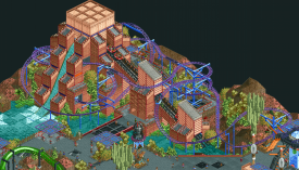
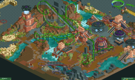
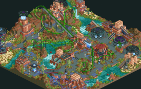
Really great to see not one but two NCSO-adjacent parks this season and going up against eachother too. Architects has the macro on point, love the organic shaping of the landscape, and how the pyramid architecture fuses with the landscaping in its colours but feels distinc with its sharp, linear designs. The invert layout is superb of course, can't say I'm the biggest fan of the first loop but the rest flows so nicely. The concept was a little hard to read starting off. Definitely get the alien motifs, but then was confused with the crashed alien spaceship since the rest of the park seems to point toward this being an intentional Earth-seeding thing? Idk maybe I'm reading too much into it. Cool alien spaceship design, though I'll be honest the glass pieces aren't doing it for me as the ufo-beams. I also think the lines from the glass wall pieces don't do the architecture any favours, but it's a minor note. I thought the foliage was another standout - great use of the olive green trees and fruit trees.Wickerdale:
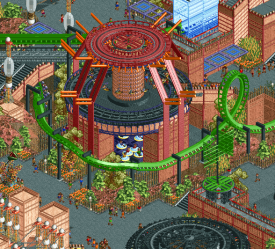
Loved how this contrasts the Architects in being a much more modern style of NCSO, but still being reminiscent of some more classic approaches to the game. The palette sets up the gloomy vibe nicely, and the entrance wrapped with the loop is excellent scene-making and interaction. The trick for the stairs is crazy, and I love digging into these kinds of tricks to find out they're done. Love the overall style and how you separated the map with the grey-red castle features having their own space. Coaster layout is excellent also, can't decide between which I prefer, also excellent support work on top of that. I do think there's a bit of a scale problem with some of the buildings, most notable for me being the windmill towering above everything, and the map entrance towers. There's loads of great detail to find elsewhere on the map too - the hanging tree, the underground cult meeting, the well, the farming details etc. I also liked how you used the dead flowers to strengthen the atmosphere and contribute to the theme. I also want to commend the palette use to make the grey rock walls, though I don't love the weird spotty inverse colour in the white.
Super difficult vote to choose, loved both a lot and liked how they showcase different approaches. -

 Ling
Offline
Wickerdale is so my speed it's not even funny. The queue and in general all the active walking space around the cathedral is just incredible. The underground board room is also a fun touch. So many lovely NCSO details to pilfer from this entry.
In Architects, I love the bright color scheme and the more "active" custom flat rides. Gyronaut is super well done, but I don't think Primogenitor quite holds up to Awakening.
-

 CoasterCreator9
Offline
Match Conclusion

The poll is now closed.
The Scream Queens have won this match with a score of 34–21.
Creators
Scream Queens"The Architects"
alex
Terry Inferno
Phoenixwing101
Manual Laborers"Wickerdale"
Jens J.
Suormot
Shen Kitchen

Scream Queens have used their one-time deadline extension for this match.
-

 Turtle
Offline
I did not expect to see NCSO at all, so seeing two parks was a surprise. I'm really glad they went up against each other as I always find it really hard to judge them against CSO parks.
Wickerdale was an interesting park - overall it was pretty dark and dreary, which was obviously intentional, but it didn't have the character that, say, Riverview did. Because of this, I didn't fall in love with it. One thing I really didn't like was the water color - this only made it feel darker and "flatter".. it was hard to tell the difference between land/water etc. The dark coaster on top of this kinda blended into one. There were some really cool architectural areas - the spires/rooves were especially great. Overall it left me with a kinda negative feeling though, which was only increased when compared with...
The Architects. I really enjoyed this park. Really cool colors, great architecture/constructions, interesting shapes, and generally things that made me want to look closer. Tons of really cool object uses, new ways of looking at old objects, etc. Basically everything you want from a park, and it just felt really fun and vibrant. For me it won this matchup easily, even though I don't think the skill level between the parks was all that high. A deserved win.
-

 Steve
Offline
This match was a tough one for me when voting! A real crisis. Really forced me to search deep within myself and reflect on who I am as an individual. Wasn't a huge a fan of what I found so I waited until nearly the last minute to cast said vote. Happens to the best of us. Right? Eric, can I borrow some whiskey?
Architects is honestly something pretty special. I could point out whatever flaws I went digging for or make suggestions on what I would change but you know what? Why bother, my dudes. This park was the poster child for everything I look for in terms of overall macro and landscaping and when you got that then you got it all. Maybe. I don't know. It was just fucking really well composed. Great idea for the overall concept of the park too. Also enjoyed this coaster a lot. You guys have been fucking with me since day one but this time you get a pass from me! And only one! No more free passes!
Wickerdale, well hey, this is still a good showing, boys. Honestly, loved the palette. Coaster layout was solid and had some good moments, especially with the huge bridge and cathedral-looking building. Everything was pretty solid outside of maybe some of the more village-y portions along the water but even then nothing was "hey look at this trash." If you're ever looking for a fun time though, just say that in your team Discord and ITM will pop up because he is actually a tech savvy raccoon. Weird, right? Makes sense though, weirdly. You'd think it were Shane but he's actually just weird enough on his own to not even need to be an oddly specific animal.
-

 alex
Offline
thanks a lot for all the nice comments on our park

A little background info: as you can probably tell it’s deliberately old school in a lot of ways. Our desire was actually to build an LL park but the combination of: a) me not being able to get the game running, and b) it likely excluding 80% of the community meant NCSO seemed a better option.We started this roughly 2 weeks before the deadline so we wanted to build in a style that could be quite fast and carefree, and it’s reassuring to see that if you get the macro fundamentals right that can still be successful in H2H. And even though there weren’t any particularly innovative building tricks, I think the aesthetic we created was fresh and exciting because of the unusual colour and texture palettes.
I honestly expected a much closer match, maybe a loss, because despite the speedy building style we still rushed at the end and there’s definitely a lot of rough edges and spots lacking finishing touches - especially compared to Wickerdale which had some fantastic details and a very polished look (full review coming soon btw). In general though I'm proud of what we delivered - especially the coaster layout which I hope gets some love in the awards.
In terms of who did what:
Terry made this crazy double helix ride (except for the base):
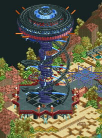
And this double-decker flat ride:
As well as the spinning coaster layout:
He also more or less came up with the park concept too. I was pitching an ancient Mayan colony on Mars (classic LL pyramid building style but with a reskin) and then he proposed what if it’s an alien civ that influenced humans - which fits well for an easy to read h2h theme since there’s already dumb conspiracy theories about this kinda thing.
PhoenixWing made a great contribution with these two pyramids, the surrounding foliage and the crashed starship: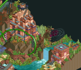
She also did lots of small but useful things like fixing hacked rides and adding path stuff like bins and benches.I did the pretty much everything else, with a lot of ideas, feedback and guidance from the rest of the team of course.
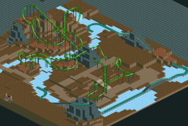
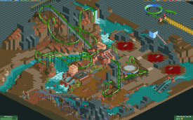
heres some screenshots to show how it progressed:
one of the first saves, just over 14 days before deadline - I spent the first day just trying different layouts until I got something which felt classic but also a bit 'alien' - I then worked the landscape around it:
a bit more detailed planning and starting to define the colours and architecture style:
i think this was 1 week before deadline - the back half of the map was very developed but I was a bit stuck for what to do with the entrance area, and I was still undecided about path colour. At this point we came up with the maze/crop circle idea which became a nice motif to scatter around:
And then 1 week later the final save - what i realise looking at this now in comparison to the above screen is how important the grey path is in acting as a neutral tone against all the peach/orange/green/blues and purples:
-

 Liampie
Offline
I always love these behind the scenes write-ups. Looking at the second to last screen about your path struggles, I don't think I would know what to do at that stage. The tarmac where you put it does not look convincing, and I likely would've gone with sand. But looking at the final overview, there is no doubt that tarmac is superior. This park is full of these hard and creative choices I think. It's bold and I'm glad that it paid off for you. Congrats on the park and the match.

-

GamingRevenant Offline
This park is pretty much insane. I wasn't able to find a single video of it online, so I went ahead and made a showcase of the entire park (4K UHD 60fps): https://youtu.be/pHmyjWz2Id8
-

 Gustav Goblin
Offline
This park is pretty much insane. I wasn't able to find a single video of it online, so I went ahead and made a showcase of the entire park (4K UHD 60fps): https://youtu.be/pHmyjWz2Id8
Glad to see you giving Wickerdale some exposure, I'm a huge fan of the Deurklink style and personally loved it. You should check out some of the other parks from this contest though; to say that Wickerdale was one of the lower ranked parks in H2H9 says a lot about the standard of RCT2 seen in this contest. Check out Gangland if you want to see crazy.
-

 CedarPoint6
Offline
Nice variety in style between the two of these. An enjoyable matchup.
Here's my video review of the parks:
 Tags
Tags
- No Tags
