H2H9 / H2H9: Round Robin - R6M2 - Manual Laborers vs Scream Queens
-
 28-July 21
-

 CoasterCreator9
Offline

Round Robin

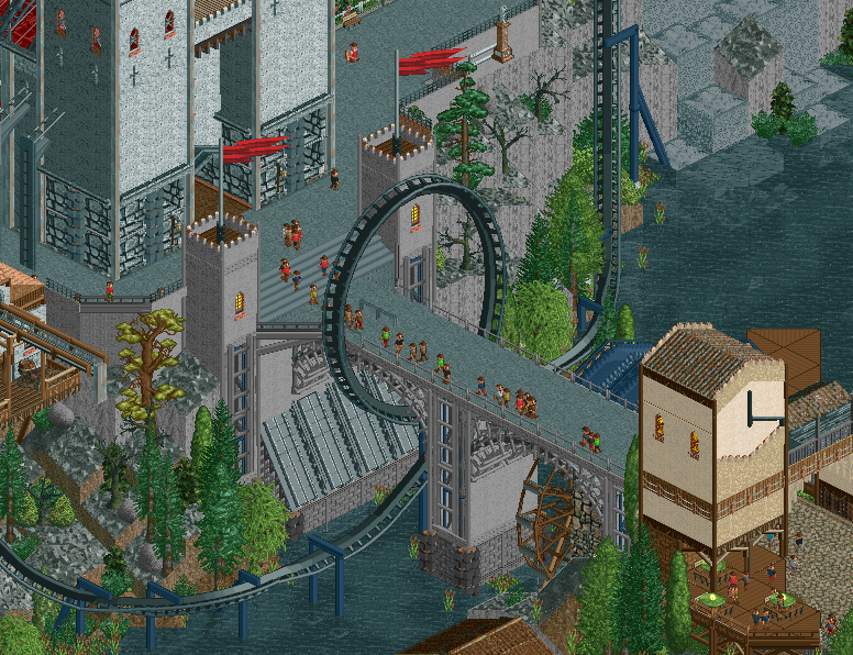
 Wickerdale
VS

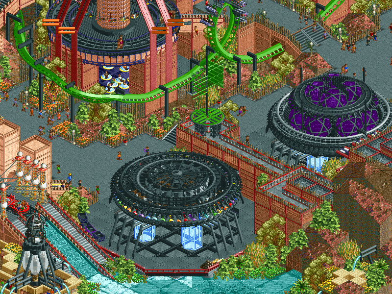
 The ArchitectsVoting Rules
- The poll will stay open for ~72hrs.
- Do not vote unless you have viewed both parks in-game.
- Everyone may vote except members of either team. Any illegitimate votes will be ignored.
- Anyone with an account that predates the start of H2H9, or who has been drafted onto a team, may vote in this match. Anyone with a newer account must pass the admins' account integrity checks.
- Voting is monitored by the admins to improve fairness.
-

 Luketh
Offline
Incredibly clever works of NCSO (and WW/TT), with awesomely opposing themes and contrasting use of color.
What a matchup!
-

 deanosrs
Offline
general matchup comments: I'm so happy that two essentially NCSO parks went against each other. We can get into technicalities about WW/TT and pallettes, but really these are both in the style of NCSO.
It's great that we can compare like-for-like instead of personal preferences regarding this style coming into play. Speaking for myself as much as anyone there as this isn't how I would personally choose to build, but I respect it and it's a breath of fresh air to see after much of this season has become more and more detailed.
The Architects:
For the first time in literally ever, I wish this park had a readme. Is the Architects a reference to something I don't get? Wouldn't be the first time!
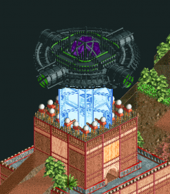
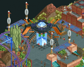
Honestly, I'm not a big fan of the base RCT alien objects. Most of them I look at and think, "oh, a lightbulb", or "oh, some weird springs". They don't really scream alien to me. A lot of this park outside of that does. The glass-over-ice effect looks like a super cool alien flesh type texture. The floating queue path covers look space-ey. The UFO lights are really cool. I think the DNA splicer may be my favourite thing - wish it was more central!
The theme generally looks too weird and abstract for me to look at it and think, "oh, a theme park". So I'm looking at it trying to be like, is this an alien planet? What's going on here? And why are they conforming to roller coaster design conventions from the planet earth circa 2000? That's where I'm missing the readme. I'm sure this does make sense, and there's something I'm missing. So I'd like to understand that before my vote finally settles.
I'm really enjoying the park, in the way that it's invoking throw backs to LL-style building even, but with some really clever modern parkmaking twists. I'm just sure I'm missing something on the theme.
Wickerdale:
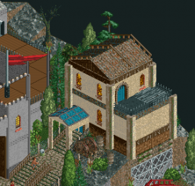
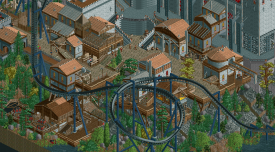
I open this and I'm instantly blown away. The first thing I noticed is the trackitecture roofs, I don't know if exactly this has been done before, but this is the least-looks-like-ride-track roofs I've ever seen built this way. Same with the windmill. I honestly prefer this static trackitecture look to the motioned ones in papillio. Maybe this opening area could have been one path wider so I could see stuff from every angle, but it's just bustling with atmosphere, and maybe that goes if it was opened up a little bit.
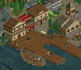
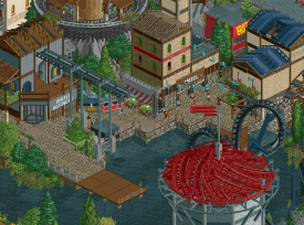
The boats and oars around the dock are really neat. I have to say though that compared to the entrance area, the architecture around here looks a little... euroscape. I wonder if this was the team that requested the 24 hours extra and this is an area that didn't quite get the love it needed prior to the final deadline?
But the fish market made from the river ride is something that looked really neat and provided those micro-details that the area is otherwise missing.
Moving onto the cathedral and coaster, so much I like. The spiral track for the dome's roof at the top of the lift hill, the queue entrance signage, the landscaping and foliage around the edges is so neatly done and all adds up to this thing just oozing atmosphere. Love it!
Awakening as a layout hits and misses. I like the start, and I really like the mid course brake into the loop around the bridge, but some of the inversions feel a little off on their pacing. But honestly I don't really know what I'm talking about with coasters so take all that with a pinch of salt.
Loads and loads of little details in the park I loved. The cult meeting was a nice one. Not personally a fan of non-moving flat rides, but as they go, crow's nest looked cool. Of course modifying the pallette to be able to use the ice as a rock wall texture was a great idea and worked so well.
I think I know which way I'm going to vote, but going to wait to see if I can figure out a few more things on these parks first.
-

 Jaguar
Offline
This is my favorite round of the contest so far, definitely an achievement having not one, but two of the first NCSO h2h parks, at least in a very, very long time. There may not be a ton of crunch here, as in previous rounds; but imo, both of these have some of the best macro composition of the contest.
It's kind of funny that the futuristic park is built in a retro, almost LL style, whereas the park that presumably takes place in the past is built in that newer, experimental semi-NCSO style.
-

 Kumba
Offline
ML+ The church and area around it was outstanding+ Great little details like the well, cult meeting and tractor+ Solid B&M invert+ Good landscaping- Sorry, but I didn't like the WW/TT objects, imo it's not true NCSO- The port and some of the buildings seem weak and inconsistent with the strong parts of the map- The platte gave the park a rainy feel I didn't enjoy and it changed the menu text color making things very hard to see, not worth it imoSQ+ Loved the coaster, really great B&M invert+ Solid custom flat rides, mostly with the DNA one+ Awesome crop circles+ Very nice UFOs and sculptures+ Pure NSCO imo and I respect that you didn't use the RMC-SR- Considering the park name, some of the architecture was just bad- Unacceptable amount of frozen staff- Overall disappointed by the foliage, but some of it was good
Kumba
Offline
ML+ The church and area around it was outstanding+ Great little details like the well, cult meeting and tractor+ Solid B&M invert+ Good landscaping- Sorry, but I didn't like the WW/TT objects, imo it's not true NCSO- The port and some of the buildings seem weak and inconsistent with the strong parts of the map- The platte gave the park a rainy feel I didn't enjoy and it changed the menu text color making things very hard to see, not worth it imoSQ+ Loved the coaster, really great B&M invert+ Solid custom flat rides, mostly with the DNA one+ Awesome crop circles+ Very nice UFOs and sculptures+ Pure NSCO imo and I respect that you didn't use the RMC-SR- Considering the park name, some of the architecture was just bad- Unacceptable amount of frozen staff- Overall disappointed by the foliage, but some of it was goodVery close vote for me. Great effort by both teams and a bold move doing an NSCO match!
-

 In:Cities
Offline
Wickerdale
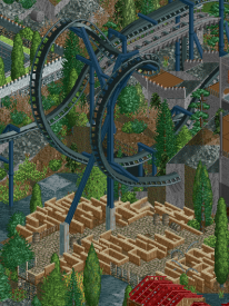
I opened this one first and was immediately impressed. This is (in my opinion) new-school NCSO. nincso in a lot of ways. I dont care that theres a palette or non-ncso stuff - its still cool. The execution is mad clean. Good focus on macro. I love the sense of scale in many of the structures. The drawbridge and gate are particularly great. And that bridge with the loop. Chefs kiss. Seriously- the execution of this is just top notch.
My complaint (and I hate to have one) is that it didn't hold my attention the more I looked at it. Don't get me wrong, its great. But many sections felt a little bare and lifeless. The setting is great, but the story wasn't quite there for me unfortunately. Thats a personal preference of course
Some things:
I appreciate a good custom flat. But always a bit disappointing to see them static. I must be spoiled haha. Cool idea though. The tractor is a neat detail, but feels slightly out of place here.
This is the money shot for me. Just a gorgeous placement. Absolutely love everything about this.
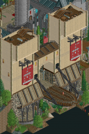
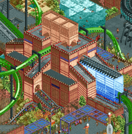
I love how imposing these gates are. The single rail track at the bottom is such a nice touch. Adds good depth. And those chains!
Here's where the park started to fall apart for me a little bit unfortunately. This section felt so lifeless and almost unnecessary. Maybe you guys were a bit rushed though. The fish underwater were a great detail, but this whole area didn't feel up to par with the rest of the park.
Just a cute little house. A little random in spots, but the shape and placement are so nice.
Overall well done guys. Certainly better than what I can do in NCSO haha. It was just missing a bit of the storytelling for me - which is always one of my biggest focuses. The quality throughout the map felt a little inconsistent, and while incredibly impressive upon first view, there wasn't much to keep me coming back for more. Sorry if that sounds harsh - I really like the strawberry farm.
Alien Dorado
I have to admit, I wasn't super impressed right off the bat. Again, I feel like we're just spoiled brats at this point and i'm sorry. But man my opinions quickly changed. I may be in the minority on this, but this park just keep getting better and better the more I looked at it. Maybe I was initially dismissive because this felt like "old-school" NCSO/LL style, and I'm so used to the flashy new stuff haha. But at its core, this park is quite simply GOOD parkmaking. All of the classic tenets are here in terms of composition and layout. It won me over the more I explored. Like I said above - story and concept is king. And the story of this map is SO evident. I absolutely love it haha. The landscaping and foliage is eclectic, and I can appreciate it. Its so vibrant and full of life in the best possible way without feeling too cluttered or busy. I continued to discover new things upon each viewing that only pushed the narrative further.
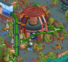
One of the things that impressed me the most was the multi-use of the buildings themselves. Everything seems to have a purpose, and many of the structures have multiple uses and interaction points. The coaster station with the MCBR flythrough and queue integration is just masterful. The multi tiered Pilot Kindergarten/School building with the coaster wrapping around is stellar. Another great detail is the "destinations" for the UFOs themselves haha. Chichen Itza, Ur, Giza. So cool haha - and yet again adds depth to the story. The way things are meticulously crafted to incorporate other elements shows a seemingly effortless maturity in how the construction was approached. I wish I had that level of skill haha. Top notch park. The ideal NCSO h2h style park in my opinion.
Some things:
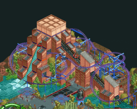
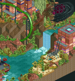
Scoop? Space El Dorado is so good. No but seriously, the interaction between the coaster and the rapids drop is top notch. I love the repetition in forms of the structure itself. The foliage climbing up the side of the pyramid is ace. Great swooping helixes over the water makes me really wish I could ride this irl.
So clever. Took me a second to realize what the purpose of this was. Glad you guys named it appropriately - its such a fun detail! Carrying the "plan" of the pyramids haha. Brilliant
This is top tier stuff. The winding queue, the multi levels of the building, the MCBR flythrough, the TRANSFER TRACK LEVITATOR. Man this is so good. Its clear to me that a the construction of this was very carefully thought out. I love the color pop of blue that the awnings provide as well.
Yet another brilliant building. The multi levels are so good. The multiple pathway openings on the bottom level leading the the saucers is great. Love the red beams. Symmetry, repetition, and interactivity.
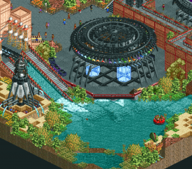
Destination: Giza lol. Great use of the multicolored vehicles to simulate the UFO lights. I really dig the queue for the rapids as well. Nice little first drop. The foliage seems chaotic but somehow works so well here.
For all the crazy new rock objects and textures added this h2h (yes, I know I've contributed to that madness), this proves that the new objects aren't always necessary to achieve the desired effect. The landscaping here is so good. Beautiful setting. And fun detail with the crashed UFO. Maybe a missed opportunity for some frozen staff stuff here
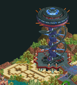
Definitely said WOW when I saw this. The crop circles! I think the use of the maze is what REALLY makes this area so good for me. Perfect contrast of colors. I love that the structure is slightly elevated above the crops. I particularly love how you guys terraced the landscaping in the back. Frames this entire area so nicely without feeling intrusive.
A relatively simple scene, but one that caught my attention right off the bat. Took me a second upon opening this park to recognize what was going on, but the light blue glass used to represent the UFO beams is so apparent. Thats when the theme really clicked with me. So good
All in all, I had to absolutely give it to the Scream Queens this round. Sorry Laborers - I thoroughly enjoyed Wickertown, but I fell in love with Ancient Aliens. Thanks for the great parks this round guys!
Josh
-

 Sulakke
Offline
It's refreshing to see a NCSO match after all these insane CSO parks.
Wickerdale by the Manual Laborers
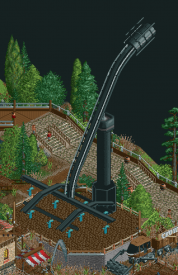
The coaster is great. It might be my favorite coaster of the contest so far. I especially love the part after the mid course breaks. The drop into the ravine, followed by the big loop around the bridge and the beautiful turn are all looking ace. I'm also impressed by the coaster supports. They are almost as good as the Toon custom objects. I'm less impressed by the architecture on the map. The bigger buildings (entrance gate, windmill, clocktower, church, castle and the tower with the pie dome) all look out of scale and therefore a bit clumsy. I would definitely have made all of these buildings smaller to match the rest of the scale. Some of the smaller buildings look great, but the majority looked a bit random to me, especially the buildings of the village next to the castle. I love the bridge. And I have no idea how you did those steps leading up to the castle nor the flagpoles, but they look awesome. The park could have used more peeps, since some areas are a little dead. And I don't mean the graveyard, but the docks and the area around the Immelmann.
The Architects by the Scream Queens
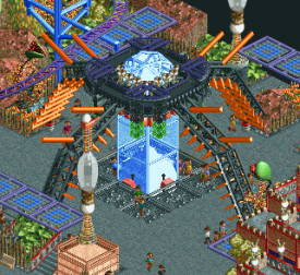
It took me a while to understand that the blue glass objects are laser beams. Love that. I'm still undecided whether I think the architecture is meh or great. Even for kinda Inca temple structures they look a bit blocky to me and the line details made it worse, I think. I'm also not sure about the UFO's. It took me a while to figure out what they were supposed to be and they could have used some glass elements on top like the crashed UFO has. Also, I think a different color than black or a secondary color would have made them look better. The area with the DNA ride and grain circles looks sick. The overall composition, color scheme and landscaping of this park are all fantastic and made me vote for your park.
-

 Liampie
Offline
Manual Laborers - Wickerdale
I am instantly reminded of DKMP style parks, with all its pros and cons. The pros: a lot of experimentation and building on previously successful ideas. The cons: ncso pitfalls and building on previously successful ideas. I guess the ncso pitfalls I mentioned can use some elaboration, but I’ll keep it short. 1) buildings (partially) out of proportion (that gatehouse… But also the large church’s towers (too small, weird spires), and the giant windmill, a single dead tree that’s three times as tall as most trees on the map, clock so big but without any detail, so on), 2) fence spam on buildings, 3) subpar object choices like LIM track flying buttresses, (blue?) virginia reel roofs, and boats that appear to be made out of woven straw. To the list of DKMP-related pitfalls I’d also like to add the palette, which is the worst palette of the contest so far. The new colours do not fit in at all, everything built in that ghastly grey looks like ghost objects, and I can hardly read the game interface. Why is the water black, anyway?
Now we got the usual complaints out of the way, time to point out everything that this park did right, in my opinion! First of all, the coaster kicks ass. The layout looks beautiful and I always appreciate layouts that are outside the box. The last inversion is a giant loop? Ballsy. Custom supports in the last half of the layout (cobra roll not so much) look great, well done. Theming is hit or miss for me. The village to the left of the big church is very nicely laid out, although it’s missing some content. What does it contribute to the map other than being pretty? I can complain about the fence spam, but the bigger picture here is very nice. I love the Digging Frenzy ride, good take on that type of ride, glad to see someone finally do that in RCT. The other side of the back of the map with the cupcake shaped castle is also very nice. Love the spiral roof, nice use of RMC track as well. Front half of the map is a bit of a mess, but with some nice scenes nonetheless. The little harbour scene in the centre is super atmospheric with some nice details. The smaller church is easily the better of the two, I like that it has an interior too. Speaking of interiors… Are those cult members playing beer pong underneath the graveyard? Nice coffin too.
I’ll end this review with an overall impression: Very nice park with plenty of good ideas, but some major flaws too. It doesn’t help that I find the overall concept lacking. What is the theme, the narrative here? Is there a concept or is this just a loose collection of ideas? There’s vampire stuff, but also an unrelated mine, an unrelated strawberry farm, and more stuff like it. What time is this map set in? There are tractors and shipping containers, but also giant gatehouses with a ton of cannons and medieval looking banners. There’s also a harbour locked in between waterfalls. I think you should’ve picked a clear concept, and built everything around that. If it doesn’t contribute to the concept, it shouldn’t be on the map, ideally. Again, nice park, but not my favourite (other than the name, Wickerdale is so simple, but so nice!). Well done, anyhow! And it’s really delightful to see NCSO flavours finally make it into H2H.Meh style, lovely arrangement.
One of the best little scenes of the match.
Scream Queens - The Architects
There’s currently a discussion on discord on ugly colour schemes, and the hypothesis that you can make any horrible combination of colours work through dedication and consistency. I think this park is an excellent example. Lots of flesh colours, with bright green and black. It shouldn’t work, but it does work. It’s still not the best colour scheme ever, but I really appreciate the originality. Another general thing here is the space style music… Have I overlooked this style the past 20+ years? It always seemed quiet and uneventful, but it’s audible here and I love the mysterious vibes it contributes to.
I’m a fan of ancient times, and although I think all these UFO theories are bollocks, the theme still strikes a chord with me. Love the theme, it’s easy to make this cheap, but you’re presenting it in an original way with some great ideas, like the UFO projecting the pyramid plans, the UFO lights, and the idea of stalls being UFOs that just beam fried chicken or whatever down to the guest. And of course, the transfer levitator, and the way these levitation beams are done in general! Makes for a great motif. As for rides, I think Primogenitor is one of the best coasters of the contest so far.
Like others have commented, the park is a grower. I think the people who made this can do better in some regards (more appealing foliage, more noteworthy architectural features (ironic)), but it’s a park to be content with for anyone!Pyramid plan! Sick!
Just beautifully planned. So organic, everything belongs.
Wickerdale vs The Architects
Of course the parks gotta be compared, and I can compare the ncso approach. It’s been said for many years now, that H2H was going to see ncso. I think this first happened in H2H7, that it seemed like a given to happen. Then with H2H8 the odds were even greater, but it still didn’t happen… A lot has changed in the community since, and Storybrook Glen proved that there is room for ncso on the highest stage of RCT. I think it’s a tad ironic that we finally see NCSO in H2H, but neither of these parks are reminiscent of Storybrook Glen and that type of NCSO, and also not in terms of quality. Wickerdale is seen as an example of modern NCSO, but actually I’m of the opposite opinion. Wickerdale reminds me of the ncso we’ve seen for years, and with the fence spam in places even of the NCSO we were familiar with prior to the NCSO-renaissance. Sure, it uses some modern ideas and techniques, and some custom content like the RMC track and the palette too, but it sits below that glass ceiling that Storybrook Glen shattered earlier this year. I feel like I’ve seen it all before. The Architects does not rely on modern techniques as much (there is plenty, though), but it offers much more new. It’s design and macro are very advanced, there are design choices and concepts underneat the superficial layer of object choices and ride names. The Architects is a good example of the last advice I gave to Wickerdale in my review above: take a single concept, and relate everything you do on the map to that concept. Don’t get distracted, nor tempted to include some easy, cheap gimmicks. The only place where I think The Architects is guilty of this is the crashed ship. Totally unnecessary, and also a bit cliche.
Anyway, it’s clear where my vote goes. I loved seeing an NCSO vs (almost) NCSO match-up, the comparability really makes it interesting. I’m also glad to see two excellent coasters, because I’ve complained about the relative lack of good coasters this H2H. My congratulations to both teams for their parks, and congratulations to the Scream Queens for getting my vote.edit: thought of a better way to put it. Which park is more like modern NCSO, Wickerdale or The Architects? Perhaps it's Wickerdale, but it's unfair to say that The Architects is traditional, because it's very fresh - what about it is traditional? It'll be hard to find any park like it in the NE database. Anyway, good design is timeless, and The Architects is just that. Techniques are irrelevant for composition and concept. Those things never age.
-

 saxman1089
Offline
Not really an NCSO person, but I enjoyed looking over the two parks. Architects landed better with me for whatever reason, I think because of the colors and the overall mysterious vibe, so it got my vote. Wickerdale was pretty cool too, but just didn't strike me as nicely as Architects did.
-

 wheres_walto
Offline
Not really an NCSO person, but I enjoyed looking over the two parks. Wickerdale landed better with me for whatever reason, I think because of the colors and the overall mysterious vibe, so it got my vote. Architects was pretty cool too, but just didn't strike me as nicely as Wickerdale did.
 -

 saxman1089
Offline
Not really an NCSO person, but I enjoyed looking over the two parks. Wickerdale landed better with me for whatever reason, I think because of the colors and the overall mysterious vibe, so it got my vote. Architects was pretty cool too, but just didn't strike me as nicely as Wickerdale did.
SO FUNNY
-

 Lurker
Offline
Wickerdale:
An impressive opening, I like how this park is laid out, and the elevation changes throughout, as well as the general atmosphere. Looking through the town I saw all kind of creative uses of objects and even ride vehicles, also some interesting scenes around the park.
The Architects:
This park isn't as flashy at first, but as I started noticing all of the very nice touches around the park, subtle things that show a lot of skill and creativity. I also like how it's a pure NCSO park with no WW/TT stuff even, It actually has a strong LL feel to it.
Going to give this a bit of extra time before voting, as this is yet another tough vote for me. -

 Faas
Offline
The Architects was a (clear) winner for me.
Both parks showed great skill, but the Scream Queens showed tons more artistic and compositional qualities that I really enjoyed. No custom palette was also a breath of fresh air this contest. A true NCSO park!
Wickerdale was great in places, but I didn't enjoy the weird sense of scale and the giant tree and flatride made of trackitecture. Those didn't fit in my opinion.
-

 chorkiel
Offline
This match really shows the versatility that ncso still provides. Someone on discords called the Architects 'LL in rct2' and I like that. Wickerdale on the other hand is more traditional ncso. Architects landed with me for whatever reason. I honestly think because of the colors, although I liked the mysterious vibe in both parks. Both parks had some interesting structures and compositions, but the Architects had more standouts for me.
-

 Zarathustra
Offline
really loved this match. I'm a big NCSO fan, so this was a real treat. and it was interesting to see sucha. different approaches to ncso going "head 2 head".
Wickerdale drew me in first. I absolutely love the opening scene with the bridge and the loop and those very creative stairs. the stairs trick is fucked up. The idea of an invert that has a huge drop and giant loop after the MCBR is just wonderful to me and love the second half of the layout. overall nice custom supports. The layout is creative and imposing, but also feels a little janky at some parts. In particular the zero G roll and helix around the lift hill just feels like it has no flow to me- too many awkward straight unbanked pieces.
Overall this park feels extremely DKMP-esque, which was a bit of a surprise to see in h2h. That definitely came with certain positives and negatives for me. One positive of course is the creativity on the micro scale. beyond the stairs, the use of the triangular prism for half-diagonal glass blew my mind, especially in the context of the dome. somethings felt extremely out of scale and some felt like they were just copies fo stuff I'd already seen on dkmp on ne. so that was a negative for me. I also don't get what this park is about- when, where, why is it? there doesn't seem to be much of a theme, although there is mention of vampires having been there in the past. it does feel very dark and spooky, but it doesn't feel like that was even that committed to. As a result, the huge castles and little village buildings came off a bit generic for me. Maybe it could have used more supporting rides. But I fucking love the windmill.
The Architects- when I first opened this park I hated it. the bright green plus martian rock thing didn't work for me at all. I thought all the foliage was bad. I didn't like the way the invert does steep twists at a considerable speed. But weirdly, the more I looked at it, the more I wanted to look more. It really grew on me in a way no other park has this season. A lot of what won me over is the theme and the way it was so ruthlessly executed. the longer the looked, the more I thought "ok, so yeah the foliage is weird, but that's the point- it's alien" and suddenly it started to look good. like creepy trees and jungle bush- that shouldn't work, right? but longer I looked the mroe it did. and once I got over that, I started to enjoy everything else in the park, particularly the great macro. everything just feels so well placed and readable. I love how much content there is, with multiple coasters. and the fucking DNA sequencer is insane. just everything in this park feels so creative to me. are aliens' trying to impregnate me? will there be an anal probe? will I enjoy it? I'm not sure of the exact story here, but it's quite clear that martians have their sights set on earth and I love how many details contribute to this. the pilots school is best example, but laso the whole map. also the queueline awnings- wow. and I love the invert layout, even if it's a bit weird in a few spots. weird is nice sometimes, rather than the same stuff we've seen so many times. spinner is cool too, and I like that you fit in two coasters. glass on ice pseudo LL? I'm feeling it. always like those sorts of techniques. so in the end, I voted scream queens.
In conclusion, a very interesting match. I mostly agree with the old-school vs. modern interpretation that many have posed, but I think it's interesting that really both parks have modern and traditional elements to them. Architects to me feels like an LL park, or early RCT2 park, recast in the NCSO style of recent years, but not going so far as something like storybrook glen in the modernness of its NCSO. Wickerdale, like most dkmp parks, is a mix of traditional NCSO (as Liam pointed out) with very cutting use of tile inspector, and the incorporation of objects not traditionally consider NCSO. great job to both teams. #blessed
-

 posix
Offline
Wickerdale
A nice park, an interesting mix: oldschool qualities of design, partly evoked by the NCSO choice. Composition very reminiscent of old semi-realism NE parks, which here looks like a coincidence. Stylistically this would fit more into a DKMP category to my eyes (at this point I would have to look up the builders again so I am mostly unbiased). Overall this appearance that results is very likeable. I love how the architecture organically flows across the map, manoeuvres height differences, merges with other elements in the park, opens up to various angles, all while not relying too much on modern-day diagonals, or even half-diagonals. I think this is very much a skill in itself and just great to see people can still do it (the (more) oldscool way), which I find more pleasing, anyway. I'm also very impressed by the amount of content on this map, all the strong signalling you have done in unimposing ways, even for less "spectacular" parts like the little market down by the water for example. Very very solid.
The park suffered for me aesthetically. I thought the palette hurt it, and the grey water does not look very fortunate to me. Sadly as it's such a big part of the park, this was a certain problem for me.
The Architects
Just wonderful. So many good and clean ideas everywhere that perplex you they haven't been done before (A cactus out of cacti??). This park is so oldschool H2H it hurts. A wacky theme you otherwise wouldn't do, a lot of improvisation, big rocks. But the talent of the builders and their creativity really brought it together, into a rather enjoyable little park that was both fun to explore, and a joy to look at visually. These themes have never been easy to do. To squeeze aesthetic value out of that RCT1 martian texture is one of the few holy grails of the game, which thankfully to the added texture hues RCT2 introduced became a bit more fathomable. I think you've done it well. I enjoyed the combination with the dirt and red sand textures. The rock formations themselves are tastefully done, with the right kind of compositional understanding for appearance and sightlines. For me the strongest part about this park was its sculptural playfulness. My personal highlight here being the DNA machine. The star shaped lines offset against a natural helix motion, balanced off by making it float above a bed of beautifully designed maze. Just great. Those moments where you forget you want to understand still, and instead just marvel. They're the best. Thanks for this experience.
 Tags
Tags
- No Tags


