H2H9 / H2H9: Round Robin - R6M3 - Logan's Run vs Cereal Killers
-
 30-July 21
-

 CoasterCreator9
Offline

Round Robin
 Blue Pearl
VS

 GanglandVoting Rules
- The poll will stay open for ~72hrs.
- Do not vote unless you have viewed both parks in-game.
- Everyone may vote except members of either team. Any illegitimate votes will be ignored.
- Anyone with an account that predates the start of H2H9, or who has been drafted onto a team, may vote in this match. Anyone with a newer account must pass the admins' account integrity checks.
- Voting is monitored by the admins to improve fairness.
-

 Liampie
Offline
At the risk of sounding obnoxious, I was going to say the same thing.
Also make sure you wear a blindfold going into Blue Pearl to shield your eyes from... nah, kidding. Great little map, Logan's Run! Really digging the coaster layout and the colourful architecture!
-

 Gustav Goblin
Offline
Gangland is unlike anything that has been done in RCT2 so far. I don't want to say too much, but this was one of the easiest votes of the whole contest.
-
 G Force
Offline
Logan's Run:
For what you guys have it's a very well planned and composed map, lovely colors and fun theme. Obviously wish there was a bit more context but I'm sure the deadline was tough on you all.
Favorite bits are definitely the land texturing, absolutely elevates the atmosphere and the mood of the park, and the flume. Dang this might be my favorite flume in a long, long time. Wonderful framing, unique layout, good colors and detailing, awesome stuff!
Rockwork actually probably let this down a bit too, got kind of repetitive, but outside of that the landscaping was pretty solid.
All in all, pretty solid stuff for whats there, would stand out as a pretty great little design submission if it were outside H2H (lets hope you submitted it as one though!)
-
 A n d r e w
Offline
Interesting that a black & white park went up against one with what may be, for me, the most beautiful selection of colors we've seen this contest so far. The colors of the architecture in Blue Pearl was perhaps the highlight for me here, in particular the bits of deep red. Just gorgeous. The architecture overall is great, I just wish there was more of it, and I wish the rockwork was done more carefully and considerately. Lovely park.
-

 spacek531
Offline
Gangland: very neat idea with the story. Executed well enough given the constraints of the game and the fact you don't have a plugin to go with it. I hope your CTR creator built on the park or that's against the rules for making a park-specific CTR. Or is it?
Blue Pearl: A beautiful park that feels like a combination of Mizma Springs and El Dorado. It's beautiful, but against something as innovative as an interactive story like Gangland I have to vote against it.
-
 Camcorder22
Offline
Blue Pearl: The small size seems to indicate potential issues with time, but I certainly don't have anything bad to say about what's here, besides maybe that it isn't particularly conceptually ambitious. The layout is top notch though, especially pacing and interaction wise and is maybe more than any coaster this contest one I was finding myself wishing I could ride. Same goes with the log flume, queue etc, everything was laid out with great care.
Gangland: Honestly these type of palettes kind of discourage me from being drawn into the details of a park but this one was a bit of an exception. Appreciate the imersiveness with the entry scene and messages. I also was wondering why it was glitching so much and then I understood why. My attention span is way too bad for it and also ACAB, but props for putting an entire mini game in here as well. The more I dive into the details of the park and the surround city the more immersed I am in the time period and this may be the best of these types of parks at selling this era. If I had to complain, some parts of the map feel a bit dead/bare, but that might make more sense with the vibe anyway? Probably will hold off on voting for now but leaning towards this one.
-

 wheres_walto
Offline
Blue Pearl
- landscaping felt a bit repetitive in spots, I would have liked to see something other than krypton rocks again after their prominence in Droomvlucht
- it feels like I've seen this park before, the colors vaguely remind me of Lemuria and El Dorado, the setting vaguely reminds me of Mzima Springs and Zerzura, I don't feel like it establishes its own identity or theme, and that leaves it feeling somewhat generic
- map size is disappointing, what's there is all well-constructed but it leaves me wanting more. It feels closer to a micro than a H2H park in terms of content
+ really nice coaster layout and interactions, fun to watch
+ the quality is consistently high throughout. With the exception of maybe the krypton rocks, everything works: the colors are nice, the textures are nice, the detailing is well done. It's a nice little park, but it does feel uninspired, which I totally understand at this point in the season
Gangland
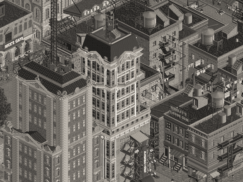
++++ atmosphere. Very cool opening sequence and setting
+ continuous interactive story-telling makes this a really fun viewing experience. I was repeatedly surprised, you can't help but smile while things play out before you
+ love the old-timey boardwalk, the dance hall, carousel, classic cyclone coaster, Bioshock Infinite docks
+ really great city details, you nailed the empire state building, rail yard, and city era feel with awnings, fire escapes, and ad signs
+ vertical parking is awesome, love the use of era-appropriate automobiles
- architecture is bit simple, and the park overall is a tad under-detailed in places, harder to notice in black and white
- understand the spatial limitations, but it does seem quite cramped from a city planning perspective (this is a petty nitpick to balance out the +/- ratios)
This season has been all about atmosphere and aesthetics, and Gangland nailed it. You feel transported into a living, breathing 1920's experience.. that's really fun! Blue Pearl strikes me as more skillfully built, it probably took more time to create, but the end product feels a bit lacking in personality. Maybe it's too reminiscent of other work, maybe it's the nebulous theme and location. Either way, I have to give the nod to CK this round.
-

 posix
Offline
Gangland is a pretty hard mind fuck, wow. The cleverness to incorporate this degree of storytelling is out of this world and pretty much never seen before. I can only applaud. I never in my life would've thought a "ride has broken down" message could be so deep and exciting. Or the fact that the music was breaking at the beginning, to coincide with the story. The park alone is good enough, and the fact that a power-gimmick like this doesn't take away from it is only further impressive. Wow.
The Logans' park was sweet. Very tasteful landscaping in the beginning scene. Further into the park compositionally a bit too dense and unfortunate, and those rock objects can go hit or miss all too easily. A good effort, but a bit small overall, and the competition here was just too strong.
-

 chorkiel
Offline
Interesting matchup.Blue Pearl is one of those instances where it's a really good design, but not necessarily a good h2h park. There's not a whole lot to explore, nor is it a very original theme. Put it (cohesively) on a map with Lemuria and two or three other similar designs and you're going towards spotlight. Gangland on the other hand does better on the gimmick-factor. However the cool story and grey palette are almost a distraction from what a good park it is. Because it is. The landscaping near the dumped body and the broken trail track, are things that don't have to look as good as they do in such a park. Great job.
Also copying my comment from discord:
"[Gangland is a] cool park."
-

 CoasterCreator9
Offline
Gangland
Really impressive opening, and super well done with the music timing. Atmosphere is big in this park even from just opening the file. It's probably no secret by now that I'm a fan of these classic style parks, and even more so when it's a seaside park - so this theme is definitely appealing to me. Black and white palettes are always a hit or miss to me - I think in this case it works in the favor of the park (especially with those super cool film grain effects), but I think it does conceal a few rough patches. The minigame is really unique and an impressive feature of the worldbuilding. Coaster layouts are A+, and the buildings are quite well done and highly detailed.
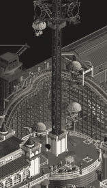
Love this corner with the parachute drop.
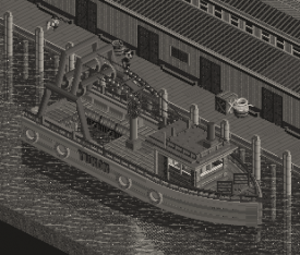
An Excellent Boat
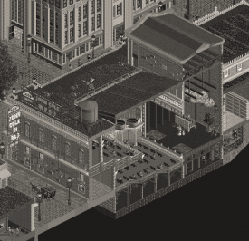
I think the theater scene is one of the more impressive bits of micro on the map with all the props and detailing between the floors.
Blue Pearl
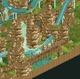
Very charming, and the verticality of this park is something I appreciate. Main feature was the coaster itself; the layout was fine, but I think it's helped by the interaction with the landscaping. I actually love the log flume here, most likely my favorite feature on the map. I thought the landscaping was a little mixed. In the opening area (the park's screenshot in the thread, too) I thought it was nicely balanced with regular sand land and the objects. Back near the coaster it sort of became a bit too repetitive with the grand canyon rockwork. The foliage did help to break it up though. The buildings are great, I just wish there was more of them. Theme was a bit unclear to me.
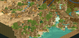
My favorite landscaping on the map, love the waterfront.
Favorite feature of the map; this kind of log flume should really be done more - especially after seeing the style (big drop with a hill after, etc) in El Dorado and now here. A lot more interesting than the typical log flumes we usually see.
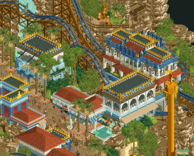
The buildings are great with a ton of cool details. Feels very lively; there just isn't a whole lot of it to keep me interested.
-

 dr dirt
Offline
Thought on this on for awhile, actually, and I was flipping between one and the other and null voting. In the end, the content and effortful detailing of Gangland was undeniable. I think it was the slightly less consistent park, in terms of level of execution, but I kept looking through both and there was just so much breadth to it.
Blue Pearl - What's to love? Lot's of atmosphere, lot's of coolness, and a theme that I'm all about. I love some mystery-element in there; I'm not sure if this one was intentional with that of if I was injecting it to the park myself. The architecture was superior. The RMC was great, and I love its size fit into a small footprint. The colors were perfect; blue and desert will always be super-effective. There's not really much there that I dislike. I like it all.
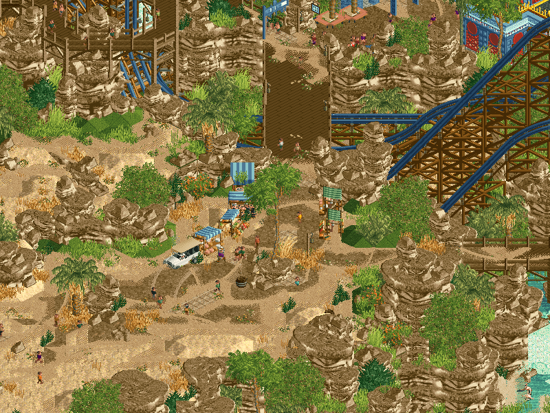
Little bits that are great - the rock cutouts revealing the coaster, the elevated queues and pathways, interactions with waterfalls, and the interaction of the flume and the RMC. Great stuff. I like the downed truck, the market stalls, and the bits of staff members and frozen staff that actually aren't just a quasi-required inclusion in a H2H park. The only obvious thing I disliked was the repeating rock textures, which maybe could've been mitigated with more time. More tiny things that could've been reexamined are a few spots where the Minas Tirith (or w/e the name) stone blocks are sort of blurred into their surroundings. Also, the direction of the statues are facing away from where they'd be viewed in some places.
Overall, love the work, really would've benefited from utilizing the full range of the map size, if nothing else than to put in negative space in the surroundings. I'm not that into needing content for getting my vote, but when it's lacking, it's tough to go against a park that is brimming with content and extras.
Gangland - Crazy opening, one of the wildest things that we've seen this season, or any season for that matter. A little bit outside the scope of RCT, but incredibly impressive and immersive, and very effective in the H2H setting. The mini-game is in that same category, but was actually stronger to me, it takes you around the map, and everything is executed in an RCT-esque way. Awesome.
As for the actual park, I thought it was solid. The middle section of buildings were excellent. I also loved the attention to naming everything and giving it some character. I don't know if there was a ton of depth in the lore of this park, but the breadth of different ideas and things going on is insane. The best detail is the car park mechanism, so cool. I also found the coasters strong. I do think there was some parts that seemed a little bit lacking in execution like some of the skyscrapers being a bit blocky with details tacked on rather than intrinsically complex. I'm also not the hugest proponent of buildings cut at the edge of parks, but the interior details were nice.
I'm not all about the palette, as I feel something similar could've been captured with the use of effectively coloring things to give the effect, but I get it's now the popular approach. The old film effect was cool, however, and adds the level of visualistic style to the park in addition to existing in like a realistic fantasy genre. That's a great combination for H2H.
This matchup overall I think was unfortunate for LR, as Blue Pearl got pinned against a park with a crazy quantity to it, and Gangland kept up (for the most part) with Blue Pearl's quality of execution. It was a difficult vote, but after repeat viewings, Gangland just is striking as a quintessential approach to the H2H park, and that's tough to top.
-

mrs_walto Offline
wow now i'll be all caught up. Steve, I'm coming for you <3
Blue Pearl
- is it like a pirate park?
- *zooms out* whoa it's kinda crazy
- first thing I notice is well, there's an excess of rock formations, and not in a good way
- that's a steep coaster, I would not like to be riding that
- there's a big empty desert on the side of the map, what's that for? Maybe they ran out of time, let's dig deeper
- cute little Logan's Run sign, that's cute
- I don't think I like the gold trim on the buildings, I think I'm being picky. It feels like it should like a raiders of the lost ark park.. was there an info packet attached to this?
- I'm confused on what this is
- I just don't think I like it, and I don't like to be so harsh, but there's just a couple buildings and that's it
- not really anything of note in cutaway
- It's just a little too cluttered, a little too chaotic, the roller coaster is like the only feature that stands out, I'm not sure what this is supposed to be. I'm sorry
Gangland
- how the hell did they do that??
- *gasp* there was a murder! he was pushed out of the tower!
- Lou Guisto, local gangster
- oh this is fun! A murder mystery!
- Society has broken down whaaaaaaaat?
- okay so I don't think it's Stan
- *gasp* breakout! follow that criminal. He broke out of jail oh my god! He's running! He left!
- hehehe oh no! it crashed.. does that mean.. did I solve the murder? *laughing*
- what happens if I put Stan in there?
- Cop car has crashed, oh shit
- uh oh, it was the wrong one
- *re-opens park to restart murder mystery and get cell A suspect*
- Who's Jimmy Weaver? He's looking sus
- Oh no it was the other one, I lost him
- *re-opens a third time to try again*
- so it's not Lou and it's not Stan
- oh he broke out again, aw man he got away again
- I don't think I got the murderer, but that's okay
-

 Lurker
Offline
Blue Pearl:
A lot of nice interaction moments here, my favorite area is where the coaster, flume and queue all come together. The flume as a whole was pretty good to me. One thing that seemed off to me is the rock textures looked a bit repetitive in places, otherwise, the landscaping was nice, especially the waterfalls.
Gangland:
I was totally surprised when I realized this park was actually starting off with a playable, interactive mystery. The whole thing is filled with stuff that I didn't even realize was possible, just amazing technical work to pull that whole thing off. As for the park itself, I love classic parks, so I enjoyed seeing the excellent recreations of all of those classic rides, especially the early 1900's looping coaster.
-

 Sulakke
Offline
Blue Pearl by Logan's Run
This park didn't do much for me, to be honest. Sorry. I think the park lacks identity and originality. What am I looking at? Is there anything more to this park than it being set in some kind of fantasy oasis? Is it another part of Lemuria? The kryptonian rock landscaping, coaster layout, architecture, atmosphere, everything is pretty nice, but we've seen it all done better before in this contest. My favorites parts of the map were the transition of dessert to oasis, the waterfall and the drop tower. The flume placement was my least favorite. It's still pretty good but the placement looks a bit awkward in some angles. Overall the execution was pretty good, but I'm looking for more in a H2H contest.
Gangland by the Cereal Killers
This is probably my favorite H2H park so far. The opening scene is fucking sick. Two days have passed since I've seen it for the time and I'm still in awe every time I open the park. The story line was incredible as well. Really cool to see something like this in RCT and the execution was flawless. The noise effect was amazing too and sets the atmosphere for this park perfectly.
Even without these features the park is really strong overall. The architecture is topnotch. My favorite part is the block of smaller buildings with all the rooftop signs. The Ford Billboard being the highlight. This area nails early New York so perfectly. Well done. Luna Park was great too. I especially like the Dance Hall building and terrace. I think some planters around the park would have increased the atmosphere a little bit in this area, since it feels a little bit sterile and empty.
I do have some minor complaints. The rail yard, docks and walkway next to Cyclone are a bit lifeless compared to the rest of the park. And personally I would have left out a famous building like the Empire State Building since the scale seems off. It would maybe have been better to make up a smaller skyscraper inspired by existing skyscrapers.
Such an incredible park overall. I feel like there's still a lot of small details I've yet to discover. Great job, builders.
-

 ottersalad
Offline
Wow Gangland is amazing.. holy crap. The story and the tricks to give that movie feel were above and beyond anything I would've expected to see this H2H.. kudos to you guys for that. I made sure to explore the map before trying to solve the crime. The Luna Park area was amazing.. really well done. So detailed and the style/time period is something I've always wanted to try. Sure as hell I couldn't do as well as this. So atmospheric for such a small little park! The city was well done too.. and same with the docks. Great sense of realism here.
Blue Pearl was neat too.. very pleasant to view. But, the extreme abundance and repetitiveness of the Kryptonian rocks was too distracting. The waterfalls and the ride interactions were great, but just stacks of the same rock object shifted my focus. There's some floating supports in places and there's a general sense of unfinishedness with a third of the map being a bare desert. Having said all that, the RMC hauled. That was a quick and fun layout. The flume was very nice as well.. really liked how it weaved through the map.
-
 Faas
Offline
Gangland was lovely. I am not a good detective though. I get the black and white vibe to go along with the film noir vibe, but I think I would have liked to see it in colour as well. The whole mini game aspect takes my attention away from the park itself, but I loved the vertical car parking.
Blue Pearl was okay. The concept wasn't really clear. Looks more like a NEDC submission to me, where you just try to incorporate a coaster into a (kind of random) setting. -

 Turtle
Offline
Wow, incredible work. From both teams, really, but wow.
Blue Pearl was a great little park - it did feel slightly small compared to other parks we've seen though. Really lovely theming, really great ride and a strong atmosphere. One of those where i'm not really fussed exactly what the theme is because everything looks so great. As someone said above, put a few of these on a map and you're looking at a high-scoring spotlight - undeniably great work.
Unfortunately, it went up against the best bit of storytelling in RCT ever created. Now, historically, and in general, i'm against gimmick-y parks. I'll almost always choose a really solid themed park over a strong gimmick. Not that this park wasn't good-looking, but with the monochrome palette it was tricky to tell exactly what was going on a lot of the time. But this was one of those times when everything was secondary to the concept. All the theming, rides, everything, only served to support the central idea - a murder mystery in RCT. One with multiple outcomes, that actually viewed like a story, felt real and on-brand and enthralling. This might be one of the single greatest RCT parks ever made. Definitely one of, if not the cleverest.
Seriously well done, and a fully deserved win. I am staggered that this wasn't put up for finals, can only assume you either need the win (i haven't kept track of the standings), or you have something even better coming up. Scary.
 Tags
Tags
- No Tags
