H2H9 / H2H9: Round Robin - R4M1 - Scream Queens vs Tile Inspectors
-
 10-June 21
-

 Kumba
Offline
First, SQs, outstanding park! I really loved the "clockpunk" and artsy kinda vibe in it. Seeing that Terry did 80% was a surprise. I was already a fan of his NSCO work, but wow, he's definite a great CSO player too! I hope the AP score will get him NE Parkmaker.
Congrats to AVC, Walto, Mulder (2-0!) and Bio on a huge win! This park was so crazy it literally scared me. Really, early on, I thought I might be asked to work on it and I was afraid, lol.
I am working on a mid-season review were I will have a lot more to say about these parks and all others.
Let me address the penalty by starting with the precedents for a DQ in H2H. It has happened 4x that I know of [H2H3-8]. The first and frankly only time a park that was trying to win was DQ'ed by an admin ruling was Merlinwood in H2H3 after Posix posted that a sign in the park read "yyo pwnz all joo, n00bs." Indeed, yyo was a co-builder of the park (which was the likely winner) and it was DQ'ed. The next "DQ" came against my team in H2H4 when the Stallions submitted an unfinished park well beyond H2H size. At the end of that season, I DQ'ed the Tigers for refusing to send in a park for the championship game, but you'll see that they didn't raise an objection. The fourth case was the most recent and from the end of last season. Common trend here is that almost all DQs have come from purposely not following the rules, but in the case of yyo, it might have been a lack of understanding.
We need to keep in context what happened with Stardust, as the admins did. The tile count was surpassed due to placement of a 7x1 star field object that only has one view and was placed on a solid black land texture on a park set in space. Only in a park like SJ can you have something crazy like that happen. We had no intent to surpass the limit, had been working hard to stay within it and of course counting tiles which was not easy to do on this map.
I think the admins made the right ruling by going with a penalty. I do think 20% was a little harsh, but within reason. It seems one issue some have with the penalty is that the H2H9 rules only state a disqualification as an outcome to a rules violation. I think that was an error on their part. However, it can be viewed as SJ being disqualified of 20% of its vote for the match.
If we DQ'ed every park that was a tile over the limit, we'd have a lot of DQs and hurt the contest. I can list a number of parks that have surpassed it. Past precedent is simply to make a park that's "H2H sized." Still, I actually prefer sticking closer to the rules. I think it's a good thing that we don't DQ parks for letting their creativity overflow, a little.
-

 Liampie
Offline
Thanks for the reply, Kumba, that's a pretty neutral analysis of some relevant points, and I always enjoy the history bits. You're missing one: the DQ from H2H5, when Seven Days in Prison was submitted hours after the deadline. I think that was it.
I think the admins made the right ruling by going with a penalty. I do think 20% was a little harsh, but within reason. It seems one issue some have with the penalty is that the H2H9 rules only state a disqualification as an outcome to a rules violation. I think that was an error on their part. However, it can be viewed as SJ being disqualified of 20% of its vote for the match.
If we DQ'ed every park that was a tile over the limit, we'd have a lot of DQs and hurt the contest. I can list a number of parks that have surpassed it. Past precedent is simply to make a park that's "H2H sized." Still, I actually prefer sticking closer to the rules. I think it's a good thing that we don't DQ parks for letting their creativity overflow, a little.
I don't think the severity of the penalty should be publicly debated, especially after the fact, although of course it's controversial. I won't get into that regardless of whether I agree or disagree with any of it.I do think it's worth addressing that the 'all rule infractions must be met with a DQ' bit in the rules is too strongly worded, and not representative of how an NE contest is actually refereed, and how H2H has been refereed in past editions, I thought that was obvious to anyone. The deadline rule alone would probably disqualify at least one park per round, as sometimes parks come in a few minutes late. I like your interpretation of the rule that some votes can be disqualified, but I personally think we should reword that part of the rules, that has been part of rules ever since H2H5.
Hope to leave a review this weekend, I'd like to explain why I voted for Yerka and why I didn't vote for Jubilee. Past two weeks have been crazy for me...
-

 Recurious
Offline
Thanks for the well thought out comments Kumba and Liam. I must admit that I agree that the problem is mostly in the way the rules are written. Personally I also think a DQ would be extremely harsh, so I can understand why this was not done even though strictly speaking the rules do call for this. Yesterday Liam and me also talked a little bit and while we still don't agree on everything I think that did definitely help clear the air.
I do want to adress one thing in Kumba's post, and this is in no way me trying to attack anyone or trying to change the decisions that were made. I feel like those are in the past and I think it is best if we move on. But there is one thing I still wanted to adress and that is this: you state that this 20% vote penalty is pretty harsh. But honestly I think it's not really that harsh of a penalty. 20% sounds like a large number but the actual impact is way lower. The match score before the penalty was 46-16, after the penalty it was 37-16. That means that without a penalty the TI would have a 74.19 win percentage, and after the penalty they have a 69.81 win percentage. A difference of only 4.38%. If you take into account that there are 7 RR match-ups, the difference in the final score percentage by this penalty is only 0.626%, an almost negligible amount. So that is still pretty mild if you ask me.
-

 posix
Offline
@Recurious, I'm very relieved to see you change your mind a little. I honestly regretted your initial post.@Kumba, very insightful, thank you. Amazed you found that yyo moment.I can add a bit of pre-H2H3 history and tell that leaking was commonplace in H2H1, and since everything was LL, and people play many hours during the contest, it went as far as someone literally copying content from another team they had seen, to then use as their own. This was one of the bigger reasons why Nevis decided to quit NE, maybe the first "H2H victim". There was also leaking during H2H2, but not to similar prominence. There were certainly late submissions past deadlines, and iris was forced to be lenient if he wanted to have a contest at all. Since everyone was a lot younger during those days, rule breaking was usually of such ill intent. Therefore, the rules have grown to be targeted mostly towards that: intended cheating. I think it's quite clear to everyone that today this needs to be adapted. Thankfully we haven't seen any true malice this contest (so far
 ). Let's keep it this way.I promise to review both parks. My NE time goes mostly into helping to run the contest. Think the mid-season break will help.
 -

 Julow
Offline
The two parks were so good.
But that stardust jubilee park... wow. I don't even have words. This is just an incredible piece of art. Probably my favorite piece of RCT EVER !!!
-

 wheres_walto
Offline
Alright Scream Queens, as promised I've got some reviews here for you. I'll start with my own because there's no way I can follow up Mrs Walto.
+ the rocks really work well, it's an unorthodox object choice which I think actually fits well with the theme
+ you nailed the dream-like atmosphere that you were going for. I wasn't familiar with the artist before viewing the park, and I'm not sure I needed to be in order to enjoy what you built. In some ways it doesn't help to see the source material because you're reminded of the limitations of rct
+ the piano, the clock hands, the swan hedges, vertical waterfalls are all well done and build this mysterious dreamscape
+ great interactions, the log flume/train/go karts section is exceptional layering, I also really enjoyed the swan corner with two-color coaster, train bridges, and elevated forest path
+/- the architecture has really nice forms but is a bit simple and under-detailed in places
- I think the obscurity of the theme worked against you guys a bit, I applaud the creativity but if there's a larger message expressed through the collective works I think I missed it
+ outstanding small features across the map, the grandfather clock, hourglass, and faucet drip are so simple but so well done and add a lot
Really great job to all involved, I came to like this park a lot more after my third and fourth time looking around.
And now Mrs Walto's reviews, she may or may not be very biased because of my own involvement with our park:
Stardust
- I'm glad that building this park is over cause I'm really glad to have Mr Walto back
- *opens park* woah it looks so polished now
- I love the amount of stars, even though they caused us some trouble
- overall it's visually stunning, it just feels like you're in the galaxy
- the planet is super impressive, how did you make it?
- number one rule: would I have fun at this park? I would have a blast here, it looks so fun to visit
- using cutaway view, weeeee I'm going all the way to the bottom (that's what she said)
- everything about this park makes me go wow
- I know I'm biased but I gotta say, it blows me away, it's hard not to be impressed
- little spaceship, little nightclub
- I love the little day spa, I love the portal for the ships, it feels so alive
- there's so much to explore in cutaway
- it's hard for me to review this park objectively because I watched it get built
- I love the retracting coaster part, the signs
- this park was a labor of love, and exceeded my expectations. When I heard you signed up for a rct contest, I was expecting a basic park and somehow you built this
- my one complaint is that it's glitchy, but oh well
Yerka
- first thing is the entrance looks like a dream
- Linda Belcher impression "oh my gawd it's like a feh-ry taaale"
- this feels cutesy, perhaps Dutch? oh look at the piano
- I like the trees and coaster in the piano, at its core a park should be fun and this is
- love the beach scene, are these clouds? I like this floating island
- the train coming out of the water is cool
- full of whimsy, I would have never thought to make that piano
- look at this little romantic garden ride, I'd love to go on that with Mr Walto
- the drip of the faucet, very impressive
- as I'm doing more H2H (laughs) reviews, I'm appreciating what it takes to make a great park. It's not enough to make good things, it had to tie together well, and this does
- my pet peeve is diagonal coasters, it just doesn't ever look right
- overall I like the architecture choices, some are simplistic, but it's clean
- very tidy, very polished, I'd like to spend a day here
- choo choo (giggle)
-

 In:Cities
Offline
Congrats on the accolades!
Shame about Yerka - you'll get em next time Terry
And Stardust - I absolutely thought this was spotlight-worthy. Incredible work by all.
-

 AvanineCommuter
Offline
It has been a while but I really need to take a break from RCT and NE in general after R4. There’s been a lot of emotions and taking a step back away from the community helped me get my head around everything before responding.
Thanks to everyone who took the time to leave a review, it’s really genuinely appreciated! I hope there will be more reviews eventually before this park is lost to NE history forever.
It seems like there's been enough said about the tile overage, so the only thing I want to add is that the final version that's available for download for accolade review is fully within the 3600 tile count, and visually is indistinguishable from the one that had the misclicked tiles. I know a lot of members are upset that we didn't get DQ'd because of the mistake, but despite the stress and uproar that went on in our team forum when we realized we were going to get a 20% vote penalty, I genuinely am grateful that the Admins decided on not straight up DQ'ing 2 months of hard work because of a last minute, unintentional mistake: the extra tiles (background stars only...) were literally added a few hours before submission, and unbeknownst to anyone on our team...
Now that that has been said, I want to provide some background on the park concept and building process.
This park was actually inspired by the Japanese SNES game, Parodius. It’s a side-scrolling space shooter where you face ridiculous bosses. The most memorable for me was a gigantic Vegas showgirl who moans when you shoot her from your octopus spaceship, and that was the initial ideal behind this crazy park.
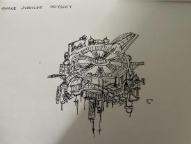
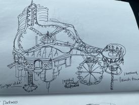
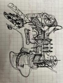
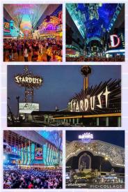
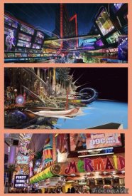
We started with the sketches below of a floating space station casino themed to the classic Stardust hotel in Vegas.
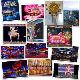
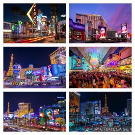
The moodboard took inspiration from the gaudy, tacky and over-the-top architecture that is so prevalent in Las Vegas, with outward-facing ornamented facades covering massive casino / hotel programs within. We wanted to create a real version of what the gaudy Vegas aesthetic would be if Stardust were taken into the future. We drew inspiration from Vegas of course, but also Googie architecture, retrofuturism, roadside diners, and tacky space-age aesthetics.
In being true to the concept, this was Maximalism with a capital M, which is exactly what Las Vegas represents - nonstop chaotic action, lights EVERYWHERE without a moment's rest. It was destined that there would be people who would hate this aesthetic, but we wanted to be true to the ambiance and atmosphere, and it was just such a blast to go all out and do it all and more.
The casino original was 1/2 the size, and without interiors. We restarted and expanded the casino to be near the max map size and decided to do full working interiors, which was quite a bit of work but ended up being so worth it. This was my first time doing interior micro detailing, and I definitely gained a lot of inspiration from the realism masterpieces from NE. Nippon’s release was hugely inspirational and gave me a big push in fleshing out all the different casino / hotel programs. Particularly difficult were all the curved shapes and diagonal interiors, which we had to spend a lot of time to get realistic enough that it doesn't break the immersion of a Vegas casino interior.
This park ended up getting more and more complex as we built, with new ideas and programs being added in each week. It would not have been even remotely possible without Scenery Manager, the most revolutionary addition to OpenRCT that absolutely changed everything for me as a builder. Thank you Sadret for your incredible work. And with this, we ended up hitting a limit we didn’t even know was there: # of objects per tile. The tall hotel block ended up glitching until IntelOrca was notified of the issue and added a fix to raise the limit in the develop version of OpenRCT, so we owe him a huge debt of gratitude for solving this problem, otherwise we would have had to stop the park entirely.
A Gif of the Building Process:
https://gfycat.com/chubbyfocusedfossa
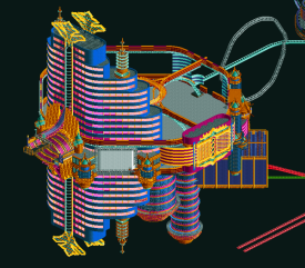
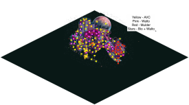
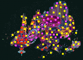
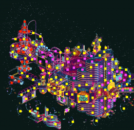
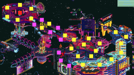
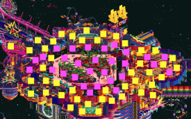
An attempt to breakdown builder shares - AVC - Yellow, Walto - Pink, Mulder - Red. Bio did most of the stars together with assistance from Walto.
My Thank Yous to the team:
Walto and Mulder were the perfect partners on this park, with Walto being dubbed the Signage God with all his incredible cursive billboards and unique sense of object usage adding so much to the final product, and Mulder’s wonderfully wacky trackitecture prowess being a perfect fit. It was so much fun to work with both of them, and our styles vibed seamlessly in a very smooth build, especially for such a complex and ambitious park. A thanks for Bio for stepping in to assist with placing all the stars throughout the background towards the end, as it really added a lot to the context.
I have to give incredible thanks for Walto and Mulder for their amazing work on this, but also have to give special shoutouts to the whole team as it was a truly collaborative team effort.
Tolsimir supported with the whole idea behind the Slot Machine + Rollback system for the Jackpot coaster, and he did quite a few hacks throughout the park to get the rides working. We originally were to have 3x tracks and endings, ranging from Xtreme to Mild depending on how the slot machine rolled. Thanks for being such an incredible captain and pushing the park to its limits.
Robdedede was absolutely CRITICAL to the park with all his crazy hacking of all the rides in the park. His work was so essential in getting the sync’d Neon Flash working, the giant Ferris Wheel, the Jackpot! + Better Luck Next Time rollback synchronization, the slot machine mechanism, and the zipper ride all functioning despite all the times we messed up the track during the course of building. Sorry about that Rob! This park would not have happened without Rob's effort.
Spacek did arguably some of his best CTR work in creating the various spaceships, space trains, the functioning zipper cars (which will undoubtedly come in handy for future parks), and my favorite CTR of all time, the slot machine symbols. Incredible work that brought the park to the next level.
BSG created what I’d like to think is his best ReadMe board yet! No one has mentioned it at all, but it truly was so wonderfully crafted and I’m constantly impressed with his artistic talent in crafting our team’s boards. He also worked on creating a static version which we hope will be released so everyone can enjoy the park without it causing your computer to burst into flames. He also created a working comet ride and, along with Fisch, a vertical billboard light beam that ended up having to be removed to make room once we hit the object limit.
Although Fisch did not build on this park, his impact on the final product was HUGE. Fisch came up with the idea to do a planet backdrop, and really make a full starry night scene to sell the space setting as we haven’t seen a full space park since Asteroid Fields. He worked tirelessly to create custom objects to add to the park, and iterated multiple versions of both the planet and the stars alongside Kumba / Tolsimir to make the whole thing come together. We could not have achieved the final setting without his input and constant feedback throughout the building process as well. An ENORMOUS thank you to Fisch for all the hard work that really brought this to another level that we would never have even imagined without your genius and hard work.
And overall a thank you to everyone on the team for their constant feedback, positive energy, and cheerleading that really helped Walto, Mulder, Bio and I push as hard as we can to make the best park we could. This was the most fun I've ever had building a park in my entire time at NE and in RCT in general... Thank you!!
I'll eventually get around to posting a review of the parks of R4 that I haven't had a chance to review yet, there were some real gems and great work from a lot of players...
-

 AvanineCommuter
Offline
Some outtakes:
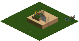
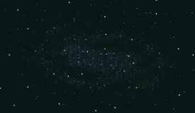
We planned on adding a Nebula in the background, but had to nix it due to the object limit.
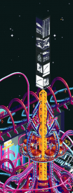
This was the light beam with advertisements that Fisch + BSG tested as a CTR that would scroll from the top of Neon Flash, never made it into the final save.
Walto's first attempt at the entry to the Genie Buffet.
The colors before we perfected the dual chrome palette was striped and brighter, based on Harrah's and some other casino exteriors as reference.
Mulder's first attempt at a Medusa-esque tower, it stayed in the game for a while before he upgraded to the final version.
A nixed Stardust logo by Walto
Beginnings of a large spaceship that was nixed
Another nixed spaceship
-

 In:Cities
Offline
Man this is spectacular. Always love seeing the behind the scenes processes for these maps! Truly an outstanding piece of art.
-

 Steve
Offline
All right, I'm finally doing it! I've been putting it off for what feels like YEARS but I am commenting on the ONE match up I've missed so far. I think. I mean, fuck, I hope. Have I missed any others? I'm sure I have. Someone go through each match and make sure I've said something on each one for me. Xtreme, if you do this for me you get an hour outside in the sun (but then it's straight back into the basement! Don't try to escape!). Anyway.
I'm booting up the parks again because you know, it's been a hot minute, if I'm honest. The hottest of minutes. Hotter than Rusty day drinking a summer shandy a few months ago in public during the peak of the pandemic. Anyway.
Yerka, yeah, I was impressed by this. The entrance and the flume with the intertwined karts and paths were honestly a highlight of the contest for me. Overall, I don't understand the source material much or remember it really but ask me how many fucks I give. Don't need to know or care to, because the work is good and sometimes you don't need the context to appreciate it. I don't need to be spoon-fed your agenda, man. I am my own person. A grown-ass man. I mean, what. Either way there was a lot to like about this: giant piano, the clocks, the waterfalls... it was just a well composed and well executed map with a compelling theme and vision. Unfortunately, you guys had to go up against one of the best maps of the season.
Stardust is obviously, well, an incredible achievement in RCT. Are you guys a bunch of cheaters? Maybe, yeah. Am I going to hold it against you the same way I do for robbie92 repeatedly kicking my ass in public? Nah. Well, actually, maybe. Despite whatever shenanigans you guys were up to, we're past it and hey: this shit is wild. I imagine you guys shit a brick when AC released *their* Stardust so props for sticking to your flamboyant and batshit crazy guns on this. There's really not a lot to say that hasn't been said: the custom signs everywhere, the interiors, the custom ships, the huge planet backdrop...unreal. I'd say the one knock that I have it probably that this map literally sends my laptop fan into berserk mode with all of the moving pieces but aside from that, shit. Well done and fuck you guys.
-

 CedarPoint6
Offline
Here's my video review of the parks. Stardust Jubilee is still super impressive and up there among my favorites of the competition.
 Tags
Tags
- No Tags
