H2H9 / H2H9: Round Robin - R4M1 - Scream Queens vs Tile Inspectors
-
 10-June 21
-

 FredD
Offline
Yerka Daylight Time - Scream Queens
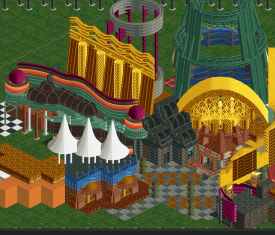
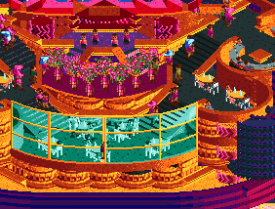
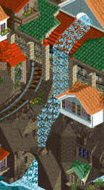
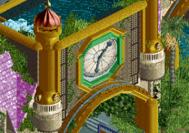
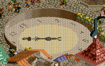
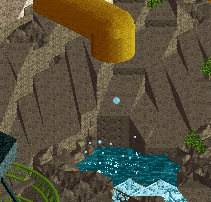
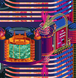
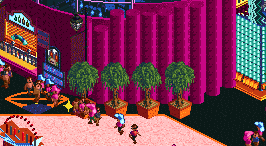
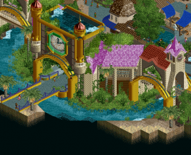
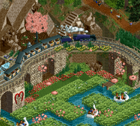
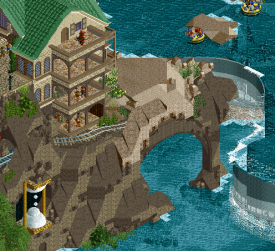
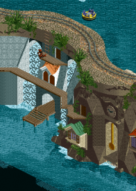
Man it took me a while before I actually dived into the park because that animated clock at the entrance was quite bamboozling. And then I noticed the waterfall going up instead of down... Djeez, great stuff! Overall the park feels pretty cosy and pleasant. Reminisce was a great little coaster, that red 'heart inversion' looked really nice. Overall a very solid and pleasant park, a good concept with some nice gimmicks. Cool stuff.
Stardust Jubilee - Tile Inspectors
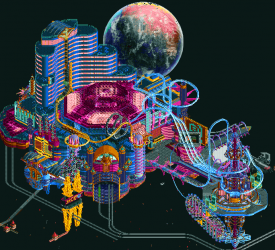
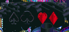
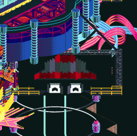
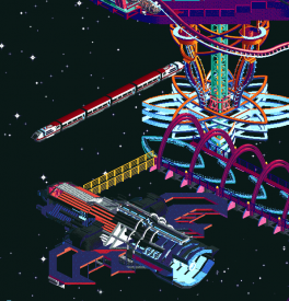
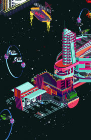
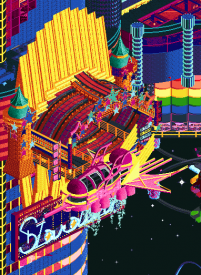
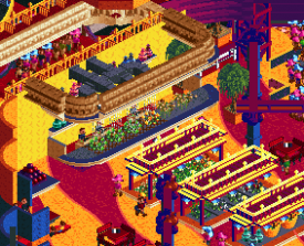
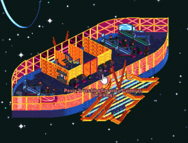
My duuuuudeeeeees... woooooow! When I saw the screen I thought that that planet background wouldn't be in the game, right?! Well... wow o wow... This shit is wild and with all respect to my teammates Hoob and Josh, I think you guys snitch the title of best Stardust park. That background of the planet is so insane, it really elevates the whole map and it makes my heart as a space freak beating faster. The park itself is also bonkers, with some insanse neon archy. There's so much to see and explore here, I have the feeling I can explore this map for days and keep noticing new stuff. Respect for whoever built this, probably my #1 park from H2H9 so far.
Yeah my vote goes to Stardust.
-

 posix
Offline
Match Conclusion

The poll is now closed.
The Tile Inspectors have won this match with a score of 37–16 .
A penalty of a 20% vote count reduction was applied to the Tile Inspectors park, as its used tiles were ~20% above the allowed maximum of 3600 during Round Robin (Rule C1).
Creators
Scream Queens"Yerka Daylight Time"
Terry Inferno
Recurious
Lilith
Tile Inspectors"Stardust Jubilee"
AvanineCommuter
wheres_walto
Mulder
zxbiohazardzx (F)
-

 zxbiohazardzx
Offline
little sidenote to the mention of Posix: the tile limit was exceeded on the park, but visually it would not have mattered and it could have been achieved within limits (misclicks occurred)
Thanks for the win anyway! great park by SQ
-

 Recurious
Offline
I don't mean to sound like a dick or to be a sore loser, but this result seems quite unfair to me.
I counted the tiles on the tile inspectors park and as far as I could tell they were between 400-500 tiles over the limit (which is less than 20%, but still quite a large amount). 20% honestly is a slap on the wrist for this, it literally makes absolutely no difference in the final result because they still won by a landslide and they are out of division so basically the only teams who benefit from this are AC and manlabs. What do we get? Our chances of going through to the semi-finals are basically ruined because we got steamrolled by a park that did not play by the rules and there is 0 compensation for us. The rules are also quite clear on this situation:

Please note that failure to follow any of the following rules will result in the respective park, player or team being disqualified.
Note that the rules don't say: this will result in a penalty, nor do they say this "may" or "could" result in a disqualification. No it says this WILL result in a disqualification. The TI park as amazing as it is, should not have been allowed to compete. The decision to allow it to compete to me sends a clear signal that the rules should not be taken seriously. While I can understand that the mods didn't want to ruin the contests for the TI as they really needed this win, this is just extremely unfair. When Cocoa and Camcorder made a park that was too large in the NEFC they were promptly disqualified, why should this park be allowed to compete? Even if it was a critical match up for the TI, they should have been more careful.
I also think the argument of misclicks is a bit of a poor argument, like I said before, I think you should have been more careful in that case (it's extremely ironic that this mistake happened to a team called the Tile Inspectors lol), we very carefully kept track of the tiles in our park and made sure we were not over the limit, taking one look at the mini-map in the tile inspectors park makes it clear that they really were careless. I would also argue that while visually it may not have mattered, it may have mattered quite a lot in being able to meet the deadline if they have had to be more careful with their object placement. It takes a lot longer to carefully place objects than to randomly spam them around. This round also made clear how critical deadlines can be looking at what happened with Croaked.
As amazing as Stardust is, I honestly think a 20% vote penalty is a joke.
Anyways, thats enough negativity for one post. Other than exceeding the tile limit stardust was an amazing park and I will review it probably somewhere this week, because I do think it definitely deserves a review. I was also completely off on the people who built it. Didn't expect to see AVC on this.
-

 Liampie
Offline
You should sign up for referee next H2H. If you care about running a successful contest and maintaining a community for 20 years, a rigid attitude will not get you far. The matter has been resolved, anyway.
-

 Version1
Offline
Oh yes, the oldest rule of NE coming into effect:
The better your RCT the more rules you can break. -

 Liampie
Offline
Oh yes, the oldest rule of NE coming into effect:
The better your RCT the more rules you can break.This is nonsense. Like I said, the matter has been resolved. Stirring shit up is certainly not appreciated.
-

 wheres_walto
Offline
This post got way longer than I intended but hopefully it's fun to read. I should have gone the Maverix route and put it all in a pdf but oh well.
Thanks to everyone who voted and commented. Thanks especially to AVC and Mulder. This idea was AVC's from the start, and he was an incredible partner/lead builder. He had a clear vision, was continuously active, and was overall amazing to work with. He designed the entire map layout and had an uncanny ability to construct canvasses for me to paint, it made my job super easy and I'm thankful that I got the chance to work with him. This was originally scheduled to be our round 3 park (would have gone up against Le Coeur and been released the match right before Stardust Circuit), but we needed extra time. AVC pulled double duty on Papilio Valley to make sure both rounds turned out right.
Mulder was an ideal third builder, the power tower was all his work, everything he touched turned out really great. Shout out to biohazard for coming in late as a floater with a ton of energy, we were all pretty tired by the final week and he gave a much needed push toward the finish.
Also want to thank my teammates for their incredible contributions. RobDedede is our team's secret weapon, without him this park would be a giant pile of scenery. Fisch came up with the planet idea and designed a ton of objects for the park. Tolsimir and Kumba both helped out a ton with hacks and functionality. bigshootergill designed the logo and put in overtime to convert animated objects to static versions for the final release. SpaceK created the most amazing slot machine CTR I've ever seen, plus the zipper and space traffic. We intended to create a more viewer-friendly version but ran out of time in the end. This building process was so intense, but it led to by far the best team collaboration that I've experienced in 3 seasons of H2H. Without our teammates, this park wouldn't have been possible. This team is so crazy talented, I'm just along for the ride.
Thanks also to Scream Queens for Yerka, it's a really nice park and I can tell a lot of love and creativity went into it. I'll leave a more complete review after some time has passed, when I can view it with unbiased eyes. Expect a Mrs Walto review at some point.
This park meant a lot to me. My wife and I moved to Las Vegas last summer, so when AVC pitched a casino I was pretty excited about the idea. I wasn't sure what to expect from myself when I signed up for H2H9. I hadn't touched the game in years and was learning about common features all throughout the building process (I didn't know about cutaway view for an embarrassingly long time). My first few practice sessions were rough, but my teammates (Leon and Sulakke always hype me up) were super supportive as I shook off the rust, and it honestly gave me the confidence I needed to keep grinding.
early practice run, trying to get a feel for some new objects
first thing I built on the map, not terrible but glad it got better
Stardust Circuit being released changed everything for us. Our discord was in absolute shambles that entire afternoon while scrambled to figure out how screwed we were. We were already past in-game year 200 at that point. Imagine putting in so much effort, only to have another team put out an awesome park with the same name, cooler signs, a better aesthetic, and the same music (our leading song at that point was One More Time by Daft Punk). This is what our park looked like on the day SC came out:
The animated LED screens and overall aesthetic of SC inspired us to push even harder in the last two weeks. Our park became significantly better as a result of their work, the 1J animated square objects and a color palette change with multiple gradients enhanced the style of our park immensely. We knew our work was going to be compared and we knew the two parks would be linked for better or worse. It was a blessing and a curse that their park was so awesome because while it helped improve our own park, it added a ton of pressure because there was a chance we'd competing against two parks in the vote.
It's gonna be tough to do a proper dot map for this one, it's by far the most complex park I've ever worked on and so many pieces throughout the park were collaborative and overlapping in the end product. I was primarily responsible for the signs and main casino floor, the palette, ferris wheel, peep management, and some coaster supports. AVC built just about the entire structure and all the micro interiors, plus tons of other stuff throughout. Mulder built the power tower, large spaceship, and did a ton of tile inspector clean-up. Hopefully they'll pitch in and give more detail. Some of my favorite bits that I haven't seen anyone mention yet:
the Stardust sign on the left set off a frenzy of billboard creation for me, something just clicked that night
GIRLS GIRLS GIRLS
covering up side angles was harder than actually building this
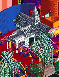
I wanted to have an Elvis impersonator as wedding officiant, but didn't get around to it
Some bonus content that didn't make the final cut:
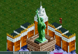
couldn't figure out where to put this, that statue of liberty object sucks ass
first glass roof version, it took like 15 tries to settle on the final color
crappier version of the diagonal Stardust sign
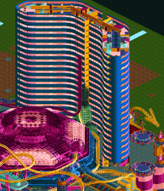
the hotel literally broke the game, it's a miracle we managed to get as many floors in as we did
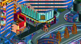
ill-conceived interior main street beneath the casino, featuring really crappy red building
first experiment with ferris wheel centerpiece, it's nice but too messy, the star turned out much better
possible walto hiding spot, preferred pride flag, good luck finding walto in the final version
this is what Lady Luck looks like from the side, not her best angle
In case anyone was wondering why there was a multiple day delay, I made a mistake on submission day with the star background and went over the tile limit, we didn't catch it until the mods pointed it out. The mods were more lenient than they needed to be, I'm grateful that the park was able to be released without DQ. More will unfortunately be said on this and I hope it doesn't overshadow the parks, but consider how you might feel to be solely responsible for the disqualification of a project you and your teammates spent hundreds of hours on because of a careless mistake on the final day. Sorry you lost, but it wasn't because of tile count. As Liam said, it's been resolved after endless debate.
I thought it was pretty rad how hoobaroo talked about how much music influenced Stardust Circuit, here was my go-to playlist while building, it's a mix of funk, psychedelic, dance, and disco, it was essential for getting me in the right head-space.
Keep Yourself Together - Gazzara
Canned Heat - Jamiroquai
Private Eyes - Lumiere
Last Surprise - Persona 5
Funkytown - Lipps Inc
One More Time - Daft Punk
More Than a Woman - The Bee Gees
Tank! - Cowboy Bebop
Night Fever - The Bee Gees
Turn to Stone - ELO
Can't Take my Eyes Off You - Frankie Valli & The Four Seasons
Major Tom - Peter Schilling
Dancing Queen - ABBA
I am the Walrus - The Beatles
I Remember - deadmau5
Fly me to the Moon - Evangelion
Space Carnival - The Comet is Coming (in-game track)
Come Fly With Me - FRAK
Like some pointed out, the name came from the old Stardust hotel. Biggest visual inspirations for me were the strip and Fremont Street in downtown Vegas. Being able to visit both during the building process was a big help for me. We wanted to capture the frenetic, colorful, vibrant, over-the-top energy that Vegas brings, and judging from the response (both positive and negative) I think we succeeded. Thanks again for all the feedback, hopefully more reviews will trickle in during the break period.
-

 Terry Inferno
Offline
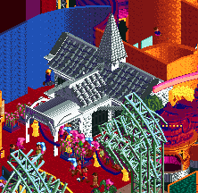
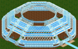
Quite unfortunate that we got beaten yet again, but not a surprise given the sheer quality of the park we went up against. To face AVC and walto's best work and still garner 16 votes is not too shabby for a R9 pick whose CS work has never before scored above 70. And to think that the Tile Inspectors used up such a powerful combination against the guy whose only other H2H contribution to date is the hole in Motherland is mildly amusing.I'll post a second writeup that takes a more in-depth look at the building process over time, but for now, I want to credit those who had a hand in ensuring that this park reached the level of quality that you see before you now.The 80% share here may be a tad misleading in the sense that it makes it look like I'm 80% responsible for this park being what it is. While I did physically build that much of it, this park would not be anywhere near the level of quality it is now without the contributions and support of the entire Scream Queen team. Rec, alex, dr dirt and Camcorder were constantly finding new suggestions to take this park to the next level, and the others were always quick to show their support when I added something new to the map.The other two builders deserve a great deal of recognition for taking something with a hint of flavor and spicing it up to make it delicious. Recurious really brought each area to life with his foliage and detailing around the rocks and cliffs and underwater, most noticeably around the go kart track, which was quite bare in comparison before he added his magic touch. He also built a fair amount of the buildings around the clock (including the path elevation change directly around it), as well as this one next to the portal (more on that later) and the Treehouse of Longing. He even built a few custom objects necessary to keep the flow intact, most notably the curved wall with crazy paving on the outside of the clock. Lilith is responsible for the epic water illusion that makes Deadline Falls disappear from one angle, the Bawling Dam and the viny area underneath the launch section. More on all of this in the second writeup that will detail the construction process.
(also, I encourage the other builders to highlight their contributions as well and document their own experiences from their perspective)We would also not be where we are without the object makers. In addition to Lilith's clever new water object, alex blessed us with the equally fascinating upwards waterfall objects, which I'm certain will see plenty of use in future surrealist and fantasy works.(you'll have to view this in-game to see the actual effect)CHE's staff title in this park as a clockmaker is a direct reference to the fact that he literally made the clock objects in this park. That 4-piece animated clock at the entrance is all CHE...(again, even more impressive in-game)...and he also scaled down a massive clock object to fit perfectly within these curved wallsSpeaking of the flat clock object, its original size was 99x99, but that seemed just a bit too large for H2H. More on this object in the second writeup.Roomie also deserves special recognition for his endlessly useful colorable ball CTR, which is an improvement over other ball CTRs (including ligma) because A) It's colorable, and B) It doesn't fly off the track at a certain speed. Another example of an object that we'll likely be seeing quite a bit more often in the future. It's used not once, but twice in this park.And of course, CC9 deserves massive recognition for keeping this map on a server for the past two months and always being a great sport about updating saves when new objects found their way onto the map. Not only did it improve the smoothness of the building process, but it allowed other members of our team to come in and look on a regular basis.Overall, a great experience to lead a park and actually complete it before a deadline. After going 0 for 4 in completed GT attempts last year, actually finishing something for the first time in 2 years is a win in itself. This park may not have won the round (in fact, I'm fairly certain it did not), but it was still very much a personal victory.And I think we can all agree that it's something of an improvement over the last H2H park I helped build. -

 Gustav Goblin
Offline
It absolutely blows my mind that you made most of YST, Terry. I've always really admired your NCSO work, but this is leaps and bounds above what you've done with CSO in the past. I can definitely see you being picked earlier next H2H.
-
 Jappy
Offline
Alright, review time! As a SQ, i won't really post anything about Yerka, though I can say our team did a fantastic job and created a memorable park with classic methods and just good composition.
So, Stardust Jubilee. Seeing that screen of course immediately blows the viewers mind. That giant moon is impressive and gives a wow factor to this park. The park itself is flashy, bright neon and begs for your attention and exploration. There's a lot to unpack here. Cutaway shows some amazing little scenes and great details. Good use of trackitecture as well.
The negative part of this park is it's readability though. I had trouble making out the different levels and all the colours are in your face. Here's where that 'begs for your attention' part comes back to bite it in the rear as there aren't that many places which are more muted and calm and allow for some breathing room. This is something that the other neon space park this season did better imo.
Congratulations on the win, the amount of great work we've seen this season of H2H really blows my mind.
-

 Recurious
Offline
Part 1: Random rant etc.
You should sign up for referee next H2H. If you care about running a successful contest and maintaining a community for 20 years, a rigid attitude will not get you far. The matter has been resolved, anyway.
Alright, bit of a snarky comment. But you apologised on discord so it's alright. You also mentioned on discord that you guys tried to find a fair solution, and I completely understand that. However, before I shut up about this I want to explain why I think this solution is so unfair.
Let's start at the beginning. The Tile Inspectors go over the tile limit. According to the rules this should lead to a disqualification. I understand that it was probably not intentional, but to me that sounds like a bad excuse. Who is going to determine what was accidental and what was just lazyness or deadline crunch? The argument of: but we spent so much time on this and it was a mistake is also a bit of a bad excuse imo. There are athletes who train years for an event and still get disqualified because they break a rule, even if it was accidental. "We put a lot of effort in this" should not be an excuse to let any breaking of the rule slide.
So first and foremost, I think according to the rules a diqualification was more than warranted. But instead the admins decided to go against the rules and decided to find a fair "in-between" solution. The problem is, that this solution is not a fair in-between solution, and I will tell you why.
A 20% vote reduction is such a low percentage, that it was extremely unlikely to have made a difference. A 20% vote reduction translates into a 9 vote difference here, which is almost nothing. Most H2H match ups tend to lean pretty heavily towards one park or the other. If we look at previous H2H's in less than 20% of all match-ups a 9 vote difference would have changed the outcome of a match-up, which is a quite small percentage. And if we look at match ups where an actual 20% vote reduction would have made a difference, the number would be even smaller. So this 20% vote reduction was basically unlikely to have made any difference at all.
Even more importantly, the admins had seen the parks before the match-up even went live! It doesn't take a rocket scientist to figure out that this was never going to be a close match-up. Even some of the people who did end up voting for us admitted that they knew they were probably not voting for the winning park. So the admins knew beforehand that this 20% vote subtraction was not going to make a large impact on the outcome of the match up. This means that they did not try to make things more fair, no they just wanted to create the illusion that some punishment was being handed out for breaking the rules, while in reality this was ofcourse not the case as the punishment was completely without any consequences. The decision that had to be made was never about trying to find a fair punishment, the decision was about whether or not the rules would be enforced or whether they would decide to let it slide, and clearly they chose the latter option. And before anyone thinks I am searching too much behind this. I brought up this point to one of the admins before the match up went live, so the admins were very much aware of this.
So yea that kind of sucks for us. But it gets even worse. After the admins decided that they would let the rules slide. They also decided to not tell anyone about it. This avoided any backlash against the Tile Inspectors park for going over the limit. I think some people may have voted differently if they knew that the TI park was over the tile limit by such a large amount, I know that I personally wouldn't vote for such a park out of principle, just like I won't vote for an unfinished park out of principle. Would this have been enough for us to have a landslide victory? No, definitely not, but it may have pushed the vote closer such that this 20% vote penalty would have actually mattered somewhat. In any case, the lack of transparancy by the admin team on this is pretty dissapointing imo. I just don't see why the admins catered so much to the TI in this incident while they were the ones who made the fuck up.Why the admins seemed to really not have thought about our side of the story is a mystery to me.
Finally, to add to the holy trinity of insults to injury, this vote penalty doesn't help us even if it would become close later in the season. The Tile Inspectors are not in our division, so we don't get any gain from a percentage reduction in their final score. The only teams benefitting from this are AC and manlabs.
To summarise:
- Admins decide to let the rules slide.
- Admins instate a different punishment not in the rules which they KNOW beforehand won't have any effect.
- Admins are not transparant about the punishment, making sure that it definitely won't have any effect.
- The actual punishment being instated doesn't benefit us, but actually benefits two teams not involved in this match up.
Honestly, this doesn't sound very fair to me and I think that even for the neutral observer it is quite clear that this is unfair at worst and extremely extremely extremely lenient at best. While it may have been true that TI going over the tile limit did not cause us to lose, it is a certainty that the TI only won because the admins decided to ignore the rules and decided to keep quiet about it afterwards until the voting was finished.
Part 2: Stardust Jubilee review
Anyways, now that that is out of the way, lets get to the fun part of this post. My review of Stardust Jubilee:
I will start with a negative, because that way we can get all the negatives out of the way and we can be positive for the remainder of this post.
I did not actually think the planet sculpture was that amazing as everyone here seems to think. Sure, its kinda cool I guess. But its just a gimmick. The texture doesn't match the game and it literally takes no skill to build this. It's just an image taken from the internet converted into RCT. I don't really see the appeal and I was also really surprised to see so many people so hyped about it. For me it actually detracted from the rest of the park which is really good. I guess googling an image is considered peak RCT now?
Okay, with that out of the way, lets focus on the rest of the park because holy shit its good. There are so many cool things in this park that it is hard for me to pick out a favourite, but some of the stuff I really liked:
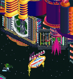
+ The stardust and lady luck signs. So incredibly well done.
+ The little floating gas station
+ The ETA-2 Jedi Starfigther CTR's and how you made them look like they came out of lightspeed at the edge of the map
+ The pink and yellow space boat together with the entrance tunnel.
+ The starbucks coffee sign
+ The jackpot sign
+ Honestly, most of the signs were pretty freaking great.
+ The slot machine
+ The coaster, where you somehow managed to make three tracks next to eachother look good.
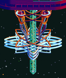
+ The tower structure with the S&S launched freefall tower.
+ The architecture in general, especially the bits on the lower levels with all the entrances and arches.
+ The bar nebula entrance sign thingy.
+ Oh there are interiors too? C'mon guys how the hell did you guys have time for all this!?!
Yea AVC & other builders, this is without a doubt one of the best if not the best park you guys have ever made. It really blows my mind how you managed to make something this good and added such a large amount of content in such a small amount of time. So well done and congrats with the win (even though you should have been DQ'ed).
Part 3: Some words on YDT
Honestly this park was a blast to build on. It really was a team effort, and by team I mean Terry. Terry went freaking hard on this park and iirc at some point there were even talks to switch this around with our R3 park because Terry was just going so fast. I joined this park relatively late and I mainly helped out by adding details everywhere around the map. I think the only area which I did not touch at some point was the Pianosis area. Besides adding details I also tried to do grunt work/non creative work on stuff that just needed to be finished so that Terry could keep busy with adding creative elements to the map. Terry was definitely the brain behind this park and he was a pleasure to work with. Everytime I took the park and showed some screens he was always extremely enthusiastic about what I had added, which was very motivating. The only downside was that for me the bench was absolutely terrible as many of my favourite objects were not in xD. But we managed to make it work and I am very proud of the park we built
 . I hope it gets you that parkmaker status Terry, you deserve it!
PS. Oh and bigshootergill, when you taught me how to block supports using the tile inspector and told me to not use it against you guys in this match up. I most certainly did
 .
. -

 Version1
Offline
Rec is right. I know my comment previously was a bit snarky, but I really do question why rules exist if they get ignored anyways. Even if this wasn't an automatic DQ it should have at least been an automatic win for the Scream Queens.
-

 Liampie
Offline
I was hoping this would lead to a constructive discussion, if we're going to discuss it anyway, but I'm not going to respond to this monologue full of conspiracy theories and assuming bad intentions on our side. And naturally Version1, as a non-competing member of the community, an expert on everything has gone on. Rec, PM me/us if you want to talk further, but this incendiary has no place in the match thread.
-

 Recurious
Offline
I said all I wanted to say about it. I never said you guys had bad intentions and I don't think I am promoting conspiracy theories. All I am saying is that you guys must have known that this penalty would not lead to a difference in the final result for this match up. If you guys didn't that just means you guys were extremely naive.
In any case it means that you guys either just did not care enough about the rule breaking to do anything about it, or that you guys were extremely incompetent in the decision making process. Both are reasons for me to be very critical about the decision making process here. I don't think that is a conspiracy theory, that is just something that logically follows from the events that occured. I also think that you waiving valid critism on the admin team away as "conspiracy theories" instead of actually adressing it is extremely dissapointing behaviour and I expect better from an admin.
-

 Version1
Offline
And naturally Version1, as a non-competing member of the community
Nice to see the standing of those of us who don't actively compete. Very respectful...
-

 BelgianGuy
Offline
not gonna comment on yerka because of bias
jubilee:while technically strong and impressive in the way it's constructed. it's so busy and overwhelming i cannot enjoy it, it feels messy cuz of so many layers overlapping that there are very little interesting sightlines for me personally. also the amount of details is so high it because unreadable to me and takes away from it. less is more could've been a nicer approach to this in my personal opinion.
-

 In:Cities
Offline
I'll let the experts above continue their conversations.
I'm here for some reviews though!
Stardust 2
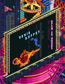
Yes, we took your name first. And we built a glowing neon city of opulence in a neo-future space setting. But honestly, this park stands wayyyy out there on its own as being something utterly spectacular. I'm a massive fan of atomic/googie/retro futurism type design, and this just nails it right in the dick. Perfect score. Way to build the coolest h2h park ever. There's just so much to explore and discover on this map that its almost overwhelming. The custom signage is my favorite. Walt was able to absolutely NAIL some of those typefaces that really made it all come together thematically in the end. The colors are nice - if a bit busy at times. Nice gradient palette trick, where did you learn that? Also, where did you get these LED animated squares? Proprietary. Either way - there are quite a few things that you guys did in this park that we were absolutely considering including on our map as well. The epileptic custom zipper hanging off of a building was definitely one. Sad that spacetits didn't make an appearance though. Idk what on earth is going on with that coaster, but it looks spectacular. Custom spaceship vehicles are so well done. And the slot machine is insanely clever. Putting SpaceK to work I see. All things considered - I'm glad that the objects we created for Stardust 1 were of use to you guys here. That's always my goal when creating any new pieces for the game, so its really cool to see others put them to good use. Even when its during an intense competition where emotions run high. Absolutely stellar work boys. I found Waldo on my first time opening the map though. Amateurs
Some things I noticed:
I looove the space transport ride. And this big purple spaceship thing at the bottom. The yellow railing is a nice choice.
The drive-thru is so clever. Yes, we've seen them done in game before but not like this! The double lines for the floating parking spots is brilliant haha. Also really love the yellow flames keeping the Stardust sign in place! Lol that dumpster
This one legit made me say Wow. Brilliant use of the curved trim. And the animated squares added a lot it seems!
I don't know what this is, but I like it
The gradients look so nice here. Clever Starbucks sign - if a bit out of place maybe. Love the crashed ship into the screen haha. Again, excellent signage here.
This is just cool. Repetition in design is something I always try to include in some form - and this makes great use of that principle. The giant arrow pointing towards the GIRLS GIRLS GIRLS window is brilliant
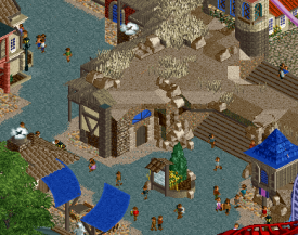
Didn't realize what this was when I first opened the map. But when I realized it was the VIP entrance it made way more sense. As cool as it is - its the spot of the map that suffers the most from clutter. The wood track doesn't do any favors here, and the lovely yellow ship highlights compete for attention too much with the mcdonalds fries behind it. Some slightly simpler colors and textures would have made this much more legible, because its clearly a great idea
Didn't notice this the first time. But man such a good and fitting idea haha
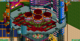
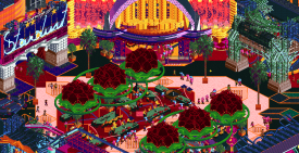
These roses made me literally say WOW again. This is without a doubt the best casino floor ever attempted in this game. Good thing Kumba was on your team to provide impeccable expertise and guidance.
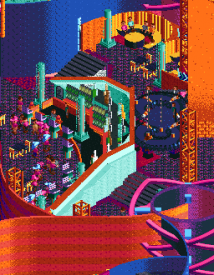
This is just a perfect example of finesse and construction knowledge. Having spent a TON of time in hotel lobbies, this just feels perfect haha. The bar tucked into a little enclave, the elevated lounge, the curved booths, the high rollers table. Maaan
idk I just like these trees
The rising steam is such a great detail. And the range hoods above. You boys know your stuff.
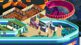
This was when I was just shaking my head. The isolation tank, the sauna, the naked peeps in the locker room. Jesus haha
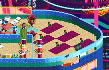
look at these nerds doing yoga. probably steve in a decade or so
Poor posix looking at his computer monitor watching drama unfold
All in all, this is probably my favorite h2h park of all time. Even above Floating Paris. You guys are absolutely insane. This park is maximalism to the extreme - done right.
Made me almost regret not picking AVC when I had the chance. But I got my boy hoobaroo and you've got stardust 2. Can't mess with the OGs
Yerka
Okay, I opened this map second. And after even a quick look I was already second guessing myself haha. Stardust 2 almost certainly seemed like a winner, but this park was just so absolutely wild in a completely different way. This is surrealism done right. I looked up some artwork by the artist in focus, and man does it enhance the viewing experience of this park in such a good way. The thing that this park does so well is the various elevations and levels. There are so many things on completely different heights, but its all so legible and lovely to view. Really made me stop and stare for a while at some of the serene spots. A completely different viewing experience than SpaceCocaineCity2, and I love it. Terry, it's so great to see more work from you as always, you special singing bald king. I'll be revisiting this map quite a bit, as I find new things to love every time I open it. Sorry to see such a special park lose.
Some things:
This is what I mean about the perfect execution with different elevations. This is both so believable and so absurd haha. Truly a unique look that I almost wish was greatly expanded on.
One of the best park entrances I've seen to be honest. The arches work so well. And the overgrown foliage underneath is just so appropriate for some reason. Sat and stared at the clock for a while haha.
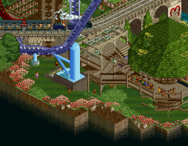
This little scene was one of my favorites. The grassy pathway underneath the coaster - the blocky support, the train up above. Just a lovely piece of placesetting.
Speaking of placesetting - this little spot was my favorite. Just beautiful! I love the 1k fog heart. The pink tree, the flowers, the hearts on the wall. I wish it were real.
This is spectacular. That arch is just too good haha. Man, as a team you guys REALLY know your dirt. Love the different colors of the dirt - makes it very believable and polished.
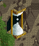
This is great haha. The grandfather clock, the upwards water, the clean concrete surfaces contrasting with the foliage and overgrowth. Serene and peaceful.
Congrats to both teams for putting out wonderful (and complete) maps.
-

 FK+Coastermind
Offline
The size violation certainly leaves an unfortunate taste in the mouth for this match. That includes what seems like a rush to push this rule violation to the background and move on like it never happened, which clearly advantages the team that broke the rules and disadvantages the team that followed them. Outside of all that, I want to give these parks the reviews they deserved, both excellent parks in very different ways.
Yerka had a much more refined approach, building up a theme through a more carefully constructed approach to rides and sculpture and architecture. This honestly feels like the kind of park I'd propose, something that is artistic, surreal, but without a need to justify itself or explain it's existence. The reversed waterfalls were gorgeous and such an incredible idea. I loved the trains and go karts, the piano, and the floating island was inspired. A really unique take on something we've seen many different ways. The sculpture and colors throughout were really captivating. The only thing that held this back for me was the final polish. Some of the architecture and micro details felt like they could have used some refinement or another pass to really boost the execution and wow factor. But, I understand that may not be the style you were aiming at, and the slow burn of the park as you explore it is really spectacular.
Jubilee 2 Electric Boogaloo was a crazy juxtaposition, a park with a huge first impact and a lot of really flashy moments (literally). The planet and stars and space traffic, the signage, and interiors were all incredible but also very fresh. In many cases, I think the approach to color and shape made this feel more than just 'space based interiors' but something like an artistic deco future. Probably my main complaint for this part is that some of the exteriors felt a little too macro and awkward in comparison to the more detailed parts of the structure. Honestly, I felt like it wasn't Stardust Circuit but Le Coeur du Ciel that hurts Jubilee more, because it creates a harsh comparison for what floating architecture could be on a macro level. But, I would say it's pretty minor when considering the technicolor styling of the park.
In the end, the wow factors of Jubilee stole my vote, particularly the signage and some of the starship sculptures (and the restaurant). Again, both epic parks and both should be very proud of what they've accomplished, drama aside.
-

 Fisch
Offline
Bringing this over from Discord as some had suggested:
When we hit the object limit (not tile limit) 4 days prior to the deadline, we had to delete about 5000 stars from the map and convert some of the star background to Large Scenery for our builders to be able to finish the park. On the last day those LS star objects that I created for not hitting the object limit were placed in position of the previously present star walls by one of our builders who had not previously placed any of the stars and thus was unaware of the difficulty of placing them.
Due to the dark palette with the ground texture being blacktiles, the frame drop, and the LS star objects being only visible from 1 angle, some of those LS objects were misclicked onto tiles behind the ones they were meant to be on. So while visually they were correct from the only angle they were visible on, if one really wanted to go the extra mile of checking the tiles outside the park boundary via tile inspector, one was able to find misclicked 1x7 LS pieces that our builders did not realize they had placed.
That is the cause of the 20% vote deduction we received and the reason why SQ are saying our park should've been fully disqualified for violating the rules. When the admins pointed this out to us, we had already sent the park in and first didn't know what they were talking about.
When we found out, Bio (our floater) created a new version where he simply moved the misclicked stars into the tile boundary. That new version is now up for accolade voting. You cannot visually find the difference unless you look at the position of each star individually. Idk if Bio 1=1 copied the locations of the misclicked stars into our map boundaries for the new AP version. The new file is rather a version to prove that we weren't trying to break the rules by going over the limit. None of the unfortunate misclicks made any difference or gave us an advantage visually.
 Tags
Tags
- No Tags
