H2H9 / H2H9: Round Robin - R4M3 - Manual Laborers vs Logan's Run
-
 12-June 21
-

 Cocoa
Offline
thanks for the words so far. Logan's brewery--- an incredible park and a huge step up for those builders. I possibly would have voted for it, unbiased. I thought we would be blown out. will try and review properly at some point!
to be fully honest, this is not the kind of park I was expecting to make in h2h, coming off a much more... wild MM run. But of all my wacky ideas, this much more subdued one caught the ears of my teammates, so we pushed forward. This was by far the most difficult h2h park experience I've had--- I was genuinely five bad minutes away from quitting rct at one point. When Otter stepped in to build with me when people got swapped around, that was an immense boost to my motivation--- I couldn't let him work so hard while I was wallowing in self pity . It was probably only about when I built the whale and squid that I started to feel like this was going to come together. Its been a ridiculously busy period of my life in my creative pursuits, my research, my friends, my mental health... so it was a wild ride during the construction of this park, alternating between manic chaos cocoa and depressed chaos cocoa. I hope i didn't piss too many of you off, but also, maybe I hope I did a lil bit
 . In the end, I am proud of our park, and moreso, for the fact that its actually here, finished, in front of us. I spent weeks relatively firmly believing it was going to be canned and I would drop out. It may not be my greatest RCT ever but its definitely a personal victory in that sense.
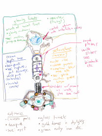
it all started with this innocuous post of mine on coasterforce:
I really wanted a dense, layered indoor park that uses its space effectively for a totally immersive environment. And not just any old environment-- the themes had to be purposefully indoors, like the theme of the theme was being inside. Ah, you get it already. I knew it would be hard in RCT, but I wanted to try anyway. I'm not sure I was totally effective, but I think if you put yourself in a guests perspective, our park layout and interwoven rides would be fukn sick. (It just perhaps doesn't quite work in RCT.)
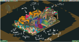
The park hasn't changed much since it began:
in retrospect, I probably would have separated the areas into three separate showbuildings, in a sort of clover formation around the central arcade. oh well!
The ridiculous name and readme came quite late in the process. The cheekiness and silliness of the whole thing really helped me power through that last week or two of absolute slog, because I knew I had at least that to look forward to. The idea came because we were fucking around with long names and I liked the sort of Cave Johnson vibe to it, so I was like hang on, we can just... do that. I'm a big sucker for using real random things as a source of narration when I'm writing and I had some experience making fake podcasts for friends on road trips so Otter and I set up our phones to record while VCing at like 11pm my time, when the park was due at 3am. I was pretty sure we could make it not cringey by just laughing along and having fun, but I was not sure it would win us any votes (in fact, I thought maybe the opposite). I chucked all the files in audacity, did some audio magic stuff and chucked on some bioshock ambience underneath and then sent the park in way too early. (there's sooo many missing objects and visible supports and shit, it kills me every time I open it). In the end, I love what we did, altho am a bit embarassed that it may have given us the edge, after all my complaining about object editor tycoon lol. If more people do this, I'll be happy to have been the first (probably?). Big shout out to pos and liam for actually letting us use the park name and the audio... both of which perhaps waivered in the grey area of allowable content.
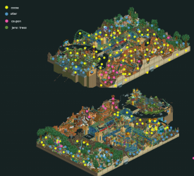
heres the breakdown:
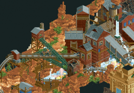
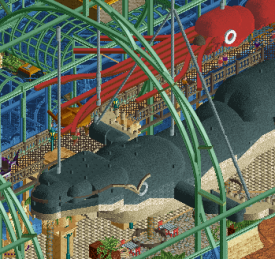
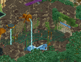
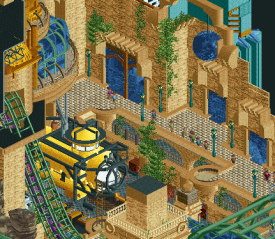
I did the park layout and all the ride layouts, for better or worse. I got the discovery bay sort of entrance started, and otter superbly finished that up. Most of the underwater-base-vaguely-bioshock-but-not is my work, and probably the stuff I'm most proud of here- particularly the art deco signs, the animals, and the sub. But I love the overall path layout and layering and atmosphere here. Otter did a lot of 'underwater' exteriors and the outside of the bathysphere station, and some cavern work. I had the least amount of vision for the forest- I was picturing the sort of nausicaa forest with giant bugs and weird alien shit, but it sort of morphed into a more elven/pandora kind of mix. I barely started it and then Otter killed it here, taking over from me with his own inspiration. I did the mechs (sorry otter) and the dragonfly head and some minor shit. Coupon started the dragonfly, and jens went around fixing all my awful dinghy slide trees (LL...). The cave area was also mostly me until Coups stepped in to help out more seriously, and he killed it here. the flume drop into the crane is fucking awesome and so is the spinner support structure on that second lift. This area was so satisfying to see come together, because obviously I'm obsessed with this kinda shit... bit messy but you will never get a clean park from me.
Anyway... real life calls again. Its been a busy and crazy year and it only continues it seems. see yall another time, maybe
-

 Hepta
Offline
From the screens, looks like two really nice and well-opposed parks!
I missed the vote deadline and I still haven't had a chance to look at them in game, as life is picking up around me and I've had essentially no free time.
Just want to send thanks and congrats to the builders for keeping up the heat! I hope the drop off in comments isn't too discouraging. I'm going to take a look at the parks during the break and hopefully edit this with a few thoughts.
-

 ottersalad
Offline
First off, congrats to Logan's Run on an amazing park. When the parks were released, Josh said he thought Logan's Brewery was a park I built on! Really wish that was a park I worked on.. really enjoyed the vibe so much. I'll write a proper review soon.
In terms of Diegetic Underground, it was quite an intense build, but very fun. It was a bucket list thing for me to work with Cocoa. After being able to contribute such a small amount to Mekong and seeing his building style in H2H8, H2H8/8, and now H2H9, I wanted an opportunity to properly work with him. So when the park was losing momentum, I jumped on the park. I think it was a project I wanted on from day 1, but I got on Gauntlegrym and we know how that came to be.
The vision Cocoa provided was very clear (even if he disagrees slightly) and was easy for me to work with. I wanted to get as much done because we weren't sure if this would be finished in time for quite awhile. When things came together the last 2 weeks it was great to see. When he pitched the idea of a voiceover of the park I was nervous, but excited to ad lib a bit. Really fun and creative and I'm glad the community enjoyed it. I wrote up backstories for some of the areas/rides to give sort of a S.E.A. flavor to the park to give the Disney tie-in for the pitch.. but when Cocoa went for the humorous vibe, I had to roll with it!
Overall, this was a challenging yet fun park to work on. Really like the contributions Coupon provided with the mine area and the placement of the dragonfly. The crane drop on the log flume was so damn cool. And Jens stepped up big to fix all the crap trees Cocoa and I made lol
Here are some bits I'm very happy with:
Rapids theming
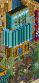
Eastern / Ryan Industries
Rapture Vibes
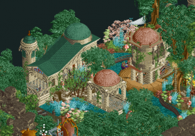
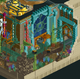
Park Entrance buildings
-

 Julow
Offline
I admire the work done on The Diegetic Underground but the park is unreadable for me. Just too much textures and information and stuff going on. But I love all the cool ideas and elements in this park nonetheless !
-

 In:Cities
Offline
Finally taking some time to review these parks. Sorry boys.
Logan's Beer City
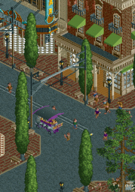
I really enjoyed this one right off the bat, and it continued to grow on me the more I viewed it. The minor criticisms I have for it (could have used more peeps and liveliness!) are just that: minor. The overall makeup of this map is executed so well. Coaster is beautiful, and the colors are very pleasant. The custom trains and rail way are such a great touch - very excellently done! The attention to detail with the rail yard, the interior of the brewery, and the tons of of quaint little seating areas and nooks are so well done. The backstage areas are nice for context, but do sadly contribute to the lack of life issue with this park. I think the rooftop could have used some more peeps as well. Maybe a party, or beer tasting event, or even some douchebags playing cornhole or beer pong idk. Regardless, this park was classy and kept my attention long enough to snag my vote - although it was a very tough call. The station for the wooden coaster is my favorite. Love how that little layout is perfectly nestled in the corner.
Some things:
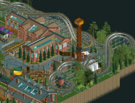
Again, this is my favorite little section of the park. The coaster wraps perfectly around the drop tower, and the little flat ride is wedged perfectly in that little spot. The string lights above are a great touch. The colors and repetitiveness of the Crazy Train station work so well. Great call on the glass ceiling pieces.
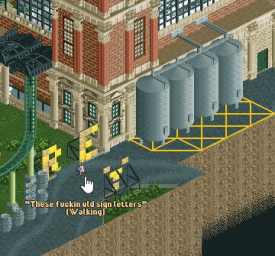
g force waiting to leak again
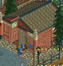
Fun detail! After seeing the front of the building, I was hoping to find these in the back, so nice job being predictable and clever lol
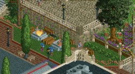
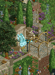
One of the first things I noticed on this map. The little firepits and Logan are awesome. Very believeable! Purple flowers are good.
Simple but effective detail. Nice movement!
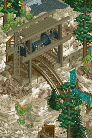
I really love these kinds of winch lifts. Good Death?
DUI
Diabetes Cave
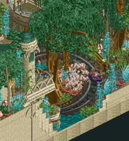
Alright - after viewing like 7 more times after voting, I started to regret my vote for the beer boys. Man this park is so cool haha. I think what held me back from it was the readability - which unfortunately comes with the territory of doing an indoor, underground, compact park in an isometric game lol. But honestly i think you guys pulled it off about as well as you could. The entrance area is spectacular - although suffers from some cleanliness issues. The mesh over the water is great, and should have been the first indication that this is a cocoa park. I love the main hall. The whale looks so sassy. And the giant squid is just perfect. I wish the tentacles were even longer though. Missed opportunity to steal the new shark CTRs that we made for Stardust 1. As for the lands themselves - I've gotta say that the Yellowstone area is my favorite. It was the easiest to follow along, and the sheer amount of interactivity between the rides, the scenery, and the paths is just masterfully done. Bug forest is cool! Wish it was twice as big. The large trees are very well made. And that rapids lift is incredible. Wtf lol. Sadly the underwater area held my attention the least. Not sure why - its technically good, but feels so crammed and cluttered. I almost didnt even notice the coaster haha. Yellow sub is sweet though. In the end, I feel like this park is definitely more "my" style, but I felt disappointed a bit by how it came together. Each little bit is so great, but sadly H2H style parks result in things being pushed way closer together than whats ideal. Same issue I had with previous parks like World's Fair. Still, you boys should be proud of this map. Congrats on the win!
Some things:
The lift passing underneath the beam is a highlight. Really, this whole ride is a highlight for me. Best ride in the park imo. Love the multicolored geysers and waterfalls dripping down on the ferris wheel. Feels like Disney on steroids.
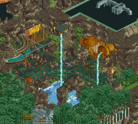
Very clever entrance to the Yellowstone area. Love how the log flume is peeking out a bit. The waterfalls dropping into the pools below is a great way to sell the verticality of this section. Well done.
This is so good haha. Perfectly framed and perfectly executed.
I love how mad this whale is for no reason. Nice touch adding the little bumps on the skin.
This little entrance area is great as well. Good call adding the grass up top! Really lovely. Glad to see the green iron and grates continue on throughout the park.
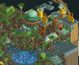
I did enjoy this area a bit. Readability in the bottom half is a little tough, but I like the height of the buildings up top. Great color scheme - i appreciate how you guys stick to it.
Pretty sure this window didn't file his paperwork last night
-

 dr dirt
Offline
Logan’s Brewery - For a sort of silly concept it ended up pretty damn classy. There’s a lot of great quaintness going on here, and nothing really felt “off.” That’s said, there wasn’t a whole lot that got me super excited on first viewing. It grew on me but after the log flume, there wasn’t much that was particularly inspiring. Not that everything needs to be.
The main drawback for me was the map shape; which, all things considering is pretty minor. I think I was wanting something square, perhaps, to match the sort of quaint and classic look going on. But, I did enjoy all the little bits of beer details. I appreciate that.
Overall, I don’t know if I have much to comment on this park. The highlight was the log flume, and the rest was well constructed but also sort of without any strong gestures or design. I also think this one would work far better on a big map with a more naturalistic approach as the river and such was very nice.
Diabetic Underground - The naming was very cocoa and funky but perhaps a bit too much. I’m not quite sure I fully understand what is going on in this park, but I can enjoy some cool ideas nonetheless. It was an interesting approach to building a park all underground - or at least hinting at it.
Where this won out for me was that it had some more style and coolness. The submersible was awesome. The various little contraptions and displays (I guess I call them?) had lots of badassery going on. The section I wasn’t captured by was the weird plant area in the back. Felt a little bit undercooked compared to some of the other ideas, I think.
For a cocoa park, it felt a little halfway, to me. It was an effort in cool, bizarre, and interesting themes/details but didn’t have the same atmosphere and charm some of the other stuff has - like DisneySea or Mekong. Might have been the indoor aspect as it didn’t allow you to build up on the vast environments you usually tackle. Intriguing, however, and enough so to nab my vote.
 Tags
Tags
- No Tags

