H2H9 / H2H9: Round Robin - R4M2 - Cereal Killers vs Adventurers Club
-
 06-June 21
-

 Magnus
Offline
What a strange matchup.
First impressions:
Opened Uncanny Valley and thought this is a easy win for their opponents. Quickly opened Croaked and was shocked by the unfinished mess it is.
So much for the first impressions and I was about the null my vote.
Then reviewed both parks in more detail and was reminded on how wrong a first impression can be.
Croaked:
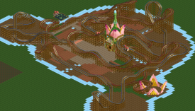
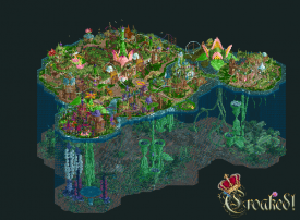
As many other said, I am curious to find out what has happened here. Hitting the object limit used to be the biggest nightmares during my active days. I liked the two levels, even though they are difficult to view, just like the floating parks. Being a scuba diver myself the underwater section did not give the the right feeling and it was somewhat lacking in content.
While the sculptures are not my cup of tea in terms of aesthetics they show a great level of creativity and skill. I feel a lot of effort and time went into this and it saddens me to see how it did not fully come together.
Uncanny Valley
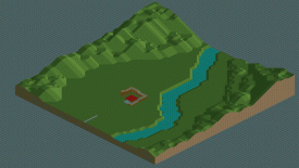
The park appeared very basic in terms of architecture, layout and rides. I then started finding little details, easter eggs and inside jokes and the more I looked the more I found.
I feel it is a risky concept as it took me quite some time to start finding these. The park shows an amazing level of skill and feels like a veteran player put in a lot of thought into it.
I hope we will find explanations for some of the ideas when the voting is closed.
Voted Uncanny Valley.
-

 Recurious
Offline
Interesting round.
Croaked: This park had a lot of potential. Really a shame it wasn't finished. I am not sure why everyone is talking about the object limit? Is that just a polite way of saying they didn't manage to finish the park? Because they are still quite a bit from the limit. I was able to black tile the rest of the map up in like 10 minutes and that immediately made the whole thing look a lot better already. I think that even though you guys didn't finish, it is even more of a shame that you guys didn't atleast try to tie things up somewhat nicely near the end so the park would have looked presentable. I think within an hour you could have made this park look passable if you had blacktiled the surrounding area, removed the peep jams and deleted some unfinished stuff, hell you guys may have even had a chance of winning because it was still somewhat close for me. What is on the map is pretty nice. I like the coasters and there were many good ideas there. The whole thing was ofcourse super ambitious and for that alone I commend you guys.
Uncanny valley: I really love the concept. There were so many funny ideas in this park that made me chuckle a bunch of times. My favourite joke in the park was perhaps the fact that the player names for the staff were tied to last seasons H2H teams, the moment I saw Icons next to my name I thought to myself: goddamit guys (but in a good way
 ). The park reminds me a bit of a mix of all coasters go to heaven and motherland from last season. I do agree with others who say that besides the jokes the park is a bit bland. There isn't really anything that stands out. Although I guess that is also kind of the point. I think the same effect could have also been achieved with a setting a little bit less bland. Nevertheless, the execution was nice and technically sound. It was definitely fun trying to find all of the little jokes you guys put in and I am still pretty sure I haven't found them all. I hope after the voting is over someone can make a list so I can find the ones I missed.
In the end I decided to vote for Uncanny Valley although I still thought it was somewhat close. What was the deciding factor for me was that Croaked just wasn't tied up properly (which I think should have been possible even if the park wasn't completely finished). Uncanny Valley was funny and had a lot of fun ideas, on a technical level it was well done and well polished, it also held my attention for longer.
-

 zxbiohazardzx
Offline
First opening reactions:
Croaked!
A fun idea, but i feel you guys overstreched it. the double layer means you hit limitations of the game faster especially with the filling you chose. Smart map, lovely map but unfortunately a little too unfinished for first round of viewing.
Uncanny Valley
I keep amazing myself by the lucky draw that CK get this H2H. but thats a personal one i guess. Overall this park feels rather mediocre if your not into realism that much or if you have seen other parks in that category this H2H. Although something seems off in this park, i dont really know what is.... but that will be checked in the more lenghty 2nd review posting
-

 spacek531
Offline
Frog eggs vs. easter eggs?
Croaked: I don't know if the underwater section was intended to be fleshed out with rides and peeps, but without them it feels superfluous. A few questionable object choices for several giant plants give the park an odd feeling - others have pointed out the same.Realism Valley: a lot of clever gags, I liked it.
-
 Mr.Brightside711
Offline
Croaked was just not my deal. I can see this being different if it was planned better and finished of course. The underwater half of the map really doesnt add anything. In fact it takes away from the top half which had some stuff going for it of course. But you cant even rotate the screen without completely losing where you are. And it is needed with how fast and sprawling the coasters are. This park needed some major editing in size/scope.
Uncanny is the worst park EVAR! You take realism and make fun of it in every way possible. So rude! On first look, the park is actually pretty bland which I feel may have been intentional, but seeing things unfold in terrible ways was funny and a unique take on park making in general. There are a lot of crazy tricks and mind fucks and it really added alot to viewing time which is cool. Good job and I hate you.
-
 Xtreme97
Offline
Croaked!:
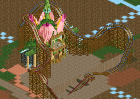
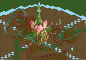
Well this was definitely a wild experience. You put out a very strong contender for most ambitious park this season, the concept is super cool with the Frog civil war and it has loads of elements that I was super intrigued by. However there was an obvious amount of unfinishedness present which distracted from what was there, and combined with the very chaotic nature of the scenery made for a confusing time. I did enjoy the park despite this, there's a lot of really unique parts with unusual objects that I found weirdly fun, and loads to explore. The dead frog king resting on the lily leading up to this dominating central "palace" structure was maybe my favourite part of the map. Also loved all the lily flowers and weirdly that dark green mulch is a good contrasting base. Can't say I really liked the coasters all that much, they have some nice interaction but I find the single rail doesn't work well for sprawling layouts like these - loved the custom trains though. I think this top layer could have stood on its own nicely with a bit more refinement, but I did quite like some of the bottom layer - particularly the big egg sac structures. Was disappointing to see this unfinished as I think with more polish I would have ended up voting for it.
Uncanny Valley:
Was expecting something fairly tame upon first seeing the screen but as it became apparent that there were optical illusions and other weird things I became a more excited to view it, and the name clicked. Great park, on the surface it's obviously a refined, if a bit unremarkable, realism build. But the little tricks and off-kilter things that you find the more you delve in certainly make it a more interesting piece and are something I'm glad has been played with. The optical illusions work very well thanks to the isometric nature of the game, allowing things like the backstage roof thing, and the weird adventure playground. Lots of other great details so I won't spoil the rest (particularly enjoyed the Looper station), but it's definitely something that keeps you coming back and makes the viewer pay closer attention once they realise what's up. I think the rewatchability and uniqueness in the "uncanny" aspect is what sets this apart and clinches my vote. -

 Hepta
Offline
Interesting matchup. I sort of spoiled the effect seeing the matchup for myself, since I read some of the reviews while at work. Based on the concepts and screens, I thought I was going to vote for Uncanny Valley. However after finally getting a chance to sit down and look at the parks in game today, I ended up thinking differently.
Croaked: Despite the obvious glitch that happened somehow with AC submitting their park, I really enjoyed Croaked and the missing black tiles didn't detract from my experience. When I heard "unfinished park", as an old school NE member I was expecting the worst. But the park looks far from unfinished to me, other than some missing black tiles. In game it really came alive with atmosphere. On a micro level, some things do look a bit odd and contrasting, but I really loved the macro of this park and absolutely commend the ambitious effort.
Uncanny Valley: The concept of Uncanny Valley seems quite smart at first but, it ultimately feels a bit too gimmicky to me after some time in the park. There are some really cool tricks and hacks, and lots to explore in the park for RCT nerds, but in the end I personally just wasn't too captured by the park as it just feels as though it lacks a centerpiece or center of focus. A more full surrounding would have really helped sell the park as a whole for me. I think the concept is cool, but it's the only thing carrying the park for me in this case.
-
 inthemanual
Offline
went with croaked. I understand deadline pressure and the situation around it, so while it's a bit disrupting here it wasn't earth-shakingly distracting, or enough to pull my vote away from it and towards the competition. Uncanny Valley held me in and made me explore to find the little oddities, but I wasn't really thrilled with it overall and despite holding my attention with the scavenger hunt, I just didn't get as much enjoyment out of it.
-

 posix
Offline
Match Conclusion

The poll is now closed.
The Cereal Killers have won this match with a score of 48–18 .
Creators
Cereal Killers"Uncanny Valley"
saxman1089
G Force
Coasterbill (F)
Adventurers Club"Croaked!"
][ntamin22
FredD
Otsdarva
SensualEthiopianPolice (F)
-

Otsdarva Offline
Congratulations to saxman, G Force, and Coasterbill on the win. It was a delight exploring the park and discovering all the bamboolzing. Hope to see a full list of all the things to spot.
Although unfinished, I had a great time building this with Intamin and Fred. It was their creative ideas that made the majority of the map; I only tried to replicate their work to fill in some patches. Nevertheless, it was a great experience and I learned a lot from my teammates' examples.
-

 saxman1089
Offline
Otsdarva, on 11 Jun 2021 - 07:02 AM, said:

Congratulations to saxman, G Force, and Coasterbill on the win. It was a delight exploring the park and discovering all the bamboolzing. Hope to see a full list of all the things to spot.
Thanks Otsdarva! We've got a list together, but we're not even sure it has everything... we keep finding stuff that we put in and had forgotten about.
I'll put together a "making of" post sometime early next week, currently slammed by work deadlines irl. -

 Liampie
Offline
Thanks for the votes everyone! Contrary to popular belief, this park was actually my concept initially, and I'd always thought G Force would be a perfect partner. I didn't actually end up building it myself (I would've loved to), but saxman and G (and a little Bill!) did a great job and there was a lot of team brainstorming involved - which is also why the list of uncanny things is taking a long time to reconstruct.
 Anyway, I'm delighted by the response our park has gotten, it's exactly how we wanted the park to be received. We took a risk building a rather bland/generic looking park (alex got it - that's an intentional and even essential creative decision) and it paid off.
Hope to review Croaked soon!
-

 saxman1089
Offline
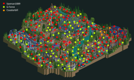
Uncanny Valley started out as one of Liampie’s ideas during our team brainstorm at the very beginning of H2H. We threw ideas around for a while and eventually landed on building a generic American amusement park set in the Northeast, since both G Force and I are familiar with the area. From the very beginning, we knew this park needed to be properly balanced. The park itself should look generic and unremarkable upon first viewing, and then the uncanniness and “wrong” things would start to become apparent. We also needed to be careful, because we didn’t want certain uncanny things to come off as “bad realism.” They had to be intentional and deliberate.Every time someone had an idea for something uncanny, we pinned it in our team discord channel for the park, and eventually ended up with a huge list of ideas. A huge number of them (over 100) made it into the park, but there were definitely a few that didn’t make it in. We have a list, but we’re not even sure it’s complete, as every time I’m ready to call it complete, I think of something else that wasn’t on the list.I don’t think I was ever intended to be the primary builder on this, but I was one of the first to do tests in-game. Mamarillas showed us an exploit with diagonal track and sloped track, which eventually became the train going up Looper’s lift hill in the final version. Based on our ideas, we started a map around the beginning of April, incorporating some of our ideas. On the original map, I laid down a carousel in the center of a “Penrose” stairs illusion, which remained largely unmodified throughout our building process. The building process went pretty steadily after that, with a lot of building and rebuilding. We “finished” the park with about one week to spare, and spent that week finishing things, polishing things we weren’t happy with, and adding more and more minor uncanny details.As for layouts: Bill and I traded layouts for Raven, until we eventually landed on a layout that I heavily modified from one of Bills’ previous version. Bill did the layout and hack for the diver, which loses two seats per car every time it goes through a tunnel. I mostly did the layout for Looper, with input from the rest of the team. Looper’s supports and catwalks were tough, and we didn’t really get it until the last week before the deadline. The coaster is technically based largely on Sooperdooperlooper from Hersheypark, and we really wanted to do a similar support style to it, since we haven’t really seen it in-game before. For the longest time, we had junior coaster track layered on top of wooden coaster track, but none of us were really happy with it. One day, I had the idea to try layering the new RMC track with mini coaster track, which had a lot of the same looks as the real SDL track. This worked great, and G Force eventually re-did all the supports to bring it to its final version.It was a dream to work on this park with G Force, as he’s always been one of my greatest RCT influences. In reality, G Force was probably supposed to lead this park, with myself, Bill, and poke or RCTFan as supporting builders. Eventually, it kind of morphed into me leading, with G Force supporting and improving the things myself and Bill built. Poke never responded and was replaced. RCTFan did build a little bit on the park, but we replaced that stuff after he dropped out. We contemplated a fourth builder, but by that time, the park was mostly done and it wasn’t really needed.Thanks to all for the kind feedback and criticism. It really seems like this park had the intended effect on most people who viewed it, and that’s all we wanted, win or lose. It was a blast to build on this park, and most importantly, it reminded me why I love this game and this community. Look out for more RCT from me in the future, even after H2H.To finish this off, I want to note some of my favorite uncanny things in the park that I hadn’t seen mentioned anywhere. There are still probably upwards of 50 things that no one has mentioned yet, but here are a few:• Scenic overlook is blocked completely by trees and the back of a bathroom building• Log flume area is completely disconnected from the path network of the rest of the park• Water cannons for shooting riders on the dive coaster• Extra helix of track that Looper never uses• Flowers that change color from red to yellow and back as you rotate the screen
 -
 Coasterbill
Offline
It was great building on this. I wish I had time to contribute more but Sax absolutely hit this one out-of-the-park.
I'll be honest, I didn't really know if this park would win but we knew that it was incredibly fun and that's all that matters in the end. I'm thrilled to see that people had as much fun viewing the park as we had building it.
PS: Croaked was incredibly fun. You guys did a much better job with that park than the vote-spread would imply. Great custom flat and the fact that you were pushing the object limit on an H2H park is absolutely bonkers.
-

 ottersalad
Offline
saxman1089, on 11 Jun 2021 - 3:34 PM, said:

It was a blast to build on this park, and most importantly, it reminded me why I love this game and this community. Look out for more RCT from me in the future, even after H2H.
Yesssss great news! Glad you signed up this season and clearly it was worth it! Great write up as well.
-
 G Force
Offline
Appreciate all the kind reviews by everyone, was super fun to see all the reactions to the park and the discoveries members made during the first few hours. Real joy to create a park that causes that kinda reaction. Initially this was a really rough build for me, but the last few weeks we're great and I was pretty happy with how it all turned out. Was a pretty fun process with all the brainstorming sessions as Sax mentioned, tons of giggling to ourselves as we implemented different ideas. Also like Sax mentioned, this really re-kindled my enjoyment with the game, hopefully that leads to something in the future.
Unfortunate that Croaked didn't quite get completed, I'm sure the match would have been very different had you guys gotten those last few aspects implemented. Hope to see the finished product soon from you guys!
-
![][ntamin22%s's Photo](https://www.nedesigns.com/uploads/profile/photo-thumb-221.png?_r=1520300638)
 ][ntamin22
Offline
Congrats to the Milk Maids! Uncanny was a ton of fun to explore, and I spent most of my time with the map open with a huge grin on my face. Well-deserved win.
My background of screwing around with operating mode hacks in LL did take a way a tiny bit of magic for the flat rides, but I really appreciated the creativity to put them all together in ways that look surface-level normal. Besides, most of the "punchlines" didn't rely exclusively on having some hacking trick behind them. I think this could almost be a Looney Tunes park; the sight gags have a very classic cartoon feel. Peel the train tunnel entrance off the cliff face and move it over, that kind of thing.
I can't tell if the whole concept is enhanced or limited by being stuck in an H2H map. Bits like the fishtank building, the "scenic overlook", or the train-station-fakeout could really have benefitted from more space to play with to set the viewer's expectations, but a dense cluster of jokes like the backwards-train-and-photospot-on-illogical-transfer-track would risk feeling less intentional if they were spread out over more rides. The strength of the park is having those multiple layers to everything, so if it were a bigger park maybe it would feel like one gag per ride and fall flat. Going for a "vanilla" american realism canvas was shrewd. The coasters all look pretty good despite their ulterior motives - love the looper supports.
The whole train loop is nuts, clearly there were a ton of ideas to run with there. Also love to see perspective tricks on map rotation, very cleanly integrated here.
-

 FredD
Offline
Congrats to CK with the win. It really was quite uncanny and bamboozling sometimes. It felt a bit bare for a H2H park but the gimmicks worked wonders. Hats off to you. Have to admit I was quite triggered haha... Why oh why calling a coaster that is clearly a Schwarzkopf a B&M, like whyyyyyy. Coaster nerd me got angry. Mission accomplished

---
I have to admit I'm only feeling back normal since yesterday or so. I legit felt like shit for the first days after the deadline. I wanted to redeem myself from Motherland and that obviously didn't happen for obvious reasons... I'm still glad our park didn't crushed in the poll and got some votes in. I also want to thank everybody who was kind enough to leave a review and still look past the unfinishedness. There were some sweet comments, thank you!
Me, Intamin and Otsdarva have put a lot of effort into this park and then hitting that object data limit 20 minutes before the deadline, right when we were blacktiling and doing the water edge wall was devastating… I felt like shit and broken. Nobody thought we would hit it, we never thought that would even be a possibility.
Of course there are some more spots on the park that could need more refinement and polishing besides just the blacktiling and water edge not done. But still seeing where the park came from… 2 weeks before the deadline I didn’t really believe we wouldn’t get it done on time. Intamin and especially Otsdarva really made huge steps on the park in the last moments and with the deadline coming closer I became more and more optimistic we would get it delivered. But the object data limits said no… Please let the new OpenRCT2 format be here quick! I do want do fully finish it and complete it. Because this park deserves it.
Enough of focusing on the bad stuff. Let’s talk about what has been built got there.
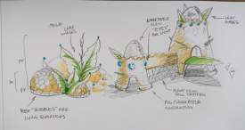
The park is Intamins baby. He came up with the idea of a giant lilypad with a frog kingdom on it, with 2 cults fighting for power. Of course he could back his ideas up with great sketches which made it so much easier for the rest of us. I liked the idea a lot and wanted to contribute. This is fantasy and not a style what I’m used to which was a big challenge. Once again Intamins sketches were absolute golden, it helped me getting his ideas visualised and getting into the groove.
So yeah his sketches were the ideal starting point and inspiration. I tried out some archy and Intamin begin with shaping the giant lilypad. Intamin showed me that there are really some gems to find in the disaster bench when it comes to objects, which gave me some new insights.
Then I started with the palace, which should be the central big weenie of the map. The thing where the whole frog society revolves around. Intamin shaped up the top of the palace tower greatly with that giant flower! Of course we needed rides and at least one coaster as well, after all, it is still a NE h2h park, right?! We agreed duelers would fit the story greatly and then thought wooden coasters were the way to go because wood is organic and thus fits the narrative the best. So I gave it a go.
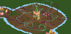
Obviously we didn’t end up with wooden duellers because the wooden supports and track just blocked too much of the views. So after a while we decided that the single rail track could come across a pretty organic too and it would block way less of the park. So there I went with more lay-outing. I’ve never done duelers and I don’t think I’ll do them again soon because man… so hard! Both coasters need to have a good flow, timing has to be right and then you want them to meet them at certain spots but then it screws with the flow or timing… We had lots of try-outs before we landed the final coasters. It should interact with the palace since the cults fight for the throne and I also was keen on keeping the high five element and the swooping hills over the palace since those looked awesome in my opinion.
In the end there are just a few subtle moments of dueling but those moments are solid. Each coaster takes you away to another side of the lilypad too. I tried versions where they stayed more together but that made a big spaghetti of track which frankly couldn’t be themed good or would just be a pain in the ass.
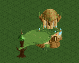
Try-out from Intamin
As you see we had numerous lay-outs and adjustements before deciding on the final ones. Could show you even more… Since the coasters were so big and impacted the whole lily pad it quite halted progress for some time on the map. But once with that out of the way we were good to go. I built quite a lot early on. The team kept me motivated. I build the teacup ride, the whole hunting ground small lily pad, finishing of the palace…
I was going fast but Intamin needed some more time to warm up and find his groove. Normally we would have had Swagtitties as our third builder but sadly h2h didn’t work out for him. We had trouble finding a new third builder and I was starting to feel the pressure because at moments I felt like I was the only one building. Lucky that was still early on but you know, I rather get stuff done early than late flirting with the deadline (the irony)…
The parks concept also made it a real challenge. We figured out we could scrap the under water part if we would get in time issues. But ofc we really wanted to do it as it would give the map so much more extra. For 90% of the time we builded with the land elevated doing the upper lily pad (because I really don’t like playing with virtual floor). Once we were comfortable enough we could make it, we dropped the land and started doing the underwater part. That also meant that the whole lily pad needed to be support blocked… I spammed a lot of object blockers there which is also one of the reasons we hit the object data limit… I still feel shit about this. Another challenge was that we could not use landscaping or trees to hide some spots easily, which you can do in a normal setting. This park would be completely dependent from the buildings and short foliage like bushes.
I was getting quite burned out on the park and needed a break. I have to admit that my pace wasn’t up to the pace before my break and I could have done better there. At some times I found it difficult to get back into the park. But it’s a team effort and Intamin found his groove and then Otsdarva came in as our new third builder. He really stepped up his game the last weeks and helped us getting it ‘done’. A month ago I was quite pessimistic about getting the park finished but with the deadline coming closer I became more and more optimistic.
This park – without a doubt – is the most stressfull H2H experience I have ever had. From getting burned out on the park, going from not believing the park will get done in time to believing it will to hitting the object data limit 20 minutes before the deadline… Wow… what a ride it was! Intamin and Otsdarva were great to work with. Intamin is an idea machine, there’s constant fresh and cool ideas coming from him. Made it so easy and doable to do a fantasy park for me! Otsdarva is a hero for doing the supports of the coasters on the last building day and that’s just a fraction what he did that day. You really dragged us over the finishing line Ots! Without you, the park would’ve been way more unfinished. Also big up to Sens for helping us finishing the park.
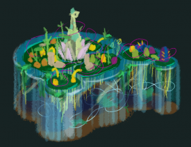
The end was dramatic but overall I enjoyed it. I’m glad I tried something else in RCT and I quite like the result. To finish, a screen of how it should have looked like..
Edited by FredD, 13 June 2021 - 04:51 AM.
-

 dr dirt
Offline
Croaked - A fun park that was a damn shame it was visibly unfinished, but what is a H2H season without some awkwardness? I enjoyed it a lot. There were parts that were extremely fluid and organic and some other bits that felt stiff to me. Overall a good development of a magnified natural diorama.
The major thing I disliked was the difficulty in maintaining my orientation to above and below ground. At times if felt that there wasn’t much distinction where the two met that made it hard. I think the glass sides were necessary here and helps a lot seeing them in place.
Otherwise, a cool concept that was a little messy in execution but generally good. Pleased to see FredD on here as I think some messiness will prove beneficial to your development here, as well as pushing organic forms into your work. Probably would’ve had my vote if finished, I reckon.
Uncanny Valley - frustrating that Liam gets these wins. It got my vote due to being finished. It was clever and nicely constructed, but felt like it was maybe 1/4 as ambitious as it’s competition and held about as much in terms of volume.
The positives is there’s not anything bad about the park. It’s a good park that would score fine, and I think that’s the goal. Also the details of things being off were clever and the main focal point that were also hidden. The train going up the lift and the dive coaster dropping seats were the highlights. The Wing coaster was also solid.
The negatives were I hunted for the weird details and didn’t really find interest in much else. Maybe that’s the point. Actually looking at the actual park, the vast majority of the work, feels like there wasn’t much to draw me in. I kept looking for ‘uncanniness’ in everything as there wasn’t much to really grab onto otherwise, as it was pretty much mini-___-winds with some anomalies sprinkled in.
 Tags
Tags
- No Tags
