H2H9 / H2H9: Round Robin - R3M2 - Manual Laborers vs Tile Inspectors
-
 25-May 21
-

 posix
Offline

Round Robin

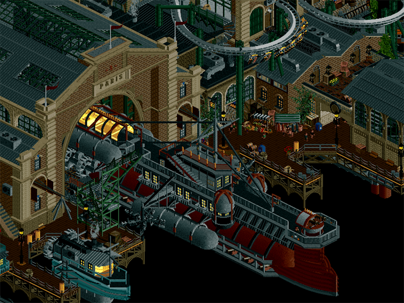
 Le Coeur du Ciel
VS

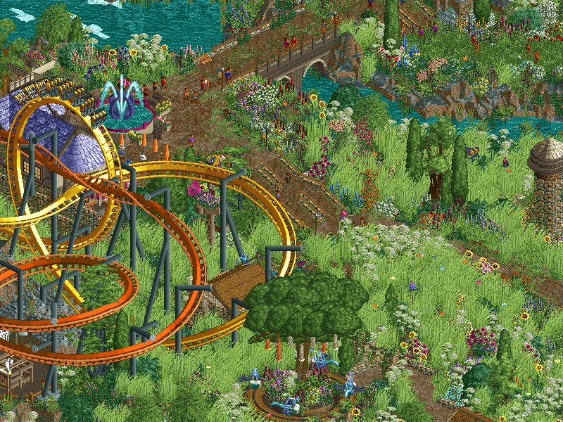
 Papilio ValleyVoting Rules
- The poll will stay open for ~72hrs.
- Do not vote unless you have viewed both parks in-game.
- Everyone may vote except members of either team. Any illegitimate votes will be ignored.
- Voting is monitored by the admins, who can see names behind all the votes. This is to improve fairness.
-

 Tolsimir
Offline
Since we all know how stressful it is to add custom music to your RCT folder (which one of the folders was it again anyways?!) we came to the conclusion to just provide the track for everybody to open it in their favourite music player. In other words, we forgot to put a ride with the song so if you want to experience it play it in media player
 -
 Coasterbill
Offline
Le Coeur du Ciel refuses to open for me. Anyone else? It just goes straight to the home screen.
-

 Cocoa
Offline
Bill you probably gotta delete the contents of youe object folder unfortunately. Happens to me so often
 -

 SSSammy
Offline
Since we all know how stressful it is to add custom music to your RCT folder (which one of the folders was it again anyways?!) we came to the conclusion to just provide the track for everybody to open it in their favourite music player. In other words, we forgot to put a ride with the song so if you want to experience it play it in media player
spiritual successor to The Good Dodgems
-

 Fisch
Offline
Great job! Really awesome stuff. Cannot wait to video review this round's parks as there's so much to love here. Inspirational!
-

 Liampie
Offline
Le Coeur has an Acqua Alta level of perfection to it, very impressive work. Clean, lively, (mostly) easy to read, but still dense. When I first opened it for a minute on Sunday evening, I was expecting to be bored by it; we've seen steampunk flying city stuff before. I spent more time with it yesterday and all of those feelings avaporated.
Papilio Valley excels in the idea department, there is so much warmth and fun here. It's also uncanny how much of an abandoned H2H park of mine is here - a park I was still keen on making. Avanine, Sulakke*, what did you do?
 I assume a coincidence, there's zero hard feelings here! You took it in a different direction than I would've done and you've done it wonderfully.
*Not speculating on who built the park, just jokingly implying they passed on ideas from the H2H6 team forum
One of these parks has to lose. H2H is merciless. This does not count as my full review, by the way. It'll follow.
-

 chorkiel
Offline
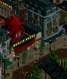
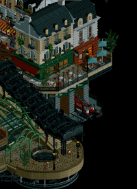
Le Coeur de Ciel: After getting over myself for not liking the nighttime palette, this park was incredible. It is so well-built. Everything is extremely detailed, but also very legible. The Moulin Rouge area stood out in particular to me. It felt so alive with all the thigns that were happening there. Arguably one of the best parks of the season so far.
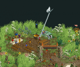
Papilio Valley: This was just a lot of fun. The theme is cute and whimisical. All the bug objects really made this come alive. The biggest eyesore for me on the map are the huge coasters, which take away from the subtlety of the rest of the map. Maybe the map could've done with just one, instead of a dueler. That is just a small gripe with a park that I had a lot of fun exploring otherwise.
This essentially pits a good park against a fun park, which I often find difficult to decide which is more important. Probably the toughest vote yet for me.
-

 Coasterbill
Offline
Le Coeur de Ciel: This is totally not my style but suppressing my own biases as much as possible I can appreciate that it's very well built. It's as steampunk as steampunk gets but it's well executed. Moulin rougue was great.
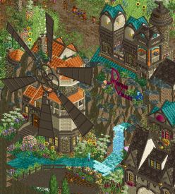
Papilio Valley: I absolutely loved this. Great colors, cute ideas like the enterprise web, a great atmosphere, cool duelers (I love the idea of barrel rolling through the vertical loop) and great windmill. Tons of fun details throughout.
My vote goes to Papilio Valley.
-

 barnNID
Offline
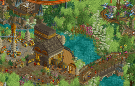
Papilio Valley: I thought this was a really interesting and tranquil park. I like how the dense foliage works to divide the park into distinct parts that vary with each other but also work together. The foliage is done pretty nicely, although some parts are a little too much for me. I kind of wish there was some spots in the dense field that were less overgrown to break it up a bit. I thought the rockwork objects were used really well here to create a really nice “loud” effect near the water especially. Also the butterflies are a cool touch.
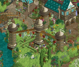
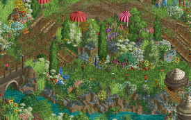
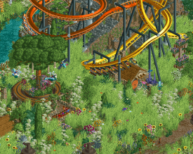
Here’s an example of an area where the foliage and the landscaping work beautifully together to create a really nice scene.
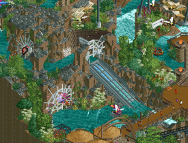
I thought the rides were overall pretty awesome. The dueling coasters were really cool layout wise, however I wasn’t a fan of the color choices. Specifically the black supports made the coasters look really out of place to me in the context of everything else. The flat ride is cool and themed really well. The ant hill ride thing is also really great. Adds a lot of context to that area and elevates it for me. My favorite ride has got to be the rapids though. Really beautiful and atmospheric throughout the whole thing.
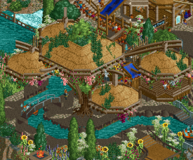
One of my favorite views from the rapids
The archy here is pretty hit or miss for me. There is some parts like the entrance village that are just strictly incredible. Then there are other parts where there are so many textures and colors and everything is so jam packed together that it becomes hard for me to read. Don’t get me wrong, the ideas and individual buildings are awesome, I just wish they had been given more of a chance to breath.
The building here is nice, but there is just some much going on everywhere else on the screen its hard to figure out where I’m supposed to be looking
Overall I though this park was really great. I hope my review didn’t sound too harsh because I actually really loved this park. The ideas seemed really fresh and it was done really well taking everything into account! Really fun to view this one?
Le Coeur Du Ciel: I think this is my favorite H2H park so far. The concept is clear and executed amazingly, the shaping of everything is absolutely incredible, and the archy forms are great. The interaction you guys achieved with the coasters might be my favorite part of this park. The was “Skyline” frames the area it is in is crazy. It fits seamlessly into the archy around it leaving everything completely readable which is impressive to say the least. I feel the same way about Volkaryia (although maybe to a tad lesser extent).
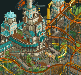
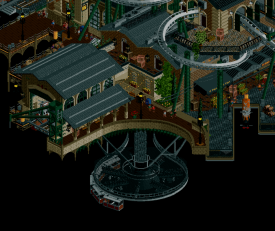
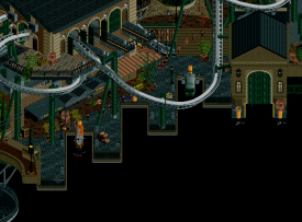
The way the coaster frames all of the pathing shapes and buildings here is amazing
The archy in this submission is on another level for me. Everything is so unique but fits in perfectly together. Every building seems to have its own purpose and identity which I really like. The shapes in the archy is really good as well. Great use of curves and diagonals to break up boxy shapes in the right spots. All the cutaways are just outstanding showing off really well done interiors and somehow keeping everything really readable.
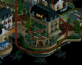
This façade is ridiculous
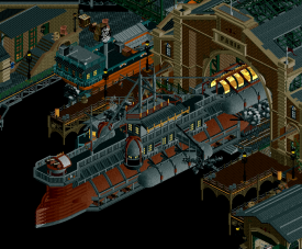
The running propeller theme is really cool and adds a lot of movement to the park. I like how it integrates with things like the coaster supports as well as just supporting the city. I think the dock area is probably my least favorite part of this park which is saying something because it is still absolutely great. The airship itself is cool and the station building housing it is really well done.
Here is another great example of how the shaping of the propeller, coaster, and path are work together really nicely.
Overall, I was very impressed by this entry, really a fun one to look at.
Conclusion: I will be voting for Le Coeur Du Ciel this match as I think it comes together a bit better than its opponent. I really enjoyed both parks regardless, the builders of both should be really happy with what they achieved!
-

 CoasterCreator9
Offline
It's as steampunk as steampunk gets but it's well executed.
I found this rather funny because it doesn't seem particularly steampunk to me at all. It's a unique take on the flying city theme, and I really like that about it.
Papilio Valley
The coasters are probably the highlight for me, along with the treehouses. I appreciated the unique take on dueling coasters with cool interaction between the two. The windmill CTRs are a nice touch, though the big one was a little choppy compared to the rest. I love the large scale, impressive and imposing architecture - but I felt as though it definitely blocked me off from seeing things I liked even more from other angles. Still not a fan of the white speckled rockwork, but it works better as it's been used in moderation and with consistency here. Foliage was a bit of a hit or miss for me - it felt lacking in structure. I sort of had one of those "is this a unique world or a theme park?" moments. You've got all these elements that point to a unique world like the treehouses with supply lines, then all these theme park details like transfer tracks and rapids boat storage. Not a bad nor good thing, just an interesting thought I kept having which might have changed how I viewed the park's narrative.
This was my favorite spot, nice atmosphere nestled along the water.
The station itself is nice; the rollers along the side feel a little underdone - but I liked this in general.
Lovely atmosphere here.
Le Coeur du Ciel
I ***adore*** this theme. Something about that concept of flying ships and cities really resonates with me - I've loved the concept since I was a kid. I really think you guys did it great justice here. The night palette actually works for me here, because it highlights the lights, the tan buildings break up the darkness of it, and the park itself is very lively and has a lot of movement throughout. The candle effect in Le Trois 666 alone is worth the palette swap. The world feels very lived in, and I love that about this. It also very much feels like Paris. The tip of the Eiffel tower, the architecture, even Skyline's station very distinctly reminded me of the metro system - super cool. The ships are fantastic, the coaster layouts are wonderful, and there are tons of layers to this which kept me coming back and finding new things. It feels like a full, lively city without actually being that big - remarkable.
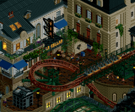
Love this scene, the layers and balconies, the little fire brigade. Super cool.
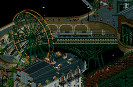
Also really liked this part of the map with the parks, gardens, and the railway below.
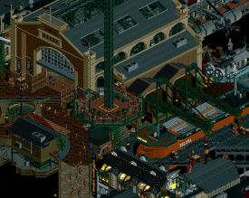
Awesome contrast between the lit buildings and the port - the cranes, ships, and the tower above all come together very well.
Another two very high quality parks, with my decision coming down to the smallest of things. As far as overall quality on average goes, this is turning out to be quite the H2H.
-

 Magnus
Offline
Again two great parks. I have no idea how some of these effects are pulled off and the level of detail blows me away, especially considered the time limits everybody is facing in H2H.
Voted La Coeur du Ciel. Absolutely loved the nighttime feeling and theme of this one.
Papilio Valley's duellers are great fun to watch and clearly the better coasters in this matchup for me. The theme is very unique, but feels a little hit or miss to me. Strong entry, but a tough competition in this matchup.
-
 Mr.Brightside711
Offline
Wow what an incredible match! These are definitely some of the strongest parks so far in H2H9.
Paris is really cool and the concept is really amazing. I'm a huge fan of Bioshock Infinite so the vibes kinda fit that which I love. Its a bit dark but eventually it starts to work in the parks favor after in it for awhile. There are a lot of really cool details scattered around the park as well. The opening scene is probably the best shot of the park. While there are tons of stuff as good or better than that, it is hard to find an area where everything in the view looks great together as a whole like the opening view. There is so much going and it is amazing but I wanted more of that wow scene, instead of just a wow detail I guess. Mostly Im just being picky because I have to choose which park I like more. One thing that I can say is the coasters aren't amazing. While the Mack is actually pretty great, it is super hard to follow where its actually going. It dives under the map so many times you lose. It's hard to get a feel for what it would actually be like riding it. The flyer I'm really not a fan of at all. Sorry. But coasters aside, lovely park. A memorable one for sure!
Butterfly Valley is another great park, and a seriously cool fantasy take with a some grounded bits that don't take you too far into fantasy. I was shocked at how long it took to feel like I was finding all the details this park has to offer. This park is really fucking pretty!! And there are plenty of areas around it that feel like they could be totally different parks. Which I think is a good thing because the butterflies, flowers and insects all tie it together so well. There are a ton of wow moments and screenshot worthy views around the park. Cleaver use of objects and rides as well. The coasters are really cool too. While not realistic at all, (what the hell is up with the starts of them?!) the actually dueling and flyby moments are so damn good. My favorite is for sure the corkscrew in the flyer's half loop. Wow! I should also mention all the great sculptures and art around the park. All super easy to read and looks great too. Really just a lovely entry!
Overall, this was a super close one for me. But I think what separated it was just the wow moments, and I think Papilio had many more of them. They get my vote.
-

 wheres_walto
Offline
Mrs walto reviews, I'll post my own thoughts after the vote closes, spoiler alert: y'all park is dope
French Flies
- oooo oui oui Paris
- nice ferris wheel, nice color scheme but it's a little gray... Oh wow I was talking shit look at all this architecture, damn they got your asses good
- oh what's this swirly doodle thing? I think this is a custom ride
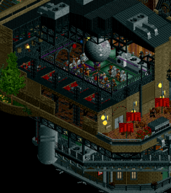
- I didn't even notice moulin rouge, oh a little orchestra pit, they even have the fufu dancers
- omg there's a panda on the stripper pole. You'd make an excellent stripper
- clicks cutaway view oh yea we're really cooking with gas. They didn't do the interiors very well (the work of a critic is easy, I've let all this power go to my head)
- overall this is really nice, dark but well made
A Bug's Life
- first impression is that it's big (that's what's she said)
- omg the waterfall, I dig it
- this is cute, the park you showed me last week I was meh about, it feels like we upped our game a bit
- I really like this, it feels like a hobbit village
- that windmill is chefs kiss, is that custom?
- I really like the village
- I like all the butterflies flying around, this is adorable
- little spider webs with bugs stuck in it, I think this is gonna win. This is fun!
- I love each individual component and I feel like it comes together for a nice park
- a big moth, it could have been better executed but I'm not mad at it
- stoooop the ant colony is so cool, look at the ants. The peeps are riding the ants, look!
- this is what rct should be, it's fun, it's whimsical, I gasped because it's so fun -

 RWE
Offline
Le Coeur du Ciel; Might be my favority this season so far. Wonderful architecture, awesome Moulin Rouge, nice tiny details. If anyone ever wants to write a school bock about how to build a good H2H park, make sure to include this as an example. Only thing i might wanna critizise is that i dont get the concept totally. I get its Paris but why is it flying? Have i missed something here? Doesn't really influence my opinion about this park a lot, but i would love to hear more about the concept from you guys when voting is over. All in all amazing work and great job, this is the comeback your team definitely needed after the last 2 rounds.
Papilio Valley; This is an amazing park too, impressive to see how much content you managed to include into this. Concept is great and well developed, windmill feels like a cool gimmick. I think all in all this park is a bit more incoherent compared to flying Paris. Wasnt a huge fan of the coasters, thought you definitely could have done more with those. Otherwise as said, good job on this too, great park i will definitely remember.
Decided to vote for Le Coeur du Ciel. But as for many of these matchups, sad to see one of these parks lose.
-
RaunchyRussell Offline
Great match here! Both parks are of high quality and have drastically different themes.
Le Coeur:
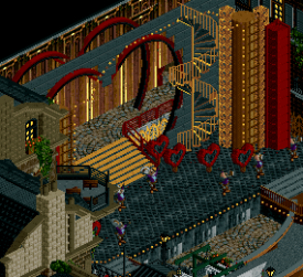
This park really has a "perfect" amount of steampunk in my opinion. It's integrated into the archy very well without it coming off as cartoonish. Even though it's fantasy, it's still believable. The archy is a huge strong point for me here. Some favorites would be the "paris" dock building, the Moulin play, the gentleman's club, the whole jetski chain return to power the propellers (love this) and the covered stairs next to the fire station. This is a park I will definitely be looking at for years to come.
Papillio:
Another great park here with an interesting theme, executed very well. This park for sure has the best coasters of the matchup. The invert paired with the flying coaster is a very cool combo. Great interaction moments with the each other and with the landscape too. They were very fun to watch. The archy was fun, whimsical, and had an almost disney-esque feel to it. Loved all of the butterfly sculptures and objects throughout this entry. This one definitely carries more of that classic RCT charm with it. Some of my favorite bits would be the dueling coasters, the enterprise "web", the treehouse portion with the supply pulleys.
I'm going with Le Coeur this match. Both teams obviously killed it, but Le Coeur really struck a chord with me.
-

 posix
Offline
LaborersVery fresh an interesting take on a fantasy creation. I quite loved it. I thought the propellers were executed rather successfully. In fact most of these "technicalities" were done very clean which is usually quite rare. You found a very convincing balance here between excess effect and unimposing sprite choice. Especially since these are all animated.All the little ideas to explore were quite fun, like the disco, or the panda entertainers (waiters? strippers?). I love it when people do the broken up rooves to avoid cut-away view. I think cut-away is much more a utensil for building than for exploring. The added convenience of being able to see things straight away pays back much more than people think I feel. It certainly did here.There is a lot of very finessed and high-level architecture here. Given how complex of a map composition and building style this is, I was quite impressed by how legible it remained. This further made you want to look deeper, and the macro, of what was really a micro-heavy park, totally performed. I love seeing this.Lastly I thought this was a quite more successful use of a dark palette. It made sense to me, and kept the park visually accessible, while also achieving the desired aesthetic. A very impressive park to me overall.InspectorsI'm surprised there wasn't more 3d-modelling debate on the windmill. I think it looks very cool. Beyond the entrance, it gets very messy for me very quickly. I wish this had a similar compositional cleanliness and good macro as the Laborers park. I can't quite make sense of the map organisation. There is a lot of everything here. A lot of grass object, a lot of butterflies, a lot of fine detailed rocks, a lot of peeps, a lot of little things stacked onto itself. I suppose this was the theme and thus intentional, but I don't think it worked here. I love the fact you tried duellers. They're so underdone in these times. I enjoyed them. The ants bit was a fun idea and quite successful I thought. I liked how you hid it behind a camera turn, which created a nice reveal moment for what was a pretty clever idea. A very good gimmick. And lastly "Swarm" looked very good to me. Quite amazing how many theming ideas are in this custom ride, and so readable at that. Well done.Still overall I did prefer the Laborer's park which gets my vote.
 -

 Turtle
Offline
I voted for the Sky Fortress of Yesterday, which is now possibly my favorite park of all time.
-

 In:Cities
Offline
Apologies for the late review - been a busy week!
Dear god this matchup. I'm going to try and review as I spend time exploring the parks.
Floating Paris
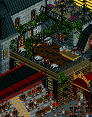
Leon? This park is like if the Replacements were good. Kidding, but its sad to see them leave him behind. Either way - this park is mesmerizing. Flawless planning and execution. The palette is perfectly fine. I appreciate it. Coaster layouts are awesome and well integrated. Great macro planning with the 3 main islands and central structure. The individual building designs are so well constructed. The sheer amount of rotating / spinning things are so great in selling this theme. The green supports on the Skyline coaster were absolutely the right call - especially with the string lights. Colors everywhere are spot on. The pops of green gardens everywhere are what really tie it together for me. Helps to establish the entire Paris "feel". Elevation changes and levels are done nicely. Open plazas and tiny alleyways. Lit windows. Using Jet Skis as chains. Good lord Le Trois 666 hahaha. The names of all the pandas are hilarious lol. Tolsiminx and Kumbeau. Robert Dedede haha. The entire theatre complex Jesus Christ guys this is so good
Some things:
The hearts. The arrangement of the entertainers. The spiral staircase. This is just so cool
I love this scene haha. DJ Pac out here killing it
Glad to see them enjoying some well earned beers.
Favorite little corner. Just so believable.
I'm a sucker for good design repetition and geometry. Favorite "map edge" treatment of the contest haha
Best docked airship we've ever seen in game. Seriously - these colors are so perfectly "steampunk"
This is one of the highest quality maps i've ever seen - if not the highest. Stop trying to demotivate everyone
Butterfly Town
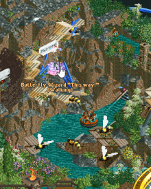
What a classic H2H map. I love it. Packed full of tiny little details and big ideas. This is what I love about this contest. Its organic, its beautiful, its clever. There are so many fun tricks and things to discover here. Giant windmill. Smaller windmill. Could have used more of the small ones I think! Also - a little nitpicky, but I think the map should have started on the park entrance. The sign next to the windmill over the waterfall is just so good. The sheer amount of fun ideas in this makes me really confident in knowing who worked on it haha. The coasters are cool, but I almost wish they weren't there. Doesn't feel like the right choice for this map - despite it being a battle between the wasp and butterfly. Just way too big and imposing. Makes the lovely landscape feel overly cluttered and messy unfortunately. That said, there's some pure brilliance here. The tree roots, the waterfall, the ANTS. I really enjoy a lot on this map.
Some things:
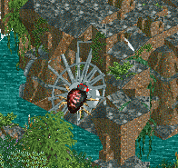
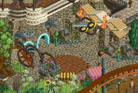
Broken enterprise as webbing is brilliant.
I love the grass paths here. The new Tolsimir rocks along the shoreline are very appropriately used. Nice one
The little thought bubbles for the Rapids scenes are clever. I like the wasp nest theming as well.
Very cool idea for the ride entrances. Dueling dragons, but butterflies and wasps
One of the best entrances to a park i've seen in game. Love the custom sign.
Gorgeous little scene. Reminds me of the riverlandman himself
The ant vehicles are so cool haha. Love how peeps can ride them. The ants stealing the food is clever.
Both teams should be super proud of the parks they put out this week. While wildly different, one definitely stood out as just significantly more polished and fleshed out than the other. Voting for the Replacements this week, as flying Paris was simply RCT spectacle at its finest. Sad to see you lose another one Inspectors - I'm sure you'll smack the next team.
Josh
 Tags
Tags
- No Tags
