H2H9 / H2H9: Round Robin - R3M1 - Cereal Killers vs Logan's Run
-
 23-May 21
-

 spacek531
Offline
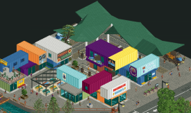
I was leaning CK but the food trucks did it for me. That's some insane object work and it turned out really well.
-

 Cocoa
Offline
wow, another excellent matchup. took me a while to decide!
christchurch: really astounding realism here. some next-level stuff, and totally captivating. the earthquake museum bits are brilliant, and I so appreciate the car-ride track that tells you the name of the building. that's a really nice idea. the church is quite phenomenal, as are all the bits of infrastructure- cranes, planters, posters, decrepid houses, etc. I like the theme- I feel like I've had my eye on the christchurch rebuilding plans for a while, so its a nice thing to port over to a h2h park. And I think the single rail works well, obviously calling back to the new one coming to Sydney. Just makes a lot of sense IMO.
lemuria: so atmospheric and charming, just an excellent realistic area. the port-of-entry row of shops is so vibey and detailed, especially the interiors and that funny walkthrough ride. the coaster itself is a brilliant layout, very top notch and the RoB callbacks give some good fuzzy feelings. I love the warmth and vibrancy and just fun everywhere. It doesn't break any ground, but that's fine, you know? Just really lovely parkmaking.
In the end, Lumeria got my vote, just barely. It was just so... nice. Flowing and easy and pretty. Maybe I'll end up regretting that, because I suspect Christchurch will end up being the far more memorable of the two. But so be it!
interestingly, this is almost certainly CK's best park yet, but somehow may deliver them their first loss... funny how things shake out!
-

 Jappy
Offline
Yet again, H2H9 delivers us a matchup that's ridiculously hard to vote for. The quality so far has been astounding and I find it very tricky to choose a favorite in this... Both parks are incredible in their own right! yet I have to be harsh and choose one over the other...Christchurch City center:It's funny how every single park delivered by CK so far feels like park that a team led by Liam would make.
 Not a bad thing at all, just something I noticed. The execution of this is damn near flawless, the details in this are so cool. The foodtrucks, the seismograph, the art... All so well done! But I miss a bit of excitement. And the one RMC isn't enough for me I'm afraid.Lemuria:I gotta admit, I'm not an expert on NE lore so it took me a while before I figured out the link to RoB. For me, it doesn't do much apart from being a nice homage. I like this entry a lot even without it. The buildings are great, there's movement everywhere, the interiors are fun... Just an overall great little piece of parkmaking. For me personally, this juuuuust excited me enough to warrant me voting for them. Even though I have to agree with the comments above that in the long run, Christchurch might be the one people remember most.
 -

 Cocoa
Offline
btw the constructing building was just pointed out to me. thats a fukn brilliant little detail. watering flowers I assume?
-
RaunchyRussell Offline
This is the hardest matchup for me.
Lemuria is overall beautiful and executed really well. Love the color schemes, the coaster, and the macro of this entry. The archy is also another huge strong point as well.
Christchurch is also amazing in its own right. The skyscraper being built is amazing to watch. The archy is fantastic of course. Also love the little objects made for this too like the wiggling tower in the earthquake research building.
IDK what to do.
-

 FredD
Offline
Cereal Killers - Christchurch
What a great piece of rct this is. You know I love great archy and plenty of that to find here in this map. A good mix of modern archy with some older styles. The church is phenomenal. The earthquake story is such a nice touch. There are so much cool details to find here: the museum stuff, a lot of cool trucks, the excevator... The coaster is fun but my one and only complaint is that I just wanted a bit more rides, a bit more theme park I guess?! Kinda like you've built the outskirts and forgot the park part
 Minor complaint because what is there is beautiful.
Logans Run - Lemuria
This is just gorgeous! Def one of my fav parks this contest so far. Every box is ticked here for me: atmosphere, archy, great technical execution, great coaster, rides, lovely lush foliage,... Kudos Logans Run, a very memorable park to be proud of! I don't really know what to say more... I love it!
Two great parks, one hell of a match... My vote went to Logans Run.
-

 Recurious
Offline
Probably one of the most difficult votes for me so far. I like both parks. Some small things which I liked and disliked in particular for each park:
Christchurch
+ Love the handymen constructing the building. It's a gimmick, but I am a sucker for gimmicks. It's really cool.
+ Overall archy is very nice.
+ The various vehicles spread out throughout the map are cool. Personal favourites are the gelato truck and the excavator.
+ The ring of fire map and the earthquake exhibits are really cool.
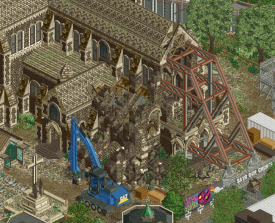
+ The grafiti/art on the wall of the construction site of the church is really nice.
- The coaster, while cool, felt a little out of place with the rest of the map just being a city scape. In general this is something which I did not really like about this park. There were too little rides. Besides the coaster there isn't really any other ride in the entire park. Even though there were lots of things going on and lots of things to look at, I would personally have liked it more if you would have included multiple rides in the park.
- Not a huge fan of the palette. Feels like it accentuates the grayness of the cityscape even more. Would have liked if the colours popped a bit more.
Lemuria
First thing I noticed when opening this park is: this is very beige. Also not a fan of that brown/orange colour of the rocks, I think it really stands out in a bad way. Onto the positives:
+ The archy is amazing.
+ Love the little trident sculpture.
+ The droptower/coaster interaction is fantastic and I love the building around it.
+ I think the little walk through attraction was a neat idea. But I feel like it would have been better if the guests would actually walk, not sure how possible it is. I also see what you were trying to do with the large peeps and the small peeps trying to represent a family. But the large peeps just look huge. So overall the execution could have been better but the idea is a fun one.
+ The rotating rapids platform was cool, is that new CTR made for this park or did it already exist? Looks cool in any case.
+ Coaster layout was good.
- This park is based on RoB, and I don't like RoB so this was never going to be a match made in heaven for me. I think the park suffers from the same flaw as RoB suffers from: its a mess of beige.
- The main street, while very cool is so cramped together that it is hard to see some of that amazing archy.
- A lot of areas of the park feel a bit cramped and busy making them hard to read.
+ Overall though, I think you guys improved upon the original source material so well done.
Not really sure who to vote for here. I am conflicted.
-

 Maxwell
Offline
Glad to make voting this time around! Comments included below:
H2H9 Park Reviews
Christchurch City Centre
Holy granularity Batman! The impact of the textures and overall grittiness is instant and incredible
The architecture is amazing as well. Seriously impressive cityscape, especially given the haphazard theme
Notable are Quake City, Thornton Terrace, The Millennium, and of course the Cathedral
Honestly, I love all the buildings in this map. City Hall and New Regent, Leighs Building, Te Pae CC, the list goes on…
Really appreciate the use of car ride track to name the structures – simple yet very helpful for viewing
Also love all the construction sites. Whether it’s a high rise or road repair it’s all very well done
+10 for all the vehicle and interior details, especially Quake City. Each case ceases to amaze me!!
Mishmash Market is great fun and really brings a sense of vitality to the map!
The divide between collapsing infrastructure and the fight to keep the structures alive creates a really interesting atmosphere. Almost post-apocalyptic/fantasy themes in a park rooted in realism
Love the inclusion of all the urban art as well!
+1 for Flight of the Conchords, Lorde as a Handyman (lol), and the Urban Explorer!
Lemuria
Love child between RoB, PoE, and Mirage Islands’ entrance?
At first glance, I was impressed by the sheer vibrancy of it all. Colors, lush foliage, landscaping, etc.
All the architecture in Port of Entry area is fantastic! (All the love for Mythos too)
Love the inclusion of what I assume is Taylor and the water tunnel from PFury in Escape from Lemuria!!!
Great interiors in general throughout this area
Eversio is perhaps one of the greatest coasters we’ve seen in competition. The layout, interaction, themeing, and diagonal mcbr all contribute to an absolute standout attraction
Notable moments include the first drop under the pathway, Griffon’s Tower turnaround, and the dive loop/interlocking corks above The Flood
The station is equally as incredible, and very fitting for the quality attraction. Love the overall feeling of grandeur and opulence here
All the supporting attractions are great with Postmaster Logan’s perhaps my favorite!
+1 for the small views into Griffon’s Tower load platform as well!!
Additionally, love the small fountains to the side of The Flood’s lift
+10 for The Flood’s rotating platform. It’s a very inventive contribution to say the least!
Small details such as named staff are always fun too. Lol’d at the SF one
Vote for R3M1 – Lemuria
While after immediately viewing both parks it did seem to be another tough decision for me, however, it became clear which park felt the most well rounded once I took a deeper look at the attractions. I am torn as both parks contribute standout quality that should be commended regardless of competition, but Eversio really sealed the deal for me. Interesting too considering that Christchurch City Centre certainly felt more unique overall which tends to pull my favor.
Continually impressed with the efforts and quality involved! I loved both of these maps and hope that both teams feel very proud of their work thus far.
Excited and prepped for R2!
-

 posix
Offline
LemuriaI must say I did love how Lemuria tried to be more of park for once. Think that's actually the harder thing to go for conceptually for H2H, so I take more interest when someone does it. The park was a little too full for me. It felt hectic and non-composed, as everything was maxed out with any chance for negative space sacrificed for content. Personally that's a problem for me as it makes me zone out more and struggle to stop the park from becoming a blur. The ride design was so devoted and wonderful. You tried really hard to make it work despite the tiny space available. The main ride again was intricately integrated and looked nice. But again, access. I did love how you tried to make everything so organic and natural. Always a winner, and beautifully done here.ChristchurchFelt very new. Loved the monorail coaster to the right and its compact layout. Never easy to integrate something like this with intricate and big architecture like that, but the way you did it made sense and was thus impressive to see. I think most of the urban design you realised is quite successful. It looks accurate without being boring, it's inspired and still looks as though you took creative liberties with some of the building shapes, which were rather complex and yet pretty readable. Something I thought I would never be able to do no matter if I wanted. The big church also made sense, but felt a bit too much like non-content which was a bit of a shame considering how much space it takes up of the map. It hurts the park a bit how there's such a strong divide between lively and lifeless. I'm glad this map edge fad is still going by the way. Like what you did here.Null voted since there wasn't a clear enough preference for me.
 -

 AJ-
Offline
~Christchurch City Centre~I really very much enjoy this park a ton! I like that it's more city and scene focused than theme park focused.The opening scene and coaster are sick af. I really love watching that tower being built (and the mural somewhere else). Killer idea!!! I love the coaster. The layout and interaction with the building is great. Gettin intamin single rail coaster vibes? That station building is just gorge wow.The rest of the archy is done expertly too. I like the mix of old and new styles, and under construction styles too. The centerpiece church I think is perfect. I wish the earthquake motives were taken through the entire entry a bit more. But The stuff that's here is so freaking good, the earthquake museum thing and the rubbles, all so good!!!~ Lemur Land~nice.
 -

 Lurker
Offline
This is going to be a tough one to vote on.
Christchurch:
It took me some time to really appreciate this park, as I got into the fine details and small scenes throughout. The mix of old and new is great for variety, and the buildings are just so well executed. (The earthquake resistant building with the displays inside was a major highlight)
The half diagonals broke my brain a bit at first, but I liked them more as I kept looking. The coaster seemed kind of random but it had a good layout and interacted with the building nicely.
Overall it does a great job capturing the feel of a busy urban center in the middle of rebuilding.
Lemuria:
I was impressed by the shoestring work on the main coaster, and the diagonal break run fits pretty well. A solid layout with good interaction as well.My favorite area was the gift shop area, the buildings, the path layout and the foliage were just so well done there. And the interiors (Especially the gift shop) were some of the best I've seen.
-

 CoasterCreator9
Offline
I had to sit on my review for a bit. I developed a favorite fairly quickly after a few views, but I really had to debate with myself why exactly I decided the way I did.
Christchurch
Excellent architecture, beautiful cityscape, great storytelling. You guys are really pushing the boundaries of how much a city can carry a H2H park. A lot of the little tricks here and there bring a lot of life to this. In fact, I found the coaster to be the weakest part of the entire thing. The scenery tricks to create a growing building and mural being painted are quite cool. I particularly enjoyed the repurposed shipping containers, the damage/rebuilding sections, and a lot of the architecture in general. I think the toughest thing about this round for me is that both parks are quite exceptional, and it really came down to maybe one or two negatives. For me, Christchurch had a quite forced coaster layout, and a lot of the tricks really only got me for the first viewing. Regardless, excellent submission, and one of the best RCT cityscapes we've seen.
I really enjoyed the abstract overhang structure here. The entire area feels very believable.
Super convincing rubble, very lively scene with the artwork and the construction machinery. Seems maybe a bit off from peep scale, but I do like this a lot.
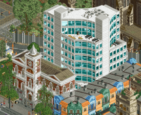
This white building is another favorite. Super cool.
Lemuria
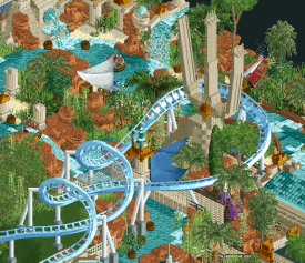
Modern RoB. It's a shame that you don't have more room to elaborate on this, because I'd love to see this as a full park. The subtle references are pretty neat here, very enjoyable. For me though, the highlights are the liveliness and the pure "theme park" atmosphere. It's fun, vibrant, and incredibly immersive. I love the water features all over the place. Foliage is great, coaster layout is phenomenal, and the ride selection in general is quite solid. The functional walkthrough attraction itself is very cool - the ride vehicles could use some significant polish, but the walkthrough itself is top notch. I might have liked to see some more interiors detailed, either with roof sections removed or cutaway-capable, but what's present is really fun - really my style of park here. Very nice work.
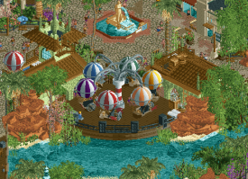
I love this little balloon ride tucked in against the river. Six cars for four arms is a bit...odd, however.
One of the coolest parts of the ride - the interaction with the river rapids, the statue, and the paths. Lovely. The dedication to shoestringing the coaster is also fantastic.
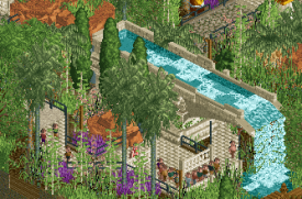
I loved all these waterfall/aqueduct features, but this queue in particular highlights the immersion and atmosphere for me.
Excellent matchup; two very different but very nice parks, both with unique strengths and weaknesses. In the end, it came down to a very close call for me.
-

 inthemanual
Offline
Was really thrilled exploring CCC. There were lots of details to dig up (virtually everything's been mentioned already) and it was a great, finely detailed, and crunchy piece of New Zealand, wrapped up in a really nice RCT-friendly package. I was a little 50-50 on the coaster, it didn't quite feel like what I'd expect from a single-rail, but it added some needed life, movement, and RCT-ness to the park. Overall a wonderful piece and one that would be difficult to beat.
When first opening Lemuria, my impression was honestly that I was leaning towards CCC. The red rocks being a flat awkward shade kinda threw me off, and the coaster felt tucked-away and a bit roughly paced. But spending a bit more time I started catching all the little sightlines to the coaster, the warmth of the rocks grew on me, and most primarily, I discovered the PoE-type Village/mainstreet area, which had a certain life and energy to it that really connected with me. The park definitely won me over and took my vote, despite my initial lean to the contrary. -

 Milo
Offline
This was an extremely tough vote and props to both teams for really bringing it this match.
Christchurch:
I love a good cityscape and this turned out to be a great one. It is teeming with life and all sorts of fun little things to check out. It is clear a lot of dedication and effort went into this and I think the amount of time I spent just looking around for new things to see (and consistently finding them) shows how worthwhile that effort was. Although I'm no student of architecture, even I could appreciate the variety and sharp execution of all of the buildings, both new and old. However, I just couldn't shake a little bit of frustration at the subject matter and how I struggled to really connect with it. A setting like this is not a bad idea by any means, and would be almost unbeatable as a Grand Tour New Zealand entrant. But I think you just needed a little extra something to really sell the idea. I think Nippon would suffer without the baseball game set pieces, both inside and outside the stadium and I think that's a bit what the problem is here. The coaster fit in as well as one could hope and was a good layout but did feel tacked on. The fun little details like the construction and even down to the use of half obscured invert track as pipes in cutaways were all fun to discover and might have uses in future projects.
Lemuria:
Apparently reboots aren't just for the movies. The RoB connection was something I picked up on quickly and it took me a little while to warm up to it. I was worried it would mostly just be cutesy name drops on the rides and a couple references but I think this does do a good job as a full contemporary reimagining. I believe a significant amount of motifs from the original were well executed here and it was fun to see the new spin on each, especially on the rides themselves. The coaster was great, one of my favorites of the season so far with the extra little touch with the diagonal brakes. The rapids ride was also a lot of fun although that area as a whole was a little overbearing for just being a themed ride with lots of interactions. I liked the backlot infrastructure as it helped sell the modern take on the theme as well as setting this version apart from the original enough to not feel like a full on retread. The front section with the mainstreet/pavilion section was a bit quiet but not in an unpleasant way. I initially thought the map felt a little dead but after exploring I started to enjoy the atmosphere a lot more. The one thing that I had in the back of my mind was it did feel a little cramped and I would perhaps preferred this to be a full size project but it is well composed enough to work in this setting. In the end enjoyable rides and that theme park charm won me over.
-

 posix
Offline
Match Conclusion

The poll is now closed.
Logan's Run have won this match with a score of 41–32 .
Creators
Cereal Killers"Christchurch City Centre"
FK+Coastermind
Splitvision
Logan's Run"Lemuria"
Xtreme97
Steve
SSSammy (F)
-

 SSSammy
Offline
FK, Split, what an absolutely incredible park you guys created. Once again I am gutted that one has to walk away with the win
-

 Steve
Offline
What Sam said; you guys absolutely brought forth a tremendous piece of RCT. I will give you guys a proper review in the morning! Well done, everyone.
-
![][ntamin22%s's Photo](https://www.nedesigns.com/uploads/profile/photo-thumb-221.png?_r=1520300638)
 ][ntamin22
Offline
Okay, Lemuria.
I would describe this as an extremely solid map that went in just a tiny bit too hard on certain aesthetic choices. It's neo-classical to a fault. So - let me knock out some complaints, and then I'll get in to gushing over the rest.
From the macro level downwards - I didn't agree with the color choices for the rocks and foliage. I found the orange rocks overbearing and oversaturated relative to everything else and it really made it hard to focus on the built park elements; they are all beige and swamped by a seemingly continuous blob of uniformly-green mush. The stylistic approach demands you make a template and do the whole area like that, and in this case I felt the template is poorly balanced. More saturated trees or a less saturated rock (or more variation in both - bordeaux red mixed into the rocks, dark green into the trees, etc.) would have been better, or even just - not every wall needs to be beige. The coaster station could have done with a different color for the main tower or the roof or - something to add some variety.
The coaster is sick. It's just such a slick layout, effortlessly presented. I'm not sure the final helix is really needed, but that's about the only complaint I can muster. I didn't notice the blocks are shoestringed on the first couple laps, to be honest. Great use of the loop support, and the element combo I'm going to dub the "ampersand swooper-looper" is so smooth. I love the station building's ambition and the mix of path interaction / visibility and the hidden second half. Just a lovely ride to see.
The water taxi is hot. I kind of wish it just re-used one of the R2 swinging ship CTRs or something instead of introducing a whole new train model, but it does look good and it's very exciting to see something at the right scale that's also functional.
I like the rapids well enough, but they aren't a showstopper. It's a bit over-long and under-exciting, and I'd have liked to see another narrative scene in place instead of smothering it with foliage.
On to the very clearly IoA bit - very, very nicely done. The walkthrough attraction is excellent and I'm not sure how much of that is from me loosely remembering the real one - the clump of peeps vehicles is a bit weird, but it's easy enough to follow along. Lovely interpretation of mythos with the rockwork and a ton of fun port of entry architecture. I like the recurring motif of the half-circle wooden element, and it's a lot of great "unidentifiable tropics colonial" that only borrows juuust a little bit from Mirage Islands. The cutaways were neat, but did clutter those views a little bit; overall I don't know if the backstage added much for me.
In summary - great coaster, very good IoA-type area, whole extra heaping helping of a very uniform and not-to-my-tastes foliage and rockwork that brought it all down a little.
-

 Xtreme97
Offline
Fantastic matchup, obviously super chuffed we won and hard fought against such a strong park. FK and Split, you guys did a superb job with Christchurch, so many great ideas and the archi is sublime. The growing buildings and murals being painted were amazing to discover. You should be really proud, I think this one will be remembered well.
As for Lemuria, I'm really proud of it! Steve pitched the idea to reimagine an old LL or classic spotlight area with a modern take - I liked the concept a lot and we settled on "what if Universal had built Rivers of Babylon in the style of Islands of Adventure", which naturally lent itself to Lemuria due to the Hulk connection (and allowing us to do a kickass B&M). Lemuria being a mythical "lost continent" also allowed it to tie in nicely with that area of IOA. In terms of real life setting, we came up with "Mystic Isles" as a fictional second gate to Universal Singapore, located in what is currently the golf course next door.
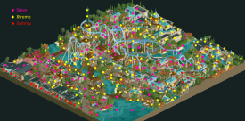
Initially the map got off to a bit of a slow start but we picked up a lot of pace in the final week and I'm really proud of what we achieved in the time, probably one of my most fun building experiences. Steve was responsible for the stellar layout, the ending went through a couple renditions but Steve dropped those first 3-4 elements in as if it was nothing. As for who did what, it was fairly mixed. I've included a dotmap below that shows the contributions, I'd say I'm most proud of the coaster station and the two buildings that open onto the marketplace. Steve did a brilliant job with the rest of the marketplace, as well as the ride queues which are phenomenal. SSSammy was also a massive help with the interiors of the shops, and doing the Escape from Lemuria walkthrough which I loved. Also want to thank Kenos for the CTRs (the balloon ride is so good, as is the rapids turntable which was made literally a few hours before submission), Zara for the brake and shoestring hacks and the rest of the team for giving great feedback. -

 ottersalad
Offline
Great job to both teams. Pleasantly surprised to see Steve on two parks this early in the contest. Should've known you two would team up again!
 Tags
Tags
- No Tags
