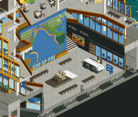
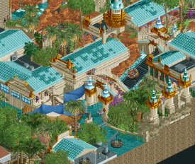
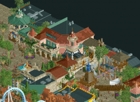
H2H9 / H2H9: Round Robin - R3M1 - Cereal Killers vs Logan's Run
-
 23-May 21
-

 Liampie
Offline

Round Robin

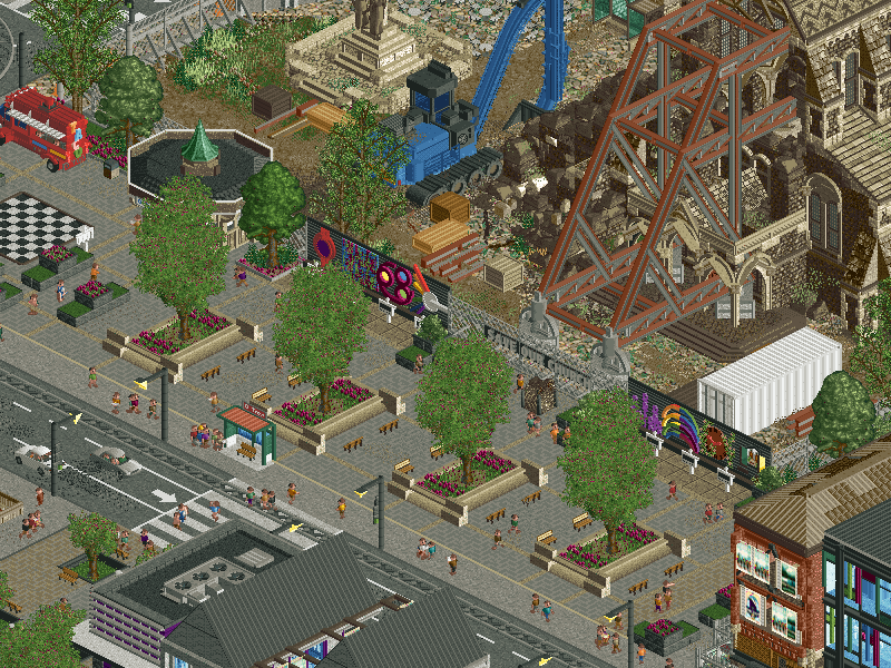
 Christchurch City Centre
VS

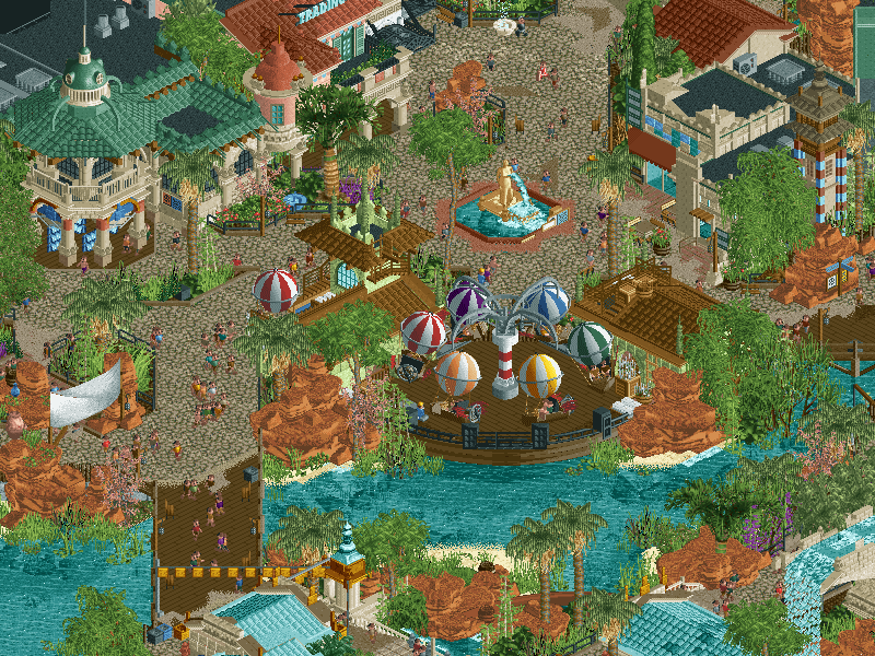
 LemuriaVoting Rules
- The poll will stay open for ~72hrs.
- Do not vote unless you have viewed both parks in-game.
- Everyone may vote except members of either team. Any illegitimate votes will be ignored.
- Voting is monitored by the admins, who can see names behind all the votes. This is to improve fairness.
-

 barnNID
Offline
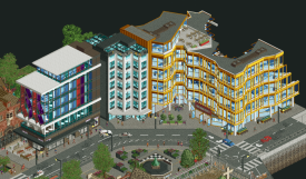
Christchurch City Center: First thing I notice is how nice the shaping is in this entry. I like all of the curves and overhangs in the archy a lot. I also think the half diagonal street was a good use of those objects.
Great shaping and archy all around this area
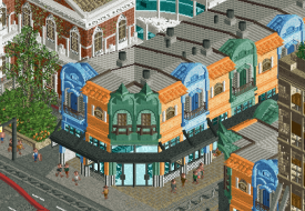
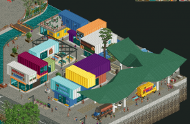
I was a pretty big fan of the blend of modern and historic archy, I think you guys hit the nail on the head by making this feel like a really city. On that note, I don’t really know if this is a recreation of anything? Either way, it was well done. The color choices were really good for the most part, specifically the area with the repurposed shipping crates. Some of the other color choices didn’t really sit with me as well, although that’s probably just personal preference.
This area in particular feels like too much color for me
I like the running theme of construction going on in this entry, really elevates everything to feel more realistic. I am also a big fan of the archy on the church itself, although I wont spoil that one with a picture haha. I like how you guys found a way to integrate some more tranquil areas into the cityscape, really gave everything a chance to breath.
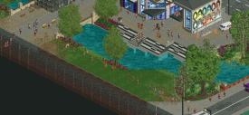
This is one of my favorite spots in the park
The layout seemed cool to me, although I’m not really a layout expert as you can see from looking at any of my parks lol. I actually kind of wish you guys chose the bolder route of just not having a coaster in this entry rather than squeezing one into the corner like you did. The station building on the other hand was pretty sweet.
Overall, this is a great piece of realism. A park that I definitely enjoyed viewing!
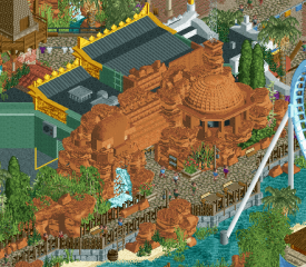
Lemura: Another really cool realistic entry. The archy here is the highlight for me. It all blends in together really nicely, but the buildings themselves are also unique which is really nice. The temple stain building was just great from all fronts, really impressive stuff.
I think this is my favorite façade on the map, a great example of the uniqueness of the buildings
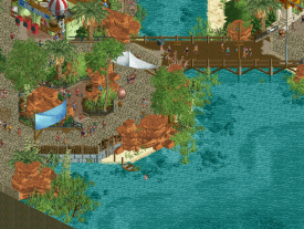
I am also glad you didn’t jam pack the park full of content. There is a ton here to enjoy, but you still left areas for everything to breath. The scene next to the lake is a really calm break from the complexity of everything else
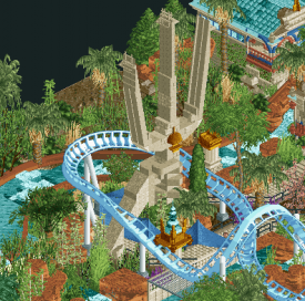
I thought the coaster itself was awesome. I loved the colors that make it pop on the map, and I was a big fan of all the great interaction moments here. The supporting rides were all really great as well. The balloon flat is great, and integrating a balloon into the station building really brings it to the next level for me. The rapids was awesome as well, the rotating platform vehicle is a really cool addition.
There is great interaction here
Overall, this park was really fun to view. The builders should definitely pat themselves on the back for this one.
Conclusion: For me this is a pretty hard vote. My CK review might sound harsher but I really appreciate the concept they went for and I think they executed it greatly. I think Lemura is definitely on the safer side concept wise, but it was done very well. I want to view the parks a few more times before making a decision. Another great match!
-

 djbrcace1234
Offline
" For me this is a pretty hard vote. My CK review might sound harsher but I really appreciate the concept they went for and I think they executed it greatly. I think Lemura is definitely on the safer side concept wise, but it was done very well. I want to view the parks a few more times before making a decision. Another great match!"
This is where I'm at and its hard to really choose. Both built their concepts well and I can't find anything I don't like about either. I may not even vote because I like both equally.
-

 wheres_walto
Offline
Mrs walto reviews:
Lemuria
-first thing that stands out is the bright blue coaster, which I like
-its all a cohesive color scheme, I like it
-not sure what the theme is, they didn't do a sticker book like the other teams did they
-bodies of water are wastes of space that could have been used for something creative
-I like the cute interiors, adorable souvenir shop
-I wish there were more custom rides
- the fountain looks like the man is peeing hehehe
- I get what they were trying to do but I'm left feeling underwhelmed
- the blue roofing is nice
- overall, as a passerby amateur in this world, I feel like while there's some impressive elements, it's not a park I would visit again if I was a peep
- it feels a bit mechanical in a way, lacking some creativity and fun
- I give them bonus points for the rotating wooden object after hearing the explanation
Christchurch
- I appreciate the custom crane
- so are they demolishing or building
- look at the poster, little painter, I like the attention to detail
- at first I was like, is this not an amusement park? But I get it, it's a city build
- how do you do the thing where you look inside buildings? Omg I'm learning, cutaway view! I know about inspector tiles (go team!), custom objects, custom music, and it's really hard to build diagonally
- omg little boats. I am navigating cutaway view
- I like this apartment building, it reminds me of LA
- it feels like a gentrification of the city, maybe some more amusement elements would have been nice, but they built something really cool here, I love what they've done with the place
- okay your museum it's impressive
- little rooftop bar I'd hang out up there
- oh there's a little shopping center, look at the little string lights. That's really cute
- *sits silently watching for 5 minutes straight* I like this
I'll write my thoughts tomorrow when I have more time to look through, but first impressions are strong from both -

 Roomie
Offline
You guys don't make this easy do you? Christ.
On first viewing i really have no idea where I'm going with this. Both really good but so so different.
-

 ottersalad
Offline
Wow, what a great matchup to start round 3. Really enjoying combing through the details and ideas of each park. Making sure this round to do a good job of taking my time to appreciate each park before deciding on my favorite.
Christchurch
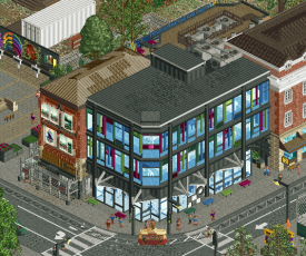
Wow, really good display of urban architecture I haven't seen done in RCT before outside of maybe Tromso? Really enjoyed this building here:
Also, shout out to SoDoSoPa.
Lastly, since I'm sure others will touch on the church with those crunchy new roof textures and how the map is all about changing and rebuilding the city center, this museum of sorts was really well done. How did you make the seismograph work? That shit is bonkers.
Lemuria
Dang, it seems like it's rare this H2H to see a proper theme park area.. Or maybe I just have poor memory. While Tokyo Dome was cool, I am a fan of these types of parks, much like Frontierland and Fairytale Kingdom last H2H. While I am no expert on park layouts (see every park I've made on NE lol), I do appreciate the commitment here to show buildings and backstage areas to really make this slice of a park believable.
I really enjoyed the rapids ride and feel like it was what you guys spent the most time and effort on. The lift was so cool and wish I could see it from a guest's POV.
Also really enjoyed this plaza and strip of shop fronts. Really atmospheric and well done.
Great job to both teams. Might be a day or so until I cast my vote.
-

 Sulakke
Offline
Lemuria
In contrast to Otter, I'm not a fan of these kind of theme park sections in H2H. I'd rather see a smaller full theme park, but that's a personal preference. And it's kind of a shame we have seen the Atlantis so many times done before, which causes me to think that I've seen this park a few times before already. I do like the idea of making an homage to an area of the legendary RoB, although I think you could have done more with that. There are not so many references and resemblances other than the naming and some of the color scheme. I would have loved to see an almost 1 on 1 recreation but with the current meta.
The village area is really atmospheric and it's nice to see a heavily themed yet realistic theme park setting again. We haven't seen those a lot in the last couple of years. The architecture here is fantastic. I especially like the bigger buildings Lemuria Apparel and The Atrium. There are so many different colors in this area, but it works so well. Great job. My only complaints are the windmill, which is a bit of an eyesore that didn't work for me and the typo for the darkride entrance sign.
The coaster is very nice. The layout might be the best we've seen this season. The interaction with paths, the drop tower and the rapids is fantastic. And the color scheme is still lovely of course. Really great job on the supporting too! The backstage area seemed a little bit unfinished/too clean here? It didn't really bother me, though. The rapids were great too. I really like how it has quite some elevation changes, while the park still feels flat. Nice job on that.
Great H2H park. Shame there weren't any lemurs though. And to whoever built this park, please rotate your trees once in a while. Only the Steve trees rotate automatically while placing them, the rest don't.
Chirstchurch
At first glance I thought I would easily vote for Lemuria, since the overview of the park isn't really impressive and the concept is kind of weak. But once exploring the park, my thought about this park have changed. This might be the most detailed RCT park ever?
The contemporary architecture is the clear highlight for me. I'm a sucker for contemporary art and architecture and this was a real treat for me. Leighs Building is extremely well made, while Quake City might be my favorite RCT facade ever made. The structure is so organic and it feels so realistic. It makes me think I suck at RCT.
 The only building that didn't work that well for me were the New Regent Shops due to the bright colors. I'm familiar with the real life buildings, but those colors seem to be more washed out than the ones you built.
 I'm not convinced by the coaster. It feels very forced in since it's the only ride there. What's it doing there? Not every H2H park needs a coaster. The layout was nice though and I really like those track supports.
The church was nice, but maybe a little bit repetitive and dark. I'm not the biggest fan of the color palette in general. It makes the park feel darker than it is supposed to be, I think. Also, it might have been better to choose a path type around the church that doesn't blend with it this much. The debris and supports were really good, though. And I love the excavator. Just like all the other vehicles and I was shocked seeing the working crane hook. And the flowering object tricks in here are awesome.
Lastly, The QR code was hilarious. I love these packages your team makes. Keep them coming!
Another fantastic match. The quality of the parks has been so incredibly high this contest and every vote is though.
-

 Hepta
Offline
One of the interesting things about H2H is how the contest evolves over time, as everyone sees how the community responds and votes in earlier rounds and the builders adjust their strategies accordingly. As a spectator, I also can't help but be somewhat influenced by the earlier parks we've seen.
So when I first viewed both parks last night, I quickly started to feel I would end up voting for Lemuria. But like most rounds this season, this is a tough vote and I'm not sure yet.
Lemuria: The excitement was already there when I saw the name. The idea of remaking a classic ride from the most legendary RCT2 park of all time is one that I personally love, and Logan's Run executed brilliantly. Layout was top notch as was the archy. Of course, the atmosphere is quite different from the original, and this was the main drawback for me.
Overall I found the park a little bit dense, and it required a lot of rotating the camera to view everything, and often still it was not possible to see things easily, especially from peep POV. In between the details there is not a lot of breathing space, partially made worse by the red rocks that tend to overwhelm my eyes (though I don't hate them). I would have loved to see a bit more negative space throughout, to give it a closer feel to the original macro atmosphere in RoB. But the challenge with H2H is that leaving negative space in a limited 60x60 map leads to parks that can feel empty (and get voted against for that reason). So I am just a little torn on this, and I can't really fault the builders for filling the map up. Overall I love the park and was so happy to see some classic style RCT theme park building.
Christchurch: I was also really hyped to open up Christchurch, and the opening view is immediately impressive. The building constructing itself is super cool and I'm still not sure how that's done. After that, I took a look at the coaster which had quite a nice layout interacting with the building, but the center of attention in this park is obviously the archy and attention to detail in the construction of the city. So I started to take closer looks at everything but for some reason, I just couldn't really get into it.
Personally I just have a hard time with these sort of parks that basically are only 10% theme park. Yes, the city center and everything is amazingly done, but there's just one coaster tacked on the very edge of the map. And this is made worse in my eyes by the fact that we had an amazing city last round, which also included a kickass theme park right in the middle.
I'm sure people will have varying opinions about the topic, but for me, I enjoy RCT most because I enjoy the roller coasters and theme parks, and there just wasn't enough theme park in this entry for me to enjoy it fully. I absolutely respect the builders and it's obviously very high quality, but I am having a hard time feeling I can vote for a city over a theme park.
I'm holding my vote for now, to let the thoughts bubble and take another look at the parks later.
-

 wheres_walto
Offline
Lemuria
+ didn't realize at first that it was partly an homage to Rivers of Babylon, but I really like that as a concept (I pitched it to our team at one point
 )
)+ super cohesive, but half the park is a bit too homogenous I think. My favorite area was the shopping plaza, I loved the movement and the architecture was exceptional
- the layer density and detail are top notch, but I think it's a bit too dense and that it takes away a lot of life from the park. I get that it's meant to be a slice of a larger theme park, but I thought the dead lake corner could be better distributed throughout the coaster area to give it some breathing room. That area is scenery- dense, but not action-dense, which is what I loved so much about El Dorado
+ the realism details are nicely done and provide needed context, they inform me of the genre (for a dumbass like me it helps). I totally feel the cheesy lower-budget replication style that I imagine when I think of Asian theme parks
Christchurch
+ The building construction is absolute genius, that was a jaw-dropping discovery for me
+ you've totally nailed the juxtaposition of modern urban architecture against classical styles, I'm amazed how well you've expressed the visual differences. The classic buildings feel small, dirty, aged, in some cases literally on life support. The modern buildings towering over them with sleek, overcolored, glassy designs is really effective
[] not having a rundown beautiful church interior feels like a missed opportunity, the pews are there but I'd like to see the organ and columns. Not going to fault you too much because the exterior is gorgeous
+ The quake city building is stunning. It's so gaudy and weird in its shape but it works so well, and the interior details are super cool
+ I don't really have any strong criticisms. This is the first map this season that to me really feels like its own element. It's an evolving city center, I can feel the tension between modern and classic styles, and an incredibly cool trick hammers that point home
[] coaster was not necessary for me, I was blown away by the map and story elements that I wouldn't have even noticed if there were no rides
Lemuria is a great park with one flaw: that it's lacking life in half the map. It's over-dense, perhaps by design, but without movement, creating a beautiful but static composition. With Christchurch, I know that I've been here before, I've seen these types of buildings take over aging older structures, I've lived in shitty downtown apartments that look like that, I was captivated. I felt Christchurch was more innovative, certainly more daring, and a bit better executed, Lemuria is in the upper tier of parks so far this season but this was an easy vote for me
-

 chorkiel
Offline
Lemuria: This park was struck for me with one flaw. It is overdense, yet there's not much to see. As an area in a bigger park this would have worked quite well but it on its own, it just misses something. We have seen Atlantis been done plenty of times and although this was very well made, it did not really offer something new. Please don't think that I dislike the park. The coaster had some nice interactions. The main street also looked fantastic.
Christcrunch: another city with a twist. Solid idea-generating, because it seems to be working for you. I mostly enjoyed this as a display of architectural styles. Every building had its own identity, which makes them all feel very real. Furthermore the city also felt very alive. As for some bad parts, the detailism made it a bit glitchy and I didn't enjoy the map edges. Overall a very solid effort. A park that keeps growing on me.
-

 AvanineCommuter
Offline
Christchurch - Cereal Killers
- A very unusual choice in theme. I don’t love it but I don’t hate it, but we’ve seen so many city parks it’s hard not to feel like wanting more out of the themes. But even with that, the builders knocked this one out of the park with some brilliant ideas and details!
- The growing construction; what a brilliant trick. Really cool to see!
- The contemporary architecture looks incredibly done throughout. So many styles, angles and curves all done with impeccable finesse. Really nice. In particular I love the earthquake building with the ring of fire map, genius detailing in there. The curvy white building was also such a beautiful shape, and lived the colorful walkway and posters.
- The coaster I did not like at all, and it didn’t add anything to the concept. Not a fan of the layout nor its squished placement at the edge of the map with no interaction. I don’t know also what the concept behind the coaster is. This was the biggest weak spot of the park for me.
- there were so many little details that were brilliantly rendered: drooping plastic tarps, posters, signage, planters, seating, the shipping containers, the cranes and cement trucks, repairwork, etc. Very fine eye for detail.
- I was feeling mixed about the interiors. On one hand, I don’t expect you to do every interior. But on the other, it looks very strange while cutaway is being used and one building is fully built out and the one right next to it has a scrambler with queue line. I don’t know how far the cutaway meta will go, but it really does break the immersion to see selective interiors that aren’t just viewable from the edge of a map or window. I don’t think this hurts the park at all though, since cutaway is really an extra tool and not part of my consideration overall in this case.
- The 1/2 diagonals were really used well here. Showing the power of breaking the grid!
Lemuria - Logan’s Run
- First off, a RoB remake is a fun concept. I liked the whole idea of updating the classic to today’s meta, and in IP form too. Clever!
- The layout of Eversio Lemuria was amazingly done. Best layout of H2H9 thusfar? Possibly! Great flow and interaction while still keeping close ties to the original in RoB. Though I have to say, the original’s ending with the batwing and waterfall should have made some sort of appearance; that was my favorite part of this legendary ride.
- Ambiance ambiance ambiance! The whole park is reeking with atmosphere, a very [censored] characteristic and pulled off wonderfully here. I loved the interwoven nature of some of the rides too, some great moments of interaction.
- The store interiors were nice, but particularly liked the wonky CTR adventure ride. Those floating peeps are messy but hilarious, just like the dancing peeps when they first came out in Feira.
- The architecture was amazing, on one half of the map. The entrance to the park was really beautifully built and had some great combinations of colors and detailing that brought the whole thing to life. The main coaster entrance and station were impeccably built, also with a unique style that was carried throughout the area. Then, on the side with the rapids, it sort of falls apart for me. It was very difficult to read as it was surprisingly dense without even having any tall structures, and portions of detailing and roof elements started to blend together and didn’t have the same precision and finesse the entrance had. I think the legibility of the rapids area was just not there.
Overall I voted for CK because of the unique details that kept me exploring for much longer than I thought. Some brilliant work from both teams, congrats on putting out another exciting and high quality matchup! -

 Liampie
Offline
I censored the username mentioned in your review AVC, remember to not publicly speculate about the builders.
-

 RobDedede
Offline
Amazing job once again from both teams!
Lemuria:
Very interesting concept to remaster a section from an old spotlight park. I think it was executed well in this case, but while it was an interesting idea, it felt pretty safe. Does that make it bad? Not in the slightest, it's just something to point out. I think the krypton rocks looked really nice in this park, likely due to the great colors as well as the fact that they were used in moderation. The back of house details were really well done and sold the idea that this is a heavily themed realism park, rather than a fantasy map. Also, nice use of our market stalls, lol. The architecture was nice all around the map, though I wasn't the biggest fan of the section where there were light blue roofs everywhere. It was a little bit hard to read, though it still looked pretty good. My favorite part of the map was the coaster. Its pacing and elements were top notch and the diagonal mid course breaks gave it that extra push to be a near perfect coaster in my opinion. Nice work Logan's Run!
Christchurch City Centre:
At first viewing, this park felt to me like Tromso 2.0. In fact, I think that might be my biggest gripe of the park, if you can call it a gripe. There's modern architecture, there's a church, and the overall style just felt really, really similar to me. Almost a little bit too similar. Looking past that, though, I'm having a hard time finding anything I don't like, even after viewing the park several times. I love seeing modern architecture in RCT, so that was all great. The raptor had a nice layout, too. My only issue with that were the arches that supported it in places. Since they are the same color and track piece it was hard to read what it was at first. Other than that though, it was a great coaster that complimented the map nicely. Of course, one can't overlook the flower trick that was used to simulate a building under construction. Genius! The earthquake museum was my favorite building on the map. I simply can't get over the inventiveness of the exhibits inside. From the ring of fire map, to the shaking building demo, to the painted stairs (that I think represents a seismic strength chart?), to the 1/2 diagonal balconies. So good. I almost forgot to mention the mural that gets painted. Wow! Reminds me of one of the art pieces I built in the Warhol Express (it's similar shape and color). This park has everything I like in a park, which is why I am voting for it.
So yes, my vote will be going to the Cereal Killers this round. Both teams should be very proud of what was built, though. Keep building awesome stuff!
-

 Magnus
Offline
Another difficult one to vote on.
Two good parks to kick off R3. Usually this would be the first round to throw in the slower builders and I was expecting to see unfinished work here. Maybe the next matchups will prove me right.
Christchurch
The screenshot developed high expectations in me. Great attention to details and the level of detail is amazing in this one. I am not sure about the theme though and I would have probably gone for a different setting for a H2H park. The coaster and the other rides did not do much for me. I would have appreciated seeing some of the architecture in a more classic theme park environment. Imagine the church building being part of a mystery story and a coaster winding around the building.
I am deeply impressed by the level of detail in this one, but while spending a lot of time on exploring little details the park as a whole did not grow on me.
Lemura
Thanks for the previous comments on the RoB remake - I did not realize this when viewing the park.
I liked the coaster and the rapid ride a lot and image the park is a lot of fun from the peep perspective. The view we get from the top was somewhat too uniform for me. More room to breath for some of the spots would have helped this one a lot for me. The details, the rides, the architecture, everything is there, but could have been soo much more powerful with more room to breath and possibly a different palette.
Don't get me wrong, I liked Lemura a lot and think it could have been even more amazing with some small changes.
Voted Lemura as it fits my personal preferences for a H2H park more.
-

 Turtle
Offline
Such a tough call, I love both parks. Great work.
I voted for Christchurch, will give my thoughts after the voting is done.
-
![][ntamin22%s's Photo](https://www.nedesigns.com/uploads/profile/photo-thumb-221.png?_r=1520300638)
 ][ntamin22
Offline
Jesus, christchurch is just bonkers. Absolute architectural tour de force. I cannot get my head around the level of creative vision to do half of the stuff that was done in here. The earthquake museum animated objects and the construction project and the half-diagonal streetscapes are all different flavors of mind-bending.
-

 alex
Offline
toughest vote for me yet.. In the end I went Christchurch because it felt more daring and fresh in the aesthetics and execution and I want to reward that. Lemuria was equally fantastic - loved the simple idea and the execution was very beautiful it just felt a tinyyyyyy bit safe in comparison (Im having to split hairs here to make a decision). Best coaster layout of the season so far though i will say that!
 Tags
Tags
- No Tags
