H2H9 / H2H9: Round Robin - R2M3 - Cereal Killers vs Scream Queens
-
 13-May 21
-

 CoasterCreator9
Offline

Round Robin

 Esoterra
VS

 A Day at the RacesVoting Rules
- The poll will stay open for ~72hrs.
- Do not vote unless you have viewed both parks in-game.
- Everyone may vote except members of either team. Any illegitimate votes will be ignored.
- Anyone with an account that predates the start of H2H9, or who has been drafted onto a team, may vote in this match. Anyone with a newer account must pass the admins' account integrity checks.
- Voting is monitored by the admins to improve fairness.
-

 Turtle
Offline
I'm voting for A Day at the Races, will add more thoughts after the voting ends. I will say that I thought i'd be voting for Esoterra until spending a bit of time in both parks, but changed my mind.
-

 barnNID
Offline
A Day at the Races: What a wonderful park! The first thing that jumps out at me is the landscaping. After seeing so many complex landscaping styles over the past few matches, it is quite refreshing to see the landblocks come back into play. I think this was also definitely the right choice here as it highlights everything else nicely.
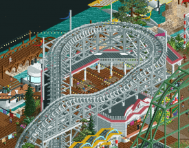
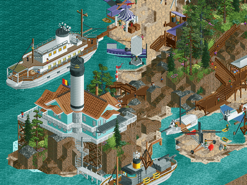
I'm going to start with the theme park area. I really love both of the coaster choices; Really unique stuff and executed greatly. The side friction layout in particular is really impressive. The colorable brick path works surprisingly well here and I am a huge fan of the cottagy archy present throughout. I really enjoy the fact that you guys packed a ton of content into this area without making it feel cramped at all. In some areas where there are boardwalks at different elevations they do start to blend in a little bit hurting the readability. I think that was only in one spot from one angle though so not really a big deal haha.
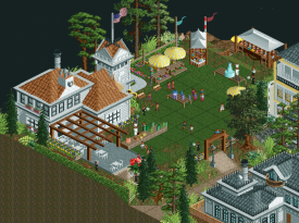
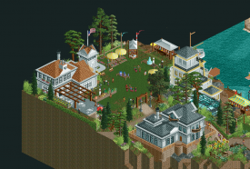
I love the little plaza here
As for the surroundings, I really love the cottage country feel. This entire area park really has a nostalgic atmosphere for me. One negative for me though is some of the boats and planes don't hold up compared to the rest of the park regarding detail. I really like all the movement you included in the surroundings to bring everything to life.
What a nice scene
Finally we have the race area. The plane show in itself is really great. I love the dive through the loop and the focus that was put onto it conceptually. The stadium is my favorite part of the entire map. The grand scale and functionality were both very impressive. I do feel like the sinage could have had a bit more detail.
Overall, I really enjoyed this park. This was a really fun one to explore.
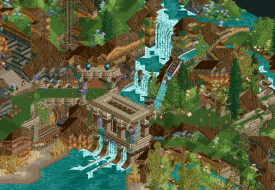
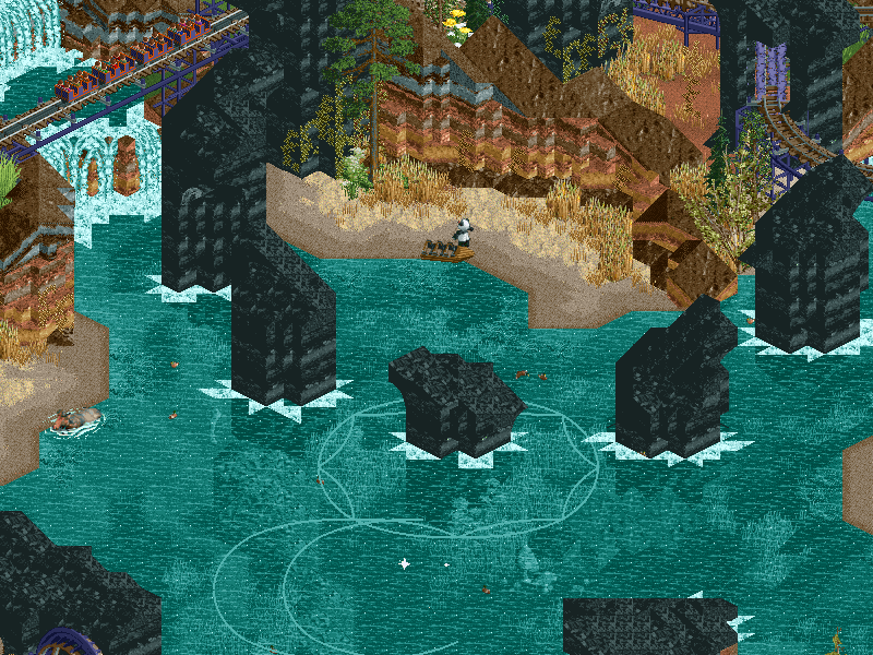
Esoterra: As soon as I saw the screen I knew I was in for something interesting. The atmosphere of this park is really cool. Everything seems very novel and experimental which I'm always a fan of. I really enjoyed the the small amount of archy that was included here. I love the "lost ruins" vibe that I get from this.
I love this scene
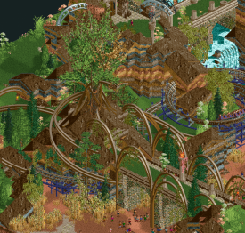
Obviously the focus here is on landscaping and foliage and I think you guys really hit the nail on the head with both aspects. This park is so atmospheric and the new landscaping objects are great. The foliage palette is awesome, I love all the different colors the flowers bring. I also love the fact that even the bridges seem like they are part of the landscape, everything works nicely to produce a very unique atmosphere. The big black rocks work well as a center piece and offer some much needed contrast.
This is probably my favorite screen from the map
The coaster layout was pretty cool, and I was a fan of all of the supporting rides. I think the splash boats were my favorite ride included. The maze is also placed very nicely. I was also a huge fan of the wheel of fortune.
Overall, I really like the innovation here but I can't help thinking that this park is missing something. Maybe a bigger architectural feature? regardless, I really enjoyed this park. Definitely one of the most interesting submissions we've seen this contest.
I have no idea what I'm going to vote for yet, both parks are awesome in different ways. I'll have to sleep on it.
-

 wheres_walto
Offline
Races
+ fun concept, you did well to capture American Victorian architecture and the feel of a race track
+ I do appreciate how many plane variants you built, it feels like every plane is unique to the pilot
+ the air show was a nice surprise, very much appreciate that it doesn't reveal itself right away
- bad jokes and lazy touches abundant, makes it very hard to stay immersed
- for a park dedicated to planes, the custom planes throughout the map are pretty uninspired. Why do the wings have the same wood plank texture as the docks? It feels like you took every test build of your planes and threw them somewhere on the map, I think almost all of them are badly lacking definition and feel badly outdated as sculptures
Esoterra
+ horse-led chariots are a neat ride, it's kind of boring and doesn't make much sense on water but it's something I haven't seen before
+ I kinda like the complete dismissal of all paths. It works better in some areas than others, but I respect the bold choice
[] the tarot card deck is a neat idea and an effective way of showing off small details, but the image quality is pretty bad in some of them so I'm not sure what I'm looking at
[] sediment layers are a neat idea but it's not executed well and frames your entire map upon a distracting eyesore
- why are the rocks so blocky? Is it intentional? I feel like I'm looking at a low poly 90's console game rebuilt in RCT. Those black rocks, while I'm assuming they're meant to represent glossy obsidian, are really bad
- I'm just not really sure what I'm looking at. I think it's a tarot-card-artwork-inspired world.. I'm sorry but I just don't think I get it
Not the strongest matchup in terms of quality... we've become a bit spoiled from the first bunch. Races is clearly the stronger entry to me, but the builders made their park feel juvenile and cheap with some of the lack of attention to detail, it no doubt would have been shut out by others we've seen already in the contest. Unfortunately I couldn't get into Esoterra at all; I found it boring, confusing, and not very pleasant to look at, but I do feel a lot more care and effort were put into it than into Races
-

 Gustav Goblin
Offline
A Day at the Races: This is a gorgeous blast to the past. I really enjoyed the accuracy of the '30s-era rides, especially the Aeroplane Coaster and Bisby's Spiral Airship. I love how Aeroplane Coaster's layout starts off as your average Leap-the-Dips before going freeform with a drop that would have been more than illegal back then. Of course, we can't overlook the planes. I love the combination of the twin-engine airplanes and aurora borealis CTRs to create an airshow complete with colored smoke. The custom stuntplane is really interesting, but I can't help but feel the chance was missed to make some CTRs for the other airplanes. After seeing the level of detail throughout the rest of the park, the default suspended airplane car just doesn't match it. Otherwise, very nice park!
Esoterra: The elephant in the room is the tarot card theme. It binds the entire park together really well, and the rides window just looks sublime displaying all the names and formatting. The Fool's layout was also really nice and was fun to follow around. The Chariot was also nicely done, although a shoot-the-chutes with a horse in front looks kinda weird. However, I found this one hard to get into. While the theme is nice and the park itself is well designed, there was this weird underlying disconnect which I just couldn't tap into. Good effort though!
Both parks were really nice, but I honestly think the Cereal Killers take this round.
-

 ottersalad
Offline
Esoterra:
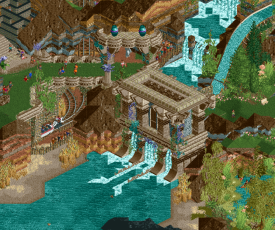
Interesting park. Reminded me a lot of Pineapple Road.. viewing this park, that was all I could think about. I think this park suffers from the same issue I had with Liberal Arts.. it seemed to reliant on a new rock texture that I'm not a fan of. I think the land objects you used here were unique and a bit more natural feeling, but the stratified dirt and map edges were overkill. Distracted me as a viewer of the map. Going back to Pineapple Road, the land block landscaping felt oddly more natural to me. But that might be me being old school and enjoying the original objects and aesthetic of RCT. God I sound like a crotchety old man. Another issue I had is that the staff was mostly unnamed and those that were named were odd, like Pat Sajak. While there were a lot of great landscape moments with waterfalls and elevation changes, I was left wishing for archy. The temple at the bottom of the splash boats drop was great though.
Day at the Races:
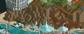
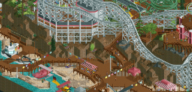
The entrance boardwalk/amusement park was so cute. The side friction coaster was a highlight for me. Very old school and simple until the big drop along the shore. Bisby's Spiral Airship was super creative as well. I enjoyed all the tiny boats and how each one seemed unique and not like any others. Little moments like the unboxing was cool. But my god the park was loud as hell! I noticed someone point out that you used the suspended swinging airplane car instead of a CTR.. which I agree is a bit odd. Throughout the park though the archy was really simple yet effective. Clearly feels early 1900s and I have a soft spot for nostalgia. What was a bit of a negative for me was how basic some areas felt. While there were some great rides, archy, and tiny details throughout, some bits felt undercooked and not up to the same standard as the rest of the park. A lot of the rock work and foliage was poor. Namely these bits:
And this corner of the map just didn't feel or look like the same quality as the other half of the map:
I think also the same issue that Esoterra had was that the park seemed perhaps unfinished with unnamed staff and unnamed rides/trackitecture. But for both parks, it's not a big negative to me, but worth pointing out.
Combing over all the different planes was fun, and the old timey coasters I was quite a fan of. Esoterra, while unique in its aesthetic, didn't hold my attention for as long as Day at the Races.
-

 FredD
Offline
Scream Queens - Esoterra
My first thought when I opened the park was that it looks cool, but what is it?! I don't get the theme or story behind this map. Something with tarrot cards? Which I know nothing about and refuse to do so. Googling esoterra gave me links to massage services which also isn't what the park is about... I assume... A readme would've been great here.
Aesthetically there's some cool stuff here. I like the ground layers which adds in some nice colors. The ruins here and there are also really beautiful and setting an atmosphere. The hierophant bridge is cool. I did miss some rides, most of them don't really stand out to me. The drop of Last Judgement was easily the best ride set piece here. There's also a kinda caterpillar ride (Tarrot Deck) which was so hidden. Shame because the entrance/exit path going over the ride into a sphinxtunnel is great but it is hardly visible. That def needed some more breathing space.
My biggest complaint are the squarish/blocky landscape setpieces here and there. I think that could be done a bit better and more organic.
Cereal Killers - A day at the races
I knew I was harsh on your teams first match-up, but I can be short about this. I love it! A clear concept executed pretty well. There's some really great archy here and it's all done so clean. At the same time, this park is full of atmosphere too. I really feel like I'm back in time, in my sunday suit going to watch a cool air race.
I also appreciate the spiral suspended coaster! That def shows that the builders know their rollercoaster history because it is also named after the very first suspended coaster (from 1902!). As a rollercoaster fan I like this even more than the sidefriction, just because of the history behind it haha. A lot of cool planes too, planes are underrated. Planes over boats.
Loved it!
For me it's a clear Cereal Killer vote.
-

 Dr_Dude
Offline
I don't get the theme or story behind this map. Something with tarrot cards? Which I know nothing about and refuse to do so. Googling esoterra gave me links to massage services which also isn't what the park is about... I assume... A readme would've been great here.
i know this park won't be everyone's cup of tea for other reasons, but the theme is very clearly interpreting the imagery of the major arcana through park landmarks. i think any further explanation would be dramatically unsubtle. if anyone's confused about the theme just take it from a tarot reader that it is a good and fun take on tarot

-

 FredD
Offline
As I said, I don't know anything about tarot. I had to google "major arcana"... Please don't expect everyone just knows it, especially when it's about something quackery.
-

 Hepta
Offline
Nice to have a matchup with a little bit less heat and intensity to it, but still two solid H2H parks at a similar level of quality. Considering that both teams won their first round matches, it seems they both took a less aggressive approach to R2. Good to see some matchup strategy at play! Either Liam's Breakfast Club or Dirt's Damsels in Distress will come out lucky with a win, with a park that would probably lose against any of the other 4 parks this round.
On my first viewing last night, I was initially more drawn to A Day At the Races, and I think that's just because it's more familiar feeling. A safe theme choice with some classic RCT realism, some nice hacks and details around an attention grabbing centerpiece. There are some great custom rides, and the movement of the planes and animated scenery makes for a great lively atmosphere. The side-friction caught me totally off guard with the big drop, super awesome moment and I was already loving that layout with the little green bridge over the path. All in all, I think the main boardwalk/amusement park area was the best, with the surrounding areas having less strength. While there was nothing "bad" on the map, several areas seemed to be more hastily put together, and much of the archy was of just average/slightly above quality.
The first time viewing Esoterra, I found the park a bit hard to look at. However, I think this is a normal phenomenon that results when you're looking at a new object, (or a dark colored pallete) especially one so heavily used throughout the park. When you're not used to seeing that object, it stands out and makes it hard to view whats around it. However, once you adjust to the unique atmosphere created, you can start to explore the little details. And that's exactly what I did today on my third viewing, and I really enjoyed the park. My favorite area is the one around the water ride, and overall I thought the park was interesting to explore with the little nooks and crannies everywhere. I did think the obsidian rocks could have been done better. Perhaps even just the placement felt a bit random. All in all, I really commend the choice of theme and attempting to bring a unique atmosphere through the new rock object and creative building techniques.
I am having a tough time deciding my vote this round. I thought both parks were executed to a similar level of quality, having both some excellent parts and rough edges. Quality being similar, I am leaning to vote for the park which I think was more difficult to pull off to this level, which is Esoterra.
-

 Cocoa
Offline
this may be a tough one to decide. two good parks, both with different flaws, and very different things drawing me towards them.
esoterra: this one is slightly painful because i think you almost nailed it on the landscaping. I love the idea of having exposed strata so I'm curious to have a go with that object myself. I think you perhaps overdid it- too many stripes with too many colors, and too straight too- especially around the map edge, the repetetiveness pulls me out of 'this is landscaping' and into 'this is a layered cake'. Other than that, I actually enjoyed this a lot more than I expected from the screens. the coaster layout is really wonderful and the park has a magical, weird charm to it. I love the bare landscaping, lack of paths, and just total mysticism and ambiguity. IDK much about tarot so I don't really 'get' it, but I'm fine with that too. the park feels small, I have to say, but its still charming, and I'm left with an interesting air of mystery that I really love.
day at the races: on the other end of the spectrum is a classic, bombastic show-offy park. again, I find the landscaping underdone, and I almost wish you had recycled the 'good' planes instead of spamming a lot of clearly-rushed-but-unique ones across the map. this park needs excellent vehicles to pull off, and I think like 40% of the ones on this map are great and the rest leave something to be desired, both in scale and detail-- sort of like those oldschool cars near the hotel, that almost work, but are just a bit too short and stubby. but off the criticism and onto the things I like-- the stadium itself is awesome. I love the shape and structure of that, and the aeroplane coaster and bisby spiral around it are just really well executed IMO. some of the archy feels a bit undercooked here but there is also a really fun and refreshing, casual atmosphere here. feels like the old days of trav's clovelly beach and that era of h2h parks.
maybe i'll sleep on this one!
-

 Magnus
Offline
Two good parks, but probably one of the weaker matchups in this year's H2H. Still feels confusing to say as both parks are by far more elaborated and more fun to watch than anything built in my active days.
Esoterra did not work out for me, as I have no clue about tarrot and the landscaping made it extremely hard to look at for me. This is probably a personal factor, but I feel the theme is a very difficult one for H2H as it requires a lot of background knowledge to be understood.
The park certainly had it's strong points and some of the screenshots posted of this park look amazing. As a whole it did not really come together for me on an aesthetic level.
The idea and concept of A Day at the Races was a lot easier to follow for me. It gave me a very classic RCT feeling, which I personally enjoyed a lot. The classic landscaping, the classic colors and buildings worked great here. The grandstand overlooking the airplane race was pulled of very clever and had a lot of life. The sidefriction coaster was a very clever choice and is fun to watch, holding the park together.
After opening both parks a second time my vote goes to A Day at the Races.
-

 Steve
Offline
Good morning, New Element! I am back with yet ANOTHER Steve Review. I gotta say, I'm impressed with myself. Who knew I could keep up with such quality content while captaining a team that makes parks like Tokyo Dome City? Would I call myself a "jack of all trades?" Yeah, probably. Will I continue asking rhetorical questions at the beginning of each of my reviews? You bet your bottom dollar, my dudes. Anyway. I'm feeling good. It's Friday and I have my "sewer water" in hand (AVC, you can meet me at the flag pole at 2:30 or I'm taking your lunch money, you bougie piece of New York trash!). Still waiting on my manila folder of loose Australian coffee though: SHHHAAAAAANNNEEEE.
Anywhoozle, looking like both teams really phoned it in on this match. What gives? I'll start with Tarot Rock Park because truth be told, I actually liked it! Maybe too much to even write a proper Steve Review. It got my vote, at any rate. I'm trying to find things to really make fun of, if we're being honest. The big black rock pillars...fine, I reckon they look like this on purpose or at least I hope they do. Is the queue for The Fool a joke? Seems like it's a pun for everyone to be waiting for such a long time for a mine train with a fucking loop on it. Wild. Anyway, the macro is strong here. I honestly don't care if people don't get it, it's good RCT. I will stand on my soapbox again and say I'm sick of people feeling the need to "understand" a park to fully appreciate it; I am still waiting for people to enjoy the aesthetic of a map without relying on it's premise to give it full merits. The Tarot cards were a good enough and clever way to subvert a readme. If you need anything more than that you're either too picky or too stupid (yeah I said it. If we got a problem then AVC and I will be at the flag pole at...what time did I say? 2:30. Right). Good job, Queens, even if I'm still bitter about Round 1!
Now to the juicy stuff. Finally a park I can rip to shreds. EXCITING. I hope Liam built on this one too. Just kidding, I will try and be nice. Apparently I was too mean on my review of El Dorado. Will I apologize for it? Maybe eventually, but not now. El Dorado is a great map so chillax, as Kyle would say while laughing through his nose. Anyway, Day at the Races: I will say, I enjoy the theme, but what happened here, boys. Be honest. Talk to Papa Steve. Was this map building for H2H7 and you were holding onto it just in case? What is this path?! It's brick?! How?! This side friction is kinda nice until it gets to a 200ft drop off a cliff (admittedly, it's cool looking but also, did Fred build this?). THE CLOWN FACE. NIGHTMARES. The little spinner on top of it is cute though. Same for most of the planes, I guess. I admire your courage of using the land blocks like this (are we sure Fred isn't on this team? Conspiracy!). Oh I just noticed the synchronized planes with the red/white/blue, that's cool. Is it cool enough to save you, though? Apparently, since, well, you're winning! Despite my squabbles you managed to create a winning (maybe) and finished park, and that is commendable. My slight wrath against it still stands, though.
Well, another match, another boring Steve Review. I'm running out of gas, fellas. Who knew the pipeline hack would hit me so hard (ha! Get it? Always good to include some current events in a review, right?). Oh, I just remembered: Scream Queens can you put your team name in front of your save game park names? You are making my folder a bigger mess than it already is. I could rename it I guess. More work for me though, and you guys don't seem very busy LOL just kidding. Good work to everyone, even me. I'm busting my butt over here.
-

 Scoop
Offline
Yes... Very clearly. *rolls eyes*i know this park won't be everyone's cup of tea for other reasons, but the theme is very clearly interpreting the imagery of the major arcana through park landmarks. i think any further explanation would be dramatically unsubtle. if anyone's confused about the theme just take it from a tarot reader that it is a good and fun take on tarot

-

 Version1
Offline
i know this park won't be everyone's cup of tea for other reasons, but the theme is very clearly interpreting the imagery of the major arcana through park landmarks. i think any further explanation would be dramatically unsubtle. if anyone's confused about the theme just take it from a tarot reader that it is a good and fun take on tarot

So it's a very clear interpretation of something which is a) extremely niche and b) inherently unclear.
-

 RobDedede
Offline
Here are my thoughts on both parks:
Esoterra:
I hate to be negative, but my first impression was that I wasn't a fan of the rocks on the side of the map. I do find them to be pretty distracting honestly. However, I thought the landscaping in the rest of the park was actually quite nice! My biggest gripe overall is that there's a large lake in the center, and there's nowhere for the water to flow. There's water flowing into it, so eventually this thing is going to flood. I think the choice to not have any visible paths was a good one. I like the look of it personally. The Tolsimir waterfalls did not really fit here though if I am being honest. It looks a bit strange to me. The layout of the main coaster was quite nice, and it was very fun to follow around. Great job with that. Unfortunately, I know next to nothing about Tarot cards so the map was pretty hard to grasp for me. I understand what sort of art style this map was going for, but for some reason I just couldn't latch on to a lot of the rides. Sorry about that. The concept is just pretty niche I suppose. Let's end the review on a good note, though. The bridge near the entrance of the park is super cool. Awesome work on that!
A Day at the Races:
Again, I really don't want to be negative here, but my first impression upon opening this park was that it felt a little bit dated in terms of style. I think what brought out this feeling specifically was both the basic landscaping as well as the path choice. I don't typically use the term "crunch" but I think I will use it here. This park lacked a lot of "crunch". The textures were pretty simple. However, aviation is something that I love, so the concept of this park immediately connects with me. All of the different old style, wacky plane designs were superb. The small little helicopter specifically was really cute. The vintage theme park section was also well done. I thought both the Aeroplane Coaster and the Spiral Airship were really well done, too. The vintage architecture present throughout was also cool. It really brought out the style the map was going for. The grandstands were perhaps a bit too large I think, though. The little posters for the different racing teams (or were they paintings?) were another nice touch. And who could forget the wing rider? Also, the clown face on that one building was nightmarish but still a nice touch, haha. Overall, this park did a great job of capturing that vintage aesthetic Great job!
After sleeping on it, my vote goes to the Cereal Killers. While both parks had their ups and downs, I thought A Day at the Races had an easier concept to both grasp and appreciate. It also had a nice level of detail. Good job to both teams!
-

 AJ-
Offline
~Esoterra~
This park is very unique, both in its idea and construction. I love the theme, even if i know little about it!. (lol @ people getting mad about not understanding- then ‘refusing’ to? Go off sis). All the little scenes were great, the High Priestess and Star one was my favorite. I dont remember who said this, ‘it looks like an experienced builder trying something new’, and I kinda agree. It’s all good things but I think the next iteration of this style of park will be spectacular! This park is full of so many good ideas and i’d love to see more!
Great work Scream Queens!
~A Day at the Races ~
This park is technically quite good! This is one of the better ‘culture/ city with an event park’ that's happened since my brief time in NE. I really like all of the planes and flight details in the park, they are executed so well. The whole beach side scenes are adorable. The air show is also super rad. The main side friction coaster looks really fun to ride, the large drop would be killer! The standout for me is the green swinging airship ride! That's just incredible!!
Super cute park CKs!
My vote went to Esoterra! I was kind of torn for a while but the deciding factor for this vote was, ‘which builders would I wanna see another park from?’. To me both parks had about the same net quality in a way, and it came down to which creative elements carry the most weight.
-

 Lurker
Offline
Esoterra:
Very good landscaping all around, and although my knowledge of the subject is minimal I thought the setpieces were intersting and well done. One thing I wasn't a fan of was the map edges, they seemed too uniform to me.
The mine train coaster had a solid layout and nice use of terrain.
A day at the Races:
To start, I absolutely love classic parks and side friction coasters, so this park appeals to me from the start.
Speaking of the coaster, I enjoyed the way it work in and through the park, and even used the cliff for a big last drop. I also loved the Bisby's spiral airship, a great recreation of an obscure ride from the 1900's.
The airshow itself was fun to watch, and the planes around the park were nice although they did vary a bit in the amount of detail. -

 hoobaroo
Offline
Haven't had time for many reviews, but I thought this matchup was getting too much flack. I honestly really liked both the parks, even though their aesthetics are either peculiar, or not hyper-adjusted to the meta.
Esoterra
I'll start with Esoterra, as this one really grew on me the longer I checked it out. My knowledge of tarot card reading goes as far as JoJo's and a few for-fun readings at parties, so basically none. My first impression was that the direction of the map feels a little, well, directionless. My style is usually more following a steady path throughout a map, so it put me off a little. On top of that, the landscaping and rockwork wasn't to my immediate taste either, as it seemed a little uncanny and incohesive. The next day, there was something about Esoterra that I couldn't exactly shake, so I revisited it with a different, more curious mindset. I had noticed the tarot card themed names at first, but I wasn't fully immersed the first time I had seen it. So I look up the tarot card meaning of the first ride that happened to be on my screen, The Moon. I read the description of the card, which is upright unconscious and intuition, and reversed confusion and fear. And something clicks, as I realize there's a deeper significance to what's going on on this map then I first noticed. So I start going around the map, scavenger hunting for tarot cards. Wheel of fortune, representing inevitable fate and cycles, represented by the infinitely spinning shoestringed wheel ride with my dude Pat Sajak. Empress, representing fertility and nature, over by the farm, with the "fertilizer generator" lol. The Chariot, headstrong; The Last Judgement, reckoning, with a giant splash dive. I could go on and on to prove that I "get it", but my point is, that this became genuinely exciting when I realized that there was something seriously cool happening on this map. The map starting framed on The Magician, representing desire, creation, manifestation. Did this magician create the map? What does the fool really represent here? I don't have the answers to all of these narrative questions; I just know that I really am in love with the level of esoteric mystique concealed beneath the initial guise of this map. My mind even changed on aesthetic issues that I had on first viewing, like the uniformity of the map structure, as I began to see the map less as a single story with one direction, and more a collection of these symbols that represent some kind of process/cycle. The uncanny aesthetics began to give off a more mystical feel as I read more and more. Things that seemed incohesive to me at first, now seemed very much so intentional. I figure this map might get a lot of flack for not being straightforward enough for most, but I am very glad that the Scream Queens made this map. It is deeply fascinating, oozes passion and care, and took guts to go all in with this knowing that the reception might not match the effort. I'll definitely be spending more time on this map as I think there's just so much going on here.
A Day at the Races
Honestly, this one was awesome too. The opening race setpiece, it's sick. The follow up planes with the colors, also sick. The man standing on the stunt plane, even more sick. The map overall is charming, and also refreshingly not-intense. The coaster flows around nicely, and does a nice job of framing parts of the map. In general, it was just a really pleasant and atmospheric map. The execution wasn't mindblowingly insane or anything, but it's all pretty good and sells the feeling of being present at this event very well. And the attention to detail is great all around as well. Plenty of fun things to notice, like the cooking contest, the Floridian, etc. A fun and atmospheric map in general.
Yesterday, I thought I would've gone Races for the more impressive setpiece and fun details. But as I spend more time with Esoterra, I just am fascinated more and more. I really enjoyed this match.
-
 inthemanual
Offline
Esoterra begged me to explore deeper and uncover everything I could within it. Some micro-level stuff felt a bit messy, like the weird rocks and layering, but the way things came together was strangely charming for me.
Day at the races felt faithful to its concept but the execution didn't feel like it had enough time to mature. The planes and custom rides were well done, and the scale, while smaller than most, was executed consistently.
 Tags
Tags
- No Tags
