H2H9 / H2H9: Round Robin - R2M2 - Logan's Run vs Tile Inspectors
-
 11-May 21
-

 Wulfke
Offline
In your OpenRCT object folder
Doesn't seem to work
Still get the pop-up screen to download the objects when opening the park
Any suggestions? -

 Six Frags
Offline
Doesn't seem to work

Still get the pop-up screen to download the objects when opening the park
Any suggestions?Did you re-instal Openrct2 sometime in the past? Make sure you have the correct folder you place the objects into and not a previous install folder. Like I had this problem too a while ago, but found out Openrct2 was installed in my onedrive folder (users/<username>/onedrive/documents). I think it happened when I went from my old to my new computer and still used the old folder on my old hard-drive. Also, if that doesn't help you can try to open openrct2.com in your /bin folder of Openrct2. That should give you you a console with an error log, apart from starting the game from the right folder. Good luck!
-

 Liampie
Offline
Logan’s Run - Nippon
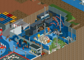
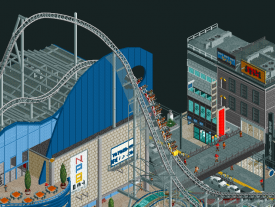
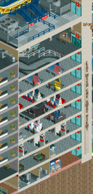
Holy shit, so much content! And the execution seems nearly flawless. Surprisingly clean and readable. It’s hard to pick out any flaws, and anything I mention will be either a nitpick or an arbitrary personal preference. The opening baseball scene was a lot of fun, also with details like the camera crew dolly. Other highlights are definitely Thunder Dolphin and the log flume, as well as the infrastructure. Japan is a strange and exotic land for me, and the architecture is alien, but at eye level I found the environment you created to be very immersive. Let’s get to the criticism. I think the map could’ve done with… less content and/or more focus. The baseball scene was fun like I said, but I can’t say it set the tone for the map. It felt like a random inclusion with no relation to the other stuff, other than being geographically proximate. Likewise, I think most of the interiors didn’t actually contribute all that much. The building that houses Baaack Daaaaan was anticlimactic and I also didn’t care much for the coaster. I would’ve liked to see you develop this more, at the expense of for example the baseball stadium. Lastly, the map was hard to view, everything was so incredible laggy! 7 frames per second, could be worse, but made it hard to even move the map around.
Tile Inspectors - Seven Liberal Arts
Much has been said about the new custom objects in this match. I’m appreciate and admire all the innovation, while at the same time being a little worried and skeptical about the direction of things. Maybe just intimidated. Tolsimir opened pandora’s box with the half diagonals last year, and now more and more boxes are opened with backgroundless signs, new font signs, and objects that you need to manipulate with the tile inspector to get the right look. All impressive and useful, but also intimidating as we stray further from traditional building methods. You didn’t make that very hard!
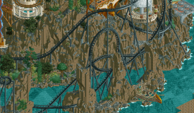
Anyway, I don’t have to build this park myself, I just have to sit back and enjoy it.Let’s get the specific object observations out of the way: new rocks: I knew Tolsimir was working on something and I figured he’d sit on them so that his team could use it in H2H. This is not what I expected, but I’m pleasantly surprised that the goal was to make them match RCT rocks and how you’ve repurposed 1K ruins if you look closely. That said, I think they work better in smaller quantities. The largest, barest rock walls are the weakest parts of the map. The entrance island is entirely fantastic, and this is also where the rocks really shine. The little street going up the hill is so incredible atmospheric, and all the new and obscure objects like the canvases are used optimally. I see the complaints about the market stall object as I too value making market stalls and other things by combining objects, but the argument that this is just a custom car to replace what otherwise would’ve been monorail cars is fair. And it looks sexy. The main island is more hit or miss for me. The ensemble of architecture here is not quite as harmonic as the first island, if anything a bit dissonant. The coaster has received some criticism and I can see why, not all parts of the coaster flow all that well. I know how hard it is to create a fantastical coaster and I think you’ve done an above average job for sure. The pre-lift helix wrapping around the dick shaped tower, the first drop sequence, and the final inversion are all great set pieces. It’s only the middle that really lets it down I think.
Lastly, I’m a big fan of the park’s concept. It’s getting harder and harder to find novel park ideas and this certainly is the most original theme this H2H so far, and it personally resonates with me too. Maybe you could’ve executed it better though, making it clearer what the seven liberal arts are and how everything on the map is tied to them. Where does ‘The Doubt’ fit in, and what’s the relevance of the entrance island? No biggie though.
---------------------
Overall while I think Nippon is technically more flawless, I found Seven Liberal Arts more charming and fun to look at, and the concept and ambition more commendable. Props to both teams though, excellent excellent match with two excellent parks. It’s always sad when one great park has to lose, but that’s H2H! -

 In:Cities
Offline
incredibly tough vote. I'll share more thoughts later, but I've got to commend both teams for creating absolutely stellar maps. Very intimidating!
I love those new rocks Tols. And the market stalls are great. Baseball game is impeccable, and the sheer amount of detail is insane.
Love you
-

 Turtle
Offline
I'm voting for the Greek one, will give my thoughts after the match. Two more great parks though, outstanding work.
-

 ottersalad
Offline
Tokyo Dome:
Wowee. This was quite a park. Really loved the shear amount of detail here. So much to explore while still being grounded in being as realistic as possible with fully detailed interiors and shops and what not. Even the underground dark ride was well themed with another kraken for R2.
Other bits I liked:
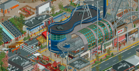
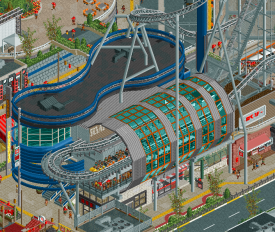
The station for the coaster was great with the curves and then the angular bit covering the brake run. Really highlights the layers to this park.
Lastly, the big moment which other's have shared already:
Well done guys, you knocked this one outta the park, literally.
Liberal Arts:
Well, I have to say, I'm not the biggest fan of this park. I think it was extremely creative and had a lot of moments and references I simply didn't quite grasp. A lot of what CC9 said I agree with, so I don't need to rehash it all here. The rockwork here was not something I was remotely a fan of. The new objects, while as creative as they might be, are quite ugly. This side of the map I simply did not enjoy at all.
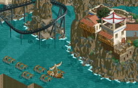
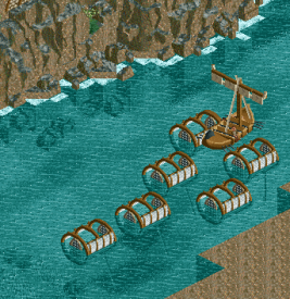
Then little moments like this provide worldbuilding and immersion that I enjoy quite a bit with the beautiful architecture and the cliffs and the fishing pots, but then the clashing of base game ground textures and these new rock objects brought the atmosphere down for me.
More focus on architecture would've been a bit more exciting for me. The new market stall ctr is so cool, and whoever made that or helped with that your creation is about to be used endlessly. The architecture here is lightyears ahead of what we saw with Forum Caeleste last H2H, and it left me wanting more.
I think I would've rather seen more emphasis on integrating these new rocks into existing textures as opposed to making them the focal point. I may seem rather harsh in this review, but I think it's fair for me to say I simply didn't like the overuse of these objects. As Cocoa said, it was like spamming 1/4 tile rocks, but busier.
-

 FredD
Offline
Tile Inspectors - Seven liberal arts
Have to say I both dislike and like you for making a way better shadow cloth object than mine
 From this match-up, this is def the park strongest on atmosphere. That whole village at the port is without a doubt my favorite part of this map! The shipframe in construction is also such a cool detail.
 The other part of the map, I wasn't quite feeling it. It sure has some bonkers archy and some cool features though. But for some reason, it doesn't quite click for me. The coaster feels a bit abundant. The landscaping though is def pretty cool.
Logans Run - Nippon Park
Have to admit I was kinda disappointed when I saw the screen. "This is just a baseball stadium?". Lucky there's more than that in the game! The baseball scene you immediately see when opening the park is quite phenomenal. I admit as a baseball noob I needed some explanation from my American team mates...
It's clear where the inspiration came from
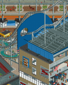
 The coaster is pretty cool and that hole through the wall feature is nice. I really like the station of it tbh, nice shapes going on there. I like how this park is full of life and like at every tile there's some stuff to see. Also great work on the custom (hack) rides, those add a lot to the park.
 It was a close match-up imo, I really had to sleep on my vote. I went with Nippon Park since it grabbed my attention for longer and ofc, as a theme park fan it also appeals a bit more to me.
-

 posix
Offline
Match Conclusion

The poll is now closed.
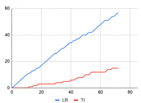
Logan's Run have won this match with a score of 57–15 .
Creators
Logan's Run"Nippon Professional Baseball Championship Weekend at Tokyo Dome City"
CedarPoint6
Maverix
SSSammy (F)
kenos
Tile Inspectors"The Seven Liberal Arts"
Tolsimir
Sulakke
DededeRob
-

 In:Cities
Offline
This match was so tough for me to vote in. I'm an absolute sucker for well executed "fantasy" type maps. But I also love some great realism. Always appreciated both styles and never really had an absolute preference. Flipped back and forth a lot on my vote here. (Take your time to vote, you dickheads.)
Tile Inspectors
First off, I love the rocks. Thank you Tolsimir for continually innovating in this game. As someone who at least attempts to do the same - I definitely appreciate your approach to things. Truly some never before seen stuff on this map, and it doesn't go unnoticed. The sense of verticality here is something to be greatly appreciated. This map was serene to explore. While having some seemingly rushed spots (underwater rocks in places), it still felt like a wholly fleshed out map and certainly worth of winning any match. It's daring, its experimental, it's bold. It works on so many levels. For a game about roller coasters - they tend to be the things that hold my interest the least on most maps. Everyone has their preferences. This one was insane. I adore how it interacts with the rocks and arches. It's effective, and executed so nicely. Ignore the rock haters.
Some things I loved/noticed:
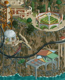
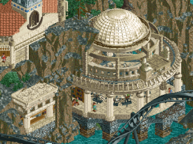
Okay, this whole scene here is just spectacular. The verticality, the Pythagorean Theorum building. The stairs winding down the cliffs. The coaster wrapping around the gazebo. the maze. The red pattern on the pathway up top. So much finesse went into this little area of the map and I greatly appreciate it.
Whatever this poor turtle is trying to do, I appreciate him for stepping outside his comfort zone and wiggling all over the mountain
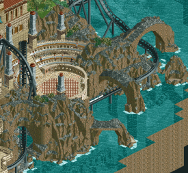
The arena. The arches. Such a great setting.
Queuing in front of a bookcase? Study the greats.
Oh come on
Logans Run
Alright, so as soon as I saw the park title I knew INSTANTLY that cp6 and mav built on it. Maybe you guys are too predictable. Maybe Steve let you have too much freedom. Either way, you boys really went hard on this haha. The park is an absolute homerun. Yes I said it. From the opening of the map and the baseball scene, to the eventual scroll and reveal of the insanity surrounding it - this map is an assault on the senses in the best way. I feel panicked trying to find the time to actually view this park - let alone the time it took you guys to build this haha. Oh hey - those animated stadium seat peeps look familiar. Someone needs to keep an eye on that Xtreme fella. As a whole, this map is just overwhelming. I love it. I definitely have a major appreciating for the wild and unknown - new techniques and explorations in this game. However, seeing a realism based map like this is just simply breathtaking. You guys absolutely crushed it. The diagonals do a lot for the macro aspect of this park. The main coaster itself is awesome - but doesn't hold my interest unfortunately. No fault of yours - I just am drawn to everything else in this game. More so interested in interactions and framing. Realistic layouts are great, but I would have no way of accurately judging them by that metric. So well done on it - it certainly looks impressive. There's just so much to see in this park.
A few things I loved / noticed:
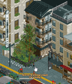
The verticality here is just great. Love the different levels visible here.
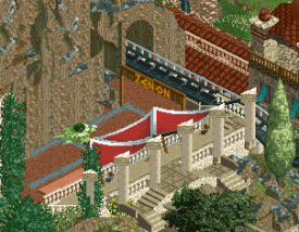
Signage is excellent. The different textures on the awning is a nice, very subtle detail. Sells it well.
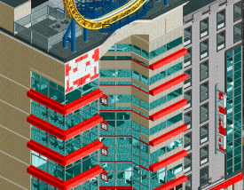
This building is just TOO good. The space invader. The vertical marquee sign. The repetition of colors and patterns. Sells it.
Good boy. don't knock over faas' bikes
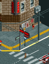
The man fixing the traffic lights. The location accurate traffic lights. The clever way of explaining why they're all red and the traffic is blocked up. Brilliant.
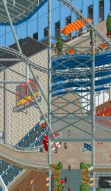
This building is just too good. Wtf. Queue going underneath the track. Escalators in the middle. Shops at the bottom level. This is how you do it folks.
I don't know why there's go karts up here. But the elevator is amazing. Just a great building.
Just too good. Flawless execution.
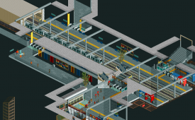
This entire subway station. Adore the primary colors on the walls. Map is a great detail. The shop, the stalls, the brick texture. The poor guy having to mop up the water. Those pathing tile objects are slick - props to the creator
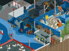
having worked in a sign shop for a long time - I'd be so excited to have this as an install job. The wave details are just so incredible. The wave mural on the wall. The different wall colors for the inside of the darkride. Man this is just too good.
Had to go with Steve's team in the end. Excellent job guys. Always a shame when one great park has to lose. The TI boys should be insanely proud of what they made.
Steve and I: rookie H2H captains. Insanely high sex appeal. Both of us build on our first rounds and lose by a tiny tiny margin. Second round win by garnering at least 50 votes. Lets copy eachother next round and both win, okay? We don't face eachother until round 7 - so i'll cheer for you until we have to smack you down
-

 Maxwell
Offline
Unfortunately missed the voting on this one as well, but review included below!
H2H9 Park Reviews
The Seven Liberal Arts
First off, the theme is great and very thought-provoking. Love the overall approach!
The object creation and use in this park is incredible, especially the tents and new font ofc
I appreciate the simpler approach of using more textured objects to add detail versus layering
Interesting noting the differences in object use for rock work. This feels truer to classic RCT than that of the recent WW rock meta
Overall landscaping and foliage is beautiful and executed perfectly across the map
The architecture is imposing while graceful. Waterfront areas are simple and full of life!
Most of the attractions are clever and very inventive -- The Planets!
Notable are Musica, Arithmetike, Astronomia, Logike, and Rhetorike
Very much enjoy the abacus structure, Geometria, and the Pythagorean sitting area!
Trireme is incredible and a great addition to the theme
Supporting details such as the ship framing and sculptor really bring the atmosphere!
+1 for Toga peeps and the fishing nets. Really feeling the AOE themes here
Nippon Professional Baseball Championship Weekend at Tokyo Dome City
Love the simulation, especially the inclusion of the Walk-off Homer in the celebration
Technical details throughout are all great and very immersive
Baseball Legend Autographs, Batting Cages, and Dunk Tank are all notable inclusions
+1 for Ride on Animals and Deep Abyss attractions!
Again, the technical prowess shines through on many of the attractions, e.g. Linear Gale hold brake
Especially enjoy Panic Coaster with the reverse launch and one-way station!
Watch Party is fantastic as well! The perspective feels just right given the angle and location
Love the simple, small details like the box trusses and BabyMetal Signs/Equipment Vans!
Overall architecture and infrastructure is very impressive; even more so considering the levels
All the interiors, cutaways, and rail line details really bring it all together
Thunder Dolphin Station/Blue Fall area is my favorite of the map! Such a unique blend of modern and traditional themes
+10 for Grand Carousel
Vote for R2M2 – Nippon Professional Baseball Championship Weekend at Tokyo Dome City
This was a difficult one for me, and at first viewing I kept wanting to vote for The Seven Liberal Arts. There was something about it that just carried a certain spirit that felt very quintessential RCT to me. Almost nostalgic in a way, yet it was still so technically advanced and mystifying. In the end, NPBCW@TDC also carried a spirit, but one of a more 'traditional versus modern' dichotomy that ultimately kept my interests longer. Not only that, but the technical complexities provided so much detail and content that it barely edged this one out for me. This one felt reminiscent of M1 in terms of competitiveness, but an even tighter decision for me in the end.
Groundbreaking work all round, and great job as always to everyone involved!
-
 Maverix
Offline
Went the Scoop route of a PDF rather than a super long post about what all went into the park. Check it out below!
 Tokyo Dome BTS.pdf (3.98MB)
downloads: 278Will be posting my review of 7 Liberal Arts later today!
-

 Dr_Dude
Offline
wouldn't have upset me if Nippon broke the h2h spotlight glass ceiling. congrats to both teams on their parks.
-

 Gustav Goblin
Offline
Went the Scoop route of a PDF rather than a super long post about what all went into the park. Check it out below!
 Tokyo Dome BTS.pdf (3.98MB)
downloads: 278Will be posting my review of 7 Liberal Arts later today!
I didn't even notice that logo on the side of the road was Babymetal. Another fantastic touch in the best H2H9 park so far. Also are you implying you worked at Super Nintendo World?
-

 Maverix
Offline
I didn't even notice that logo on the side of the road was Babymetal. Another fantastic touch in the best H2H9 park so far. Also are you implying you worked at Super Nintendo World?
I helped design and build it yes! -

 Maverix
Offline
The 7 Liberal Arts:
Such a great visual upon opening the park. The mountain with the temple on top is fantastic.
Diving deeper into the park there are fantastic details everywhere.
Starting with the village, the ships are fantastic, love the one with the full sails using the bobsled track.
The architecture here isn't overly detailed but feels appropriate and charming. Also love the use of the new rocks here. I definitely think these work best when they compliment an area, rather than be the focus.
Moving to the main island, the layout of climbing the mountain having to pass the 7 different arts is fantastic. Great layout to help convey the idea. Some notable highlights include the arena, astronomers tower, and the geometric maze. Again with new objects, I love the subtle use of them for the arches around the maze. Works so well.
The temple at the top is amazing. So much detail on the diagonal. I do wish the diagonal arches read better from the side angles, but there's not a ton you can do about that.
My biggest gripe with the map I think is actually the coaster. I assume that it being called The Doubt it is supposed to represent everyone's doubt in their abilities? If so, it feels weird that it starts off on the main map, I think it would have been cooler if it just circled the main island (it does still do that tho so points there).
Overall tho the map is fantastic and a visual wonder. You guys really put together a great park and should be proud! Great matchup and the real winner is the other two teams who didn't have to face either of our teams this round

-

 KaiBueno
Offline
I look forward to seeing these this weekend, as well as anything else I've missed in last 2 wks when I'm reunited with my rct2/laptop.
They look amazing...but the CP6, mav, sammy, kenos combo is almost unfair. -

 Sulakke
Offline
Congrats on the win, Logan's Run!
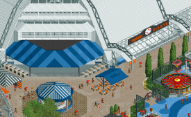
 It's never fun to lose, but losing against such a strong park makes it less painful. I really loved the opening scene. It shows great creativity and the custom music file is a good choice and adds a lot of atmosphere and immersion to the park. The stadium in general was well made. The only thing bothering me was that you used the same color for all the stadium peeps. It would have been more realistic if there was some variety in shirt color to break the repeating pattern.
The theme park section next to the stadium feels very Japanese and the execution of that area is of the highest level, although I wouldn't expect anything else from the legendary CP6.
All buildings on the map were fantastic too. I can't choose one building that stands out for me, but the overall quality is just so high. I didn't care for the interior, though, and same for the cutaway stuff. I can understand the decision to go for this, but especially the buildings cut in half look kind of awkward and give off a feeling of bad park planning.
The little scenes all around the map really made this park come alive. The market stalls add a lot of atmosphere in an otherwise very sterile and organized world. I really enjoyed things like the watch party, the moving TV camera, the wacky animal ride and the pitching and batting games. I didn't really understand how the dunk tank was supposed to work?
Overall it's such a great park. I'm still amazed how much there's to be seen and the interaction between the different layers is insane and doesn't feel forced for once. It makes it feel like 2 H2H parks in one. Are you sure you haven't exceeded the tile limit?

I really enjoyed building on our park. We started very late with building this park, three weeks before the deadline, I think? In the end, we ran out of time which has led to the rough underwater landscaping. We would have refined the landscaping around the big island if we have had more time too. Otherwise, I'm very happy with how our park has turned out, especially considering the small time frame we had to work with.
Tolsimir asked me to build the small island, which I did. The small island is supposed to be a port of entry with little shops and craftsmen for the visitors, before they would enter the big island showcasing the liberal arts. Since I was working with Tolsimir, the king of breaking the grid, I tried out some diagonal and round shapes I wasn't really familiar with, like the diagonal buildings, the diagonal swinging ship and the round terraces. I really like how the small island turned out in the end.
Tolsimir clearly was the mastermind of this park and I think he'll post a behind a scenes soon explaining all the arts and ride ideas. He focused on the big island and the liberal art rides. The new rock objects Tolsimir made were the base of the aesthetics of our park and I love them. Although they might be used a bit too excessive in this park, I think they are a real asset to our community and they are so much better than the LOTR, 1K ruin or Krypton rocks. Besides Tol's object making, I am really impressed by his creativity, macro planning and building pace. It was a lot of fun to work with him and he pushed my RCT work to another level too.
Rob did the wrecks, the abacus, the cutaway minigolf, most of the coaster supports and a lot of hacking. The quality of his RCT has been growing so much in the past couple of weeks. I hope he can surprise us again this contest.
I also want to thank SpaceK again for the incredible market stalls and the rest of the team for the help and feedback!
-

 AvanineCommuter
Offline
Nippon Professional Baseball Championship Weekend at Tokyo Dome City - Logan's Run
- that baseball game opener is stunning! so creative and wonderfully executed.
- architecturally the entire city is beautifully done, especially the stadium and the main station / department store areas. The street vendor stalls are my favorite parts, as well as the beautifully crafted interiors.
- so much detail packed into this park, it's incredible that this was R2...
- loving the supports and look for Thunder Dolphin, and appreciate the inspiration but not exact replica of the area. It's smart to alter it for RCT purposes
- I love the entire diagonal street filled with infrastructure and cars for the viewing. Really cool scene setting there!
- I love the attention to detail, there are so many little tricks I'm deleting and taking apart to try to understand how it was constructed. Loved that.
- the entire area with the rides were really spot on in terms of construction and execution, but atmospherically it wasn't my favorite area of the park.
- the commitment to fully cutaway park is crazy ambitious and the park pulls it of wonderfully. Some interiors definitely felt a little less detailed than others, particularly around the perimeter buildings, but overall it was such am impressive feat that it doesn't take away much from the overall park.
- my favorite building is the peanut building and the subway areas, as well as the entire ground floor shops and market stalls on the streets. Really wonderful!
I'm sad that we had to go up against such an incredible park, Maverix / CP6 / kenos / Sssammy should be immensely proud of their achievement here! Best of the season so far, congratulations on a job well done and a well deserved win. Homerun!
-

 Steve
Offline
I knew I was forgetting something! Ah! Shit! XTREME how did you get out! Back to the basement! Whoa wow sorry guys, it's been a hectic time in Logan's Run. I don't know how you guys do it. Winning is not easy. Just kidding! I mean it! I honestly went into this whole thing expecting to lose everything short of my own dignity but even that's been long gone for quite some time. It's fine though. We're all family here. Wait, how'd I get inside this Olive Garden? Oh, good, Liam is here with a menu. "...What? Yeah, I want fucking breadsticks. Christ."
Anywhoozle. Gotta hand it to Tile Inspectors; you guys are doing some serious detective work cause regardless of whatever camp you're in for custom stalls, the park still slaps. The rocks! The diagonals! The FUCKING speed hill on the coaster. Jesus Christ on a cracker that fucking speed hill. Genius. Why are more people not talking about it? Maybe they are, I have not read most of these comments, truth be told. And I am nothing if not honest. Usually. The jury is still out. Wait, how'd I get inside this courtroom. Oh, good, Liam is here with a menu again. "...Are you lost? This is a courthouse. Yeah, I still want the breadsticks, dude."
Despite all I loved in the new objects and the speed hill that left me in a puddle, something rubbed me the wrong way! Can't quite put my finger on it. The objects in their own right are obviously stunning but maybe it was the abundance of them all at once. For the hottest of seconds I almost feel like I'm not looking at RCT anymore and a different game altogether. That's sort of the risk inherent with new things though, I suppose! You did the right thing by sticking to in-game textures, no doubt. I think in the future they will be commonplace but for the first time seeing them, I can understand how one could find them jarring. Wait, how'd I get inside this cannery. Oh, Liam is here with a menu. ..."Are you just following me around? You still don't even have the breadsticks, what is going on at that Olive Garden? No, you can't just - no, Liam. Yeah, I mean I still want them. God."
 Tags
Tags
- No Tags
