H2H9 / H2H9: Round Robin - R2M2 - Logan's Run vs Tile Inspectors
-
 11-May 21
-

 posix
Offline

Round Robin
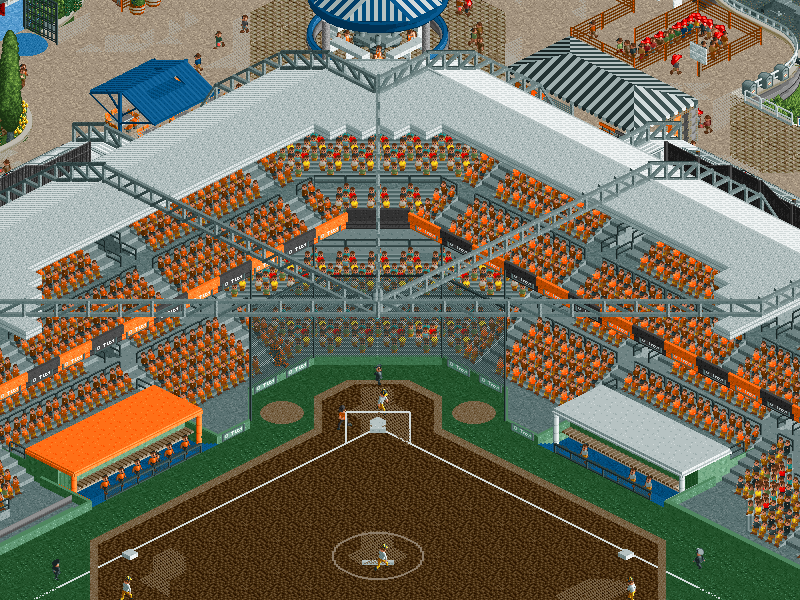
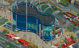
 Nippon Professional Baseball Championship Weekend at Tokyo Dome City
VS

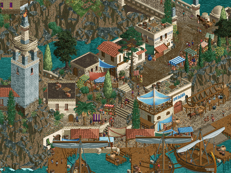
 The Seven Liberal ArtsVoting Rules
- The poll will stay open for ~72hrs.
- Do not vote unless you have viewed both parks in-game.
- Everyone may vote except members of either team. Any illegitimate votes will be ignored.
- Anyone with an account that predates the start of H2H9, or who has been drafted onto a team, may vote in this match. Anyone with a newer account must pass the admins' account integrity checks.
- Voting is monitored by the admins to improve fairness.
-

 Gustav Goblin
Offline
Nippon Professional Baseball Championship Weekend at Tokyo Dome City- Guess you can make a baseball game in RCT2 now. Holy crap, I don't know how Logan's Run did that in a week, let alone create the rest of this magnificent park. The entire layout is so free-flowing and jam-packed with detail, down to the interiors in the buildings. I'm really loving the new custom rides, especially the swinging ship and the carousel. I'm just at a loss for words taking this park in.
The Seven Liberal Arts- Before I opened up Logan's Run's park and saw an actual baseball game in RCT2, I was confident the Tile Inspectors had a free sweep. I started by following The Doubt, and it didn't take me long to realize both the ride design and the landscaping in this park are second to none. The rockwork may be the best I've seen in RCT2, and the humble market streets are every bit as impressive as the towering buildings. The central binding theme of the seven liberal arts is executed beautifully through each ride, and Musica, Arithmetike, and Astronomia are really clever concepts which add a new layer of fantasy to this park. My only gripe is using the default vertical drop car with its limited sprites for Musica made it a bit confusing to follow. Otherwise, absolutely stunning park.
EDIT: I just realized there is a transparent sign with a custom font in 7 Liberal Arts. Mind completely blown.
I can't make a choice on who to vote for. All I know is I've just witnessed the best RCT2 in years.
-

 CoasterCreator9
Offline
[Note; This got way longer than intended, but I felt both parks deserved an extra detailed review for both being such remarkable parks in different ways. tl;drs are in the post...]
I know I’m going to be saying this over and over; but the bar just keeps getting higher and higher with each match this H2H. Another two really wonderful parks, and completely different in nature.
Seven Liberal Arts
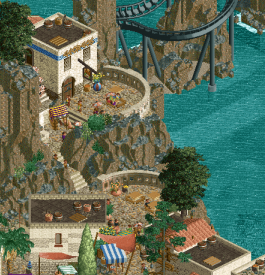
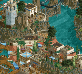
Elephant in the room out of the way first; these are some really impressive new objects. Most notable of course being the font capable 3D sign. I’m a bit less of a fan of the rockwork here; the shape and irregularity is actually very nice, and I felt that it was very well executed along the coasts where there was more of a balance between the textures, but I really wasn’t a fan of areas where there was an abundance of the bare dirt texture. I appreciate that you guys tried to emulate the in game textures, but the objects themselves almost felt a little blurry and were covered in these odd white pixels. I think the biggest thing this park sets out to do is push the boundaries of the game; there are so many diagonals and unique shapes and forms that we don’t typically see in RCT, much thanks to these new objects. I think this was more successful in some areas than others. The seaport and village was my favorite part of this, as well as the creative custom rides. The swinging ship CTR is fantastic, and I loved finding all sorts of things tucked into the cliff sides. The abacus and harp structures are quite clever, and I appreciate that they were incorporated as rides and not just a sculpture piece. I caught myself questioning why a giant harp and abacus, but it’s more fun to not question it.
 In general, while maybe not perfect objects visually, I did really enjoy the overall form of the landscape.
I think perhaps there was a bit too much time emphasis on the object creation and attempting to break the boundaries of the game which led to a few things becoming overlooked during the building process. The ambition and vision is commendable, but some of the visual clipping and the transition from the well sculpted landscape of the mountain to a much rougher underwater landscape was jarring at times. I found this most notable with the shipwrecks along the coast; in some areas the landscaping transitions very nicely under the water, but in others it almost seemed like there was some (perhaps unfinished) full tile landscaping left over. In addition, the sparseness of the underwater foliage was quite the contrast to Acqua Alta’s execution; whether this was by choice or necessity, I don’t really know - but I did find it noticeable given the emphasis some of the water scenes held such as the fishing boats and shipwrecks. The emphasis on diagonal architecture really didn’t work for me in a few places; notably the gray building underneath the coaster, and the significant use of diagonals in the structure atop the mountain. I respect the effort, but I think the building ended up losing out on some readability as a result. The Doubt was a bit of a mixed bag for me, there’s a wonderful moment as it snakes along the coast near Grammatike, but that was the best part of the layout for me, with the rest feeling a bit tacked on as an excuse to sneak in a coaster.
Tl;dr:
+Lovely port and village scene
+Excellent custom rides, a lot to explore along the hillsides
+Verticality is always fun to see in RCT for me
-The well crafted landscape often stopped at the waterline, and the coastline features seemed hastily done-The architecture is a mixed bag, and in some places the extensive diagonal use became a little unappealing to me
-Not a big fan of the coaster in general
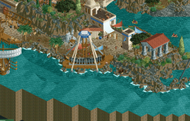
I really enjoyed the village and port; the way it's slotted into the cliffs of the island, the swinging ship (strangely modern for the setting
 ), and the little shipbuilding scene were all lovely.
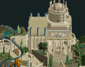
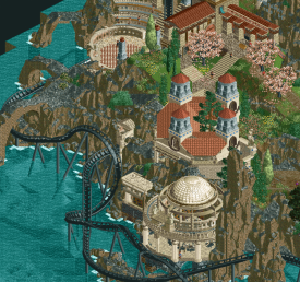
I think this screenshot is an interesting one; the structure was a cool focal point and core in this park feeling like it was designed to test the limits of RCT as it is in its current state. I think the end result is a bit of a hit/miss in places; the diagonals can come off as feeling a little flat, yet you still managed a lot of detail with what can be a fairly restricting building style.
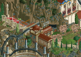
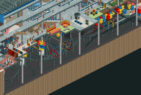
While I appreciate being told where to use cutaway, I was a little confused what I was supposed to find here, and the big bold cutaway sign was quite immersion breaking. I do really like the foliage here, though.
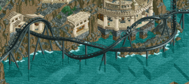
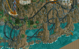
This was hands down my favorite section of the coaster; I love the way it intertwines with the coast and itself. I don't love how the landscaping goes from being so sculpted and detailed above water to blocky and ragged underwater.
Just reiterating on the village scene; I love the rounded balconies here. I really wished there was an easy way to view them from the water side, but it was blocked by the mountain! Regardless, the atmosphere present as well as all the subtle details really brought this park to another level for me.
Tokyo Dome City
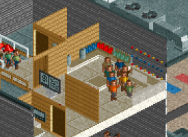
You guys know this is Round 2, right? You know you don’t have to nearly hit the object limit on a 60x60(!!!) park, right? I’m not even sure where to begin. First off, the opening scene with the baseball game is pretty fun and clever - it really sets the mood for the rest of the park. Secondly; talk about some truly awesome custom rides. This definitely feels like Tokyo Dome City in every way. Thunder Dolphin is fantastic, and the park design is a huge highlight here. It’s immediately clear that those involved know the source material and are passionate about it. The layers and attention to detail are astounding; even the damn bathrooms are modeled. This very well may be the first release **truly** constructed with cutaway in mind; not just a building here or there but **everything** has been meticulously considered. It’s not perfect, and it’s almost overwhelming, but that kind of attention to detail is something that I can easily appreciate and enjoy combing through. Everything from the convenience stores to the JR station feels just like Tokyo. The architecture is obviously in focus, and it has a lot of character. The structures are unique and lively without falling into some of the tropes of just being the same old same old cityscape. The street stalls were exceptionally well done and brought back fond memories of spending the New Year in Kyoto a few years back. Another minor thing to note is that I think this park demonstrates how to achieve a convincing and busy appearing cityscape without resorting to a bunch of cars just driving around everywhere.
As I mentioned above, the sheer amount of stuff everywhere can be a bit overwhelming. I’m partial to this kind of parkmaking, and even I was struggling to take everything in here and there. The concept here is certainly much safer than Seven Liberal Arts, but the pure ambition involved is just nuts. It’s a little weird seeing Back Daaaan with it so bright in the building, but the execution of the ride itself is accurate. I think something that kept coming to my mind as I viewed this was the dedication to accuracy being both something I appreciated greatly as well as left me wanting in a few spots; Back Daaan being one, Thunder Dolphin blending into the surroundings a little bit from an isometric perspective being another. Definitely made me consider what I value more and how it contributes to the overall product. After the past matches, it was a little weird seeing so much of the map edge again! I also noticed that this park was another case of the default viewing angle being the most appealing; I love the interiors, but it was definitely harder to read with those big buildings in the foreground. Though, once again - the fact that this park is optimized for cutaway made it a bit easier for me to use that to view the park. I do wonder how necessary all the big buildings with interiors end up being, and what the park might be like without them, but I think in the end it wouldn’t feel like a city without them.
Tl;dr:
+Top notch ride design across the board
+Nailed the feel of Tokyo; tons of personality
+The sheer amount and quality of detail is astounding
=Amazing that it’s been fully optimized for cutaway view
-Definitely feels a little overwhelming and hard to read in spots
-The nature of the park being so optimized for interiors and cutaway made some of the map edge scenes a little awkward
-While most of the interiors were unique and well done, it did make it more noticeable for the few empty interiors
Awesome Back Daaaan, and nice object use to break up the flooring here. Kinda wish there was some way to make it really feel like the exciting, dark experience it is - but that's beyond us for now.
This section of park really evokes feelings of true to life urban parks in Japan. The bright colors, the many layers, and the busy feel to it all. Some of the scenery use was a bit chunky (the representation of the concrete below linear gale), but overall I think this is very nice.
I found the subtle use of 1k netting with the awnings to be quite effective here.
C u r v y - though I did think in this case, while more difficult/time consuming, some objects might have felt a bit cleaner. Not sure though.
Nailed it with the karaoke room.
I hate that I find myself splitting hairs with some of this, but the bar is climbing so rapidly with this H2H, that it's often the tiniest thing that separates these parks. Both are extremely well done with each having fairly minor issues - all the builders should be very proud of their work. -

 Cocoa
Offline
nippon: holy crap this is impressive. the atmosphere of tokyo dome is absolutely spot-on. in particular, the triangular courtyard is so perfect, I feel like i'm back there. the baseball game is of course nuts, especially the neverending celebration spiral. I love all the stalls everywhere and the screen showing the game is a fantastic detail. there's lots of great textures around and just fantastic detailing. the hole in the wall that thunder dolphin passes through is particularly impressive. I love the rooftop halfpipe, that instantly brought back memories of spotting that thing in tokyo IRL and being so confused on what it was doing up there. this is a wonderful piece of realism and another great entry in the recent japan saga of NE parks.
7 liberal arts: from name alone, I feel like this is something I always wanted to work on with one of your members (lol). before I discuss the park, i might quickly vent about the ridiculous rate of object creation these days. on the one hand, I do love it. there's some awesome stuff here, especially that greek sign (geniuses for figuring that out) and the door frame land walls. on the other hand, I feel like I'm increasingly left behind in a game that is more and more 3d modelling. don't get me wrong, I will still happily consume and reuse all the shiny new toys. I just can't help but sigh a little bit as I get left behind in the dust. which is a personal problem, and no fault of this parks.
otherwise, its a great park. I love all the little dioramas everywhere, particularly the pythagoras one, and the recreation of that famous painting. the archy is nice, especially in the entrance area. I don't know if I'm sold on the landscaping, tbh. It almost feels way too busy for me, like the days when people would really spam 1/4 tile land objects. maybe it needs to grow on me, i'm not sure. as a whole composition, i'm not sure the park works as well as I was hoping, and the coaster is a particular sour spot for me. although it does 'flow' a bit better than in acqua, it still feels like a sprawling behemoth and the black-on-black only draws the atmosphere away IMO. especially near the harp and those back cliffs, I'm not feeling it.
anyway, this is another round that absolutely solidifies how fucked this h2h is. jc you people are on a whole nother level. when do you have the time for this shit??? I think I know my vote but I may sleep on it first.
-

 RCTFAN
Offline
I need to come back and write up my thoughts - but I echo Cocoa's comments about the skill level (now required) is insane with the amount of custom scenery and rides... But, that doesn't detract from the parks; it's just a reminder of how advanced this game has become.
I really enjoyed both parks, but my vote has gone to the Tile Inspectors.
-

 chorkiel
Offline
Nippon: Ugly realism has never been my cup of tea, but there was enough to keep me entertained in this park. The baseball match at the start for one. The panic coaster was also fun to find, same as the Taito Station Go Karts. In general, I'd say the strongest part of this park was the use of cutaway. The weakest aspect was how ugly it looked. Early in my viewing I started coloring Thunder Dolphin to see if I'd like that better and I accidentally kept it around on further viewing. You can see care and attention was paid to make this not one grey blob through details. Some big structures have such a grey aura that they kind of invest the park. I'll end with saying that it is an impressive park and even though I'm not the target audience, I appreciate the effort that went into it.
7arts: This park on the other hand falls right into my preferences. It gives you an unfair advantage, I suppose, but the park deservedly competes with Nippons skill level. Other than the obscure references, the park was also full of inventiveness, great rides, and architecture. Not sure I'm a fan of the temple on top of the mountain, but if I read it well on discord that just means I'm old minded. Another thing I read on discord was people not liking the coaster (colors). Personally I liked how the coaster connected everything on the map. Overall I just thought this park was outright fantastic.
My vote goes to Tile Inspectors. Thanks for another great matchup to both teams.
-

 barnNID
Online
The Seven Liberal Arts: As soon as I saw the screen for this park I knew I would be in for a treat. The landscaping is absolutely amazing. The new objects you guys created are definitely meta shifting and just ooze with freshness. Beyond the landscaping, I love the incredible village scene filled with new objects and new ride vehicles to lift everything to a new level.
This scene in particular is my favorite from the village.
then we get into the "main" part of the island with the fantastic harp ride and amazing counter ride. Both are great pieces that really elevate the theme and lay out exactly what you are trying to convey. there is great archy forms and awesome landscaping and foliage throughout. The building on the top of the mountain is executed perfectly with a crazy level of detail. The accent colors work well to highlight what you accomplished architecturally. I feel like I should also point out that the planets and the perspective art were both nice touches.
One negative for me here is some of the archy in this area doesn't quite hold up to the precedent you set yourselves with the building on top of the mountain. I wish there was just a tad more detail on some of the diagonal buildings.
This is probably my favorite shot from this area
Finally we get to the coaster and the ocean area. I'm not big into coaster design, but the layout looks solid to me. the way the coaster dips and dives through the surrounding rockwork is impressive to say the least. I am also a big fan of the little ship wreck details that were included throughout. Now the one part of this part that I am truly not a fan of is the color choices on the coaster. I think going with one of your accent color instead of black would have really helped the atmosphere here and bring everything together for me. Even so, I'm still left insanely impressed by what you have presented with this submission.
This is my favorite part of the coaster
I think that this park would have surely beaten both my teams park and pirates! but unfortunately it is up against what is in my opinion the best park of the contest so far.
Nippon Professional Baseball Championship Weekend: What an opening scene. Seriously an incredible way to present the atmosphere and setting you are going for with this park. While I'm here, I would like to take a moment to appreciate all of the amazing hacks that you guys pulled off here. The impulse with the block break, the panic coaster, the sky flower and of course the baseball match. All amazing work that shouldn't go unnoticed.
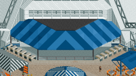
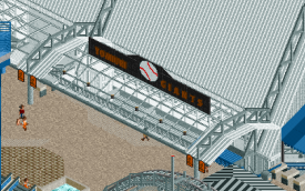
Ill start with the baseball stadium. It is really big and really believable. The new corrugated roof object really does this set piece justice in bringing it together. I love the signage and I also love the running baseball theme throughout the park with call backs such as the big screen showing the game.
I love this sign you guys came up with
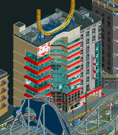
I'm going to move on to the outskirts of the city buildings now. First of all the archy is great throughout this entire park. Amazing color choices and texture choice. The accents are awesome and really bring everything together for me. Again I was impressed with the signage and probably more impressed with the cutaways. I think my favorite park of the cutaways is they seem to serve a purpose. Everything is there for a reason and you have accomplished a lot of movement in them to make them not seem static. I was happy you included that half pipe ride and that it remained closed.
I love the red accents on this building
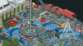
now for the actual park/mall. first of all the mall is great. Tons of movement and very convincing. again the cutaways here serve to really elevate it. Again I'm not one with layout expertise but damn that grey coaster looks awesome. I appreciate the netting included throughout and the planning that must have gone into placing this bad boy. the support work is amazing and not intrusive on anything that all which must have been a pain to pull off. then the supporting rides are just amazing. The flume is great, the impulse is great, the dark ride is probably the best we've ever seen in rct, the swinging ship is fantastic (and thicc), the 2x2's are awesome. The color choices in this park are bold and pay off greatly in elevating the atmosphere for me. I love the crazy curving pattern of the blue pathing, it works really well. one of the only complaints I can think of for this park is the default enterprise looks out of scale compared to all of the amazing custom rides you includes here. I am a big fan of the foliage used throughout the park, with the flowers really highlighting the pathing. and speaking of the pathing, the shapes you have managed to accomplish are bonkers.
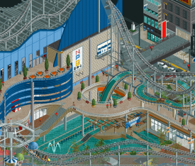
One of my favorite scenes from the park. amazing interaction between the flume and the pathing.
Conclusion: both of these parks are amazing examples of rct at its finest. It is honestly a shame that one of these parks has to lose this match. The amount of detail and cool interaction in baseball park just narrowly beats out the incredible innovation in the seven liberal arts for me. Great job to both teams, both parks were a pleasure to view.
-

 Hepta
Offline
It's being talked about how quickly this game is advancing, and I'll echo that sentiment. Like many of us here, this was my favorite game as a kid (I still remember buying CF and LL at the store when they came out, before RCT2), and I feel so glad to have later found this community and watched it remain steadily alive all these years, only to reach now and rocket-ship with all these new tools being developed for the game.
But this H2H, honestly, is really touching me in a deep place. The level of passion and creativity that is being put into all these parks is just insane and it's made me feel like a kid looking at an NE Spotlight for the first time. The excitement keeps building with every match and this one delivered in every way. I keep saying it, but thank you to all the builders.
For me, since I haven't played the game in 7 years, a big part of watching this H2H is also discovering these features of OpenRCT, like the cutaway view which I literally just discovered how to use while trying to view this match (so I apologize for missing any cutaways on previous parks, as I had been trying to delete roof/wall objects to see them before, haha)
Tokyo Dome City: Sports stadiums making a comeback in RCT...?! The intro was great, love the clever hacking for the homerun and celebrations. The first thing I did after that was zoom out to take in the macro, and wow. The combination of city highrises, modern architecture, and Japanese street stalls with Thunder Dolphin in the center was all very convincing. Love to see new custom rides, and it was really just an awesome city scene to take in. Once I was finished exploring around the exteriors of the park, I switched on the cutaway view and it was like discovering a whole new world. I could go into listing all the details but they were all Awesome (Store).
It really blew my mind how much of difference it made in viewing this park when all of the busyness is removed from around what you are directly looking at, and I found myself using the cutaway to look at most of the park. I think this style of building definitely feels somewhat overwhelming without it. But since the park is designed from the ground up with this feature in mind, it has an amazing effect where you really feel like you're in the park as you are exploring each layer and seeing how the peeps move.
Thoroughly enjoyed viewing this park, extremely well done, Logan's Run!
Seven Liberal Arts: Opening this park, the first thing I took in was the macro which is just beautiful. I definitely have a huge respect for fantasy parks and this park is so cleanly done. I really like the way the buildings and Seven Arts are integrated into the landscape, jutting out of the rocks and cliff sides, it generates an excellent atmosphere. The creativity with the Seven Arts were also great, it showed a lot of thought had been put into the theme. The village area was some classic RCT goodness and I really enjoy these cute areas when they are as well done as this was. Loved the diagonal pirate ship and the custom model was really top notch (funny we had two custom swinging ships this round).
Although I really loved parts of The Doubt and I appreciate the attempt to break away from pure realistic coaster design, I thought parts of this ride's layout were a miss. I didn't quite like the first drop near the harp. It seemed like the coaster was built on top after the harp was, and the placement of that element threw me off. Then the layout went into a very standard sort of B&M element pattern which was sort of just meh to me. But then it returns and flows through the cliffs, interacting nicely with the surroundings, so I liked the ending as well.
The other part of the park which felt a bit rushed/lacking is the final touches of landscaping and the underwater details. The custom rock objects were excellent but I just thought they needed a little bit more to break them up here and there, possibly with foliage or just with different terrain features. Parts of the landscape just feel a bit too barren, and the lack of underwater detail contributed to this somewhat.
Wow, this is the longest RCT review I have typed in years. But that's testament to the level of quality in both of these parks, and also to the strength of this community. As far as voting, both parks had excellent but very different concepts that require different skills to execute. Tokyo is an immaculate recreation with immense attention to detail. Seven Arts is an incredibly creative and beautiful fantasy park with a unique theme. Although there is a temptation to vote for the daring and creative fantasy park over the recreation, I feel I can only vote based on how well each team executed their concept, and in that case I think Logan's Run succeeded in this match.
-

 Jens J.
Offline
Wow, another sick match-up! I'm going to keep my reviews short but sweet:
The Seven Liberal Arts: First of all, those rocks... gorgeous. I'm also really loving the way you guys did the harp and abacus! Lots of cute viewpoints throughout the park as well. I would've prefered a colour other than black for the coaster and I'm not sure if I like the arch of the temple on top of the mountain. Nevertheless, stunning park here! Will definitely come back to this park whenever I need some inspiration for good-looking Greek buildings.
Nippon Professional Baseball Championship Weekend: That baseball game though, super impressive! At first, I thought this park was a bit too overwhelming with the amount of stuff going on (my PC almost took off by the sounds I was hearing haha), but after a while I started to really love all the details going on. Loving all the building shapes and the pathing. The log flume cars probably take the final turn after the big drop a bit too fast, but that's the only big negative point I could think off. Overall, another awesome park!
After a lot of back and forth between the two parks, I eventually decided to give my vote to Logan's Run. Both parks raised the bar of H2H parks this season once again with their innovation, but in my opinion, Logan's Run executed their idea just a tad bit better.
-

 SensualEthiopianPolice
Offline
Yea, though I walk through the valley of the shadow of death, I will fear no evil: for thou art with me; thy rod and thy staff they comfort me. And by rod and staff, I mean baseball bats cuz it's baseball time, babee! Never before have I seen a park open on such an interesting and well-executed set piece like that: the home run, the fielding team returning to the dugout, the hitter running the bases and the rest of the Giants coming out to celebrate on the mound. Every bit of that was so charming, fun, and clever. I often talk about important it is for H2H parks to leave "good first impressions" but I never imagined that first impression being *this* good. I only hope that this charm isn't lost on people who don't know baseball too well...
But that's just one small part of a park, but Nipple Baseball Home Run Action Team Go! really maintains a strong sense of charm and fun throughout with it's really good attention to detail. Every building against the park edge has a modeled interior, some of which add even more great Easter eggs to the park. Even the metro station, which is mostly only visible via cutaway, used some clever techniques to make very good-looking vending machines and custom subway maps. Even turning a screenshot of the park into a giant projection of the baseball game was such a nice touch that really made me happy to look at it. I can confidently say: this is my favorite park of the competition so far.
On the other hand, we have the also utterly fantastic The Seven Liberal Arts. I would say it is genuinely a shame that I opened Baseball first because that made it so much harder for me to appreciate Liberal Arts, which is completely unfair to the park; it's a genuinely great park! I never in a million years, would have thought to building a harp-playing rollercoaster but here we are. The use of custom assets to really ramp-up the quality of rockwork is stunning and really pays dividends here. As for The Doubt though, I really like 2/3rds of it. When it is snaking around the island, I think it's great, and that pre-lift around the penis tower is *chef's kiss*, but the parts where it goes out over the water just feel like a plain ol' black B&M that doesn't fit as well with the rest of the park. But to be clear, that complaint is mostly a stretch, the park is phenomenal.
My vote is going to go to Major League starring Charlie Sheen. I really was just thoroughly charmed to hell and back by this park. Every new detail I found made me feel more excited to keep looking at it and find new ones. But still, Tile Inspectors really made Logan's Run have to work to win this one, so congrats to both teams! -

 RobDedede
Offline
Where should I place the .parkobj files in order to open these parks?
In your OpenRCT object folder
-

 wheres_walto
Offline
One gripe I have with this H2H is that most of the conversation is happening on Discord. It's amazing how active things are (I woke up this morning and had 9 hours of messages to read through, this is my third H2H and I think we've sent more messages as a group this time than the previous two combined), but I wish we had a way to log and summarize the contemporary thoughts on these new parks because this thread is barren by comparison. It would be nice to be able to go back and read the debates that are happening right now because the lack of comments here creates the false impression that these parks aren't receiving attention and sparking debate.
Anyways, it seems that the discussion of our park is largely centered around object creation and building philosophy and that the park itself is a bit of an afterthought. Before release we were concerned that the park would be reduced to a demo of innovation, and we feared that this would hurt us in the vote. From my perspective, I stopped playing in 2015 and didn't really pick up RCT again at any point in the past five years. I had to learn about OpenRCT, tile inspector, scenery manager, DKMP migration, multiplayer servers, H2H8, GT, Discord, cut-away view, hundreds of new objects, so new shit is kind of the norm for me right now.
To paraphrase Steve: they're objects, get over it losers. I don't like to talk much about our parks while the vote is open, but I do hope that the park itself is being considered for more than just the new features.
Logan's Run, you guys did an incredible job. These were Mrs. Walto's reactions to your park:
"*gasp* what???"
"Get him out! Oh it's a home run, omg they're celebrating, they're doing a victory huddle! That's adorable"
"*zooms out* ...yea you guys might lose"
"I love this baseball stadium, it looks like the Cincinnati Bengals, the animation was delightful"
"This is Japan isn't it? omfg I'm an expert on Japan I've played through Persona 5 so I know about Shibuya"
"This is really good, oh wow. It feels so alive, oh look the little subway tracks"
"Was that a custom sound effect?"
"The care they put into this is evident, the detail for the interiors is really nice"
"An underground carnival? This to me feels like what rct should be"
"Oh cool they're watching on the tv"
"Oh the outside of the dome, okayyyy"
"Little team name, little Giants, why is this so cute? I'm so sorry"
I think her thoughts do well to summarize my own: your park is just plain fun. The opening animation was awesome, playful, silly, and really effective. The colors are vibrant, the theme is lighthearted, it helps that everyone who has been there in real life confirms that this is a faithful depiction. The quality dips in some areas, particularly the map edge buildings, some interiors were nice details but most didn't blow me away. The large diagonal street section is a bit hard to read at certain angles, but ultimately this is an extremely impressive living world, made with extreme care, interesting layers, tons of details, and a fun atmosphere. I think it can't be understated the importance of building an enjoyable viewing experience, and I loved viewing your park, nicely done to all involved
-
 Coasterbill
Offline
"Live thoughts as I view both parks...
Logans Run:
- Holy f*ck this baseball game! The other park is already screwed and I haven't even opened it yet. All player motions aree basically accurate to what would really happen, the celebration and the other team walking off.... jesus
- Thunder Dolphin is awesome. Really nice support work here
- The park is very nice. I love the Knott's-style parachute drop / observation tower.
- Very cool that the swinging shop actually moves.
- Horrific traffic is cute
- Giants cam is great, really good idea using a maze to make people jump
- Really nize mall
- Love the Japanese vending machines
- Panic coaster is really cute
- Oh wow, and an underground subway station with moving trains and complete gift shops because of course there is
- I actually hate you all for being so good at the game
... alright, I don't see how they can top that but on to the next park.
- Okay... tile inspectors showed up today
- I see we have a swinging ship dick waving contest on our hands. This one is cleaner, though I still think you all should just use the game default since it's fine. lol
- Greek lettering object has me shook
- The architecture and awesome little canopies are really cute. I love this aestetic. I love the walls out of the Roman Ballustrades. Oh... Tolsimir... that checks out
- Love the shipbuilders
- I really can't stress enough how much I love the way these markets and architecture works so well
- Worship Hades gave me a laugh
- Gorgeous bridges
- Incredible cliffs
- I see what you're going for with the harp but I don't know if I'm feeling it.
- I'm not feeling the coaster in general. I deleted it and I actually think it makes the map look better. I understand the pressure to add a coaster but I don't know... this one just doesn't seem like it needs to be here.
- Astronomia is insanely cool.
- Master the numbers is also insanely cool
Overall I loved both parks but Logans Run made my jaw drop. This is a clear choice for me, but the the Tile Inspectors park has some of the best cliff work and most incredible markets I've ever seen. Both are incredible and I'm sorry that either park has to lose. -

 dr dirt
Offline
I had a hard time voting against someone on this matchup. Both parks were very strong, and felt like they would be lasting influences on the game. In the end, I had to go with a park that I felt hit pretty much everything and struck a balance of impressive and showed an eye for subtlety.
Nippon Professional Baseball Championship Weekend at Tokyo Dome City - Take it easy on the name. Interestingly, here's another 'event' park which those always have a hump for me to get over; I naturally think, am I finished after witnessing the event? In this one, no, the baseball championship is secondary. It provided an extra element here just to get you started into the setting of the park.
Probably has the best coaster of the contest with Thunder Dolphin, and probably the coolest ride selection thus far, and it'll be hard to beat. The baseball game is crazy. The stadium itself is so believable and has a great use of bold shaping. The layers and interiors, and infrastructure is crazy to pull of in what - 1.5 months? The roof Thunder Dolphin runs over is a winner, as is the blue wall there. Architecture is top notch.
Didn't find any outright drawbacks! There's some decisions made in how to lay out the map I would've done differently, but the way it was chosen has its merits, especially for the opening scene. A stadium in the center would've been the direction I'd take, not necessarily better or anything. The paths between the different levels could use maybe a little more clear delineation, either in path color or railings or strategic foliage or whatever. I'm generally anti-cutoff buildings, but that's just a personal taste and nothing I would judge a park poorly on.
Insane work, overall, something like this is tough to beat in H2H.
The Seven Liberal Arts - This park would find success against any other park, and I don't think the voting is going to be reflective of this. In short, the pushing boundaries is something that I appreciate, to choose a side on this dialogue. I think this park did that, and did it well, but just short of some of the potential these innovations offer. But this is to be expected when its brand new and still feeling out how to utilize some of these things.
The coaster was mostly amazing but the lift/drop was a miss I think - it's odd and daring and generally is lacking in framing these elements I think, which is necessary for something like that first drop. After that, it's excellent, I'm hesitant to put a coaster over the water like that, but if a layout works, it works. The little areas are well thought out, my favorites were geometry, the astronomy tower arches, and grammatike. Use of domes and circles and such was so superb.
The rocks I enjoyed. It's an interesting way to tackle and replaces LOTR rocks in a fantastic way. It's approachable. If players want to use LOTR rocks in the future, I'd advise to just use these. I don't think, however, they were used quite to their potential in this park. The seaside village and landscaping with that was excellent. But then the temple is on a big straight cylinder of a mountain with a flat top, just sort of unnatural when compared to what you did everywhere else. So I love the big elements - the harp and the abacus, I'm not sure about on this map, though. Those two are so different than everything else, it's like a perfectly believable island of the arts that would exist in a fictionalized ancient Earth, and then the harp is a giant fantasy set piece. It's awesome, but I was unsure on the fit. The abacus is a little more fitting, but could've afforded to be set into a cliffside to lower its profile a bit.
As an aside - I loved this texturally. Fantastic. Still, this is probably in the top 3 or 4 parks thus far for me. It did get a hell of a rough competitor here.
-

 AJ-
Offline
~The Seven Liberal Arts~Woo! I think this is my favorite idea for a park and it's done pretty well.This market scene at the bottom is absolutely gorgeous. I think this density of buildings, composition, and textures is so pretty! The swinging ship is done perfectly imo. The little boats are all adorable, the little fat one is my favorite. The small booth vehicle is done so well too. The harp is such a cool idea too! The rockwork and foliage in the middle of the park is also super mega pretty. The arches that the coaster goes through are sick.
 -

 hoobaroo
Offline
The thing that makes me happy about this matchup is that although both are so different, the love and attention to detail for each park's subject matter is so visible from all the builders involved. This ethereally beautiful Greek island, with the peaceful feeling of progress in a formational society in the process of making discoveries that will change mankind forever. The robust, eventful scene of Tokyo, so full of movement and energy. This might be my favorite matchup so far, just because you can feel the insane amount of sensitivity and care put into both parks. I haven't cast my vote yet, but both teams should be really proud. These are both wonderful monuments to their very different subjects.
-

 Lurker
Offline
Nippon Professional Baseball:
What an opening scene! Very impressed by the technical skill that went into this, so many moving parts to complete the scene. And beyond that there was so much exploration and small details, especially the excellent use of cutaway view.
I appreciate when buildings have interiors, and nearly every one here did, with fantastic attention to detail at that.
The rides themselves are excellent, doing a great job capturing the feel of a densely packed, urban park.
Seven Liberal Arts:
This park also stunned me on opening, in this case it was the beautiful landscaping and the fantastic layout/ composition.
The architecture was fantastic throughout, my favorite part was the town on the island in front, it's a peaceful, beautiful and well executed area. The main building was a bit hard to read, but did pull off a lot of detail in the difficult to build diagonals.
I loved how the coaster fit into the island, although the train running on an invisible chainlift on the banking at the start and the launch fairly close to the final brake run weren't my favorite parts, but I like the ride overall. The rideable abacus and harp were also cool. -

 Magnus
Offline
If the trend of screenshot vs. actual park continues the voting will be quite easy for me in the next rounds, even without opening parks in game (I know this would be against the rules and I will for sure not do so.)
From the screenshots I was sure my vote goes to the TIs. After reviewing both parks in-game in detail my opinion changed quickly.
The Tokyo Dome park is amazing and I have no idea of how some of the structures were pulled off. It feels like a complete new game to me and the level of quality is blowing me away.
The story behind the seven liberal arts is a very clever idea and it appears to be a perfect concept for H2H. Some of the architecture is truly amazing and created a dense atmosphere, but the park did not come together for me as a whole and feels somewhat forced or built under a lot of pressure.
Don't get me wrong, it is a great park but I feel the concept would have allowed for much more.
 Tags
Tags
- No Tags
