H2H9 / H2H9: Round Robin - R2M1 - Manual Laborers vs Adventurers Club
-
 09-May 21
-

 G Force
Offline
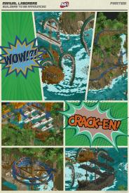
I really want to love Pirates, whats there is fantastic, but its a little light on content and doesn't really have the momentum behind it to really be great. Perhaps if there was one more big coaster or something? Idk, just felt like there was something missing from it. Will have to settle with just really liking it.
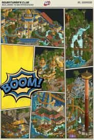
El Dorado was technically fantastic, reminded me a bit of Lotte World from H2H7, really hard to find any complaints. Great coasters and theming, wonderful custom rides, great micro (fake peeped benches were a nice touch). Some of the archy felt a bit weak I guess, mostly the hotel and flume station, but thats a nitpick if anything. Ultimately a classic H2H type park, but I still sorta wish it brought a bit more to the table to make it stand out.
Tough choice for me, gonna have to sit on it a little longer I think.
-

 AJ-
Offline
Pirates!My vote went to this park! I think the entire package of this park is so artful and stunning. I love the colors, shapes and arrangement. This just has more of what I like personally- It looks more like an art piece and thats my style I guess lol.I love the Kraken and messed up boats.This is my fav foliage and rockwork of h2h so far.The forts are so fun to explore.The zipline mine carts were great.GHOST boats!!!El DoradoI really like this park! The idea is super fun and the execution is good. The whole park is super pretty and kinda glittery too!The archy around Yaguara is some of the best ive seen.The log flume is done so well.The little iguanas are the cutest!Great pallet.Once again congrats to both teams on the fantastic products!
 -

 Psi
Offline
Hard to say. The custom drop tower in El Dorado was too fun to watch, as was the log flume, but the boat ride + whirlpool in Pirates was super clever. Gotta wait on this one, all of these matchups have been so close
-

 Lurker
Offline
Pirates!:
The ship battle is a cool centerpiece with a lot of great effects, and the ships are well done.
Gangplank has some great interaction and moments as it winds around the cliffs and buildings.Overall the park has a great remote, rugged feel with the jagged rocky cliffs, makeshift buildings and dense tropical foliage.
El Dorado:
This park is just so packed with details, and yet it was still decently easy to read, and with a very pleasant color selection.
The buildings were very well executed technically and the shaping, texures and layouts of the paths stood out to me as especially well done.
The cut-out on the side of the map had interesting scenes (Especially the gold track conveyor) and add a lot to the map. -
 Mr.Brightside711
Offline
City of Gold: this park is very pretty. Lots of stuff to look at and it kept my attention pretty well. The cutaway sections are good but nothing too crazy. The log flume was so big I wish it had cutaway. I actually liked the cutaways on the sides of the map much better. One of my favorite things on the map is the log flume splash down, but I wish it wasn't diagonal so there was a better viewing angle. My biggest issue with the park is that there are so many rides and all of them are kinda meh. The best ride might be the drop tower. weird to have it right by the diver though. On the bright side the rides pretty much all have something really cool about them like the top of the dive coaster or the mine train lift. On the darkside the layouts are all IMO weak and not my thing. Besides the rides I think the park is pretty strong overall. The waterfall corner is sooo good. y'all did a good job!
City of Pirates and Gold: this park really has a bunch of wow factors. The kraken scene, the cliffs, the other ship, Davy Jones locker. The park is really pretty. These are probably the best ships ever. I also like (or tried to at least) the little village sections on the sides of the maps. But there is a huge issue with it all being the same color and it makes reading those areas super difficult and loses alot of the skill that was probably used building all that. The voyage ride is really really cool. Love the whirlpool and Davy Jones part but confused on how it ends in the gold room. Lol. Gangplank on the other hand is ... Well it's about as good as any of the coasters on El Dorado. I don't like it. And the color choice just doesn't make sense to me. Thats probably the biggest flaw imo. I do like this park alot but it leaves me wanting more details to keep my attention.
In the end this was another hard choice but I think the kraken scene in Pirates will stay in my memory more than anything in El Dorado so my vote goes to plank gang. -

 Steve
Offline
All right my dudes, the first swig of coffee has just hit and I am ready to drop the hottest of Steve Reviews (still trademark pending, goddamnit). It wasn't a sip of Dunkin' iced though, had to settle for a home brew today. Will this unfortunate mistake impact the humor of this review? It's likely. Am I hedging to argue my relevancy later on in the Discord with probably RWE? Yeah, probably. Anyway.
First up for this not-so-heated match is El Dorado, the park Liam did in Round 1 a couple season ago but, shinier I guess? I'll refrain from the Chel jokes since apparently I was a weird little kid that no one else can relate to, whatever. I didn't want my lunch money anyways. I mean, what. Anyway, neat park despite whatever confusion it instills upon me. Is this a real park? A fake park? A fake park that's meant to look like a real park? Scoop tells me it's a park the locals built for themselves... then why the hotel? Do they not have homes of their own? El Dorado can't be that big to merit such a day trip to warrant a hotel stay. Mucho confuso. I guess the hotel is nice, anyway. Maybe Chel is doing turn down service (fuck, I said I wouldn't do it, I'm sorry!). I supposed I should end with a positive moment and say that the log flume is straight ballin' so whoever did it looked at Chiapas and said "I'm going to punch this ride in the face" with zero remorse and honestly I am here for it.
I'll start talking about Pirates! with this: whoever had the idea of the Kraken with the vortex and the broken ships and the adventure boat ride getting sucked in only to wind up in the cavern with the ghost ship is a fucking genius. Epic set piece and something that defines H2H. Who gives a fuck if El Dorado had more "content." THIS is content, and ultimately contest-defining content. Teams will look at their parks the rest of the season and say "OK we have to include something incredibly eye catching and epic that's also contributing to the park idea and integrate it into the story or idea." Masterful, and there's nothing like it on the El Dorado map. These guys on the Laborers coulda did nothing else and it would still be better than a couple pyramids with lots of trees and gold and a few coasters. I don't care, fight me. Outside of that, landscaping can take a hike I guess. Otherwise, the slapshod structures, all the little detail strung about. What's not to like about this? I'm probably in the minority I guess (well, clearly) but this is something I love similar to what we wanted for The Good Death: the wow moments that don't beg for your attention or slap you in the face but the moments that are relaxed and quiet. I'll never understand why the meta for H2H has become "we need to have a thousand things on the map and whack you over the head with it and also spoon feed you the story." I'm not saying El Dorado did all of that, but when are we going to start appreciating the parks that don't do any of it? It's exhausting.
Anyway, I guess that was kind of a nice review for Pirates! fuck nin, I guess? I don't know, I need more coffee. Anyone want anything from Dunkin'?
-

 SensualEthiopianPolice
Offline
All right my dudes, the first swig of coffee has just hit and I am ready to drop the hottest of Steve Reviews (still trademark pending, goddamnit). It wasn't a sip of Dunkin' iced though, had to settle for a home brew today. Will this unfortunate mistake impact the humor of this review? It's likely. Am I hedging to argue my relevancy later on in the Discord with probably RWE? Yeah, probably. Anyway.
First up for this not-so-heated match is El Dorado, the park Liam did in Round 1 a couple season ago but, shinier I guess? I'll refrain from the Chel jokes since apparently I was a weird little kid that no one else can relate to, whatever. I didn't want my lunch money anyways. I mean, what. Anyway, neat park despite whatever confusion it instills upon me. Is this a real park? A fake park? A fake park that's meant to look like a real park? Scoop tells me it's a park the locals built for themselves... then why the hotel? Do they not have homes of their own? El Dorado can't be that big to merit such a day trip to warrant a hotel stay. Mucho confuso. I guess the hotel is nice, anyway. Maybe Chel is doing turn down service (fuck, I said I wouldn't do it, I'm sorry!). I supposed I should end with a positive moment and say that the log flume is straight ballin' so whoever did it looked at Chiapas and said "I'm going to punch this ride in the face" with zero remorse and honestly I am here for it.
I'll start talking about Pirates! with this: whoever had the idea of the Kraken with the vortex and the broken ships and the adventure boat ride getting sucked in only to wind up in the cavern with the ghost ship is a fucking genius. Epic set piece and something that defines H2H. Who gives a fuck if El Dorado had more "content." THIS is content, and ultimately contest-defining content. Teams will look at their parks the rest of the season and say "OK we have to include something incredibly eye catching and epic that's also contributing to the park idea and integrate it into the story or idea." Masterful, and there's nothing like it on the El Dorado map. These guys on the Laborers coulda did nothing else and it would still be better than a couple pyramids with lots of trees and gold and a few coasters. I don't care, fight me. Outside of that, landscaping can take a hike I guess. Otherwise, the slapshod structures, all the little detail strung about. What's not to like about this? I'm probably in the minority I guess (well, clearly) but this is something I love similar to what we wanted for The Good Death: the wow moments that don't beg for your attention or slap you in the face but the moments that are relaxed and quiet. I'll never understand why the meta for H2H has become "we need to have a thousand things on the map and whack you over the head with it and also spoon feed you the story." I'm not saying El Dorado did all of that, but when are we going to start appreciating the parks that don't do any of it? It's exhausting.
Anyway, I guess that was kind of a nice review for Pirates! fuck nin, I guess? I don't know, I need more coffee. Anyone want anything from Dunkin'?
Can you get me a vanilla chai latte and a strawberry frosted with sprinkles -

 FK+Coastermind
Offline
I've been so busy in real life that I haven't gotten a lot of time for reviews, but I gotta give a shout to this match up. Both incredible parks, both very well crafted, love seeing two similar concepts up against each other.
Personally, Pirates is a clear winner for me. It felt like a different game, with a focus on textures and landscaping in a style that is very unique. The kraken vignette alone is match-winning to me, but added with the other elements and vignettes, the amazing mix of landscaping and built form, I'm excited to see who built this because I thought it was spectacular. In the past year, we've seen a lot of rct creations pushing the boundaries of what rct can look and feel like, and I see this as another example.
El Dorado is also amazing, filled to the brim with great concepts done really well. You found a ton of ways to mix-up the style while still clearly keeping everything cohesive. Particularly the entrance was a stunner, and I'm a sucker for the gradients along the side of the map and all the detailed cutaways. There were really two things that swayed me toward the other park. First, the macro, while well composed, felt incredible cramped. There was so much that at times it was hard to tell what was going on. For example, the diver was the only coaster I could follow without having to turn scenery off. But to be fair, part of this criticism is that I think Pirates managed to use space better and feel massive, which made a harsh comparison for me personally. Second, while this park managed to execute and explore the El Dorado theme incredibly well, there weren't as many moments that felt like new, awe inspiring concepts. Both of these parks had themes that have been done a lot, which places more emphasis on doing it new IMO, and I felt Pirates managed to better expand the horizon of it's theme than El Dorado.
Congrats to both on an incredible matchup. Regardless of how I voted, excited to see who built what cause these are two more incredible parks in what has proven an incredible H2H thus far. Cheers!
-

 alex
Offline
pirates!
The sparse composition is quite daring and In general I’m really enjoying it. Even though its just one cove it gives it the spread out feeling of a pirates sea map or something.
I loved the repurposed-boat style architecture with all the mast structures and rooves made from upside-down boat hulls.
In some ways the landscaping is really well done - I think the mix of objects works well and it was a smart decision to make a transition piece for the volcano and land textures. And I like how vertical it is - often we see cliffs where slopes are used to break up the repetitiveness of the vertical wall, but I love how you went the opposite way and used overhangs. The overall forms are really striking. In other ways though the landscaping was very messy, it glitched like hell, and I also think you should have given more consideration to the outer edge of the map - because this can be quite distracting and ruin the overall picture.
The coaster is a highlight of the map for me, love how unconventional it is in the way it snakes along the cliff edge - so much fun to watch - that hairpin turn especially.
And obviously there is a kraken too which is crazy good.El Dorado
I found this to be a really fresh take on the El Dorado theme, or perhaps more accurately it’s the first fully fleshed out El Dorado we’ve seen in RCT, in the sense that you’ve gone beyond just painting pyramids gold to thinking about what infrastructure is at work (the slowed down animation of the gold stream is a wonderful touch btw!).
Whilst this map feels like quite a contrast to pirates! in terms of density, It would be foolish to judge this matchup as a ‘macro vs micro’ contest - because there is excellent macro sense displayed here - Yes this park had a much busier feeling, but I found it to be well composed so that it didn’t feel overwhelming. It’s actually impressive how you fit so many rides in yet it’s not crowded or poorly arranged.
I also loved that the coasters are a uniform colour, of course it made narrative sense, but it’s also a bold aesthetic move. Each had really nice interactions, especially the log flume - very well integrated with the structures, path, landscape and water features.
If I were to nitpick here though, I think you could have benefitted from creating some sense of hierarchy whereby one of the rides was a main focal point. It’s not really a problem that each coaster is of equal prominence, but on a smaller map like we have in H2H I do think it helps give a more clear narrative package if there is one set-piece ride.
I agree with some of the critiques of the hotel feeling misplaced (mostly architecturally) - however I disagree with comments saying the park has an identity crisis - this fuzzy line between realistic park infrastructure and fantasy world building has always been something people are willing to suspend their disbelief over in H2H, infact its practically the H2H meta, so I don’t see why anyone would find it so puzzling now.
In terms of architecture, the pyramids are nice but the smaller scale architecture is what wowed me the most actually. Loved the use of curves and the trim layering, and how cohesive everything was. The standout structures for me were actually the little cliffside huts next to the (also beautiful) waterfall by the entrance - so atmospheric! Worth also mentioning that the landscaping was fantastic throughout.
Both excellent parks but in the end I did enjoy El Dorado a little more. -

 trav
Offline
A lot of previous comments here hit the nail on the head. It feels like Pirates! was higher quality as an overall package, but had less content. For me, the entire 'right' hand side of the map was dead content. The mine train was kinda cool, but was significantly less impressive than the water ride. The architecture over this side was also a bit of a mess. The left hand side of the map was much better and composed really well. The temple is great, even if it does look like a CSO version of Storybook Glen. I agree that the Kraken scene is by far the best thing on the map, and the ships are possibly the best ships we've ever seen in Rct.
El Dorado was very much a H2H park, crammed full with content that may be less impressive, but I spent longer looking through simply because of that. The log flume and the Aquatrax were both fantastic with their surroundings, seriously top level stuff. The waterfall near the entrance was also incredible. The rest of the map was great, but there definitely were a few sections where the quality dropped off significantly for me. The biggest culprits for me were the hotel which just had a boring exterior, and then the building in the bottom-middle screen of BSG's collage above, which didn't fit in with the rest of the park and stuck out like a sore thumb.
Overall, my vote went to El Dorado. I think H2H is and always will be a competition where ideas and content does better than execution. Not to say that Pirates! didn't have content, but I don't think many parks would be able to fit in as much as El Dorado does.
-

 Jene
Offline
So the level of quality definitely hasn’t dropped on the start of round 2. Again two amazing parks with unique concepts. When I opened these parks I really couldn’t pick which one I liked most.
Pirates has this super strong opening scene and oozes POTC goodness. I love the Kraken, the ghost ship and the zip-line carts. I think I’ll be checking out these mountains and foliage again and again for inspo, because they are so great. On a critical note, some of the wooden archy was kinda hard to read due to it all having the same brown colour.
El Dorado just screams Phantasialand on cocaine to me. Chiapas eat your heart out. I love all the yellow, blue and soft red colorcombo’s. There’s a ton of content on this map and it’s all sky high quality. On a critical note; writing ‘cum away’ on a hotel just isn’t classy to me. We all know why we go there, let’s not spell it out. On a serious note: the cut-away details are amazing.
So after thinking about this for two days, I’ve come to this conclusion: El Dorado would be a higher scoring park for me content/quality wise (if I would be in the panel), but Pirates is the park that made a bigger impact on me. So I’m going with Pirates.
-

 In:Cities
Offline
On a critical note; writing ‘cum away’ on a hotel just isn’t classy to me. We all know why we go there, let’s not spell it out.
LOL
maybe the letters could have been defined a bit clearer haha
-

 Jappy
Offline
El Dorado
Love the idea and the PHL influences behind ome of the rides. It has some fantastic angles and park making. The hotel doesn't really fit that well though imo.
Pirates
The Kraken and maelstrom are fucking fantastic. The foliage is great and the mine train is beautiful. Love the macro and sightlines in here.
Tough round!
-
 Maverix
Offline
El Dorado had an Aqua Traxxx, Pirates! didn't, so clearly El Dorado is the winner.
Two very different, and yet similar parks here. Pirates! rocking the Macro, Dorado rocking the Micro. So I think for me a lot of it ended up coming down to who did the thing the other park was good at better in there own park, which for me, was El Dorado. Pirates! didn't lack depth by any means, but El Dorado felt like it had more, and then the overall park looked good on top of that. Again, sucks that one has to lose, but the real winner is the friends we made along the way.
-

 battle boy
Offline
Hey everyone! I watched the competition scripts and:
I like "El Dorado" more. In my opinion, it is made more carefully.
Needless to say, I like his style because it is more structured.
The attractions are well-designed. The style and theme do not "flow out" from the screen.
It seems that sometimes "exaggeration" leads to loss. Here the players managed to "avoid" it. Overall -mega - extensive architecture - the river of gold and the "Templo de Teocuitla" convinced me to give a point.
"Pirates!" - it's a different style. There is a disorder in it. The pavements in part of the jungle seem too "crumbling". Of course, there is a spark to this scenario. A great idea for a "beast" in water. The ride "The voyage ..." is fun and generally a zone. The grotto and the blue and yellow lost city are cool too. Still, something deters me from this island ...
Or maybe it should be like that? -

 Recurious
Offline
Again two really fantastic parks, some ramblings on each:
Pirates!
+ The tentacles. So creatively done and super cool! I also love how the boat ride goes into the vortex in the middle.
+ The ships, they are epic!
+ The archy around the mine train coaster, just fantastic. I just wish there had been a bit more archy!
+ The zipline cart transport
+ The landscaping
+ The little bridges made out of mine train track.
+ I am usually not a fan of having these bird CTR's in the park, but I feel like in this park it works well.
+/- The golden city bit was cool, but I did not care too much about it. The area fell a little bit flat compared to the rest of the park for me.
- While the landscaping is cool, I feel like the map is a little repetitive
- The park really feels like multiple seperate areas with no clear pathways in between, in fact there are only a few places where you can really see the peeps moving around. I would have prefered if there were some more clear pathways and if the seperate areas of the park were more clearly connected.
- The name. I mean this is the most uninspired name I have ever heard...
El Dorado
+ Love the temple de teocuitla ride. The layout is cool, the small trains are cool, the elevator lift is super cool and the golden river is dope.
+ Yaguara, this coaster is super cool and the station building archy is lovely.
+ The log flume is fantastic. I love the diagonal drop and the archy around it is just fantastic.
+ The little cut away scenes are great. My favourite is the one with the Scruge Mc'Duck money dive, such a fun idea!
+ The falcon fury type drop tower is seriously impressive.
I don't really have anything negative to say, there are some minor nitpicks but overall everything is great. This park held my attention for very long and I had so much fun exploring every little detail. Well done to whoever made this.
Because of that, I am voting for El Dorado. However, I also thought Pirates was very good so the people who build that can also be proud of their work (except for the name).
-

 posix
Offline
Match Conclusion

The poll is now closed.
Adventurer's Club have won this match with a score of 51–30 .
Creators
Manual Laborers"Pirates!"
nin
MK98
Jens J.
Adventurer's Club"El Dorado"
Scoop
barnNID
SensualEthiopianPolice (F)
Louis!
 Tags
Tags
- No Tags
