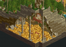
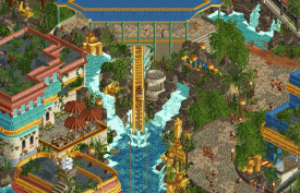
H2H9 / H2H9: Round Robin - R2M1 - Manual Laborers vs Adventurers Club
-
 09-May 21
-

 Liampie
Offline

Round Robin

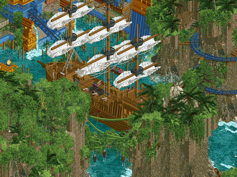
 Pirates
VS

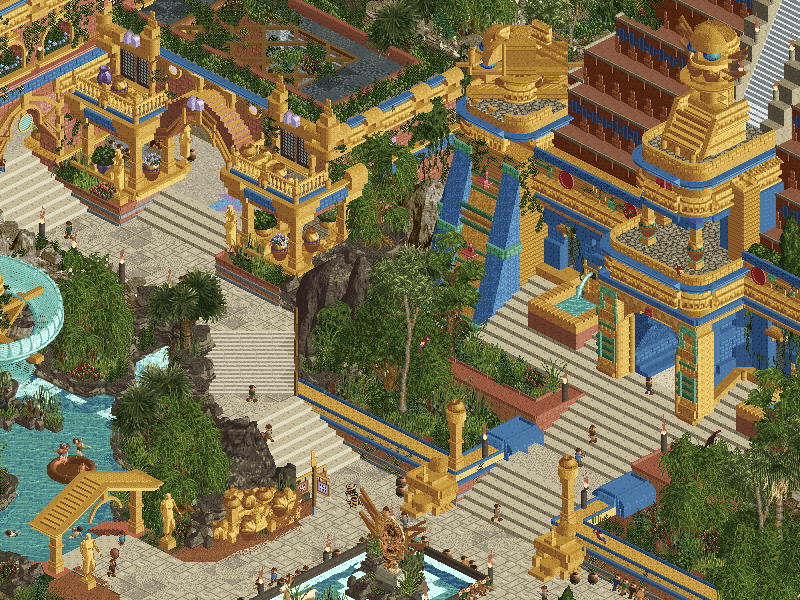
 El DoradoVoting Rules
- The poll will stay open for ~72hrs.
- Do not vote unless you have viewed both parks in-game.
- Everyone may vote except members of either team. Any illegitimate votes will be ignored.
- Anyone with an account that predates the start of H2H9, or who has been drafted onto a team, may vote in this match. Anyone with a newer account must pass the admins' account integrity checks.
- Voting is monitored by the admins to improve fairness.
-

 wheres_walto
Offline
Mrs Walto's reactions:
El Dorado
"I wasn't too impressed with the travel log" *opens park* "ooooooooo that's so pretty"
"This feels like El Dorado and I didn't even watch Indiana Jones"
"Look a custom object!"
"Does that say 'cum away' on the roof? That's pretty funny"
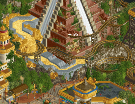
"I like how steep the pyramid is with the tiki torches"
"Gold transportation A+"
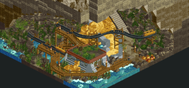
"So creative, I love the cutaways"
"Look at the gold reserve with the little poles"
"No dead space which I appreciate, I prefer more is more, it needs to feel alive and this does"
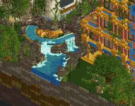
"Can we please address the waterfall in my review? It's stunning"
Pirates
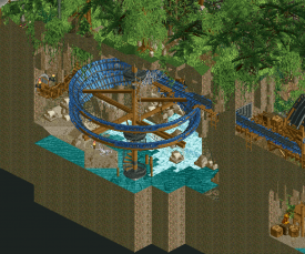
"Look at the tentacles wow that's impressive"
"Part of the ship is sunk that's really cool"
"Wow similar structure themes between the two, they also have gold reserves"
"The jungle and ships are really well done"
"Oh wow a ghost ship, that's really cool"
"Little skeleton oh wow"
"I can recognize the kraken skill even as a layperson"
"The rocks are very vertical"
"It doesn't even feel like a theme park, it feels like a world creation"
So there you have it folks, both teams totally knocked it out of the park. I'm gonna need to take a closer look before I can vote
-

 AvanineCommuter
Offline
Mrs Walto's reactions:
El Dorado
"I wasn't too impressed with the travel log" *opens park* "ooooooooo that's so pretty"
"This feels like El Dorado and I didn't even watch Indiana Jones"
"Look a custom object!"
"Does that say 'cum away' on the roof? That's pretty funny"
"I like how steep the pyramid is with the tiki torches"
"Gold transportation A+"
"So creative, I love the cutaways"
"Look at the gold reserve with the little poles"
"No dead space which I appreciate, I prefer more is more, it needs to feel alive and this does"
"Can we please address the waterfall in my review? It's stunning"
Pirates
"Look at the tentacles wow that's impressive"
"Part of the ship is sunk that's really cool"
"Wow similar structure themes between the two, they also have gold reserves"
"The jungle and ships are really well done"
"Oh wow a ghost ship, that's really cool"
"Little skeleton oh wow"
"I can recognize the kraken skill even as a layperson"
"The rocks are very vertical"
"It doesn't even feel like a theme park, it feels like a world creation"
So there you have it folks, both teams totally knocked it out of the park. I'm gonna need to take a closer look before I can vote
I love her reactions. -
 Coasterbill
Offline
Both of these parks are absolutely ridiculous and I feel bad that I have to vote against one of them.
-

 CoasterCreator9
Offline
Round 2 definitely looks to be off to an intense start with two high quality parks.
Pirates!
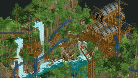
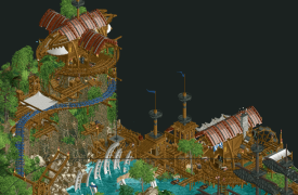
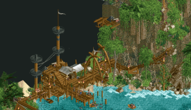
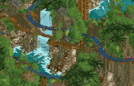
Someone has been playing some Sea of Thieves lately - me too. Definitely a great theme I would love to see more of in the future; really enjoy the makeshift architecture and pathways along the cliffs. The sea battle with the kraken is an obvious highlight here; the ships are very well built and the cannon features are pretty great. The landscaping is very impressive, though I did feel like there were a few too many rock types competing with each other in places. The coaster and water ride are nice accenting features to the landscape and the sea features.
I definitely felt like there were a few great moments that were sort of loosely linked together. A big part of this theme for me is when there are hastily built structures built out of necessity, connected by ramshackle walkways. I got this feeling in a few areas, but with most of the architectural features crammed along the sides of the map, they didn't really feel like a centerpiece or feel like they got a chance to shine. The park as a whole really shone bright from the opening angle, but other than a few map edge cutaway shots the other angles didn't really appeal to me - especially when I noticed a big bare dirt wall next to some lovely little cutaway scenes. The biggest sticking point for me is how some of the most interesting features of the map are just strewn about the sides, and really don't take a starring role.
One of my favorite parts of the park, the combination of makeshift architecture, the coaster, and the lift ride are all pretty great, and I enjoy how it's incorporated into the landscape. I really don't like how the palette has inserted all these purple specks everywhere though.
I also really appreciate this architecture; I just wish it wasn't all directly at the edge of the map.
Another major highlight. Though with how the map was arranged, I'm not really sure where this path was connecting.
Where there were these cutaway features, they were very nice. I do wish the giant bare wall had one or two, though.
El Dorado
First off, I really like the "mythical location gone commercial" idea. LOVE the fact that you managed to tie in the "tracks are made of gold" to an actual foundry for it in the park. The map edge cutaway scenes are quite lovely; aside from the use of walls to make the map edge look more appealing, I appreciate the fairly even density of these scenes bringing some life to what would otherwise just be dirt walls. The pyramids and landscaping are great, and I love the gold pile Scrooge McDuck thing - awesome.
There are a few clunky areas, such as the hotel standing out as feeling much more like a modern structure than anything else in the park. While I liked the handball court in the pyramid, I felt like the use of cutaway in the hotel was more of a little bonus than much substantial. Deserving of recognition, but didn't add a whole lot to me when a lot of the park wasn't optimized for cutaway view. Some parts of the park are so detail/texture laden that it does get a little hard to read in spots.
The whole foundry scene with the "tracks made of gold" backstory was really cool, and I enjoyed being able to see that in the park.
I love this; despite how busy the park is, there's a fair bit of nice serene places like here where the log flume snakes past a nice open area with lovely waterfalls. The rockwork all fits together and looks like it belongs with itself which is a huge plus.
Each little cutaway was a nice little treat, this one was especially cute.
The logflume as a whole might be one of my favorite parts; great theming, lovely interaction, and a hell of a splashdown. The flat ride hacks and stuff were also very well done, but this flume really takes it to another level.
Definitely going to have to think about this one for a little bit. One park with a few great setpieces that I keep coming back to, one park with a ton of great details that I keep finding more of; one amazing from one angle, one well built when viewed from all angles; one compositionally awkward, one sometimes hard to read. I think this may be another close match, with two parks appealing to different preferences, but both undoubtedly great parks.
-

 chorkiel
Offline
Pirates: My first impression is that I'm not a huge fan. The main issue for that being that the park felt a bit repetitive. Particularly the foliage/landscaping. There was a bigger mix in architectural styles, however there was not a whole lot of it so I was quite fast done with exploring. Another gripe I had with the park was that the landscaping often blocked a lot of the park and many things looked good from mostly just one angle. That's not to say there's no good parts. The way you constructed those ship-buildings in the rocks and trees was impressive. The kraken fighting the ships was a fantastic centerpiece.
El Dorado: I can keep this review short, because I just think this is a very good park. A simple theme that was executed effectively. The architecture was a definite highlight for me. I also really enjoyed the colors in this park. Maybe it misses something that would blow me away, but I don't expect every (h2h) park to do or have that.
-

 Dr_Dude
Offline
tentacles and tracks-on-tracks gold bars are my two favorite setpieces of the contest so far
-

 Hepta
Offline
Two more stellar parks, I really enjoyed viewing both of them. To me, two different styles of park.
Pirates is like a story world, capturing attention with the large, excellently made set pieces set in a lush jungle with very well done vertical landscaping. The kraken was amazing, loved the moving tentacles, as were the old style ships. With only a couple rides and a single lane path throughout, it does feel a bit sparse. I also would have preferred standard blocks over mine train track for constructing the peep walkways. All of the architecture was great, it would have been cool to see a few more buildings with those Robinson Crusoe-like treehouse structures, like the zipline cart and elevator.
El Dorado feels immediately very comfortable, and being more like a traditional theme park. I liked the adventure-type rides, the log flume and the mine cart with the cool lift hill. I thought the dive machine could have been stronger, the brake run was weirdly short and it looked like it would have been easy to give the end of the layout a bit more flow. Also the queue line was strangely short for a main ride while the others in the park were really cool. Overall, I thought the architecture was good, if a little blocky in some places. The hotel was a bit gaudy and there seemed a little too much blue in some places but it didn't detract from the overall. I spent a lot of time looking at this park and really enjoyed all the details; it really felt full.
In the end, I think Pirates has a few parts that are very top tier but it lacks supporting content to bring everything together. El Dorado on the other hand didn't have as many top tier standout elements, but overall contained much more supporting content and all at a very high level, and that made the park feel more full and complete to me.
-
 Xtreme97
Offline
Another stunning matchup! Will be a tough decision for me I think, both parks have very different strengths and weaknesses, and take two different approaches to tackling their respective themes and ideas. El Dorado seems more typical of H2H with the cacophony of rides and the way it's jam packed with content that holds my attention and keeps me exploring (not a bad thing by any means!), whereas Pirates! takes a more measured (yet risky) approach with having just a few dedicated set pieces but executing them flawlessly.
El Dorado:
This was the first park I looked at and I was really impressed. The colour scheme is bold with the golds, reds and blues throughout but they're balanced quite well with the lush jungle foliage. The entrance is a really fab piece of architecture, love the imposing nature it has on the path below. Not quite sold on the hotel(?) type building - to me that feels like it's trying too hard to add a "themed realism" setting that the rest of the park eschews. The waterfalls and little huts buried into the cliff side to the right of the entrance are definitely one of the highlights that others have picked up on, brilliant scene-making. Loved exploring the rest of the park - you've managed to squeeze in a good number of solid coasters but it doesn't feel cramped, good utilisation of space. A few things of the things that best stood out to me were the view of the log flume drop, the upside down hanging peep ride and the slowly flowing molten gold. Also enjoyed the underground track factory and how it tied together all the gold tracked rides.
Pirates!:
This park is definitely right up my alley in terms of what I most enjoy in RCT and what I aspire to make myself. The Kraken is probably one of my favourite H2H set pieces ever. It's a risk to have it take up a significant portion of the map but the quality is so ridiculously high that it pays off, and the tentacles are so well done with the way they move. The ships are equally significant, probably the best example of any pirate ships I've seen in the game, and how it interacted via the cannonballs and explosions. Once I'm past this scene (and I know I'll keep coming back to this), the landscaping is breathtaking. Love the use of the volcano texture (a nice example of how ncso tricks/objects can be evolved in cso), and the multitude of textures in the foliage that somehow work in producing the dense feeling. The "el dorado" scene is probably my second favourite thing about the map, very much a different approach taken than AC but I love it, the scale of the structure and sense of discovery and mystery with all the overgrown foliage is so gorgeous. This is better than I could have dreamed of doing this theme so kudos (and I reckon exceeds the example from SG). The mine train ride weaving around the vertical landscape is brilliant too. Also love the curvature of the building shapes with the wooden coaster track which again has an ncso feel, though all of the brown becomes blurred a tad. The elephant in the room however is that square cutout in the backside of the map, which is hideous. You could have easily pinched a tile here and there to curve it out.
All in all two stellar parks, the quality of RCT just isn't slowing down. Very tough decision but I'm going to go with ManLab. Brilliant park that left me with feelings of inadequacy. -

 wheres_walto
Offline
Pirates
+ That kraken was a holy shit moment upon opening the park, incredibly well done, immediately recognizable, and legitimately terrifying
+ Probably the best in-game ships to date, the cannonballs are a great feature, love that one of the ships has been capsized by the arms. Everything in this scene is just so spot on: the downed sail, drowning crewmen, this is an unbelievably epic set piece
+ Love the temple, it's beautiful and mysterious
+ Amazing ghost ship, the sails and colors made it immediately recognizable, great detail
+ Little features throughout kept me looking: the prisoner cage, hanging bodies, sharks circling blood in the water, x marks the spot, there's a lot to find
+ Treehouses are great, I'm not sure how you made some of those shapes
- Foliage and landscaping were just okay in my eyes. You have a really nice foliage texture but there's not much room to breathe. I think it would have been more effective had there been more variance in the level of layering. The rocks are okay, it's a bit hard to read the shape because of how flat the textures are and seeing blocky base land can be a bit jarring
El Dorado
+ First impression: wow! The color is exceptional, there's so much going on, everything is so full of life
+ The hacked rides are so good, I have no idea how you managed to make a functioning peepable top spin the way you did (side note: is the inverted sprite for those trains the same as the tram cars?)
+ I love the architecture, I love the level of interaction. Every single place I look I find vibrant interesting compositions
+ The rockwork, waterfall, and cliffside houses near the entrance are beautiful. It's interesting how similar this section is to the cliffs in Pirates, I think this was the better executed interpretation
- I thought the back half of the map was significantly stronger than the front half. The hotel interior to me is much nicer than the exterior, and I thought the pyramid structures were a bit plain and could have used more texture
None of these matchups have been easy, the quality this season has been so consistently high that it comes down more to personal preference than clear skill distinctions. For me, I loved the busy crowded atmosphere in El Dorado, I loved the colors, I loved the interactions and the liveliness of the map, there's no wasted space without it feeling overdone. Pirates had the oh shit moment of the season upon opening and created an incredible scene, it feels more like a painting than a living breathing world. Pirates is more epic, El Dorado is alive.
Both were incredibly well executed, but I lean slightly in favor of El Dorado this time around
-

 RobDedede
Offline
Another great match up here!
El Dorado:
The palette in this park is really nice, and I like the whole idea of making the coaster tracks out of gold. It puts a nice twist on the El Dorado theme, though I think that idea could have been fleshed out more. I loved the cutout of the track foundry. I wish that had been the central focus of the map personally. My favorite ride on the map was the log flume, which was a nice spin on a Chiapas type ride. The way the diagonal drop is framed is just so nice. All of the hacked rides in the park were great too, and I especially loved the top spin. There was something in the park that I wasn't a huge fan of: the hotel. Yes, the cutouts were quite nice, but the shape of the building did not mix well with the mesoamerican architecture for me personally. It just felt a little bit out of place for me. Overall, though, this was a really fun park! Great work!
Pirates!:
That trick with the kraken tentacles was pulled off quite nicely. It adds some really nice movement to the centerpiece of the park. The use of the rapids pieces around the maelstrom was also done perfectly in my opinion. My favorite ride in the park is the blue adventure coaster, which I thought interacted with the overall landscape really nicely. Then of course there are the ships, which in my opinion are some of the best ever made. They are just so well done. While there are a few spots where the landscape was cut in a little bit strangely, I think it can be forgiven, especially since the macro is so well done otherwise. Personally, I was actually fond of the landscaping. Maybe it's because I'm so used to the volcano rocks from all of the entries I've seen on DKMP. Who knows. In any case, I thought it was actually well done.
This ended up being a really tough decision for me, and I had a hard time voting against either park. After much deliberation, I went with El Dorado because I felt it had more content and the idea was more ambitious. It also made better use of hacks, new custom objects, and micro detailing. While the macro on Pirates! was probably better overall, El Dorado also had some nice moments on that front. Congratulations to both teams for making two awesome parks!
-

 Coasterbill
Offline
I'm surprised by the votes here, but this just reinforces the fact that I have no clue what people will and will not like in the game.
Both parks blew me away. I got some strong Chiapas vibes from El Dorado and I loved the bold colors, great architecture and fun underground details. It's a great park and I have no complaints.
That said... pirates was just crazy. The boats were ridiculous, the tentacles were amazing, the whirlpool... same. The supporting rides were also great. Honestly this is one of my all-time favorite H2H parks. That park gets my vote, but in most matchups I would probably vote for El Dorado because it's great too.
-

 zxbiohazardzx
Offline
Review time!
* PiratesFirst opening and i like the full image i see. The location feels like some carribean jungle and the giant kraken and ship immediately draw my attention
+ Great classic pirate ships (Queen Anne's Revenge in particular (shame the 2nd one in port isnt named))
+ Smart use of the game to make the kraken and the gun-fight+ Nice use of foliage and colors to set the mood
+ Aztec bay is pretty nice element, although it can also be considered out of place...- Gangplank layour feels a bit fast pre-lift
- The ghost ship interaction for The waterboats feels odd and they pass it at relative high speed
- overall cohesion for a park or rides feels odd. Not really sure how to improve it but it feels like 3 parts without any real visible pathing connection or other stuff merging it together not being water.Overall the negatives are nitpicking because the park is a great entry. Well done and a good contender.
* El Dorado
First notion i had was this actually matches the pirates pretty good. both feel like a jungle/gold theme was added but for this one it feels that the gold/blue is the theme and the first opening it looks great
+ Path layouts feel solid and the park feels heavy on content
+ smart use of wals to break the " boring brown land-edges
+ lots of tiny details and carefull placement of smaller objects
+ Im a sucker for the execution of these water rides. they feel really nice and add to the atmosphere alot.
+ cool cut-away elements. i particularly liked the trick with the track foundry
- TopspinShoestring1 (i feel you could at least have renamed the ride....and it feels a bit left out in terms of style and placement compared to the rest of the map
Overall a really tough choice despite my negatives maybe not showing it.
I pondered the day on my decision but in the end the El Dorado to me felt more coherent and matched my personal preference so i guess that was the decision.
Great job though by both teams. this H2H is showing some amazing parks!
-

 Magnus
Offline
Voted El Dorado.
From the screenshots posted I thought Pirates! would easily win the match for me.
The jampacked map of El Dorado made me change my opinion quickly though. The park comes together very nicely and the sheer amount of details was amazing. Filling the map with tons of rides and little details has always been a good idea in H2H.
The single effects in Pirates! are probably more creative and the execution is amazing. The map did not come together for me though too well. It feels like the map was separated into different parts for each creator and the different building styles clashed too much for my liking.
Great job by both teams once again and an amazing kickoff to R2.
-

 AvanineCommuter
Offline
Sheesh the quality just doesn't let up! Two fantastic parks...
El Dorado - Adventurers Club
- The amount of content in this is bonkers, it's so dense but still so legible. Fantastic composition overall, ride placement and circulation and landscaping... it is all really well considered!
- The entrance and cutaway view was really beautiful, but my favorite part is that little corner off to the right with the organic waterfall and beige huts buried in the landscape. I wish there were more of these expanded in its own little area!
- The architecture overall is gorgeous, there's some really nice use of diagonals here that felt super natural and well integrated along with the curved pathways.
- The working topspin is wonderful, as is the falcon's fury and, really, all the rides. Valdores is a death trap and I love it. The layouts are well done overall, especially the flume ride with the beautiful diagonal drop, which is my favorite in the park lineup, but I don't think any of them compared to Gangplank.
- The gold smelting backstory is clever and really nicely told through all the cutaway scenes and little corners here and there. Nicely done.
- I think the main detracting factor for me is that I'm not quite clear on the intention of the park. Is this a real El Dorado that was... converted into an amusement park? or is this an amusement park themed to El Dorado? Or is this just El Dorado? I felt a little conflicted about the background here, and in that vein, the hotel felt a little out of place and personally I didn't think that it contributed to the map despite being well executed and beautifully built.
- I think also the readme was a bit confusing and didn't add to the park viewing experience. I wasn't sure what to make of the storyline there until Josh explained it separately.
- I also ended up spotting quite a few minor issues like missing blocks or misplaced objects, including small texture issues that could be resolved with some tile inspector work. Could be due to time crunch, but just a minor nitpick.
Pirates! - Manual Laborers
- the Kraken is so perfectly executed, along with the best pirate ships we've ever seen in this game. The entire battle scene with cannon balls and the whirlpool that the boat ride goes down is impeccably done. There's so much life going on in the water, I spent a good 5 minutes just watching the action in the water.
- I love the architecture in the jungle, really nice use of single-rail coaster to create unique supports and beams. I like the reference to ship masts used in the architecture itself, and the entire setup with the zipline and the mine train going through the landscape was really really nice
- the hidden temple was beautiful and nicely tucked away in the corner. Some really bold color choices that provides a nice relief against the green + brown combo in the rest of the park; it's stunning! That single tree with the single-rail roots is perhaps one of my favorite things on the map too.
- Really enjoyed Gangplank, it's such a cool layout that has so much interaction and is sprawling. I didn't realize how massive it was until what felt like a few minutes went by before it finally returned to the station.
- The landscaping was hit-or-miss for me. The use of the new nincso objects + volcano rocks is wonderful, and I personally loved the use of the dark palm / fern objects to break up the monotony of jungle foliage. It felt really new and refreshing as an aesthetic. However, some areas like the waterfalls could have used more care in keeping a more organic shape that was done with the landspikes; there are some straight edges there that could've been rounded out. Also, all three waterfalls have no source / river behind them, so it felt a little artificial instead of natural.
- The ghost ship with the tattered sails... drool worthy!
- I really enjoyed the patchwork minetrain paths, it was interesting to follow along and trace the peep's circulation throughout the landscape.
- Atmospherically the park is excellent all around. Definitely a strong aesthetic that is consistent and beautiful.
- However, I echo other critiques in that the map shape could have been further considered to not have a huge squared cutout in the back; rounding that out and giving some cutaway content in that back area would've elevated the park, as most of the action is viewable out in the water but the backside seems less considered. Taking tiles away from the water edge could've given the whole macro composition a better flow; as it currently is, it feels a little disjointed.
- As I mentioned in discord, I didn't care for the Pirates! name, it felt a little flippant and not aligned with the immersive, atmospheric parkmaking, but it really didn't affect my enjoyment of the park itself.
Both parks are very simple in theme and concept, both seen before but never done justice in RCT the way both teams presented this match. Huge kudos to all the parkmakers for their incredible work!
I ended up voting for Pirates! simply because the atmosphere and giant setpieces really transported me fully to another world. El Dorado was utterly fantastic all around as well, so it was a very very difficult choice as they were so different in their approaches to the game, but either park could be the winner in my eyes.
-

 Sulakke
Offline
Pirates!
The kraken scene is truly insane. The moving tentacles, the vortex, the circling birds, it's all fantastic. I love how the water coaster cars are sucked into the vortex. What a scene. Instantly one of the highlights of H2H9. The ships are some of the best we've seen in the game. I just wished you would have added some ropes. I don't like the ghost ship scene. Although the scene is a nice addition to the water coaster, I don't think it was the right choice to put it in a cutaway in one of the cliffs. It feels too gimmicky for me now. Just like the water coaster, Gangplank is a really enjoyable coaster to watch. I really like it's meandering layout along the cliff edges. Also, the butterfly object used as bats is a great find.
I wasn't the biggest fan of the pirate architecture. The trackitecture roofs look outdated compared to the current detail level. Besides, I don't think the monster truck track texture is very convincing as pirate roof tiles. I also thought the colors were a bit too monotone. I would have liked to see different shades of brown. I do like the messy look the scaffolding creates, although the use of mine train track is a little bit excessive. Details like the pulley and zipline are awesome. I also love how some of the buildings consist of pirate ship elements like the mast and sails. The El Dorado architecture is well made, but could have used another color.
I'm not sure yet whether I like the landscaping or not. The foliage is pretty good, but the rockwork is messy due to all the different rock objects you've used. I'm also not sure about the macro composition you've gone with, since some areas are hard to see because of the cliffs. I think you could have done more with the landscaping since it's kind of repetitive. I'm craving for more landscaping features like the arch cave (with bats!) and the small beach with the treasure hunt cross. Kudos for the extensive underwater work. A really cool and enjoyable park overall.
[AC review here soon]
-

 posix
Offline
Adventurers ClubWhat a beautiful park wow. This is perhaps one of my favourite map edge effects yet. I hope you used scenery manager for it? Also in combination with blue for water, or white for the paths, I love how this looks. Makes the map more of an abstract floating entity, than a piece chopped out of RCT. Very first moment of opening the park, I notice the custom message beep is missing, and I almost missed the message. This has been a pet peeve of mine for basically my entire time on NE: pause your game whilst you enter the message, then save, and don't unpause! I love all the peeps sitting around the entrance fountain - very nice touch. Perhaps you could've made it a bit more realistic by not having 100% of seats taken though. The theming here is really strong. Wonderfully organic, and beautifully colourful. This is such a palette use redemption for you guys. If I had to criticise, I would say the overall look you went for is a bit too sell out, in that everything is saturated, like what Samsung would do on their phone photos. I would've appreciated more subtleties, less loudness, less maximalism. Then again, I know this is H2H. The Talocan was incredible. Almost amusing to see you would even try and get the movement right. Sadly thought it was a bit hidden from both of its angles. No less, looking fantastic. Same for the drop tower. I loved the double cars, or whatever it was. Made it look fresh and realistic, in a good way. The flume also looked spectacular. Again very PHL inspired? Bold move to put the drop diagonally, and hard to see from either angle. Still ultimately successful I thought. The white architecture here is just beautiful. Then sadly some of the stuff towards the end of the map almost just feels too much, to the point where I just can't access it anymore. I also guess most of you play with OpenGL? Some parts here were a major glitchfest on the "hardware display" renderer for me. Not really something the park should be discredited for though, obviously.Manual LaborersThe Kraken is just such a winner, as everyone's said. Really really strong idea to do it like that. Same for the vortex, not just the ride but also the white water object designed in a whirl like shape. Just such a strong scene you are immediately drawn to. Cinematographic RCT. A skill on its own that can go wrong quite quickly if not executed to similarly high level. I thought most of the wooden structures near the water were rather successful. Very convincing of their theme, very lively, very organic, and feeling new despite the overdone theme. I loved Gangplank. I thought it had such a good camera exposure that made you want to explore it. The layout itself was interesting and different, and had a very inspiring wilderness feel to it that I thought was wonderfully creative. A very good ride choice to interact with the kind of landscape the park has, and for which it's incredibly hard to find something to integrate. This is a very difficult thing to do, that I worry a lot of people will overlook when not looking at the parks long enough. The voyage ride I felt was quite challenged. Its station was awkwardly placed and suffered from unfortunate composition. Thankfully one angle and the broken up wall allowed you to connect with it, but otherwise it was largely hidden beyond its opening drop and almost became invisible quickly. A shame given the amazing idea to climax it with the vortex. I think it would have needed some more framing, some elements in the water to delineate it as a ride perhaps, in as far as the applied semi-realism/fantasy approach sensibly allows.
 -

 Turtle
Offline
Jesus Christ, the standard this year is so high already. Genuinely all would have won finals in the past.
I'm really in the middle for this one right now, both parks are definitely the best versions of their respective themes i've ever seen and are dripping atmosphere. Might end up feeling one way or the other, but for now I can't vote against either.
-

 dr dirt
Offline
A second viewing changed my mind on this one. This was a battle of something built with a cinematic eye and something built that would be good RCT. Very interesting.
Pirates! - this felt like something I want to now see on a giant map thanks to the new save tests coming out. It was like a sliver of the pirate world, but then got constrained by H2H limits which forced some things to be placed where you didn’t want them, exactly.
This is the cinematic one, and showed a great deal of restraint in negative space and framing certain spots artistically, like the hanged skeletons, the crows nest between the waterfalls, the ship battle. The details to see were clear and had love put into them, and were given space to shine. Also was an effective “two parts” park where the front half with the ruins is very sequestered and off.
Great sculpting with the Kraken, I like that it wasn’t anything giant and wonky like if you’d tried the whole head and whatnot. Fun rides, mine train was cool. Architecture was great across the board. The one negative was the one map edge being a big cut out square when the rest of the map wasn’t cut out that way, which is rather unfortunate. I both like and dislike the name, part of me loves pushing storytelling but part of me likes that it’s lighthearted.
El Dorado - This one, overall, feels like a complete picture where it’s competitor was a smaller section of a whole. I thought it was a fantasy El Dorado until I saw the hotel when I completed my loop around the map the first time. I like the thought of a commercialized fictional place, but the commercialization didn’t feel at the forefront to me (which would’ve been cool) so it appeared an actual El Dorado with rides because this is RCT. Not really a negative, but I think steering into the skid one way or the other would’ve been very successful here.
I found the park technically strong for the most part, but not something I could fall in love with. I know it’s probably the most subjective RCT-term, but was asking myself, where’s the atmosphere? I tried to dissect where I’m missing it and I think it’s the choice of cleanliness in the building and using the curved walls to line paths where you’re missing out on things integrating together in exchange to try to force a complex shape. Comparing the sections with and without the walls is pretty stark, on second look.
Gold foundry was a winner. Custom rides were too. The hotel was not. The pyramid is an interesting geometric shape, the prism not so much. The interiors were cool, but at the end of the day it was a big box with some deco blocks on it. The corner with the custom top spin was excellent overall. The way I would describe the building of this park is “excellently constructed” but parts were missing subtlety and vibe for me.
 Tags
Tags
- No Tags

