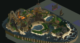
H2H9 / H2H9: Round Robin - R1M3 - Tile Inspectors vs Adventurers Club
-
 30-April 21
-

 wheres_walto
Offline
Boy am I glad this one is over, if every matchup is as close as these round ones were, we are in for a long season.
Some scattered thoughts on Lost World:
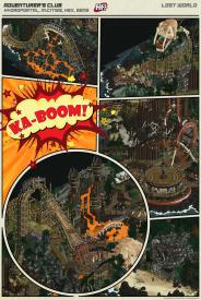
+ The landscaping is S-tier, I've never been so captivated by sand and dirt but it all feels so natural, the varying water levels and colors across the island are just so welll done
+ Worship is an amazingly executed ride, loved it
+ Half-diagonal supports? Get the f out. If the Tomatotown aqueduct is any indication, half-diagonals can easily create uncanny valley responses for players, on a smaller scale like this it creates beautiful supple curves
+ The more I look the more I find crash details, all super well done
+ Wooden stakes at the gate and broken bones are so well-executed. It's not easy to make stuff like that look good
+ Just noticed the fucking black panther hiding in the woods, are you kidding me
- The color palette isn't for everyone, I think I'd prefer if things were a tad brighter, but you've definitely created a distinct look for this park. My cynical reaction to extreme palettes is that the builders are covering up some other deficiency, but I don't think that's the case here at all
+/-? You took a big risk by building what looks like a smaller map, about half of which is landscape. Maybe the meta has changed and people are less impressed by overwhelming quantity of content
I thought right away that these were the strongest two parks of the round, our discord the past few days went from hopeful optimism before release, to tight buttholes when we saw how awesome your park was, to slight relief when we got out to a big lead, to mom's spaghetti when the vote got closer, to outright bargaining when we lost the lead, and finally peace when it was all over. I had accepted defeat and initially misread the announcement thinking we lost by one vote, only to find we had won and to learn that I felt the same either way: happy that the stress has passed, full from a week of groundbreaking RCT, and in disbelief that we get 6 more full rounds of this
-

 bigshootergill
Offline
Epic matchup Adventurer's Club. Absolutely loved every inch of your park. Win or Lose, your park will be a standout from this season's H2H, it's legendary and it's only 3 days old!
 And I think you guys are just getting warmed up!
Loved seeing Leon & Rene put this park together, with help from Mulder & Bio. It became more and more grand with each passing day, I think it turned out much better than any of us imagined at the start.
-

 ottersalad
Offline
Wow. Quite the matchup. Not much else to add to the reviews already, but I figured I'd add why I voted the way I did. I was really blow away I think by how developed and detailed Acqua was. Insane the amount of minute details packed into this map, especially considering how short of time we had for round 1.. and I would know!
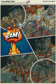
I am also a huge sucker for anything steampunk. That and the beauty of Venetian architecture was a good combo for me. Quite honestly don't get the complaints about the flyer layout.. looks like an absolute blast to ride and it incorporates so many unique elements namely the lift supports and some of the cutaway/behind-the-scenes moments. Where this park shines for me is watching rides like the submarine traverse all the substructures.
In terms of Lost World.. damn. I've said it already on discord, but it's amazing to see two of the highest quality parks I've ever seen go up against each other like this. So much to be proud of here. The storytelling was superb and I think the palette initially distracted me and swayed my vote. I think the more I open this park and look at it more I have come to understand that the dark rockwork/landscaping guides the viewer to all the important scenes and moments in on the island. Little touches like the shark following the search party were honestly things I missed on first viewing. This will be a park I will return to again and again for inspiration.
Thank you to both teams for what you created. Truly great artwork.
-

 alex
Offline
damn this match was insane. I voted quite late so had no idea about the early lead of AA until seeing the graph - and congratulations on the win!
I think it was alex who said he's bored of steampunk, and I agree. However, you can't deny that combining it with Venice was a good move and that the conceptual execution is exceptional. It feels bad to call this map just another steampunk theme.
I think I've been misconstrued here - I was saying I was won over by the quality of worldbuilding in spite of the fact I'm usually bored of the steampunk 'genre'. It was a compliment not a critique

-

 Liampie
Offline
I think I've been misconstrued here - I was saying I was won over by the quality of worldbuilding in spite of the fact I'm usually bored of the steampunk 'genre'. It was a compliment not a critique

That's what I was trying to say as well, but it was a hastily typed comment by me, hence poorly worded. I'm 100% with you.
Btw I didn't get to guess on who built these parks... I opened Acqua Alta semi-anonymously, Fisch originally submitted the file and when I opened it I didn't question his involvement. I thought it looked like Tolsimir too. I didn't really have time to properly think about it and consider everyone, but looking back now, I'm pretty sure I would've picked Leon, and I'm pretty sure I would not have picked AVC - I don't see anything that looks like his work... Rene and Mulder I would have no clue. I'm mostly surprised there's no Tols, though.
-

 Faas
Offline
Mulder was the only easy guess for me because of the spiralling tower.
Congrats TI! What a match! -

 FredD
Offline
Oh man, what a match this was! We were sure Tolsimir and his team would deliver a topnotch entry and they easily matched that expectation. When the parks were online we were "oh shit" and we fell behind in votes I was feeling that that would be it. But what a comeback we've made! We even lead it at some time by 1 vote. In the end, it wasn't to be but the fact we only lose by one vote proves we had a great park to battle the Tile Inspectors.
Acqua Alta was an epic park and really no shame to lose from. At least we didn't got Motherlanded
 It was a pleasure to follow the construct of Lost World. I have to admit I had my doubts about the palette at first but it grew on me and it all came together. It was a bold move and that's also something to appreciate. And maybe it will also grow on people not liking it at first?! Who knows. Hydro, Hex, Josh & Sens. You guys started our H2H with a banger. Really proud of our R1 park!
And now I can finally write my review of our opponents park.
Tile Inspectors - Acqua Alta
Honestly I thought 'shit' when I opened this park, we would start our H2H against the best park of H2H9 so far... It really is my favorite from R1. The concept is pretty cool, still funny we have 2 drowned cities in the first round. Steampunk is not my favorite theme but I have to admit when done right it can deliver beautiful work. And that's without a doubt the case here!
What blasted me even more away was al the crazy insane great archy. Holy shit! There is not one building on this map I do not like. I want archy tutorials from the men that made this. Teach us. The archy is in fact so great that I hardly notice the flying coaster lol. Not saying it is a bad coaster and it is not needed, but it feels more like background compared to the archy. Let's spam some screens from stuff I loved:
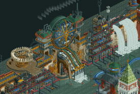
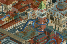
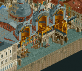
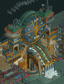
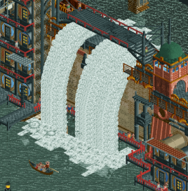
This whole dam, that middle piece, that waterfalls and that air machine... Just gorgeous.
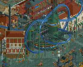
I really dig how that pretzel loop is worked into the city. That diagonal building on the left is also crazy good, how do you guys do that? I always struggle to make diagonal stuff look good

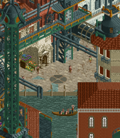
This drowned square is just... wow... the facades are just out of this world. Also really like the debris on the water and that big tower. While it is really big you managed to make it still look interesting to look at.
This is sick...
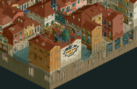
That sign is genius! And once again so much great archy to spot here.
Yeah I think I can keep showing screens so I leave it with this

Congrats with the win TI! You made a memorable park, love it <3
-

 Steve
Offline
I think this is a good observation; I personally can't stand when, for example, someone builds a micro with a fuck ton of movement or just content in general because it's what's expected. I will always maintain the best wow moments are the ones that don't slap you in the face. Neither of these parks were especially gimmicky and I am not speaking to them here specifically. However, there was definitely a highly skilled subtlety to Lost World that is hard to ignore.+/-? You took a big risk by building what looks like a smaller map, about half of which is landscape. Maybe the meta has changed and people are less impressed by overwhelming quantity of content
-

 zxbiohazardzx
Offline
Aqua Alta:
Wont really review our own park. Loved the concept and the ammount of work we could acomplish before R1. Multiplayer truely helps.
my contributions mainly consisted of adding the boating traffic (and hacks) the submarine ride and track-invis (town layout was already there) and the submarine station idea was mine. inclus cutaway for those that had not seen it yet.
Lost World:
Man what a park, i had to get used to the palette as many others stated but overall a superb park and a worthy opponent.
+ RMC layout was awesome
+ Supportwork on the RMC was one of the higher quality i have seen
+ Insane bone-element and overall theming was top
+ Entrance area was great
+ Supercool features all over the map
+ Skull Rock was a nice detail
- Palette (but not truely an issue)
- Park size was relatively small or felt smaller then others entries. not sure if this was actually a smaller map or that the coaster scale made it feel smaller....
Overall a superhard decision for those not on these teams, and for me this one would have been a last minute vote as both parks had great quality. -
 WhosLeon
Offline
Lost world:
When initially seeing the screenshot of the park when the match went live, i knew we were going to have a hard time against this. Holy shit, that skull. The whole scene upon opening with the skull and the raft at the shore surrounded by sharp rocks is incredibly cinematic and just looks fantastic. The shipwreck a bit further into the water is also perfectly executed. The way the park is set up with the opening scene on one side and the settlement that comes into view when you browse further into it is really great and contributes to the narrative in a brilliant way. The whole settlement is just so incredibly detailed and well made with all the rides interacting with eachother, the wacky wooden walkways, and the lava stream providing a beautiful pop of color in the darkness that surrounds it. Speaking of that darkness, I've grown to be a fan of the palette. While at first it seemed a bit dark to me, I think it actually contributes to the narrative brilliantly. Yes, it made some things hard to see, but that made it so that every time you look at the park you find new things, almost like taking the viewer on an expedition to the island. The RMC has the best custom wooden supports I've ever seen, and the layout is great too. The first drop interaction with the crocodile skull is another fantastic piece of interaction.
Overall, I'm having a really hard time finding anything in this park to criticize, it's a beautiful piece of story telling, world building and RCT.
Acqua Alta:
I had the idea to do a park themed to the floods of Venice before H2H started, and had planned to pitch the idea to any team i might have ended up in. The initial map i proposed is almost bang-on similar to the end product:
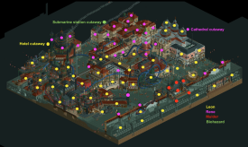
The whole building process was really smooth and it was a lot of fun collaborating with Rene, Mulder and Bio, who all made fantastic contributions to the map. These contributions can be seen here on the dot map i also posted in the discord earlier today (except for the boat traffic that is also done by bio) :
Apart from the builders on the map, I also have to give credit to Fisch and BSG, who made the waterfall ride train, Tolsimir, who made multiple objects for the park, SpaceK for the incredible looking gondola CTR's, and the whole team together for all the brainstorming, advice, and feedback they gave us during the building process.
Thank you to everyone for the reviews, it's really been a joy to read all of them and thank you to the Adventurers Club for putting up such a strong fight. We might have won, but it could have gone either way easily, and I think both of the parks would have been deserving winners.
-

 Six Frags
Offline
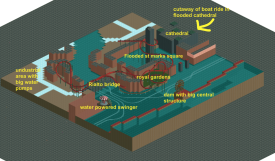
Always love to see concept stuff like this, really gives a nice impression how it all came together.
This is definitely my favorite matchup in H2H ever, both parks were so close in terms of quality and enjoyment. Again great job guys, and I feel so bad writing AVC a dm congratulating him with his awesome park
 Kudo's to all supporting builders, especially René for their great work and blending in with the lead builder!
 -

 AvanineCommuter
Offline
I gotta say, this was such a nervewracking match to follow. As others have said, opening up Lost World was a big "gulp" moment. The park is absolutely stunning!
Lost World - Adventurers Club
- Simple theme and concept but perfect execution with innovative and creative object usage throughout. These 1/2 diagonal are taken to the next level in some of these areas, and they look completely organic and fitting within the grand scheme of the park.
- Rite of Passage is, again, another contender for best woodie (well, RMC) this year. The layout and of course the custom supports using the 1/2 diagonal latticework is so fresh and clean.
- The architecture throughout was sparse, but included just the right amount of grandeur and wow factor when necessary. I loved the double totem with the waterfall as the small "pre-ride" portion of Rite of Passage, and the huge imposing gate and fencing is simple from a detailing perspective, but has so much wow factor in the macro sense.
- Glory and that entire station structure is just so so so beautiful! The lava waterfall on the outskirts also was another gorgeous moment that really was not only put together flawlessly, but also worked so well on a macro level in where it was placed and how it was viewed in relation to other setpiece elements. Such great design at play throughout this park.
- Overall the map is cleverly done in a macro sense with the skull layout and the lovely narrative of the wrecked ships on the rocks (those 1/2 pathing objects as spikes is low key genius), but I also did feel the map was a little imbalanced, with the vast majority of attention-holding content on 1/3 of the map while the rest was empty landscape. That being said, the landscaping is of course top notch Josh-goodness that is just so undeniably groundbreaking and beautiful. It *feels* natural and real. It's incredible.
- I personally loved the palette, viewability is fine on my end with a 8-year old Macbook and didn't have any issues seeing even the darker corners of the park. It only really became difficult once it started to rain, but that even furthered the immersive quality of the theme for me! I know this was a controversial point for the park which is unfortunate. I really thought it brought the concept to life.
- The only real major critique I have: I was really not a big fan of the naming throughout the park. Not my type of humor I guess, but I actually felt that it took away from my park viewing experience by breaking my immersion and taking me right out of the incredible world you've created. For example, discovering the amazingly executed skeleton spine and ribcage on the beach, only to see it named "your mom"... broke the immersion in a single click. Similarly, the readme's back story is great and well crafted, but the bits of humor just didn't work for me, felt a little out of place for such a moody and dark world.
Absolutely stellar park, incredible for R1 and would have very much deserved to win. It was really neck and neck and although I'm happy our park won, it really could have gone either way. Congratulations to Hydro, Hex, Josh and Sens, phenomenal start to what will surely be an incredible showing from Adventurers Club this H2H!
Would also like to congratulate Leon, Rene, Mulder and Biohazard for an equally stunning start to this H2H. It was so crazy to see how quickly Leon and Rene progressed each week, and how seamlessly their ideas translated directly to the park and worked with each other's styles. SpaceK, BSG, Fisch and Tolsimir also all contributed a lot with the CTR elements that brought the park's atmosphere to another level. The dam break was so satisfying to see after all the trial and error testing to get it to look just right. The thing that really stuck with me with our park is how really accurate so much of the Venetian recreations were. My favorite building is the Doge palace (pink building), which had always been such a unique landmark that was never done justice in RCT until now. The steampunk architecture, as others have pointed out, is a pretty worn trope but it really hasn't been executed to this level and immersion before. Mulder's giant hydrometer was killer and Leon's factory was immaculately composed and detailed. Beautiful beautiful stuff.
Also, as soon as I saw the park start to take shape I immediately had thoughts that people would guess I was a builder on this park.... and CC9's poll confirmed it! Fooled ya all, we did!

-

 Turtle
Offline
I really think i'm in the minority here, but something just didn't quite hit home for me on steampunk Venice. It was pretty obviously well-built, some incredible architecture, and just really high quality RCT. But it didn't quite come together into a cohesive atmosphere. I felt like there was a really nice Venice bit, and a not so nice Steampunk bit, and they didn't really mesh. It was so close to being great, but something kept bugging me. I honestly think it may have been the color - the water color was something I didn't love, and either the blue or the red color in the Steampunk parts was not working for me. Red, gold, blue and green (teal) maybe felt too primary color-ish. Like I said, i'm really struggling to put my finger on what it was.
I loved Lost World - something I have never seen before and something that felt very atmospheric. Definitely a gamble with the strong color palette but here I felt like the unorthodox colors really added to the overall feel. I will say it was a pretty messy park, and I found myself confused a few times trying to work out what exactly was going on. AVC mentioned the world "organic" above and that's a great shout.
It was a really close match, and i've definitely been more negative than I should have about Acqua - this was so close to being outstanding. Thanks everyone for two incredible parks. I'm so happy I didn't sign up for this contest.
-

 dr dirt
Offline
This match was incredibly close for me, and the best match of the round, I think, in overall quality. What it came down to was incredible quality and quantity + great atmosphere versus slightly less incredible quality + quantity + fantastic atmosphere.
Acqua Alta - Incredibly impressive to pump this thing out in a month. The damn breaks were sweet and surprisingly well executed given they’re ride cars. Theme was awesome and obviously jives with our concept over at Scream Queens. The two are clearly comparable with I think A.A. tackling more quantity and a clearer ‘secondary concept’, ie Steampunk, versus a survivor colony. Architecture was the strength in addition to tasteful details. There were strong macro gestures in there as well like the use of Ferris wheel objects and Steampunk designs.
The flyer was good, but I think a more fitting coaster type would have fit well too. With Steampunk I’d want something sort of janky and riveted. Not sure if a flyer meets that, but it fits with Venice. The spinner was great and tucked in nicely. Lots of things in motion on this one, so it felt alive. Awesome.
Where it didn’t overcome its opponent for me was in scene-setting and an extra degree of artistry in its designing. Things were a little separate with Venice and Steampunk sections and the shift between those was pretty abrupt. I felt like I wanted to move the factories and such to the center, and old Venice surrounds it. The dam and walls also were sort of un-integrated. It was nice to have spacing there but needed something to ‘connect’ the city and the damn.
Lost World - I don’t mind the palette but I don’t particularly like it either. Maybe just a little too heavy-handed on it. Where this excelled was artistry in building up a scene and hitting focal points. It has the “this is cool, and I’m not sure why” thing due to the placement of and down-space building up to the major elements of the park.
I thought the skull could’ve been better. The other skeletons were executed so much better, and I’m not sure why you wouldn’t make the skull the same color as the rest of the skeletons. The landscaping textures were great on the sands, the cliffs weren’t bad, but could’ve used a hair more clearly defined dimensions. Loved the gates and walls and the shape of them, excellent.
The RMC was cool, loved the big dive loop under the lift, great moment. The supports were pretty flawless. The platforming for the condor was a strong point as well. After seeing brute force execution for GT parks, I was surprised to see hydro on this. But it shows hugely improved macro senses, and I’ll be watching your future work with great interest.
Overall amazing match-up. Two parks that would compete well against the stronger parks of H2H8. Bravo teams. -

 René
Offline
Lost World:What an amazing park have you build Adventurers Club!This was a really nerve wrecking match! Before the release I was quite confident that we could win this round, but after the first look it was clear that you really made something special and came with a park that was a true competitor to ours.I think the custom palette was great and really fits the theme of this park. At first the map felt really small and half of the map felt too empty, but it quickly became clear to me that this was part of the story and even on the part outside of the gate there are a lot of interesting details to discover. My personal favorite is the giant spider in it's spiderweb. Other things that I really liked were the Skull Cave, the army camp with the helicopters, the lava flow outside the camp, the amazing support work of the RMC and the amazing looks of the 'Glory' ride.I'm really glad that you made such a comeback during the voting because this park really deserved getting a lot of votes and I wouldn't have been surprised if you would have won this round.Great work guys and I'm really curious what you'll come up with in future rounds!Acqua Alta:Thanks everyone for all of the reviews. It was a pleasure to work on this park with this team. Before I started Leon already made a great start with the Venetian architecture by building the Doge's Palace and the building opposite to that one and due to this and due to the huge amount of feedback and suggestions we got from the rest of our team it felt surprisingly easy to build the rest of the 'classical Venetian' part of the map. It was tough to build all of this in only 4 weeks time and I'm wondering if we could have done this without the new scenery manager tool. That is a true gamechanger!Also thanks to Mulder (for his amazing dam structure) and zxbiohazardzx for all the work they did on the park and to Bigshootergill for making the Investigation Board.
 -

 Milo
Offline
Both parks are awesome, see you next round!
Okay okay, I'll type up a little more but I do feel like I have less to say about this particular match than the other 2. I'm not sure why, other than both parks have very little to complain about and it mostly came down to personal preference. When I voted it was before the comeback so I had already written off the results long before this came down to one vote.
Acqua Alta 1896:
It's a great idea to do this type of theme in Venice with the alternate history angle and as such it is a little more fun to explore than Drowned. I loved the little waterslide stacked housing on the dam as well as the train station. It all had a very plausible steampunk feel on top of the standard Venice landmarks. I'm not too familiar with the source material but it was all readable enough that I picked up what I needed to just through exploration. I liked the heavy boat traffic and the details under the water. The cutaways with the internal foundations on each building were very well done. Overall there were a ton of nooks and crannies to explore and I spent a significant amount of time looking around the map.
I think one thing that let this down were the rides, particularly the coasters. You had two extremes that I didn't really like. The flyer did not do much for me despite fitting in with the theme and had a meandering layout that I didn't care for. The themed supports were cool but I would have just as soon had that be integrated into a custom flat or shuttle coaster themed to the take-off of a flying machine. The factory spinner ride had the opposite problem; it was well executed but a themed wild mouse can only be so interesting. What interaction was there was good but it just can't hold attention for that long. The subs were a great addition that did elevate the map, especially that particular underwater scene. Overall though I had more fun looking around for planes suspended on cranes or a boat hauling a chunk of dam than I did watching the rides. The custom trains and music were very cool and added quite a bit imo. It's the type of thing I was expecting from this team and is the type of innovation that can get the edge in close matchups like this.
Lost World:
The palette is the most obvious point of contention but I liked the look and I think it helped sell the dramatic landscape. In fact I wonder how well received this park would be without something like the palette. It probably comes dangerously close to being too thin on actual park content but I didn't mind. The world building and unique landscape really helped with the immersion to the point that I was able to look past the bulk of the map being devoted to jokes and building a fantastical landscape. All of the major rockwork features, sculptures, and structures are all top notch, even down to the shape of the island itself (although I didn't catch it the first time).
The portion of the map devoted to parkmaking is great, with a fantastic set of coasters and innovative and fun custom flat rides that all help reinforce the tribal theme. The multiple car types on the flat helped reinforce the DIY cobbled together feel with all wreckage scattered around the landscape. The trio of boats on Search Party was also a nice little idea that is so simple but effective. My second favorite moment of the round was how the custom car Samantha popped out of the jungle. There is a moment where the trees glitching actually looks like a scene in Jurassic Park when dinosaurs are moving in the distance and all you can see are the trees shaking as they get closer. That probably was not an intentional use of the glitch but the effects on the whole map were done at this high of a level and immersed me in a way few RCT projects have. Tongue in cheek elements like the sacrificial drownings got a chuckle out of me and I like the less serious approach. I was an early voter for you guys and had pretty much turned my back on this match before the comeback so congrats on coming so close. After this and Cook County Fair I am very excited to see what you come up with next.
-

 Fisch
Offline
I thought this match up was absolutely insane. The two parks that in my opinion would've beat all 4 other parks of the round had to go up against each other. Absolutely nerve wrecking to watch the votes come in and while I'm happy that my team got the win, I'm also sad for Adventurers Club that you weren't rewarded for your absolutely wonderful work.
Both parks are absolutely top class in my opinion and are almost flawless executions of their concepts.
Here's my video review:
-

 RWE
Offline
Acqua Alta 1896; Great concept and definitely one of the best, if not the best, venice architecture we have seen so far. I really appreciate the fun approach of the theme and the overall atmosphere. I will definitely come back looking at this for `inspiration´ many times. On the negative side i think this was lacking a bit in terms of ride design. Not that i havent enjoyed the flyer, but i agree with some other reviewers that it felt a little bit out of place here. Ton conclude well done, Tile Inspectors, deserved win.
Lost World; This park is really nice. I appreciate trying to do a dark atmosphere theme and im a huge fan of the coaster and the giant gate. Landscaping and foliage on this seem to be a little bit hit or miss. Some parts of it felt very well made to me, while others lacked focus and readability and there was a little too much going on for my eye. The palette didnt help here, because it kind of amplified that effect. All in all, dont get me wrong though, i really enjoy this park, sometimes small decisions in parkmaking can decide these H2H matches massively, and that definitely was the case for me with this.
My vote went to Acqua Alta 1896. Good job, both teams!
-

 In:Cities
Offline
A little late to review and comment unfortunately. Been mad busy lately, so it's been hard to find the time to do much of anything it seems.
Wanted to really congratulate you boys on an incredible park and well deserved win. There was so much to love in this park. I'm surprised we were able to hold our own the way we did!
A few things I loved/noticed:
Good lord this tide gauge is incredible. The kinetic energy, the color usage, the symmetry. Just impeccable.
This waterfall effect is just pulled off so well. Love the peeps walking behind it.
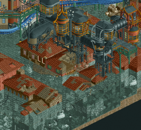
submarines and underwater section is great. I also particularly love the black iron and gold structure built on top of these buildings.
pretty little scene here. The storm drain flooding/overflowing, the flowers, the elevation. The gondolas sailing by.
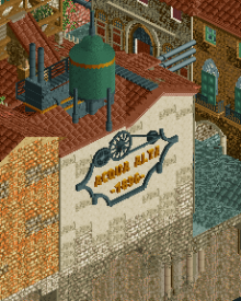
you all know I love a good logo. This is no exception. Love the official logo for this park, and love how you guys were able to add it to the map.
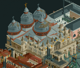
This building is just impeccable. Jesus Christ. Literally.
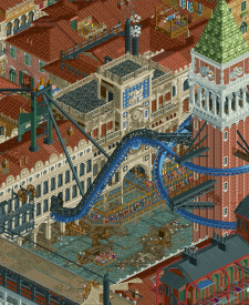
I can't say I was a massive fan of the coaster, but man do I love this interaction. The supports hanging off the tower, the muddy/trashy area below, the queue. The repetition of the windows and architectural motifs. Again - just flawless execution.
All in all, there's just tons to see here. Fantastic worldbuilding, and thats what matters to me most when I play this game. I greatly enjoyed seeing you guys push the limits and create a masterpiece of a map that will surely be remembered for a long time.
screw you leon you cute villain
-------------------------
As for our map, man am I proud of the boys for coming together to get it finished. This park was always "my" project from the start - with me taking the lead and working with a couple builders to get it done. Hydro was really keen on trying out the theme, which was surprising but welcome. After his initial test of the skull cave on the beach, I knew he would be locked in. Hex was always someone I wanted to work on this park with me as well. In addition to simply being a great dude to talk and build with, I knew that he had something to prove and was very motivated to show this community what he's capable of. (recurring theme with my team it seems).
I was very meticulous with the overall plan and shape of the island itself. I wanted to establish a world unto it's own that could feasibly sit in the center of a vast ocean. Taking inspiration from Hyboria/Conan, Peter Jackson's King Kong (duh), Skull Island, Jurassic Park, and more - I didn't want it to be a specific IP. Just a canvas for a new story to take place, but with recognizable imagery and tropes that people would recognize and engage with.
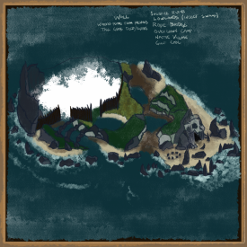
Here is my initial sketch:
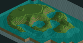
As you can see, I wanted the geology to play a major role in the formation of the island. Dark volcanic rocks - sharp towers and shards protruding from the ocean. The back half where the village ended up was meant to be surrounded by a sharp caldera of sorts - high volcanic rocks. Yes - the skull shape was implemented from the start. Yes I know theres also a skull cave on the skull island. And also like 109121 other bones and skulls and stuff. We were definitely going for an edgy approach. I ended up using a heightmap to generate the terrain - which then gave Hex the canvas to start developing the coaster.
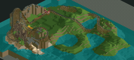
I ended up having to leave for a week to work on location for a video production, so I wasn't able to build much at all in the week leading right up to the deadline. Here's how the park looked before I left:
Poor Hydro and Hex were left to figure things out. Any chance I had to build, I was chipping away at doing the rocks and shoreline. This park was never meant to be our round 1, because I knew that I'd be busy traveling and working - but had to make some changes. Once I returned, we were able to get some significant server/VC build sessions in so that it could be finished on time. Most challenging was the literal day before deadline when my girlfriend decided to throw a birthday party for our dog. CP6 and his lovely wife Jen attended with their beautiful pup Lily, who my puppy quickly fell in love with. Meanwhile, I had the server running on my PC in the home office so that progress could be made haha. Did tons of last minute work - the helicopter survivor base, spider scene, and crashed boat were my setpieces that weren't added until the very last minute. Always knew I wanted to build them, just kept procrastinating until the end haha. Hydro built the crashed plane like an hour before deadline haha
There were a ton of other ideas that we wanted to implement - but sadly ran out of time to include.
- Wrecked trains of those who "failed" the Rite of Passage.
- A lot more sunken/wrecked boats. Some modern, some old. Wanted to give a sense of history.
- Giant worms/scorpions/swamp monster
- peeps impaled on stakes
- zipline from the big tree to the survivors
- survivors hunting for crabs on the beach
- More sharks / undersea creatures
- hut where you see vats of blue/red paint for villagers skin
- mist object around the RMC lift
- SOS on the beach
In the end, I'm mad proud that we were able to execute my vision to the level that it is, while both remaining true to my initial plans, and evolving over time with the fresh ideas brought to the table by my team.
Massive thanks to;- Sens for hopping in at the absolute last day to push us through to the end. Incredible job matching our landscape style to fill in the gaps.
- Iretont for making the giant T Rex head literally on the day of submission haha. And those Pterodactyls. We got so hyped when we saw them lol.
- RaunchyRussell for being a hack god and helping us to get the shoestrings nice and sexy
- Scoop for the feedback and awesome map sketch for the readme
- ][ntamin for the feedback and for the readme format the night before submission
It really felt like the whole team came together to help us push this park out, and it's greatly appreciated. So much more to come!
Also, yes the palette is dark. Cry about it
 Tags
Tags
- No Tags
