H2H9 / H2H9: Round Robin - R1M3 - Tile Inspectors vs Adventurers Club
-
 30-April 21
-

 Faas
Offline
I voted for the Tile Inspectors. I can see how the humor and style of Lost World can be enjoyable for people, but I'm not one of those people. The coasters were really cool though! Maybe if it was lighter and I could see more my vote would have been more difficult.
I loved most of the architecture in Acqua Alta, and my favourite ride was the spinning coaster. I'm not sure if the flyer added anything other than cluttering, and I don't like how it seemed to be too intense or nauseating so that the stats had to be altered. But that's nitpicking.
Two great parks this round! -

 battle boy
Offline
After watching "The Lost World" and "Acqua Alta 1986" I thought that it is hard for everyone to judge objectively which of these parks deserves a point. At least for me, because the subject of the first and the second are very separate.
In order to achieve a good effect, everyone (both teams) tried to put in as much as possible.
And they are great. The effects are impressive.
In the case of this clash, I thought to approach it from a psychological point of view.
It is not the care and quantity as well as the accuracy of details and details that affects the recipient here.
It is the subject matter that is the key factor to decide about the voice.
Cannibals, full of wilderness, the specter from which everyone would frighten - versus the beginnings of the civilization boom and the entire accompanying climate with an admixture of post-catastrophic thread.
Of course, everyone can have a different evaluation criterion for this match.
I like the subject matter that I can imagine more realistically and at the same time have a lot of fun with it. Although the threads in "Lost World" deserve attention, I don't like this horror.
So a point for "Acqua Alta 1986".
-

 battle boy
Offline
Oh I forgot. I'm voting now.Battle boy, your vote doesn't count unless you use the poll at the top of the page!

Thank you. -

 Lurker
Offline
Another tough match to vote on with two fantastic parks.
Lost World:
This park does a great job with the opening, it immediately sets up the story, and tells the story pretty well through the whole park. The landscaping the great throughout, especially the rockwork and the flowing lava.
Not sure I like the palette however, it's good for atmosphere and the theme (The rocks look great with it) but it made it hard to see detail for me.
Acqua Alta 1896:
This park also has a great opening, the tide gauge is an impressive centerpiece to start out on. The amount of detail and special effects was amazing (The water scenery object was used amazingly well with the submerged ruins and train station, two of my favorite areas), almost overwhelming at first but I was able to get used to it pretty fast. The custom music was also quite effective at adding to the atmosphere of the park.
-

 Maxwell
Offline
Accidentally nullified my vote, but that doesn't mean I can't copy my notes a third time!
H2H9 Park Reviews
Acqua Alta 1896
The included map was a great creative touch! Love how it builds the team’s namesake
Off the bat, the clock sculpture is instantly recognizable
+1 for DaVinci flying machine
Love the intricate cog-work lining some of the walls, really adds depth and overall atmosphere
The dam, underwater rail lines, and smoke details are all well executed and inventive!
Venetian architecture and causeway details are all great, especially Ponte Rialto & the Basilica areas
Juxtaposition between Steampunk, Venetian, submerged themes all blend very well together
Fabbrica di Vapore!!! Love the layout and interiors; favorite of the Round so far
Lost World
The included file was a fun read! Hope that these continue with each “Adventure”!
Palette is pretty dark, but is effective
The amount of detail and organic-ness of the shoreline is incredible
+1 for the HUGE gate! Love the sense of scale, and great effect with the Bargaining truck
Very impressed with all the sculptures throughout!
All the attractions are great from their themeing/naming to their hacks!
Especially impressed with Worship and Appeasement (all the drownings…)
+1 for overall supporting details; plane wreckage, foliage overgrowth, landscaping, lava flow?!
Tribal themeing and general architecture feels spot on
Map feels larger than it is given the balance between the opposing sides of the island
Vote for R1M3 – Lost World
The decision was supported by the overall balance between content and activity, all while selling the story and applying clever hacks... if that makes sense. This doesn't take anything away from Acqua Alta 1896, however I do feel as though the breathing room and focus towards the natural landscape in some areas did edge out Lost World for me. It certainly made it feel much bigger than it is, which I feel really says something.
Toughest one yet for me. Really proud of the content you guys are shelling out nowadays. And to think of what's possible when I first joined...
Can't wait for R2!
-

 G Force
Offline
Loved Lost World, feel like it really pushes the game to the limits right now with the palette and objects/textures. Almost feels like a different game, even liked the RMC too believe it or not.
Acqua was pretty fantastic as well, though the concept sorta seemed a bit more standard H2H to me, loved the micro, but much like Flood the park just didn't really have any memorable moments for me and felt a little sterile. Technically it's probably the better park, but just didn't push the same buttons for me as Lost World. Fantastic work guys!
-
 Ulvenwood
Offline
Only a short review this time:
Acqua, I don't recall ever seeing a park as highly detailed as this, with some wonderful architecture(although some buildings used lots of diff textures they became hard to read)
Lost world
Very immersive, and a great palette choice. Unbelievably atmospheric, this is the park I loaded up again and again and again. -

 alex
Offline
Both of these parks are absolutely jaw-dropping and I dunno how either team pulled it off for Round1. Insane achievement by all the builders.
Acqua Alta: I'll preface this by saying I'm generally very bored of seeing anything remotely steampunk or retro-futurist in RCT at this point, however the commitment to convincing worldbuilding and sheer quality won me over here. The architecture is simply stunning. Some detail highlights for me were: the flooded interior of the basilica, modular plug-in housing on the damn wall, the factory + spinning coaster complex. Very impressive attention to detail with underwater and interior scenes along the map edge - especially the exposed stilts and pillars because there is a nice conceptual link between these and the 'new' stilted architecture above.
Lost World: It did take me a while to get used to the palette, and even after taking a very long time looking over the park I do think it could've been improved a lot by turning down the contrast a notch between the dark areas and the too-bright seafoam and bones, whilst still maintaining the dark atmosphere - Instead of giving attention to the amazing curvy natural forms in the landscape and architecture the eye is immediately drawn to squareness of the white water objects. Still, I respect you for being daring here, and it does speak to just how incredible I found the park otherwise that it's still my favorite of the match. It's so fresh and unique in the way everything was constructed, from the beach landscaping and foliage to the new angles in the wooden structures and walkways, the giant post wall and gates. Everything feels like you're trying new approaches to execution rather than sticking with tried and tested methods - and for that you get my vote.
-

 PhoenixWing101
Offline
Wow, two more stunning parks for Round 1!
Acqua Alta 1896
Damn, nice to see another drowned park, and one that's so different, and with some absolutely stunning architecture! Plenty of creative uses of objects here and some nice details like the planes. How did y'all build so quickly I'll never know.
My issues with the park are varied. One - some of the architecture feels almost overly detailed to the point of just being messy, and the building with the pink layer... not a fan of that one really. Also i just generally feels a bit busy and overwhelming really. I dunno, maybe I'm just more used to parks with heavy landscaping. It's still one hell of an impressive piece
Lost World
On first inspection, I hated this park. Honestly. It's the palette; y'all took a gamble and I don't think it paid off for everyone, judging by what a lot of people are saying.
HOWEVER, when I came back to view this park again (and my first thought was "OMG they have Pterosaurs!") and I have to say it's grown on me. The main area by the lava still feels cluttered as all hell (I'd defo have moved the pirate ship for one) but there's tonnes of details - I especially love all the crashed aircraft, and the shipwrecked boat which definitely tells the story. The "Glory" ride is still as crazy as ever and the drowning guests are a concern I'll admit, but I think that this must be the point of this map after all!
Upon viewing the parks again it's definitely a much closer battle than I originally thought; and obviously congrats to both teams for an impresive amount of work! But in the end, I have to give it to the Lost World, despite the damage it's done to my eyes. Congrats to both teams! -

 Steve
Offline
Sorry for the late response, teams; I am a busy man with parks to build and Emma Watson subreddits to peruse (just kidding. Or am I? posix can I get a cringeharold up in here?). Anyway, this might be the match of the round! Even better than my match, maybe. How did this happen? AJ you're in big trouble, mister. The team thinks I have a whip at my disposal but I haven't been to a dungeon since I was a kid. Wow, this is a dark review. It's fine though, right?
Anyway, I'll keep this short and sweet, I think. I say that now, though. Get ready for a nine page dissection on these (I'm kidding again. Such a jokester!). Although I wagered The Grid Detectives would beat Journey Fan Club into a depressing pulp of their former selves, I was wrong! Welcome to my personal hell of a constant tie! Despite the closeness of the match, both teams delivered seriously great shit (even if Tolsimir copied alex from the first match. Will I hold that against them? Obviously. I still need my hug, Roberto). I ended up voting for Joshua in what is likely the defining vote of the whole round, I think. I have so many followers, don't I? This isn't much of a review is it? Are you even still reading this, posix?
OK so 2 Drowned 2 Furious was obviously wicked good. However, I have to remove peeps and close all the rides because RIP my FPS (also RIP to some random who died because when I did that someone drowned. Hilarious though). Aside from that, I really enjoy this Venetian Steampunk version of that crystal park AVC did like ten years ago.
King Kong: The Park was also, obviously, wicked good. I have to give them points for the awful palette. It's like a train wreck but still somehow, awesome? And serviceable to the theme? Plus those supports on the RMC. I need more tissues (man, what is wrong with me this morning). I also really liked the dinosaur popping out of the trees; whoever made that object/ride needs either the highest of fives or a slap square in the penis.
This seems like a natural stopping point.
-

 robbie92
Offline
Off the bat, this was a super tough round to judge and it's also astounding what both teams accomplished within the first round; there's enough content in both to feel like later-round contests.
Acqua Alta: At first impressions, this was the runaway winner for me. The amazingly-detailed Venetian architecture, the incredible world-building details, the sheer enormity and vastness of the scope of the park... Just a truly overwhelming experience to dig through with some absolute gems. The tide barometer, the flooded St. Mark's, and the pipework are all standouts early on, as well as the pile details on the sides of the map. The architecture of the city itself was detailed but still legible, and the dam housing was a really fantastic execution of modular construction. The factory architecture as well was really well done. The main issue for me that went on as I was viewing this was that it started feeling like too much; the park pieces themselves were phenomenal, but the sum of the parts didn't quite live up to the promise of the details for me. The composition of the park felt unbalanced to me for some reason, maybe it being the really strong natural line of the dam contrasting with this suddenly-dense city centre, with each section of the map seeming to exist as its own separate component. I also wasn't a huge fan of the flyer, which felt kinda rambling and aimless compared to the more natural integration and precision of the other supporting rides. Some of the other movement in the park felt excessive to me, like the abundance of boats (thematically makes sense but felt overpowering at certain points with all the vehicles looking the same) and the smoke; the smoke was a really great idea thematically but ended up reading oddly with the lack of fluidity coming from the RCT restrictions. Still, this is a top-tier H2H park already and I can't wait to see what else you guys can do.
Lost World: I'll admit, the palette was extremely hard to look past at first glance; Alex made a good point in that the darkness ended up putting a lot of emphasis on the sea foam pieces which got distracting. That being said, once my eyes got adjusted, I was pretty blown away. It's a simple premise executed phenomenally well, and the tightness of the narrative between the readme and the park is deceptively ambitious and paid off so well. The landscaping and the way it begs the viewer to really traverse the map and discover details was phenomenal; the texturing of the sand, the distinction between rough seas and placid swamps... it was all just superb. Easily the best landscaping since, well, your captain's Namibia entry
 . In terms of the rides themselves, the RMC was fantastic, with an excellent layout that interacted with the island in a strong way without feeling as drawn-out and rambling as some of the other rides we've seen in this round so far; the custom supports were just bonkers in the best way, I can't believe y'all had the patience and energy to push that through for R1. While there's not a ton of architecture there, what's there feels novel and fresh from a textural standpoint. I think overall, while the palette does hinder a bit of the composition and texture work at play in this park, it's not enough to dampen just how fresh this approach was.
Had I voted within first viewing, I'm sure I would've leaned towards Acqua Alta, but in the end Lost World grew so much for me on subsequent viewings and just felt fresher to me overall. Still, either of these would likely obliterate any other parks in this round and it's almost a cruel twist of fate (though not for my own park hehe) that they had to face each other in the end.
-

 AJ-
Offline
Congrats to both teams and turning out the best match of the round in such a short amount of time. I think both parks are spectacular and show such different skill sets.
The detail, the architecture and depth in Acqua Alta 1896 is unmatched! Holy cow those buildings look incredible. I think the spinning coaster is absolutely fabulous from the colors, the supports, the layout and the big structure around it. I also really liked the Venice parts and everything around it. The flooded aspect was done so well! And that train station! Great job Tile Inspectors!
However I really thought the macro in Lost World, the story telling, the coaster, and all the cute and creepy things in this park were my kinda things!! I freakin love coaster supports in this game and that RMC is the best coaster of these 6 parks so far! I personally liked the pallet, though the depth/ contrast in some colors was whack, I think it paid off in its effect on the park. There were a ton of little things to me that all added up to barely overcoming the perfection in Acqua Alta 1896.
My vote goes to Lost World! I personally liked the subject matter and style of this park more and that was really my final factor. Congrats Adventures Club!
-

 Wanted
Offline
These parks are both 10s so I'm not voting. World class shit, congrats to all builders.
-

 Hepta
Offline
My jaw absolutely dropped when opening both of these parks. You guys are really taking this game next level. Congrats to all the builders.
I voted for Acqua Alta 1896. The level of detail and beauty combined with the cyberpunk theme, Venice being saved from rising sea levels, the awesome machines and structures, and all the little nooks and crannies were fun to look through.
Lost World has an incredible coaster and of course that's what this game is about. I haven't seen an RCT ride that make me want to ride it so badly in a long time. However the park overall didn't keep my attention as long as the opponent park, despite the coaster, spectacular landscaping and cool little details.
Can't wait to see what you all have in stock for the next rounds! It's only round one and both of these teams have made a big statement!
-

 posix
Offline
Match Conclusion

The poll is now closed.
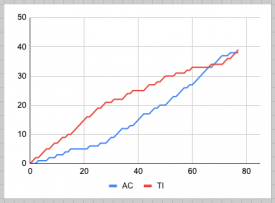
The Tile Inspectors have won this match with a score of 39–38 .
Creators
Tile Inspectors"Acqua Alta 1896"
WhosLeon
René
Mulder
zxbiohazardzx (F)
Adventurer's Club"Lost World"
hydroportal
In:Cities
Hex
SensualEthiopianPolice (F)
-

 In:Cities
Offline
Congrats TI's! Well deserved. We're just happy that we made it even somewhat competitive.
My goal was to let some newer/relatively unknown guys take more of a spotlight and shine. I was unfortunately really busy with work and travel irl during this build process, but my boys really grinded away at this park. Much of it was built within this last weekend haha.
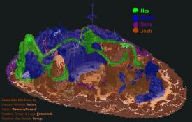
I'll share more construction info soon. Here's a quick builder share map.
-

 Liampie
Offline
Congratulations TI. What a fucking match. I only got around to properly checking the parks out tonight. Did Lost World first, and thought 'I can't NOT vote for this map, it's so fucking good!'. Then I opened Acqua Alta, and thought 'I can't NOT vote for this map, it's so fucking good!'. I could write an elaborate review, but I think others have summed everything up nicely. I think it was alex who said he's bored of steampunk, and I agree. However, you can't deny that combining it with Venice was a good move and that the conceptual execution is exceptional. It feels bad to call this map just another steampunk theme. I can shoot conceptual holes in both parks btw, but it's nit picking. No further review from me for now; maybe I'll do some screenshot highlights at some point.

Here's the cray cray graph for this match.
 Tags
Tags
- No Tags
