H2H9 / H2H9: Round Robin - R1M3 - Tile Inspectors vs Adventurers Club
-
 30-April 21
-

 Liampie
Offline

Round Robin

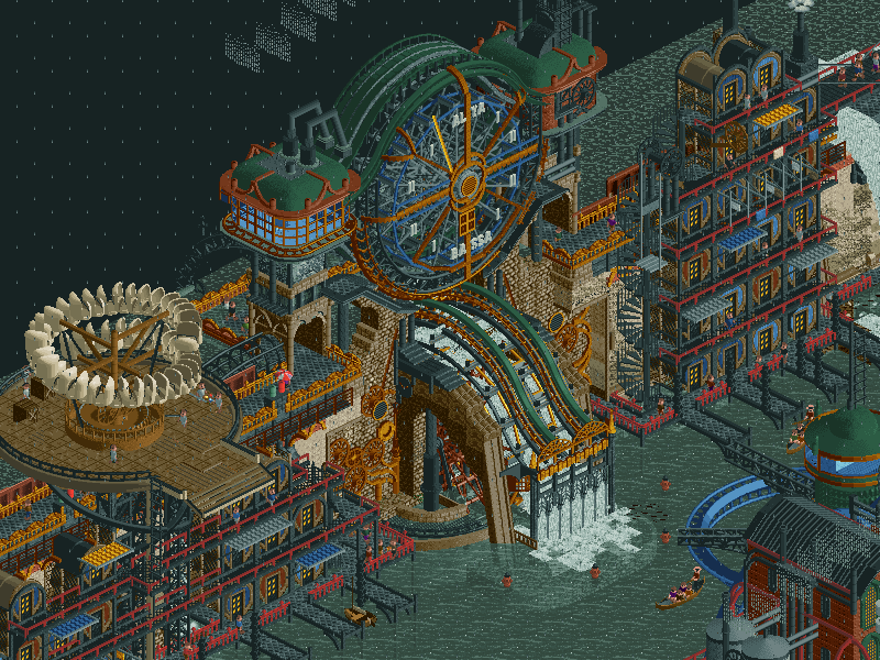
 Acqua Alta 1896
VS

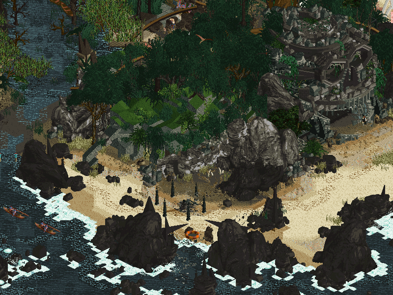
 Lost WorldVoting Rules
- The poll will stay open for ~72hrs.
- Do not vote unless you have viewed both parks in-game.
- Everyone may vote except members of either team. Any illegitimate votes will be ignored.
- Anyone with an account that predates the start of H2H9, or who has been drafted onto a team, may vote in this match. Anyone with a newer account must pass the admins' account integrity checks.
- Voting is monitored by the admins to improve fairness.
-

 Gustav Goblin
Offline
Business is picking up around here!
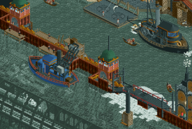
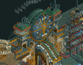
Acqua Alta 1896- Pack it up, folks. Best park of the contest so far, no doubt about it. The moment I saw Tolsimir, Fisch, WhosLeon, and AvanineCommuter on the same team, I knew they'd blow everyone else out of the water. I was 100% correct. It is just jam-packed with detail and beauty and soul in every single tile, and the grandiose architecture just screams AVC. The custom rides like the dam breach and the smoke give the park so much movement and detail which I don't think would have been recaptured with scenery alone. The one downside I have is that it lags the hell out of ORCT2, but that hardly takes away from this stellar, stellar effort.
Lost World- Considering the monolith it had to go up against, this one put up an amazing fight. The journal that comes with the park is hilarious, but open up the park and it's immediate evident it's not just all laughs. The way the search party and the crashing truck lead you through the park is a great composition method which reminds me of Zerzura from the last H2H. The island is gorgeously sculpted, and landmarks like the huge gate and the skulls bring it a sense of grandiosity and adventure. Rite of Passage is one of the best coasters this contest has seen so far, and I just adore its layout and the way it interacts with the island. The failed expeditions (especially Not Flying Germans) are great little touches. An absolutely spectacular park which deserves high praise in its own right.
This is what I've been waiting to see from H2H, and holy crap both teams delivered today. I gotta give my vote to the Tile Inspectors, but the Adventurer's Club put up a hell of a fight! Great job to both teams!
-

 Ling
Offline
Acqua Alta 1896 - Love the active smoke stacks and the dams. Love the mix of really clean feeling areas and really dirty feeling areas. It almost has a grungy, Dishonored-like feel to it. This might be my favorite entry of round 1.
Lost World - I hate the giant spider. Also I can't really..... see anything. Really not a fan of the color palette. Rite of Passage has a great first drop + first major hill interacting with the huge skull but the dispatch times could use a little tuning for the trains to run more smoothly. I skimmed the meme journal and still don't really feel like I "get it". Adventure maps like this live or die on their setpieces and the chief in the massive skull is the only one that really does it for me. The "Appeasement" sacrifice ride is a really neat trick, not sure how that was pulled off.
-

 Six Frags
Offline
Wow, what an INCREDIBLE parks here, both are absolute gems. Shame one has to lose.
Lost World
What an entry with the read-me, or should I say novel. I loved the series Lost, and I get that your story is heavily inspired by it. Love the creativeness here. Onto my favorite bits of the park;
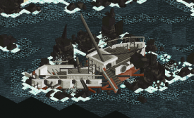
Great destroyed boat, nice entry when you open the park, you immediately know what the narrative is.
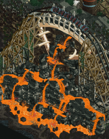
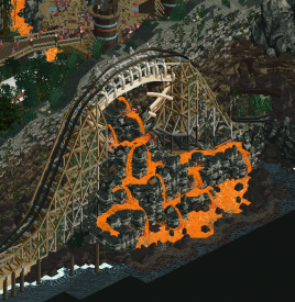
Love the bones in the support structure, and the lava coming out of the mountain dripping down.
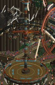
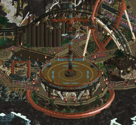
Love the different cars spinning on top, and the whole pole has nice color accents.
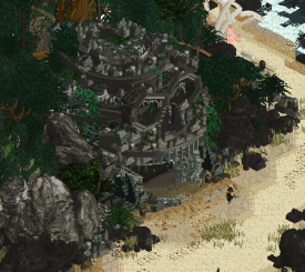
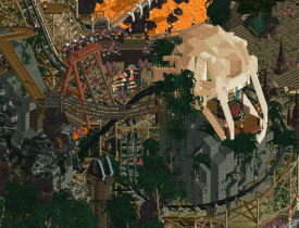
Very nicely sculpted skull. Also love the landscaping details and how the beach is brushed with different land types and textures. Creates depth and I love it.
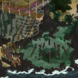
Absolutely love how this sacrifice pit/drop was created. Also, the stadium seating with peeps watching at the bottom is hilarious and at the same time horrific
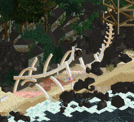
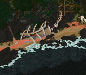
Beautifully constructed carcass. Also ingenious to use the coaster track as spine.
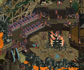
Using Roomie's dancing peeps ride to create this worship dance is genius! Was laughing out loud when I saw it
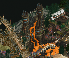
Absolutely awesome sculpture. Love how you created this kinda scary monkey face. And that coaster bridge over the lava is just wonderful.
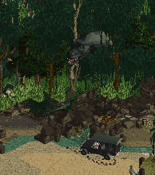
No idea if you created this T-Rex especially for this project, and if you did kudo's! I never saw it before so I assume it is made for this, and it adds that extra polish and uniqueness to it. Who is Samantha btw?
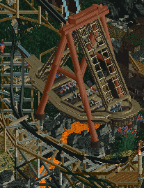
Nicely created custom flat. Again love the little lava stream underneath.
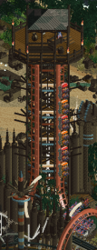
Nicely crafted watch tower, and love the interaction with the coaster on it.
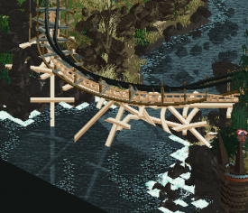
Lovely support structure under the coaster.
Overall, I thought the color palette was a tad too dark. Really had to spend minutes for my eyes to adjust before I started to see all the details and stories that you guys created. Once I did, the park got better and better each time I found something new. This park would've beaten every other park, but....
Acqua Alta 1896
When I downloaded the file, I immediately was happy to see you guys included a custom music file, they are seriously underrated here. Also love the graphic with (I guess) the inspiration pics you used.
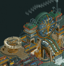
When opening the park this scene immediately gives that WHOA moment. Lovely sculpturing here and the use of the haunted house cars to create those Da Vinci sails is just brilliant.
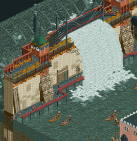
Lovely breach in the dam, also kudo's for the details in the side of the land of the park with those plumbing poles, and in other places little cutaways.
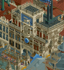
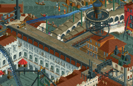
Lovely architecture. Borderline overdetailed tho. Love all the decorations and color scheme.
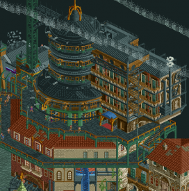
Again very skillfully crafted steampunk-ish building. Also love the smoke trails you guys created coming out of the pipes, using the fade ride.
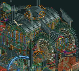
I'm starting to sound like a broken record, but again a great structure. Great use of trackitecture to give the building that smooth touch.
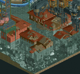
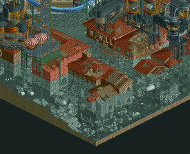
Lovely underwater stuff. This is how you do Drowned stuff Can clearly see the street level, and a nice touch with the nautilus trucking through it all.
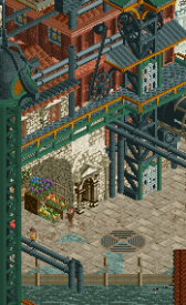
Just a nice detail I noticed with the flood causing the well(/grate?) to overflow. Also, don't think I've seen that object before, and always love to see nice objects being created for H2H
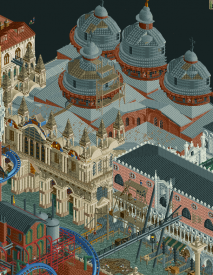
This is how you create domes Also love the scaffolding to show they are being re-painted. The front facade of the building is also top-notch with all the decorations.
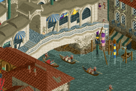
With spacek on the team you're gonna get this possibility of awesome custom rides and this fits so well here. This blows the other gondola custom ride (by Lady Croft) away! Also love the bridge.
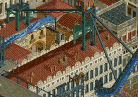
Lovely created custom support for the coaster. Didn't really care for the coaster itself, as it lagged a bit and it meandered a bit too much. Nice elements and its interaction with the surrounding though.
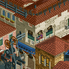
Just a nicely themed darkride. If I were a guest in there I would've loved the view outside. Also nice custom wheel object in front of it on that structure. Fits well.
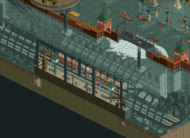
Very nice cutaway station here. Those clock towers are so nicely crafted.
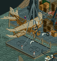
Amazing oldtimer plane, is it meant to be the Da Vinci plane? Kinda looks like it... The amount of detail and realism is immaculate.
edit; When browsing through the park a bit more I think I found the 'real' Da Vinci plane;
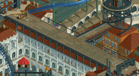
Also love the runway on top of that building. Well thought out!
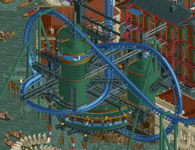
Last but certainly not least, this is just lovely interaction between the coaster and the structure. Nice lighthouse and clever use of the monorails for the bottom of the structure.
------------------
Unfortunately for the Adventurers Club, they went against what might be my favorite H2H park ever. Lost World would've beaten all other r1 parks with ease, but against this mammoth of a park I'm not sure anything stands a chance. Great job both teams for these gems of parks, I will enjoy them for many more hours to come!
What a great start to H2H9! -

 CoasterCreator9
Offline
Two more really impressive parks; nice match here.
Lost World
That RMC is fantastic; such amazing support work and a really strong layout. The highlights of this for me were definitely the rides and the animal (or dead animal) features; the spider, skeletons, Samantha, puhteradactyls - lovely features and great additions of life to the park. It does feel a little one sided with all the rides and such basically on a third to half of the map, but the impressive landscaping helps keep the rest of the map fairly interesting. The water features are great, and I love the wrecked planes, helicopters, and ship hanging out. Adds a lot to the idea that it's a forsaken or forgotten island. As always, the object use making the water more interesting is quite impressive.
The elephant in the room for me is the palette. The dark dark brown was so abundant, and the objects it was used on gave me a bit of a headache. Stuff was either overly dark or overly bright (the spider) and neither was too pleasant for me. This issue was compounded by the abundant rain on the map, making everything even darker, while making the bright things practically neon. I really appreciate what you were going for with it, I just don't think it was successful in my eyes. Why are the peeps so sickly blue? I wasn't sure it that was intended or a side effect of the palette. I also noticed a few unpolished spots, namely under the water. The ride you've used for wave sounds is visible, and there are several areas where scenery supports are visible.
Lovely fossils, that tail is great. Shame about the visible track below...
Incredible and maybe one of the peak moments of this park; really big statement piece.
Another really impressive set of layering and vertical features. It's a little hard to read and I'm not sure what's up with those peeps, but the setting is incredible.
While I noticed this area to be a little glitchy, I was a big fan of the way all these rides interact here.
Acqua Alta
Holy shit. This is incredible. There is so much I love about this that I'm going to have to force myself to limit myself a little here. First of all, adore the theme. Obvious parallels aside, I'm a big fan of the steampunk-y vibe, and I think you guys really pulled off the whole defense against nature thing with the dams and the breaches. I like how this and Drowned are so similar yet so very different. I love the way your music choice accents the atmosphere; it's almost a Bioshock Infinite kind of vibe to it. From the submarines exploring the damaged streets, to the fantastic flying coaster, the smoke drifting across the map, and all the stunning details along the dam - it all comes together so well and in such a beautifully atmospheric way.
My only, and admittedly fairly minor, critiques would have to be that the way the map is cut off in some spots is a little awkward. The basilica domes are nicely detailed, but it's a shame that they just got cut in half. I also did find myself wishing that corner with Vecchia Vita had a bit more of that rebuilt steampunk style that the other side of the map has.
I really adore this whole underwater train with the smokestacks.
The giant water gauge is super cool, love how you pulled this off.
Love this landing strip, might have liked to see a bit more stuff like this across the park.
This whole underwater scene here is really something special.
These are both very impressive parks, definitely something to be proud of considering it's only Round 1!
-

 Cocoa
Offline
aqua volta- this is one of those parks that just floors me with how detailed and intricate it is, and totally intimidates me-- i cannot build to this sort of standard. it may be the most detailed park ever made. and probably the best venetian theme in rct2, and the best steampunk theme in rct2 I've yet seen. the buildings are architecturally incredible, and the steampunk themeing everywhere is just crazy. it actually makes my game lag pretty badly with all the moving scenery. I love the storytelling of the world here, and of course, it all oozes with atmosphere. I really respect the color palette too, the water is novel but works well. i actually cannot believe this is a r1 park-- do you guys not have anything else to do with your time?? there are two slight misses for me- the flyer layout is a bit clunky and lacking the ideal flow which would gracefully move around the park, interweaving with itself like the real FLY instead of just doing one big loop. secondly, on a compositional level, I couldn't figure out how to approach the park, or how to move around to experience it. i just kept darting between details because it didn't have a 'narrative structure' to follow with my eyes- the result of which is it becomes harder to find and enjoy some of the buildings and detailing that are so incredibly remarkable in this park. btw- the interior to the church is one of the best interiors/dioramas i've ever seen in rct. all up- this idea is an absolute banger and the execution does not let it down incredible stuff.
lost world- holy fukn shit-- this may be one of the best parks i've ever seen. i'm absolutely floored, and frankly embarassed to be drafted so high in this competition when I can't even come close to this. the landscaping is fucked smooth, incredibly flowing and so natural and epic. the giant structures- bones insulting me (funny every time), giant skulls, spiders, rituals,... all of it is so good I don't even have words for it. the rmc is incredible, and the support structure is so well designed that I just want to give up now. how do you guys have time or energy to do this. wtf. the planes and boats, round stone structures, giant gates, the drawing in the readme. jesus christ guys. the narrative structure of the park was bang-on perfect and really drew me into the world. i felt like I was experiencing a ridiculous movie or something. the ideal h2h park in every way, IMO.
-

 MCI
Offline
What a match...
Kudos to both teams, the level of detail in both parks was absolutely insane.
I have tro admit, that I'm not a huge fan of the colour pallete in lost world. I get what you were going for, but it's just not for me. The rest was superb.
Voted for aqua volta
-

 Jene
Offline
Wow, what a match! I could list all the things that I love about Acqua Alta 1896, but it would just become this endless list. This park is gorgeous, full of life, fantastical, but at the same time looking very close to the real Venice (apart from the steampunk stuff that is). I'm going to revisit this park again, and again, and again. And the best part of this park is that the flood killed off all those f*cking annoying pigeon's on the San Marco square. Cheers to that!
The read me of The Lost World had me spit my drink out my nose. It was gross, but definitely worth it. The RMC is amazing and all the side attractions are great as well. I love the dinosaur popping out of the woods, the giant spider, the skeletons and the drowning of peeps. But . . . it’s all really hard to see. I get what you guys were going for with this palette, but for me, it doesn’t work. The contrast between the brights and the darks is just to heavy, which makes it a very unpleasant viewing experience.
The clear winner to me are the Tile Inspectors.
-

 chorkiel
Offline
Lost world: This was a park full of hits and misses for me, so I'll list them as such. Some are just personal preferences.
Hits: the theme - dinosaurs are awesome, the sculptures and custom objects, all the offerings.
Misses: the palette, the rmc, and the mapping. Most content is a bit crammed on one side of the park while the other side feels a bit empty. Because I didn't like the palette that didn't offer a nice look at an esthetically pleasing island landscape. Lastly the park was very glitchy for me.
Acqua Alta: Although I'm not usually the biggest fan of the whole steampunk vibe, this map offered plenty of good things. Particularly three buildings stood out. The basilica, the train station, and the factory. Personally I wasn't really a fan of how the smoke was in the way of my view of the city. Could have been a cool trick but not executed well enough to work in my opinion. In contrast to the water surge, which looked fantastic.
Heavily leaning towards Acqua Alta, but I'll think my vote over some more today.
-

 Magnus
Offline
Best matchup of this year's H2H so far.
Two amazing parks with great attention to detail and a lot of creativity.
Voted Lost World, simply because it kept my attention for longer.
True shame one of the parks has to lose the matchup. Then again this is what H2H is about. Sometimes you are lucky with an easy matchup, other matchups are truly difficult to win.
-

 posix
Offline
Lost World
This park was absolutely stellar in parts. The landscaping, the theming, the ideas, translated into such amount of content, and the way you portrayed the story for the park were all pretty spectacular. We've elaborated lengthily on the palette, but it really just hurts this park so much. It hinders access to it in the most unfortunate way, as you know it's all there, you just cannot see. I hope you might be inclined to offer a post-voting version of the park using a different palette, if you can still be bothered after all the commentary on it.
Acqua Alta
Just unbelievable something like this could be submitted for a Round 1 (!) park. Like Xtreme rightfully said this is a perfectly legitimate finals park. It felt very FLY inspired which I loved. First impression is the high amount of ingenious architectural constructionism, the blending of heavy materials and structures in unexpected and lighthearted ways, as you would expect from a steampunk kind of theme. As others have said, there was weirdly almost too much content. The flyer almost felt like it shouldn't be there, as everything around it is already so maxed out and wonderful. The exposure to your plenty ideas begs to be cleaner and less hectic, as do your countless smart and impressive design choices. So overall the park becomes a bit of a blur for me that I struggle to attach to, but that still impresses me a lot.
Since H2H is making me choose, I'll go with the Inspectors on this one. Park of the round material for me.
-

 wheres_walto
Offline
I'll hold off on posting my thoughts until after the vote closes (Lost World is excellent) but in the meantime, I showed Mrs Walto the parks without telling her it was our matchup and these were her reactions as someone who only knows that I play rct with my online friends:
Lost World
"The man with the big penis that's so funny *haha* the massive schlong.. seamen, get it? *Hehe*"
"Oh the park is just really dark"
"It's hard to see"
"Looks like a skull that's cool"
"I like how they built the island but it's hard to see anything, the lava waterfall is cool"
"*Gasp* bucky drowned poor bucky"
"The beach is empty"
"Poor grandma. This park has some safety issues"
Acqua Alta 1896
"I think I like this more than flooded London"
"That canal is very wide"
"You can totally tell it's Venice"
"Ooh the music is nice"
"I love this bridge"
"I like the architecture in the square"
"It kinda feels like it's lacking whimsy, maybe it's the color scheme"
"I'm not crazy about the factory looking thing" -

 Recurious
Offline
Probably the best match up of round 1. Both incredibly strong parks. Some ramblings on both parks:
Acqua Alta
Wow, what a park guys! Really well done. Some things that I liked and disliked:
+ The gondola's, they give so much atmosphere and provide a nice amount of life to the map.
+ The music. Such a nice fit, and I love the flowing water sound effects in the music. Really makes the waterfalls that much more believable.
+ I really love how full this park is. It really strikes the correct balance between being filled to the brim with content while still staying readable and not becoming unbearable.
+ Love the little square tucked in between the buildings at the end of the Rialto bridge.
+ I love the little airplane and the boat tugging it along. On that note the little street that is half underwater next to it also looks dope.
+ Love the flying coaster, especially the custom supports were cool and the framing of the pretzel loop was sick.
+ The waterway with the gondola's in between the houses looks so sick.
+ Archy overall was great.
+- The spinning coaster was great, but hard to follow.
- I wish the water on this wasn't gray. Together with the dark factory side of the map this makes the entire map pretty dark and dreary. I get that this is kind of the point, but I still wish there would have been a bit more colour.
- In general not really a fan of this palette for this park, it makes it too gray/dark.
Lost World
Again another fantastic park! I feel like AC was a bit of the underdog in the contest based on the "rate the pre-trade H2H teams" topic but this park proves all the haters wrong. Some things that I liked and disliked:
+ Overall landscaping was fantastic
+ I thought the "bargaining" car crashing was hilarious.
+ I really love the wooden walkways with the half diagonals inside the fort. Looks very atmospheric and I am definitely going steal these.
+ The RMC and the offering coaster were great. Love the interaction between the two and the RMC pre-lift section over the lava.
+ The lava waterfall. Looked awesome.
+ The rock skull is pretty cool.
+ I like how this park fits in with the team name.
+ The readme was nice and gave good context.
+- I honestly don't mind the pallete, I think it looks pretty cool in places and in some places it helps the landscaping. However, there is no denying that in other places it also makes things hard to see.
- Not a huge fan of the white skull thingy on top of that mountain that rite of passage races around. I know what it is supposed to represent but its too messy imo.
- The part of the island with the skull is a little quiet, which I guess is the point. But it could have had something added which adds some movement in this part of the map imo.
I will have to think a little longer before I make my decision on these parks. I am leaning towards one but after opening them again I am starting to have doubts again. So well done to both teams, and whoever loses: y'all got unlucky af. These parks would have won in any other match up imo.
-
 Mr.Brightside711
Offline
Wow, what a match-up. These are IMO the best parks of round 1 and either would have probably beat any of the other 4. It really is a shame one of these parks has to lose.
Acqua. Wow this park is insane. Maybe the craziest thing about it is that it was build in 4 weeks. There is loads to look at and tons of crazy details, structures, and sculptures. Big fan of steam punk so I feel like that was pulled off pretty well. A lot of praise has been given to the flying coaster but the beginning and ending are a bit weak, and it maybe sprawls out across the map a bit too much. Pacing is also odd. The spinner, however, was absolutely fantastic. The layout, the station, the theming. Wow! Overall a great park with incredible work put in. I do wish the steam punk bits were a bit more balanced. Half the map seemed maybe too heavy while the other half maybe too light? But either way, this was just a well done park.
Lost World. Again, what a crazy park built in only 4 weeks. I really do love this one. The colors have seemed to bother a lot of people but I think it fit pretty well! One of the scariest looking parks I've ever seen. There are a bunch of super cool details that really bring the story together. I feel like it was smart to kinda split the map in 2 for the theme park and the skull beach. Either side was a pleasure to explore. The rides half was maybe a bit too condensed though, and I wish it had just a bit more breathing room. The launch coaster was unique and fun and the RMC was pretty good. B&M track didn't work for me though and what is up with the blocks? Should have been 2 trains, not 3! One of the best things about the park are all the destroyed vehicles and skull sculptures. They are all done amazingly.
This was definitely a tough match to decide on, but I gotta give it to Lost World for the more unique concept and bigger risks they took. But Congrats to both teams.
-

 Turtle
Offline
I voted for Lost World, will give my thoughts after the matchup. Two of the best parks ever, probably.
-

 geewhzz
Offline
This is crazy, 3 amazing parks have to lose this round. This game is almost too much now, the objects and speed and everything are unbelievable. I feel like an old Boomer.
Vote = Lost World and was surprised to see the results! All of these parks are just too good.
 Tags
Tags
- No Tags


