H2H9 / H2H9: Round Robin - R1M1 - Logan's Run vs Scream Queens
-
 25-April 21
-

 posix
Offline

Round Robin
 The Good Death
VS

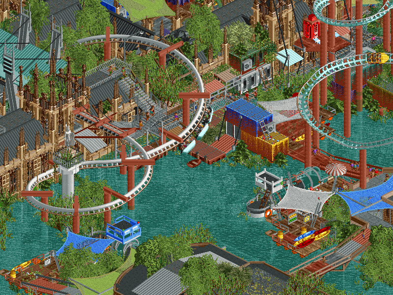
 DrownedVoting Rules
- The poll will stay open for ~72hrs.
- Do not vote unless you have viewed both parks in-game.
- Everyone may vote except members of either team. Any illegitimate votes will be ignored.
- Voting is monitored by the admins, who can see names behind all the votes. This is to improve fairness.
-

 Liampie
Offline
I love how both parks are so different, but also have parallels. Both are overgrown and are missing their bottom - Drowned has no street level, Good Death has no legs. And both are kind of upbeat, despite their topic. Lovely first match.

-

 barnNID
Offline
The Good Death: I really enjoyed this park. I'm loving the atmosphere that you guys achieved here. The landscaping is incredible and the woodie is absolutely great. The skeleton was deffinitely a highlight for me as well (the rings on the hand are wow). I was a big fan of the coaster interaction on both coasters, you guys did a great job on that front. The micro is great everywhere, the ruins and overgrowth comes off as really believable.
Drowned: I really like the concept here and I think you guys pulled it off pretty well. Firstly, the archy is absolutely fantastic here, incredible stuff. The combination of modern archy with classical archy works well here, feels like a real city. I'm a really big fan of the launched swinging invert, looks like a really fun ride. I'm a big fan of all the movement in this park and the way you guys went about all the bardges and bridges. It looks like a lot of thought went in to why certain buildings are repurposed into rides, which makes the concept a lot more believable to me. Finally, that ferris wheel is bonkers.
I'm not sure what I'm voting for yet, I'll have to take a look at both parks again. But wow, great first match:)
-

 wheres_walto
Offline
HYPE TRAIN WOO WOO
Great job by both teams, finishing parks of this quality in such a short time is no small feat. Here are my free-form, stream of consciousness first impressions:
The Good Death
+ Didn't recognize the skull initially, the skeleton looks amazing zoomed out, very nicely done
+ Love the theme, reminds me of the giant's corpse from Ender's Game
+ The banked double helix at the end of The Moss is very cool, good layout overall
+ Great use of colors, it's mostly landscaping but I don't feel like any sections clash visually
- High quality, but feels safe. Beyond the skeleton, it's a standard fantasy village anchored by a large wooden coaster
- Not a ton of direct interaction between the body and the village
- Weird that the only music is a techno beat
Drowned
+ Love the underwater details, the jellyfish are really creative. Funny that both parks have flying birds
+ Very cool theme, and well-executed. Reminds me a lot of the Last of Us with the flooding and overgrown buildings, you guys captured the feel for sure
+ Makeshift sheet metal paths are a nice detail, it's really cool to see how the new construction interacts with the flooded elaborate architecture below
- Don't love the colors, specifically the bright orange accents and coaster/supports
- Parts of the map feel dead, one corner in particular feels like wasted space
Strong matchup, haven't decided how I intend to vote yet, great job by both teams!
-

 AvanineCommuter
Offline
Lovely start to what will surely be an incredible H2H. Great work to both teams!
Logan's Run - The Good Death
- Love the theme and atmosphere, very beautiful landscaping throughout
- Map composition is fantastic, love the unusual shape and the huge elevation changes. I strongly support more parks that explore landscaping in this vein!
- Those ribs and skeletons are really well done, love the hand holding the track
- Architecture is so cute and pleasant throughout
- Love the custom supports on will o' the wisps, also really appreciated the unusual layout and interaction with Moss. Creative ride, really nicely done
- Moss has a really fantastic layout, love how it weaves within the landscape and is so low on the ground. Contender for best woody 2021!
- Dodgems music is a strange choice... but it does give the park a slightly more surrealistic edge that I'm appreciating. A bit of silence towards the other side of the map though, I feel like a custom track could've helped elevate the ambiance further
- love the necromancy ritual, what a cool little scene
- shirtless guests! great little detail
As an overall impression, I think there could have been more development / context with the giant skeleton remains and the park as a whole in terms of concept. I love the execution throughout, but like Walto has said, it does feel safe.
Scream Queens - Drowned
- Another cool concept that was really well executed. Absolutely loved the whole aesthetic of a an post-apocalyptic London and the kind of reused spaces.
- very clever use of the fade object on the edges, brilliant idea
- all the awnings and storage containers are really cool and well done
- love the stolen London Eye car being reused elsewhere on the map
- I don't quite get the name "Deliveroo" but the layout was very nice. Love the stacked track helix, really cool aesthetic. Love the station for the ride, really nicely integrated into a stunning Parliament building
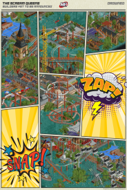
- The entire parliament building and architecture throughout is fantastic and a really cool twist on existing London architecture. Love the worn down dilapidated look and all the new additions
- Lifeboat Reserve Squadron is my favorite ride in the park, really cool idea and layout
- love the use of slight sloped roofing as walkways
Overall I loved the concept and execution, although there were moments that were a little aesthetically reminiscent of a disaster-bench park. It seems purposefully done though, and I appreciate the outside-of-the-box ideas at play.
Haven't fully decided between the two parks, but I am definitely leaning towards Drowned.
Congrats to the builders of both parks, what a wonderful kickoff to this contest! -

 Wanted
Offline
12 years since I started following H2H closely through each match. It's become such a tradition that I found myself pouring a drink to kick off H2H9. Cheers to another 10+ years of this. Downloading both parks now....
-

 nin
Offline
Great first match-up. Both parks compliment each other really well, with Good Death being more melancholic and serene, and The Drowned going for a busier, technically detailed look. I just really liked that we got hit with two bolds approaches to parkmaking for the first round, but given the theme similarities, y'all some depressed kids, aren't ya?
As mentioned, The Good Death had a pleasant atmosphere with nice landscaping, foliage and overall solid macro approach, but detailed enough to keep interest up close. The storytelling takes a second to get into, and while the giant skeleton ended up being a cool detail, aside from the hand sculpture it doesn't read as clearly as I think could be achieved in the post-DKMP-giant-sculptures world we're living in now. It also comes off as unfinished or forgotten given that half of it just doesn't exist. The architecture was also repetitive, given the same combo of roof and wall detailing, along with similarities in form for much of it. It was nice and well-made, but definitely felt like filler in places. As others have said too, pay more attention to the music choices in your next parks. While many may play without sound, presentation is key and having random music such as the dodgems playing shows a lack of care regarding it.
The Drowned was a great compliment to TGD I thought, being a near-opposite approach to similar themes and ideas. Great technical detail throughout, and the initial sight of the map is a bit of a bunch to the senses. Because of that though, it's almost jarring and leaves you wondering where to look first, and no particular thing stands out unless it's something the size of the ferris wheel. The amount of content was impressive, but seems hard to view when there's so much going on. The textures, colors, sheer amount of 'stuff', it's what I fear about a H2H in this modern age: we have the ability to make so much content that it all becomes homogenized together. I also felt like more care could've been put into some aspects, like the underwater portion of the Arrow was odd and felt rushed/unfinished.
That all said, the theme was very cool and I appreciated details like the date change. Like TGD I just wish more care was put into certain aspects, but I'm sure with both parks time was just the biggest factor against you guys.
--
Both are very impressive parks- I'm really looking forward to what you guys and everyone else does this contest. If this is any indicator for that, it's going to be a good time. -

 G Force
Offline
This is a really tough one for me. Drowned was a little hard to read and take in being so micro focused, but I love the details and archy, how the park was built around the structures. Good death has a stellar coaster and good vibe/atmosphere to it plus a few moments, but sorta feels a little lacking in content.
Will have to give it a day or two, but great work by both teams! Completing high quality R1 parks is always super tough and both squads certainly pulled it off here!
-

 Hex
Offline
Alright this is my first time writing anything for H2H and I'm super excited for this first matchup!
-----
Logan's Run - The Good Death
"All I want is a little of the good death!"
-The park layout and macro are both executed so well.
-Elevation changes are a nice touch, really sells the river splitting the terrain in half.
-Spooky Scary Skeleton! (I wish we saw a leg or something at the foot of the map, pun intended.) The flowers were a great touch, and the hand holding the track really sells the deal here for me.
-I'm a sucker for terrain woodies and interaction, and this park combined the two. The Moss is excellent; the double helix towards the foot of the map is captivating.
-A very solid supporting coaster, The Will o' The Wisp does its job by not taking away from it's larger sibling, but still provides nice interaction and elements on the west side of the map.
-I do wish there was more content at the top of the map, and I wish some of the buildings didn't look exactly the same, but overall this is a wonderful first entry!Scream Queens - Drowned
"Don't let me drown!"
-If there's one thing I'll remember from this park, it's the wonderfully submerged Ferris Wheel (London Eye?). Damn, talk about a killer set piece!-Love all of the little tidbits; some of my favorites were the queue for Wrecking Crew coming out of the dormer window, the swimming pool in the Museum's courtyard, the tiny house made from one of the Ferris Wheel cages, all the tarps with worn-out bits, and the floating trailer in the one corner attached by chairlift wires.
-I disliked the choice to have the map be a square, I think it could have benefitted from being a rectangle - still gives off the city vibe.
-The macro was kind of hard to read, but I could make sense of road lines that used to be before the flood occurred.
-The architecture of and around Big Ben is excellent.
-This is a sick concept!
-----
Loved both of these parks. I'm not sure if I'm just stupid but did neither park have a Read-me? I feel like that would have helped me understand the themes and backstories a little bit more. -

 Faas
Offline
I liked both parks.
Drowned had a cool concept but of course not very new or original. The execution was good though, albeit a bit too heavily micro-focused.
The Good Death has a really cool sculpture throughout and an awesome terrain woodie, definitely the best coaster of this round. Apart from "big skeleton" the concept wasn't really clear for me though, especially with all the rides having pretty generic names.
My vote will go to the latter. -

 chorkiel
Offline
Drowned; clever idea and well executed. There was a lot to explore and it was all well detailed. Luckily the map wasn't overstuffed with things, so it remained very legible. Architecture was the main standout for me.
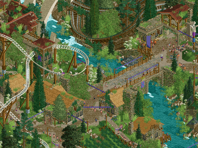
The Good Death: what this lacked in content and cleverness, this made up for with atmosphere. Simple concept but executed tremendously. It's difficult to put in words how pretty this park is. Luckily plenty of people have taken screens to exemplify this already.
Tough call, but I voted for The Good Death.
-
 Coasterbill
Offline
Drowned has a great "Waterword" vibe that I really love. I'm surprised by the reaction, I thought this was the clear winner. The amount of detail and technical skill everywhere is pehnomenal. There's so much to explore. The canopies work really well and those cranes... hot damn.
The good death had great atmosphere but it lacked in content for me compared to Drowned. The coasters were excellent though which bumped it up a bit.
A great opening match and two really nice parks but I'm voting for Drowned.
-

 ottersalad
Offline
Wow. Great opening matchup to this season of H2H. I really enjoyed both parks. TGD reminded me a lot of some of the work done on Dr Dirt's conquest game map, very shire-like and easy on the eyes. Loved the atmosphere and the coaster layouts.
Drowned was pretty solid. I get the comments about the heavy focus on micro details, but this is H2H after all, and focusing on minute things like awnings, dilapidated facades, crunchy foliage textures, etc make this entry feel very "real". Looks like a working post-apocalyptic settlement reminiscent of The Division 2 and TLOU. For that, I voted for Drowned.
-

 Steve
Offline
What a first match in a line of what's sure to be consistently great matches. Thrilling to be a part of a H2H like this after so many years still.
Good luck to both teams; your park is stellar, Queens!
-

 FredD
Offline
What a great match-up to start with! Both great parks and both very different. This is gonna be interesting...
Scream Queens - Drowned
Winner of this round when it comes purely on concept. Pretty cool idea to create a drowned city, our possible future if climate change keeps going... The foliage inside the drowned buildings is so nice! Overall this map has some nice archy here and there. The abbey is without a doubt my favorite building here, and the vines around the tower are a great touch. The Deliveroo coaster is solid, the strengled helix is awesome.
Logans Run - The Good Death
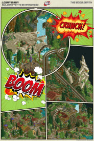
Where Drowned shines on its concept, this shines on atmosphere! It's all a great mix between dense and undense landscaping/foliaging, rides and resting points. Drowned has the micro, but this has the macro. Foliage and landscaping are great and the archy is integrated with it so good. I like the woodie a lot, I love how the "first" drop is cut into 3 parts before you reach the lowest point of it. It also has a nice helix
 And man, that hand holding the first turn after the first drop... wow, awesome!
Both great parks to start H2H9. My vote goes to The Good Death as I'm a sucker for parks with strong atmosphere.
-

 RobDedede
Offline
Before I begin, I would just like to say that I loved both parks! What a great way to start H2H9!
Drowned:
This park is so great on a technical level. I like the idea of climate change drowning London and turning it into a tropical wetland. This took me several minutes to figure out though, and I really wish there was a readme. This goes for both parks! Both coasters were quite well done, and I especially liked how the suspended coaster dove underwater. Theming the water coaster to life boats was also a smart choice. The flooded archy was stellar, too. I especially loved the flooded Westminster Abbey. (I'm pretty sure that's what it is?). Regardless, great park here! I only wish that perhaps there was a bit more detail in the corner near the London Eye. It feels a little bit empty. I also sort of wish the map had a bit more of a natural shape, but that's a nitpick. As many people know, I'm a sucker for industrial theming. In this park, the filtration twist ride and the crane swinging ride were awesome. Overall, amazing job here!
The Good Death:
This park has such excellent atmosphere. I'll admit, it took me a few minutes to realize the bones were a skeleton. Maybe I'm stupid, but just like drowned, a readme would have been so helpful here! Speaking of the skeleton, the ring on the finger and the plants in the eye socket are amazing touches. Nice teacups ride with the necromancy ritual, that was cool. Both coasters were right up my alley, especially Will O' The Wisps. Just a smaller, gentle ride with great theming. The Moss was also great, especially the helix and the way it interacted with the rib cage. Overall, the sort of pagan atmosphere this park went for is really cool. While some of the archy might be a little bit repetitive, it doesn't bother me too much. The landscape is extremely well done and is one of the biggest highlights in the park. The largest critique I can give is one that a lot of people have also given, and that is this park feels a little bit safe. The skeleton is bold and awesome, but I feel like I've seen the rest of the park before. This doesn't mean the park is bad, just not bold. Still an amazing job though!
After much deliberation, and sleeping on it, I've decided to give my vote to drowned. I really enjoyed both parks, but I felt the bolder theme deserved the vote. It's H2H after all! I'm also a sucker for industrial/apocalyptic type theming. Great job to both teams!!
-

 AvanineCommuter
Offline
So this decision is becoming more difficult the more I look at both parks.
The Good Death has what I typically love in a good park - strong atmosphere with beautiful layouts, it's gorgeous to look at, and it has a touch of surrealism that really draws me into the theme. I think the downfall for me is that it feels like there's a lack of content towards the top of the mountain that doesn't tie everything together as well as I'd like, and the repetitive architecture in the village could have been a little more varied to keep more interest. The aesthetic is also very safe, even though it's beautifully done. I think this park could have really used a nice cutaway surprise in the mountain to give it an extra bit of spice that I feel is missing in that area. As it is, I'm not really in love with the castle and the walkways up the mountain and it feels a little empty.
Drowned has a cool concept that was executed really well with a lot of little innovative, "never before seen" ideas with a lot of content which kept me interested for longer than the other park. However, the emptiness and lack of life in certain corners of the park did kind of hurt the overall experience and it is more of a micro-intensive approach that can get a little messy at times. I do love the overall rag-tag aesthetic though, and it was really reminiscent of Alex's Junkyard and some disaster-bench parks which has a certain ugly-pretty charm to it.
Of the two, TGD had hands down the better coaster layout, atmosphere and overall macro impression. Drowned had hands down the better innovation and "freshness" that I also look for in H2H parks.
I'm torn.
 Tags
Tags
- No Tags


