H2H9 / H2H9: Round Robin - R1M1 - Logan's Run vs Scream Queens
-
 25-April 21
-

 saxman1089
Offline
I suck at writing reviews, but I just want to say that I liked both parks a lot, which made it really hard to choose. Drowned was excellently done, especially the architecture and its overgrown/apocalyptic accents. TGD ultimately spoke to me more, I think because it invoked for me the brevity of life and all of our passion for this game/rollercoasters. I know that's a little deep for an RCT park, but it was the first thought I had after looking at the park and it just stuck with me. From a technical standpoint, the wooden coaster was excellently done and placed into the landscape, and the skeleton sculptures were so good from the standpoint of texture and feel.
-

 Ling
Offline
The Good Death - OMG that skeleton, and I love the unconventional woodie layout. The architecture is so refreshingly open feeling, which is a nice change of pace from some of the other really dense entries. If I had a complaint, it's that the top of the mountain feels a little empty or inconsequential, and the cathedral looks more like a ruined fortress, but it looks too specific to not be based on some real-life structure, so I chalk it up to my lack of familiarity with nordic (?) styles. I just can't believe how cool that skeleton is, I wish there was more of a story to the rest of the map.
Drowned - I respect the layers going on here hugely. The natural-disaster-survivor aesthetic overlaid on all this architecture is really cool, but feels a little at odds with all the structures looking like they were reclaimed by nature 100 years ago. I always welcome a nice swinging suspended coaster layout in a high level competition, but Lifeboat Reserve Squadron didn't quite do it for me as a supporting ride. The shop interiors were very clever, and all the mixes of textures are so striking. This is such a wonderfully creative entry.
Unfortunately I missed the voting (sorry, I've been pretty inactive...) but my vote would have gone to The Good Death. I'm happy to see it was so close though - speaks to how incredible the first round is, and how awesome it is that H2H can still be so stunning after so many seasons.
-

 Julow
Offline
Drowned is probably my favorite park ever.
This is the level I wish I had. It's absolutely genius.
It's the kind of park that I love exploring, and by the time I look at it, I can't stop telling myself that the people who created it should collaborate with real theme parks because their ideas could truly benefit the real world.
-

 FK+Coastermind
Offline
Been a busy couple weeks but I owe a review. Congrats to everyone involved, two stellar parks and a great way to kick off H2H. Love how close this and other matches were, I think it speaks to the skill and level of execution on the site right now.
Ultimately, I went with Drowned primarily for holding my attention longer. The attention to detail in the architecture, how structures were built and then reconfigured on top, and the general sense of slapped together construction in the wake of sea level rise is brilliant. While the concept wasn't maybe the most original (I've been there) I think the execution and the setting were. The choice to make this London brings a sense of familiarity to it that was perfect for the concept, without that it's just a created world without the frame of reference. Personally, I liked the launched suspender, thought it was fun and unique.
Really loved The Good Death as well. The crunch and almost artistic and expressive landscaping was beautiful, and the world building here was really lovely. Like others, I thought the wooden coaster was great but wasn't as big on the other one. Really, the only thing I felt was holding this back was a bit of context. It felt very artistic, but I'm not sure the aesthetic alone could hold up the concept without giving the viewer something more. The skeleton was inspired, particularly the rings!
Ultimately, while I loved both, I found myself slightly more engaged with Drowned, so that's where I put my vote. But I don't think there are any losers here, neither park was less then amazing and the closeness of the score reflects that.
-

 Milo
Offline
Some of the more thorough park reviews did a great job of covering the respective highlights but as we head into Round 2 I just wanted to look back and put down some thoughts on Round 1.
I enjoyed this matchup a lot and I'm glad it set the stage for all 3 matches being very close and also having a somewhat unique complementary aspect to the opposing parks. It probably comes down to just being the first H2H match in a while, but I agonized over this particular vote the most out of what ended up being tough choices all around.
Drowned:
I really appreciated the builder insights after the match was over and I think it provided some clarity as to why I ended up voting against the Scream Queens here. The central theme and execution are all great but hearing about the construction process using the new plugins shows what I think I had the most problem with. The basic idea is centered around a realistic city and the construction involved copy/paste from outside the map onto the main map. It has a very grid-like "kit build" feel and although a lot was done to mitigate this with all of the tarp structures and reconstruction on the rooftops, I'm just not sure you had enough time to fully iron out some of the downsides of building this way on what is already going to be a somewhat flat and rigidly organized map.
The rides were a lot of fun and I applaud the heavily themed flats and unique take on tracked rides. Deliveroo's water tunnel felt a little underdeveloped and the water coaster was solid but didn't blow me away. The scavenger boats are a fun idea and fit in with both the idea of scraping together resources but also living like an island paradise in the new tropical climate. It is good to see the peep trash grittiness as that is something that can elevate a lot of different ideas: from cyberpunk slums, to apocalypse themes or a contemporary fairground. The landmarks were all well done but I would have liked to see some more dislodged smaller structures/debris in between the sturdier main buildings. The argument could be made that this is after cleanup has occurred but then why the scavenging? As Liam pointed out, the theme falls apart a bit under excess scrutiny but I don't think that holds it back so much as some of the construction choices.
The Good Death:
The ceiling is definitely lower here but the execution is strong enough to elevate a solid theme idea. It was cool to see that I was able to pick up on the majority of the theme as described by AJ just based on exploring the map. The festival atmosphere with the streamers/ribbons, the naming and of course the execution of the giant skeleton were all excellent. The landscape could not have been more different than the urban setting in Drowned and I felt myself enjoying exploring this map a little more due to the height variation. Fisch went over some of the town macro issues and I feel like the top of the hill with the elevator wasn't quite the landmark set piece as maybe was originally intended but overall the consistency really helped sell the theme. I was very happy to see the mix of builders and that it was AJ who spearheaded this. I had a feeling it was maybe someone doing a Steve impression but it turns out it was the man himself, and everyone pulled together to make a cohesive map. The Moss was the ride of the match and although the steel coaster wasn't particularly amazing, it was well themed with the supports and the turnaround interaction with the woodie was a great moment of ride interaction. The flat rides were also all well executed and added some needed liveliness to the town sections.
My vote was the tying vote at 39 or so and it was fun to see the back and forth lead changes as the match tightened up. The ride lineup sealed the deal for me on Logan's Run here and I really enjoyed the atmosphere and the waterfall through the eye socket was my favorite set piece on either map. I was sorry to see The Good Death lose but it was by a narrow margin and the Scream Queens will still be my favorites throughout the season. I am a little concerned about roster efficiency for dirt as he used so many top 5 picks here but they did get the win. I'm just not sure how much robbie or alex have in the tank for the rest of the contest but they got a win here and built a map that was very much my style. It just got edged out in a 51/49 percent fashion in this particular match.
-

 Fisch
Offline
Awesome work!
As some might've seen already, I created a video review. I will say, that I'm not really sure about my video review for this, as I wasn't able to create the video review until quite a while after this matchup was released.Brilliant parks and a great first matchup for this season. It was super tense, just like match 3 later on and both parks would've deserved getting a win. I ended up voting for Drowned as it was so well done technically, but it was a super difficult vote due to The Good Death's atmosphere.
Here's the review:
-

 robbie92
Offline
Realized I never left my post-match commentary!
The Good Death: I love how effectively you guys worked with such a striking concept here. The idea of a civilization springing up around a long-forgotten skeleton is great, and you really made a beautifully-composed map here. There was a real sense of warmth to this despite the subject matter; I think the density of the landscaping and the movement in it (all those butterflies) really gave the map this sense of life and serenity. Both main coasters were fantastic, though I feel like the supports of Will o' the Wisp almsot stole the show for me. You guys did a wonderful job with implying this expansive environment within the confines of such a small map too! I think my biggest quibble (other than the lack of stronger narrative elements as mentioned by Alex) would be that the approach to fantasy didn't feel as novel as I would have hoped; I feel like this forest-y European vibe is one we've seen a lot on the site, so I would have loved to see you guys approach the same concept with maybe a fresher aesthetic take. Still, this was a fantastic park to start the season with and I can't wait to see what y'all can do next (except Steve, we don't need more Steve).
-

 RWE
Offline
The Good Death; Great concept, nice composition, a lot of awesome screenshot moments, this is a park i enjoy a lot. It really shows a good sense of ride design and color, a great start to H2H for Logans Run. Only negative point i might have is that the concept could have been developed even further in my opinion. Especially against other parks the amount of details to explore in here could have been a bit more, and also some more storytelling wouldnt have hurt. Architecture also might be a bit too same-ish. But all in all amazing map and one of my favorites so far.
Drowned; Technically very well executed map with a good concept. Especially the architecture was something i really enjoyed when viewing this. The awnings we see here are something i definitely expect to be stolen from many. The London eye was epic. I think while TGD shines at macro and has some flaws at micro, this is the other way around. Would have loved to see you go for some more interesting composition and maybe emphazised the crunchy ugly theming a tiny bit more. All in all this is a great map tho and it definitely deserves the win.
In the end i voted macro over micro here, my vote went to the The Good Death. And as we all know bones are conceptually stronger than water.
-

 Scoop
Offline
Alright I finally have some time to get some reviews out of the way. So here... we.... goooooo!!!
Scream Queens:
When I saw what the concept I got really excited. I thought it was a great idea. There is a lot to say about how amazing the architecture is in this park. All of the recognizable buildings are stellar and well executed and the areas with the awnings are so cool. The ride design was a low point for me. It just didn't make sense why the suspended coaster was there. I get that it's supposed to be a delivery service, but I just didn't get that vibe with it. Maybe if there was a second station or a set piece where all the supplies were getting "dropped off". It just seemed like there was a coaster just for the sake of having a coaster.
Here are some areas I absolutely loved:
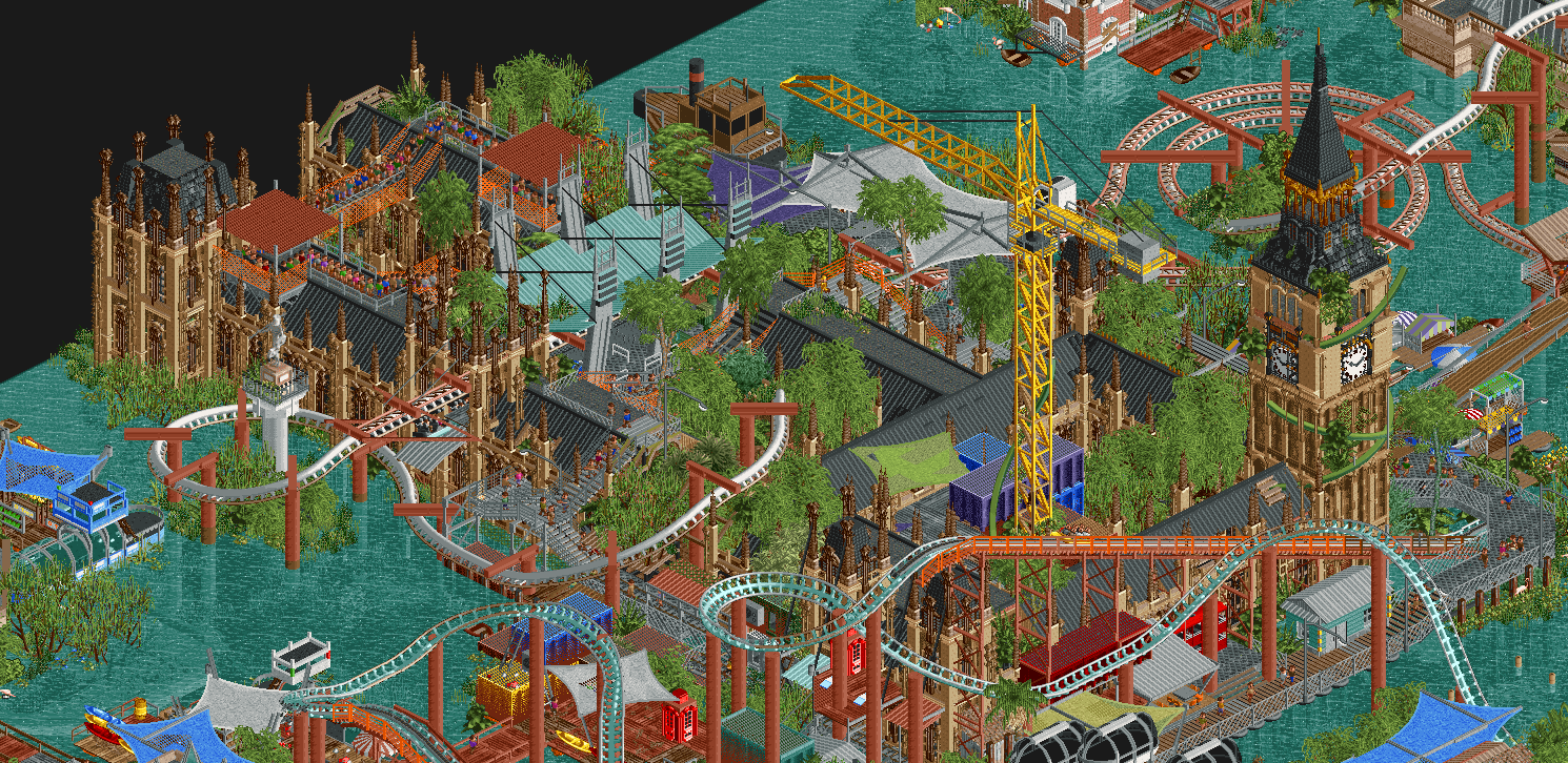
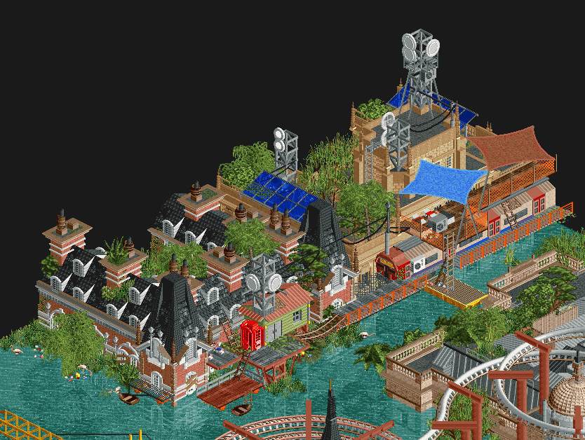
My biggest gripe with this park was it's readability and macro. I understand that the park is supposed to follow the footprint of London to a certain extent but I think a few liberties could have been taken with the placing of structures to give a better visual hierarchy. I also think the water level is too high and would've worked better if even more of the city was sticking out. There is also a lot of detail in this park kind of to the point of unreadability. I just would've liked to see some of the clutter removed, not including the foliage. Overall, still a very solid park and well deserving of the win even though I voted for.....
Logan's Run:
What a serene little slice of map making. The architecture wasn't outstanding like the Scream queens and it was very safe as far as the concept goes, but what's there is extremely likeable. That wooden layout is fab all the way around and the landscaping is just really cool. The skeleton is also pretty snazzy and interacts with the park elements with ease.
here are some memorable moments:
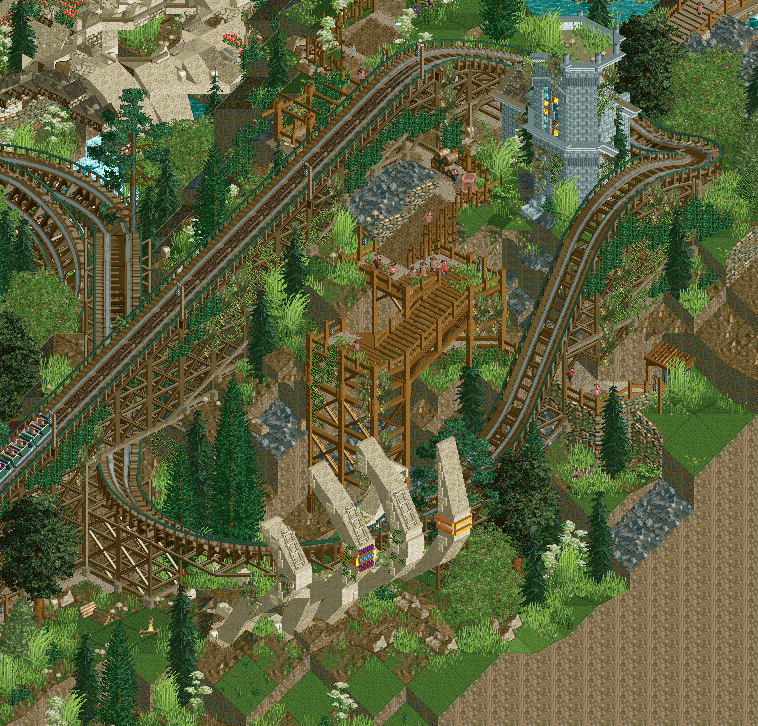
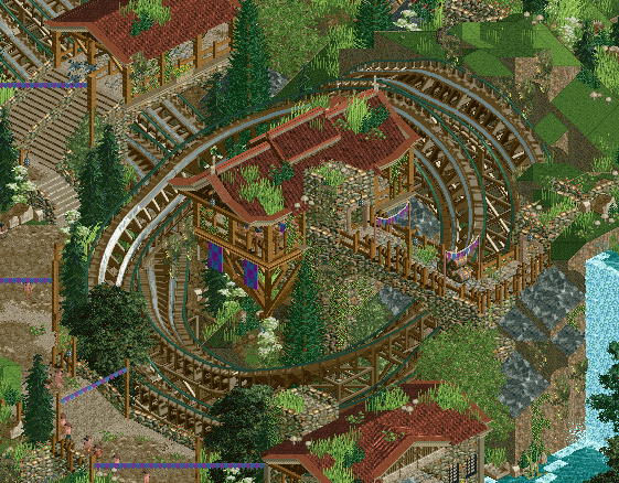
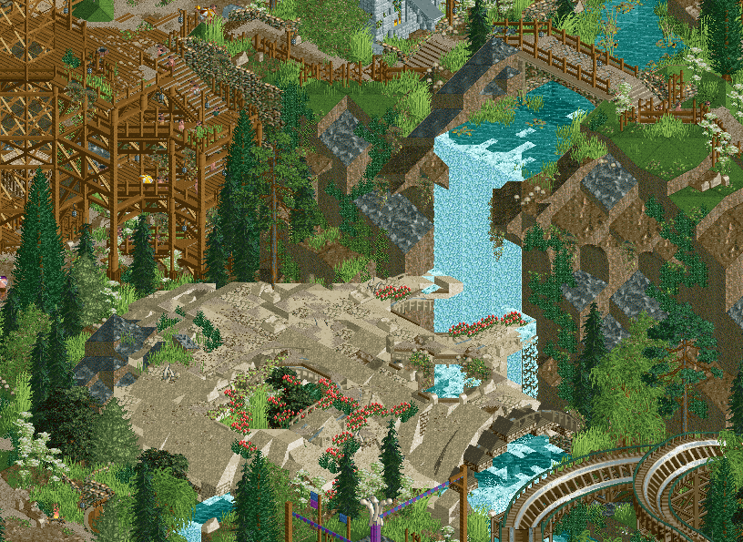
As pleasant as this map is, I do have a few minor gripes with it. The architecture is very similar across the board. I would've liked to see maybe one more variation between the buildings or more of a mix of the existing ones seeing that there is a bit of a distinction between the red and light brown rooved buildings. As I previously mentioned I wish the park wasn't as safe as it is. take a few risks next time!
 Some of the waterfalls could be improved upon. Especially the one next to the skeleton, because of how flat it looks.
Either way Congratulations to the builders on both parks. Stellar first match!
-

 Tolsimir
Offline
This was a good round to start off the season. Both parks were on the same level what also reflected in the outcome of the vote. I went with The Good Death in the end because I weighted the mayor scene of the huge and very well crafted skeleton most. It was really convincingly done, especially liked how the waterfall went through one of the eye holes. I agree on the comment that the missing bones below the torso was a bit strange, maybe you could have given hints on where they went. The missign big visual highlight was my largest complaint in Drowned. Or let's put it differently as there definitely were highlights of course like the Big Ben or the London Eye: I think due to the nature of the concept the map was very flat and that caused me as a viewer to not be really led around when viewing and I just plainly watched everything and nothing at once. Especially in the corners of the map this was even more apparent, they seemed lifeless and not much happened there. I think a large structuring feature for example like including the Thames would have helped me to appreciate the map more.
In the rides department I think SQ were in front. The swinging coaster had more memorable moments imo, especially the double intertwined helix was very cool. I think having the coaster supports of both coasters in the same color was a bit an unfortunate decision. For the woodie in TGD I really liked the first drop into the bone hand hand, cool stuff, especially would have never guessed that Steve did it!
 Also the inclined helix turnaround was very classy and smooth. I thought in matters of atmosphere both park were on par, but due to other reasons. Drowned was ahead in small and micro details all elevating the worldbuilding of the map, I liked all the tarps and reused containers, they overabundant use on every of those building island made it a bit too samey all around though for me. For TGD I think it came more together as a whole, I liked the setting of the village. Not sure if I liked the elevator bit, I think it doesn't quite fit into the rest of the theme, nowhere else you can find some "pre-modern" mechanical stuff on the map. I appreciate the landscaping here though. Landscaping wasn't apparent in Drowned, and that's of course completely logical since you built a drowned city, however I think the overabundant foliage of the map was not 100% successful. What it though was giving the climate tropical feeling you went for.
In total, I think what one map didn't do quite as good the other one was better and vice versa which resulted in the very close decision and me going for TGD for the reason explained above. Good job teams
 Tags
Tags
- No Tags

