H2H9 / H2H9: Round Robin - R1M1 - Logan's Run vs Scream Queens
-
 25-April 21
-

 Maxwell
Offline
Wow, wasn't expecting this close of a vote but this is awesome nonetheless!
I wrote down some notes as I was exploring the parks. These notes are copied below:
H2H9 Park Reviews
The Good Death
Overall theme of spiritualistic magic makes for a fun and interesting dynamic. Reminds me of Midsommar, maybe there is some inspiration here? Would love more backstory
Random torture devices(!) along with the tranquil scenery and atmosphere strengthens the dichotomy
Perfect naming for the park/entry overall
+1 for the architecture supporting the building within The Moss’ rose bowl element. Love the supporting structure
Drowned
Jellyfish!
Clock Tower overgrowth
+1 Wrecking Crew being both an adrenaline junkies' dream while also an OSHA nightmare
Flooded mall tour!
Overall architectural/technical prowess; breaking the mold with fading map edge
Content under water level – submarine and scuba divers
Filtration and the trash; prison cells with peeps that sell the theme
Strong BioShock vibes which is always fun
Vote for R1M1 – Drowned
The decision was supported by the overall content and sheer complexity. Not that this takes anything away from The Good Death, however Drowned did keep my interests longer.
Great work all around. Really looking forward to the next matchups!
-

 Sulakke
Offline
Logan's Run - The Good Death
+ Love the theme
+ Skeleton and the hand interaction
+ Lovely color scheme
+ The wooden lift with the cables and the accompanying stairs were really cool and executed perfectly.
+ The ritual custom flat ride
- A little bit glitchy in places, especially the supports of Will o' the Wisp, the sandy paths, the grey ruins and small foliage objects placed on top of large foliage objects, causing flickering.
- The architecture was very nice, but also a bit repetitive and safe.
- Some of the landscaping was rather blocky.
- The music

Scream Queens - Drowned
+ Also loving this theme.
+ The station of Deliveroo is fantastic.
+ The overgrown shopping mall with Deliveroo swinging above it.
+ The museum swinging pool.
+ The stolen Millenium Eye pod is such a cool detail. Execution of the Millenium Eye itself was great too.
- I thought it was kind of a shame the map doesn't capture the atmosphere of London well.
- The floating trees and bushes don't make sense.
- Just like the other park, this park is also really glitchy, especially the Big Ben, parliament and some of the underwater stuff.
- The corners of the map felt dead compared to the other content on the map.
- The lamp posts used as ornaments didn't work well in my opinion.
Overall a great way to start this H2H. Two evenly matched parks and a really hard decision to vote.
-

Otsdarva Offline
Drowned
- Great idea and brilliantly executed
- Each building is architecturally distinct and finely detailed that makes each area fun to explore. The awning brings a great variety of colors to otherwise dull rooftops
- Shows lots of signs of life despite the peeps' predicament
- Delivero looks fun as heck and the idea of a launched suspended swinging coaster makes me wish something like that is real (or more suspended swinging coasters in general). Love the underwater section and the station is amazing
- Creative use of the bumper boats as jellyfishes
- Other details I liked: the reuse of the Ferris wheel cabin, the museum swimming pool with the makeshift diving boards, and the double decker bus using suspended monorail trains
A Good Death
- Interesting concept but I wish a readme was included to help clarify the theme (or may be I'm just dumb)
- The Moss's interaction with the surrounding is great especially the wraparound with part of the queue above
- The giant skeleton is unique and nicely done especially the hand sculpture and so is the coaster's interaction but I think the rings are a bit tight looking
- Great unique support work for the Wisp
- Good use of purple accents
- The Ritual ride hack is nicely done
- Even though most buildings are using the same materials and have similar roofing, the construct and placement of the structures fit so naturally with the terrain that it makes them distinctive
Final verdict: undecided - abstain vote
I like both parks for different reasons. Both teams of this match built excellent parks and should be proud of their product regardless of the outcome
-

 Six Frags
Offline
New member here, so my vote won't count.
I fail to see any reason why your vote wouldn't count. There isn't any rule for it in the voting section of the "Rules and Sign-Ups" topic. Also, it's obvious that with 2 park releases (and 2 screenshots), you're not exactly 'troll/fake account' material.
-

 battle boy
Offline
Eh! Hello greetings to all. I saw those two parks and read the three comments, then thought, "-I don't know what to write ...". However, I will write.
I saw "Good Death" first. Cool park with a super intense exciting wooden rollercoaster. Few moments after. I looking this steel one as a great "addition to the landscape"
(something for those who like a quiet ride). Various elements of the landscape lead me to say that the skeleton hidden in the ground is the main element
fairy tales about the skeleton, of which the other elements are a member - this is the background to his existence.
In my opinion, for those who do not want to feel deeper into the choice of the forest (damp moss, morning dew) it may be difficult to appreciate the calm atmosphere of this scenery, the team of authors has created in this park. I appreciate.
He is good. Only maybe the sidewalk with an elevator is "not too dingy enough" for me.
The second park I saw, and I be simply delighted. "Drowned": Such an idea? = great idea! Colors that make me feel a pleasure to watch. The variety of details and the meticulousness of performance "seduces". The energy from the technical facilities runs at full speed. The guests are having a great time and so are the monkeys. Probably more than one monkey has stolen more than one sandwich. Water brings the project together and gives the possibilities of potential.
The superproject for Me is: "Deliveroo" and this is the point for this park for this project. I like the performance of this roller coaster, and all orginal character of those. This whole park for Me is a harmony of joy and seriousness.
So "Drowned".
-

 posix
Offline
Match Conclusion

The poll is now closed.
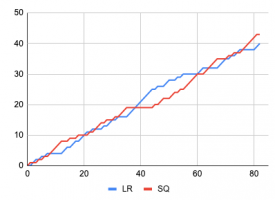
The Scream Queens have won this match with a score of 43-40 .
Creators
Logan's Run"The Good Death"
Steve
Jene
AJ-
SSSammy (F)
The Scream Queens"Drowned"
alex
Robbie92
CoasterCreator9
-

 Liampie
Offline
It was a great first match when it started, and it's an even greater match when it ended! Congratulations Scream Queens on your hard fought battle. It took you some of the big guns on your team though, and you beat a group of lower ranking players (according to the draft, excluding Steve). Logan's Run still has a lot of firepower for the coming rounds.
Here's a graph that shows the progression of the match; it may be off by one vote here and there, but the trends are accurate.
-

 Steve
Offline
Wow, what a fucking match. Congratulations to Alex, Rob and CC9! Plus all the other Scream Queens; regardless of who built it's always a team effort!
A little background on our map: so, AJ came to the team with this idea basically right at the start and really fleshed out the vibe and theme right from the early brainstorming sessions. This park wouldn't be here without him! With Jene and I hopping on we certainly contributed our fair share along with others' suggestions to get the park where it needed to be, too.
Essentially the idea of the map is that long ago, a giant in mysterious land had perished, and locals had developed a small village upon discovery of a cathedral for worship of the lost creature. So they had created a system of pulleys and ramshackle steps to get to and from their village to the crumbling house of worship. In the midst of viewing this park, you'd have caught the village in celebration of the lost giant; death made anew. Hence why all the festival banners and little stalls strung about. Of course, it was slightly vague because we thought it somewhat stood on its own in addition to us wanting the viewer to draw their own conclusions.
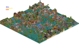
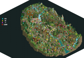
Here's a somewhat messy map of who mostly did what. AJ did the general layout of the woodie from the start with the rest of us tweaking here and there as well! I did the layout for The Will o' the Wisp after a suggestion from AJ doing a mini coaster himself:
Again, great match and well done to the Scream Queens! What a start to H2H9. Will post my thoughts on your map shortly! -

 SSSammy
Offline
huge congrats to jene and AJ for their hard work on this park, and to steve for everything he did to complete the package. I made the skull and it took me an embarrassingly long time
-

 CoasterCreator9
Offline
Wow, what a rollercoaster. Huge turnout, so many lead changes, down to the wire until the very end.
Excellent job, guys.
I'm probably going to sound like a stuck record with all the above reviews so far. This park definitely felt like Steve had a hand in it, there's a ton of landscaping atmosphere and cool features throughout. I think where this park excels is having a very impactful and stunning first look. Discovering the details throughout, from the skeleton to all the landscaping details - all very cool moments when viewing the park for the first time. Both coasters are very solid, great layouts and lovely interaction with both the landscape and the structures. I think something that I kept getting stuck on while viewing was that it felt a little too overgrown in places. The default angle is definitely the best for viewing, but places like the castle on top of the mountain and a few other spots were a little muddled until I turned the camera. The other camera views don't feel quite as appealing or impactful as the first, but they reveal some lovely details.
_____________________Drowned - Who did what:
Alex was our main idea guy behind this; he also did most of the layout work and park planning. Robbie was hugely important from an architecture perspective. Without either of them, I think we would have struggled to pull this off the way we did. I mostly played a role in sprucing up foliage, detailing, and some structure work here and there. I also did a lot of glitch cleaning. Oh, and I guess I made a few boats.
This was a fun park to build, and I had two excellent teammates to build it with. If you'd told me in H2H8 if I thought I'd be supporting a park with alex and Robbie, I probably wouldn't have believed it. Great guys to work with - the dot map was hard to make, by the end we had all supported each others' work in some manner.

What a first match; I'm excited to see where the rest of H2H9 takes us. Amazing job Logan's Run - you guys put up a huge fight. If you'll excuse me, I need a beer.
-

 posix
Offline
I hadn't posted my thoughts yet. Honestly, I null voted because I felt it was impossible to pick one park over the other. Both are super strong in their own right, and whilst I was leaning towards Drowned, Good Death had some elements I could not deny.Drowned triggered many reactions and memories. It was great to finally get H2H9 underway, and this was the first park submitted, and helped spike the excitement a lot. I've been pining for London ever since I had to leave, and it's sweet to see it recreated. But then this dire prospect of rising water levels is all too sobering, yet at the same time beautifully executed as far as RCT goes. Really well done. I love suspendeds, and launched suspendeds like that are a total winner. The circular shapes used with it were just beautiful, and constructionally intelligent. The architecture of course had that Robbie insanity factor to it. Something only he can do, and ever impressive. Congrats on the win guys.I loved the naturalistic theme of Good Death. Usually something that hits home with me, even more so when Steve does it. I thought the wooden was incredible, and a lot of fun to watch. The overgrown nature looked beautiful and very convincingly done. I love when foliage is more of a feature than a filler. The skeletons of course were incredible, especially that hand. Totally stunning. The only weakness I felt was readability. The park felt a bit too mushy in parts. For example I couldn't find the entrance to the other coaster next to the wooden. Also the terraforming was admirable, but ultimately a bit too much for this short time scale. At some point it just gets too hard to pull everything together, and I think the map shape and overall macro shows it a little.Very sorry one park had to lose, but excited to see all future outings from you both.
 -

 geewhzz
Offline
Nice job everyone, it's always a shame that one great park can "lose" in H2H but cheers all around.
-

 alex
Offline
review - The Good Death
I have to admit I came into the match quite confident in our park, and after my first look at yours I was still confident, but as the votes came in that begin to erode haha, and it also made me spend more time appreciating your park. You really can’t go wrong with a wooden coaster in a naturalistic setting if the execution and atmosphere is good, and here it was absolutely top notch. Add to that a super cool buried skelly and you’ve got a winner (well, almost ).
).
The main thing I was left wanting was an extra level of world building and storytelling. It’s good to read your explanation now Steve, but when viewing the park I didn’t feel like I knew much about this settlement other than there were burials and a sort of celebration of the cycle of life, death and regrowth. If it was intended as a Midsommer-esq paganism I would’ve liked to see more folkloric storytelling. I think this is partly where the “readme would’ve helped” comments from - although I fundamentally disagree with the readme thing, I want to see the story told through the parkmaking not a document
Anyway, congratulations on a fantastic park and giving us a super tight match - special kudos to Jene and AJ as relatively newer members - I think you have something to be proud of in very almost beating me, Robbie and CC9. -

 alex
Offline
behind the scenes stuff
setting:
Obviously the idea of a climate-change caused flooded world is quite common in films and other media, but we did take some specific inspiration (setting only, not characters and story) from a well known sci-fi book I’d read by JG Ballard called “The Drowned World”: https://en.wikipedia...e_Drowned_Worldsuch as the London setting and now tropical climate. To me this was the most interesting part of the idea - to use a city which is associated with being cold and grey and turn it into a jungle.
Here are some of mood images:


some scenery manager insights:
This park was my first time using scenery manager, and it was really fun to experiment with making buildings from modules:
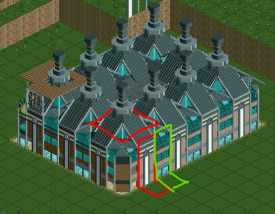
And Robbie made most of the Houses of Parliament by creating and repeating a 2x2 module:

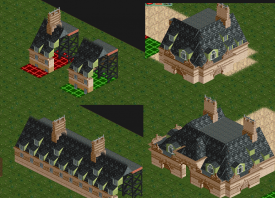
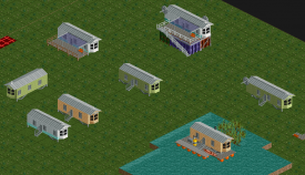
Another thing I loved about it is the potential for fast prototyping - once you’ve made a ‘base’ piece the simplicity of copying and pasting it and trying some different decorations and contexts is amazing. For instance with these caravans I could test small variations and setting changes like positioning on a float or on top of containers:
it was a total pleasure to build with Robbie and CC9. It's just crazy seeing the architecture that Robbie comes up with, and CC9 has a great eye for adding atmosphere, signs of life and storytelling details.
-

 Steve
Offline
Another start to a new H2H season and another start to a potential flood of classic Steve Reviews. Oh wow, "flood!" The puns have already started and it was unintentional! I mean it! No kidding! Anyway I'm trying to get Steve Reviews trademarked but it's expensive and I'm a busy man. Did you guys know I'm captain now? Crazy, innit. I might have lost against alex AGAIN but it's going to take a lot more than a guy with the balls to openly use Papyrus fonts to take me down. At least I can say I almost beat robbie92 but he's an OK guy with a passion of deep v-necks and stir fry so he gets a free pass. As for CC9, well, who cares. Anywhoozle.
This map, as much as I hate to admit it, is actually OK! It might be underwater and submerged in the filth that is inner-city London but for what it lacks in it's ability to tax me without representation it makes up for in some cool facades that definitely used the scenery manager. Am I going to hold that against it? Probably. Will robbie92 hold me while I openly weep after this loss? I hope so.
Anyway. I like this ferris wheel. Is this really in London? I know there's a cool bridge that gets fucked up in one Harry Potter movie. Where is that? Actually, is Emma Watson on this map somewhere? If so I can stop right now and just cede the win even more entirely because that would be awesome (hi, AVC!). I do see a boat right next the ferris wheel. I didn't read alex's last post but did you guys just wanna do something so Alec could make more boats? You assholes. Also, what's up with all the tarps? It's not even raining. Unless it's supposed to be? I have the weather frozen. Imagine if this park was frozen instead of just wet? Think of all the coasterbill objects you could use! #TeamAnna
Coasters are cool here I guess. I don't know why a rescue mission from this big boat is sending life boats to the skies via lifts and drops and turns but hey that's also my kind of mission. Oh, it passes Big Ben, too! Smaller than I thought it'd be but hey I also hear that a lot so what do I know? Is this the building robbie92 basically just copied over and over again? I can't tell nope not at all. Neat train though, are we sure Jappy didn't build on this park? Is it too late to challenge for a DQ? I'm not bitter but at this point I'm willing to try anything. Are you there posix? It's me, Steve.I'll end this by taking a spin on this death swing being suspended from a literal crane. If this match has taught me anything it's that I should conquer my fears! ...Oh good there's no line. ...Wow those poor bastards have to shop by canoe? My Prime order just came the other day for groceries. ...This is a lot taller than it looks. Are we sure Leon didn't make this thing? ...Are there any seatbelts or something? ...What do mean "use this old police tape?" ...All right fine, Alex, jeez, I know you're great and all but you're really pushy, man. ...OK I'm ready. Hey is that Emma WatsSOOOOONNNNNNN NNN NN NN N N N.
-

 Turtle
Offline
Really amazing matchup, well done to both teams. As some have said, unlucky one team had to lose.
I personally preferred The Good Death, although not by much. I thought that it was a little cleaner and more completely executed (if you'll excuse the pun). I thought the atmosphere was slightly stronger too, which for me outweighed the other park having more interesting little touches.
I could have easily voted the other way with slightly more cohesion to the atmosphere.
Great work all, really looking forward to more parks.
-

 CoasterCreator9
Offline
Actually, is Emma Watson on this map somewhere?
Pervert.
Note on the canopies everywhere; I forgot to mention in my "making of" post; but the idea is that climate change has both resulted in the water level rise, but also a hotter climate and more intense sun. Hence the more tropical climate, flamingos, monkies, etc. Is it London? Kinda. We never set out to recreate the city, and took some obvious liberties. It's London, but it's not.
I'm happy that people liked our work, fuck you Steve - I saw her first, and me being able to build some boats was a happy little accident.
-
RaunchyRussell Offline
Haven't gotten time to comment on these last two rounds yet, but would like to say amazing work to everyone involved. While both parks were executed very well I went with Drowned just for the amount of content. I could explore that map for hours. The Good Death was beautiful overall, It just didn't hold my attention as long as the other. Still a fantastic map with plenty of awesome details and overall wonderful atmosphere.
 Tags
Tags
- No Tags
