The Grand Tour '20 / The Grand Tour '20 - Round 6 Voting
-
 13-December 20
-

 Liampie
Offline
He who travels has stories to tell!
Round 6 - Chile
Round six, six entries. Fitting, isn't it? Just like how this round's objectives were tailor made for Chile. Let's see how the entries live up to this. For reference, these were this round's criteria that all entries will be judged on:
1. Your park must be set in or themed to Chile
2. Include a coaster with a minimum length of 2000 m (6562 ft)
3. The map must have an elongated shapeHow to vote
Before you vote, you have to make sure you've viewed all parks with thought and care. Voting happens through the polls above. The submissions will be judged on two criteria. First, you are asked to vote for the parks that you think completed the three objectives for this round the best. Second, you are asked to judge the parks on their overall quality - separate from the round objectives. After 72 hours, the polls will close and we will add up the votes from each poll. The submission with the most votes in total will earn the creator(s) a ticket to the final round!Entries
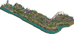
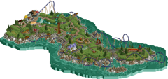
Whispering Cliffs Valparaiso Stormrider by Xtreme97 (50%) and inthemanual (50%) by Coaster-GEOFF (65%) and Zarathustra (35%) Located in the dazzling city of Valparaiso, set high atop a rocky shore, Whispering Cliffs Valparaiso invites you to enjoy a thrilling day out. As well as a plethora of hair-raising rides, the park boasts one of the world's longest roller coasters, La Viuda, with a length of 2033m. A mysterious benefactor known only by the initials N.E. paid for the custom built ride, and hasn't been heard from since. Cape Horn, where waves crash and two great oceans meet. The Chilean government allowed for a theme park to be built as long as its two existing monuments and lighthouse were preserved. With a modest zipline and bungee jump, Cape Horn Adventure Park was born. After adding a few more flat rides, the park’s owners decided they needed a star attraction to lure thrill-seekers south, no matter what it cost. Stormrider is B&M’s first hyper hybrid, which combines the giant camelbacks of a hyper with the smooth inversions of a wing. Riders soar high in the air and rush low over jagged rocks and stormy seas. Scenery by Geoff; layout and ride hacking by Zarathustra. 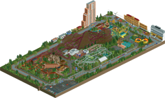
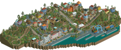
Fantasilandia Valparaíso by kenos by Liampie The small Park in Santiago Fantasilandia builds on 2021 a big Coaster that push this small park to get famous in the world of big amusemnt parks. Immigrants from many different places settled here to form a unique cultural blend here in Valparaíso. The eclectic, colourful, chaotic cityscape has survived the bulldozer rage of the 20th century, and reflects the hidden diversity of Latin America. 
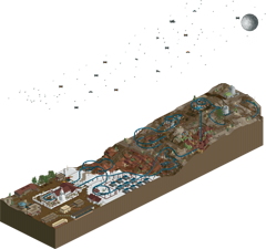
Cerro Armazones Astrónomo by mamarillas by KaiBueno (65%) and RobDedede (35%) The Extremely Large Telescope (ELT) is the largest visible-range telescope on Earth. It is located on the Cerro Armazones hill in the Atacama Desert, where a dry climate and high elevation offer clear views. Camping and stargazing are popular in the area. Other astronomy facilities, such as one dish of the Atacama Large Millimeter Array (ALMA), also reside nearby. The ELT is being updated in 2021 with a new Intamin launch coaster to bring in thrill-seekers and create a new revenue stream for the European Southern Observatory. Cerro Armazones will feature two launches, four inversions, and over ten seconds of air time! Stretching out across the Atacama Desert, Astrónomo races past highlights of the northern Chile desert’s diverse topography, in search of the moon and stars... -

 Zarathustra
Offline
If our drop tower crashes, please re-download the park. There was an issue with the file, but it has been corrected now.
-

 ottersalad
Offline
Great work everyone! Quick reviews:
Kenos:
Nice small little park with some cool details and scenes around the park like the protest. The coasters were well done I think.. but they didn't have much interaction and the path that meandered thru the park was very bland. You are great at making layouts.. just need to work on supporting them with good theming and surroundings!
Geoff and Zara:
Really pleasant looking park. The cliff/seaside rock work was great.. definitely can tell where you got the inspiration from! The flat rides were really well done.. and the coaster itself was quite interesting with how it interacted with the cliffs. Very open and breezy park.
Dedede and Kai:
Interesting palette. The coaster I think relies too heavily on the numerous launches. Would've been neat to see hills and use of elevation changes to keep the train moving. Good landscape though.
Mamarillas:
Damn you strike again! The telescope building and the dish were amazing and quite the focus of my attention when viewing the entry. The coaster was nice.. enjoyed some of the elements and swoopy turns and drops. Having the two launches in the same building/wing of the ELT was smart.
Liampie:
Wow, this is a very pleasant entry. The elevation changes were great and added a lot of room for the coaster to interact with it's surroundings. The various incline lifts were funny, especially the elevator car. Really enjoyed a lot of the archy here as well.. especially near the waterfront.
Xtreme and ITM:
Ah what the heck guys.. this is so damn good. The quality here is great. Not gonna lie, I feel like top-tier parkmaking has gone waaayyyy up this year and this park is included for me. The coaster is amazing.. I like the track layering, the support work, the interaction, and the layout doesn't seem stretched at all. The cliff rockwork is nuts.. how you tucked in so many custom flats along the cliffs, and even had the incline lift near the entrance.. dang.
-

 Gustav Goblin
Offline
Whispering Cliffs Valparaiso (Xtreme97 and ITM): Wow! This is a very strong way to start this round. The detail is incredible and very consistent throughout the park. La Viuda, Acrofobia, Tarantula, and the incline railway are really unique as well. What I really love about this park is that it has it all, from a developed theme park to gorgeous beaches, villages, and cliffs. Definitely a standout park in this entire Grand Tour.
Stormrider (Coaster-GEOFF and Zarathrusta): Very nice! The titular Stormrider is a great design, especially in the way it interacts with the scenery. The other flat rides have a lot of character as well, although their placement seems a bit abrupt. This park really reminds me of Balthali Terrace from the last round, so finding out Geoff was involved in both was not a surprise. Nice work!
Fantasilandia (kenos): This is a nice little park. The mine train and the parking lot protest were very well done. However, this park suffers from an overall lack of refinement and some questionable ride types like Volare. Getting those extra details in the terrain and buildings could take you a long way. Good job!
Valparaíso (Liampie): Nice! I'm a sucker for cliffside villages, so this one was a treat. I love how tightly packed Ascensore is into the landscape, diving in between houses and racing the funiculars. While the lack of custom supports is getting to me, I imagine it would be a bear to build them all. I just wish the ocean had some waves and rapids and splashes to liven it up; it just feels kinda dead otherwise. Even with its flaws, this is a very nice entry.
Cerro Armazones (mamarillas): Wow! I love the detail you put into the telescope and the satellite, and the trackitecture is pretty mind-boggling. Seeing what you've done with trackitecture over in Deurklink's server, though, that's hardly surprising. I also love the little splashes of color in the landscape with the rocks, flowers, and cacti. The coaster is pretty nice as well. Solid park.
Astrónomo (KaiBueno and RobDedede): Looking over the references document really makes a difference in this park. I echo my sentiments from Cerro Armazones; the splashes of color with the multicolored rocks are very welcome. The whole park in general is very colorful, although that white is a bit harsh. Overall, it's a good park, but more detail could make it a real winner.
Haven't been into RCT2 for a while, so I'm rusty at reviewing. I'm voting for Whispering Cliffs Valparaiso for both categories, while Stormrider is my second pick for highest quality and Valparaíso gets my second vote for closest adherance to the objectives. Just the finale left and this competition is over. Can't wait to see where our champions will go!
-

 barnNID
Offline
Whispering Cliffs Valparaiso: I was really impressed with the amount of detail present in this entry. The architecture was really impressive throughout, and I think the coaster acts as a great center piece to everything. Perhaps the most impressive part of this entry in my opinion is the fact that the coaster doesn't feel like it was elongated to fill the 2000 meter requirement. The custom flat rides were also a big plus for me with this one. I was very happy with the sheer amount of rides that were put into this project. The only thing that I didn't really love with this project is the rockwork. Something just seemed weird to me with the spammed pieces along the cliff side. I voted this park along with stormrider for both categories.
Stormrider: I was really surprised that I enjoyed this entry so much. I think the rockwork was pulled off nicely, and the coaster was great. The archy felt like something was missing in some places, but the sheer beauty of the atmosphere and the coloration was enough for me to look past it. Really impressive stuff on the whole, I voted this park in both categories along with whispering cliffs.
Fantasilandia: I thought this was a really nice piece of RCT. I enjoyed a lot of the archy and the amount of coasters you added into this project. I think the fact that you were rushed on time does kind of show in the final product, as some areas seem to be missing that finished level of detail. I think there were some weird composition moments as well. For example I really loved that salmon apartment building but it does look a little weird next to the one story house. Overall I though this was great, I hope to see more from you in the future.
Valparaíso: Your work never ceases to amaze me in this game. I am really impressed at the final result of this knowing how pressed for time you were. The landscaping is the biggest plus for me with this project. I know from experience how hard it is to build a city on that sort of landscape and you seem to have pulled it off wonderfully. The coaster is also really cool, the interaction with the landscape was great. The final result however does seem like it is missing that finishing touch to really bring it to life. If you had the time to add in the last layers of detail I think this park could have been my favorite.
Cerro Armazones: The trackitecture here is incredible, really crazy stuff. The giant observatory seems a little bit out of scale but it is extremely nice none the less. the coaster was really nice and interacted with itself in interesting ways. To me this project felt like it was missing something. I think if you had included a more fleshed out cutaway view for the large building it would have added a lot to the final product. Overall I though this was great though, and it certainly kept with what you are known to be great at. Good Job:)
Astrónomo: I really enjoyed this entry. The variety of different landscapes and colors were really great and interesting. I liked the archy a lot and the palette was a really bold choice that I think paid off. The coaster was also really great, and flowed quite well. I think this park lacks a bit of refinement and detail most notably with the support work and the observatories. I think spending a little bit more time on the detail would have pushed this project into contention for me.
-

 FK+Coastermind
Offline
Whispering Cliffs Valparaiso: I joked to Timmy that this park feels like everything we wanted to do with our Namibia entry but didn’t have the time or energy to accomplish. This is easily my favorite park of the round and I think the best execution of the objectives. I love the color story, particularly the white/peach of the huge coaster and the vibrant purples. I think this was the best coaster of the round and had the best combination of flow, iconic elements, and next-level interaction with surrounding rides. It also somehow manages to feel not that incredibly long compared to some of the others this round. The cliffs might have benefited from a bit more variation, but overall I really like the impact they had and how you incorporated that with some of the rides. The execution of the architecture, path details, park infrastructure, ride details was all spectacular. I particularly love the rainbow plaza and modern buildings, the park entrance, the coaster supports, and the final segment of the coaster. As with some of the other entries, there are parts that didn’t feel specifically ‘Chile’, but the bit of urban architecture and landscape made up for that in my mind.
Stormrider: The final argument in Geoff’s case for a wildcard spot. This was another great entry, with an impressive coaster, a unique landscape, and a ton of great details. All the rides nestled into the foliage area great, though the grasses did feel a bit overwhelming in places (and very reminiscent of Geoff’s Nepal entry, heh). The execution and detailing throughout is great, particularly on the lighthouse and little town area, the ride details, and the coastline (though I think you could have married the rocks with the grasses above better). There are a lot of similarities between this and Whispering Cliffs, but both feel very distinct. I’m excited to see what you both do next after GT.
Fantasilandia: Having talked with you a bit as you were building this, I think you’ve shown great progress from your Nepal park to this entry. The execution of your ideas, particularly ride details and infrastructure, has improved a ton. However, in both cases I think you were pretty ambitious with the size of the park. While you have a ton of great details and ideas, they needed more space to breathe and more attention then I think you had this round. For example, the protest is such a great idea, but feels a bit like an afterthought pushed to the side. Similarly, the bits of urban architecture, which are really important to setting this in Chile versus anywhere else, are pushed so tight to the edge of the map. I’d recommend trying to focus your ideas moving forward so you can be sure to better organize them around whatever objective you have for the park.
Valparaiso: I gotta say, I’m not sure how I feel about this park. Definitely props for finishing it, since you managed to get so much done in the last 24 hours. However, because you were posting so much about it on discord I can’t help but keep that all in mind as I view the park. Overall, it feels apparent that you didn’t have the time you’d like and that impacted the end product. For example, the composition is great from two angles but harsh from the back looking down the hill. You’ve got a ton of interesting shapes and forms in the architecture, but the finishing seems clearly rushed. The landscape in particular feels like it was spammed in places with all those cactus shrubs and 1k rocks. The coaster itself was alright, but felt a bit awkward in places. I have every confidence that with more time this would have been incredible, but given how quickly it came together I think it’s just lacking consistency as a whole package, and I’m not sure how much this actually reads as specifically Chile. I did love the dock (though it needed more junk) the white building on the waterfront is incredible, and the micro composition of areas like right above the coaster station was great.
Cerro Armazones: Another great entry and one with a ton of unique and fun ideas that made it a blast to explore. Particular highlights are the ALMA dish, the campers, the truck in the garage, and a lot of the finer details. I think the execution for the most part is really spot on and high quality. Perhaps the only negative is the general blocky-ness of the huge ELT dome. I don’t think you’ve done a bad job at capturing it based on real-life pictures, but it’s just a tricky thing to make in rct and felt a bit at odds with the sleek execution of other parts of the map. Some more textures layered in the landscape would have really pushed that above and beyond, but I’m nitpicking. I also think this was one of the more successful ultra-long coasters. Congrats!
Astronomo: I may sound like a broken record, but I think both of you have grown by leaps and bounds across this contest, this park being a great example. It’s jammed packed with ideas and you’ve done a great job of taking reference material and composing it in a meaningful way across the map. It also shows that both of you are becoming more comfortable with the modern suite of custom scenery objects. The textures and how you’ve developed different landscapes across the map is great, particularly juxtaposed with the bright blue of the coaster (others may grumble about colors, I won’t). What holds this back a bit is some of the finer execution in places, just that sense of bringing all the different disciplines together. For example, the scale of the buildings in the village relative to the path felt off, and the observatories are a great idea, but the execution was a bit blocky. Love the idea of having a night sky, though I wish it was easier to see as part of the whole. Congrats on a great round robin, particularly as two of the most frequent participants.
-
RaunchyRussell Offline
Fantasilandia: Lots of things to like here. 'Tren Minero' was the strongest ride on the map IMO. The protesters in the parking lot was a really cool idea too. Things like that really add life to the map and make it more interesting. The RMC was massive, strong layout, and it really dominated the park. It seemed sort of out of place though. Would have liked to see the taller buildings integrated into the park besides them tucked far away. Overall, well done!
Astronomo: This park had a really nice old school charm to it. The coaster I thought was pretty successful and enjoyed the color scheme. The night time-y palette with the stars and planet definitely made the map more interesting. The church and the surrounding buildings were consistent to the theme. The small observatories, I thought, were simple and successful. Despite their blockiness they hold out that old school charm for me. The flats were also very well made. The terra forming just seemed very random. I know the time constraints had something to do with this and that's understandable.
Valparaiso: Great atmosphere here. Definitely lacked the grittiness I would expect when I think of urban Chile. I think the strongest parts of the map were the two hotels, the surrounding buildings on the elevations, and the shipping container yard. The coaster just seemed very randomly laid out, but still had some good interaction moments. I know that if there were more time given this would have been much better.
Cerro: Really excited to see you branch out into the custom scenery objects. The ELT dome was absolutely massive and love how it housed the coaster along with the launches. The coaster's layout flowed well with the terrain and interacted with the dome very nicely. The details such as the semi-truck, the trailers, and support work were awesome. The ELT seemed a little blocky, but understandable with RCT's constraints. The satellite dish I thought was the most successful, very well made.
Cape Horn: Wow. The grass textures and shading were outstanding. Loved the rockwork and all the life in the water. The waves, the sealions, and splashing against the rocks. All these great details sold the open, tropical island atmosphere. I couldn't imagine trying to tackle that before the terrain manager plugin was a thing. The lighting tower was very cool, but man the bungee tower was my favorite of the flat rides. I also like how the wing coaster outlined the island. This was definitely a good way to hit the ride length requirements without making the layout too redundant. Awesome entry you two.
Whispering Cliffs: How the hell did you guys fit that much detail in such a short amount of time? The setting is immaculate. You two managed to capture the overall vibe of Chile in this pretty well. I love how the map starts out at the bottom near the shoreline town. It slowly tapers up into the grittier suburbs than into the park entrance plaza. That entrance is so damn good. The custom flats were also a huge plus. Very creative on the cliff hanger ride especially. There's nothing more I can say about the coaster that hasn't already been said. It was for sure the most successful in the round. Lovely job you two.
-

 Coaster-GEOFF
Offline
Been a while since I’ve done some reviews so this seemed like a good idea to write something for this last round.
Cerro Armazones (mamarillas):
Nice entry! You have, again, spoiled us with great macro! Simple, yet good executed.
Really like the coaster with the diagonal launch and has a great pace on it.
If anything, I’m not a fan of the barrol/cork combo, although Io think I understand what you wated to accomplish.
Overal nice park with some cool parts, like the camp and the truck inside the garage.
Valparaíso (Liampie):
You probably heard it before but amazing what you did here in this short time.
The repetitive 3x2 can’t really hide the use of the new plugin though. But to be fair, I think this is only the case because of your time limitations of course. I don’t think you would have gone this route if you had the full month.
I think the whole shore line is the best archy of the map. I really love the old white building and Netflix stuff, a lot! Maybe the wood supports underwater seem a bit weak to support a road though.
The coaster is pretty cool with that left part (especially the triple down!) being the best piece of coaster throughout the whole round, of not the contest at this point.
Cool stuff! You’ve managed to give us a nice “liam-quality”entry “within a week” that deserved my vote in both categories!
Astrónomo (KaiBueno and RobDedede):
I’ve got mixed feelings here. Somehow it’s a really nice entry with some very cool ideas like the stars.
On the other hand I think some of the objects where a bad choice. I’ve made the same mistake in croatia by using these steam objects which just don’t look good tbh.
The rocks are a nice touch but were placed a bit odd therefor there to much blocky, unnatural transitions between them. In the future, try to hide the edges with foliage or other smaller rocks.
I do love the idea and execution of the church a lot! It fits so well to have a station there and the archy was done very well!
Great looking coaster with a lovely color scheme. I do feel like 3 launches is to forced.
Overall good looking park with a very original approach!
Great job Fellas!
Whispering Cliffs Valparaiso (Xtreme97 and ITM):
Let me just begin with what I though was less good about this so I can close with a bang!
First I would like to confirm previous comments about the scale being slightly off with the modern stuff. I think that it truly the hardest part of combining these 2 styles so I wouldn’t really be concerned about it.
Although the entrance is impressive, archy wise, I think the purple is hideous, lol. But that’s just my taste…
The rockwork is confusing me a lot. It’s very repetitive and against all rules of building nice rockwork but somehow does feel good overall, haha.
The remaining archy is stunning! The atmosphere in the beginning is impressive with the nice buildings and rainbow road.
The park layout feels very natural and the flats are done superb!
Really love the coaster too. I’m stunned on how you guys make a 2000+ layout feel so “normal” and fitting in a realistic themepark. The track layering works very well here which is surprisingly not glitchy at all and the supports are great!
Might not be a surprise but you got my well-deserved vote on both categories!
Thanks for this nice rct moment guys!
Fantasilandia (kenos):
Cool stuff Kenos. There are some great atmospheric parts throughout the park.
Nice RMC but maybe a bit to slow at the tail. You could have maybe used a bit more land elevation to get that last part a bit lower and thus faster.
Some parts of the park are way to crowded btw, lol.
I really love the protest idea! Such good execution, lol.
Overall good park and I appreciate you submitting it anyway although you’ve had some timing issues.
Stormrider (Myself and Zarathrusta):
I really liked building this park. I had an amazing partner who made a kick-ass coaster and cool hacks!
Just the type of stuff I’m not really strong with!
Thank you Zara!
I really had a blast doing this and all the other rounds.
I have learned so much throughout this contest and appreciate everyone who has given me pointers, comments and guidance. This growth I have been showing the last couple of months is only because of you guys!
I’m truly happy about my progress and now I think I can start making a name for myself within this lovely community with some design submits in the near future!
Thank you
-
 inthemanual
Offline
GREAT ROUND EVERYONE!Cape Horn: Love the landscaping and ridemaking here. There's lots of cool rides that really sell the park identity here, and a really well done landscape that gives this park a home. The architecture felt a little undercooked and eclectic, but other than that this was a phenomenal entry.Cerro: Cool sculptures and cool coaster. The coaster did a lot of cool things but it felt a bit sprawled out in places. I wish there was a little more with activity around the map, because other than the coaster it didn't feel like much was moving. I liked the little campsite scene, and having the amateur astronomers juxtaposed with the ELT was a funny detail.Fantasilandia: A nice little pseudo-recreation, this captures most of the highlights of the real park while adding one of your own in the way of the big honking RMC. While the coaster does feel a little out of place in a small park like this, it's pretty well done and was interesting to follow.Astronomo: The landscape was the real star of this entry. You captured different parts of the desert feel without it feeling disjointed, and it looks rather good. I felt the coaster rambled a bit too much and should have been a bit more intentional with the composition and flow of elements. It seemed too sprawled out rather than doubled back on itself like Cheetah Hunt, which you've said was an inspiration for it. The buildings in the town were reasonably well done, I liked the texture, color, and detail choices on them, but they didn't feel like they belonged in a park setting nor that they had a very clear purpose or function. The pop of bright white on the station was a nice eye-catching feature that helped highlight the coaster, and was a great decision. The custom flat around the telescope felt a bit fast. Overall good work, definitely showing growth in both of you.Valparasio: The launched lifts juxtaposed with the funiculars is a really clever idea for basing this entry around. I think you also did rather well given the time constraint you were under. Some of the copy-paste was noticeablke, but not distracting, so you did well with that tool, I believe. I rather enjoyed the 2nd launch section, but felt the rest of the coaster was a bit weaker.Whispering Cliffs: We ran right up to the deadline with this. Was a joy to make and I consider it a spiritual successor to my unfinished boardwalk park, as it captures the same level of density, activity, and ride hacking that I was aiming for with that park. Given the requirements, the idea of trying to build something along a cliffside like the Whispering Cliffs scenario seemed like a good way to get a start on this round, but after X built the coaster layout, the ideas and planning started morphing into more of an urban park on the cliffside, and most of the original scenario cues I'd considered including were dropped in favor of a clearer identity. There's definitely things I'd like to improve on if we'd had more time, but I'm proud of this nonetheless and happy we got it done!
 -

 kenos
Offline
first of all thanks to the great community
Yes, I know my ideas are usually bigger than my knowledge of how to deal with CSOs, but I learn well.Whispering Cliffs Valparaiso (Xtreme97 and ITM): I love everything about this entry, everything is so clean and well thought out. The cliffs are super realistic, the small town architecture is from another planet.
Now to the amusement park:
Holy shit is the cool the many custom far shops and this roller coaster is so nicely embedded it could easily be 1km longer. the park entrance is one of the best I've seen here so far. Everything just defies detailsStormrider (Coaster-GEOFF and Zarathrusta): This entry is also more than really good, the idea with the waves is gigantic. The choice of the coaster is really well embedded in the landscape and the grazing is very realistic as in the previous entry by GEOFF ne 1+.
OK the first version of Lightning Strike was funny and I liked the joke from Xtreme, meanwhile the ride works again
All in all, a nice jobValparaíso (Liampie):Valparaíso (Liampie): First of all, congratulations on getting this entry ready. The city with its individual levels has turned out very well, and the many small details are beautifully implemented. the port is also a very nice idea and the NETFLIK sign. Since I often see your performance very well on NE. I think with more time and cso supports, the roller coaster would have become even more powerful. Here, too, a very successful entry, it just lacks a little life but it was really tough when you showed us what you built in 24 hours.Cerro Armazones (mamarillas): The idea is simple but very well implemented.
in track architecture they are simply masters and achieve almost everything, even the roller coaster was well thought out.
The huge telescope is right in the center and has become great
keep it upAstrónomo (KaiBueno and RobDedede): the idea turned out great and the starry sky. The roller coaster looks a bit out of place because it also has several lifts. Here one could have played more with the terrain
but also here a clean entry -

 Zarathustra
Offline
never written reviews on NE before, but I thought I'd give my thoughts. don't know much about CSO, so take how you want.
mamarillas: I love this entry. feels like there could have been a little more there, but what's there is so good. The coaster has so many cool elements- the diagonal adjacent launches especially, plus the corkstall over the road and the high 180 right after. Loved the dish like everyone else, but also really love the giant telescope. I don't mind how plain and octagonal it is, since that's basically unavoidable at that scale, and appropriate for a scientific instrument. desert looked really good, loved the subtle texture variation, and the mix of colors. voted for this in the first category.
Liampie: this coaster worked, but didn't really excite me. three launches and a lot fo helixes will get to the 2000m, but not in the most interesting way, I think. dueling launch with funicular is cool, but I think I would have like it more if it happened just once; loses it's novelty as you watch the coaster. so many launches also makes it slam into the brakes with a ton of speed at the end. Visually, the entry looks quite nice, although a little simple at times, probably due to time constraints. some of the buildings are really pleasant, and I love the docks.
kenos: so many nice things when you zoom in. I love the protests, and the area with the bumper boats and swinging ship is very scenic. RMC is a tough choice for the big coaster. It's a little hard to follow and very slow at the end, which is not like an RMC. The buildings are barely on the map, but what is there is very nice.
Dedederob/ KaiBueno: already shared some thoughts on the coaster, so I'll just summarize that it had some very nice parts, and some parts that could have been better by using the terrain in a more interesting way. I love the church and the rainbow is such a nice re-creation section. The night sky is also a highlight. With the colors, I really feel like this is at night, something that is hard to capture in RCT. I like the different sections of desert with different land types. foliage/landscaping could have used more details or form to take it to the next level, but it's not bad.
inthemanual/ Xtreme97: loved this- instantly one of my favorite parks. I feel like I've been waiting to see a park like this since I've joined NE- a park made with a passion for using ride hacking to its fullest potential. The coaster also is insanely good, it flows so good that it feels only about 70% as long as it actually is. One lift ill and a MCBR and it still works- by far the best coaster of the round. favorite flat was Xtremo, followed closely by the octopus. all the coaster interaction with the rides is so nice also. I think if you lost the standard cso flats- the balloons and el rodeo, it would be even better. The just don't have the right texture and scale compared to the rest of the park. I also don't really the cliff rocks- I find it hard to interpret the shape of them. The rocks by the water work better for me. Still these are small issues; overall I love the park. the entrance too was absolutely top notch. this and ombezi were my favorite from the whole contest. voted for this in both categories.
me and geoff: I'm really proud of this park- think it is the best park that either of us has done. Thank you to geoff for taking my original idea and coaster and making it looks so beautiful. You were great to work with thanks to all the nice comments. to those comparing the grass to Geoff's Nepal park: that is indeed part of why I asked Geoff to partner with me. I think he really took the grass to the next level and I like how unique the look came out. My favorite thing I did is probably the waves effect which took forever. Was really fun to enter this. Great contest and I look forward to the finals.
-

 FredD
Offline
Whispering Cliffs
Wow, really great one to start with. Despite the tall stretched map, it feels huge! There's so much there. How did you finish this in that time period?! The town part is really lovely, really like the colored square and the ascensor. The park entrance is one of the best I've seen, great shaping there. La Viuda is awesome, really great coaster. A lot of interaction, good. The custom rides are really leveling this park up, have to say I'd shit my pants if I had to ride that Acrofobia ride lol. The station of the go-karts and wild mouse are also highlights! One thing I'm less a fan of is the mass use of the kryptionian rocks. Never been a huge fan of them. Great work, one of my favs this round.
Astronomo final
Lovely submission. I like how the coaster station is a church, though I don't really see how that connects with astronomy?! I would have painted the church something else than white though, because now you have this beautiful contrast with the village and the (salt?) ground next to it but the very white church is breaking that contrast a bit too much. Landscaping was good, I really liked the ruins. I also liked the observatories and the geyser thing is really awesome. Good work.
Cerro Armazones
I think I found the winner... Wow this is amazing! That observatory is... huge... yet it keeps grabbing my interest and doesn't get boring. Amazing work and real piece of craftmanship. Same thing can be said about the 'smaller' antenna. The coaster was great too, really felt like a newgen Intamin launcher. However a shame that it doesn't run on block brakes, that's just not safe at all! I'm sorry man, but this kind of operation is a big pain in the ass for me. Think that's the only complaint about this park at all. It's all just great! Really love the subtle foliage you went with. As a space fan, really into this entry.
Valparaiso
Ha the classic 'I don't have much time but i'll throw something together' entry from Liam that still blows away everything. Really lovely piece of work but somehow it doesn't do as much to me as usual Liam parks. The archy is great and very atmospheric as we're used from you. The port is great but it also feels a bit unfinished?! I think that port could've been made a bit more dirty and have a bit more details. The biggest issue for me in this park is the coaster. It's not a bad layout, it's just the colors. I really dislike them, it blends too much with the environment. I also think it's a shame that's is not custom supported. I know how you feel about that but custom supports can add so much to a coaster!
Fantisalandia
Pretty decent little park. While it's not up to par with the other parks I think it shows some promise. The town buildings are pretty good and I also like the station of the RMC. I think you have some good ideas, with some more polishing on the technical execution of it I think there's promise. But please promise to never use that chair-o-plane ride again
 It's ugly.
Stormrider
Really cool park you got here. I like the gras fields combined with the LOTR cliffs, it really works here and the landscaping/foliage is the star of this park. Coaster is also pretty good, good interaction with the landscape. That first drop going under a waterfall is really cool! There's also a lot of detail in and around the sea, kudos for that. The drop tower is also cool, but again I'd shit my pants if I had to ride it. Archy was descent, some good ones, some less good ones. Overall a pretty neat entry.
Another great round with a lot of quality entries. It was hard to make just one choice but in the end I voted for Mamarillas park. Loved that huge observatory.
-

 Liampie
Offline

He who travels has stories to tell!
Round 6 - Chile: ResultsRound 6 offers a clear winner again. Receiving nearly double the votes of the number two, Whispering Cliffs Valparaiso by inthemanual and Xtreme97 is our final round winner! Coaster-GEOFF, paired with Zarathustra, continues his increasingly succesful streak, ending in second place this time. Liampie barely made it to third place, narrowly beating mamarillas. Congratulations and gratitude to all winners and participants!
Find a table with all entries and their respective ranking and scores below. The total score has been calculated using the following formula:Total score = objectives score + quality score
Entry Score Score 1 Score 2 #1 Whispering Cliffs Valparaiso by Xtreme97 and inthemanual 70 37 33 #2 Stormrider by Coaster-GEOFF and Zarathustra 38 22 16 #3 Valparaíso by Liampie 25 14 11 #4 Cerro Armazones by mamarillas 24 15 9 #5 Astrónomo by KaiBueno and RobDedede 19 15 4 #6 Fantasilandia by kenos 6 4 2 Last chance to qualify for the grand final... The wildcards.
-

 Xtreme97
Offline
Stormrider (Coaster-Geoff and Zarathustra)
Really enjoyed this entry. There's a fair amount to explore and I think it showcases both of your best qualities well. The coaster is great, clearing the length barrier with room to spare and a cool layout that isn't necessarily a fantasy style but still feels out there. I love how it interacts with the landscape, especially the hill and dive under the bridge, and the way it severs the island visually in that sense. There's a nice macro element that the high density of grass brings, and it's cool to see you've continued that kind of foliage style across from your Nepal entry, Geoff. In some places it might have been good to go a bit sparser, but it's still a nice evolution to see. The custom rides and hacks were really solid all round too, especially loved the bungee jump (which would be terrifying, not that I can judge with some of the rides in our park ) and the waves from the two oceans meeting. The monuments were good too, adding that extra layer of believability and connection.
Astronomo (Kai and RobDedede)
This was a really interesting little park. The idea is wonderful to have the coaster start at one end and traverse the varied landscape of chile as it makes its way out and back. The coaster itself is a little janky here and there, and could have perhaps done with a more purposeful layout to make use of the landscape better. There were definitely some highlights though, such as the turn through the colourful canyon and the interaction with the geyser. I love how distinct looking the whole landscape was actually with a lot of unique areas that show a lot of in depth research. The church makes a great centrepiece for the town, though the white is indeed a bit bright compared to its surroundings.
Fantasilandia Santiago (Kenos)
I found this quite nice, a park with a lot of promising parts but ultimately let down by the unfinishedness. Starting with the coaster, and this is a real giant of a layout for an RMC, but feels quite jumbled with all the track. The first elements of the turnaround going into the immelmann are great, and I do like the station. The rest of the park is pretty decent, and I enjoyed the splash boats wrapping around the spinner ride (don't like that chair ride though, feels like a completely different art style from RCT). There was also the protest which was a cool addition and added something a bit more exciting to the surroundings.
Valparaiso (Liam)
Cool to see someone else tackle Valparaiso, such an interesting city. You definitely took a different route to us, with the layout embedded in the city, and for the amount of time you did it in this is really impressive. The launch lift elements of the coaster going side by side with the funiculars are my favourite part of the layout, and it plays well with the landscape overall. The architecture is great for how quickly it must have gone up, and I think it shows how strong your instinctive style has become. There are a couple of notable uses of the copy/paste plugin but also some standout unique pieces, such as the blue and yellow building by the docks. The foliage on the left-hand side felt a bit too undercooked and reminded me of your Croatia entry more than anything.
Cerro Armazones (mamarillas)
I loved this a lot! I'm glad someone went with the ELT/VLT theme, and you pulled it off better than I ever could have. The telescope is immense and really well-made, exactly the sort of thing you've become well known for. The coaster has a cool layout, love the double launch out of the building extension, and there are some lovely moments such as the dive in front of the car park with that little bridge of foliage going across it. I think you got the landscape and foliage down perfectly, with the patches of greenery in the canyon, and the small expanse of desert with the camping astronomers was a great little detail. Great entry.
-----
Whispering Cliffs
As ITM says we ran up to the deadline with this one, so I'm really proud of what we were able to achieve. The city area in particular is probably some of my fastest work (we even considered cutting it entirely as we got near the deadline) and I love how it turned out with the rainbow road and the mix of modern and older buildings. The process was pretty smooth throughout, was great working with ITM and I think our build styles fit well together. Excited to be in the finals!
And for those interested, I posted a progress timelapse in the discord that I'll include here to: -

 KaiBueno
Offline
Thanks Sammy...I love how your videos are so positive while simultaneously redesigning the rides.
...as for what we threw out there, I probably did get it backwards, but a loving eff you as well. I will think on the quarter tile issue, but agree on your long coaster theory including how much is underground. I do prefer shorter coasters where I'm in control of it piece by piece vs the incessant need for this round of 50m more.
Thanks again for the comments, give credit to Rob for the sky for sure...was a fun partnership on a park idea he had in a round I was going to skip.
Glad I didn't. -

 Liampie
Offline
I love your videos, Sam. I agree with most of your layout criticism and I think that everyone who gets feedback that their coasters lack flow, can learn a lot from seeing you improve coasters. The SLC edit made me laugh, though.
Thanks for taking the time to record, edit and share these!
-

 kenos
Offline
@ S S Sammy it is hard to see how often do you restart open rct2 do show all parks and thanks for the review i know in my map it can be better but the time was so lost i do like from first 2nd pic to 1. pic in the last night of deadline. Liam knows what this means


-

 Xtreme97
Offline
Thanks for the review sam! The coaster wasn't really based on anything in particular but interestingly after we had got the support and track style down, CP6 did his "long coasters" livestream and one of the ones he showed, Daidarasaurus, is quite close to what we were going for with the track layering and chunky supports.
 Tags
Tags
- No Tags


