The Grand Tour '20 / The Grand Tour '20 - Round 2 Voting
-
 13-September 20
-

 Liampie
Offline
He who travels has stories to tell!
Round 2 - NamibiaHere we are again! Nine entrants joined us in Namibia, and they succeeded in illustrating the diversity of the country. Who will receive a ticket for the final is determined in the same way as last round, using the polls above. Note that your votes are public. Here are this round's objectives again to refresh your memory and help you judge the entrees.
1. Your park must be themed to or set in Namibia
2. Your park must contain at least one striking landscape feature
3. Your park must contain at least one roller coaster that interacts with the landscapeHow to vote
Before you vote, you have to make sure you've viewed all parks with thought and care. Voting happens through the polls above. The submissions will be judged on two criteria. First, you are asked to vote for the parks that you think completed the three objectives for this round the best. Second, you are asked to judge the parks on their overall quality - separate from the round objectives. After 72 hours, the polls will close and we will add up the votes from each poll. The submission with the most votes in total will earn the creator(s) a ticket to the final round!Entries
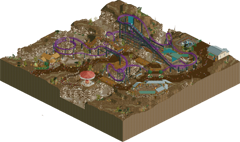
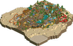
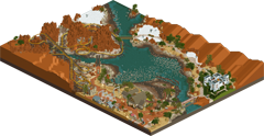
Fish Canyon Corkscrew Ongongo Oasis by inthemanual (75%) and FK+Coastermind (25%) by Faas The long-time star of Fish Canyon Adventureland, Fish Canyon Corkscrew was built in 1994 to help re-establish tourism to the region. The ride continues to thrill guests with it's stunning vistas and unique positioning above a delicately preserved natural landscape. This Oasis waterpark in the middle of the Namib desert has recently added a roller coaster to attract more thrillseekers. It's up to you to make this park into Southern Africa's leading theme park! Your goal: To have 2,000 guests in your park at the end of October, year 33, with a park rating of at least 700
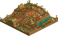
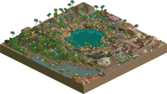
Twyfelfontein Zoo Otjikoto Meer by RobDedede (80%) and Zarathusta (20%) by KaiBueno Welcome to Twyfelfontein Zoo, home of the Premier rides quadruple launch coaster, Petroglyph! The coaster takes its name from the markings found in that area, and features four launches, two backwards and two forwards. The park also contains numerous animal enclosures, as well as a giant Top Spin, and a chairlift. For accommodations, we have the Country Lodge based on the real one at Twyfelfontein in Namibia. Ride hacking for the backwards launches and top spin by Zarathustra; everything else by Robdedede. Welcome to Otjikoto Meer (pronounced: “Oh-gee-koh-toh”) or “Deep Hole Lake”, my entry for New Element's 2020 iteration of The Grand Tour. This park was a blast to make and involved a lot of research into an area of a country I'd not known much about prior to this contest. Please read the document and look at the pictures/links for full enjoyment!

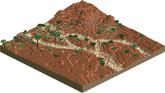
Eye of Namibia Efundja by AvanineCommuter (50%) & Tolsimir (50%) by Splitvision (70%) and Jaguar (30%) Right where the fertile soils of the Namibian plateau with its diverse nature meet the hostile flats of the vast salt deserts lies the Eye of Namibia. A striking centerpoint of culture and commerce on the high grounds and of death and drought at the bottom. In the remote northern parts of Namibia, the droughts can be severe. In this rural village, there is a belief that performing a ritual in the old ruins by the river bed will bring rain. Is it just archaic lore or will the gods listen? 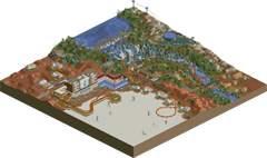
INDA Ombezi Basin National Preserve by Coaster-GEOFF (50%) and mamarillas (50%) by In:Cities (55%) and CoasterCreator9 (45%) Ruacana is a small town near a waterfall on the Kunene river. A hydroelectric power station was built there in the 1970's. Thanks to upgrades in 2012, the station now generates more than enough electricity for local needs. In a bid to attract more tourists, Ruacana has built a resort hotel and commissioned an Intamin launch coaster, INDA, which means "go" in the Oshiwambo language. Visitors can experience a thrilling ride or relax and enjoy the scenic falls. Located in the coastal Namib Desert, Ombezi Basin National Preserve is Namibia's number one destination for wildlife photography, hikers, and campers. Recent renovations and improvements to a historical mine have now made this region Namibia's premier destination for international roller coaster enthusiasts as well! It is currently the rainy season, so watch out for flash flooding and active wildlife as you embark on adventure outside of the resort! 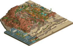
Karivo Lodge by ottersalad Welcome to the Karivo Lodge, Namibia's premier safari lodge and campground. Take a guided safari tour, sit by the pool, take a stroll in town, or better yet, ride our new roller coaster! -

 Liampie
Offline
Try to enable weather effects (if you've disabled it in the past) and don't read the reviews and comments when you're checking out the entries. I highly recommend going in blind.
-

 Goliath123
Offline
That rainmaker idea is so smart
I think the Ombezi preserve was the best tho, such a great execution of the jeep tour
-
 ottersalad
Offline
Twyfelfontein Zoo
Welcome to the Grand Tour! The coaster was neat.. Along with all the hacks throughout the park. The quad launch and reverse spike were definitely a highlight. Would’ve been a little better if the spike/layout was more central in the map was a focal point.. The coaster station felt a bit tucked in the corner and up against the map edge. The top spin looks terrifyingly fun too. Look forward to seeing more from you!
Efundja
Wow, that effect was amazing. Really cool to see the map flood like that. Other than that, there wasn’t much else to see sadly.
Otjikoto Meer
First off, really cool landscape feature with the lake. Reverser coaster was a bold choice, and I enjoyed that. One thing that sorta stood out to me though was the underground/under-restaurant part of the layout.. Was it a cut away? Why is half of the building sorta missing? Regardless, your landscaping/rockwork was nice.. Im always a fan of 1k ruins. Definitely an improvement over Spiirokiti.
Ongongo
Great scene to start with.. Yet another funny detail I enjoy from your parks. The coaster drop was intense.. Really would be a lot of fun to ride that element. The water park was great too.. The red and purple slides work well with the terrain. The slides and pools are well integrated in the landscape and are well themed. Overall this was a very fun entry.
INDA
Wow, the architecture is stunning.. I know the waterfall is amazing.. But those tents/cabins are so cool. Really wish I did something similar. The coaster interaction with the waterfall and river was top notch. Sadly, the layout sorta just meanders after the second launch. The power plant was a really cool detail. Good stuff guys.
Fish Canyon
Now we have the answer to the age old question: “what if Namibia had an Arrows looper?” Amazing scene over the canyon. Really strong layout and interaction with the landscape. The wave swinger, much like the top spin in Robdedede’s entry looks terrifying yet fun. Really cool.
Eye of Namibia
Is this H2H? Jesus guys.. This is amazing! Such great world building. The environment is so vibrant and well done.. The layouts are strong, the archy is strong. Simple details like the foliage and path textures really elevate this. The ring of fire and the elephant skeleton are so damn cool! Can tell you guys put a lot of effort in to this.
Ombezi Basin
Holy crap.. This is amazing. The palette and ground textures here look like a totally different game. Incredible. I feel like your guys’ entry is like mine, but on steroids. The lodge is a structure I wish I knew how to make.. I envy that skill of building large buildings. Spent a lot of time exploring the safari ride path and everything but the coaster! But, the coaster is well done. Maybe a bit too much underground for me, but other than that it was top notch. Kudos on the support work. Oddly one of the highlights for me was the house near the flamingoes and the photographer Elliot. Such great archy, and would offer breathtaking views of the preserve.
Karivo Lodge
Quick thoughts on my park. Idea was to do a safari lodge/park near the town of Swakopmund, but ran out of time to build more of the city! The coaster was meant to be similar to the Muntanya Russa in Tibidabo, thus the spare train from that ride. Some of the archy was derived from one of my favorite games growing up.. Sim Safari! Really enjoyed using that game again for this park. The tents, dining lodge, and info cabin were all from the game. Hopefully some people noticed that! Really enjoyed researching Namibia this round. Such a cool country.
-

 AvanineCommuter
Offline
Fish Canyon Corkscrew
What a BEAUTIFUL coaster. Perfect layout, one of the best of the contest so far, and the color pops so vividly against the really beautiful landscape work. Great supports too, and love the way the queue wraps around the corkscrew like that. Some queue covers would be a nice touch to add here, as it's all very exposed; the orthogonality of the queue really contrasts with the more organic diagonal pathing elsewhere in the park. The canyons are wonderfully done, really something special and sells the area completely. The use of the triangular awnings and teal detailing works really well as contrast. The wave swinger is perfectly placed. I think the twist ride and the small building next to it didn't fit with the park; maybe a large cliff would have been a better filler in that corner, to give the area a little height variation. Really unique look overall, one of my favorites this round!
Ongongo Oasis
Really nice coaster, short and sweet with a scenic cheetah-hunt helix done really nicely over the waterfall drop. Overall atmosphere is great and there were some really nicely composed spots with pools and bridges and paths, as well as the elevation change from the entrance to the back of the park. It was a little strange to see buildings with the backside facing the desert though; some minor detailing or pathing behind them for backstage areas or just rocks / foliage would elevate the aesthetic here. The slides were all really nicely done, especially the bright red one. Though I wondered if the yellow hump slide really have such an abrupt stop in real life. While it did give me Mzima vibes, it was different enough that it didn't bother me. Really nicely done.
Twyfelfontein Zoo
That coaster is really cool, loving the triple launch and the overall layout. I think the color choice should have been something that contrasts with the landscape, which is all very red / orange / yellow.. I'd suggest teal, bright blue, or maroon. The custom topspin is so cool too, I didn't know you can do that! I like d the relentless curved roof of the main coaster's station and some of the smaller details like the tables with umbrellas, but overall the larger buildings are a little chunky and underdetailed. Working on creating a more flowing path layout and integrating your buildings together would help soften the regularity of your composition as well. In terms of foliage, I'd suggest clumping your trees together instead of scattering them, as it'll provide you another tool in your arsenal to create diversity on the map; the even distribution of the foliage doesn't give you an opportunity to play with density and voids in the landscape. Regardless, the map had plenty of interest and was nice to explore.
Otjikoto Meer
Interesting choice of the reverse coaster, I really liked how it dived in and out of the cliffs. Compositionally this was really strong for me, the center lake with the cliffs are wonderful and provided so many great scenes. The underground cutaway was a nice touch. I really liked how you embedded the smaller flat rides into the landscape, it's a very nice touch and makes them feel super cozy. Just as with Twyfelfontein Zoo, I'd suggest you to clump your foliage together with taller trees in the center and smaller shrubbery around the perimeter; right now it's too evenly distributed and looks scattered. I actually really like this with the green water palette for some reason...? Great job on this one.
Eye of Namibia
Had a great time working on this with Tolsimir. We really didn't have a clear goal in mind, but just wanted to combine all the beautiful landscapes from Namibia into one park. We had the cracked white salt flats and the cracked mud, dry river beds, steep narrow canyons, the tall column rock formations, and fairy ring formations in the savannah shrubbery as the main items we were intrigued by. I contributed the two coaster layouts and Tolsimir did the Ring of Fire + Pottery Ride + Elephant Skeleton, and we both worked on the landscape and architecture throughout. It was a very chill build with Tolsimir and I really enjoyed working on this park without feeling too rushed towards the end, which was quite a change of pace for me. Hope you all enjoy!
Efundja
Mindblowingly cool effect, such a clever use of the custom train tool! The timing with the storm is absolutely perfect too, and the message at the beginning really told the story. I hope we see more of this kind of creativity just like with Cocoa's micro. Watch out H2H9, I suspect there will be many more to follow... As for the actual park, it was very very bare; from the overview the macro impression is great, with the organic sandy riverbed cutting through the red sand dunes, but up close it was a bit sparse. Doesn't take away from the WOW factor of that rain though... amazing.
INDA
Those tents! Really cool take on Namibia with this kind of resort vibe, it was very nicely done. Loved the unique pathing choice throughout with the footsteps / stick railings.The deep blue water looks great, would pair really well with the deep orange sand in some other palettes to really sell the Blue + Orange + White colors that are so prevalent in Namibian landscape photograph. The coaster was not my favorite overall, it was quite sprawling, but it did interact with the landscape very nicely diving under and shooting over the pathing / rocks. I think the white sand was a good touch for contrast with the rest of the park, but would be elevated if the composition wasn't so squared off. Having a more organic arrangement of the white sand vs. the river + forest would take this up a notch. Overall it was a very nice map with some unique architecture that we didn't see in other maps, so kudos for tackling the theme with a unique approach.
Ombezi Basin
I feel like this park will be a GAME CHANGER in how landscapes and blending textures will be done in future parks. What a masterpiece! The deep orange is wonderful, it changes the LOTR rocks completely and makes the entire landscape so believable. I didn't think anyone would pull off dunes, but you guys did it. The shading between the deep brown to the light brown is so wonderfully done, I'm especially impressed that you did it with transparent water tiles... I would have never thought of that. The coaster itself was great, especially those tedious supports that look stunning against the landscape. I enjoyed the layout when it's above ground weaving between the canyons / rock formations, but I didn't care for how much of the second half is underground... makes for difficult viewing. The entry to the park is also perfectly done, the pathing is so well blended and it really feels like a dusty path leading to a beautiful curved-roof Safari lodge. Absolutely stunning entry, my favorite of the round!
Karivo Lodge
This is really some of your finest work Otter(along with Cael Wywel of course)! The sandy entryway to the park is lovely, really cool composition and macro impression. The architecture in the park is clean, effective, and engaging. Really nice simple pathing that works so effectively with the large planters breaking up the path. The coaster is simple but effective as well, with a nice concise layout that has a really nice flow. I think this is the only park with some of that German colonial architecture, and while it's really nicely done, but I do kind of wish it wasn't there so you could expand the desert and the safari areas, especially since the safari is a bit cramped in the corner. But not a huge detractor for me. Really great work Otter!
-

 CoasterCreator9
Offline
Wow. Super impressed with both the quality
INDA
Pretty awesome setting. While maybe a little barren in places, I liked the setting a lot. Neat mix of nature/resort/traditional village. Layout is nice, Cheetah Hunt-esque in a way. The pacing was a little bit slow here and there, but this is overall a really great showing from you two.
Eye of Namibia
Didn't expect anything less from you guys; really impressive. Tons of little details - really amazing that you were able to put in three coasters. Tons of atmosphere and a lovely semi-fantastical landscape. Definitely nailed the objectives. If I had to pick anything, it would be that there's clearly one angle that really "works" for viewing; the others are a little less perfect but that's a nitpick at best. Awesome job you guys - my second favorite, but I'm biased.

Efundja
I won't spoil anything, but when I first opened this it was a magical experience. I connected the dots as the stuff and things began happening, realizing what was about to happen just before it did. Really incredible feature! I think it might be time related, but I do wish that there was a tiny bit more to this. The landscape is beautiful and I love the features that are there, but it's ever so slightly too empty in places. Really happy you guys submitted this, it's a treat. Talk about insane H2H potential here.
Ongongo
I should have seen this coming, but somehow I didn't. Really just a fun entry. I love water parks in general, and it was cool to see it done in an oasis style like this. While maybe a little slim on "stunning landscape feature", I love the way the coaster dives under the pathways. Very possibly a top three for me, lively and charming - not much more to say than that!
Otjikoto
Well, this is a nice surprise. I get a real feel of your work in this, which is really cool - but the landscape is definitely elevated in a way I didn't expect. I like the bold coaster choice, and I get a certain nostalgic sense of this while still feeling very modern RCT in a way. I really like that. The landscaping is a tad rough and jagged around the sinkhole, but that's a pretty minor thing and is stylistic in its own right. Nice job Kai, can't wait to see what you manage next.
Karivo
I'm really surprised this is the only submission with much "urban" content. Definitely cool to see some of that inspiration poke through, and really amazing again how much sheer variety this round got out of a relatively obscure country choice. Love the coaster, goes without saying that I appreciate some uniqueness and weird-yet-appealing design styles. It goes without saying that I also appreciate your landscaping choices. I think one of the biggest things from following your work is the architecture; easily your best to date and possibly a breakthrough for you. Definitely in my top three for this round.
Zoo
I tried about 4 times to spell that name. I gave up. I'm going to say it flat out front; not the biggest fan of the palette. This is definitely a me thing, but I just wasn't a huge fan of the orange-washed feel I got. However, love the hacks at play. Definitely an interesting semi-NCSO vibe going on - not sure why you opted for track as stairs and umbrellas. The foliage and landscaping is a tad rough around the edges, but this honestly reminds me of a lot of early NE CSO work, so you're absolutely on the right track - looking forward to seeing what's next for you two.
Fish Canyon Corkscrew
Man, this is brown. I don't mean just "dirt colors" but actually brown is a theme brown. Honestly, it kind of works. You've got enough color from the boardwalk paths, coaster, and other rides that it manages to balance it a bit. Not *quite* the land textures I would have thought of from Namibia, but certainly not bad. Nice layout, sparse but very nice park content, and excellent interaction. Really solid work, and probably a top three entry in my ranking.
Ombezi
Hey, I had a hand in this! In:Cities was largely responsible for the overall vision and getting the incredible landscape started. We have a visual representation of the shares to show, but basically I made the coaster and the stuff surrounding it, as well as the *very* basic structure of the resort (the details and incredible foliage on that half of the map is all Josh). I had a blast doing the rockwork and designing the coaster. It took awhile to get right, but I think I came up with something to be proud of. It'll be awhile before I custom support something, but working on this project was a lovely spark of motivation after doing a lot of purely landscape work for solo projects. I always love working with Josh, and I'm really proud of what we were able to put out. He deserves a huge amount of credit for his vision and guidance, as well as object making dedication to make this park happen the way we really wanted it to. Check out his sketches; it's kind of amazing how close his concept got us to the final product.
I hope I proved I can actually create coasters.
-

 Xtreme97
Offline
Fish Canyon Corkscrew (Itm and FK)
Loved the coaster, the layout is solid and the vibrant purple is such a gorgeous colour to use against the brown landscape to really highlight it. And that's not to knock the landscape either, which was marvellously done. In some places the krypton rocks get a bit lost texturally among all the brown, but the shapes of the canyons and the crunchy detail is top tier work. Building the corkscrew and the queue into the land bridge to create that piece of interaction was a touch of excellence as well. The swing being perched on the canyon is great placement and creates a nice scene with the batwing. The architecture was a bit mixed and seemed to take a backseat overall, though the firepit area was neat. Really solid entry guys, definitely among the top 3.
Ongongo Oasis (Faas)
Very active and atmospheric little park. Oryx is a great coaster, I love the dive in front of the waterfall, under the path and up through the hole. It could have been a bit longer I think, maybe going under or over that entrance area and having a turnaround on the other side. Elsewhere there are lots of fun details such as the cliff diving, and the waterfall area is a standout with the lush foliage. Your architecture is still a bit small but the bright colours here elevate it. Not a big fan of the patch of salt flat in the corner which feels somewhat unfinished, mainly due to the dead desert trees placed seemingly at random.
Twyfelfontein Zoo (RobDedede and Zarathustra)
Pretty good entry, the palette works quite well to enhance the atmosphere, though it was perhaps a tad too beige throughout. Petroglyph has a fairly nice curvy layout and is well placed on the cliffside. That properly working triple launch hack is amazing by the way. The architecture is decent throughout, I especially liked the chairlift stations and the style you had going on at the top. The landscaping could have used a bit of work, felt a little rushed particularly below the launch where you had a lot of flat land pieces that looked unnatural. I also think the rapids/splash boats stairs trick has become overused and it feels out of place in this park. I did really dig the little bit of river you had in the corner, with the screaming swing teetering over the cliff edge.
Otjikoto Meer (KaiBueno)
Very nice work, feels very uniquely your style and a solid step forward as a parkmaker as well. You did a great job at recreating the sinkhole lake which is an unexpected theme for Namibia, and the context you provided with the readme was fantastic - shows you've done a lot of great research. I think the landscaping work is very nice, if a little blocky and patchwork, and the way the coaster pops in and out of the sides at points is cool. Speaking of the coaster, I don't think I've seen a proper reverser coaster in a while so this was another unexpected facet to the park. The underground portion was one of the highlights and there were some nice moments elsewhere on the map such as the funky german boiler. The biggest point that could have used improvement to me was the foliage along the outskirts which was rather scattered.
Eye of Namibia (AVC and Tolsimir)
Wow, what a map! This might be one of the most creative pairings and clearly brings out some of the best work from both of you. The overview is absolutely stellar and when you dig in there's just so much to see, really H2H level work here. You've become something of a master of enormous woodies AVC and this is no different with a lush, flowing layout and tons of brilliant interaction with itself and the landscape. The use of white crazy path for the salt flat was stellar as well to get that cracked look. Love the elephant carcass for the wingrider station, and that coaster has another superbly flowing layout. The pottery ride is a nice find too, great little story it told with the kiln at the end. The only thing I would say I didn't like here would be some of the rock objects, whose textures seemed out of place.
Efundja (Splitvision and Jag)
A park like this lives and dies on its premise, and this one was an absolute showstopper. Had to take a moment to just let it process after I first saw it, really an amazing idea and the hack worked pretty much perfectly. The coaster itself is pretty good, the half cork drop into the riverbed area timed with the effect was brilliant, felt like it was telling a story. The rest of the map was pretty bare however, with only the area to the left having any real activity. I can see this sort of thing becoming a crutial part of innovation in the future, especially in contests like H2H.
INDA (Coaster-Geoff and mamarillas)
I enjoyed this quite a bit, the map is really varied and has a lot to offer to keep it interesting in every corner. I really love the bright orange hue of the coaster which was a great choice to make it pop against the rest of the map. Really liked the hotel as well, and the tented buildings dotted about are wonderful. The layout of the coaster is a great example of utilising the different landscapes on the map well, with the dive over the waterfalls followed by the turn over the salt flat. The waterfalls and river were really very well done too, and I liked how the rocks got less intense further down the line. Didn't love the water colour unfortunately, it feels a bit too unnatural for my taste.
Ombezi Basin National Preserve (Josh and CC9)
My first look at this left me speechless. The landscaping is just on another level, absurdly good stuff that shows how far the game can be stretched. The way you play with textures and transitions is masterful, and the colour usage is incredible, creating these vivid scenes that feel so far ahead of the curve. The map is so well thought out with its area transitions too, and nothing feels out of place or squeezed in. The coaster doesn't steal focus from the landscape, but neither does it feel pushed to one side. I love the interaction and the way the yellow looks against the dark orange. My only issue would be that I'm not feeling the patchwork effect of the steel roofs here as much. The lodge house is superb, similarly so with the fort, which provides a really striking contrast to the dunes and watering hole.
Karivo Lodge (Otter)
Lovely entry otter, you're really making strides with your cso work. I enjoyed the landscaping here, the big rock makes a statement and the patches of foliage were very nice. The way the map opens onto the city portion is a cool idea, and I like how you've done those two hotels. The coaster is very nice, has an appropriate level of jank but still a good flow to it, and the rocky arch is a great element. Overall the architecture is quite strong, the stone buildings were great, not sure on the choice of orange for the roofs but it's good that you carried it through. And I love the little blue tent huts, the colour is very cool against the warmer backdrop. -
 inthemanual
Offline
Good job to everyone. The quality of the round was far above what I expected from any point in this contest, yet alone a round as challenging as this.INDAI like the more urban feel of this, and the hotel huts felt very real and authentic. Some of the placemaking felt a bit off to me though, like having a loud coaster and hotel so close to an otherwise idyllic retreat.Eye of NamibiaChock full of good ideas, this is the clear content king of the round. Two massive, well-made coasters and a really cool landscape. Really clever rides and hacks throughout and great ideas and execution.EfundjaThe clever hack really carried this park. The most clever idea of the round by far. However, the actual park content kinda felt placed on top of the landscape rather than integrated with it, and due to this it fell a bit flat to me beyond the hack.OngongoLovely Faas work as always. Lots of well-crafted moments throughout the park and a real authentic water-park vibe. It didn't resonate as distinctly Namibian to me as most of the other entries, but that was the only flaw I could really call out.OtjikotoI like the more grounded direction this takes as opposed to some of your other work, but it's still distinctly Kai, with some of the forms and colors, which makes it unique and special. While it lacks any significant "wow" factor, it's well-made and interesting throughout, and the primary ride felt believable and interesting.KarivoThe park area carried this for me, as the urban stuff felt flat. The coaster was well done, but not particularly exciting, and I wish it did a bit more with the well-crafted landscape. The safari tours, and all the park buildings felt very inspired and created a nice, believable atmosphere.Twyfelfontein ZooLoved the triple launch and watching the top-spin build up speed to complete the loops. The umbrella hack is quite clever too. I would have liked to see a little more attention to the landscaping. Some of the land feels blocky and haphazard, and the plants feel randomly placed, rather than scultped to represent the Namibian environment. The rides were definitely a highlight here, and I loved the warm colors as well.OmbeziEveryone's already told you how perfect this is. I love all the texturing and it's all so rich and believable. I can nitpick a few things though. The orange sand felt a bit too bright, with some of the texture being lost to the low contrast, high saturation colors. I wasn't a fan of the glass-framed exterior, because to me it made the borders feel cartoony, and it didn't mesh with the rich, texture-dense interior. The station for the coaster also felt like it could have used something more. I'm not a huge fan of the checkerboarding on the roof, but I think it could have been pulled off had there been some extra texturing to blend the different colors more like you'd done on the rest of the map. 3 small points of feedback on an otherwise incredible map. Really raising the stakes with this and expectations for H2H9 are going to be very high for you two as a result.Fish Canyon CorkscrewI had a blast making this, and FK definitely helped in places where I needed it, using his strengths in texturing to add interest to areas of the map that might otherwise fall flat. The concept started as "I always see people putting the queue or paths under the corkscrews, so what if I made it go over instead?" The rock arches around that area are based on the Spitzkoppe in northern Namibia, and the rest of the landscape is based on the Fish River Canyon in southern Namibia.
The Firepit Restaurant area was something I found while researching, and fell in love with the idea. The restaurant it was inspired by cooks traditional meals over an open flame, and is all outdoor seating under a cobbled selection of awnings and metal roofs. I tried to capture that feel with the eclectic mix of roofing, the flags and banners, and the firepits. -

 FredD
Offline
Eye of Namibia
It's the first entry I open and man... the others will have to be at their double best to beat this! Really amazing entry! The shape of the map with the lake also mimicking an eye, really love that kind of detail. I really have no remarks outside of I love it. Great landscaping with that nice red desert color, I really like the wingcoaster tophatting against that Lion King-esque hill. And the salt plains are done awesome as well. The archy is great, the atmospere too... Really awesome job dudes!
INDA
I like the idea of lodges in the Namibian nature, but that concept is kinda killed with a modern hotel next to it imo. Archy is a bit simple imo, not too bad either but it doesn't do much to help creating atmosphere. Coaster looks ok but my biggest issue with this entry are the colors. The blue of the water is so distracting, I don't know why you went with it because it doesn't add anything, it even takes it down imo... The palette you chose also made the foliage kinda dull, it looked much better with the standard palette. I'm a bit harsh here but overall it's a solid entry and it shows promise. There is some cool stuff like the water treatment plant and the waterfall.
Ongongo Oasis
This really looks like oldskool Faas and I dig it a lot! Feels very cute and charming, thanks to excellent color choices and texture use. Such a small water park also feels really believable. The cliff diving peeps was a really nice detail to include. The coaster is also really good, a bit short but exactly what such a park would do and the airtime hill popping out of the path is great! I have 2 nitpicks: I don't like the pink 1K ruins (I don't mind the ruins being there, I don't like the color you gave them. Doesn't really fit with the pale sand you went with imo) and Doppeltaucher has a short exit strip. Other than that, really lovely and memorable entry.
Ombezi
Where is the boat?! Goddamn it... No boat, no vote
 All jokes aside, a really solid and good entry. The landscaping is on point and I do like the red hue you guys went with. Great combination of rocks, salt plains and water. When CC9 showed the screen of the coaster it looked bare to me, but in the greater picture it fits so perfectly! I do wish you didn't use the landscape red in the checkerboard roof of the station though, blend too much. Oh yeah, the details on the path are amazing... And amazing how that does so much.
Fish Canyon Corkscrew
Based on the screens shown before release, this was one of the entries I was looking forward to. And it delivers. The coaster is really, really beautiful. Great colors but especially the support work on it is just stellar. I just wish the station was a bit more... bigger... special...?! Feels a bit underwhelming. The cliff mill is a great idea and I'd piss my pants of I'd ride it lol. The canyons are great, I do miss a bit of green or just color in general. It all feels a bit dark to me.
Otjikoto Meer
I'll sound like an ass, but sorry KaiBueno, I'll be honest with you and this entry can't really keep my attention for long. The archy is too simple, it seems like you had an idea but couldn't execute it well. The quarter block landscaping is also a big no no to me. It makes it all too busy. Those quarter landscape blocks are in best use when used to support normal rct landtiles.
Karivo Lodge
The city center is nice, though I think you could've made the streets a bit more crunchy. The archy here is good but the archy in the park really nails it. Don't know what to think of the orange roofs though... bold move... The coaster is great, looks like the old janky coaster you'd expect in such a place. Nonetheless it has that flow NE is so keen on. The landscaping is great, great detailing on those sand roads and the electric wires too. I do think some 1K ruins and a little quarter block landscaping could even elevate the landscaping more. Great entry!
Twyfelfontein Zoo
Extra points for the name. Other than that, my least favorite entry of this round I'm afraid. The colors are too much of the same, the coaster blends in with its environment too much. The coaster itself isn't looking good either and it lacks flow. Archy is really simple and the station of the coaster is... well, just not looking good. It's too much of the same (roof) and the walls are terrible. It's a shame you didn't use the style of the stations of the cable car more because those do look good.
Efundja
Well... honestly I don't think Efundja will win this round but the flood you pulled off there is a possible winner for a NE Award. My jaw dropped... I think solid the best term to describe this entry. It all looks pretty good but compared to the top entries here I don't think it's enough to possibly win this round. The coaster is ok-ish, it looks like a cool ride to ride irl but that lift man
 Also, why that pink color?! Blends too much... I really digged the station of it, very cool. The droptower trees were also pretty neat.
 A lot of good and cool entries, yet again! I decided to give my vote to Eye of Namibia, they are the clear winners of this round to me.
-

 csw
Offline
Some really good entries here. My favorites were Ombezi, Fish Canyon, and Eye of Namibia - they all were a tier above the rest. A few other one-off comments: the water trick in Efundja was cool, but there wasn't really anything else on the map that held my interest. Faas's entry was probably the most fun - that's just the way Faas does it. Most of the landscaping was good across the board but Ombezi blew it all away.
After putting my votes in it seems mine are generally 10-15% lower than the average community vote - didn't think my voting scale was that far off but maybe it is? Not sure how some of these are getting >70 or >80 community scores.
edit: one more thing I've noticed on this round and the first round. Peeps. I like peeps, peeps are great, but is there any way to control how many peeps there are? Thousands of peeps crowding a small map take away from the experience - I can't focus on anything else. I always end up hiding them. Maybe this is a me problem. But I think I would appreciate these contest entries more if they weren't packed to the gills with peeps.
-

 Gustav Goblin
Online
Fish Canyon Corkscrew (ITM and FK): Very nice submission! The corkscrew layout is super fluent, and I love the helix around the rock formations and the queue over the corkscrew. The swinger is also the best looking I've seen in ORCT2. The Twist is nice too, although I feel like it could have had a quarry theme to really make it stand out. Great work!Ongongo Oasis (Faas): Really loving this one! I love how it starts at the stranded truck in the middle of the desert. It really sets the scene and builds up to the big park reveal very nicely. The landscaping in the park is utterly gorgeous. Everything just flows together so well. The cliff jumping ride is a genius idea, and Oryx is a great way to dry yourself off after a day at the waterpark. Considering it was probably put in to fulfill the objectives, that dramatic drop down the waterfall and the path around it looks incredible. Great submission!Twyfelfontein Zoo (RobDedede and Zarathrusta): Pretty good submission. The landscaping and architecture really sells the Namibian theme. However, the blend between NCSO and CSO is a bit odd. Considering the Deurklink-style choices like the golf hole/lily pad tables and the roof over Pteroglyph's station, it makes me wonder why you didn't commit to one or the other. Also, while I like the way Pteroglyph interacts with the cliff, the cliff itself isn't a super striking land formation. Still a great effort.Otjikoto Meer (KaiBueno): This is an interesting submission. I love the effort to capture a real location, especially a unique one like Otjikoto Meer with German architecture in an African setting. I love the rockwork around the lake and how the coaster interacts with it. You also nailed a whip ride, which I don't see done correctly very often. However, the sepia palette version is pretty odd. It seems like everything is muted, dull, and almost sad except for the bright green grass. The regular palette version has plenty of pop, though, and it's a nice effort.Eye of Namibia (AVC and Tolsimir): This is the one I was excited for. You two are already some of NE's finest on your own, but you've proven you two are a dynamite combination with this one. Vulture is utterly fantastic, from the elephant skeleton station to the way that first hill curls underneath the rocks. The Namibian Pottery Company is also a really interesting concept, especially with the cutout view and the way it utilizes shuttle mode. Orumborombonga really reminds me of the Raincatcher from La Reve Parapluie in its vastness, and the rock pattern in the salt flats really draws attention. I could grow a beard talking about all the other little details I love in this one. Fantastic work!Efundja (Splitvision and Jaguar): At first, I wasn't blown away. The barren landscape was an interesting setting, and the bursts of color like the coaster layout and the thick-trunked trees were nice touches. Rainmaker's station was creative in its use of the ruins. The soccer field really drove in the nail with the rural, homely feel.And then the rain came, the rivers flowed, and I blessed the rains down in Africa.I am blown away. To make your striking landscape feature a raging river complete with custom coaster trains and abandoned boats caught in the river's flow was genius. The way it times with both the rain and the coaster was a perfect touch. In a country known for its rock formations, to do the opposite was a bold feat. Great submission!INDA (Geoff and Mamarillas): Solid submission. I love the backstory behind INDA, and the way it interacts with both the dam and the boardwalk really brought attention to the rest of the park. I also loved the little touches INDA doesn't go near, such as the football game complete with an animated ball. Good work!Ombezi Basin National Preserve (In:Cities and CC9): Now this is some good RCT2! Expedition Kolmanskop is a gem, and the interaction between coaster and landscape is electrifying. What just may be more impressive, however, is the natural beauty of the preserve. The wildlife (especially nin the hippo), foliage, rockwork add so much life, and it's mesmerizing to follow the preserve tour. I'm so tempted to make a title sequence just following the tour truck around the park, but then I'd get stuck watching it and never play the game again. Absolutely goddamn phenomenal and one of the best entries in the contest so far.Karivo Lodge (Ottersalad): This is nice! I'm a fan of sprawling family coasters, so Karivo Coaster definitely grabbed my attention. The rock arches the coaster passes under are great touches too. The park itself is nice, and the big town hall building is absolutely lovely. Solid work overall!This round was insane. As usual, I'm picking two favorites for each category Micro Madness style. The parks that fulfiled the objectives best in my opinion were Ombezi Basin National Preserve and Efundja. Ombzei's depiction of Namibia was pristine, and the interaction between coaster and landscape was top notch. Efundja's core concept and how it times with the coaster going over it was the most creative idea I've seen this whole contest and definitely deserves an accolade.The two best parks overall were Ombezi Basin National Preserve and Eye of Namibia. While Ombezi treaded the line between realism and beauty to create easily my favorite park of the round, Eye of Namibia had the spectacle you'd expect to see in an AVC park while tempering it with a distinctly African feel. Amazing entries, everyone!
 -

 In:Cities
Offline
Karivo Lodge (Otter)
Easily some of my favorite work from you i've ever seen. While the city entrance is nice, it feels a little lifeless unfortunately. Still technically good though, and its always nice seeing you going back and forth between CS/NCSO. That said, it's just about my only criticism with this park. The leadup to the park entrance is done SO well. I particularly love the named vehicles, and the helix from the coaster making an appearance to guests as they're walking up. The actual park entrance itself is my favorite of the contest. Just so well thought out and composed. This is a lovely well-designed public space. Path is wide without feeling too overbearing. Coaster station is a little understated, but very nice. I think my favorite building is the safari tour entrance. Its effective and looks great! Excellent job with the landscaping and dirt textures. Compositionally this map is very strong. The mountain overlooking everything is what truly makes the map for me.
75/100.
Inda (mamarillas & Geoff)
Mamarillas has been one of my favorite players for the past couple years, so seeing an entry from him is always exciting to me. Geoff is a newer face around here, and I'm extremely impressed by the amount of work he's produced lately. A strong emerging talent thats only going to continue getting better! The park itself is great - a concept that I initially wanted to do in some regard. Luxury "glamping", resort, large salt flats, etc. Theres a lot of great details to be found (infinity pool, football game, dam power station, the lion about to steal the campers food. Unfortunately the biggest detractors on this map are the foliage, rockwork, and water color. While the rockwork for the waterfall was great, I think it fell short around the hotel base. The water color choice was just a bit too bright and blue to be convincing for Namibia, and the foliage didn't seem to be very well planned. That said, I thoroughly enjoyed poking around this map, and am excited to see new work from you both as always. (And would really enjoy an opportunity to work with you both sometime!)
65/100
Fish Canyon Corkscrew (ITM & FK)
When I found out you two were working together, I knew this round would be top quality. The only thing even remotely disappointing about this map is that I wish there were more of it. Good call going for a theme / location that isn't the typical red sand / african feel. The usage of elevation in this park is masterful. The coaster itself is extremely visually appealing. Purple was absolutely the right choice for this ride. Support work looks great, pacing is solid, and the interactions with the path / landscape are top notch. I particularly love the outdoor restaurant with the firepit grills. Very convincingly done! The smaller supporting rides were nice. The twist could have used slightly more theming, but the swings have excellent placement. I love how they're perched on the side of the canyon like that. Speaking of canyons - they were executed exceptionally well. Incredible work. Overall this was one of my favorite entries this round. I just wish we got the chance to see the map fully fleshed out the way you guys had originally planned!
80/100
Ongongo Oasis (Faas)
Okay this map is a blast. First off, I love the bit of storytelling upon opening the game. The crashed car, the circling vultures, the beachball off to the side giving a little hint as to whats ahead. So good. Park entrance is also extremely impressive. Great space design. I love the custom sign, and the little sandy part with peeps lounging. Coaster itself is one of my favorites this round. Great work with the path interaction - the part where it dives below/in between the path is memorable and executed perfectly. The central waterfall leading to the pool with the cliff jumpers is so well thought out and very aesthetically pleasing. The waterslides themselves are crafted very well - with the purple being my favorite. Again, the interaction with the path is just top notch. All in all, this park is simply fun. Had a great time exploring it and enjoying all the lively details!
75/100
Otjikoto Meer (Kai)
Wow man, this park is truly a step up from your previous work in a lot of ways. While I've always been a fan of your unconventional parkmaking, this feels like a step towards a slightly more grounded build style. I can definitely appreciate, but I also hope that you don't stray too far from what makes you the unique talent that you are. I really like the amount of research you put into this. It shows! Definitely feels like a real location and really makes me wish that I could visit in real life. Interesting choice in selecting the reverser coaster. We don't get to see many of those, and this is truly a joy to look at. I particularly love the section of the track that is elevated on the grass area. Would make for a fantastic view while walking on that pathway. The sinkhole itself is striking and well executed. You definitely picked a very tricky landmark to try and create! All in all, I really enjoyed viewing this park and am looking forward to your next release.
70/100
Efundja (Splitvision & Jag)
Alright I've probably opened this park at least 5-6 different times by now haha. This truly blew me away when I opened it. The way it's synchronized with the rain, the coaster. Just incredible. Seeing the water move alongside the coaster train was just something to behold. Like others said, there really isn't too much else to see on this map aside from the main river, but that doesn't mean whats there isn't still very nice and appealing! I like the open space and understated architecture. And the roto drop on the tree was clever. Always excited to see new work from you both, and this surely did not disappoint!
65/100
Twyfelfontein Zoo (Robdedede & Zarathustra)
First off, typing not only the park name, but your usernames is reason enough to deduct points from your score! My spellcheck is sweating. This park is a mixed bag for me. On one hand, I really love the massive scale of the coaster - but on the other, the foliage and landscaping really bring this down for me a bit. The bushes just seem randomly scattered around without much thought put into placement. I'd really love to see you guys take that into account for your next projects, as I think that will really help elevate your work. Custom top spin is very impressive! Love the placement and effort it must have taken to hack this. Definitely something that I can't do! Architecture is solid for the most part - a little inconsistent. It seems like you guys were struggling between wanting to do NCSO, and fully embracing CS haha. Still a great effort nonetheless. Custom palette is very nice as well. Biggest question I have for you all is why on earth there is a squadron of 51 handymen in this park haha
55/100
Eye of Namibia (AVC & Tolsimonster)
Good god. Jaw dropped when I opened this map. You are two of my all time favorite builders on this site, and to see you both collaborate on something like this is truly incredible. There's just so much excellence on this map. First off - that giant elephant skeleton. WOW. Followed by the diagonal launch into the diagonal kopje rock formation and the circling vultures. Such good storytelling on this. That rope bridge is just genius. The fairy circles, the ring of fire, the f l a m i n g o s, the sunken flats, the somewhat hidden sand scrambler. It's just all so well woven together. I absolutely love how massive and imposing the station for the crash bandicoot theme song wooden roller coaster is. Just so great. You guys are my clear favorite, and well deserving of any praise, recognition, and victory this may achieve for you. Eye love you
85/100
Ombezi Basin National Preserve (CC9 & Myself)
First off, i'm just glad that this is done and over with haha. I was immediately excited about this round when it was announced, because I've been wanting to build this exact type of map for some time now. I knew I wanted to include rich orange dunes and bright white sand. As soon as the country was announced, I started sketching my plans, colored and labeled them, and started building. Asked around a bit for a partner, but others seemed to have different plans and directions they wanted to take. Thankfully CC9 stepped in, and I knew immediately that he was the perfect fit (again). Always a pleasure to work with, despite both of us being extremely busy with life and schoolwork. I don't know how on earth he had the patience for those custom supports.
Regarding the map itself - I'm a little torn on it. Yes, I achieved the exact look I wanted to achieve. But much of it was through custom scenery that I made specifically for this match. As well as the palette. I don't shy away from "bending" the way this game can be played, but I am also conscious that not everybody can or wants to play this way. I like the ingenuity that comes with limitations - thus bypassing them sometimes diminishes that creativity. I'm glad many of you seem to like it though! I'm personally very happy with the end result.
Massive thanks to cc9 of course for being an awesome partner. And a huge shoutout to Spacek for coming in unexpectedly with these brand new safari trucks. I hope I was able to debut them effectively.
Josh
-

 FK+Coastermind
Offline
Some quick-ish reviews for all these great parks!
Ongongo Oasis - Overall great quality and a lovely little entry. I was somewhat torn on how to vote on this though. It had stuff to look at and some interesting terrain, but lacked the drama and wow factor of some of the other entries. Ultimately went with a vote for best quality but not best for the round objectives. The execution was excellent, but it felt safe in places and I don't know if it screams Namibia to me.
Ombezi Basin National Preserve - Top park of the round by a wide margin for me, and instantly one of my favorite things ever created in rct. This park managed to surpass my expectations for the round and convincingly accomplish so much of what I aspired to do in Seasons. The level of texture, gradient, blending, and just overall composition is incredible. I have to assume the only reason it got less than 90% is due to size and content bias, because i'm not sure what I would look to be improved upon. Congrats to both CC9 and In:Cities, this was just incredible.
Eye of Namibia - A collab made in heaven and a product that matches! Second favorite park of the round, and definitely one of the more original approaches to this contest we've seen thus far. Both the coasters are incredible and have dream-like amounts of interaction. I love the concept and shape of the park, the world building, and all the details that really bring this to life. The ring of fire in particularly is inspired, as well as both the stations. My only complaint is that parts of this felt less Namibia-specific and more 'generic Africa' to me, but a minor quip when really the defining element of Namibia is its landscape.
Efundja - This park deserves a lot of praise for one of the coolest and best executed hacks we've seen in recent years. The impact, the timing of it, was incredible and having opened the park blind made for a viewing experience i'll never forget. That alone was enough to get a check mark for the round objectives. Unfortunately, while the surroundings aren't terrible, they do feel like a vessel to carry the rainmaker hack instead of something to compliment or integrate them into the surrounding. Also, like I said for Eye of Namibia, this felt a little more like "Lion King" then Namibia specifically, But fuck that, the hack was so cool I don't care about the rest, heh.
Inda - I actually think this is a hidden gem in the round that is kinda getting lost in the crowd. The execution is top notch, I love the idea and shape of the hotel and the little huts. Feels very modern chic and thus stands apart from some of the more 'generic African hut' styles elsewhere. The more I explored the park the more little details and fun ideas I found, like the water plant or the footprints in the sand. The coaster was great and really highlighted some excellent landscaping. My only complaints would be that some of the foliage felt over-texturized to the point it kinda blurred together, and I cannot with this water color. Excited to see more from both of you cause I was really impressed by your entry. That being said, I think this was a stellar entry and unfortunately is getting just nudged about by some of the more dramatic entries of the round.
Otjikoto Meer - Overall, I think this was a great entry but suffered from a highly competitive round and a more blocky execution. The atmosphere was great and really pleasant, and it had a ton of great details, like the underwater lake. Ironically, I think I liked the bizarre green-water version better, but i'm kooky. The textures were really great, but in places some of the rockwork and foliage felt more random then deliberate. Ultimately, I think the blockier architecture held this back for me compared to some of the other entries. But I agree with In:Cities, i think this is definitely some of your best work!
Karivo Lodge - Another great entry with a lot of smart parkmaking moments. Particularly inside the lodge itself, the bit of roadway outside with the power lines, and the little bit of modern development along the road felt really well executed and thought out. Similar to Faas' entry, I think this was really pleasant but just missed on the drama and wow factor other parks had this round. My only other complaint would be some of the rough edges in the landscaping, particularly the main rock feature. You showed in parts of this entry that you can do stellar landscaping, but it wasn't throughout and this round really required a focus on landscaping given the objectives. I loved some of the smaller details though, particularly the peep painting!
Twyfelfontein Zoo - My favorite parts of this entry were the coaster and the cliffhanger topspin. Those hacks were great. Overall, I think this was a tricky round for NCSO because of the focus on landscaping and the ability of CSO to be more smooth and photorealistic in capturing the landscape of Namibia. As a result, this entry looks really blocky by comparison, even with some of the land blocks level where pulling the edges down would have looked better. The foliage also felt very random in places. I do think the architecture had some good shapes and interesting moments, but for a landscape/foliage focused round this wasn't able to capture that as successfully as the others. I'm excited to see you both competing though and see where you go next with your work!
-
Airtime Offline
Stunning, stunning round guys. Amazes me what can be done in the game now a days.
Fish Canyon Corkscrew
Great little design. Some great rock work and colours on the coaster work lovely.
Ongongo Oasis
This seems a huge step up from the Faas I remember. Great little coaster and I loved the Verrückt style water ride. Great atmosphere in this.
Twyfelfontein Zoo
This coaster is awesome. One of the better coasters of the round by far! Great custom flat as well. Excited for more from you guys.
Otijkoto Meer
Really cute design. Nice to see an uncommon coaster used, really fun to watch.
Eye of Namibia
Wow. This is stunning. The coasters are both amazing but the woodie is just crazy. The pottery was such a great cute idea. Ring of fire hack was cool but I didn’t get what it was meant to be, visually stunning though.
Efundja
My laptop lagged like crazy as soon as this opened and I didn’t understand why at first. It’s only until I seen everyone go on about the effect I had to unpause it watch it (whilst lagging). Amazing effect to see, the idea is crazy good.
INDA
This is such a cool coaster and great design in general. Really excited to see more from you guys. Seriously hope you guys post more on NE as what you do on DKMP is crazy.
Ombezi Basin National Preserve
WTF? This is beautiful. This is RCT on another level and I just can’t comprehend it. This has to be the best foliage and landscaping of 2020. Whilst I loved the coaster I feel it wasn’t as strong as either of Eye of Namibia‘s. Huge fan of this regardless. In:Cities has to be builder of the year so far?
Karivo Lodge
This is beautiful. Loved the street and the dirt road leading to the park. Awesome to see a different style coaster. This really impressed me and can’t wait to see more from you.
Well done to all. -
 KaiBueno
Offline
First off, congrats to all in this round for creating such diverse entries. While Cuba featured many strong Havana-like submissions, this round did exactly what I'd hoped it would. Get away from a traditional park. Focus on the landscaping, and wow, you guys nailed it. Great solos and great teamwork. I'm honored to be among such peers in this round. This is part of what makes this community great. Now for my happy thoughts, you guys deserve it!
Fish Canyon Corkscrew (itm/fk)
Great job on an area I researched early on and debated in favor of 'no' cos of the canyon work involved. Go figure I’d choose a sinkhole and have to do it anyway. I must say you figured it out well and contrasted the dark brown with a lovely purple cork. The supports are straight forward but box it in nicely, especially the lift hill. The dive under the bridge and element near the swings before the MCBR is my favorite, but I do like the corks near the queue and that helix as well. Canyon beds subtle and low profile but still noticeable.
Twyfelfontein Zoo (robdedede/zarathustra)
Wow what a sunny hillside, so rosy! Love the elevation change here, complete with the sky ride and a place for that launched coaster to go! I love how it goes vert up the hill and rather than doing two turns in a row up top, dives down first before ascending again for the other! Looks very smooth and I’d love to ride it. I am in the camp of not hiding the spike/that end of station and maybe one more wide turn or bunny hop at the bottom, but otherwise a nice small zoo and big hill for it to interact with!
Efundja (split/jag)
What a great effect after the messages lulling you like that, then boom! This feels like a great micro or H2H trick, and I love you found a way to enable messages in Open. It certainly heightened the drama. I like the ride and surroundings, though it is almost a bit too sparse in some ways, perfect in others considering the story. Great job though, certainly the shocking surprise entrant of the round from a hack perspective.
INDA (geoff/mamarillas)
The orange is so brilliant against the water/canyon backdrop for the coaster and looks to be a fun airtime filled ride. Good job finding the waterfall in Namibia and making a story out of it too. Also, for a tag team park, great blending on the architecture and feel. The layout and buildings and area all feels well thought out and not two areas/builders next to each other. Also I saw the discord image for the hotel inspiration and you two nailed it. The dam cutaway was a nice bonus.
Ongongo Oasis (faas)
I am admittedly not up on your previous works but I think I shall go check more out. This was a fun waterpark with nice coaster interaction. Much fun in the middle of hot dusty nowhere. I love the turnaround up top over the water before diving in front of the falls under the pathway. So scenic there, I know I’d stand there and just relax near the mist and watch that dive. Great job on the slides too, the peeps are having fun.
Eye of Namibia (avc/tolsimir)
Best name of the round. Everything else? Fantastic! Love the hidden pottery. The dives the wooden makes. The elephant skull and carcass for the launched wing. Both are fantastic layouts and the village area is excellent also. Plus, the eye and Flamingos, part 1! Toss up favorite between yours and…
Ombezi Basin National Preserve (josh/cc9)
For such a small time to build and challenging country to pull from, good grief this is a beautiful monster, likely pulled from NatGeo somehow. The palette stole glorious color out of a dunes photo. The safari ride has a great route over sand and dirt and I love the smoothness of the layering with your grass edge trick. Solid coaster too – I don’t mind the inside cavern time with it, and the yellow is striking against your dune colors. Excellent job, oh and epic level of Flamingos. My laptop was thrilled...when I closed the file.
Karivo Lodge (otter)
I know you said you didn’t finish all that you wanted to and it would have been nice to see the full vision, but great job. The Karivo coaster has a simple but fun layout I’d be more than willing to ride and fits the landscape you created well. My favorite bit is still the plaza around the slide across from the coaster. The atmosphere there is great, not too open, but enough that the slide pops in like a lovely lighthouse and the beautiful lodge to offset it. Also, nice add of the safari also, I admittedly missed it the first viewing but it’s well done. Oh, and it's like the most lazy entrance area to get into the park, but fittingly sandy and void of anything but sand.----
Otjikoto Meer (me)
Quick mention – I loved this round! Score pending or not, I had a lot of fun building a realistic style park, which most of you know is not my angle. I had fun learning new tricks and methods of building and can’t believe I crammed this together in 3 wks (lost one to debating/planning). Thanks NE staff and community for letting me play and telling me what you thought. Thanks also for the comments on coaster choice. I just wanted to go for something that wouldn’t be too crazy in the middle of nowhere (go look at the maps) around a sinkhole. I too wish I could ride this, or any, reverser.
Thanks again and great job fellow Round Two-ers!
KaiBueno -
 Jene
Offline
First off I want to congratulate all contestants in this round on finishing and submitting all these incredible parks. It’s great to see everybody creating all these parks on this high level. I think this contest is really bringing out the best in everyone in this community. I’ve written a small review on all parks in no particular order, but finished with the ones that are my favourite and runner-up.
Fish Canyon Corkscrew by inthemanual & FK+Coastermind
The star of this entry is the amazing landscape. Really naturally looking. With all those subtle shades of brown it has almost a painting-like quality and I like the selection of the trees/foliage. The coaster is very well executed. With great subtle details like the extra backbone in certain places. It has some great interaction with the landscape. Only constructive criticism I can think of is that for me, it could’ve had a little more interaction.
Ongongo Oasis by Faas
That opening scene cracked me up good. Such a great contrast between the desert and the colourful aquapark. Which is all very well formed and fun-looking. I like the coaster type and layout, but thought it looked a little random next to the aquapark. Also a very cool entrance sign.
Twyfelfontein Zoo by RobDedede and Zarathustra
Nice old-school vibes. Amazing how you guys hacked those rides. The backwards launched coaster and the Cliffhanger. Would love to figure out how you did this. The foliage looks a little randomly spread around.
Otjikoto Meer by KaiBueno
Great read-me. It’s nice to read a little background info and to learn about your personal process in building this. I really liked the parking-lot area with that little powerstation and powerlines. Cliffs and rockwork are always difficult to make in RCT. I think the busy/chaotic aesthetic you chose partially works, but to me, would’ve looked better without all the grass objects closed in. The coaster is kinda quirky, but looks fun. Squirming around the lake. I think the little underground part is a nice addition. Architecture is okay. I thought the backside of the stationbuilding was a bit hard to read. The palette version is a nice bonus. Congrats on getting a self-made palette to work, I’m still working on that myself.
Efundja by Splitvision & Jaguar
Man that is some incredible hacking. Really nice effect, especially the way you succeeded in creating the flow when it starts and the little boat is a great detail. Though I really like this effect, I don’t think the park itself looks very ‘pretty’. The choices in tree / foliage selection is holding it back for me.
INDA by Coaster-GEOFF & mamarillas
A really high quality entry. Off course you can’t have a hotel in the middle of the salt-flats desert without a proper double launch coaster. Well made and with nice interaction with the waterfalls and surroundings. I loved the modern style cabins around the desert and the infinity pool next to the hotel. The lion looking at the roasting pig cracked me up. Great foliage and surroundings. Minor detail is that the football players stood still. Though I can imagine it’s hard to run around in the burning heat.
Karivo Lodge by ottersalad
I think it’s an achievement that you made a park on this level on your own in just one month time. I like the diversity in atmospheres; the urban part, the park and the surroundings. All are made very well and with a nice amount of details without being over-detailed. The coaster doesn’t do much for me though. It has some interaction with the landscape, but it feels a bit short and lacks a wow-factor. The peeps seem to prefer the safari over the coaster as well.
Eye of Namibia by AvanineCommuter & Tolsimir (Runner-up)
Wow, this park has such a ton of style and class. Amazing forms on macro and micro scale. The coasters look incredible soarin’ through the unique landscape and the pottery coaster adds a nice bit of quirkiness to the mix. I love how all those flamingo’s look together and the fire hack is amazing as well. Definitely my favourite, without a doubt.
Ombezi Basin National Preserve by In:Cities & CoasterCreator9 (FAVOURITE)
This entry is on another level. Everywhere I looked it was like I was watching a painting. The amount of well-placed details in the foliage and surroundings is just incredible. While there are still large area’s that are barely touched. So much skill. I also think the coaster is one of the best in this round. It’s long, has a ton of interaction with the surroundings and just looks really fun to ride. Even the sides look stylistic and finished. Is this going to be the new high standard for ultra-realistic parkmaking?
-

 Liampie
Offline
Otjikoto Meer
As always, nice readme, Kai. Not essential but a nice extra. I like that you said this:
"To understand this area of Northern Namibia, please read along and follow my journey, for aside from trying to build a park I can be proud of, the real lesson here was learning about a corner of the world that was unknown to me before, and perhaps you as well."I fully agree with this. NE has always been great for learning about new things, new places and new perspectives, but the Grand Tour is bringing this to the next level. Collectively, we're learning about obscure places in the world. I think for most of us, our knowledge of Namibia has been doubled, tripled, or more. I like reading about how you overcame your own prejudice of Namibia being just dunes, dunes and dunes. Thank you for taking me on this journey to the sinkhole that we both never heard of before. It's also great to read about your artistic choices. The way your used colours are actually so Bueno, but it wasn't apparant to me until I read this in your readme. Really cool how you translate your usual crazy fantasy style into something more grounded, without throwing it out the window altogether.
Map itself is good. Quality is a bit inconsistent I guess, especially when it comes to foliage and landscape. Where it matters most, the sinkhole, it is done fantastically though. The coaster is also fantastic; it doubles as a well done adventure ride. Overall I think park has possibly the most depth out of all entries, which compensates for the quality a bit. This is definitely getting at least one of my votes in the poll.
Eye of Namibia
Yep, this feels like a H2H park. The coasters are superb and award candidates. Omumborumbonga is especially spectacular, and the track layering works surprisingly well. Good custom supports. Architecture wise, this map is also one of the best. I think I recognize some Tolsimir stuff here, not unlike what he did in Tenochtitlan which I loved - the cluster near the scrambler for example. Great. Ring of Fire is a highlight, obviously. Landscaping is generally good, although around the Omumborumbonga station appears a tad unrefined and rushed. No biggie. The flamingo pond would've gotten more praise if it weren't for Ombezi Basin. Ignoring Ombezi, this is also a very well done interpretation of it. Lastly, the pottery is a great easter egg.
Ombezi Basin
As I said on discord, this park makes everything else made to date look outdated. It looks like a different game. I think most of the praise has already been covered by others. One thing I liked less here is the area around the coaster. The transition to a rocky landscape isn't done too convincingly. Maybe it's a coincidence that this corner has been done by a different builder than the rest of the map, but it does feel inconsistent. I think LOTR rocks just weren't the best choice here, they feel shapeless. The rest of the map is so clear, smooth and well defined, and this is just a texture soup. I think I would've liked it better if it was just more dunes.
INDA
More great landscaping, and more than others did you guys make the LOTR rocks work. These rocks have a shape! Too bad the river consists of laundry detergent rather than water. Great coaster. Great foliage. Great tents, although a bit tall, great little hydroelectric dam, and well done modern looking hotel - too bad it lacks an interior where there is glass.
Karivo Lodge
Loving the non-park surroundings here. Great architecture. The desert area also looks very good and I'm glad you included so much of the surrounding area. The lodge is great, one of your most succesful park spaces you've done so far. Cool tents. The safari portion I don't like. Putting a fence around the animals like that makes it feel like a zoo. This is their native habitat! Put a fence around the lodge, not around the animals! Or no fence at all. This part could've used some more space too. In hindsight you maybe could've used the tiles from the desert here. The rock formation looks fantastic zoomed out. Zoomed in, I get confronted with the totally out of place LOTR rocks. Ugh. Shame. Overall a great entry though.
Twyfelfontein
This one has a few issues for me. The landscaping was very crude, the palette unnecessary and distracting, and while it blends custom scenery with an ncso approach, it didn't really use custom scenery where it would've made sense. If you're using custom scenery, why make awful looking umbrellas using mini golf and car ride track, or rapids stairs that are nothing like the actual paths in this park? I was also disappointed to not find any actual petroglyphs, and it seemed a bit strange to me to have a zoo with only animals that are native to the area. It's more of a petting zoo that way. The rides I did like here! The custom top spin is lovely situated, on the edge of that cliff. Petroglyph is also cool, using the cliff to have an upper and lower section. The general park spaces were pleasant, with nice organic paths and solid architecture. Having a consistent archy style always pays off - one reason why the coaster station is the worst building on the map, despite being the most advanced.
Efundja
This is some classic thorough Splitvision production, with the custom messages. The concept is 100% too. I shouted something out loud when I saw it. The abandoned boat is also such a great touch. The rest of the map is servicable or good. Nice trees! The rock formation I don't like, the only portion of this map that I think is outright bad.
Ongongo Oasis
Your best work ever, Faas? This is awesome. Fantastic colours, fantastic coaster, fantastic slides (with the holding brakes, brilliant!), fantastic landscaping, and the usual fun details like the dead peep and the lost beach balls, as well as functional details done well like the showers. This park is proof that you don't need to make things super complicated to produce something high quality.
Fish Canyon Corkscrew
Great coaster. Great landscaping. Very aesthetically striking. I wish the canyon was a bit easier to read visually, the textures kind of blend together at times and the dimensions of the canyon are not entirely clear to me. Not sure how you would've easily solved that though, a landscape like this is super challenging and I think you did it better than almost anyone could. Very admirable attempt. Foliage is impeccable.
-

 Liampie
Offline

He who travels has stories to tell!
Round 2 - Namibia: ResultsAfter Cuba's success of twelve high quality entries, I doubt anyone was disappointed with nine high quality entries in our Namibian round. After fifty votes cast, two entries rose far above the others, like two lone rock formations on an expansive salt flat. While Eye of Namibia edged out Ombezi Basin National Preserve in terms of overall RCT quality, it is Ombezi that wins the round due to it receiving 41 votes for how it executed the round objectives! This means that CoasterCreator9 and In:Cities have now qualified for the final in December!
Find a table with all entries and their respective ranking and scores below. The total score has been calculated using the following formula:
Total score = objectives score + quality score
Entry Score Score 1 Score 2 #1 Ombezi Basin National Preserve by In:Cities & CoasterCreator9 78 41 37 #2 Eye of Namibia by AvanineCommuter & Tolsimir 68 29 39 #3 Fish Canyon Corkscrew by inthemanual & FK+Coastermind 37 24 13 #4 Karivo Lodge by ottersalad 23 13 10 #5 Ongongo Oasis by Faas 22 9 13 #5 Efundja by Splitvision & Jaguar 22 20 2 #7 INDA by Coaster-GEOFF & mamarillas 21 14 7 #8 Otjikoto Meer by KaiBueno 18 15 3 #9 Twyfelfontein Zoo by RobDedede and Zarathustra 4 3 1 Get your microscopes ready for the R3 entries next week!
-

 chorkiel
Offline
Figured I hadn't reviewed any grand tour parks yet, so might as well write some. Less than a page of comments is also a bit dissapointing. Especially given the quality of some of these parks. May do Cuba entries later.
Fish Canyon Corkscrew:
Tbh, I thought the map kind of lacked content. I'm not necessarily one to please with a superb layout, and that left me mostly with just the landscaping. The landscaping was very good. First of all because it was original among the other entries, and secondly because it felt very real. What I do like about layouts is if they have a nice interaction with the surroundings. The coaster did not feel intrustive within the landscaping, but it felt like it just fit. Nice job on that. The thing that I meant with the map lacking content is that the queue is just a bare path going to the station. The buildings that were on the map were good, but there were only three of them. Regardless, very fine entry.
Ongongo Oasis:
Classic Faas work, I suppose. Vibrant and playful. I think I saw you mention this as an easy gold, but that may just be a testament to your skill rather than the system.
Otjikoto Meer:
Just wanted to mention that this was my favorite coaster choice. More people should build these.
Eye of Namibia:
Fantastic map. My favorite of the round. So much to see and explore and it all looked fantastic too. Not much I can add to what has been said by others already.
Ombezi Basin National Preserve:
One of the first things that drew me in, was funny enough the large amount of flamingos. It's amazing with how many those silly birds can stand. It made me realize that you went for realistic, because the colors and palette could as well have served a fantasy look. Within realism, large pieces of nature are definitely my favorite over dull cities or concrete theme parks. The more time I spent in the map, the more fond of it I grew. Very lively and lifelike.
Karivo Lodge:
Another one of my favorites. Partially because it resonated quite well with what I think Namibia would look like in general. But also because you created an interesting map with plenty to explore. You were able to incorporate may different sides of the country in what is still quite a small map.
 Tags
Tags
- No Tags
