Micro Madness 2019 / MM3 -- R3 Semi-Final 4 - inthemanual wins
-
 21-May 19
-

 Liampie
Offline
How to vote?
Round 3 - Semi-Final 4
__________________________________________________________________
Xtreme97 forfeits. CHE has been chosen as his replacement.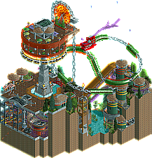
inthemanual - Mordecai's Mechanical Marvels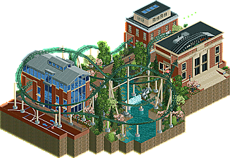
ottersalad - Spring on Campus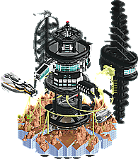
In:Cities - Xenomorph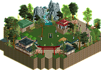
CHE - Zhúyuán Panda Center
__________________________________________________________________
First of all, check out all the entries in this match. If you can't view one or more entries, for example if you don't own LL, then please, do NOT vote. Once you've viewed all 4, select your favourite and second favourite in the polls above. After 3 days, we will close the poll, the results of the two polls will be added together, with the votes from the second poll weighing only half as much as votes from the first poll, and the 2 highest scoring entries will proceed to the next round. The third placed park will place its creator on the reserves list for the next round of the contest.
Votes are public and so any cheating of the system, betrayal of honesty or mistrust will be picked up on and will be dealt with. -

 shnupz
Offline
perhaps this'll be a bit controversial, it was a tough round to vote on though.
In:Cities - I just really really dig the Alien Aesthetic™️ and this was really fucking cool in general. Guests drowning was a nice touch lmao. Is this themed to a particular Alien movie? I've only seen the first two, I really should get around to the rest. Colours were kinda intense with that yellow but all the archy was just hng.
Ottersalad - Very lovely atmosphere and it felt fresh and new to me to see a campus theme. I wasn't a fan of the layout though, the pacing was way too fast and the ending janky. Everything else was really really good though <3
ITM - So uh, this one's probably going to win or come second here, but I'm putting it 3rd mostly because I didn't feel like theme was very strong/well transposed in general. The dragon is fucking cool as shit and the mine train is too! This is good, it just doesn't feel focused, not quite sure how to put what I mean in words though.
CHE - Pandas!!! CUTE! This whole thing is cute it's like Faas and Steve made a micro also Hong Hu lmao I just thought of Gamma when I saw that. This is some lovely, well crafted atmosphere and I enjoy the foliage and composition, I just feel like the archy is a little bit mundane and needed more detailing. What's there is nice, but idk, it also doesn't blow me away enough in atmosphere and micro that all the empty space feels like a positive. -

 bigshootergill
Offline
#1 ITM: Love the direction you've taken this contest, feels like you've built into a new ITM style we've never seen before. The chain lift elevator/dragon was so cool. Is this chain new? Never saw it before! Hope to see you in the finals
#2 Otter: Tough #2 choice for me, but I really love the archy here, and the atmosphere you pulled off here, you had a great MM bud, well done!
#3 CHE: A simple entry, but loved the atmosphere. Might be Steve's #1 pick for this match!

#4 In Cities: Love the creativity here, but for some reason it didn't hit home with me. But I could be in the minority here, we'll see how the votes tumble in.
-

 In:Cities
Offline
^ ^
No this is not themed to a particular Alien movie. Just wanted to set it in that 'universe'. There's no real specific references - just my own story with the same aesthetic.
ITM - MMM
How do you come up with this stuff haha. This is so good dude. I never knew the chain track existed, but it works so perfectly in this setting. The colors are a bit weird in some parts, but it's not a big deal. The amount of movement in this map is fantastic, and the ferris wheel as a cog is such a good idea. Love the relatively simplistic approach you took with the architecture in this - it definitely works.
Otter - College
One of my favorite entries - simply because the atmosphere is just so beautiful. I'm always a sucker for brick and green though. The layout is awesome in my opinion. Love the part where it goes through the library roof. I do think you could have added a few more small finishing touches on this, but it still feels very polished and nicely done. Great work man.
CHE - Pandas
I love how you have very clear cut and focused ideas that come out perfectly executed. This is fantastic. The composition is great, the colors are great, and the execution is great. Reminds me of Zoo Tycoon in the best way.
-

 posix
Offline
I love how the chain links rotate as they move. The RCT you guys produce is so far from what I did years back that it re-enables the kind of perplexed and mystical incomprehensible flair I used to feel in 2002 when I was new. Thank you.
So ITM, great entry. A bit messy after a while, but very good, still. In fact my first pick.In:Cities, beautiful and uncanny. Bit too wild, like you didn't manage to tame the animal of a park you were building, but impressive no less.
Otter, sweet and unabashedly common. Sadly a bit overpowered by the competition.
CHE, still liking your peaceful style. Hope to see more than a micro from you once.
-

 Cocoa
Offline
1. in:cities: the top 3 were actually pretty close here I think, but this one edged it out for me just based on the excitement I felt throughout the whole entry. It actually did have a great horror-suspense atmosphere, with all the messages of peeps drowning somewhere off-screen and the weird, dark but also neon color palette. In the end there wasn't a big surprise reveal of the xenomorph or anything, which would have been cool to see somehow, but I still thought it had a strong atmosphere backed up by quality building. The structures were all detailed, interesting, and unique, and there was lots of crazy organic-ish weird shit going on. Cool stuff dude.
2. itm: there's a lot of really awesome stuff in this entry. The giant chain, the dragon, the mine trains, circular gear buildings, etc. The reason it didn't get first for me though was that I couldn't really figure out what the "theme" was. Or maybe the point was that its not supposed to be figured out. IDK. But it felt a bit muddy conceptual-wise, like a pseudo asian/steampunk/ sleek modern fusion that didn't quite sell it to me as doing any of those things in a particular strong way. but, its still quite enjoyable all up. I particularly liked how you used those rapid waterfalls in the pool around the tower.
3. ottersalad: maybe this is actually the best built entry in this round- just high quality, nice construction. The layout is solid and interacts with the buildings well, and the whole thing feels really "real" as a chunk of american college. I could definitely imagine myself daydreaming this exact sort of thing during lectures! I love imagining how coasters or parks could fit into real life areas I interact in. and of course you put some of the track in!
4. CHE: clean, good, simple. As a section of a larger zoo, this is great. Just a nice peaceful vibe with pretty landscaping and some small but nice architecture. I like the little kiddy ride but I worry that the noise might annoy the pandas!
-

 AvanineCommuter
Offline
ITM: That chain is wonderful! The use of it as a dragon and the gear is really inspired, and I'm sure plenty of people will be using this ride in the future. I think the steampunk theme could have been sold more with solid naming conventions and frozen staff / details, so that the concept isn't as muddy as people are saying. The whole composition is lovely though, and the center tower is great. As I mentioned previously, a tighter architectural centerpiece would've really sold it, especially at the top where it could connect with the ferris wheel gear. Also - lack of music was a missed opportunity to push the atmosphere the visuals are generating!
Xenomorph: Loved the entire concept and execution! The black waterslide has such an alien-cockroach texture, and the whole structure is wonderfully alien-esque. The non stop dead peeps was a nice touch, and the entire structure was really cool as was the color scheme. I think more interaction between the Harvester and the main structure would've been a good touch to bring the rollercoaster portion in touch with the overall composition. I also wish you had used space music for the setting though, it REALLY adds a lot to the atmosphere when I turned it on. Regardless, a fantastic entry!
CHE: Clean and cute! Not comparable to your great submission with the monster trucks, but it's well done regardless. and I'm glad you included music

Ottersalad: Not quite what I was expecting. Although overall it's very clean and well presented, the theme and ride didn't resonate with me. I'm not sure if this was referencing any particular campus or was just generic American college, but the architecture is just as bad as most "new" American universities (aka very well done
 ) I think I was just hoping to see more of what you brought with drydock in the last round, but still a decent submission.
 -

 MrTycoonCoaster
Offline
In: Cities - Xenomorph
I love futuristic theme and soon liked the sound, very cool.
Spacecraft looked great with the purple fire was 10.
The idea of the escavator in the center of the tower I loved.
Foliagen at the right spot, and the color of the rocks gave a cool touch to the scenery.
The ladder coming out of the tower going to the spaceship good idea.
I liked the side towers, one of them looks like a super space antenna.
Haha, this astronaut is the best, I've always liked the astronaut.
I really liked it, good work.
CHE - Zhúyuan Panda Center
I do not have much to say, but no doubt the pandas have been very cute and the music is pleasant.
The houses are beautiful and the foliage is ok.
ottersalad - Spring on Campus
Charming for sure, these colors imitating brick really looks nice.
The buildings are very nice, I liked the architecture and details, the blue windows I loved with the gray roof.
inthemanual - Mordecai's Mechanical Marvels
The dragon became animal, I loved the current, the central tower + giant wheel + monorail great idea and design.
The gears running in conjunction with the Dragon was cool.
Mine train extreme was very good, I enjoyed this ride.
Fire, water, bridge, water fountain, all the details were fine.
Excellent Work. -

 Ling
Offline
Mordecai's Mechanical Marvels - Holy shit my dude. The chain pulley is such a cool centerpiece, and the observation deck monorail ride is pretty sweet too (though I do find it pretty hilarious how the peeps exiting just get dumped off the side of the spire...). I'm not sure what the dragon's supposed to be doing but it's so cool I don't really care. If I had one criticism it's that maybe the mine train coaster could make one more pass at the ravine instead of taking place 85% underground. That area is less visually interesting than the unique landscaping and architecture on display outside. This one might take the whole round for me, although it certainly would have been a tougher choice were it in semi-final 1.
Spring on Campus - It occurs to me we don't often see academic buildings or areas in RCT much... if at all. The architecture is lovely, very effective. I like the brick colors too, and the serene, warm atmosphere. I guess my only complaint is I don't really understand the coaster. You have the hint of a sports focus in the corner, perhaps with a shift in location the ride could have been given a more direct tie-in? With the elaborate and realistic supports it almost looks like it's supposed to really exist on a campus somewhere... with a station in a library.
Xenomorph - Neat way to tell a story and the coaster layout is solid to boot. The color scheme does a good job of making the whole area feel very foreboding, and the ship designs are really cool, glad we're seeing more of that this contest.
Zhúyuán Panda Center - Really lovely little vignette. There's absolutely nothing wrong here but I don't think it's a big enough idea to compete in the semis.
-

 ottersalad
Offline
Figured I’d share some thoughts since voting is wrapping up and I’m not gonna move on!
ITM: loved the dragon.. really neat object you made and loved how the dragon sort of lorded over everything. I think the cliff dwellings would’ve been a cool theme to continue thru the rest of the entry. Loved the movement throughout.
In:Cities: You absolutely destroyed my spaceship lol. Great vehicle design.. good use of objects. Too bad the peeps didn’t work right. But the peep harvesting effect was still there. Such a morbid, hilarious, and creative idea. Would’ve voted this #1. Sorry Tim!
CHE: You out-Steve’d Steve. A panda exhibit was a good choice.. even though it wasn’t super dense or detailed, the atmosphere was super pleasant. I’d love to see you do something full scale in this style.
Me: So the 3 buildings here are my recreations of buildings at my alma mater, Denison University! The coaster is our mascot.. the handymen are my roommates and I, and the mechanic was my track coach. Knew I was going up three strong builders so I wanted to make something pleasant and fun to build. The coaster was built first, and then the buildings around it. I saved my main idea for a future design attempt. So you’ll all see something futuristic and spacey from me down the road!! -

 In:Cities
Offline
^Let's do a space park sometime. With Stoksy. And maybe nin if we include Star Wars.
-

 FK+Coastermind
Offline
My first vote went to In:Cities, this was amazing. Really close between this and itm, but my love of Alien took this beyond. The forms were incredible, I loved the little movie detailes, the ships were incredible and so different than what we often see. My only real criticism is that it differs abit from the true theme of the movies, but that theme is SO hard to do in rct (trust me, I've tried). Well done though.
My second vote was to inthemanual, another slice of intriguing and fun parkmaking. So much unusual stuff that looks SO good, and I love the ridiculous giant chains. The dragon was epic, you've shown me the source material and it's right on. I will say, this was probably my least favorite of your three parks this MM, but I adored the other two and this one I just adore a little less. Some of the underground bits felt a little blocky. But, again, loved the creativity and excited to see you again next round.
Ottersalad, this was really well done and atmospheric; however, just felt limited compared to the drama and intensity of the others. Would love to see this expanded as a full park, but wasn't successful enough on this level.
CHE, this was great and SO atmospheric, but similar to Otter just not enough drama and concept to compete with Incities and it. I'd love to see this expanded bigger (and finished), but it just wasn't enough to win out.
-

 Liampie
Offline
itm: That chain and elevator combo - brilliant. One of the best ideas this MM. I'm also very interested in what other uses this chain object will see in the future. Not sure what the dragon is doing here, but it looks cool so whatever. That kind of goes for the entire micro. Not sure what's going on, but I'm enjoying it. Some things that stood out to me in a positieve way were the green-gold round gear boxes under the coaster's lift, those looked cool. The waterfalls in the centre of the plaza too, almost looked like jet boosters launching the entire tower like a rocket.
otter: I wasn't overly impressed with your micros so far. Good work for sure, but does it warrant a spot in the semi-finals? You've definitely stepped up your game though, Spring on Campus is a very nice surprise. The coaster, albeit a tad fast, is great to watch. Smooth layout and smoothly embedded. There's not THAT much to see, other than a few nicely done interiors, but it's pleasant enough to hold my attention for a while. You've (re)created a pleasant place!
I:C: Love the dark feel and the horror stuff that goes on. The drowning peeps were a nice touch. Good coaster. There isn't much else I have to say somehow. Nice work dude. Not enough to make it to the next round in my opinion, but it's nice work. You had a great run.
CHE: your minimal laidback style has its charms and it even allowed you to get this far. This micro is no exception when it comes to the former, but I think your run ends here. A good run, and I think it's admirable that you just kept doing your own stuff, rather than trying to adhere to the contest meta and cramming a ton of shit on a 15x15 map just because that is expected to do well. I have no complaints about this micro. Everything that is there is done well, with the right amount of little details to keep things interesting. The only thing I'm confused about is that this micro is very Chinese, except for that Japanese gate. You wouldn't put a giant pyramid in a Greek theme either.
The above order is my personal ranking too. Itm and otter get my vote.
-

 Liampie
Offline
 Semi-Final 4 - Results
__________________________________________________________
Winner
inthemanual: 25 + 14/2 = 32 points
Eliminated
In:Cities: 14 + 18/2 = 23 points
ottersalad: 1 + 6/2 = 4 points
CHE: 0 + 2/2 = 1 point
__________________________________________________________
inthemanual proceeds to the Grand Final. In:Cities is eligible as a replacement.
Congratulations to the winners! -

 KaiBueno
Offline
MMM - Love the chain dragon and the tower on the cliffs. Also a big fan of the green and yellow support towers, they just feel right for some reason. The movement is measured but not overkill in this. Great Job.
Xeno - Love the tower and the chaos below...even if that's a lot of deaths. The ride itself is fairly smooth, I especially like how at the end there's a brief part where it floats free before coming back to the station.
Campus - Otter, funny how a few weekends ago I was on a campus for about 6 hrs and kept looking at the archy and taking photos. This is along the lines of what I was thinking that day - the bldgs feel very much like at a college, with a nice coaster squeezed in.Pandas - Captures the feel of a lovely panda enclosure...agreed that this is very pictorial, but not large enough at this stage of the tourney.
 Tags
Tags
- No Tags
