Micro Madness 2019 / MM3 --- R2 Quarter-Final 4 - WhosLeon & In:Cities win
-
 01-May 19
-
 inthemanual
Offline

Round 2 - Quarter-Final 4
__________________________________________________________________
Ling forfeits. In:Cities has been chosen as a replacement.
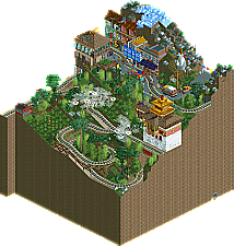
Jappy - Darjeeling Himalayan Railway
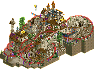
Whosleon - Cappadocia
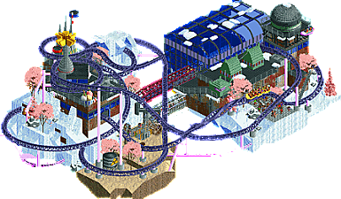
roygbiv - Stasis
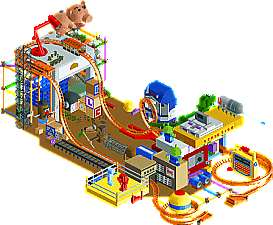
In:Cities - Andy's Room
__________________________________________________________________How to vote?
First of all, check out all the entries in this match. If you can't view one or more entries, for example if you don't own LL, then please, do NOT vote. Once you've viewed all 4, select your favourite and second favourite in the polls above. After 3 days, we will close the poll, the results of the two polls will be added together, with the votes from the second poll weighing only half as much as votes from the first poll, and the 2 highest scoring entries will proceed to the next round. The third placed park will place its creator on the reserves list for the next round of the contest.
Votes are public and so any cheating of the system, betrayal of honesty or mistrust will be picked up on and will be dealt with. -

 posix
Offline
So impressive Leon. Strong J K vibes in this. Amazing micro, clear winner for me.
Jappy, also liking yours. Sweet idea for an entry.
roygbiv, I liked it, but I'm not quite loving the over-conceptualised works by now, if you know what I mean. That somewhat goes to you too in:Cities. It's amazing how much you could capture Toy Story's imagery, but we've seen so many rooms already.
-

 Ling
Offline
Darjeeling Himalayan Railway - Cool little idea. Good use of vertical space without feeling obnoxious.
Cappadocia - Epic little layout. The train clips a bit on one of the arches but other than that this is damn near flawless.
Stasis - Cool aesthetic, kind of hard to pin down. Some cyberpunk, some post-apocalyptic, some vaporwave. The oil drill is cool, the polarity magnets are kind of cool, the coaster layout is solid. All together though... I'm not really sure what they add up to.
Andy's Room - This is epic. So many things perfectly replicated. The magic 8 ball, the etch-a-sketch, Rex & Hamm, all brilliant. This is the best version of a bedroom map I can imagine.
-

 inthemanual
Offline
@In:Cities, the green hats and shirts on peeps to make them look like army men was a fantastic touch!
-

 Cocoa
Offline
One of the hardest matches to vote on in a long time, especially choosing between 3 of my strangelove compatriots

1. cappadocia: obviously the first pick here. High quality atmosphere, amazing layout, awesome composure like we'd expect from you. Really brings me back to places like petra- I think you've nailed that vibe better than other attempts I'd seen. My favorite bit is that little hidden touch of water from one angle. But seriously, thats just such a good micro. I'd give it design!
2. in:cities: such a hard call for this second place, but this one was just so brilliant I had to give it to josh. Easily the best toy story I've seen in rct. The ride is great, and all the sculptures are brilliant. The slinky dog, piggy bank, martians, etchasketch with working interior, SNES, dino, etc. Its so clear that its specifically toy story and not just some bedroom. Fantastic work.
3. roygbiv: incredibly close third. I love the atmosphere here: hard, spooky sci fi with a great layout. The colors work brilliantly and the ice balances the whole thing, especially with the pink trees. Could easily have won another round, you just got "reserve'd" by josh's awesome park...
4. jappy: a seriously high quality fourth place to jappy. Love the archy and the idea. I wish the mountain was a bit more severlely steep and the whole micro was longer and less square so we could really see more of the train working its way up the hill- would have been great to see it passing over all the tea plantations and stuff. so for me the execution just falls short of the great idea, but its still a really great park
-

 inthemanual
Offline
Leon, you're treating this like NEDC. I don't know how you're getting such full layouts that feel so well integrated and supported by surroundings into such a small space. totally mindboggling.
roy: this was interesting and quite pretty, but the theme didn't quite click with me. I got a lot of the pieces. It still works, and I'd be happy to see it move on, but it didn't capture my vote.
Jappy: some imposing height that actually works super well in my humble opinion. Not quite as technically or creatively strong as the entries that grabbed my votes, but a strong, interesting entry itself nonetheless. -

 FK+Coastermind
Offline
So many matches, wanna get through, so just some quick reviews for now:
in:cities gets my first vote and steals the show for me IMO. The details here are amazing, the sculpting and the blocks and the different components, the execution was great and there was so much to look at and explore. This felt like a better version of Monster under my bed, you managed to nail the micro, zoomed in look so well. Awesome work.Second vote to Whosleon, for some great details and atmosphere, very well done to the level we expect from you. The coaster was fun, though a bit hard to follow, and it had great details like the street food that I think just edged out the other components.Roygbiv, this was fun and interesting and I liked the creativity. However, It felt a bit rough and not as well thought out in moments, but I appreciate the drama and the dedication to an unconventional concept. well done.Jappy, this was beautiful, amazing atmosphere, but just really didn't have the drama of the other parks and felt pretty light in content overall. The archy and landscape was great though, love this as a slice of a larger culture park. Well done. -

 AvanineCommuter
Offline
1. In:Cities: Glad to see you back in the competition with this fantastic reserve entry! Wow the amount of content crammed in here is amazing. That etch a sketch? Brilliant. The slinky dog? Brilliant. The Army men? Brilliant. Nintendo? Brilliant. All the sculptures of the characters? You get the idea. Aesthetically it looks very cartoonish, which fits the theme although it's not my favorite look. Definitely one of the best micros thusfar in the competition for the sheer creativity and execution of the references and ideas.
2. WhosLeon: I will forever envy your talent in creating a compact and weaving layout that reads beautifully as you had created in R1 and now here. The theme is beautifully executed, but really it's the composition that leaves me in awe. Love the way the coaster winds in and out of the landscape, I don't even know how to begin building something like this. Teach me, please?
3. Roygbiv: Interesting concept, the polarity magnets was a "whoa" surprise upon opening the park. I think the coaster has a nice layout but is too slow for my liking. The power tube under the station was cool though, and I somehow really enjoy the pink trees and snow... the colors were so different but it worked! Quite an interesting entry, wish there was a little more explanation of the concept or idea here, but I enjoyed it nonetheless!
4. Jappy: A quaint scene with some nice details throughout. I like the foliage on the hillside, though some more lushness could've helped even more. The architecture at the top is nicely done and works well. I think you missed a mark by having the map be so square like Cocoa mentioned; seeing a longer thinner map with the train slowly going up in elevation and maybe only one zig / zag back would've been quite a sight.
-

 MrTycoonCoaster
Offline
Roygbiv made a parking lot that inspired me to do something similar.
I never forget the blue and white airplane Jappy built.
Whosleon made the legoland, simply amazing.
3 high quality players who have dozens of nice screens to stay appreciating your creativity, and your works micro here, certainly deserving.
But I have to be sincere, In:cities reproduced something that I find very difficult to do, "TOY STORY" I am immense fan of this movie, and everything In:Cities did in that work for me was beyond imagination, I was impressed, to reproduce these works in RCT? It is absurd for my mind (lol).
Congratulations, world famous movie, colorful, well built, cheerful, nice, fun, loved it. -

 shnupz
Offline
Leon - Gee Leon, your mom let's you have two Zula's?

For real though I loved this and it feels like Djinn and Zula fucked and this thing came along 9 months later. I can't quite tell where it is themed too, but I'm going to guess somewhere in central Asia like Pakistan, Iran or Uzbekistan? The layout was lovely as always, as was the archy, landscaping and composition.
In:cities - This is so so cute, it was a tough one for me, almost voted it first. Probably the best take on the bedroom theme ever, and it put a big smile on my face. Reminded me of the toy story racer GBC game which managed to pull some amazing graphics for such an underpowered machine.
Jappy - I honestly have no idea how to place your entry. It *was* cool, and I love that railway! I had no idea it existed, thank you for introducing me to such a beautiful piece of history (I really need to learn more about British India, and the subcontinent in general). The atmosphere was charming, but honestly the railway itself felt kinda dissapointing. How much of what was on the map was a recreation? There's the upward helix and the reversal section there that I just don't know if they are real or not. That bottom corner and the tea farm looks very awkward in rct and because of my lack of knowledge on the railway itself I just don't know if this is mediocre rct or a good recreation. The street up high was the best part of this for me.
I think in general the simple square map with a one way slope like this makes it awkward to compose well in rct and have a good use of positive and negative space. It overall felt simultaneously too crammed and too empty below the street level.
The archy was overall gorgeous, I'd love to see more of this theme some time.
Roy - Your entry is also really hard to place. I have it in 4th here but I feel weird putting it last? There's a lot of cool shit here, but I think you tried too hard in some places. A lot of it didn't work which is kinda a shame for me since the concept itself is really cool. The magnets were more frustrating than atmospheric, the foliage was just a little too bare (I loved the alien look to it though!) and the coaster station was really meh. I felt like the colours for the archy and ride didn't work with the surreal landscape that much.
There were a lot of really engaging and well executed elements here spread out in between some rather mediocre parts that fell flat. I did like the coaster layout (big Leon vibes!), but I think it wasn't used to its fullest potential. -

 CHE
Offline
Highlights
Darjeeling Himalayan Railway: train
Cappadocia: coaster layout
Stasis: coaster layout
Andy's Room: dinosaur
-

 spacek531
Offline
Darjeeling Rwy: Sorry I couldn't make the train for you! It felt so bad having to turn down a train. Finally RCT's steep slopes can be put to use in a realistic way. Very good miniaturization of the line with the terrain, tracks, and town above. The clouds were a neat effect. I think the square shape of the map limited it slightly, as others have said. Despite that, what you have done is impressive and captures the terrain, vistas, and feel of the line.
Cappadocia: In a word, inspirational. It feels like a prequel or sequel to Dirt's Blood Moon. Excellent layout as always and wonderfully adorned buildings.
Stasis: Good coaster and good scenery. I like the use of the zoo tycoon rock, chuckled when I saw it. The desert adds a good splash of color but I can't figure out its purpose narratively.
Andy's room: Great! That's all there is to it. It's great. The statues of the characters are great, the toys are great, and the games are great. The layout of the coaster reminds me of Hot Wheels: Stunt Track Driver, which is great.
-

 dr dirt
Offline
1) Cappadocia - Really enjoyed this one. Has the adventurous landscaping mixed in with the coaster that is my sort of bag. I don't know how much the palette really benefitted here, but that's also me being someone who doesn't feel like palettes are now necessary. Really all around great, and you've yet again included a solid coaster. The landscaping work was probably the highlight here, but really it's all really solid. Goes to show that you can have success without being one of the most 'different' or outrageous micros.
2) Stasis - I almost ended up with this one as #1. I enjoyed Altar a hell of a lot and this is just as good. The composition is one of the better floating island micros and looks good from each angle in my opinion. The strength is in the lack of piling things on so what's there is framed in a good way, which a lot of the micros miss this important point. I thought the coaster was cool and exciting, and the trees were a great thematic choice. Really just a good style/look that was established here. Look forward to what you do in the future, especially after these couple entries.
Darjeeling Himalayan Railway - I get that this is on top of a mountain, but most of this entry ends up being the sides of land. Unfortunately, for me, your Round 1 was significantly better than this one. I did like the texture work in the architecture which felt like a step in the right direction for you there, but the rest felt like a bit of a step back, sorry. Where your R1 had great landscaping and framing and composition, this one had a rather awkward mountain top, a not fully realized 'built on a slope' composition, and it wasn't framed to highlight the strengths. Maybe it was rushed, but I was a little bit bummed by this one, especially considering you've become a builder I really enjoy viewing parks from.
Andy's Room - Toy Story is nice and nostalgic, so you've chosen a great theme to tackle and I think it'll pay off. Glad to see you still in the competition as well. Yet again another blown-up scale park here, and one of the better ones, but still, for me, is kind of stuck in the tackiness feeling I get from them. One of the major things that prevented me from voting it was that a lot of the character sculptures appeared weirdly distorted at views other than the main one. There was moments of greatness however, and had some really strong highlights like the desk lamp and the letter blocks. The coaster was nice and it was actually one of the better compositions for the super-scale genre. Also had some of the better colors for a super colorful park, which is rather impressive to pull off.
-

 Tolsimir
Offline
WhosLeon:
Clear winner for me by far. This micro just feels complete. Architecture, composition and atmosphere all add up perfectly. The coaster fits in totally and doensn't feel forced in any place. I really like the roof color being a saturated brown, it gives such a strong and refreshing contrast to the rest of the micro. I wished the color of the color worked more in that way, too. Atm it is a little blurry with the landscape, but that's the only minor issue with this micro. Well, this and the air ballon ride. I feel it didn't add anything. Still, lots of praise for this micro.
Jappy:
Voted this second because I really liked the scenes you built up. That little street with the train arriving and the different cars make it very vivid and convincing. Thanks for using that VW transporter object, it works well here. It was nice to see the train make up its way on the tea plantages. Those clouds looked familiar
 . What I didn't like were some technical issues like floating peeps through the map or clipping through walls when boarding the train.
In:Cities:
Those statues/models of the characters are very well done, they do actually look like their "real" counterpart, kudos for that. Also the rest of the toys was done really well, better than in the Monster under Timmy's Bed from last round. Still I couldn't put this above the other entries as aside from the models I couldn't take too much from it and I just preferred the others.
roygbiv:
I wanted to like this more than I did in the end. The visuals are refreshing and cool, but their are some lacklusters that killed it for me in the end like the oversaturated trees or the rather bland coaster station with a cheap missing glass for the turnaround. Also the spinning magnets did not work for me. The coaster itself was very cool and I liked the layout. Other stuff I liked were the use of the rusty wall texture and that tower next to the station. Also the mixture of snow and sand was interesting. Like others said I didn't quite get the idea behind it, though. It seemed a bit random.
-

 Kumba
Offline
I get why Leon mostly ran away with this. Great aesthetics and a great ride. Just I feel like his work lacks a little in creativity and is in a bit of a mold, tho a damn good one. Andy's Room won for me with all the famous toys and games all around. Loved the hot wheels coaster and even the desk lamp. roygbiv and Jappy also with some solid work, just this was kinda the group of death in R2.
-

 CedarPoint6
Offline
This is definitely the group of death for R2. Such great maps.
Leon- Another stunner. Great layout, great theming, and an excellent map all around. You've made a long layout look very natural in a small space. It fits really well but still gives you plenty of space to put a ton of theming and path space on. It's very brown on the whole, but the colored details you've added doesn't make it feel monochrome. Really it just makes the coaster stand out more. You've made all the varieties of rocks look not awful, which is a pretty difficult task generally. Unexpectedly, the queue for the coaster may be one of my favorite things on the map. I really like the height differential, how it comes from underneath the ride, works up and through the rock, and then into the station. Great work. One of my favorites for the round.
In:Cities- Wow! This is easily my favorite of the 'room' type maps that I've seen. You nailed it with the details. All of the characters are incredible, though Slinky steals the show. I'm super impressed with how readable all the other details are, like the magic 8 ball or the letter blocks. The etch a sketch using the ride is clever as are the bouncing peeps for the video game on TV. This is seriously some of your best stuff, I think. The more time I've spent looking at this, the closer it came to Leon's. Really hope you'll put in an R3 of similar quality.
Jappy- I was actually familiar with the source material of this one, so I was really excited to see it. The real thing is a super cool engineering solution. It's too bad you added the station at each reverse point though it doesn't deter much. Architecturally its quite nice-- I like the little town in the hillside and the way the simulator building overhangs the cliff. Good details all around, like the tea pickers, the cow, and the clouds. I like the signal at the upper switch point too. In a number of the rounds I think you would have had a good shot, but this was such tough competition. Really nice work.
Roy- Another impressive layout that doesn't feel too forced to get a lot of track in a small space. I like that the raised Cheetah Hunt style section actually has a purpose rather than just being there. Good work winding it around the theming. The theme throws me off a little bit. You have the industrial stuff buried in snow, but then also sand? And then there's the pink trees, which do ok with the palette but are also a little dense so they come across as just a splotch of pink. I do like the details like power underneath the station, the ice cream stand used as antennas, and the oil rig. It's a great micro, but like with Jappy you just had some stuff competition.
-

 Liampie
Offline
 Quarter-Final 4 - Results
__________________________________________________________
Winners
WhosLeon: 26 + 10/2 = 31 points
In:Cities: 13 + 16/2 = 21 points
Eliminated
Jappy: 1 + 9/2 = 5.5 points
roygbiv: 2 + 7/2 = 5.5 points
__________________________________________________________
WhosLeon and In:Cities proceed to Round 3.
Jappy and roygbiv are eligible as a replacement for Round 3.
Congratulations to the winners! -

 Cocoa
Offline
I'm excited for more incities and also for the accidental double replacement. Great outcome
 -

 KaiBueno
Offline
Andy's - Wow...rivaling the pinball from Rd. 1 as my favorite thru 2 rds. It's simple but executed perfectly. All the details I'd want are here, both characters, props and the freaking Game of Life.
It makes me want to watch Toy Story again. Thank you for this.
Cappa and Stasis - So hard to choose. I swear I didn't flip a coin, but it was like 2a and b. I think it came down to textures and the ride into the landscape a touch more. Super close and either would probably win most other matchups or definitely get 2nd. Go figure for a change I like the layout and building from Cappa's realism more than the sci-fi Stasis - and this considering the micro I just finished is also more sci-fi. The glass hanger for stasis added a nice feel to offset the front bldg pathing.
Darjeeling - This cute gem got stuck in another tough group! Nice village and mountainside using landscaping blocks vs scenery, but a train is hard-pressed to compete with the huge coasters that happened to be squeezed into this round. Bad luck of the draw. Cinema building is well perched with lovely textures.
 Tags
Tags
- No Tags