Micro Madness 2019 / MM3 --- R2 Quarter-Final 2 - Stoksy & Camcorder22 win
-
 01-May 19
-

 posix
Offline

MM3 — R2 Quarter-Final 2
__________________________________________________________________

Camcorder22 - frango folliculus
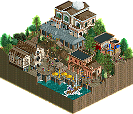
MK98 - La Residenza Di El Padrino
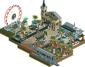
Stoksy - Moseley Square
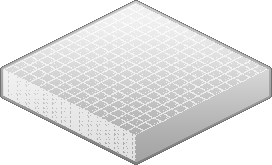
RCTFAN - Forfeit
(no replacement)
__________________________________________________________________
How to vote?
First of all, check out all the entries in this match. If you can't view one or more entries, for example if you don't own LL, then please, do NOT vote. Once you've viewed all 4, select your favourite and second favourite in the polls above.
After 3 days, we will close the poll, the results of the two polls will be added together, with the votes from the second poll weighing only half as much as votes from the first poll, and the 2 highest scoring entries will proceed to the next round. The third placed park will place its creator on the reserves list for the next round of the contest.
Votes are public and so any cheating of the system, betrayal of honesty or mistrust will be picked up on and will be dealt with. -

 Liampie
Offline
Camcorder: not sure what exactly I'm looking at, but it's the anatomy of some kind of stacked food. Cheese, meat, veggies. I think it's a brilliant idea. Definitely lacking in refinement, it's obvious that you didn't spend as much time on this as you've done on other micros. It's enough to get some of the ideas across though. I love how the cattle is just lining up in front of the slaughterhouse. I also like how the veggie layer is a garden, although the pond makes me think these veggies aren't particularly fresh or tasty. Good micro, halfway great.
M98: you're again showing that you stepped up your game. This is very nice stuff. Sadly, there's not much going on other than a little scene that mostly looks good from just one angle. The savegame therefore is hardly worth much more than a screenshot. You've got skill, now use that skill to make something extraordinary.
Stoksy: another 'scene', comparable to MK98, although more modern and urban, and thankfully with more life and things to see. Same advice/request as MK for you: use your great skill to make something more extraordinary. Use your great skill and inspiration for Australian urban scenes to finish Luna Park, and be ambitious and out of your comfort zone in Micro Madness, if you make it to Round 3!
1. Cam
2. Stoksy
3. MK98 -

 ottersalad
Offline
1. Stoksy: Impressive realism as usual. Refined and had some neat little details and movement.
2. Cam: Definitely get the stacked food idea.. is it Taco Bell like people mentioned in discord? The poor bovine and the cheesy river thing added nice movement. I agree with Liampie that this was less refined, but the little details and simply having things move about the map made me pick this 2nd.
3. MK98: Solid archy work! But thats about it. Still a strong entry.. would've been a winner in many groups in R1. Just needed more to look at and stuff moving about.
-

 In:Cities
Offline
1st - Stokly - Australia pt. 2
This is just classic stosky greatness. The movement of the buses, the little details, the colors. All of it is spot on. The ship statue is brilliant, and is one of my favorite 'little things' i've seen in game. The street performer and band are also great touches. Also, I like poor Karl. All in all my favorite of this round.
2nd - Clamcorner22 - Chalupa Supreme
Had to give you my second vote. For a rushed entry, this is incredible. Really enjoyed the butcher scene. Easy concept to understand visually - which is a big plus. Surprised you didn't build this all over a toilet. The only thing I didn't really like was the fact that everything gets lost when you rotate the screen. I know there's only so much you can do in game to prevent it, but I can only imagine how annoying it must have been to build. Nice job dude.
3rd - MKultra - El Casa de el Godfather
I almost voted you first place for using my Officer Peep object. A+. Unfortunately this entry just didn't stack up to the other two in my opinion. Great architecture and atmosphere, but it's lacking movement. I like the elevation changes, and the waterfront seating is really nice. Would love to see this as an area in a full park.
4th - RCTFAN - Forfeit
I really like the artistic choice of using all white tiles with the grid lines, but unfortunately that's about all I like. Lacking movement, color, peeps, rides, and love. Maybe next time!
-

 Ling
Offline
frango folliculus - I have no idea what is going on here, all I know is it is trying way too hard to have way too many levels.
La Residenza Di El Padrino - Love how this scene is framed. Textures could use a little work but I really dig the peach building. Cute boat too.
Moseley Square - Path textures are far too messy for my tastes. It's also so spread out it's hard to get a sense of context. The restaurant is probably my favorite part.
-

 Cocoa
Offline
1. camcorder: hilarious theme, and pretty decent for a last minute entry! I loved the cheese uh swamp and the slaughterhouse/ cook line is hilarious. The top level didn't quite hit the same highs but there was a lot of jokes and silliness that really sold it for me.
2. stoksy: you adelaide fuckboy. Nice work- just really solid realism and urban space. Here it is IRL for everyone else, btw. Well done, I just want to see some parks from you! Although I do appreciate this work regardless, its always fun to recreate spots that are close to you in real life.
3. mk98: not bad at all. A little boxy and rusty around the edges but still a solid entry. I just wish there was a little more little details to really grab my attention- it just didn't seem so fleshed out overall.
-

 FK+Coastermind
Offline
So many matches, wanna get through, so just some quick reviews for now:
First vote to stoksy, the execution and little bits were amazing, love the colors and atmosphere, well done.
Second vote to cam, this had some amazing drama and fun bits, the execution felt a little rough and repetitive in places, but I love your dedication to micro concept.
MK, this had great atmosphere and architecture, overall a great slice of life kinda micro. I just felt the drama of Cam's slightly edged you out. Great work though.
-

 AvanineCommuter
Offline
1. Cam: You're nuts, how did you even think of this concept
 .... I love it! The meat layer is where the best quality is at for me, that bovine ride is clever, with the butcher perfectly represented. The rocks really look like taco bell beef. The garden is great, but didn't think the wooden coaster was necessary. Some other "veggie" ride or "salsa" ride could've worked here. Baja Blast adds a nice touch of blue color. As others have mentioned, more refinement to the shapes and composition can elevate this further, but I really enjoyed the craziness of this micro. Kudos!
2. Stoksy: Very much a Stoksy release. I've never been to Australia but looking at photos of the place, it looks like you captured it pretty nicely. I really like the zig zag steps and the street performer, and like others mentioned that boat statue is phenomenal; what a wonderful little sculpture! Some music / action could help bring it more to life, but overall a technically very well executed micro.
3. MK98: A beautiful little scene, the music really adds to the setting. I know you were strapped for time, so what's there is really well presented and classy. If you had the time to flesh it out some more, interiors would have added another layer of interest here.
-
 inthemanual
Offline
Stoksy, you clearly know your own style and are really playing to your own strengths.I expect another slice of australia next round, but I'm also hoping it'll be more adventurous!
Cam, you built cam cheese. This is you on so many levels.
MK: a hard one to not vote for as its some of your better work. Just a bit more static and not as interesting as the other two entries. -

 shnupz
Offline
Stoksy - You absolutely fucking legend stop making me want to go to drop everything and check out Adelaide omg u make it seem so pretty keep this shit up. Everything in this is lovely, although the composition was a bit awkward, I think you just needed more space to do the square justice? It feels like there should be more, it's mostly just in the way you cropped it all I guess.
Cam - Look, I know it was rushed, and I know it isn't your best stackfest, but it's fucking funny and I had a good time. It really did need a lot more polish, but it was good. Felt really bland colour-wise, and could have done with some guest interaction. The foliage and landscaping on the top layer was cool stylistically but also felt a bit sparse. The middle layer was my favourite.
MK98 - Like itm said this was a tough one to put third. It really wasn't bad, the colours were clashing and somewhat off-putting but like, you're colourblind, it's mostly a really interesting thing to deconstruct for me since I try and imagine what it would have looked like from your perspective, but yeah there was a lot of overly vibrant and deep colour mixed in with buildings that weren't much more than very similar shades of brown. It did feel a bit static, but the atmosphere was good. -

 CHE
Offline
Highlights
frango folliculus: the butcher
La Residenza Di El Padrino: Genco's comfy sitting area
Moseley Square: b o a t statue <3
-

 dr dirt
Offline
1) Moseley Square - I think you're one at the forefront of actual 'micro' detailing here, as it's pretty damn brilliant on a zoomed in level, and definitely ain't bad from an overall look either. I really liked the path choice here, the stone blocks colored looks great, and the black stones are awesome. Loved to see the Ghibli wheel thrown in here, haha. The whole thing felt very confident and competent, and had a refreshing style that you're coming out with right now that I'm not quite sure how to describe. My favorite bit was the miniature ship statue.
2) frango folliculus - I'm not quite sure what I'm viewing as it seems to be some kind of food related, but in some sort of layered narrative. It took my vote here just for being ambitious and adventurous, but I'm afraid it certainly isn't my favorite work of yours. It sort of has the 'here's some layers,' connected by waterfalls trope. Maybe I'm just not understanding it, but it had solid enough work here to nab a vote. Compare it to your R1, which was just as much of an undertaking but had a clear direction and the scope felt natural in that one.
La Residenza Di El Padrino - It was very nice but it felt like you didn't push yourself here. There wasn't much that I disliked, which is good, but unfortunately there isn't much that I'm going to remember from this one. Quaint and pleasant, and I like these that have a square base shape, but there wasn't really any gesture into this. Sort of falls into the trap of building what RCT looks like and provides and not a unique vision. Like if you had a sketch of the plans of this, it would still look like it was made with RCT object pieces.
-

 Tolsimir
Offline
Stoksy:
Great little micro. Archy of the town hall building is very nice. I like how spaced out this was. Could really imagine walking on that plaza there and sitting down to have lunch. The statue really is the highlight, looks totally realistic. Good job. The different street artists were a nice touch to bring life to the plaza. I didn't like the interiors too much and the sloppy blacktiling on the metro and bike ride. What made this the best of the three was is great credibility.
MK98:
Felt like summer holidays! Nice archy and atmosphere. I liked the windows on the church building, the building itself felt a little too square to be a church, though. On some places it was a little plain like the turn on the path with the little bridge in the one corner. The masion was nice but also a little boring with not much to discover. All in all solid entry but I feel there is still missing a bit to compete with the other guys. For me still 2nd place.
Cam:
I found this entry too silly. Top and bottom layer don't look cool at all, the middle one I actually quite liked as it was also the most detailed one. The butcher with those poor animals was cool and sad to see at the same time. Good execution of that idea. For top layer I didn't get much and on the bottom layer I felt the cheese didn't look much like cheese. Didn't appeal much to me.
-

 Kumba
Offline
Cam did something tall, lol. Can't say I really got it, other than the middle level, which I loved and hated. Really well done and one of the most striking things I have seen in RCT. Moseley was really nice, at first I felt like there was not much there, but I kept finding details. Loved the street performers. MK's entry was a really nice, but didn't have too much of a unique quality to it, still a great little atmosphere.
-

 CedarPoint6
Offline
Stoksy- On the surface this didn't seem like I'd be spending a ton of time looking at this map and then I just kept finding more and more details. It's seriously impressive how much you can get in there. The boat sculpture is incredible. It reads so well for something so small. I'm really loving the breakdancer area and the balloon salesman next to him. The band is super cool as well. The Ferris wheel is simple enough, but really feels like it belongs in the area. About the only ride that would have, I think. I've enjoyed the theme you've created so far with R1 and 2. I do hope that you can plus up your R3 a bit as I do think the challenge will get harder. Hope you stick with your theme, though!
Cam- I expected tall from you, but I'm not sure I expected... this? It's strange for sure, but I had fun with it. A deconstructed burger is pretty off the wall and while I know your execution could have been better, this was still pretty interesting. Feels like the meat area had the best design in your head, and definitely turned out the best from a narrative standpoint. It was pretty clever. The cheese flume and the various extras level was nice though started to be a bit repetitive. Not as much as the vegetables level, though, which was conceptually the weakest. I'd have loved to see a ride that made a little more sense rather than Cronchy Boi though I'm laughing to have gotten to type that.
MK98- This was a really pleasant landscape and was put together well from a composition standpoint. The biggest drawback here is it didn't hold my attention long enough. The buildings are nicely detailed and the boat is fine. Mostly I'm just wishing there was a ride of some sort-- whether it was a car ride or a boat ride or something to give it some life aside from the peeps walking around. This works as a nice little still life painting, but against the competition I'm not sure it holds up as well.
-

 Liampie
Offline
 Quarter-Final 2 - Results
__________________________________________________________
Winners
Stoksy: 28 + 10/2 = 33 points
Camcorder22: 10 + 17/2 = 18.5 points
Eliminated
MK98: 3 + 14/2 = 10 points
__________________________________________________________
Stoksy and Camcorder22 proceed to Round 3.
MK98 is eligible as a replacement for Round 3.
Congratulations to the winners! -
 KaiBueno
Offline
Mosely - I didn't realize this was part of a series, but I like the feel of it. A big open square, this time instead of full buildings like in Padrino, we have cutaways with nice detailing inside. I think the large Ferris and Tram are what pull it all together. A bit more going for it than the other scene here.
Padrino - Like this also, just not as much going on. All of the buildings have character and the spacing feels natural. I like how for a scene that it is viable and enjoyable from all 4 angles. The large building is my favorite, too bad it didn't sneak in a small narrow ride.
Frango - I appreciate each layer, and the overall concept, but at the same time it feels like it is overbaked? Repeated viewings might have changed my mind a bit, but I admittedly voted early.
The multi-layer approach had nice touches in each, but I guess I'd rather one or two? The tomato layer with the boats and wooden loop was my favorite. The meat layer was rather brutal...and the cheese, maybe I just don't need as much as I age, especially mixed with blood. Lol. -
 Camcorder22
Offline
Great matchup! Congrats to Stoksy for the first place finish. I had a feeling this would be the outcome but am glad I pulled off a passable entry given I thought I would have to forfeit a couple days before the deadline. Love the snapshot idea and its inspired me to try this out with some spots near where I grew up. MK had a nice entry too, great to see you getting better and better.
In case anyone hadn't seen on discord or figured it out yet, my entry was a recreation:

The idea started off as a joke I made on discord about layered entries but i decided instead of just calling it "crunchwrap lmao" i wanted to make a Fantasy Park With Strong Narrative type entry and make fun of as many fantasy/layering tropes (which I am just as responsible for as anyone) as possible with all the waterfalls between levels, hidden caves, floating islands, colorful water, etc. At the same time I wanted to play it off as a serious entry that had some deep hidden backstory when it was really just a big dumb pile of food. The name is just the words "crunch wrap" thrown in google translate from English to Latin, because it sounded the most fantasy-y. Obviously there's no way to know it was done in a tounge and cheek way and not a tryhard way as some people interpreted it but I had fun with it. I definitely get some weird edgelord enjoyment out of making things that I know will annoy some people, and it comes more easily to me than trying to build something everyone will actually like (probably because it requires less skill...)
The meat level was indeed the only one that had any sort of planning and unsuprisingly came out the best and most full of ideas. If anything, that one had the not so deep and hidden message "eating meat is gross and factory farming is evil" so maybe I've made the first piece of vegan activist RCT?I think I will definitely meat my end building something like this next round so either I'll have to build something more skilled and serious, or I'll just double down on an idea like this knowing I'll lose.
 Tags
Tags
- No Tags


