Micro Madness 2019 / MM3 --- R2 Quarter-Final 5 - Tolsimir & Liampie win
-
 29-April 19
-
 inthemanual
Offline

Round 2 - Quarter-Final 5
__________________________________________________________________
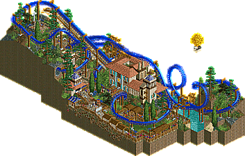
Liampie - Writer's Block
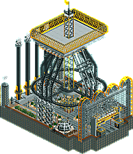
MrTycoonCoaster - The Tower
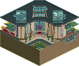
Tolsimir - 1k Museum
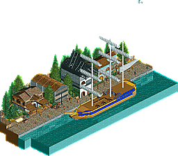
Wacked - Doc's Haywire Adventure
__________________________________________________________________How to vote?
First of all, check out all the entries in this match. If you can't view one or more entries, for example if you don't own LL, then please, do NOT vote. Once you've viewed all 4, select your favourite and second favourite in the polls above. After 3 days, we will close the poll, the results of the two polls will be added together, with the votes from the second poll weighing only half as much as votes from the first poll, and the 2 highest scoring entries will proceed to the next round. The third placed park will place its creator on the reserves list for the next round of the contest.
Votes are public and so any cheating of the system, betrayal of honesty or mistrust will be picked up on and will be dealt with. -

 AvanineCommuter
Offline
1. Tolsimir - I love you.
2. Liampie - Compact and beautiful. Interesting choice of concept, overall a very serene and nicely composed micro. I love the choice of bright blue for the coaster, had great contrast with the surroundings. Though it seemed like you knew you would get through with a simple entry

3. Mr. Tycoon Coaster - I literally said "whoa" when I opened the park; I wasn't expecting that! Really interesting and fun use of coasters to create motion throughout the entry, I love the creativity here! I think you could've used some finesse in the structure though, especially the top of the tower which was too large and bulky. Fun and creative entry, great job.
4. Wacked - A nice and peaceful scene you've set up here. The base of the boat is wonderful, the blue pops really nicely. The sails and architecture were a bit simplistic though. Is this even 225 tiles? Seemed like you could've incorporated a ride or two to keep the attention here longer.
-

 Cocoa
Offline
1. tolsimir: absolutely, laugh-out-loud hilarious. The obscure spelling names is just genius. Such a good loving roast of a charismatic and historically important dude. Just a lot of awesome details calling back to old parks. Would have loved a SoK roast too but maybe I missed it
 . The banners are great too, and there's some inspired object use!
2. liampie: always annoying that you can sneak around competitions with your half-ass bullshit
 . Its a real skill though, so kudos to you. Good atmosphere, a lovely layout, and cool old school work. I like those wooden supports but am equally annoyed at how well you do default supports! You old LL dog
3. tycoon coaster: I don't really get it but its definitely cool- all the active rides shooting up and down and around. I can't figure out what any of it is supposed to be but theres some interesting details and an usual vibe! good to see for sure.
4. wacked: shame about running out of time but what's there is good. the boat is actually very well proportioned I think, which a lot of people get wrong. The active docks is a really cool idea that would be nice to see developed further!
-

 posix
Offline
MTC - I think my favourite thing about this is actually the sound the launched coasters make. Like a meditative sound installation.Wacked - Decent, but a bit boring.Tolsimir - Impressive architecture. Well suited idea for a micro.Liampie - Wonderful. Was this another 1h effort? I easily found this to be the most enjoyable of all four. Love how you managed to create this little world on a micro. Stylistically an oldschool-pleaser, so I'm easily won over.
 -
 Xtreme97
Offline
Tolsimir: Loved everything about this. The concept of a museum dedicated to Kumba and his objects is brilliant and building it with all 1k objects is very impressive. This is definitely something I could see Kumba doing as well. Loads of hilarious stuff like the obscure spelling corner and I laughed at the display with the queue railing object. A lovely tribute to one of the site's most famous players and my favourite of the round.
Liam: I'm consistently impressed by your ability to create a strong atmosphere so effortlessly and this is no exception. Pretty nice coaster with a lovely station. The best part for me was the little seating area by the helix behind the lift hill. Gorgeous little scene there which elevated this wonderfully.
MrTycoonCoaster: This was a really cool, rather unconventional entry. The launched coasters going in tandem was a really nice effect and the other rides were fun and creative. Unfortunately I didn't quite get what the theme or purpose was. A great effort nonetheless.
Wacked: Neat little entry but there's not really enough going on. The boat was cute and I liked the blue/yellow colour combo there. Shame you didn't have time to finish it and complete your vision but it's still a nice entry.
-

 FK+Coastermind
Offline
Gave my first vote to Tolsimir, what a great concept. Probably one of the best comedic ideas i've seen, and so well suited to MM. And, surprisingly fun to explore for a micro that has no tracked rides and is generally a single building. Another example that great concepts do the best in MM. Well done.
Second vote went to Liam, purely for the atmosphere. Conceptually, this was pretty boring and compared to some of your other 'lolz i'm doing a competition' parks, not as good. But, it had that patented #Liampie atmosphere and some nice simple moments that put it above the other parks. I do hope you'll have something more incredible for next round (like your R1), but well done doing the sneaky Liam thing.
MyTycoonCoaster, there were some really fun and interesting things here, particularly the supports with functional coasters and all the movement. Your scale is still so big that I think it is hard to compare with the smaller details and closer focus of normal NE style. My hope is that as you continue to refine your work you'll keep the creativity and movement that you have here.
Wacked, this was well constructed and had some nice atmosphere. I like some of the little touches like the Furtado birds and carriages. However, overall it just lacked the excitement or drama that is best suited for micros and didn't really have the ideas to hold me for long.
-

 MrTycoonCoaster
Offline
edit by Liam: moved your post here!
Hello Staff
In fact I kept thinking: how to compete with these expert players? ok lose, but do not lose ugly hehe, because I am weak near these players.
What could I build? I was lost, it was very difficult because everything I thought someone had done, in Micro in previous years.
So I thought I'd do something about the "MADNESS" theme.
But I sincerely liked the sound that produced several equal rides and the entrance withthe arches done with ride.
I understood your question, what I wanted to do or demonstrate, so I am demonstrating a "MADNESS".
-

 inthemanual
Offline
Liam: Theme doesn't really tie in, but that's the joke isn't it? You know what this is, and it doesn't need a review.
Edit: I didn't mean the entire thing was a joke, but that the park is much more about it's atmosphere and general feel than the "tacked on" theme.Tolsimir: I've never laughed more at RCT. Great idea, great amount of life brought into it, great humor, and great execution.
MrTycoon: Fantastic tower. I said wow when I opened it. really cool how all the moving parts work together, it's just not as refined as the other entries.
Wacked: Pleasant entry, which is strange for something with "haywire" in the name. I would have liked to see a bit more life, and perhaps a ride in this, but it seems like you ended p running out of time. A solid entry nonetheless, unfortunately poised against some tough competition. -

 Liampie
Offline
Myself: in a way Writer's Block is a sequel to The Inspiration Well, although I'm definitely aware that this is a little less exciting and conceptually tight. Possibly a companion piece to Metropolis, with a loose connecting theme of the anxieties of the 21st century society. A writer struggles to finish his book and retreats to some Southern European mansion, hoping to find inspiration and productivity there, in isolation. However, the muse is dead, deadlines are creeping up to him, his publisher is breathing down his neck like a helicopter parent, and the mail is piling up. The anxiety clogs up his creative channels even more. Not really a serious entry, but no joke entry either.
Tolsimir: we've both been raiding the H2H7 brainstorm very well the past year.
 This is great, you nailed it. And it is funny. The obscure spelling corner cracked me up, but I also really enjoy simple things like an exhibit of a patch of vomit. Great job making fun of as well as paying tribute to Kumba.
MrTycoon: it's nuts. It's so weird and different. There's not much to write about but I like it. I don't think you'll make it out of the group this time, but you made something memorable by being different, and I respect that.
Wacked: I like the simplicity of the ship. Over the years ships have gotten more and more complex, and while that's great, they're also getting samey. It's refreshing to see a ship that is more simple, while still being effective. What puzzles me is that the background seems to be entirely non-custom scenery. It clashes a little. I also wish there was a little big more going on, but it's a pleasant scene with some nice touches like the crates being loaded onto the ship. "Haywire Adventure" seems like a hyperbole though. There's nothing adventurous here.
-

 Ling
Offline
Writer's Block - Can't add much that hasn't already been said. I expect some nuts stuff from you in the next two rounds.

The Tower - Crazy in a unique kind of way, but I do think it needs to have a bit more purpose than this. What's the tower supposed to be for? What's it supposed to be? You have all of these animated features and they just don't do much for me.
1k Museum - This is awesome. I think I'm missing a few of the references but it's such a good idea so damn well executed I just don't care. First pick for me.
Doc's Haywire Adventure - Ahh, the boats continue. Some nice NCSO architecture, but the scale doesn't totally work and it's missing the character and liveliness of some of the other entries.
-
 Camcorder22
Offline
1. Tolsimir: Some of the most pure creativity and cleverness I've seen in the game in a long time. Still mindblown that even the walls, paths, and foliage are all 1K objects as I wasn't aware of that at first. Was actually laughing out loud multiple times while viewing. Something about the singular objects exhibits was hilarious. At first I thought the signs for the exhibits were tombstones, which was extra hilarious for the railing since you built the replacement object. Absolutely died at the weird spelling section, for some reason the world "bick" is funnier than all the standup comedians in the world.
2. Liampie: Clearly this was one of your rushed entries and I'm honestly frustrated at how well you pulled it off lol. Love a good terrain invert, and this was one of the best layouts of the contest so far. While lack of custom supports is usually a pet peeve of mine, it looked totally fine with the built in supports here. You better actually try next round, at least so we all don't look bad.
3. MTC - Something about this gave me an otherworldly, dystopian feel that I normally don't get in the game. For some reason the synchronization and symmetry felt really eerie to me. While your style is still unconventional, I genuinely feel like you succeeded in creating an interesting atmosphere here. Keep building like this, its really cool!
4. Wacked - Was nice, but not a ton there and I preferred your R1 entry. The NCSO boat was impressive though.
-

 ottersalad
Offline
1. Tolsimir: A Kumba museum is a great roast.. holy crap. Using only 1k objects was crazy. Most creative entry so far in the contest by far.
2. Liampie: How do you crank out such good work so easily? It's not fair.
3. Wacked: Definitely can tell there more you wanted to add. The boat was good.. but everything needed more busyness and more clutter. Crates, boxes, that rope object. Maybe another boat.
4. MTC: You spent a lot of time on this, but I'm not really sure what was going on.
-

 shnupz
Offline
Tolsimir - This is so fun and really comfy too! Always love roasting Kumba and this was great, although the lack of Son of Kumba or Gaelic Meadow references was a lil bit sad. The actual museum itself is a really cool building, it felt a bit like Stoksy built it lmao. You're a great builder, and you've really shown some of your best work so far in this contest.
Liam - Just shut up and take my second place vote. This is one of the most Liampie things ever, you knew you'd get through lmao. How long did it take you to build? In all seriousness, it is really atmospheric, I found the theme to be pretty weak though, I guess you had builder's block and just decided to shit out your standard comfy style? The layout is great, the supporting is cute, the station is lovely, and the landscaping is on point. Good stuff all round, but not really attention grabbing.
MrTycoonCoaster - You build some of the most surreal and bizzare shit and I love it. You've been improving at a pretty steady rate and are bizzarely great in some areas and lacking in others but I really do appreciate how unique your style is. Overall, I found this to be kinda hypnotic, you managed to make me dissociate and not much rct does lmao. The tower itself and all of the archy really does need some work, it felt incredibly blocky, but I still found this to be really interesting to explore soley based on how weird it is. I'm always excited to see how you evolve in this game, and I'm eager for more!
Wacked - Babby RWE! <3 This was adorable, I loved the ship, and it was a very tranquil micro. That said your ncso is pretty mediocre, but I think you have quite a lot of potential there. I appreciated the little touches like the birds, but you've got some work to do on your use of textures and objects in NCSO, and this micro in particular did seem to lack life and flourish to make the theme shine. It's been great to have you here in the community, always love to see new players. I did prefer your round 1 entry, but this has its own merits that stand apart from your other work.
Overall, it seems like you're taking in a lot of cool building techniques from Deurklink's tutorials and his community (or RC&F? Not sure where you came from), they've definitely turned what would have otherwise been really uninteresting releases into some really engaging stuff, and have left me excited to see how you develop. I thought your river rapids and go-kart contest entries were really great! You have a good sense of the game and your composition seems to be pretty decent, I think your main area to improve upon from here would be your colours, textures and architecture. NCSO (And CSO too!) is surprisingly versatile in how many different ways you can make all the normally clunky objects work well together. I'd recommend checking out releases and screens from Alex, Shotguns? Terry Inferno, RCT2Day, IonZer0 and Nin to get a broad range of styles among the best NCSO has to offer. Also check out Sandwich Springs! -
 CHE
Offline
Highlights:
Writer's Block: The Inspiration Well
The Tower: support coasters
1k Museum: 1k meat your favortie frozen stuff
Doc's Haywire Adventure: carriges going into boat
-

 Wacked
Offline
Wacked - Babby RWE! <3 This was adorable, I loved the ship, and it was a very tranquil micro. That said your ncso is pretty mediocre, but I think you have quite a lot of potential there. I appreciated the little touches like the birds, but you've got some work to do on your use of textures and objects in NCSO, and this micro in particular did seem to lack life and flourish to make the theme shine. It's been great to have you here in the community, always love to see new players. I did prefer your round 1 entry, but this has its own merits that stand apart from your other work.
Overall, it seems like you're taking in a lot of cool building techniques from Deurklink's tutorials and his community (or RC&F? Not sure where you came from)
Deurklink it is, and yeah. I feel with everyone's responses they are spot on. And the boat has some custom scenery in it :-) But it is not the best version of said boat. -

 In:Cities
Offline
1st - Tolsimir - Kumba's Museum
By far my favorite of the round. I will never not laugh at 1k bick. Great idea, and great execution. The use of cutaway isn't an inconvenience in this, and makes it well worth it. I loved the hanging banners on the front of the building.
2nd - Liamlpe - Writers Bock
Another effortlessly great entry from you. Even though I think this would look even better in a full size park, it works well as a micro as well. The colors and elevation changes are spot on.
3rd - The King of Brazil - MADNESS TOWER
I love how much motion is in this! Although it crashed my game a couple times haha. I think you did an excellent job creating this. I would love to see you try more projects like this in the future.
4th - rwe lite - Boat by Buildings
Not a terrible entry, just not really suited for this contest. It's understandable that real life restraints got in the way. I would have loved to see the coaster you planned for this. Better luck next time!
-

 mamarillas
Offline
Writer's Block - Damn I'm jealous you can make something this stylish where the theme is not knowing what to make. Despite my jealousy I just can't deny my love for this micro. Coaster layout, color scheme, the landscaping with a touch of water, it's all very clean and classy. The normal supports look surprisingly great.
1K Museum - I am probably too new to NE to appreciate everything, but the concept is awesome and the museum structure is full of amazing touches both interior and exterior. So fun to explore the spaces and details even if I didn't get jokes.
The Tower - Very cool as a big, bold statement piece. Some of the finer details are a bit repetitive, like the bits of foliage. Clunky top platform.
Doc's Haywire Adventure - I like where you were heading but it just feels unfinished. Given more time I know you'd pack in the details that are lacking. I'd love for you to polish it off or incorporate it in a larger project.
-

 Liampie
Offline
 Quarter-Final 5 - Results
__________________________________________________________
Winners
Tolsimir: 36 + 9/2 = 40.5 points
Liampie: 9 + 30/2 = 26 points
Eliminated
MrTycoonCoaster: 1 + 5/2 = 3.5 points
Wacked: 0 + 2/2 = 1 point
__________________________________________________________
Tolsimir and Liampie proceed to Round 3.
MrTycoonCoaster is eligible as a replacement for Round 3.
Congratulations to the winners! -

 Liampie
Offline
Looks like I got through again. I'll do my best to not waste the privilige on another semi-serious half assed entry. I'll try to make it great.

 Tags
Tags
- No Tags