Micro Madness 2019 / MM3 R1 Group F - AvanineCommuter and Sulakke win
-
 13-April 19
-
 inthemanual
Offline
Round 1 - Group F
__________________________________________________________________
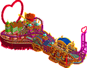
AvanineCommuter - Moulin Rouge!
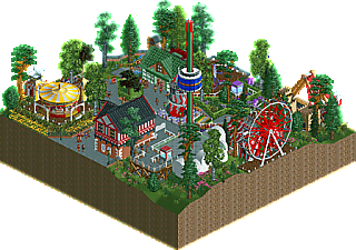
Sulakke - Pokey Park
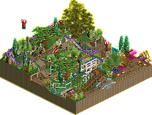
phann - The Shire
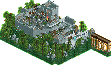
JJayMForce - Remnant
__________________________________________________________________How to vote?
First of all, check out all the entries in this match. If you can't view one or more entries, for example if you don't own LL, then please, do NOT vote. Once you've viewed all 4, select your favourite and second favourite in the polls above. After 3 days, we will close the poll, the results of the two polls will be added together, with the votes from the second poll weighing only half as much as votes from the first poll, and the 2 highest scoring entries will proceed to the next round. The third placed park will place its creator on the reserves list for the next round of the contest.
Votes are public and so any cheating of the system, betrayal of honesty or mistrust will be picked up on and will be dealt with. -

 Ling
Offline
Moulin Rouge! - What a trip. Figuring out the interlocking architecture here must have been a nightmater but it looks so polished. Except for that one mis-colored trim piece, literally broke my immersion.
Pokey Park - Why the hell do I love this so much. This is to MM what Diamond Heights was to H2H7. Absolutely adore it.
The Shire - Really nice idea, and I think the atmosphere is about right, but it's hard to reconcile the balance of enough stuff going on to make the plot interesting with a theme that succeeds or fails on how tranquil and just plain pleasant it is. Technically it's fine but I'm not sure it succeeds at being what it sets out to be.
Remnant - Hmm... was there a readme I missed for this? I think the burning cauldron and the fountains are at odds with the attempt at this historical site tourism attraction thing that the rest seems to be going for.
-
 Mattk48
Offline
#1. AVC. I enjoyed this one. Crazy theme, crazy colours, lots of fun. Archy was pretty cool, heart was a creative turnaround. I like the hot air balloons. Everything here is fun.
The following three was actually really hard for me to decide how to order.
#2. Sulakke. Very charming. This is my favorite park cutout so far this contest. Archy was cute.
#3. Phann. A unique entry with a strong atmosphere. I don't think it looks much like LOTR though.
#4 JJ. I think you did a good job making some convincing ruins. Maybe a ride in there or something else to look at would have helped. It didn't hold my attention for long
-

 FK+Coastermind
Offline
Oh AVC, what a joy. Moulin Rouge got my vote, the execution is classic AVC with some me-styled HUGE color and great movement. The stylization is top notch, you managed to get all the drama without going super tall. And, you've got enough details and finishing touches to make this feel like a composed, complete thought. Well done.
My second vote was close, but I went with Phann. Oddly, both this and Pokey Park seemed to have a similar 'small theme park' concept, but the main difference was a Shire theme, and it definitely added. A little rough in some of the execution, but it was nice to see some of the smaller LOTR theme elements, it felt like a single part of a LOTR themed H2H park. There was also tons of movement with some tracked rides, which really helped. Well done.
Sulakke, as I said above, very close between you and phann. I thought yours had better execution and was very atmospheric, but it lacked some of the theme details that make it more than just a small slice of park, and in this format I feel like concepts are so much more successful. Also, the lack of a tracked ride to create some interest was an issue when compared to the multiple tracked, bigger movement rides phann had.
JJ, I liked this as a foundation for a park, but it needed more to push the concept and the execution was lacking in areas. Particularly for this group, the lack of rides/activity/movement was a challenge for this micro.
-

 Liampie
Offline
AVC: one of the top micros so far. It's fantastic, from the rides to the theming, to the general concept and how you translated it into imagery. The use of flags is ingenious. Also loving the parachute ride. I knew you'd be good at this shit.
Sulakke: finally a true successor to #diamondheights. You took an RCT1 scenario and translated into something real. In hindsight it makes kind of sense to give Pokey Park this treatment in Micro Madness, great move. I think you nailed it. Pokey Park will never be spectacular, but it will always be charming.
phann: I definitely like it. There's stuff to see and it's very lively. On the other hand, it's kind of a mess.
JJay: clearly not your old self yet, although I also believe this was thrown together at the last moment. I'm glad you did, because it's great to see a new park under your name. It may not be up to par for you yet, I do like it, especially how the path winds up to the ruins. I think you're out of the contest now, but you gave it a shot. Hope to see more of you soon.
My preference is the above order. -

 CedarPoint6
Offline
AVC: This is a beautiful park. Love the use of flags underneath the map and just the general shape of the base. It's a bit gaudy and rich as I think it should be-- the colors really bring it all together and that teal keeps it from being too overbearing. The coaster is a lot of fun to watch as well even for as simplistic as it is. Excellent work.
Sulakke: When I was thinking about joining this contest, this was the concept I was planning on doing. But thankfully you did it instead and to a much better level of execution. You've captured the inspiration so well but done it in a really gorgeous way. The two buildings are super pleasant, especially the entrance building with the cute little arch as you come into the park. I think I'm more impressed that it doesn't feel cramped either, despite all that's on the map. This was very close to my #1 pick for the round.
Phann: Really nice entry. I like the structures over the food stalls and the horses snaking through the middle of the map. That giant tree actually fits in rather well too though it almost seems like you might have wanted to bring it more towards the center of the map and incorporated as a focal point. As some have said, I think the overall composition probably held it back the most. Cleaning it up just a little bit in terms of path layout and overall organization would help you out a lot.
JJay: Is this based on anything in particular? It reminds me of an abandoned castle I walked around in Alsace. It's pretty nice overall-- there just isn't a lot of content unfortunately. Good work on getting something in for the deadline. Hope to see more of you building in general.
-

 ottersalad
Offline
1. AVC: So much color in this and it pops really well. Great archy too... and it all blends together really well. The station area was immaculate.
2. Phann: I liked the theme here. I think doing the shire fit well into a micro. It was rough at times, but definitely a solid effort. Nice work!
3. Sulakke: Nice idea, and a positive throwback.. but looks too much like a scenario to me. Phann had a little more detail which I preferred.
4. JJay: Not bad, definitely solid archy.. but could've benefitted from some frozen staff to tell a story. No need for rides, but some narrative.
2, 3, and 4 were all close for me. I could see anyone justify each of them for 2nd.
-

 Gustav Goblin
Offline
AvanineCommuter- Out of anyone in this contest, your submission was the one I was the most excited to see. Now that it's out, I can say I'm not disappointed in the slightest. The grandiose architecture just screams you, and the heart at the end of the dueling coasters is genius. You did a fantastic job taking a well known musical and giving it your distinct style.
Sulakke- It's so adorable! Remaking Pokey Park is a perfect idea for a contest like this, but it's how you reimagined it which pushes it over the top. The quaint architecture and Cloud Nine's theming gives it a European family park feeling. I'm a filthy American, but I feel like I'm there! Excellent work!
phann- I'm not gonna lie, I whistled Concerning Hobbits to myself while looking at this one. It's a nice representation of Hobbiton, although the helicopters stick out a bit to me. Good park!
JJayMForce- I really like this micro! It's a little hard to call it a park, but the scenery is great. It does feel a little still, but seeing as it's a ruined fort, that's exactly how it should feel. I'm not sure what that cascading water near the statues is supposed to be though.
The moment I saw AvanineCommuter's name in this group, I knew his would be my favorite. Moulin Rogue absolutely delivers on my expectations and is my favorite park this round. What surprised me is how close Pokey Park came to topping it for me. Great micros, everyone!
-

 MrTycoonCoaster
Offline
## AvanineCommuter - Moulin Rouge!
Really Crazy theme, the idea of hearts was great.
I loved this mix of strong and striking colors, lots of fun. I also liked the hot air balloons.
Micro very interesting and architecture very good, I found it fantastic.
## Sulakke - Pokey Park
I also found it lovely, a charm, it seemed to me a small, happy and calm village, I liked it.
## phann - The Shire
Unique entrance with good atmosphere, enjoyed the foliage, although the mess was cool.
## JJayMForce - Remnant
The ruins are convincing, it was good.
Maybe if I had a ride, I would have a little more life.
Foliage was good and I liked the bridge to ruin. -

 Cocoa
Offline
1. avc: excellent work. The archy is all really pretty and the color choices are bold but still spot on. It all sets a great vibe thats full of fun and magic, and the heart element at the end is a great idea. I just really like the atmosphere you manage to create in the little nooks and crannies, especially the absinthe restaurant.
2. sulakke: I think you may have gotten a bit lucky here, sneaking through with a lowkey micro. That said, its pretty awesome and definitely nostalgic (I remember spending a long time on this damn park as a kid. Did you know you could buy land far away and then rent the space in between it?? If I'm remembering right...) The two buildings are high quality though, although I'm slightly confused by your decision to really do some stuff modern style, like the twister, and some really classic, like the pirate ship. But I guess, if it aint broke dont fix it, and you were going for nostalgia anyway.
3. phann: pretty cool stuff- my favorite thing is the weird wooden structures holding up those awnings. that was super cool. Also, that tree is fucked massive. I might steal it...
4. jjay: does seem like you couldn't quite find the time for this
 . I was really looking forward to a rerun of the hathor micro! I did enjoy the bushes around the rocks though, always a good vibe.
 -

 KaiBueno
Offline
Brief comments from KaiBueno! (Disclaimer - I'm renewing myself to the community and know very little of you, your parks, styles, etc. My views are framed from what I see as I open it, with a twisted 2005 perspective of wazzup.)
Moulin - Love the bright colors, tandem shuttles and how they form the hearts. The red and gold is over the top, and I love it...flowing curtains and all.
Shire - The Ponies! The balloons! Baggins' place on the hill looks great - Elven Highway is a funny name but the ride almost blocks too much that there is to be seen. The tree in the back fits well.
Pokey - Solid county fair type park, probably one of the better simpler entries in Rd.1, but for me not enough vs the first two. Colors are a healthy mix in with the foliage.
Remnant - Hmmm, I can see the name, but of what...a castle? A church? Maybe time was an issue here, feels like it is missing something. -

 shnupz
Offline
Not really able to give a full set of reviews this time but Moulin Rouge is honestly design worthy in my mind. I had so much fun exploring it.
I'd put Derail, Forest Frontiers and Ascension in the same category too, they were all lovely. Round one has been really incredible with so many releases I adore, I'm really excited to see round 2! <3 -

 In:Cities
Offline
1st - AVC - Erotic Friendfiction
An easy first place choice for me. Very creative concept. Perfect execution, lots of movement, great colors, great coasters/hacking. The banners underneath everything really added a lot to this in a good way. Always love your work.
2nd - Sulakke - Porky Park
Man I really really loved this. It's simple, but not bare. Very nostalgic and well executed. I want to build a park like this now haha.
3rd - phann - New Zealand
This one isn't really terrible by any means, it just didn't give off the vibe of Lord of the Rings/Hobbit like I would have hoped. It's a fun entry, but seems too cluttered and not well defined. Nice effort though!
4th - JJayMForce - Broken Castle
Also, this one is not a terrible entry - it just didn't stack up to the others in my opinion. Your skill is great and the theme is well done, but it didn't fit the MM format as well as the others. I'd love to see this as a part of a full sized park in the future, as it's an excellent piece of theming.
-

 chorkiel
Offline
Really thought JJ would fare much better this round.
The clear winner this match is obviously AVC. Not only did you come up with an original concept, you executed it well into the details. Very colorful and atmospheric.
For me the runner up would be JJ. Really enjoyed the architecture. Would have liked to see more movement. Was very excited to see you're participating again and would have hoped for more work from you.
Nonetheless, I can see why people prefer Pokey Park. It's a really good idea, but to mo it looked a bit simplistic / rushed.
The shire is my least favorite. It does certainly not help that I don't care for lotr. Regardless, it looked too messy and simply not well built enough compared to the other parks. -
 Jappy
Offline
finally a true successor to #diamondheights. You took an RCT1 scenario and translated into something real.
Bumbly Beach would like to have a word with you....
AVC: You get the vote this round! Fantastic micro! Vibrant, colourful, alive and the theme is so weel done. Good job! I even liked the little Le Reve reference...
Sulakke: Such a great idea to translate Pokey Park into MM. I was impressed when I realised even the positioning of the rides was accurate, apart from the slide. Nice archy as well. I could've used a track ride perhaps, even if the real scenario didn't have one.
Phann: Fun little micro! Fun rides and great foliage. But I do think the theme was a bit lost for me. I think using just regular names and not LOTR references would've made any difference IMO.
JJ: Well made castle, but some more movement would've been welcome. Also the ston texture was a bit too repetitive for me. I did like how you did the foliage though.
-
 CHE
Offline
Highlights
Moulin Rouge: that heart element <3
Pokey Park: entrance building
The Shire: stalls
Remnant: broken castle
-
 Camcorder22
Offline
1. AVC: Holy shit this may be one of my all time favorite micros now. Its unlike anything I've ever seen but also so distinctly you. While the color choices could easily go into "ow my fucking eyes" territory that was not the case here and you executed it brilliantly. Also the overall shape and composition was brilliant. I'm impressed you managed to fit the rides, and include long lines (which I've found difficult in my micros) seamlessly as well as the windmill and making it all work without seeming cramped or chaotic. Excited to see what else you'll do in this competition.
2. Sulakke: This and Phann's entry were pretty close for me. I must not have spent much time on this scenario as it doesn't feel familiar the way ones like Forest Frontiers and Diamond Heights do. So while that was lost on me, I enjoyed the overall feel and the idea that you were actually adding rides in a scenario-like manner while mixing that in with some nice archy and landscaping too. I don't think I was hyped on this as some others were but still good enough for 2nd plae for me.
3. Phann: Some interesting textures and atmosphere but overall not as well composed as Sulakke's. While I personally don't care I think you may have set some people's expectations at a certain level by linking it to LOTR. While bits like the foliage, helicopters, and food stands were nice, the purple mini golf track didn't fit at all and stood out a lot. Would've went with wood or dirt, or re-arranging things to avoid floating paths altogether.
4. JJay: Not a bad entry, but I felt like I'd seen it all after about a minute. Glad to see you building though!
-

 Liampie
Offline
 Group F - Results
__________________________________________________________
Winners
AvanineCommuter: 44 + 3/2 = 45.5 points
Sulakke: 4 + 28/2 = 18 points
Eliminated
phann: 0 + 15/2 = 7.5 points
JJayMForce: 0 + 2/2 = 1 point
__________________________________________________________
AvanineCommuter and Sulakke proceed to Round 2.
phann is eligible as a replacement for Round 2.
Congratulations to the winners!
 Tags
Tags
- No Tags
