Micro Madness 2019 / MM3 R1 Group H - Whosleon and RCTFAN win
-
 13-April 19
-

 Liampie
Offline
How to vote?
Round 1 - Group H
__________________________________________________________________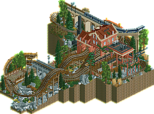
WhosLeon - Derail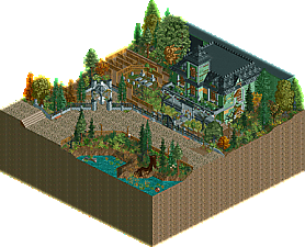
RCTFAN - Monster Mansion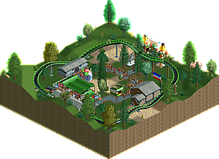
L3mmy - Actie! Nederland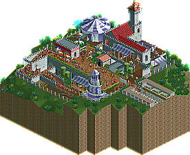
SWAGTITTIES - Nameless entry
__________________________________________________________________
First of all, check out all the entries in this match. If you can't view one or more entries, for example if you don't own LL, then please, do NOT vote. Once you've viewed all 4, select your favourite and second favourite in the polls above. After 3 days, we will close the poll, the results of the two polls will be added together, with the votes from the second poll weighing only half as much as votes from the first poll, and the 2 highest scoring entries will proceed to the next round. The third placed park will place its creator on the reserves list for the next round of the contest.
Votes are public and so any cheating of the system, betrayal of honesty or mistrust will be picked up on and will be dealt with. -
 inthemanual
Offline
@leon - probably one of the best entries of r1. An interesting dense layout, layered with features and details to make it not only readable, but also engaging and interesting. A fun part about this level of density is that the train is hard to read: I'm always guessing where it'll go next. Absolutely fantastic.
RCTFAN - atmospheric, but still. I'd like to see what you can do with something more lively.
-

 Ling
Offline
Derail - What a shutout. I think this is the first actually sort of disappointing round in the whole contest (which is fucking nuts, but also awesome), but we still managed to get a top-notch entry out of it. Love everything about this, except maybe some of the glitchiness on the rock work.
Monster Mansion - Very nice facade. I think this is meant to be a slice of a park? It's not totally clear whether this was meant to be just heavily themed or actually abandoned. The interior being empty didn't really help. But I assume you will make it through; I hope we see a bolder idea from you in round 2.
Actie! Nederland - I respect you for jumping into a contest like this - unfortunately there just isn't much for me to review or give you pointers on here. Just all around having more stuff would be a good start. Think of how you can include more visual elements related to what's going on in the plot.
SWAGTITTIES - There is some great skill on display here with respect to building form and composition - I think you will make it through as a stand-by and if you can adapt more to the contest format I think you could a few more rounds.
-

 posix
Offline
Leon, it's seriously impressive how you could fit that long of a ride on a map this size. Possibly the best layout of R1 so far. Some of the micro was too much for me, but I still voted this first.
RCTFAN, how truly wonderful to have you back. You haven't lost much of your tastefulness, and I much hope we'll get to see more of it. -

 FK+Coastermind
Offline
This was a pretty easy round to vote in.
My first vote went to Leon, a really atmospheric and class entry, i'll echo posix on the quality of the layout. It did feel a bit like a theme or mindset we had seen before, and may have struggled against some of the other groups, but it had the execution and beautiful atmosphere to win here.
My second vote went to RCTFAN, it makes my heart sing to see you building again. In terms of atmosphere as a 'slice of park' micro, this was great and had a wonderful sense of theme. That being said, it would have suffered against parks with more activity, even just peeps, and i'd challenge you to think bigger concepts for the second round. But, what you have done is hard to argue with, so well done.
The other two parks, while fun, felt like work from parkmakers that are very new to the game. I'd recommend looking at all the micros and other parks on the website to get an idea of the styles and elements that go into making more dynamic parks.
-
 Mattk48
Offline
#1. Whosleon. Clear winner. Fantastic layout, especially the second half flowed really nicely. Very impressive for a micro. Station is really nice. I think the bridge with the trains ontop added alot of charm. Rock work was good.
#4.L3mmy. Not much here to comment on. Needs more finish.
#2. RCTfan. Great atmosphere, good enough for second in this group. I have a soft spot for haunted mansions, The one at Magic Kingdom is one of my favorite rides in that park. Peeps and an interior would have really taken this to the next level. Nonetheless i enjoyed.
#4. Swag. Charming, simple. Clearly ahead of L3, but needs some more refinement to compete with RCTfan and Leon
-

 ottersalad
Offline
Easy votes here.. really awesome Leon.. lovely design.
2. RCTfan: Looked good.. just sorta lifeless. Could've used peeps or a cutaway of the ride.
3. Swag: Needs more polish like Mattk48 said. Liked that you packed the rides in though. Definitely went for a micro park. Could've been better if you focused on having one ride though.
4. Lemmy: not much here unfortunately.
-

 CedarPoint6
Offline
Easy votes as has been said, but here's some reviews:
Leon: Wow!! You've gotten it all. Great (long) layout, architecture, foliage, theming, and plenty of little details. The coaster is lovely-- maybe the best of round 1. I love the track layering and that great little canopy at the end. The station building is wonderful with so many track pass-throughs. The viaduct for the commuter train also offers some nice interaction for the coaster. Love the rocks and foliage too including the rock outcropping that the coaster wraps at the bottom of the layout is really beautiful. All in all this may be one of my favorite micros of R1. Awesome work!
RCTFan: Where's the ride??? You have an absolutely gorgeous empty box that's begging for at least part of a ride! Your stuff has always been super atmospheric and this is no exception. That queue is lovely and the facade is just incredible with the boarded up windows and ivy. Lovely little queue entrance structure too. As I said, it just needs a ride. Or half of a ride, or even just a load station. That interior is begging for some gorgeous atmosphere. That path would also benefit from some little kiosks and peeps! Nothing new said here, of course, but I really hope to see the next level of all this in R2.
Swag: Getting there! It's a nice little map, but it feels like you're trying to hide your two biggest rides. Make those rides the focal point and base your pathways and theming around them. I hope you continue to build and develop!
Lemmy: I'm glad you submitted an entry. I hope you can pull some things from the other entries to continue to up your game. The launched kids coaster looks like a fun time.
-

 Cocoa
Offline
leon: such a "you" entry. You're very good with that sort of flowing archy/landscaping/rides vibe- its sort of hard to pin down but its such a style you have. Thats a really good layout (best so far?) and a cool little vibe all up. Nothing extremely groundbreaking but great rct.
rctfan: this is some pretty great detailed work for a returning oldie!
 I tease but its a very good facade, even if those quarter tile wooden fence queues are very, well, you from 10 years ago. Would have loved to see a ride here for sure but I was impressed by the boarded up windows, texture work, and spooky foliage vibe. nice stuff.
swagtitties: I always love ride entrances nestled to the side of retaining walls for path. just such a classy setup that I should use more. nice work- nothing too novel but still fun.
lemmy: I remember getting knocked out of mm1 with no votes
 . great to see an entry from you anyway and I imagine you can learn a lot from the other entries so far.
 -

 KaiBueno
Offline
Brief comments from KaiBueno! (Disclaimer - I'm renewing myself to the community and know very little of you, your parks, styles, etc. My views are framed from what I see as I open it, with a twisted 2005 perspective of wazzup.)
My least favorite group overall...
Derail - Love the layering of track here - a lot of ride in a small space! Nice high ceiling station in brick, and the cutaway view of a train nearby. Fun layout of the overall area.
Ghost - A slightly larger Haunted Mansion still life, but with enough life in it to move on. House does its job.
Nameless - should get last for no name alone, but it was a cohesive little fair with small rides and decent color scheme. Finish the job though and name it!
Actie! - Well, I've been informed this means Action...so maybe you started late and finally got yourself in gear late? It's a bit sparse and simple, even for a kiddie coaster at a county fair. -

 MrTycoonCoaster
Offline
#WhosLeon - Derail
Actually the long ride in a small space was very good, I do not know how you got it, great work.
The other half liked it a lot, worked well.
The colors, roofs, building was good idea, good atmosphere.
The small details helped a lot in the layout.
Foliagem in the right measure, neither a little nor a lot, a great RCT.
#Derail RCTFAN - Monster Mansion
I really enjoyed the mansion, the small area with water is nice.
Just think people lacked or a ride to give more life.
#L3mmy - Actie! Nederland
I agree with CedarPoint6, hopefully you can pull some things out of the other posts to continue in your game. The roller coaster launched seems like a fun time.
#SWAGTITTIES - Nameless entry
Simple but charming yet needs more refinement.
I'm no expert, I mirror in other parks to learn and take my own imagination the best.
Perhaps highlight more the rides help, it is not so attractive, but found it fun and liked the purple color. -

 In:Cities
Offline
1st - Liampie - DKS 2 but cooler
This one is great. Not sure how you managed to fit so much layout in this space without seeming too cluttered. Architecture and colors are spot on. The interactivity with the bridge and rocks are perfect as well. Fantastic work.
2nd - RCTFAN - Not Haunted Mansion
I love this, but it just didn't have much 'life'. Great to see you come back and build something cool though. Really hoping to see a larger release from you!
3rd - nameless
You okay?
4th - L3mmy - Actie
At least you submitted something
-

 CHE
Offline
Highlights
Derail: that layout <3
Monster Mansion: architecture
Actie! Nederland: dutch flag
SWAGTITTIES's entry: Gokarts/Twister building
-

 Liampie
Offline
 Group H - Results
__________________________________________________________
Winners
Whosleon: 48 + 0/2 = 48 points
RCTFAN: 0 + 46/2 = 23 points
Eliminated
SWAGTITTIES: 0 + 1/2 = 0.5 points
L3mmy: 0 + 1/2 = 0.5 points
__________________________________________________________
Whosleon and RCTFAN proceed to Round 2.
SWAGTITTIES and L3mmy are eligible as replacements for Round 2.
Congratulations to the winners!
 Tags
Tags
- No Tags

