Micro Madness 2019 / MM3 R1 Group E - Scoop and mamarillas win
-
 12-April 19
-
 inthemanual
Offline

Round 1 - Group E
__________________________________________________________________
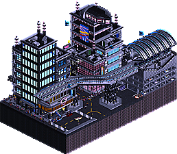
Scoop - CyberNior
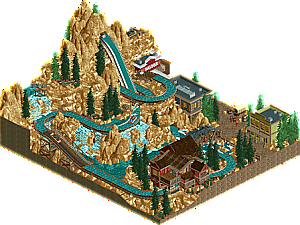
Mattk48 - Old Faithful
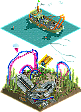
Mamarillas - Seafloor Salvage
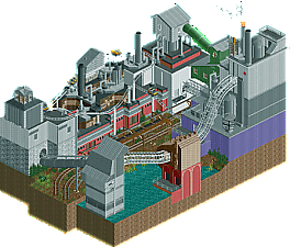
Ultro - Grime
__________________________________________________________________How to vote?
First of all, check out all the entries in this match. If you can't view one or more entries, for example if you don't own LL, then please, do NOT vote. Once you've viewed all 4, select your favourite and second favourite in the polls above. After 3 days, we will close the poll, the results of the two polls will be added together, with the votes from the second poll weighing only half as much as votes from the first poll, and the 2 highest scoring entries will proceed to the next round. The third placed park will place its creator on the reserves list for the next round of the contest.
Votes are public and so any cheating of the system, betrayal of honesty or mistrust will be picked up on and will be dealt with. -

 Cocoa
Offline
I actually can't decide for a change- these are all really strong in their own ways. I need to think a bit more I guess
-

 G Force
Offline
Pretty hard vote on this one, but Sea Floor Salvage was probably one of the coolest micros of the contest so far for me. Especially that submarine, just wow. Instantly flashes me back to all those Robert Ballard documentaries I watched as a kid.
 -

 shnupz
Offline
Easily the toughest votes I've ever made on this site much like CnC/Evil and Tubiao/Feira
Scoop These micros are all great in their own right, but I think you edge out on top for me for the very well crafted atmosphere. The music really helped set the mood and it felt more lively. The other micros are all honestly really fucking good but they did all lack in the atmosphere/life department. I really appreciate the way you executed the theme, it's been one that I have had on my mind for ages and have been shelving until the new lighting engine is up and running to have functioning neon lights etc. You pulled it off really well and I applaud you for it. This was essentially going to be my round 2 idea lmao, same sort of setting and everything.
Mattk48 Absolutely wonderful flume. I loved the rock work and the archy, it was beautiful. Lovely layout, lovely aesthetics, definitely on par with scoop's micro like that. Honestly, I'd vote for this to win a design if I was on the panel, it may be small but it is lovely.
Mamarillas Holy shit that is some damn good trackitecture. I love the salvage vessel and it is all in all a great micro. I did honestly feel like the coaster didn't need to be there imo, something more subtle but more atmospheric would have been cool. Maybe some fish swimming around etc to give it a bit of life. Third place for me, but this is a super tough choice to make.
Ultro Great setting, cool archy, really nailed the industrial feel. It felt rather clean though, which I'm not sure if that worked well with the setting. Some rust or signs of age would have been a nice addition imo. The coaster itself is... meh? Like, the visible parts are nice, but once you see through the scenery the layout is really janky. I think the sections covered by heartline track were cool, and it was overall a great idea for a micro. Fourth place for me, but this is by no means a bad release <3 -

 inthemanual
Offline
Swoop - Detailed, thoughtful, creative entry. I'd have liked a little less of a hollow, paperthin feel to the buildings. night palette added a lot here.
Mattk - impressively dense little flume here. This is a really solid entry and I'd be happy to see it move on.
Mamarillas - creative, and fantastic use of tracks and objects to create something really out of the box. Really clever. I'd have liked a more thoughtful ride layout, but the ride itself didn't feel like the focus here, so it didn't bother me too much.
Ultro - Creative, dense, and interesting. I think it could have felt a little more cohesive. The red buildings kinda stole the show, and everything else felt tacked on top, if that makes sense. -

 mamarillas
Offline
Awesome job group mates!! Scoop the city is so lively and the palette is perfect. Mattk I want to visit this place in a real park, gorgeous. Ultro I dig the layout and there's nice details.
Also huge thanks NE admin folks for everything you do!
-

 Ling
Offline
CyberNior - Great atmosphere here. The police chase is pretty much the best ride integration for this plot I can think of. The monorail station maybe takes up more space than it needs to since it doesn't actually contribute too much.
Old Faithful - I'm not totally in love with this style of landscaping but it's a good contrast here from the other colors on the map. I think you really needed one more tree type, at least, but the log flume layout and interaction and everything is just wonderful.
Seafloor Salvage - I really like this. There's a lot of weirdness, like the jellyfish the size of a car, and the foliage that looks more alien that nautical, and the floorless only really being related to what's going on by name, but on the whole it's super imaginative and a good use of the dual level format. The submarine is utterly brilliant. The little pirate caves are cute, even if they make no sense. I think what doesn't quite push this one over the edge for me is the sea floor just isn't as visually cohesive as it could be. Some stronger rockwork and more careful attention paid to the foliage would really have made the difference here, at least for me. Still a close third in this group, and I'll also commend you for your trackitecture skills.
Grime - I'm a little torn here because I know it's industrial and that generally means kind of intentionally ugly, but the structures don't really look like they belong together. There are a few different interpretations of industrial here - it's like a combination railway station/gas plant/processing plant, and a mix of a few different brick types and corrugated metal, some colored, some not. I'm also not really feeling the coaster layout. Maybe overall just more movement on the plot would have helped it out. We've seen some other attempts at this sort of industrial/pollution theme so far and I think they could all do with a bit more... bite.
-

 FK+Coastermind
Offline
I went with Seafloor Salvage for my first vote, well done Mamarillas. Overall, this felt like an idea i've never seen in a micro (someone will now surely prove me wrong on this, lol). Loved the shop, felt like everything was well executed and had some great sculpting with the sub and the broken ship. The coaster with supports felt a little odd in the setting, but I think it makes sense, floating coasters just look so gawky even when this is under water. But well done, thought this was really well done.
For my second vote I went with CyberNoir. This felt refreshing and very well done thought it certainly wasn't mind shattering. Love the vibe and style, the palette adds so much, and it had a great atmosphere as a bustling city. I'm always excited for more of this emerging look, well done.
Mattk48, it's ironic that you called this Old Faithful cause it seems like a self-burn on this theme (maybe it was?). While well executed and very atmospheric, this just didn't feel original compared to some other really original micros. I feel like we've seen this kind of splash mountain-esque log flume with the brown rocks and some western archy a lot before, and thus it just lost out to the other more dramatic and MM concepts.
Ultro, this definitely had some great moments but also some confusing ones. Moments of archy, like the tallest tower, were really nice, but then other buildings felt awkward or out of place in the industrial theme. I think it just needed a bit of editing to smooth out the rough edges and clean up the composition. That being said, well done, it says a lot of this match that yours was my low.
-
 CedarPoint6
Offline
Scoop- Looks like you're going through after all! A nice take on the theme and I do really like these dark palette parks. My favorite details here were the small billboards throughout and some of the signage. Would have been nice to see the monorail run or perhaps some other kinds of movement here. You've developed a bit of a storyline, which you could have maybe enhanced with trackitecture naming or frozen staff. I'm not sure if the elevator exit on top was part of the story or not, but it's a clever way to get people down without trapping people up top. This would be cool on an expanded map.
Mamarillas- A surprise entry! Some really nice trackitecture here. The tethered sub was my favorite thing here. Super clever. Also awesome detail with the shadows over the water from the buoys and ship. The thing I was most confused about was the coaster. I'm not quite sure what that was meant to be or meant to be doing mostly. You definitely had some cool supports, but I think you could have maybe done better with something else-- maybe moving sea creatures? Either way, it's cool enough to get my #2 vote. Nice job!
Matt- Aesthetically this is a really great map. It does feel a bit 'safe' perhaps since we've seen it before, but the execution is really well done. The layout doesn't feel squeezed despite the lack of space and I really like how the layers work across the whole mountain. This is gonna be a nitpicky thing, but don't forgot to name your unused tracks as well! I think it makes for a cleaner presentation. On the whole this was a solid entry and right there with Seafloor for me. Was a tough choice.
Ultro- Some really nice parts on this and some just ok parts. The mouse is sort of the standard micro coaster type, but the layout is fun, especially the parts you have enclosed with the ultra twister track. The section across the pipe was cool too. There's a few really well detailed facades that look great and a few more that are plain. I think it might have been a mistake to keep the edges blank. I would have other themed them as exterior walls or done cutaways. May have added a bit more interest to have a control room cutaway or production area detail perhaps. Still a fun map to view!
-

 Gustav Goblin
Offline
Swoop- You nailed the Blade Runner aesthetic! It's so full of life, even if the only functional rides are tucked away in the buildings. I love the aerial police chase, and the parking violation is a funny little touch too.
Mattk48- Love it! The old western architecture is great, and I love the rockwork. I would say there isn't much of a shoreline, but it is an artificial mountain built for a log flume. Under that assumption, it's perfect.
Mamarillas- Very unique! Your use of trackitecture for the supports and shipwreck are great, but I especially love how you used it for the submarine tether. Can't be a NE contest without a boat!
Ultro- This is such a cool park! You did a really good job nailing down the industrial atmosphere. Some of the walls look a little flat, but overall this is great.
This is one of the most solid and well rounded groups I've critiqued so far. Every submission is great in its own way, but I'm gonna have to give it to CyberNior followed by Old Faithful. Great work, everyone!
-

 Sulakke
Offline
Scoop - Well fuck, I kind of had a similar idea for round two, including the same palette and neon signs. Anyways, your execution is briliant. I love the little details and architecture. The monrail footers were fantastic as well. The city was perhaps a bit too clean. I would have prefered a more dystopian look. I didn't get why you've gone with the pirate theme. Doesn't seem to fit well.
Mattk48 - I liked this entry as well. Pretty good rockwork and architecture, but I feel we've seen it all before. I didn't like how the flume drop seemed to be coming out of the rocks. The foliage could have been more interesting with the addition of some other types of trees.
Mamarillas - Pretty nice, although a bit lifeless due to the lack of peeps. The submarine was pretty cool and I really liked the underwater foliage. I thought the research ship was a bit clumsy and it could have used some more details. The shipwreck could have used more details for sure and felt a bit out of place because of that. Did you run out of time?
Ultro - The composition and architecture was pretty good, but some of the buildings were way too grey if you ask me. Even for an industrial theme. The brown and red bricks looked better. This entry could have been better with the addition of peeps to give it a bit more atmosphere, I think. Still a good entry nontheless.
Scoop is the clear winner for me. The quality of the other three entries was pretty close.
-

 Scoop
Offline
The pirate music is playing.
whoops I built this with no music on. There is a link in the folder that your supposed to listen to. I made an oopsie.
-

 Cocoa
Offline
definitely my hardest vote so far, easily any of these 4 could go through in this group. But, I have to settle on a score...
1. scoop: Really solid work here, and you chose a popular theme. The disadvantage being, people have extra high standards! But I think you did a good job and definitely a step up for you themeing and atmosphere wise. Some cool buildings, nice ground level details, and the most polish and sophistication of anyone in this group. I think maybe a bit much of the surface area was taken up by the bulky train station, and the whole thing felt blockier/more open/less intertwined than hectic cyberpunk stuff. But I still enjoyed it and it goes to number 1 for me.
2: mamarillas: just an awesome idea well executed. The submersible was excellent and the wire going up to the ship really sealed the deal. The quarter-tile water tiles have an interesting unexpected effect where it makes the boat seem massive to me, because my brain is so used to that water animation being more zoomed in (btw, we have full tile water pieces! I used it in forest frontiers).Just a nice vibe all up and a pretty strange but atmospheric coaster down below, with some cool supports.
3. mattk48: I really really wanted to vote for this also but I just can't vote for 3... this was just strong, nice parkmaking. You did a great job fitting that ride into 15x15 without it feeling cramped or strange. The archy is maybe a bit overdone but still really nice and just a great level of polish throughout. Solid micro.
4. ultro: Probably the best ride of any of these micros, I loved the way it worked its way around the factory. Especially the bit where it dives out of the tower inside the heartline track- thats a sick element (although I didn't understand what the brick building in the middle was meant to be). The factories are detailed excellently and its just got a sense of fun and life to it. awesome entry.
-

 AvanineCommuter
Offline
1. Scoop- I loved that you tackled the blade runner type theme, which was something I wanted to do for future rounds! Loved the train station, though I agree with others that it took up a lot of space and couldve had more elements above / under it. The police pods were clever as was the chase scene. Great use of pinks and blues to give the world a certain mood, which worked really well with the color palette. More clutter / organic signage and debris wouldve lended more believability though, as your work here is almost too clean. I also learned a trick from you: elevators dont need to have peeps land on the top and can have them simply fall back to ground level....a very helpful trick. Great work, Im a little scared about our face off in R2. Please do pick the pirate theme again.
2. Marmarillas - you edged out Matt here simply because your idea was really great as was the execution. A nice surprise from a lower seed! Loved the sub and tether, the boat was simple and effective, the shadow was a clever touch. The ride also was interesting but the pacing going through the zero G was a bit slow for my liking. I think you couldve created a stronger atmosphere with the inclusion of more sea life on the sea floor: sea crabs, schools of fish, the shark / manta rides would be perfect candidates here.
3. Mattk48: a classy entry! I personally loved the rockwork, and the layout of the flume was really well done. Classic western type theme and pulled out cleanly. Great work. I think additional scale / concept would elevate the well executed theme here.
4. Ultro: I really enjoyed watching the ride and the factory setting was great. Some more grime could help, as well as small details / cutaway to show factory scenes / elements. Could use more detail throughout overall. Still a strong entry to round out a great group. -

 MrTycoonCoaster
Offline
This group was immensely difficult for me to decide, great micros, I liked the 4, all well built, spaces well used, with charm, interesting themes, nice colors.
What I found cool, is that each micro very different from each other, but lovely concept. -

 In:Cities
Offline
1st - Scoop - The Cyber
By far my favorite in the round. I guess I just like cityscape stuff a lot. But this was so well done. The pallete works perfectly for this park, and there was just enough motion to be convincing but not cluttered. The roof of the station was particularly exceptional. An easy 1st place vote.
2nd - Mamarillas - Subnautica
Honestly this is just a great idea executed very nicely. I have nothing bad to say about this entry - I just liked Scoop's more.
3rd - Matt - Not Splash Mountain
I really wanted to pick this one to go through, because I think you did an absolutely beautiful job. I wish this was a part of a land in a full scale project to be honest. Would love to see more work from you.
4th - Ultro - South Florida Industrial Park
I'm pretty confused by your entry, because I've seen much better work from you in the past. Hoping that this was just a fluke and you are able to build future projects at the high quality that I know you can. Not a terrible idea, but the execution was just off for me. Looking forward to seeing more from you in the future!
-
 Mattk48
Offline
Well seeing as the voting is pretty much over I'll review these as if I was voting.
#1. Scoop. Clear winner in my mind, there's so much more to took at and explore here compared to the rest of the entries in the group. I think the palette really adds atmosphere. I liked the police chase. Nothing bad to say.
#4 Ultro. This is a really good forth place entry, I don't think its far from third or second at all really. I think what held this back a bit for me is the flat detail-less boring walls that surround the entire map. Really cool roller coaster, and I liked the train tracks down the middle. Its a shame you didn't get more votes, the quality of your micro is not represented by the amount of votes your going to receive. I enjoyed looking through this.
And that will leave me with the same question that it seems everyone else got to was well, Matt or Mamarillas for second. It's hard for me to separate my personal bias from this one of course, but
#2. Mamarillas. I probably would have voted for the cool concept. I really wish for my own selfish gain that I could point to some glaring defect here and "vote" for my own but this is super well done. Something fresh is really hard to pull off in the arguably saturated micro world of NE, and this is something never seen before. That sub is maybe the cleanest piece of trackatitexture I've seen in a long time. The shadow of the boat adds a lot of charm. I liked the roller coaster too. Overall a really solid entry, one that I think people will remember long after this round has faded into distant memories. If I was gonna get knocked out, I'm glad it was to something like this.
#3. Mattk48. Hey that's me. And that leave the dreaded third place, the first loser. The worst spot in any group lol. When I first submitted this, I was very happy with it and couldn't think of anything else to add really. Now that we are through the first round I am still really happy with it, however looking at others work for inspiration I realized I could have done a few small things. One that never even occurred to me is interiors. I could have done the inside of the saloon visible through the rock from the back, as well as the green building that edges the map. I didn't realize how much music adds free atmosphere, I should have had some ragtime playin. Maybe a cave could have showed some of the flume in the mountain. CP6 pointed out that my extra track names are not named, something I didn't even think about. Overall still super happy with the micro, I fear I rightfully lost this one to small details. lots to learn moving forward.
FK+ the name Old Faithful, is the name of a geyser located in Yellowstone National Park, I figured it would be a good name for a water ride. But honestly I like your interpretation of the name better, that's pretty funny. InCities, I think I am going to mess around with this somewhere where I have more space. The original idea was to have a mine train in the same mountain, but I decided to scrap that idea because it looks too cluttered in a micro. But I could realize that idea with more space, imagine splash and thunder mountain in the same mountain.
Overall that's a big GG boys. Have a cold one for me, that was a hell of a group. Hopefully Scoop and Mamarillas really run the table. Thanks to all the admins and/or anyone else involved with putting this awesome contest together. Time for me to go rage build an accolade to make myself feel better.
-

 CHE
Offline
Highlights
CyberNior: signs
Old Faithful: mountain
Seafloor Salvage: yellow submarine
Grime: pipes
 Tags
Tags
- No Tags