Micro Madness 2019 / MM3 R1 Group C - Camcorder22 and Ling win
-
 11-April 19
-
 inthemanual
Offline

Round 1 - Group C
__________________________________________________________________
Camcorder22 - Thrill Towers Dubai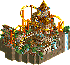
Ling - Guardian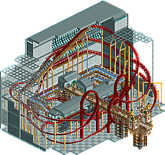
Ride6 - National Mall of Schwarzkopf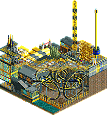
Top Gun - Excavator
__________________________________________________________________
How to vote?
First of all, check out all the entries in this match. If you can't view one or more entries, for example if you don't own LL, then please, do NOT vote. Once you've viewed all 4, select your favourite and second favourite in the polls above. After 3 days, we will close the poll, the results of the two polls will be added together, with the votes from the second poll weighing only half as much as votes from the first poll, and the 2 highest scoring entries will proceed to the next round. The third placed park will place its creator on the reserves list for the next round of the contest.
Votes are public and so any cheating of the system, betrayal of honesty or mistrust will be picked up on and will be dealt with. -

 Cocoa
Offline
1.camcorder: the original tall-meta maker from MM1 returns with an extremely expected micro. Just like your mm1 micros were tall and impressive but maybe 15% below the high quality work of those days, this one is exactly the same but for today. Tall, impressive, rough-around-the-edges, and maybe slightly unfinished. Still, theres so much ridiculous stuff here I can't help but love it anyway. The cool dark purple coaster (looks way better in the uncovered view with that circle it goes through), the tiny and ridiculously hilarious indoor ski resort (and the hilariously outdoor magic carpet which would make you so fucking hot in all your skigear in dubai but is still so cool. Imagine if it broke down? Yikes), the waterpark below, the garden way up high, hanging brewery, etc. Its very kumba-esque in the sense of "this is all the hobbies and things I like and now they're going into this fantasy dream park". Great stuff.
2. ling: you released some awesome oldschool micros just recently and so we were all expecting more of that from you, and you're not disappointing. this has an elegance and grace that just takes me back. I want to see more and more of this style, maybe even a mega park like masterpiece one day? Also, you can't go wrong with soft green awnings framed by saturated brown fisherman metal railing things.
3. ride6: you always seem to show up with some old school realism, fully unadapted to modern parkmaking, and I respect that a lot. Its a solid layout with a funny name. Not a whole lot of content, just some classic blue queue paths and full tile scenery

4. top gun: Almost put this in third but ride6 edged it out on composure I'd say. Theres some cool spaghetti stuff here and a nice vibe. Possibly it goes a bit overboard on the yellow-black colorscheme which sort of blurs it all together and makes it hard to distinguish the buildings/machinery/track/etc. It feels a bit more like a colorscheme than a theme. That said, I still think its pretty good and overall the quality of both fourth place entries and of less established players this entire competition has been very high. exciting times!
-

 Ling
Offline
Thrill Towers Dubai - Jesus dude, the finals are in a few weeks.

Guardian - What a boring name, probably thought up in the last ten minutes before submitting. Who even let this guy in the contest.
National Mall of Schwarzkopf - Love the layout, fitting something this size into 225 tiles is pretty nuts. I can also appreciate the care that goes into supporting a monster like this; it's just a shame it only really works in one view. I do hope we get to see more of you in this contest though.
Excavator - Reminds me a lot of bad's entry. That would have been a cool match-up. I do think there is maybe one or two too many rides for the space. The observation tower and whoa belly sort of do the same thing, visually. Excavator is cool but I draw the line at anything with three separate launches on principle. I really can't tell what came first though, the map layout or the coaster design, and that's a good sign. I wouldn't say it's particularly well integrated but it definitely is allowed to shine for the great spaghetti monster that it is. I also think this suffers from not having a clearer theme beyond "industrial".
-

 Top Gun
Offline
I should've added a read me, but the layout was inspired by Smiler at Alton Towers. The trains do actually duel at times. Overall just happy to have actually finished something. Will continue to build. All the entries are amazing.
-

 Gustav Goblin
Offline
Camcorder22- Whooooaaaa! Now this is how you stack rides! I love how many different themes there are in this park. I can imagine having to build the structure and place all that scenery so high must have been incredibly tedious. Great work!
Ling- Gorgeous! The architecture and the landscaping are fantastic, but what sells this for me is how Guardian interacts with its surroundings. Guardian feels less like a coaster and more like a journey, even in such a small scale. It's easily one of my favorite coasters this whole contest. I also like how you managed to fit in some stalls and a spinning teacups ride.
Ride6- I love a good Schwarzkopf! The coaster is great, but I feel the scenery is a bit bland. Granted, it's a mall, but it still feels a little one note. Solid submission!
Top Gun- This park really reminds me of that Wiz Khalifa song. I like the really compact coaster design, but the color palette is a little hard on my eyes at times. Otherwise, you've got a pretty good micro.
Get ready for my craziest opinion yet. Guardian is my favorite submission this round, with Thrill Towers Dubai getting 2nd. Thrill Towers Dubai is crazy, but Guardian just feels like so much more to me. The constant interactions between coaster and landscape and the gorgeous architecture give it a feeling I just can't see in Thrill Towers Dubai. Fantastic work Ling, you've got a hell of a micro!
-

 Liampie
Offline
How neat, a match full of old timers (of different degrees). And two of the MM1 finalists!
Camcorder: This is clearly a statement that says "I'm back." This is the crown prince of micros coming back to reclaim his reputation, after a rather underwhelming MM2. This is classic Cam, and it shows how much you've improved since Adrenaline Estates. There's a ton to see and appreciate here. The ski slope was cool, that was the only thing that really justified the uncovered version for me. Some details that stood out to me were the pool table and the slot machines. Great stuff man. On a more critical note I didn't care for the coaster much. It didn't look that good and was hard to follow around from any angle, and since you can't rotate the screen really, this is kind of a deal breaker. Luckily the coaster is only a small part of this micro. Great job and welcome back.
Ling: great coaster with good hacks, pretty theming, attractive colours, interactions, and something to see from every angle. Maybe the peeps are buried a bit too deep, but otherwise this is a very complete micro, almost archetypical even. I like how after Mala, x-sector and Corkscrewed, it's now X250's turn. Would've been funny if you actually mimicked Ride6 for this one. Who's next? Jazz?
Ride6: cool coaster, with pretty good supports (even though from one angle, some stuff seems to be floating). I think placing the station in the middle like that, and elevated too, is actually a very cool choice that is probably going unnoticed for a lot of people. At first I was intrigued by the idea of making it an indoors coaster, but at some point I realised the big grey wall isn't adding anything, really. I think I would've liked it more if it had an outdoor setting.
Top Gun: dense and yellow! Bold colour scheme but I dig it, pun kind of intended. Yellow is underrated. It's a little hard to read though, and all the glass and other transparant elements aren't doing you any favours. I heard the coaster interacts with itself, and indeed it did a little, after several minutes. Could've been better, honestly. It's not a great micro, but it's unique enough to set itself apart and it has enough content to keep me occupied for a little while!
1. Ling
2. Camcorder22
3. Ride6
4. Top Gun -

 MrTycoonCoaster
Offline
# Camcorder22 - Thrill Towers Dubai
Very crazy, loved everything, architecture, format imitating Dubai building, colors, used objects, excellent theme.
#Ling - Guardian
Beautiful, perfect, nice colors, well built roller coaster, liked the angle of the custom supports, good foliage, liked the subway, buildings are great, space 255 tiles very well used.
# Ride6 - National Mall of Schwarzkopf
Cool roller coaster inside a mall, liked the walls around it, glass is always nice, but the station maybe stayed hidden.
#Top Gun - Excavator
I loved all the glass objects used and their colors, the buildings are great, the roller coaster is nice, and the name I found very cool, good choice for the theme, it seems that the colors matched even with Excavator, 10. -
 Mattk48
Offline
#1. Cam. This looks a little jumbled and awkward to me, I'm not really sure what I think of this composition as a whole. The different areas don't mesh together too well in my opinion. The coasters didn't really do anything for me either. However each area is individually strong, and there are some fantastic details. Personal favorite part is the skill hill, as a skier myself this hits a soft spot. The lodge in there looks nice, and I love the ski rack what an awesome detail. In the restaurant/ lounge beside it that pool table blows me away, super nice touch. The very top has some nice micro detailing. Green overhang with lounge chairs and the hot tub is a cool space too. I'm not in love with this micro, but it held my attention for a long time. The longer I look at this micro the more cool stuff I find, and that all adds up to a first place spot in this group.
#4. Top Gun. This didn't do too much for me really. Its a nice colour scheme, and the coaster is nice, but that's about it. No support work and the archy is just kinda a bunch of boxes. High point for me is the glass bridge. That was pretty cool and adds some character. But not enough to challenge for a advancement spot.
#2. Ling. This is awesome. Super nice atmosphere and palette. Coaster layout is great, lots of really cool interaction with the path and archy. This is nicely paced and not too dense. I feel like as an overall composition this works much better then the Dubai tower, a greater then the sum of its parts kinda deal. I thoroughly enjoyed, it's my second place in the group.
#3 Ride6. Solid layout, solid support work. But that's about all there is. Station is pretty forgettable, and the environment is pretty stale, it's just a grey wall and a grey floor. I know its a mall but I still feel like more life could have been worked in there. Whats there is high quality, just not enough content to take down Lings atmosphere or Cam's micro detailing.
-

 Camcorder22
Offline
#1. Cam. This looks a little jumbled and awkward to me, I'm not really sure what I think of this composition as a whole. The different areas don't mesh together too well in my opinion. The coasters didn't really do anything for me either. However each area is individually strong, and there are some fantastic details. Personal favorite part is the skill hill, as a skier myself this hits a soft spot. The lodge in there looks nice, and I love the ski rack what an awesome detail. In the restaurant/ lounge beside it that pool table blows me away, super nice touch. The very top has some nice micro detailing. Green overhang with lounge chairs and the hot tub is a cool space too. I'm not in love with this micro, but it held my attention for a long time. The longer I look at this micro the more cool stuff I find, and that all adds up to a first place spot in this group.
If you liked the ski area you should check out Mount Haystack! Honestly everything I did on the ski run here was a bit of a rehashment of that lol.
Thanks for the comments so far everyone! Will give some background on the building process and review the others when I'm less lazy.
-

 FK+Coastermind
Offline
Love the throw back feels of this match.
Perhaps surprisingly, I gave my first vote to Ling. The old-school feel, the fun flyer with a ton of unique elements, and the archy style just worked for me in an amazing way. This felt old-school without feeling dated or purposefully confusing, and the ornate, artistic archy was super well done. Congrats.
Second vote to Cam. I loved this, maybe one of the most grand in scale and concept of the R1 parks, and SO much to look at. I used cut-away view to look at this starting at the bottom, and it was so much fun to follow the path all the way up. Only reason I voted this second was because I think some of the execution in places was a little rough. But overall, very well done, great park.
Ride6, this was fun and well done, if a little rough in some execution. The main reason I put this third was that it felt very one note. A single style, single coaster, so once you looked at that there wasn't a ton of other stuff to look at.
Top Gun, I like the bold choice and creativity, but this lacked the execution of the other parks and felt very default rct. While fun, not at the same level of quality as the other parks.
-

 CedarPoint6
Offline
Cam- You have such a distinct style with these micros. It's maybe a little rough around the edges, but it has such a grand style and clever ideas that it's hard not to like them. I like how you have the waterpark on the ground and then the 3 distinct different areas. It might have been cool to have a coaster run the whole height of the tower, but it may have disrupted the view to the rest. The ski cutaway is my favorite bit with the nice backdrop and little lodge. Especially with the suspended going through it. Would have been nice to throw something up on the very top VIP lounge area, but it's a good topper for the whole thing. Nice work overall.
Ling- Very old school. Bold move to go with the classic supports on the coaster. This was a good take on the Vekoma stingray concept. A little more spread out, maybe, but the layout flows really well and works great with the scenery. The immelman around the green roof building is especially nice. The architecture is a little hard to follow in spots, but it's nice enough and has a great layered old school feel that I haven't seen in a while. Good work!
Ride6- You were super close with my vote since I'm a sucker for a Schwarzkopf. I definitely see what you were going for here, but I'd have liked to see a crossover to give the ride some lefthand corners since all the models like this do. You've got the path through the loops perfect. I'd have liked to see the mall theming dressed up just a little bit. Maybe some more structural components and color. You have a fair bit of details, but it's a little flat. Still I really enjoyed watching the coaster and think you did a great job with it. Hope you keep building.
Top Gun- I'm having a little bit of trouble following everything here, but you've packed a fair amount into it. The coaster is long, though messy, My favorite part was the glass bridge across the top of everything. That would be such a cool experience to walk across. I would suggest for next time to work on color a bit. Like the yellow and black safety type coloration stands out great, but it doesn't need to be on the whole thing. If you build some areas a little more muted or contrasting, that yellow and black will stand out even more.
-

 Liampie
Offline
 Group C - Results
__________________________________________________________
Winners
Camcorder22: 31 + 9/2 = 35.5 points
Ling: 13 + 28/2 = 27 points
Eliminated
Ride6: 1 + 7/2 = 4.5 points
Top gun: 0 + 1/2 = 0.5 point
__________________________________________________________
Camcorder22 and Ling proceed to Round 2.
Ride6 is eligible as a replacement for Round 2.
Congratulations to the winners! -

 Camcorder22
Offline
Glad to see Ling get some votes and making it to R2! Love the old school entries and they def still hold up today. Impressive composition and one of the best layouts of R1. I'd say your overall level of quality was higher than mine and its naturally harder to overcome an entry like mine.
Always happy to see a new Ride6 release as well! Impressive to see a Schwarzkopf layout like that in a micro without it feeling too cramped. I agree with some of the other reviews that it may have been better off left open and themed a little differently to avoid blocking the other angles.
Top Gun had a nice entry as well, the spaghetti was fun to watch and the glass bridge was cool. Very reminiscent of early RCT2 scenario building.
-

 Camcorder22
Offline
Appreciate the reviews, kind of wish this match got more comments but hopefully everyone will get over their micro burnout soon enough. As for the idea behind the entry, I think Cocoa hit the nail on the head. I wanted to build something that was the truest to my past works, with nods to my original micros and more recent releases like Haystack. I've never seen myself fitting cleanly into either the realism or fantasy mold, I've always just wanted to build parks that fit an idealized and unrestrained vision. I don't see myself building any more micros quite like this as its a huge pain in the ass and I feel like I've exhausted the style. As some people have commented in other matches, size can be a bit of a crutch that covers up poor composition and atmosphere which are both things I'd like to refine more.
I'll have to post a gif later as I grabbed new saves pretty regularly while I was building. Since I've been super busy with music outside of RCT, I kind of just jumped into building without much planning, besides a general idea of what would go each level. Ultimately that resulted into building myself into a lot of corners, especially with the top level which got messy. I'm not entirely happy with the coaster layout but hit the point time wise that I just had to work with it and I think I did a decent job salvaging it.
(Also check the misc tab for the steep inverted blocks, not totally satisfied with the alignment or shading but they could be useful to someone)
-

 CHE
Offline
Highlights
Thrill Towers Dubai: waterparkGuardian: coasterNational Mall of Schwarzkopf: coasterExcavator: coaster spaghetti
 Tags
Tags
- No Tags
