Micro Madness 2019 / MM3 R1 Group N - Xtreme97 and Tolsimir win
-
 08-April 19
-

 Liampie
Offline

Round 1 - Group N
__________________________________________________________________
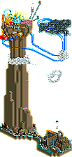
Tolsimir - Zuphiro Weather Forecast & Research
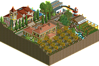
Faas - Lavertezzo Spaghetti Harvest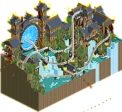
Xtreme97 - Ascension
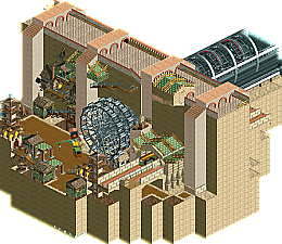
Merzbow666 - The Siege of Ba Sing Se
__________________________________________________________________
How to vote?
First of all, check out all the entries in this match. If you can't view one or more entries, for example if you don't own LL, then please, do NOT vote. Once you've viewed all 4, select your favourite and second favourite in the polls above.
After 3 days, we will close the poll, the results of the two polls will be added together, with the votes from the second poll weighing only half as much as votes from the first poll, and the 2 highest scoring entries will proceed to the next round. The third placed park will place its creator on the reserves list for the next round of the contest.
Votes are public and so any cheating of the system, betrayal of honesty or mistrust will be picked up on and will be dealt with. -

 bigshootergill
Offline
Crazy Big Ancient Drill Award: The Siege of Be Sing Se
Electrifying Asian Portal Prize: Ascension
Chilled Out Spaghetti Joint: Lavertezzo Spaghetti Harvest
Mile High Whirly Giggs In The Sky Ribbon: Zuphiro Weather Forecast & Research
My vote goes to: Xtreme97 and Tolsimir
-

 Cocoa
Offline
1.xtreme97: the fan favorite it seems! everyone is going wild for it. You've done an incredible job for sure and made use of the palette really cleverly for those roofs. The giant portal inside the gate is phenomenal, as is the dense lush foliage and pouring waterfalls. Right up my alley obviously. Really phenomenal job, I wouldn't be surprised to see this being considered in the best of r1. I had inklings that you were really good but somehow you snuck past my radar a bit!
2. tolsimir: this was a really close race for 2- there's things I really like in each of the entries. But you won me over with your really clever custom rides and ideas. The balloon ascension (cool use of two synchronized rides!), all those weather implements up top, the printing press, etc. Lots to enjoy. It was maybe a bit rougher in quality at the top but didn't detract too much from my enjoyment.
3. merzbow: honestly 3/4 are pretty much tied. I just really loved the drill and vibe here- so cool and just massive. I've never watched avatar/kora (i know, i should...) but I still really appreciated the sort of mystery of the city being shown here.
4. faas: still a really great entry, and easily the best 4th place entry I've reviewed so far. The idea is just silly and fun, and theres lots of cool details- the harvest and drying, the interiors, museum, etc. I still back this entry a lot. In a pot like steve's, this could easily have gone through- you got unlucky I guess!
-
 Mattk48
Offline
#1. Xtreme97. Wow. This is far and away the number one of the group. Beautiful archy, colours are spot on. We don't usually talk about layouts in micros, but this one looks great with the track layering and flows really nicely. Love the star-gate, that hack works there nicely. Foliage is perfect. This composition as a whole is laid out so nicely, its never too dense or sparse. Fantastic work, a micro masterpiece, your through to the next round. But you probably already knew that as soon as you submitted.
Alright now that we got that out of the way lets see what other entry's are in this group lol
#4. Merz. Fun fact this is the first piece of LL off of NE that im viewing in game. I installed LL just for this contest. I like the monorail station, that is a nice spot. Ferris wheel turbine is cool I guess. I don't know the story behind this park, so I may be missing the point. But I really don't find this entry that interesting. Especially against the tough competition in this bracket, this is a clear 4th for me.
Now for the controversial part
#2 Faas. This edges tolsimir for me just barely. This is a well paced micro. Archy is nice, foliage is nice, atmosphere is nice. Love the pasta conveyor belt lol and the tractor. Those are both really nice touches. I have 0 complaints with this micro, other then the fact that its simple. Again looking at this composition as a whole is where it shines. One of those greater then the sum of its parts kinda things. Good enough to move on.
#3 Tolsimir. That boat, damn that's a good boat. This is the opposite of Faas' micro in the sense that I don't like the composition as a whole. I think the dirt tower is far too tall, and every time i rotate the screen i have to find the thing again because its so far up in the air. I feel this is needlessly tall. The top of the dirt tower is my favorite part besides the boat. Really nice ride choice/archy and the colours really sell a fantasy style atmosphere up there. Just doesn't beat faas overall for me.
-

 Luketh
Offline
Some thoughts, in order of appearance...
Tolsimir -- Your clouds are a lot better than the one in my first round entry, I'll say that to start. All-around, this entry is wild, incredible. As a writer of the news, I love the newspaper press and all the details on that building, like the carrier pigeons. I don't 'get' the massive dirt pillar, but hell -- it looks cool, and I think you executed it well. Unique, clever, creative. The thermometer ride is awesome.
Faas -- I always wondered where spaghetti came from -- thank you for the educational experience. For some reason I find it very funny watching the tractor navigate that narrow bridge and pull a 180-degree park job all in reverse. I like the clocktower.
Xtreme -- that portal is, as your name might suggest, xtreme. Clever application of that track trick, and I like the floating supports. Really nice architecture too.
Merzbow -- An LL entry, cool! Glad you delivered on the "MY CABBAGES!" meme hahaha. Clever use of the ferris wheels as a drill. Left me wishing to see a fight scene or something of the sort between some peeps/entertainers/staff. Where's Aang?
Shame I can only pick two from this group, props to each of you.
-

 Gustav Goblin
Offline
Tolsimir- I forgot this was a micro for a moment! Both the fine details and the sheer size of this micro amaze me.
Faas- Now this is unique! The cutaway views are what really make this one shine. I almost missed the drunk worker in the rum cellar! Second favorite of the group.
Xtreme97- Whoa! I absolutely love the crazy fantasy theme in this one. The portal idea is genius for a micro and very well executed. While I don't see any problems in this one, I feel like there's a story in it which you haven't told us. Favorite of the group!
Merzbow666- Tolsimir. Xtreme. Faas. Merzbow. Long ago, the four nations lived in peace. Then, everything changed when the Merzbow nation attacked.
In all seriousness, I should've known you would do a LL park. I've actually never watched Avatar (I know, I've sinned), but you made a great recreation of Ba Sing Se. The functioning drill is incredible, and I love the reference to the cabbage stand.
-

 AvanineCommuter
Offline
I'm not allowed to vote because of Merz's LL entry (which looks great in the overview screens, btw), but I'd rank the three RCT2 entries:
1. Tolsimir - wow this really was something else. While people will fault you for having a tall tower in a micro, the details and creative ideas here really stood out: the clouds were so well done, loved the thermometer ride, the carrier pigeons, the press, the staff names that forwarded the narrative, the unique coaster layout though it could've used a little more flow, and that incredible balloon ride... not sure how you even did it but I'm impressed with the sheer boldness of your ideas and the fact that you can then execute them too. The critiques are definitely the architecture not being as interesting as the rest of the ideas / park, but the awesomeness of this micro's concept and execution outweighs the aesthetics of the architecture by miles. Cannot wait to see what else you have up your sleeves!
2. Xtreme97 - Amazing work here, the architecture is beautifully done and the color scheme complimented the theme. The portal is sheer genius, the bright blue is stunning and you did it better than I was planning to do for one of my micros with a portal (which I'm probably scrapping now
 ). The ride layout was great and flowing, and the whole thing was just so beautifully composed. You had a clear concept, vision, and clean execution. Top notch work, a step above from what I expected from you even though I had predicted you to move on to R2 in the bracket prediction already, and you nearly took my first vote here over Tolsimir too....Excited to see what's in store.
3. Faas - Very cute and quaint with a quirky humor, and it looks exactly like what I expected from a Faas submission. Really well done overall, and there are enough details in there to keep me intrigued for much longer than I had anticipated. Well done, and frankly it looks like you got unlucky to be in a very difficult bracket because this submission is quite good and could've won in other brackets easily.
Merz - Sorry I couldn't view this in game, but overall the composition looks unique and interesting from the overview. Love the use of ferris wheels for gears / drill and I hope someone can post a video review so non-LLers can see it in action!
-
 RCT2day
Offline
Unfortunately, I cannot vote in this, but I'll throw my comments in:
1.) Tolsimir - Amazing, just astounding. The balloon descending was so peaceful to watch, the storm coaster had great flow, the rides at the top were so clever and colorful, and the music added so much to this. Only complaint might be that the vertical climb of the land wasn't used very much, but that's easy to forget. Everything was nearly perfect. 9.5/10
1.) Xtreme97 - Wow...just wow. This is next level stuff. Architecture, coaster flow, creativity, foliage, everything is soooooo good. The colors are beautiful, especially with the water. Just amazing, please do this on a full-scale design and it could be one of the best ever. 9.5/10
3.) Faas - very cute park and had more movement than I initially expected. Architecture was cute and had perfect colors. 7/10
4.) Merzbow - Love the Avatar reference, especially with how well you pulled off the drill and the inside of the wall. It really captured an earth kingdom cityscape in a small area. In another bracket, this would be moving on, but you got the group of death. Sorry man, keep doing what you do! 7/10
Geez, what a bracket. Kinda glad I don't have to vote.
----------------
EDIT: Thanks to Ling and Gustav Goblin for showing me how to open LL in Open (TIL). Already null voted, but I'd like to re-vote since I've now seen all 4 entries.
-

 Lilith
Offline
correct me if im wrong but i think liam said on discord that you dont need to have LL to vote on the match? i included screens of each angle with the file for that reason
 -

 CedarPoint6
Offline
Wow this is the best bracket so far. Some incredible stuff here.
Tolsimir- The clear winner here. Impressive height, but used well to tell a story. The climb of the balloon was very relaxing to enjoy and the various parts and pieces on top of the landmass were so cleanly put together. Those were also some of the best clouds I've seen. Fantastic work and an impressive initial offering so early.
Xtreme97- That portal is the show stopped here. Just so cleanly done and incredibly impressive. The coaster layout is surprisingly strong for a tight area as well. I was also a big fan of the little gates holding up the ride throughout. Strong architecture and detailing made this a pretty clear #2 for me.
Merz- I think in any of the other brackets so far this one would go through. First off, awesome choice on the theme. Love the show and this story arc. The drill element was incredibly well done and stands off well from the colors of the city. The little feature that stood out to me was the houses and pathways up the inside of the wall. Really well put together and looks great. Would love to see this expanded to something larger.
Faas- This is pleasant and really clever. I love the attention to detail with the spaghetti hanging from the trees and the various processing buildings. On the whole I think this is a strong entry and one you should be pleased with. Your style is very charming. Nice work!
-

 Ling
Offline
Zuphiro Weather Forecast & Research - Holy hell, what a collection of details. The rockwork and tree trunks stick out and the mountainside is a little bare, but there's just so much going on it's hard not to love it. The paper press is brilliant, Stormrunner is brilliant, the weather balloon is brilliant. The hilltop castle looks almost Ghibli-esque, was that intentional?
Lavertezzo Spaghetti Harvest - Love the idea, love the buildings, love the interiors. In any other match this would have been a strong contender for #1 on the strength of the architecture alone.
Ascension - Well fuck, there goes my round 2 idea. This is so incredibly perfect. The colors are great, the contrast of the traditional Japanese architecture and this insane, deafening, futuristic portal looming over this wonderful natural scene... this will be talked about for years to come. Even the coaster layout is obnoxiously good. I guess if I had to complain about it, the way the coaster just sort of bursts through the water without any attention paid to there being a gap or break in the water or anything looks a little weird, and maybe the portal trick could have been accomplished with less track (on Ascension) and might have been easier to hide.
The Siege of Ba Sing Se - Really cool idea, and I'm a die-hard ATLA and TLOK fan. Burying the cabbage trees to make cabbages is so clever. The green and gold path as roofs is also perfect for Ba Sing Se. I do think this really suffers from being so quiet and lifeless though - maybe some more named staff to represent a bunch of the characters doing various things? It would definitely have stood a chance in a lot of the other match-ups but unfortunately this match was just brutal.
-
 Jaguar
Offline
This round was quite a tough vote for me for first place... there may be two of the best entries we've seen so far imo.
1. Ascension - The composition of this is amazing, as is the architecture. Aside from the glitchiness, this entry is flawless. It doesn't rely on something massive or layered to be impressive either and although I feel without the portal, it wouldn't be quite as impressive, the portal itself deserves credit... so well done. I also like the floating platforms... clever use of lamps. Xtreme may be the dark horse of the contest.
2. Zuphiro Weather Forecast & Research - I really like this entry... the coordination between the two balloon vehicles is interesting. I love all the details like the newspaper press, the clouds, the bird cages, and the measuring devices. The height is impressive but the fact that it's all dirt without different textures, or anything really... overhangs, birds, etc, brings it down with the monotony. This was a close vote between ascension.
3. Lavertezzo Spaghetti Harvest - A goofy but quite creative concept, I think Faas like a lot of other builders just got unlucky against the two crazy entries. There are lots of nice details like the wine cellar with the drunk handyman. I'm also trying to imagine what spaghetti trees would look like but kinda don't want to lol. Nevertheless this park was very nice and I really enjoyed the architecture.
4. The Siege of Ba Sing Se - Pretty risky of the builder to pick LL, but since it's Merz, I'm not surprised. There is a lot of clever use of objects here. The missing fences and track issues in openrct2 make opening this in LL a good idea. And speaking of which, I really liked the cabbage guy reference. A really good entry but it was just lacking in movement to set it apart and felt kinda barren.
-

 ottersalad
Offline
1. Ascension: Holy crap.. just didn't expect this at all. Architecture as already noted is great. Love the colors. And the portal was super creative. Only negative.. albeit super minimal.. was how loud the portal was! The lanterns were a cool touch. I wish I was this good at architecture.. wow.
2. Zuphiro: Super close 2nd for me. Definitely loved this entry. The balloon ride was nutty. Really curious to see how you did it. The printing press was also really cool. Impressed by some h2h level details in this. The castle at the top of the cliffs was neat too. The glass and spinning structures and the thermometer were super creative.
3. Spaghetti Harvest: The funny little details in this were great. Also good use of the cutaway here. I agree that this would've been a lock for round 2 in other groups.. just that you went up against the best 2 entries thus far.
4. The Siege of Ba Sing Se: Happy to see an LL entry. Funny to see the cabbage guy in there. The drill was super well done too. Biggest issue for me why I didn't think this was 3rd was the lack of movement or more frozen staff for references. Seemed a tiny bit empty.
 Tags
Tags
- No Tags

