H2H8/8 / [H2H8/8] Round 2 | Match 2: Illuminati vs Lawbreakers
-
 03-September 18
-

 Liampie
Offline

Round 2 | Match 2


Illuminati - Hidden Kingdom
Lawbreakers - Futuropolis
Voting Rules
- You should only vote if you have viewed both parks in game.
- Take your time to reflect on each park. The poll stays open for three days, not three minutes.
- Everyone but players belonging to either team in the match may vote. -

 Ling
Offline
Futuropolis looks like it throws out a lot of conventional parkmaking wisdom. I don't know that it works but it looks totally unlike anything I could imagine anyone ever building. Full review to come later.
-

 Impulse
Offline
Short reviews as I don't have much time on my hands

Futuropolis
Great concept even though the content was pretty much very predictable. We've got a new civilization on Mars (did I spot that right?) and with that comes two damn badass coasters. That's the good part about this park, I believe; the archy felt basic (though, who am I to judge, right) and somewhat predictable and it all felt a bit too chaotic for my tastes.
Hidden kingdom
Holy shit. This park is fantastic. RCT2 converted to LL, or a combination between these two? I don't know. Anyway. That coaster is stunning. That waterfall is stunning. That foliage is stunning. And that archy is st- great. I loved the way this park felt; very clean, very easy to hover through and discover things. In a way we've got a matchup featuring two opposites. And one of those opposites is that Futuropolis felt chaotic whilst HK felt a lot more lively and vivid. Though, some guests wouldn't hurt this park and liven it all up a bit.
Conclusion
These two great parks share some similarities, like the equally amazing coaster layouts. Though, they look entirely different. For me, Hidden Kingdom is definitely the winner of this matchup. The archy was better, foliage much better and the calmth of HK is just a selling point which decided my vote.
-

 Poke
Offline
A very strong round. Two great parks I'm a big fan of. However, futuropolis gets my vote due to the theme being more interesting and from the more unique ride design.
-

 roygbiv
Offline
Futuropolis
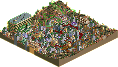
Oh fun, a Mars theme. The layouts are definitely interesting in both of these matchups."The Martian" looks like the only conventional piece on this map. This map is very bright and red, but it works at applying it's theme. The item usage is a bit more creative than its opponent, even though it seems a bit random at times. Hard for me to focus. I love the center city structures and the multitude of astronaut entertainers as peeps, gives great movement in an otherwise dead city. The large hotel structure is impressive.
Hidden Kingdom
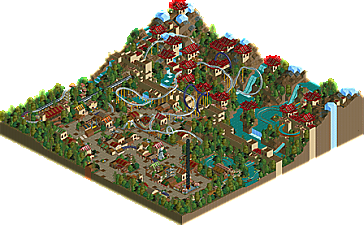
Chinese theme? I can see the great wall when I start so I am going to go with that. The layout here is also interesting, launched b&m with multiple elements like loops, cobra rolls, zero g rolls. The pitch is very sharp on some turns. The "Golden River Falls" was my favourite ride of this matchup. I love the floating bits in the bends. Waterwall adds nice atmosphere as always. Architecture was more repetitive but very clean and organized. I like the little green parts, wished you used that more.
Creative, messy, interesting VS. clean, clear, simple makes for a tough vote. I voted for Hidden Kingdom in the end though.
-

 G Force
Offline
This was really close for me, the deciding factor ended up being the strength of the rides in Hidden Kingdom over Futureopolis. It was also a bit more pleasant to look at I think. Nice work builders.
-

 Cocoa
Offline
two pretty evenly matched parks this round- shows in the votes too!
hidden kingdom
This park is sort of in two halves. The front half, the village, is not bad- a bit random/uncontrolled archy wise but it does its job. The other half, beyond the wall, is amazing though. Lovely layout, if a bit slow in places, and it flies through beautiful landscaping, waterfalls, and archy. Really clean and well made. I especially love the water ride, and those golden circles that stick out of the building. Really well done there.
futuropolis
I really liked this park too- absolute cydonia city/ slime meridian vibes, although the actual aesthetic style is a bit different. I really liked the archy and silliness/grandness of it all. Sick landscaping and craziness, and I thought both coasters were good, although the invert was great (cool colors too!). I liked seeing the togo ultratwister sprites fuck up on turns and stuff too
 . Anyways, this park was just heaps of fun and felt a bit more new and exciting, so it got my vote. A close one for sure though!
 -

 ottersalad
Offline
Hidden Kingdom
Really enjoyed the village area.. I get the random comment that Cocoa made.. but it seems to be okay to me.. only thing would be the variety of textures and lack of repeated architectural elements if that makes sense. Maybe more uniformity? The coaster layout is good.. really liked the launch and some of the interactions with buildings/cliffs/water. The splash boat ride was well done too. Only thing I didn't particularly like was how some of the foliage seemed lacking or missing. Almost incomplete along the cliffs.
Futuropolis
Man theres so much here! I like the original concept of the Togo coaster.. the sprites bugged out for me too. The archy was good in places.. but is was a bit wacky with colors and textures.. which is not a bad thing. Definitely something new and outside of what you normally see on NE. Also the foliage mustve been difficult.. how do you do foliage for Mars? I have no clue. The Martian was a good layout.. compact but had nice flow. Liked how it had room to breathe with the landscaping as opposed to being cramped in the city.
-

 Ling
Offline
Orbitron really doesn't work for me. Splicing in a loop or something I could see, but trying to do a full ride with almost no car sprites just looks super awkward. Another go karts track that... doesn't do anything because there are no peeps. The skyscrapers are a great mix of being just tall enough to not totally obscure your vision in the middle of the park, but tall enough to feel towering. Cars of the Future is a cute idea to fill space and keep the middle of the map busy. I'm not as enamored with The Martian as other people are. It feels a little too much like Nemesis... until it looks like you ran out of ideas and it just sort of meanders back to the station. Weaving the craters in looks surprisingly natural and I am a fan of the foliage. The big green building with the rocket out front looks out of place. Having a large structure in that corner of the map does balance it out visually, I'm just not sure what it's supposed to be. Maybe a large space port would have worked better? I do like the overall colorfulness of the park. Contrasts ours quite nicely I think.
-

 Ride6
Offline
Since I'm on one of the teams I Null voted.
Hidden Kingdom is one of the most refined parks in the contest thus far. The coaster is paced brilliantly, the color and texture selection throughout is excellent, and the landscape compelling.
Futuropolis is great fun! Probably would've gotten my vote had I not Nulled. The atmosphere and sense of originality was off the charts. The giant apartment building like structure in one corner really helped balance the map and the color and texture selection was delightfully strange. The suspended monorail is a great choice. The Martian is excellent until after the corkscrew... does seem to run out of idea. Orbitron is a delightful mess - very old school sci-fi fantasy park material. I wish the sprites for the car existed to do more of the ride elements, but having it glitch in and out the way it does is still pretty amazing. I wonder if a different car would've worked or if they are incapable of navigating the reverse sections? I did think the martian musical choice was uninspired and cliche, but when everything else has me grinning this hard it's hard to put too much on that. -

 Liampie
Offline
Winner:

Illuminati vote count: 9 (56.25%)
Llawbreakers vote count: 7 (43.75%)
Hidden Kingdom was made by Xtreme97.
Futuropolis was made by Scoop. -

 RWE
Offline
Futuropolis had some great overview and a really nice atmosphere to it. Also loved the use of heartline coaster. Going more in detail the park didn't managed to do that much for me though, building shapes have been a bit too undefined and the feeling of the middle part of the map was a bit too chaotic for me. Landscaping and foliage again have been quite solid though! All in all a great release though!
Same goes for Hidden Kingdom. In the end i saw it a tad above the other park, because it felt cleaner and better on a compositional level to me. Although it might got a bit too clean in some places, making it almost boring. It definitely has some great areas and things to look at though, especially really loved the lower part.
To conclude to great parks! Good job everyone!
-
![][ntamin22%s's Photo](https://www.nedesigns.com/uploads/profile/photo-thumb-221.png?_r=1520300638)
 ][ntamin22
Offline
Futuropolis:
Nice take on the classic space tab. I thought the coasters were a highlight here. The Martian is a zippy layout that does the Nemesis trope pretty well imo. It would probably look a little smoother with RCT2 banked drops or some clever tunnels, but I do enjoy that it doesn't feel like the sections between inversions are just filler. It's hard to make a low inversion count work nicely and this did well. Orbitron is also a great bit of fun experimentation. I don't think the corkscrew section worked out, but the loop feels like just the sort of crazy thing that would end up in a heartline coaster. All the city architecture didn't do much for me but I appreciated the suspended monorail and other rides winding through all of it. Landscaping was well done, but I would have like to see less ground clutter for the sake of ground clutter.
Lovely round all told.
 Tags
Tags
- No Tags