H2H8/8 / [H2H8/8] Round 1 | Match 2: Illuminati vs Lisa and the Domain Names
-
 23-August 18
-

 Liampie
Offline
Voting Rules
Round 1 | Match 2


Illuminati - Firestorm
Lisa and the Domain Names - Beachcomber Cove
- You should only vote if you have viewed both parks in game.
- Take your time to reflect on each park. The poll stays open for three days, not three minutes.
- Everyone but players belonging to either team in the match may vote. -

 chorkiel
Offline
When I opened firestorm, I started thinking about how sick it would be if ][ would win two h2hs in one year. The colors in the park contrasted nicely with the grey and brown, and it was all very aesthetically pleasing.
Then I opened Beachcomber. Loved this park all around. Reminds me of some of the first LL parks I loved. -

 ottersalad
Offline
Wheres the reviews homies?? I'll add some parts that I really enjoyed about Firestorm.
First off, happy to see more of a full park compared to the first matchup.. not that either of those two parks were bad. Just happy to see a full park in a 60x60.
First impression was how colorful the entire park was. Also, this entrance to the Firestorm queue with the crater and what I'm guessing would be some cool rock/crystal formations? I thought that was neat.
The layout for Firestorm was nice.. super fast too. Noticed that all the rides had drops that would go under the path or through a bridge at the bottom of the drops. Was that intentional? Not that theres anything wrong with tunnels and stuff!
Also really enjoyed the station to Revolution. Cool how you incorporated the hillside into the stations of Firestorm and Revolution.
Few things I didn't like, and they are very minor: The red path supports for Firestorm.. just not a fan of that texture. And I wish there was a bit of straight track after the drop on the Splash Boat ride. Other than that, this park was fun to look at, it was bright and colorful, and was well done!
-

 csw
Offline
Firestorm - Good effort here, I enjoyed the colors and the coasters were pretty exciting as well. Quite plain in a few corners of the map but otherwise a good entry for the first deadline.
Beachcomber Cove - Here we go, the best park of Round 1. Great atmosphere, colors, and architecture. Whoever built this knows how to add details without a trainer. Great little park.
To me, it seems clear that one park was built by someone who is new to LL and the other was not. Overall I've been pleasantly surprised with the quality of parks in the first round, hopefully the later rounds will produce some really excellent stuff.
-

 Scoop
Offline
Firestorm:
Alright, I'm glad to see a step up from the first match of this round (no offense). There were some really great things about this park and then some not so great things. For me I thought the former was more prominent. The two coasters were really cool and I loved the layout of what looks like a b&m hyper coaster. It reminds me of a mix between raging bull and any other out and back layout but with the same kind of overhead feel that tatsu gives. Speaking of tatsu the looper wasn't to bad either. A lot of the layout did look like it was just trying to get to the different above ground moments rather than being a layout with real substance, but it works just fine as most of this type do. Pacing on both were pretty good as well. A lot of the archy looked a little stale. There were a few nice collections of buildings but for the most part they didn't really do it for me. The station for the hyper is almost good except for the fact that the overhead dodgems ride kind of makes that area look unfinished. I think the main problem with most of the architecture is that many of the walls just look kind of flat some more windows would probably help with this. As far as the splash boats, I liked the idea of it, but I'm not so sure the water color really works as well as the builders hoped. I'm also not to sure what the point of the colored grid sections next to the drop are supposed to indicate.
Even though there are a few criticisms with this park, I still thought it was really cool and there are plenty of details that I thought were awesome.
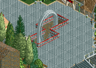
what a great element, would have looked a bit better if the path was connected through the loop but it's forgivable.
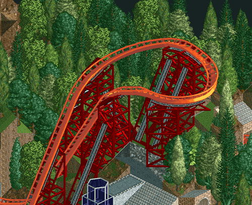
This turn just flows so well. Especially for LL.
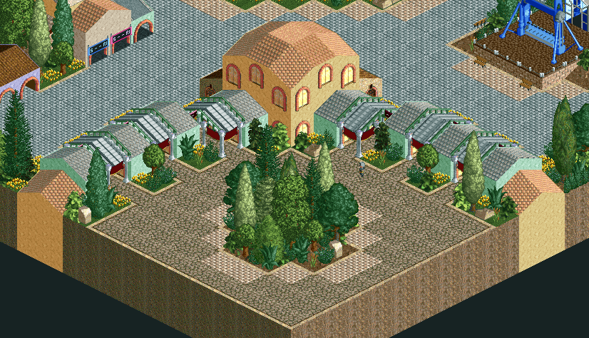
Fantastic Entrance! I love it!
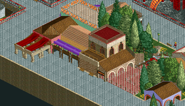
Also another nice little plaza.
I really did enjoy this park even if the criticism might not show it. If I had to put a score to it, I would probably give it a 55%. Can't wait to see even more in the rounds to come.
Beachcomber Cove:
This is definitely the best park of the round in my opinion.it how so much charm and it just looks great. It has really great composition, pretty cool coaster layouts, and some great architecture. What more could you ask for in a pretty realistic LL park? The classic woody was my favorite coaster of the two. It framed the rest of the park very nicely and also had that nice white classic color scheme. The only real eyesore is in the area with the corkscrew coaster. What looks to be a lighthouse is the problem. It just looks a bit to square on the bottom for my tastes. The idea using the slide as the top of a lighthouse is great but I wonder if using something like river rapids for the base would help with it's blockiness. Other than that it's really just a lesson in composition.
Here are some things that really stood out to me.
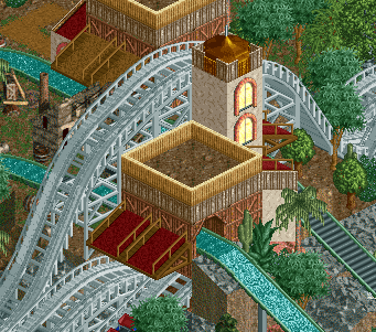
This is a cool little set piece here. Really helps the coaster stand out a bit more.
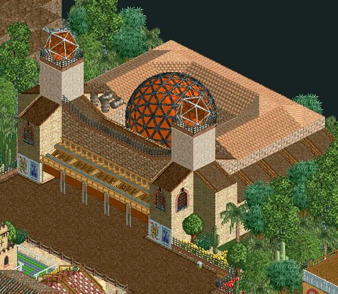
nice little theater.
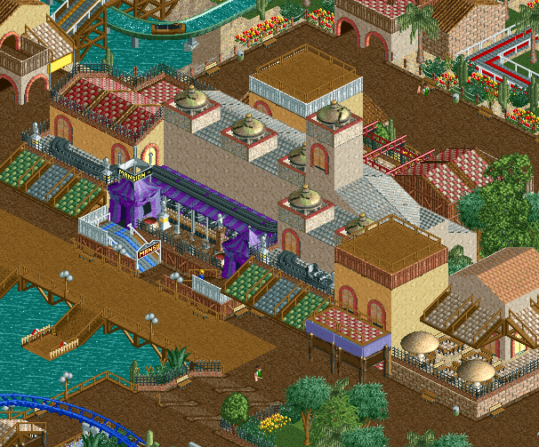
This is for sure the best building in the park. Also the nicest scene.
Overall, i have only one or two complaints about this park. I don't think it's the best we've ever seen or anything but it's a great round 1 park for this contest. I also didn't even comment on the foliage either. very enjoyable. I'll give you a 65%.
As far as where my vote is going? I'm going with Lisa and the Domain Names for this one. They just had the much better looking park in my opinion, and also had the best of the round as well. I'm looking forward to the next round of parks and can't wait to review them.

-

 Cocoa
Offline
hope no one minds if i chuck in a premature review of firestorm
firstly, ripper layout. really enjoyed it, and great colors and environmental interaction. Loved it as the central focus of the map. My favorite thing on the map is the use of the abstrant land textures, especially with the ice sides near infernal river. I think the tiled path may have been a bit distracting/ too much and some of the more 'regular' buildings were a bit squat/clashing but it didn't detract too much for me. I slightly wished you'd capitalized a bit more on the sort of wildfire-ish theme and maybe shown the rides a bit more- i didn't even notice revolution at first. that said, its all up pretty nice. good entries and solid first round
-

 Liampie
Offline
No offense to Wouter and MK98, I liked your parks, but this match is a nice step up from the first one. Aside from being more interesting and fun overall, I think these parks really reminded me of 2002-era parks and that made me smile.
Beachcomber Cove
Not so long ago I posted some Wonderful Fun Island on #flashbackfriday, and now there is this park that is quite reminiscent of WFI, although more spaced out, clean and calculated. It also reminds me a bit of the Mexican area in Discovery Bay, but not in a way that I think you stole anything. Besides, both parks are good inspiration sources anyway. Like with Parco Romania I suspect this was built by an RCT2-player, considering all the banner-supported awnings. Typical beginners trick that seemingly always wears off as you become more experienced.
A lot of the good things have already been pointed out. Good layouts, nice woodie-flume interaction, some good buildings such as the ghost train and the theatre (love the playing cards to the sides to represent movie posters), lighthouse, pretty waterfalls, nice entrance... A detail that I really liked was the boat hire track used for the docks. Not sure if I ever saw it like that before. Really good idea.
Things for improvement: ride queues were boring. Graveyard monuments on top of the ghost train were all pointing the same way. Also I always like it when all rides are named, like the ghost train windows. Especially if you use a different ride for every building (you somewhat did this), then that's a great way to name each building and give it a function. Very minor critique though. There is not much to dislike here in general. You crafted a very pleasant, atmospheric, well made little park.
Firestorm
First impression: not quite as refined as Beachcomber Cove, but even more 2002-esque. The quite jarringly wide grey tile paths, the grid textures and the uneven density of the map (some areas are just trees) are just so nostalgic. Still some unique ideas here. Using so much space paths is very hard to pull off, but you made it somewhat work. That station area for example is pretty epic. The paths, the theming, the space supports, but definitely also the layout. Epic start to an epic coaster.
The path interactions is where this park really shines. Bridges, tunnels, underground rides, and the loop. I wasn't the biggest fan of the corner with the splash boats and the Revolution coaster, but there were still some nice moments. Revolution, again has a quite nice station setup although not quite as cool as Firestorm's. Infernal River, idem dito. Even (most of) the flatrides were above average. I'd love to have a ride on these bumper cars... I also noticed Version1 being stuck at the bottom of Thunderclap. Probably a mistake, but it reminds me of that documentary of that woman who was sexually attracted to a Huss Rainbow and would lay down under the gondola and that kind of weird shit. I think it was the same documentary as the woman who was turned on by fences. But speaking of that staff member, your staff had names! And the rides were all named too! The park looks rough at first, but it's polished at the same time. Lastly, interestingly, lots of banner awning combos again.
The more I look at Firestorm the more I start to prefer it over Beachcomber Cove. I think I'm convinced and it's all because of that lovely Firestorm station area. Great job Illuminati! -

 roygbiv
Offline
Firestorm:
Coaster layout is great.
Loved the area with the orange waterfall.
Revolution was very hard to notice, felt too tucked away with such an overbearing presence that firestorms commands.
Where this park wasn't flat, it was very rigid. Foliage was too repetitive causing me to get lost (in a negative manner) on the hillsides.
The park elements (flats/buildings) felt loose or spaced too widely.
Hard to grasp a theme, volcanic? Maybe an inactive volcano with lush greenery. I like the vibe scenarios like "Infernal Views" set more.
Bechcomber Cove:
Classical boardwalk park.
Big dipper does its job, flume interaction is great with it.
Architecture and composition felt much tighter compared to Firestorm when it comes to theme park elements.
Park presents a more welcoming atmosphere and it is easier to get lost in (in a positive manner).
Very clean and crisp. This swings my vote to Beachcomber Cove in the end. -

 Iron Rattler
Offline
Firestorm
-This was a fun entry. The layout was a great dominating effort, and the focus on interaction with all the rides was very nice. Not a huge fan of the open air station, but the queue for Firestorm was definitely a highlight, especially where it wrapped around the cliff. The back half of the park by the splash boats was weaker for me, all the land textures just didn't quite mesh well together to me. Still a great entry though, and I probably would have voted for it had it been in the first matchup.
Beachcomber cove
I love this park, it's sense of composition is just so good. The layouts are lovely, and the open main street near the boardwalk with the ghost train is just so good. The wooden coaster perfectly frames the log flume. The foliage really helps provide the pleasant atmosphere for the park. Definitely my favorite park from round 1 and has my vote.
-

 Liampie
Offline
Winner:

Illuminati vote count: 6 (30.00%)
Lisa and the Domain Names vote count: 14 (70.00%)
Firestorm was made by Ling.
Beachcomber Cove was made by ottersalad. -

 ottersalad
Offline
Thanks Scoop! I really appreciate your review too. The added pictures were cool. Good job Ling! Pretty cool we matched up against each other!
This was a fun build and I’m very pleased how it turned out considering this was my first time really trying LL. The first thing on the map was the woodie layout and then everything came after that. I initially wanted a wooden coaster and an Arrows looper. As I progressed Dr Dirt came up with the name and Cocoa and Posix encouraged me to try to buildings and build a dark ride. Thanks everyone else on Lisa and the Domain Names.. loved the input and feedback. You guys are awesome! -

 Ling
Offline
A little disappointed it was such a landslide, but Beachcomber was really lovely. Congrats to ottersalad and the Domain Names.
I was going for a 2002-era ""realism"", like SpitFire, Kraken, or Slyvol. The original ideas was just to have a bunch of "amped up" rides and amplified terrain and have everything be ridiculous, and also do it all as brightly colored as possible which so much early LL was. The name came way later which is why there doesn't seem to be any particular cohesive theme. The water ride is probably my least favorite thing about it, which pretty much everyone also zeroed in on. I really just built it because Revolution living by itself on the back side of the map made it look like an afterthought, but it wasn't and I wanted stuff for it to interact with. But to get it done in time for W1 it was either that or way more forest, and the map was already pretty covered. Revolution itself is so low/hidden vs. Firestorm because I thought of this as a design focusing on the latter.
I do kinda resent the "someone who is new to LL" comments though; if anything it seems like two different eras of LL were targeted, like Liampie noted.
-

 ottersalad
Offline
Really think you nailed it with “amped up” themes and rides. Definitely apparent with Firestorm. I definitely took inspiration from some parks that were 2003-2004 so I can the divergence in eras targeted.
 -

 Julow
Offline
Erf I was a bit too late for voting on this. Both parks are good but my vote would have gone for Firestorm (and wouldn't have changed anything anyways lol).
-

 posix
Offline
Congrats ottersalad. So impressive throughout the process how you kept on going so naturally, and ended up with such a sweet charming little park. Well done.
-

 G Force
Offline
This was a really close match for me, I think the basis of Firestorm appealed to me more especially the coaster. However the execution was not quite as good and it seemed to lack a bit of atmosphere and color compared to Beachcomber. I would have prefer a slight bit more detail in Firestorm, and it would probably have gotten my vote it that was provided.
Impressive work Otter, a great first solo LL release, definitely something you can build on in the future.
 Tags
Tags
- No Tags