H2H8/8 / [H2H8/8] Round 1 | Match 1: fLLorists vs TropicaLL Storms
-
 23-August 18
-

 saxman1089
Offline
Hey look! Fights breaking out on a supposedly laid back competition thread. Never saw that coming.
-
 Jaguar
Offline
A readme wouldn't helped to be honest, although maybe it's intentionally vague
But anyways, onto the reviews:
Subdued Thought
There isn't much by way of real rides here... it's a mess but actually a fairly pretty mess. I'm still not sure of the theme? Seems there's some sort of psychology behind it... depression, anxiety, self-loathing, or BPD: the park? But then there's weird stuff poking at anti-vaxxers and something that implies an obvious stepford-esque family? Or maybe it's open to more than one interpretation... chaos for its own sake? I'm curious who worked on it but since Wouter has a cameo, I wouldn't be surprised given all the other wacky stuff he's made.
I also noticed an Ivo staff cameo and I can see inspiration from Taboo, although whereas that had cool concepts (the monorail coaster for instance), this left a lot to be desired in terms of rides and motion. It does, however, remind me of Igno Reme for some reason, possibly due to the islands, virtual terrain, and bright cheery colors in an otherwise dark setting, the dark themes probably could've been better executed on RCT2 using a palette and CS but what's here is here, and admittedly, I kind of like it.
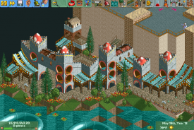
There were good spots... the interior of the building was nice and the castle area was probably the best in the park. As a whole, it looked rushed and messy, but I still thought it was pretty good and really liked it.
Parco Romania
This is very retro-looking and that's not a bad thing. However, I take it that the theme is supposed to be Roman... if so, I don't get the whole 'Parco Romania' title when it should be 'Parco Roma.' Maybe I'm wrong but the ride names would've fooled me. It didn't really give me a Roman vibe however, looked more like a generic seaside village.
As for the coaster, I thought the layout was nice... the entire park was also very clean and organized looking in contrast to its competitor. I initially didn't like the architecture, especially the coaster station, but the buildings, although simplistic, are very nicely done. There were weak spots, however, especially the harbor area with the boat... just makes this feel very rushed. The landscaping, however, was decent.
Like the previous entry, I just feel so much more could've been with this one... even something as simple as having legionary entertainers, steeplechase horses; peeps would've made this much better as well. There's also a huge ocean so why not build more of what everyone loves... boats!
All in all, the parks were decent but as mentioned, left a lot to be desired and felt rushed. If these were first efforts then they're nicely done and the first round is usually rushed. As for voting, I'm going to have to go with Subdued Thought... it just kept my attention longer, even though I can't decide whether or not it's just a collection of chaos that doesn't take itself seriously or if it's an ambitious and well-executed piece of surrealism.
-

 GammaZero
Offline
Just like how people can do art however they please and express whatever they want, viewers are allowed to give their opinion, even if it's as vague as "I don't get it", or as outlandish as possible. Especially on a matter as subjective as this, I feel that voting on the park you "understand" more, or is of a style you're more used to, is totally understandable.
 -

 Xtreme97
Offline
Parco Romania:
This feels rather old-school and it's a nice start to the contest. The coaster layout was okay, perhaps a bit slow in places. The theme wasn't particularly apparent to me either but it nevertheless felt charming. I liked the architecture by the cliff but some things like the lighthouse and terrace were messy. While this didn't have a huge amount of content, what was there was pleasant and really fits H2H8/8.
Subdued Thought:
Wow, this is a big contrast to Parco Romania, very surreal. It had some really cool areas and individually some of the pieces are fantastic, like the content inside the big building, the castle-like area and the mazes. However, some other parts don't quite work for me and feel like random clutter with no coherent meaning. Maybe that's the point? I don't know. Overall I think it's lacking in something to make it less disjointed but I will commend the builder(s) for making a very experimental park for the first round. -

 Liampie
Offline
Winner:

Florists vote count: 15 (68.18%)
Tropical Storms vote count: 7 (31.82%)
Subdued Thoughts was made by WouterVL (100%).
Parco Romania was made by MK98 (100%). -

 MK98
Offline
Congrats Wouter! Even though it made me feel a bit sad, you made a great park and it has some quality here and there. Some parts showed much more creativity than what I did and I guess that's why it won. I should've know it was you when I saw the "Liam Sux" letters in the water.
-

 roygbiv
Offline
Parco Romania:
Nice digestible theme with corresponding named attractions.
B&M "Donar" was ok. This whole park felted squashed in a corner with all the water space surrounding it.
Architecture tends to still with 1-3 elements throughout the whole park, haunted mansion windows and paths for roofs. Diversity is lacking within the content.
The fire tower was a great little idea. It places you somewhat in a time period as this park felt like ancient Romania with a B&M.
Subdued Thoughts:
This is a great little piece. I view it as a dissection of the brain, but all the pieces are scattered like that of a jigsaw puzzle. This park becomes easier to view for me when I find a place an explore from there.
The whole thing is very fluid, the overall mesh is complete, and there are tons of nifty uses of objects in a creative light.
I know there may be tons of hidden messages in numerology as you have hinted in the discord, but i'm too lazy to care about that.
I can not think of an rct park that made me read so much and question each individual meaning to assume a whole.
Each island presents a very applicable theme, such as the swamp island. The heavenly maze hidden from on lookers that leads into a "REDACTED" maze.
"a moment of peace" presents a zen garden like feature
This was the strongest area in my opinion, it would be great to see a full scaled area like this
Spelling words via water is such a classical LL throwback too.
I find the use of profanity somewhat unnecessary but whatever.
My vote went for Subdued Thoughts. -

 posix
Offline
Can I just say how fantastic it is to see an all LL match-up. Not sure when that last happened. Makes me reminisce in all sorts of NE nostalgia, especially since the 2002 style is being so embraced. Thank you guys.
-

 Lilith
Offline
Parco Romania by TropicaLL Storms
this is cool and very mk! i appreciate the minimalist vibe and even though its a little bare it was overall an enjoyable park to look at. the atmosphere is a little dry but there are some really nice ideas and details. i wish there was a little bit more color in some parts (flowers would have helped!) but the coaster colors look good and purple walls are always nice. i love all the texture work for the buildings but a lot of the shapes are too repetitive. the coaster station looks amazing however, as well as the castle/restaurant thing. that little area was the best part of the map for me, a little bit more of that landscaping elsewhere would have been awesome! the coaster is way too slow but the layout looks good, especially the interaction around the restaurant.
Subdued Thought by the fLLorists
i had a lot of fun exploring this one. each area or island is unique and enjoyable in its own way and the different styles range from complete chaos to a pleasant area that would fit in a "normal" park. it almost feels like every object in the game is somewhere in this park. i like the constrast of simple but creative ideas like the skatepark with the islands that seem like a mess of textures and colors, but even on the more abstract islands everything seems to be placed with care. im finding this park kind of difficult to review and i will say that i prefer the more structured parts of the map (the two large areas in the corners are my favorites) but the whole park is a lot of fun to look at.
 Tags
Tags
- No Tags


