H2H8 / H2H8 Grand Finals - Team Spacecrab vs Heaven's Gallery
-
 19-July 18
-
 Jappy
Offline
That's it folks! H2H is done. Time to wrap it up and go back to our own little projects. But the end won't come until we review these parks and be done with it. If you think this might all sound a little negative, let me say that's not the intention. Two great parks this final, but only one can be the winner. And the one that wins here is pretty obvious IMO.
Heaven's End:
What's this theme? Fairy tales gone wrong? Or more right actually since the brother's Grimm tales were kinda gruesome... Anyway, a darker take on wizards and shit. Pretty cool idea, well excecuted as well. Great archy, ideas and the stuff we're used of seeing this H2H. Really liked the callback to oldschool Dutch park making as well with the Anton Pieck square as entrance. The wizard/witches area alongside with the bloody wolf were probably my favorite areas. Some great park making to be seen here with the composition of the duelling and the way it's woven in with the landscape. I also really like the dense dark forest feeling with Big Bad Bloody Wolf.
Sadly however, I found this park to be too samey. Only one area really stood out as different, the Faery area, the rest all kinda looked the same despite the fact I liked most of them. Also, it's lacking something that I feel hard to put my finger on. The little extra umph to push it over the top. I kinda think it lacks life, even with the little touches and detail.
Zerzura:
What Heaven's End lacks in life, this has it in abundance. My god what a great park. The music and wind immediately set the mood of this. Filled to the brim with detail, scenes, great arch, kickass colours and whatnot this is the obvious winner for me. The execution of this is amazing as well. It felt like something from a video game or a tv show. It feels real.
Only downside, it might be a little too busy. It's not alyways that easy to see things with so many colours and peeps. But that's kinda minor.
Good job to both teams for creating some awesome work for the final of what has been a turbulent season of H2H.
-

 CoasterCreator9
Offline
Zerzura
Wow, this was so atmospheric and fun to explore. I love the sand-sailing trading post oasis setting; the ships were really wonderful. Great concept and wonderful execution. The dueling coasters were perhaps a little intrusive and least memorable part of the park, but I had a blast exploring the rest. Probably one of my favorite parks ever.
Heaven's End
Another wonderful park. Use of cutaway was noteworthy; felt a bit like a Disney style park if everything was dark and insane. I liked the orc invasion, and the orc fortress/fairy (elven?) forest were my favorite areas. Really neat concept, fantasy kingdom falling apart. Coasters were actually pretty cool to explore, and the duelers were superior to Zerzura's in my opinion.
In the end, I found Zerzura drew me in more and really brought a smile to my face. Well done to both teams.
-

 bigshootergill
Offline
"Awwww crap!?!?!?!" That was my first though when I opened Zerzura. There's no better feeling in the final matchup than going against a team's best park of the contest.
From cover to cover, I've loved every park SC has released, and this is like your crown jewel in my opinion. So damn cool! One of the first things I noticed was how you effectively used negative space with the edges of your map just being barren desert. Obviously this sold the theme, but with the larger map size for the finals, this really helped you guys focus on the central portion of the map without having to build on 4900 tiles (not that you have to, but you might as well take advantage of the larger map). But if you tried this in the RR parks, this would have lacked enough tile space to do the theme proper justice.
As for the guts of the park, working my way inside... I love the idea of the desert port and sand skimmers. Props to all the specialized ride designs, from the smaller operational boats to the larger parked versions. I love how your creativity just kept flowing from one boat to the next, each being unique and styled differently, it started the park off with a jazzed up vibe!
The buildings kind of remind me of Bermuda from H2H7, with an Arabian twist to them. The colors pop, they're nice and bright, it has that deserty, tropically feel to it as well. The lushness of the oasis is a great contrast to the edges of the map. I love the buildings being nestled into the rocks, makes for a nice variety of landscaping to prevent everything from being flat. And if you want to reel me into a park, build a feature waterfall... so you guys decided to build like 6 of them!
 So good! And then the scattered details on the rooftops, the seating areas, little pockets of fountains, gardens, entertainers (fire walker, thieves, mecca worshippers - plus the other 70) all created an immersive atmosphere that really elevated this park.
For rides, personally I love everything here. Fata Morgana almost feels like a racing coaster, even though it's just 1 track with 3 trains. The timing of having the trains pass by each other on the track adds those extra elements of excitement to the coaster. It's by no means the focal point of the park, but it's blended very well into the setting that IMO it works well! The smaller operational flat rides were great, I'm not a big fan of having flat rides that aren't peepable, but hacking is continuing to improve all the time, so we're seeing more and more operational flats. Let's keep that rolling NE!
So that's an H2H8 wrap! Awesome finish guys, glad we got face off with you in the finals!
-

 Sulakke
Offline
So I wanted to wait with a review until the poll is closed, but since the amount of reviews and comments so far has been very low, I just do it now, as this park really deserves some attention. I'm really impressed by the Spacecrab season, all parks were great and this one might be my favorite of yours. The more I explore this park, the more I discover and the more I fall in love with it. Some comments:
+ The custom music works really well here. I love the opening scene with the houwling wind. Where's the main music theme from? It sounds familiar...
+ The new custom cars and rides. The kite skiers and camels really added to the atmosphere.
+ All ships were created very nicely and set the theme well. There were almost too many ships I'd say. It almost felt like a coolness overload.
+ Not sure why some people didn't like the white palace. I love it. The minarets are really well constructed. Loved the water coaster too and I'd like to mention the amazing interaction here between the queue, the coaster drop and the palace. The coaster entrance with the columns was fantastic as well.
+ Fata Morgana is a really strong main coaster. Love the dueling aspect of the ride. Really good support work too.
+ The flying carpet ride.
+ The market stalls all over the place.
+ The pathwork is really, really good. It all feels so organic. The planters around the market place are absolutely fantastic too. Again, it feels so organic and natural.
+ All the frozen staff and little things throughout the city. It's almost an overload.
+ The gardens are really dense, but I like them. Especially the fountain is really effective. Foliage overall was really strong.
- I'm not too sure about the bare grey rock formations. They are not bad at all, but they just feel kind of basic and underdetailed compared to the rest of the map.
- Most people above didn't like the Tea Palace. I actually do like it, although I think the base needed some extra supports in the middle, as it looks very fragile right now.
- I know most people liked the scorpion and I did too, but I couldn't really figure out what it was. Is it a skeleton? It's built of too many different objects and texture to make that really clear.
- There were some flickering white dots around the water coaster. Couldn't figure out what it was, but it was distracting.
Fantastic H2H season all around. We've only seen strong parks and only one forfeit. Thank you community. I had great fun in the past couple of months.
-

 ottersalad
Offline
Sorry for a late review.. I've had a busy last few days.
Zerzura:
+ The outriggers are simply amazing. So many of them, and they are pretty unique too.
+ The scenes and activity outside the oasis are cool.
+ Station for Fata Morgana is very nice and well done. Love the dueling aspect.. great timing. Pace is a bit fast though as others pointed out.
+ The water boat ride was a goofy layout, but that whole complex was great. Reminded me of Assassins Creed 1 for some reason.
+ Dervish was crazy. Saw it at first and thought "hey that would be cool if it actually was at the top of the tower", and then it climbed.. so cool.
+ The mix of colonial architecture and then more Arabian architecture was very believable.
+ Cool addition of Petra - inspired architecture as the entrance to Fata Morgana.
+ So many neat little details.. the Fortune Teller wagon especially.
- Not a fan of the camels.. looked too un-RCT for me.
- Very busy.. kinda distracting. Some times it was hard to read what was going on at times. Maybe too much movement?
- Fata Morgana pacing.. sorry but it was breakneck.
- Tea Palace wasn't working for me
- Rockwork seemed unfinished? Cool exposed rock is nice.. but at times it seemed a bit bare.
Heaven's End
+ On second viewing.. I didn't realize how big Bloodfall River is.. didnt realize it went into the center castle structure. Great interaction with it.
+Mushroom swinger and swan boat ride combination was really cool. Great custom mushroom too.
+ The dueling flyer was amazing. One of my favorite coasters of H2H8.. great theming.. good interaction, and a bitch to support it I bet!
+ The entire concept of the park was great. I agree with CC9 about the dark Disney feel. It's not overtly disney at all. But if you added "Disney" to it, I'd agree with it. Minus the whole Orcs, blood, torture stuff.
+ The park is so dirty and I love it. The destruction.. piles of debris. Burnt buildings. Feels very much like a war scene.
+ The fairy themed area was awesome. It had some room to breathe and the coaster was super fun. Hate to say it, but it was like Wit's End, but better.
+ This park is very much like Metropolis in that it feels "old school" so to speak. I'm not an expert, but this seems like more of a H2H6 or something park. Really cool.
- Again, same issue I had with Zerzura.. its super busy. Could've used more open space perhaps.
- The orcs were cool, but I wish there were more frozen staff depicting scenes of a battle for the kingdom or something.
- I didn't like how underutilized the center castle was. I think it could've shown the dark ride coming in and out of the building a bit.
- The Orc fortress was a little unreadable for me. I think because the center castle obscured the corner a bit? Not sure. The path texture should've been darker perhaps so the buildings stood out more.
My vote goes to Heaven's End. I really enjoyed coming back to this moreso than Zerzura. Zerzura wowed me at first.. but I loved the wizard and fairy areas so much. The detail and the coasters did it for me. Great work everyone. Two great parks to cap off a fun season of H2H. I'm sorry I had to pick one park over the other.
-
 G Force
Offline
Zerzura: I appreciate the combination of two "typical" RCT elements in a unique way, being the ships and the Arabian style archy/atmosphere. It was quite clever and felt fresh without begging for attention or recognition. The detail of the ships and out scenes was purely incredible, probably one of my favorite bits of the season was the detail of the landscaping and the dock areas, really great stuff. Only thing I probably didn't like was the Coaster, just felt like it was thrown on top of everything and stood out way to much, honestly would have been fine it if wasn't included at all. Sure this is "Roller Coaster" Tycoon, but if the coaster feels forced an unnecessary to me then I don't see the point of including it. Overall got my vote, and an 85% from me.
Heaven's End: While the micro elements of this park were fantastic, especially the little story-like ones, my favorite being the chopped down tree; this park is desperate need of a more macro perspective. While the details are all great, and the ideas are all there, none of them truly stand out and nothing in the park forces you to notice them or appreciate them. It all feels just sort of a collection of things without any true focus or framing. This is something that DKS did so well, in that while it wasn't the most amazingly detailed, creative or full park, it did a great job of forcing you to notice its best aspects and areas. This park just feels like everything was spread evenly over the map without really taking into consideration the viewer. As a whole, I think the construction felt sort of dated (definitely could of used a more organic map composition, but that may be personal preference) and a bit more focused concept. Perhaps some sort of readme would have helped, as I've looked at the park for a few hours over the past few days and still am not really sure what its supposed to be. That was far more clear in Zerzura and especially Allegheny... which I feel is important in H2H parks for them to be truly special. A 75% from me.
Overall a pretty strong finals match, probably the best since... well H2H4? Cheers to both teams for getting their parks done, I know that finishing in itself is a considerable challenge.
-

 Cocoa
Offline
crabs
holy hell zarzura is a great park. the entrance in the sand with all those boats is incredible. So full of mystery and life and just such a cool idea. I love seeing original, unique fantasy shit and this really doesn't let down. one of the best arabian themes I've seen- colorful, lively, detailed. the gardens are brillaint, the castle is pretty with all the bridges, there's a lot of dynamism to the architecture/paths/rides. Very well done. I especially like the water stuff and the use of signs as patterns on the buildings- very clever. I haven't had enough time yet to really take in everything and all the jokes/ pretty bits but its an excellent end to an excellent season. well done on being consistently creative, pushing boundaries, and putting out quality h2h work.
HG
pretty good all up. probably a fitting title though! I liked it but didn't love it. felt sort of like the concept was "what if efteling was a fantasy rct park". Some parts were a bit underdone- I felt the area with the tall trees was texturally super clean and weird and underdetailed, and the 4-cornersy layout of the park took away a bit of the sort of war-story-dynamism and made it feel really blocked out and simple. the castle was good but a bit hard to read, which I especially felt in the fort. I couldn't work out what was what there- too messy texture-wise and structurally. there were plenty of good bits though- the duelers station is lovely as is most of that area. maybe an issue is that the entire park was pretty much dull red and cream colored. It made it really hard to differentiate buildings and work out the story and detailing behind anything. I probably need to delve a little deeper to really elaborate on what I liked but it was still a good park, just one of your weaker ones of the season. Which is understandable, working on finals is a real drag (as my team found out!)
I'm still excited though to finish our finals park and show you guys what we had in store (with quite a bit more polish though)
-

 Liampie
Offline
Zerzura
Usually I'd wait with reviewing the opponent's park until after the match is done, but in this case, what's the point? Both parks deserve more reviews and I'll do my part!
Opening the park in the desert is a great move, so you can 'discover' the city. Ballsy move in general to include so much surroundings in a finals park, but you gave it enough content to not feel empty and it helped the story and atmosphere a lot. In fact I think that without the desert, the park would be much less good. The city was very good. I love how every building was unique and how easy it was to explore the city. The coaster looks great. Too fast paced indeed, and a bit short, but it was otherwise very well designed. I have to admit though that the front half of the city didn't feel very innovative or surprising. It's kind of an obvious Spacecrab environment somehow. Consider that a compliment, that you established a kind of signature style in just one season! The rear half of the city stole the show for me. Not that the water coaster was very interesting, but the theming here is just 10/10. I'm totally in love with those gardens.
+ Archy
+ Atmosphere
+ Park layout
+ Healthy dose of little things like the praying muslims, the scorpion, the grazing camels and the Moroccan rappers. And how Mohammed is the most common staff name
+ Fitting signature park to cap off a season in the grand final
+ Ships, nice twist on a by now cliche thing. There could've been a few less ships but it doesn't hurt the park in my eyes. Kinda makes the city look busy and important.
+ Story
- Could've used more e-ticket rides
So yeah, great fucking job guys. -

 zxbiohazardzx
Offline
very good submissions. I loved the theming on Heavens end but i believe Zerzura had a better concept and kept my interest longer. Great end of the series and congrats to both teams for putting out such quality parks
-
![][ntamin22%s's Photo](https://www.nedesigns.com/uploads/profile/photo-thumb-221.png?_r=1520300638)
 ][ntamin22
Offline
Voting Closed

Team Spacecrab beats Heaven's Gallery
Team Spacecrab vote count: 41 (83.67%)
Heaven's Gallery vote count: 8 (16.33%)
Zerzura was made by dr dirt (30%), BelgianGuy (30%), Fisch (25%), Tolsimir (8%), Faas (7%).
Heaven's End was made by Six Frags (60%), bigshootergill (17%), RuyataxRCT (17%), IonZero (3%), Roomie (3%). -

 In:Cities
Offline
I had a feeling that Six Frags was a main builder on the Heaven's park. Such a great and distinct style. Shame that it had to lose.
Crabs, you guys have been amazing all season long. Very very well deserved.
-

 dr dirt
Offline
For now, I'll provide some insight into Zerzura's conception and construction - I'll have to get around to reviewing the end of R5 til now another day.
I don't want to go into detail on what was originally planned for the finals as BG had the original semifinals park plan, so I don't want to spoil any future parks. BG threw around an oasis idea early on, and wasn't planned, but after Dig Site's release BG was into doing a continuation with an oasis location. BG, Disney, and I largely conceived the idea from there (disney would later live in a van by the river, and was time-limited so didn't build). I think it was first an oasis with a temple to the Djinn in the center as a concept; after Dig Site, the REEC exploration/colonization was added to the idea to create a linked universe making the oasis the second site to be explored.
What made the first in the saga interesting for me was the inclusion of the strange or mysterious - so what would this one's weird aspect be? I liked the idea of a quirky transportation to get into the oasis, and thought big 'sandsails' would be cool, and we all really liked the idea of bold colored sails on desert. Apparently this exists in the Avatar universe as Fisch showed us so we had at least a small sandsail reference to start with. The potentiality of magic and other things was another element that was added beyond it's 'just an oasis' to solidify the alternate fantasy reality the parks exist in.
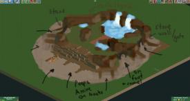
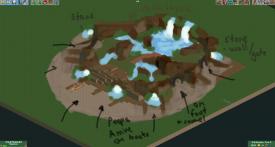
BG had an initial rendition of the park layout, that I'll let him add a screen of if he chooses. It was changed to something closer to the final version shortly, after BG created the layout for Fata Morgana and asked me to put it into a landscape. I had to change the layout a little bit, but the essence stayed the same. These sketches were at that point, which became the macro of the park:
BG decided on the ride lineup for the most part - I think sax showed us the teacups, so we decided to add those when he was considered to be a builder (but ended up only doing the hack(s) as builders were added). I think from there, I laid out the macro and did the landscape and path work and BG went to town on the bulk of the architecture seen in the park and faas hopped in to do the Thieve's Den. We wanted Tolsimir to do sandships/sandsails from the beginning, and his efforts on Mobray's resulted in us all doing them. Fisch came in big the last two weeks on the palace, gardens, tea palace and buildings around it, and a huge amount of little things.
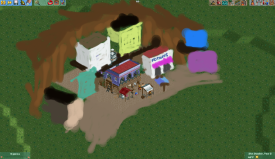
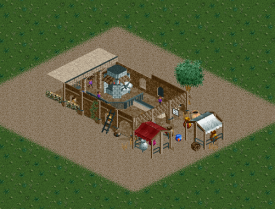
From the beginning we had a lot of references for cities built into cliffs and some fantasy Arabian type concept art. We also wanted the stalls, shops, and buildings to have their own personality and purpose - so, there's a lot of named shops that are clickable to highlight the name. Sketch for the architecture, and a trial for a pottery kiln:
In the end it was a real team effort, and I mean that in the truest sense: Me, BG, Fisch, Tols, and faas built the park, Cam put together the music and got each boat to have a single set of rides for naming, ][ntamin did the readme, SpaceK came through with a huge effort on custom rides and some hacks, and sax did the hacking of Dervish and the tea cups along with queue fixing and probably some other hack corrections I'm missing, and disney helped to created the concept. (where were you Coups?!). Zerzura is a mythical oasis, that just happened to exist and only has a loose impact on inspiring the park, but making an actual mythical location into this universe is a big plus to me. I could probably go on and on about the park, and may include some additional thoughts in a response to the reviews.
Fun facts on the park:
- We each made ships - Tols was Al-Nassir and The Wasp, I did the set by The Beyonder, Fisch did The Scorpio (just had to make it the fastest) and The Pharaoh ][, faas did The Gliding Dutchman, and BG did The Icaron.
- One more coaster was debated for a while, would've been a Thunderbolt or a motorbikes as magic carpets (later became the current custom flat).
- There's a huge number of tie-ins to our previous parks - Mobray's failed teleporter victims, Four Season's potions, Howl's (Ghibli) Imports and Oddities, Sophie's (also Ghibli) desert gear, parts of all our parks in the oddities tents, and the REEC building linking to Dig Site (maybe more!).
- Dune is a loose inspiration for the park - you'll see the Sailing Guild (equivalent to the Spacing Guild), a Melange shop, the Al-Nassir I consider an equivalent to a heighliner for a guild navigator to captain, and references to sandworms (never placed in the park)
- The flashing pixels above the waterfall are a fault in the diagonal whitewater object, but we decided to keep it as it looks sort of like magic sparkles.
- Palm trunks in the gardens are made from peep objects (Fisch's brilliancy).
- We (I) creating a park closer to 60x60, which was discovered about 1.5 weeks out, but we wanted to expand the desert anyway and the crescent/circle shape was created.
- Threw around a diagonal edge map idea last h2h, here it is.
- I also think we almost each did a gate to the city, but I think Fisch's might technically be one, but it also might be small enough not to count.
There's a great number of tidbits that are either in the park, or more importantly memorable from its creation. I really love the park we created and for me has so many things that I may never forget in my life. It's become an exercise in worldbuilding, and an exploration of creating mystery in the park's story itself and in a broader sense - for example is it a park? a city in this alternate universe? is it Liam seeing a mirage? I think the saga may continue..
-
 MK98
Offline
Congratulations Crabs! A well deserved win and a great final park. I think that the overall best team won. Enjoy your three years of pride!
For HG: very well played. Deserved to make it to the finals with a very good park. -

 alex
Offline
Congratulations Spacecrabs!
It's really great to read that this was a real team effort since thats what H2H should be about. Great insight on the planning/concept too. I like the idea of it being a vision/mirage, it's quite Kubla Khan esq. I also loved the crescent moon shape of the sand - you didn't mention it but it can't be accidental? -

 Six Frags
Offline
Awesome park crabs and a very deserved win and championship!
Everything you described dr dirt about your park was really insightful to read and the way you guys worked together on this and let everyone's strong point shine through and step up is the hearth of H2H.
I just can't quite get myself to do proper reviews of the parks yet, but who knows, maybe it'll come later on..
I signed up for H2H, mainly because I wanted to experience all the goods Open has to offer. I already experienced some of that on Caeleste, and Fantasia Apocalyptica (sorry Liam, still like that name better
 ) continued that.
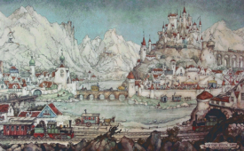
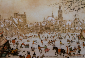
The park was rushed though, we had real trouble coming up with a good concept. Roy/Ruyatax started a Volcano style park, but didn't have the time to lead it and not enough of our team felt the concept. No-one really stepped up to be a lead on this, and I was afraid I was too rusty and not having the ability to produce Final worthy work. Time was ticking though, so I just stepped up and tried to get a somewhat finished park out in the hope the opposition maybe wouldn't be able to get something finished in.. A lot of ideas were thrown around, and at around june 5th the concept of fantasy races turning on each other was finalized. It was basically a mash-up of some ideas everyone had. I also really wanted to do some proper Efteling style parkmaking and I think our concept was perfect for the Anton Pieck style seen in the Efteling and especially Diorama:
There were bits done here and there, but the main bulk of the park was done in like a week before it was due. Apparently I was the only one on the team that could put in a lot of time so I pretty much worked on it non-stop this last week.
BSG really wanted to do Elf stuff so he created that section and the station of the duelers and other wooden witch buildings. Ion created the layout of the dueling B&M divers and a bit of the architecture on the first drop (which I later on finished for him) and some queue buildings, and Roy/Ruyatax really stepped up 3 days before it was due on the Orc section. The rest was mostly me.
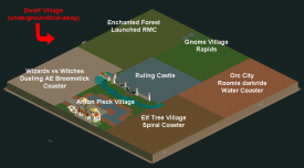
(Revised) park plan;
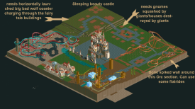
3d of July update:
The whole Louis disaster did have some impact on this park, as I really thought at that point "Why should I care anymore". Also no-one else on the team having any time or motivation to really get this park going was a huge bump in the road.. I'm glad to see you didn't had those kinda issues crabs! (well, I was hoping you did, as that would make it a bit more fair imo
 )
)Anyways, the last few days I got help from the rest of the team to get it to a decent finished state so I'm really relieved we got the park to this state.
I'm kinda disappointed the general criticism the park got was that 'it was hard to read'. I don't know what to make of that. I see BSG, mine and Roy's style clashed a bit, but hey, that was kind of the theme of the park anyway with clashing races

In the end, I was glad to be on Heaven's Gallery. It was a great team, we didn't really have any issues and everyone helped out where they could. Roomie with his rides and supports, Liampie with the palette and criticism, CHE with his hacks, Steve with his improvements (shame his mobile wasn't compatible with this park). I also love the change Discord made to this H2H, as the communication was soooooo much better in comparison to previous H2Hs. The multiplayer part of Open also saved our park the last few days as everyone could just hop in when they had time. Also, like I said before the new Open features opened doors for me and made building like 10x faster and 100x more fun! Little things like the 'select an area cut-away view' are so handy. No blocked views and no distractions.
Anyways, enough rambling, thanks all for this wonderful H2H (except Louis
 ) and grats crabs for the win. You had the best team and best synergy. :beer:
 -

 saxman1089
Offline
HG, I owe you guys a review, for this park and for Forum I think. Don't let me forget, because they both deserve them!
-

 bigshootergill
Offline
Oh, I forgot to give a shout out to CHE's elven roofs he made for our park! It might sound odd, but those roof pieces kept me motivated!

-

 Turtle
Offline
Well done everyone, stream of consciousness reviews incoming.
Heaven's Gallery - Wow what a busy opening. It's kinda hard to see what's going on with all the architecture and the foliage being the same texture and color mostly. Busy path too. But very interesting. Stuff's on fire, so this should be a fun park

I'm starting bottom left, that blue coaster's caught my eye. The trees aren't the best i've seen honestly, quite blocky, but looks like a really fun coaster. The butterflies are awesome, I love them. Colors are great, although I wish the coaster was longer. I like the steaming vats of whatever's in there, and i'm finding myself really liking the atmosphere here. I definitely wish this area was a lot bigger, would love to see this expanded into a larger faerie/elven area.
This next area feels evil, so good job on that already. The bats by the tower are a nice touch, and I see there's a river ride in here. It's so hidden though, you don't really see it. I like the blood by the drop, a good idea that one. Those trees inside the fort really aren't working for me, so many busy textures really makes it hard to see what's going on. I can see that being a recurring problem throughout this park really, maybe not quite enough space for things to breathe? We'll see. I really like the little touches here, like the gold treasure i'm guessing are the spoils of war.
Ok next area, there's statues. A little weird... oh I see they're giants I think? The mushrooms with the rock blocks are a good idea that just doesn't really look good, unfortunately. Again some really weird textures in here, although I really love that little mushroom flying saucers ride, that works really well. I can hear the roar of a woodie, and oh there it is! That thing is flying. Some of the track is red, and I now see the name so I get it. The color of the trains is clever too, like the wolf's head is covered in blood. I can see this one being vomit-inducing in real life definitely. The architecture here is slightly strange.. the coaster goes through buildings like he's demolishing them, but why not a straw one, a wooden one and a stone one, to keep the story going? It's a bit weird that this archy looks exactly like the entrance and also the big castle I keep seeing in the middle that I promise i'll get to soon.
OK here's some proper coasters, I don't love the colors honestly but let's see what's going on. They're kinda squished into the corner which is unfortunate, they could have done with being spread out I think. I don't really get why there's an icy part, maybe a by-product of spells as the witch and the wizard are fighting? But then that only happens once so i'm not sure. Overall the coasters are interesting to look at, but they don't have a flow really, and again there's so much texture going on everywhere it's impossible to look at one area for any length of time. Nice little wizard's potion ride though! And the scene of the witch zapping the wizard is brilliant, that little tableau is one of my favorites in the park. It's framed so nicely.
The central castle has been poking into my view for this whole time, so let's have a look. It's impressive looking without being aesthetically pleasing really, which is a bit of a shame. So much tiny detailing going on, so many textures, it almost looks like it was built with legos, doesn't look like one coherent building. This is probably a good metaphor for this whole park, tons of stuff going on, impressive to look at, obviously skillful, but no room to breathe, too many textures and not easy to view.
I feel like i've been very negative here, overall a good park and a fantastic season from you guys, you build a number of my favorite parks and it's been a pleasure viewing!
SpaceCrabs - Very interesting opening scene, love the camels, love the polished diagonal map edge, so brilliant. Adds a lot of class already. Look at those kite skiers, damn. I can already see this is going to be very clever. Very cool take on docks and city walls/gates, and a really great shout adding the waterfalls, makes the city feel like an actual oasis in the desert definitely. Loving the ships, loving how each one is different and unique, and named. Brilliant.
I can see a blue coaster, but honestly i want to look around out here for a bit longer, see more of the ships, check out what's going on. Each ship is better than the last, the splashes of color work really well also. Love the lines in the sand, really nicely done. I haven't noticed the foliage yet, which means it's spot on and fits perfectly. Very cool idea to have the railroad connect this to Dig Site, brilliant. Going round the other side, more boats which are amazing. So cool to see all your ideas, you've really pushed each individual boat as being different which is hard once you find a look that works. Nicely done. I see people bathing in the water, excellent, and people praying to Mecca which is an outstanding idea and perfectly pulled off.
OK i'm ready to go inside this city, but I actually want to enter from one specific direction which is a brilliant feeling. I think i'm going to go back to the other side, where the black Scorpio boat is. Architecture is excellent, so many different styles and colors but the scale is always consistent so it really works. Love the colonial station and the Arabian feel right next to it. A solid choice to not have path, it works great and allows for more natural feeling pathways. I'm sure there is so much to see and discover here in every shop, but i'm going to skip them and come back to them another time for sure.
The tea palace really stands out though, in a good way, lovely ride and building. This blue coaster keeps catching my eye, so let's go have a look. Oh it's a dueler? No wait, a mobius. Excellent. Really cool timing and layout, really nicely done. Great flow, GREAT colors so it stands out so well. Love the little spaceman and the christian guards, again just a nice idea. This park is full of them. The architecture here, especially on the station is so great. Haven't seen a building that stood out as being lower quality yet, anywhere.
Just noticed the hot air balloons roving around, love that. The custom flats are incredible too, the flying carpet ride, the Dervish one which i'm guessing helixes all the way up and down (why has no one done that before?! - maybe they have...). So clever, so brilliant, adds so much.
And now onto the Palacey bit, feels a lot lighter than the rest of the city so great job on that. The yellow stands out again nicely, good colors. Looks like a really simple boat ride with added coaster bit but it's just framed so brilliantly, the rocks, the architecture up the walls, the pathing, the foliage. Quality, quality work throughout.
I think it's quite obvious that I really preferred the SpaceCrabs' park, as it seems most people did. It's probably my favorite park of the contest - had everything Dig Site did (possibly minus a large coaster) but with added color, and a better theme I think. Was definitely a couple of levels up on the other park, it's a pity the match up wasn't closer.
Great great work to all involved, what a great contest!
-

 Six Frags
Offline
Thanks for your review turtle, pity you didn't invest some more time to dig a bit deeper into our park as it seems there's a lot of stuff you seem to have missed!
 Tags
Tags
- No Tags
